Background
Situated on the South West coast of Western Australia, the Margaret River region is full of natural beauty. Renowned globally, it is a destination which combines world-class wine, gourmet foods, pristine beaches, rugged coastlines, meandering inland rivers, towering timber forests and ancient underground caves.
This is home to Margaret River Natural Spring Water (MRNSW). Drawn straight from a natural aquifer on their family-owned farm, this single origin, pure, refreshing, spring water is bottled in small quantities and triple filtered directly at the source.
The spring is perfectly positioned within the family farm and is surrounded by untouched forest, providing a pristine environment away from pollutants other water sources are commonly affected by. This 100% pure natural water is replenished with winter rains before hand-bottling into PET fully recyclable bottles.
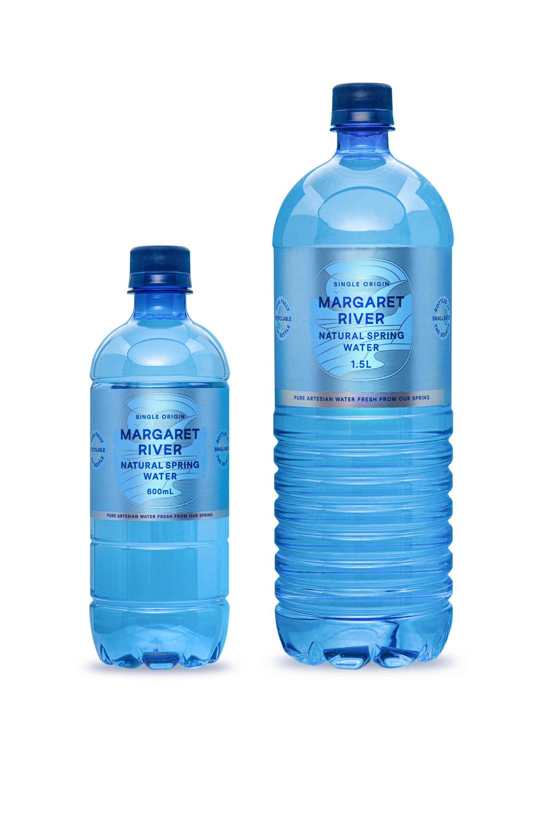
This family-owned brand bottles in small batches and provides their water in a 600ml and a 1.5mL to retail outlets through a distributor to independent stores in Western Australia and online sales through Amazon as value packs.
Recognising the brands potential, the family has passed the family farm to the next generation, who are passionate and want to provide customers the experience of drinking natural spring water in its purist form, to quench thirst and hydrate with a premium water for good health and well-being.
Brief
The client loved the existing brand but was advised as part of a marketing strategy to refresh it to engage with his customers and demonstrate the difference between the MRNSW brand and his competitor brands who claim, yet do not actual deliver a 100% pure water offering from a single origin.
Our brief was to highlight the health benefits and natural qualities of the MRNSW brand as it is literally pumped from one spring, at the source, filtered and bottled in small batches, with labels to fit their existing and limited labeling capabilities on their existing bright blue PET bottles. The new brand must also have the capacity to transition to use on glass bottles as part of the brands future offering.
Strategy
The Margaret River region is infamously known for its magical location in the south-west of Western Australia, where rainfall is abundant through the winter months and where the sunshine, surf and gourmet offerings of the region become a tourist destination through spring and summer.
Building a brand blueprint for MRNSW our strategy for the new-look brand focuses on these 4 key points:
The unique location from which the water is born.
The fact the water is bottled from a single source.
The health benefits of the water rich in natural minerals as a healthier lifestyle choice (Competitor brands often deplete or mix with our water sources)
The bottle itself is 100% recyclable.
Design Process
Working within the limitations of the PET bottle, we optimized the size of the label for easier application (which also reduced the time to apply the label) before addressing the design itself. We limited the number of colours used to ensure the label costs were close to those of the previous labels and chose a silver foil-based stock to elevate the brand into a more premium position aligning to its price point.
By highlighting the unique location, the brand redesign focused on showcasing the nature and beauty of the ancient region. Celebrating the purity and authenticity we created a custom logotype, which mimics the fluidity of the water and signals Margaret River Natural Spring Water as a brand distinctly different from its competitors. A stylised illustration depicts the signature characteristics of the region and the spring flowing within it, shimmering and changing colour as the light changes.
Inspired by the coastal landscape, the colour palette includes pure, clean tones reflecting the sparkling waters, blue skies and soft muted tones as the sun moves across the sky. These two hero colours compliment the distinct blue of the fully recyclable bottles and are also supported by a secondary colour palette of softer coastal colours, conveying a wellness aligning to a healthy lifestyle.
We borrowed the coffee terminology ‘single origin’ to identify the natural spring water as coming from a single source and highlighted the bottle is a 100% fully recyclable PET bottle, bottled in small batches in Australia as feature USPs either side of the illustration.
We aligned Margaret River Natural Spring Water’s new visual identity across all branding materials and customer-facing components to ensure a consistent representation of the brand’s identity, values, and messaging to target markets.
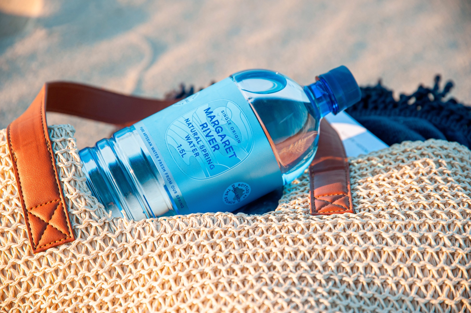
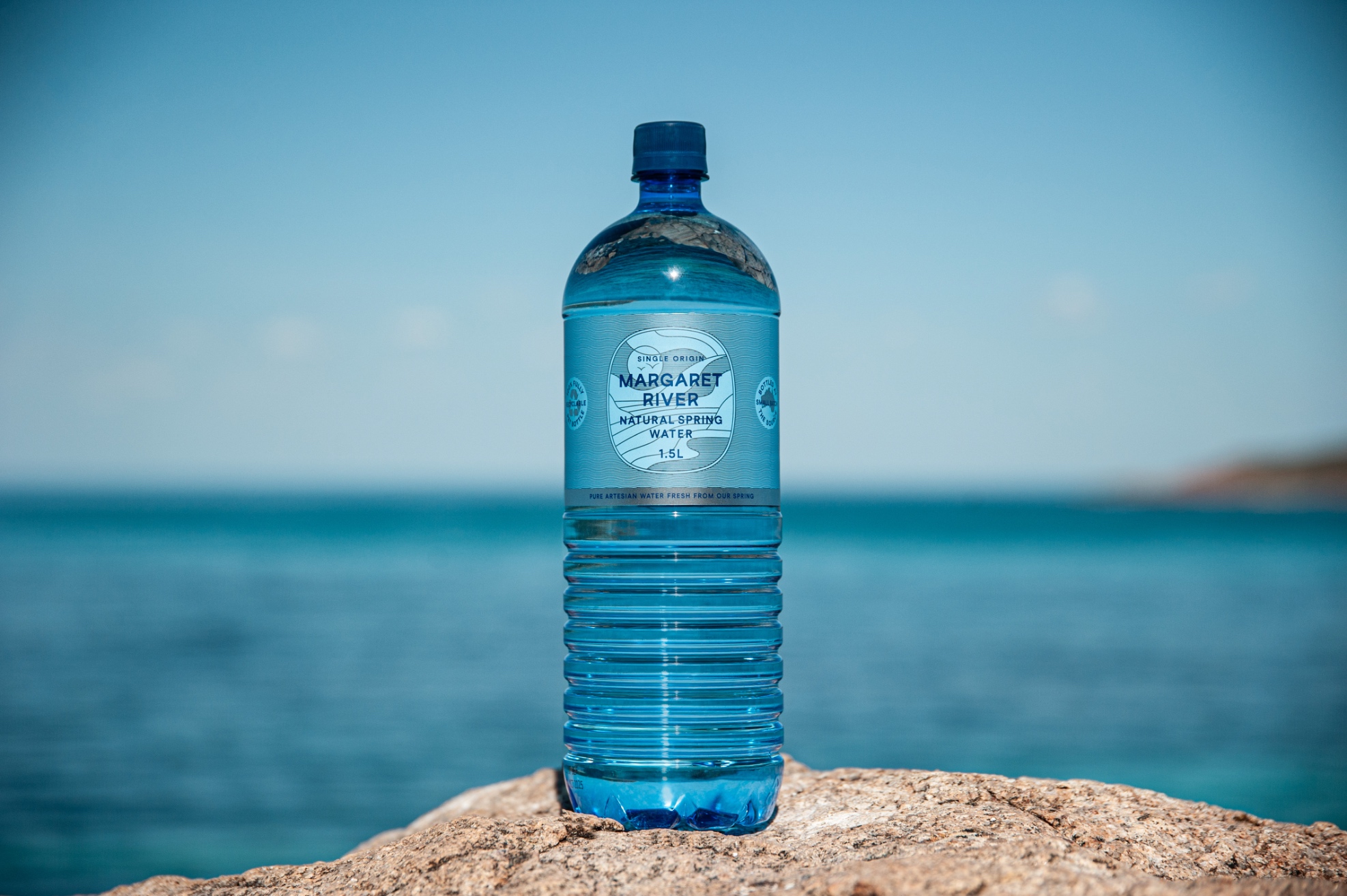
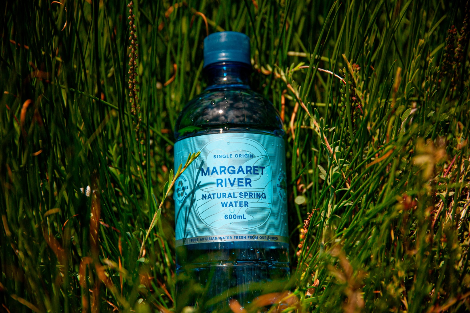
Extending beyond traditional branding, our services also included an on-location photo shoot, which was strategically designed to bring the brand to life by capturing the true essence of the region.
Additionally, our project brief also encompassed the design and development of an e-commerce website (currently under construction).
Results and demonstrate the value and impact of the project
While the new branding has been completed the MRNSW had not completed property upgrades to increase production capacity and therefore has not officially launched the new brand as such.
However, the 1.5L bottles were available for sale via independent retailers in October 2023, and without any promotion, they have increased sales by 25%.


CREDIT
- Agency/Creative: Dessein
- Article Title: Margaret River Natural Spring Water Packaging Design
- Organisation/Entity: Agency
- Project Type: Packaging
- Project Status: Published
- Agency/Creative Country: Australia
- Agency/Creative City: Perth
- Market Region: Oceania
- Project Deliverables: Packaging Design
- Format: Bottle
- Industry: Food/Beverage
- Keywords: WBDS Agency Design Awards 2023/24
- Keywords: Packaging Design, Product Redesign
-
Credits:
Senior Graphic Designer: Leanne Balen
Director: Geoff Bickford
Director: Tracy Kenworthy


