


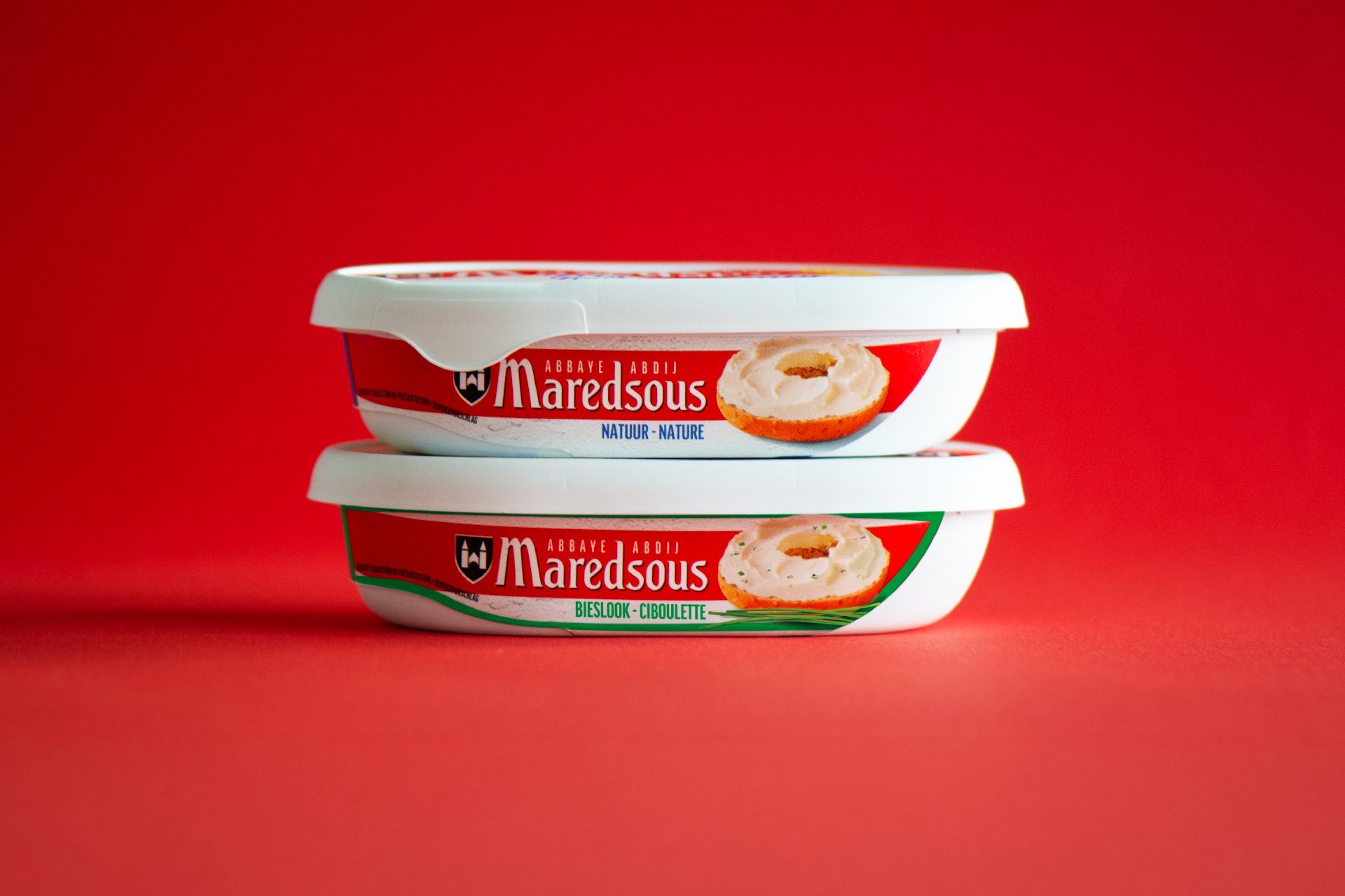
Bel Fromagerie approached us to support the launch of Maredsous Fresh, a brand-new cheese range intended for the highly competitive fresh-cheese segment in supermarket fridges. With limited packaging surface and strong international players dominating the shelves, standing out was critical.
Our challenge:
How to create maximum shelf impact within extremely tight visual constraints, while respecting the heritage of an iconic Belgian abbey brand?
Our strategy:
We defined a clear strategic direction focused on three pillars:
1 – Stronger Brand Presence – Reinforcing the Maredsous identity to ensure instant recognition in a crowded fridge aisle.
2 – Impact in a Small Format – Designing every millimetre of the packaging to work harder — clarity, visibility, appetite appeal.
3 – Respect for Heritage – Modernising key brand elements without losing the authenticity and warmth of the Maredsous abbey.
This strategic foundation guided all creative decisions, from logo refinements to colour blocking and product staging.
Design Approach:
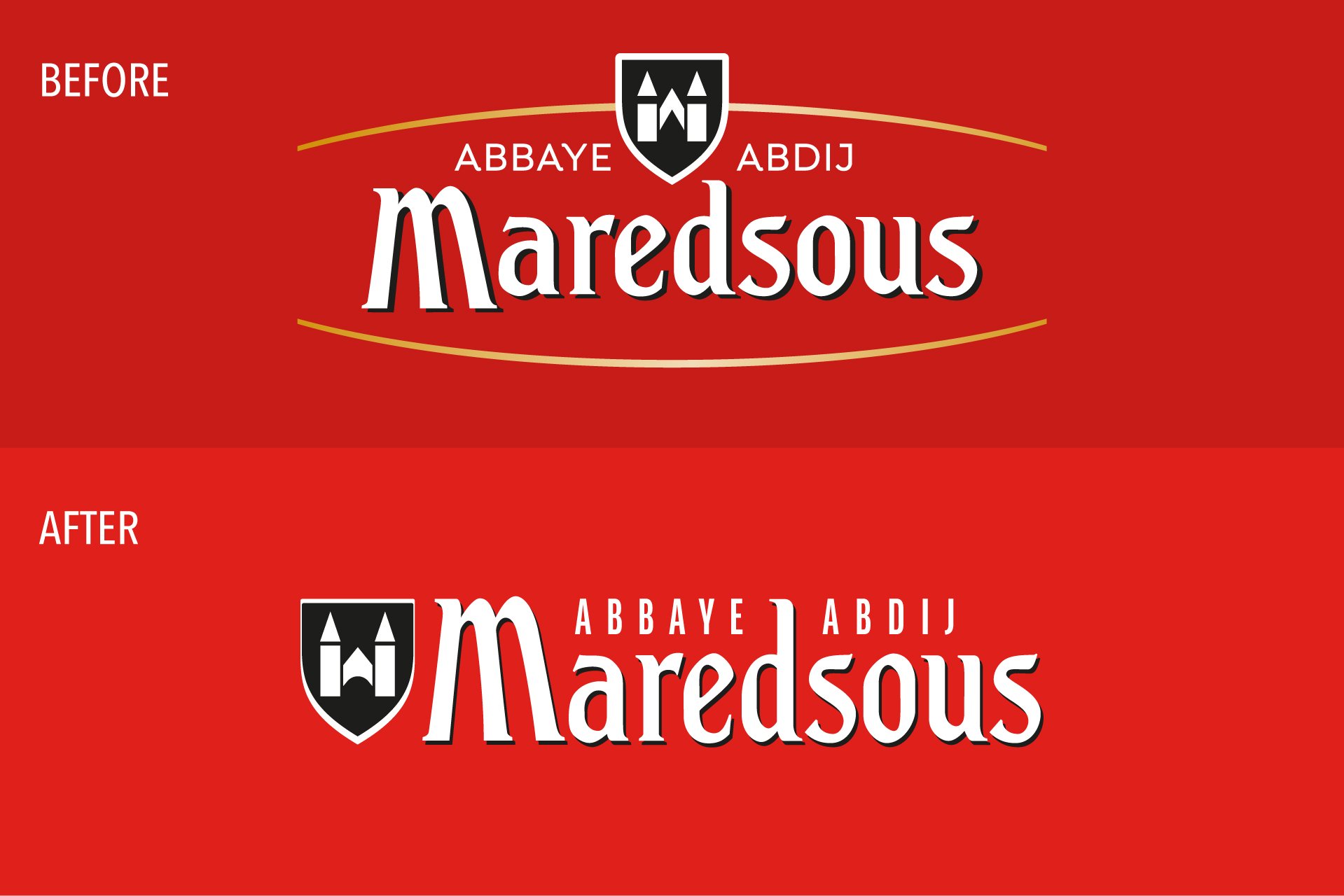
Logo Refinement for Shelf Visibility
To boost presence, we subtly reworked the Maredsous logo:
– Straightened the wordmark for a more confident stance
– Integrated the abbey symbol more coherently
– Introduced a bold red brand block to create a strong, instantly recognisable shelf signal
These small yet precise adjustments made a significant difference in visibility and brand attribution.
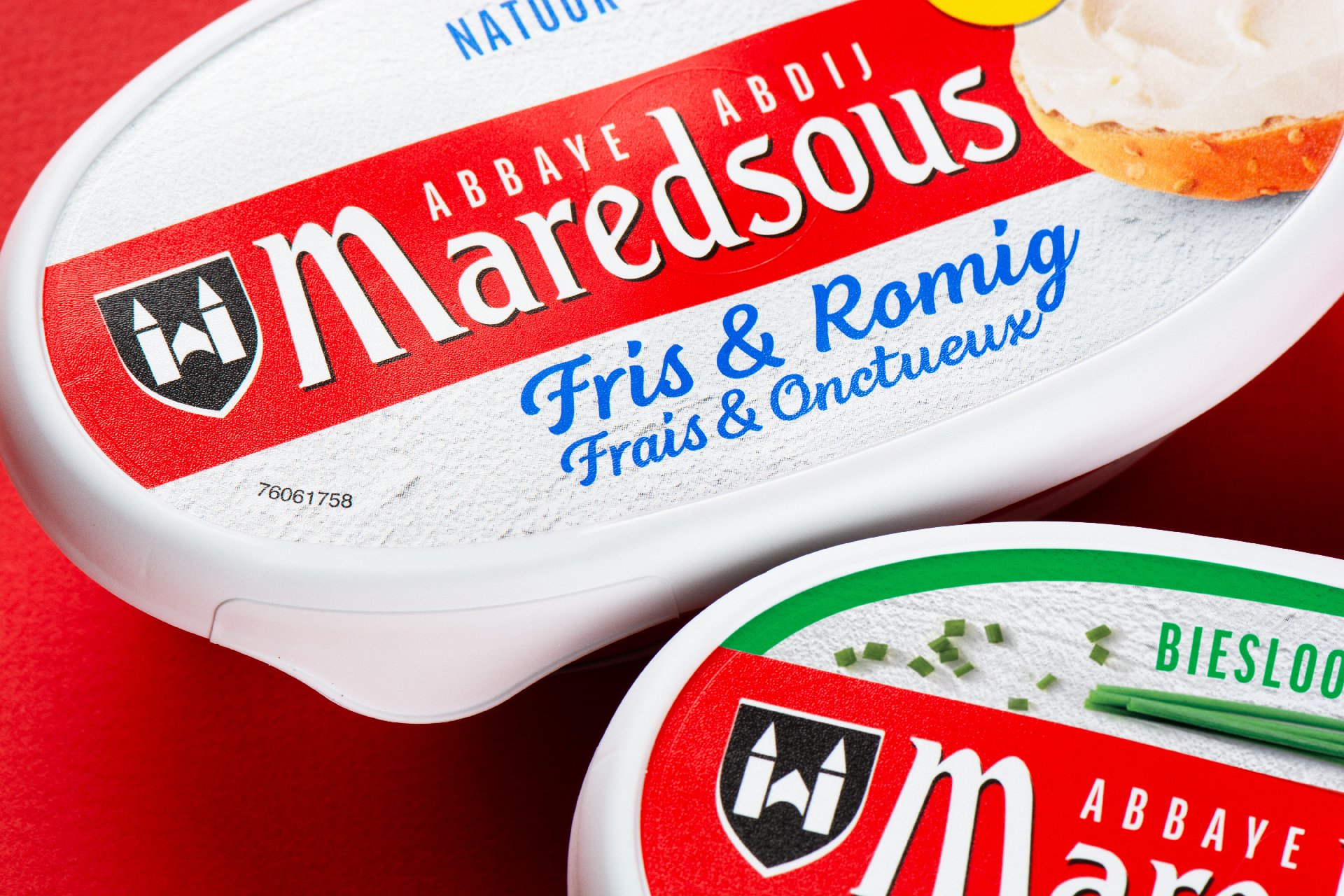
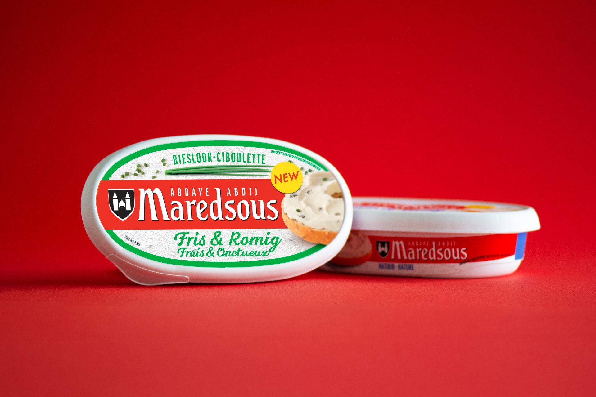
Appetite Appeal
We developed a fresh, creamy serving suggestion on a bagel — a simple but powerful cue that communicates softness, taste and natural indulgence. The visual brings warmth and appetite to a compact format, and reminded us to our very first bagel / cream cheese experience in NY many years ago.
Designing Within Tight Constraints
Fresh-cheese packaging offers very limited visual space.
Our expertise lies in maximising impact with minimal real estate, ensuring the product stands out even from a distance.
Result
A bold and modern range that:
– Enhances shelf standout in a crowded refrigerator aisle
– Strengthens the Maredsous identity with clarity and confidence
– Delivers fresh appetite appeal through refined product styling
– Respects the heritage of one of Belgium’s most iconic cheese brands
Maredsous Fresh is a strong addition to the Bel portfolio — a perfect balance between brand heritage and contemporary shelf performance.
CREDIT
- Agency/Creative: DesignRepublic
- Article Title: Maredsous Fresh Branding by DesignRepublic
- Organisation/Entity: Agency
- Project Type: Packaging
- Project Status: Published
- Agency/Creative Country: Belgium
- Agency/Creative City: Elsene
- Market Region: Europe
- Project Deliverables: Brand Design, Brand Strategy, Branding, Logo Design, Packaging Design
- Format: Tray
- Industry: Food/Beverage
- Keywords: fresh cheese
-
Credits:
CEO: Francis Van Acker


