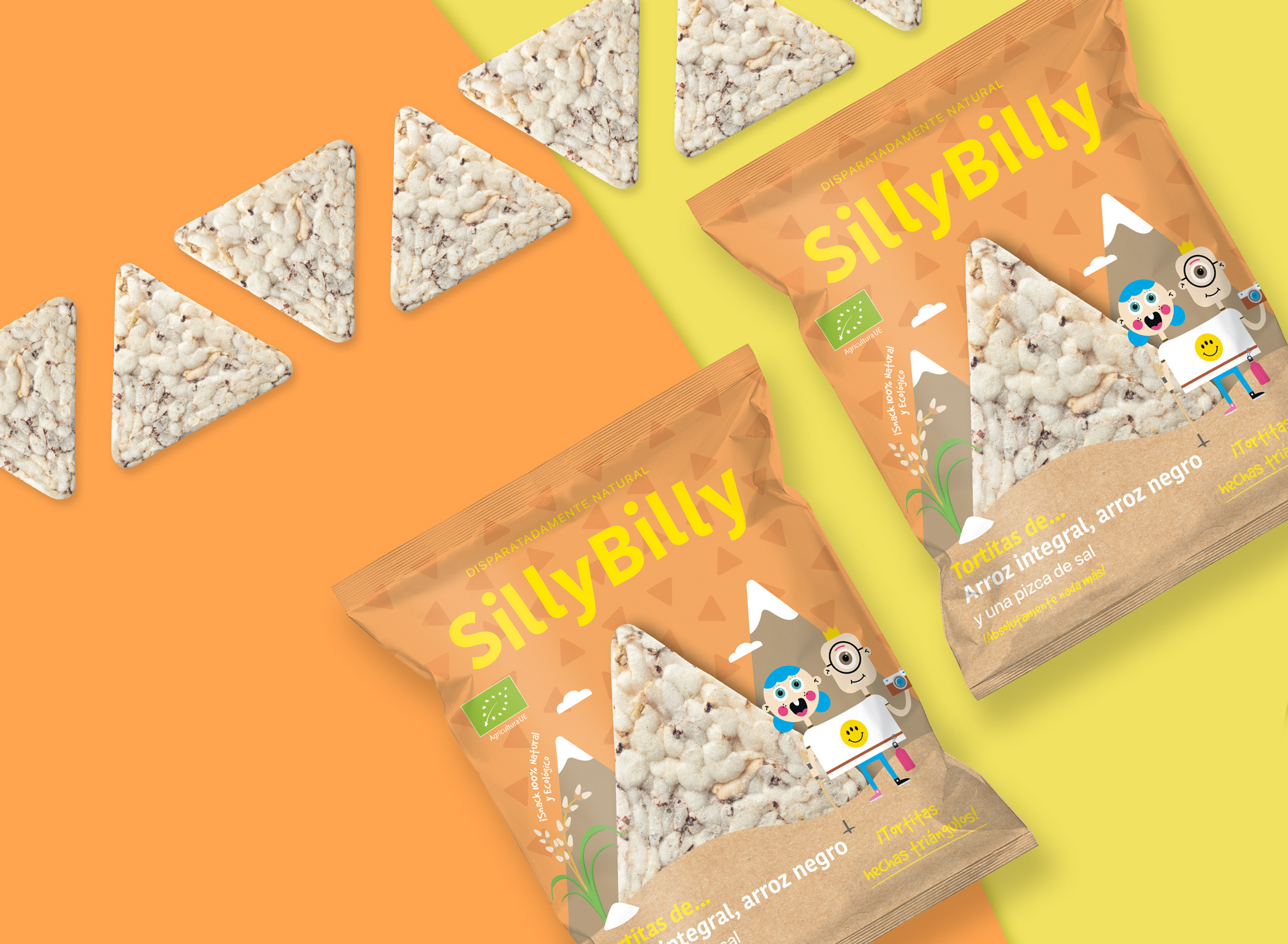
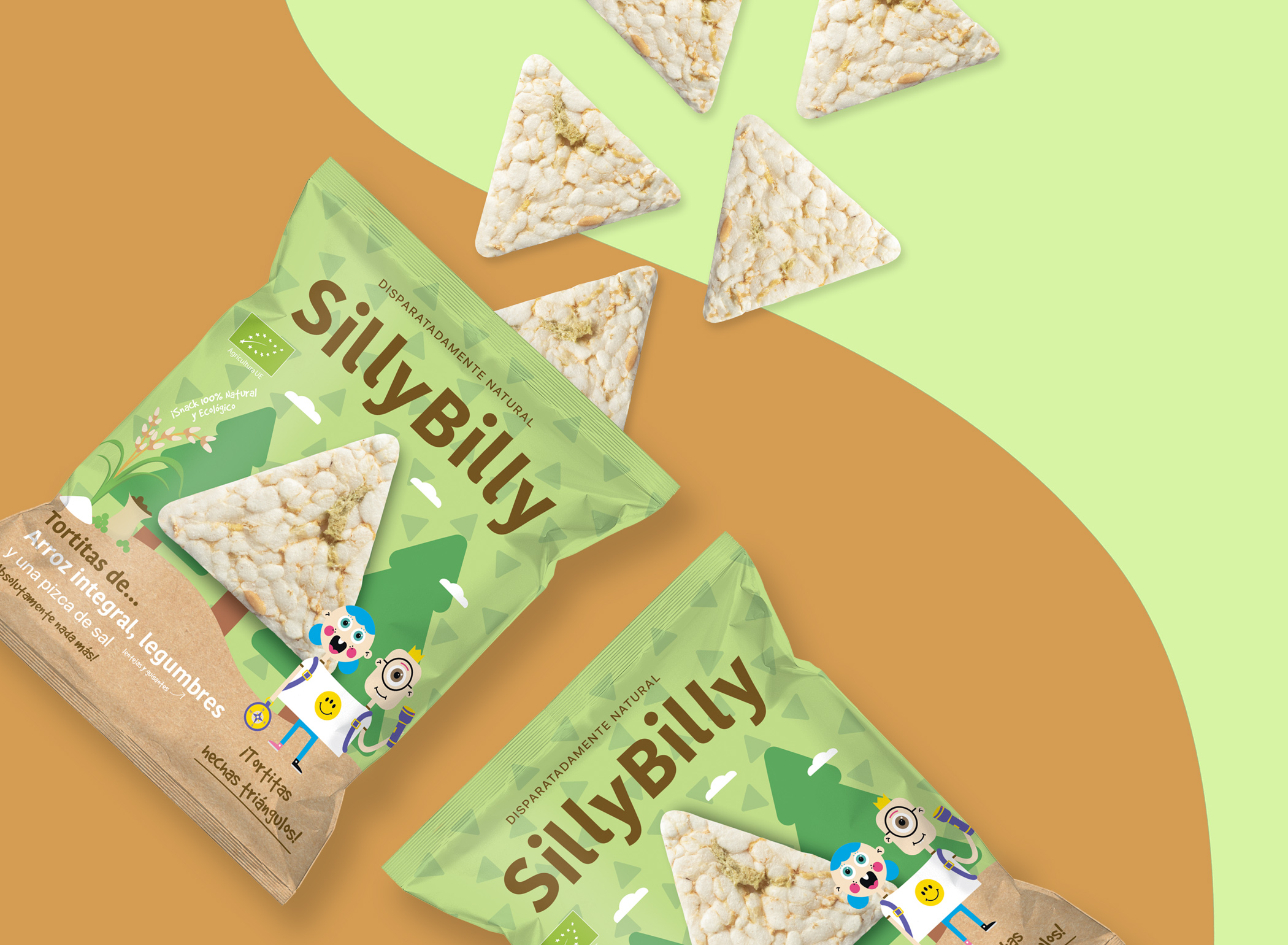
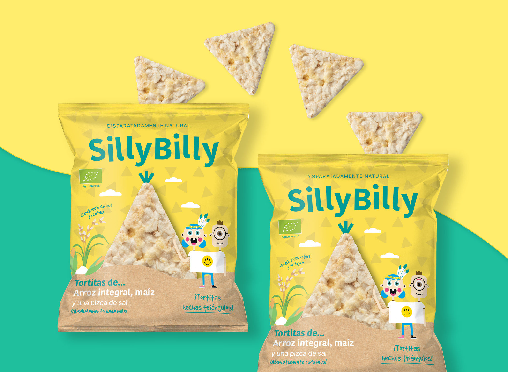
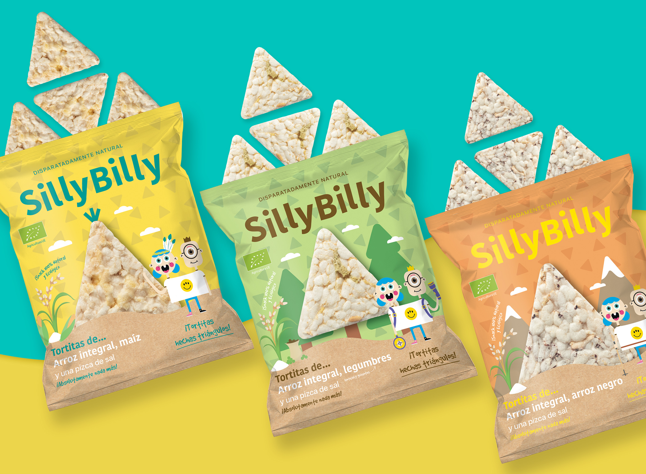
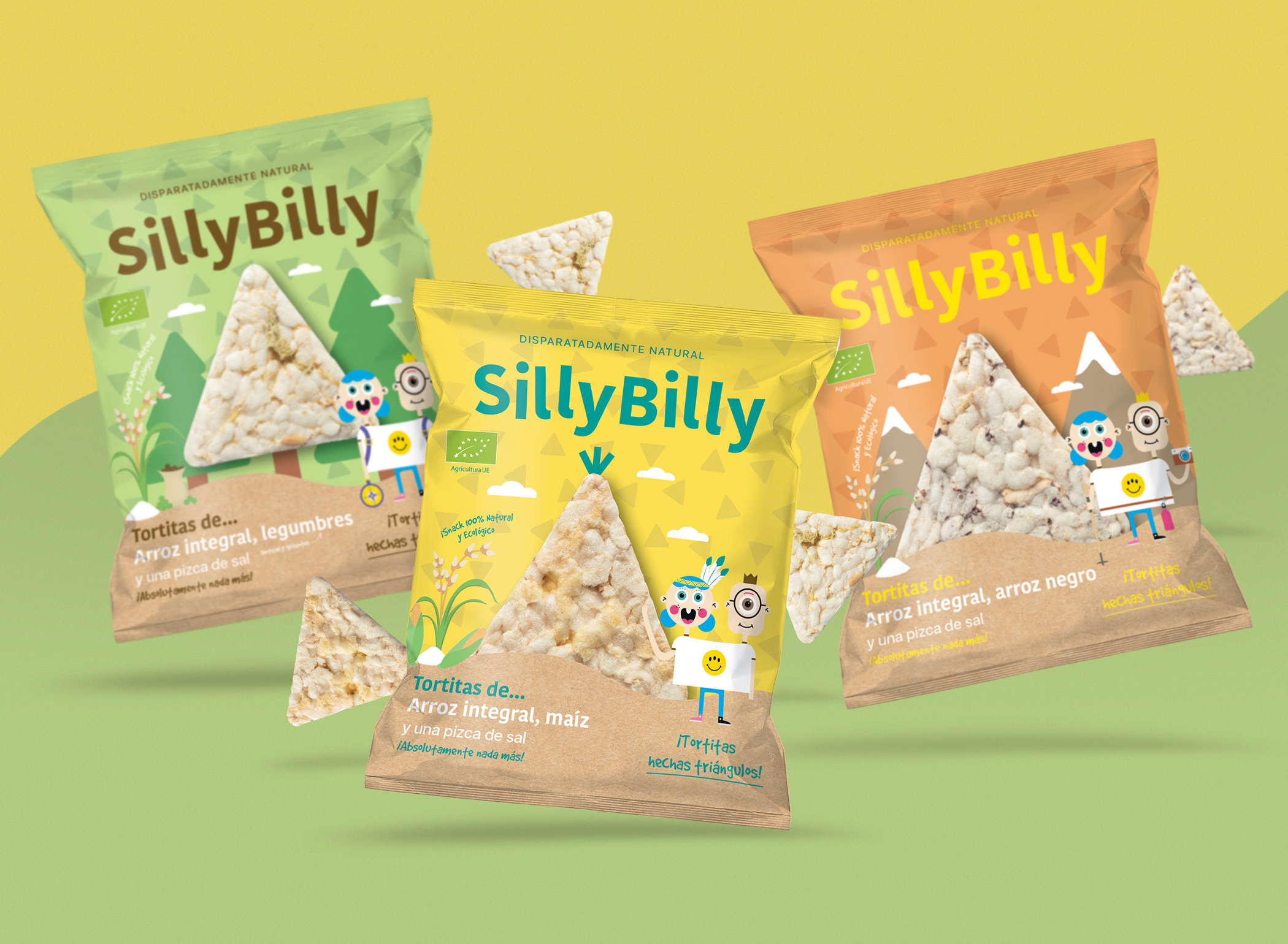
Packaging design for SillyBilly, a Spanish healthy brand snacks for children. We create a design that conveys both the fun and groundbreaking part of the brand, as the most nutritional part since we must attract the attention of parents at the time of purchase. As main element, we play with the triangular shape of the product and turn it into different natural settings where children can have fun and be themselves. On those landscape we introduce the principal character of the brand with represents the kids spirit. We combine this with organic and rounded shapes which helps to transmit an ecologic aspect and we also use bright and saturated colours for the background in order to be really visible on supermarkets.
CREDIT
- Agency/Creative: Mara Rodríguez - Design
- Article Title: Mara Design Creates New Packaging for SillyBilly Rice Snacks
- Organisation/Entity: Agency, Published Commercial Design
- Project Type: Packaging
- Agency/Creative Country: Spain
- Market Region: Europe
- Project Deliverables: Brand World, Graphic Design, Identity System, Illustration, Packaging Design, Tone of Voice
- Format: Bag
- Substrate: Plastic
FEEDBACK
Relevance: Solution/idea in relation to brand, product or service
Implementation: Attention, detailing and finishing of final solution
Presentation: Text, visualisation and quality of the presentation


