


Every strong visual identity starts with well-structured thinking behind it – the brand. “It should shine like a Northern Star and give us the direction whenever we would feel lost in coping with everyday issues. But not only to us, it should also help business partners and anybody related to the brand to clearly understand who we are and why we do what we do. It should grasp the essential qualities of the philosophy and of the approach to the business.” (As we put it in the Manuvia’s Brand Book.) And only then, when the brand is clearly defined, can visual identity work in the desired way.
The opportunity to create a brand from scratch is Cocoon’s dream job. It represents the kind of task when we can employ the abilities and skills of all our thinkers, designers and makers. Frankly said, the visual identity – something you can touch, feel and also judge – is just the tip of the iceberg. Behind any identity, there is an enormous amount of work needed to be done to reach that tangible point. The invisible, yet vital base is formed by the well-defined brand directing all marketing and communication activities, creating the ultimate “inspiration” or “the leading idea” of the visual identity.
The story of Manuvia started in 2018 with the four personnel agencies (Express People, Wincott People, McRoy Group and Xavax) joining to create a new strong entity – Manuvia. Together they could rely on more than 20 years of experience in the business and the best skills and competencies, strengthening their position as a market leader and one of the most important players in the CEE region. This was the starting point for Cocoon, when we ran a series of workshops to find the common ground, i.e. the relevant brand for – until that moment – different companies. And we did it, together with the client, of course.
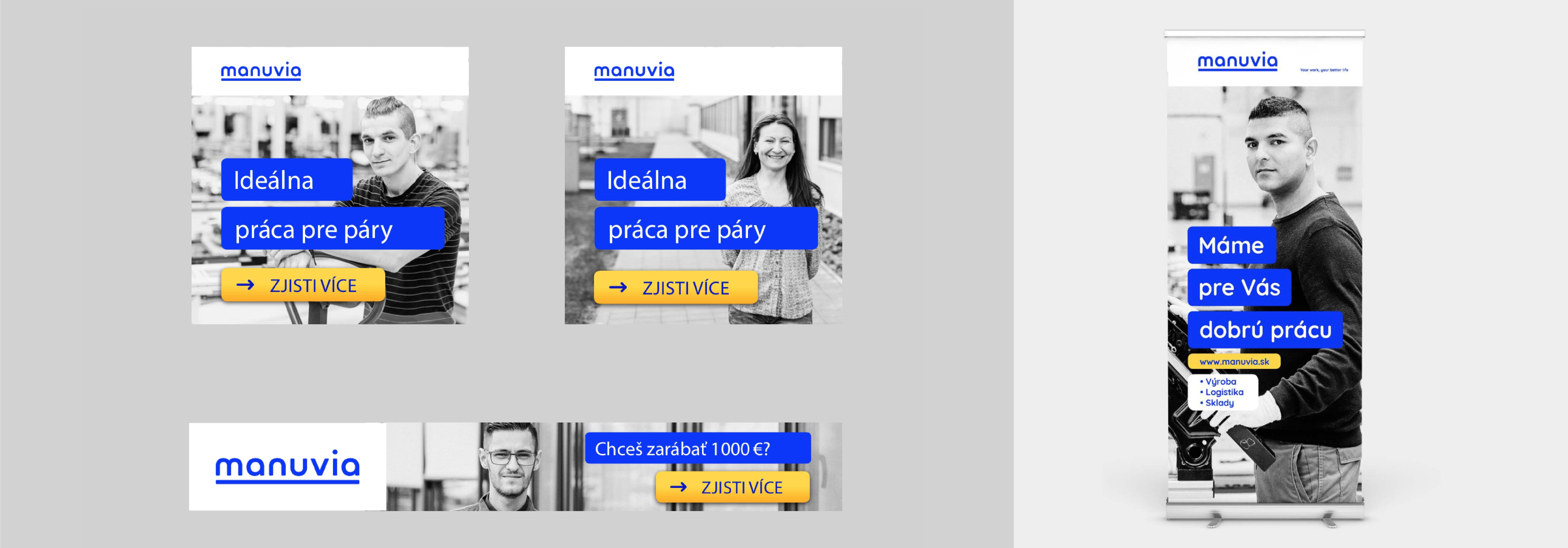
Bringing four companies with different culture and visions together under one unified brand is always challenging. We had to find a way to reach different target groups under the same brand name – agency stuff / low-skilled people (primary), manufacturing companies seeking employees (secondary), employees of the company (tertiary) and specifically, the qualified or true specialists. We had to create a brand which would be relevant and consistent in its vision, mission, purpose, values and tone of voice. And all this summarized in the brand definition came together in the creative brief for the developing the name and the visual identity.
Manuvia is not only an intersection or a simple merge of the values of the former companies. Instead it represents a new vision and the guiding principles of how to succeed in a very competitive market, while gaining more respect in the field of resourcing work staff and more trust from all target audiences. So, we proposed to present Manuvia as an empathetic leader with visions, a self-confident company with ethical principles that is ready to act; a company with a determined, competent, yet friendly and comprehensible tone of voice; based on the essential values of keeping on promises (reliability), expertise (professionalism) and transparency.
Before designers started their creative engines, we had to name the new brand. The process of name creation – naming – is may be less visible, though it can be as demanding and difficult as designing. We went through many rounds and came with dozens of proposals in the mutually inspirational co-creation with Simon Anfilov, who finally hit the nail on the head with the name “Manuvia”.
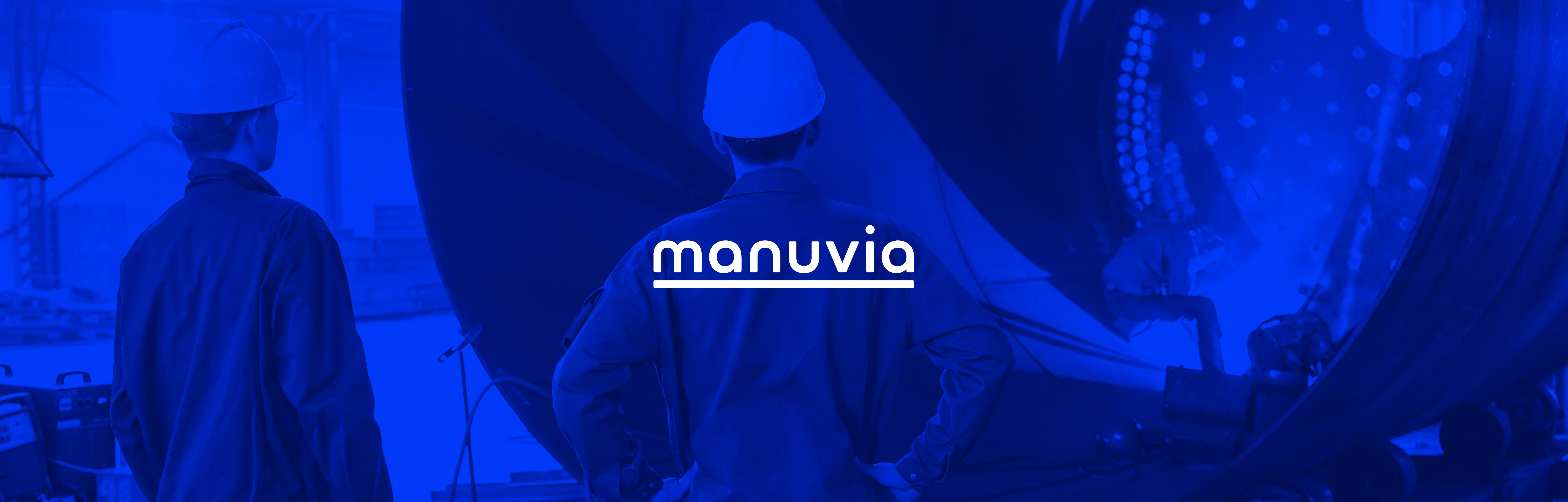
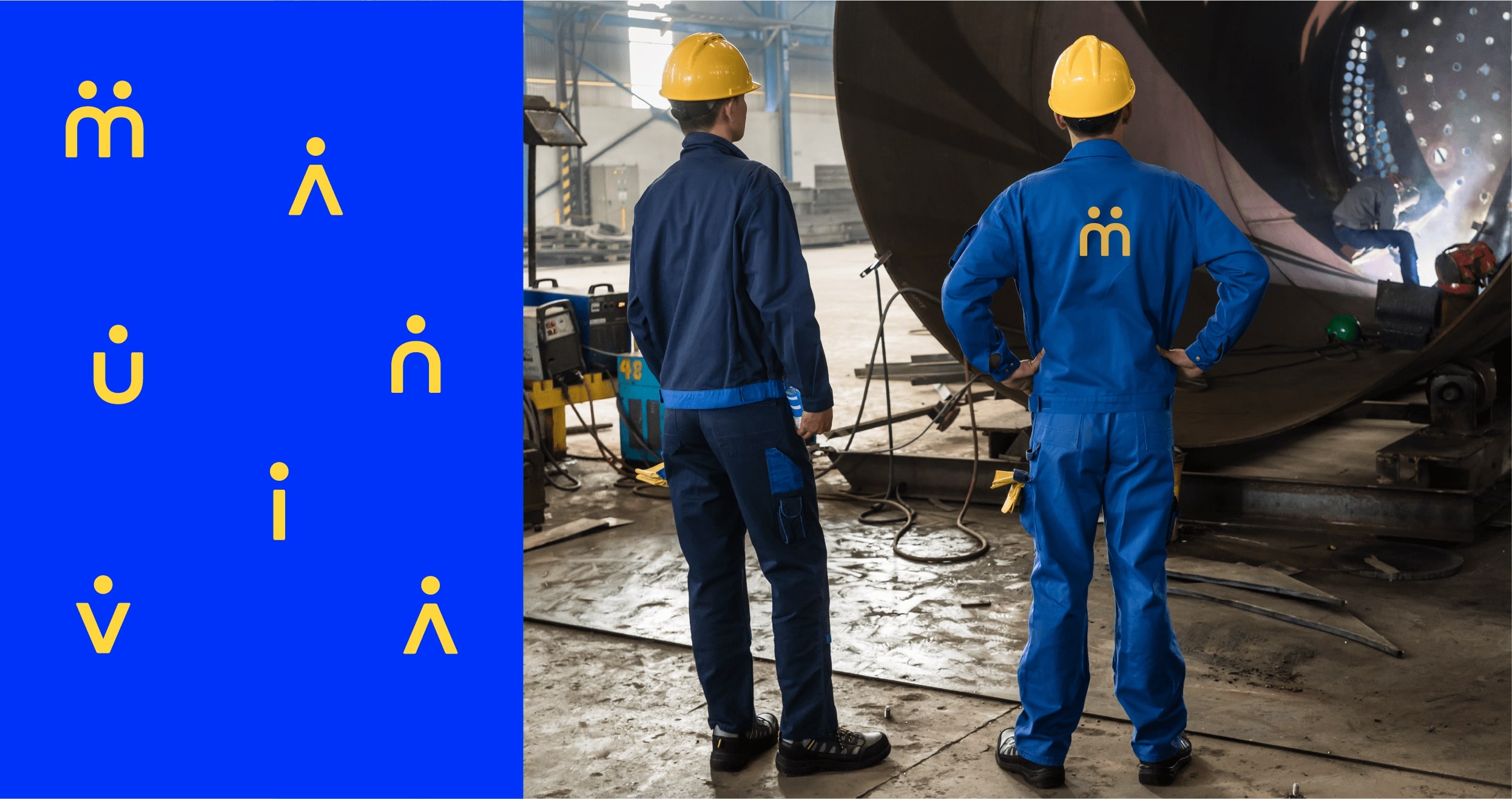
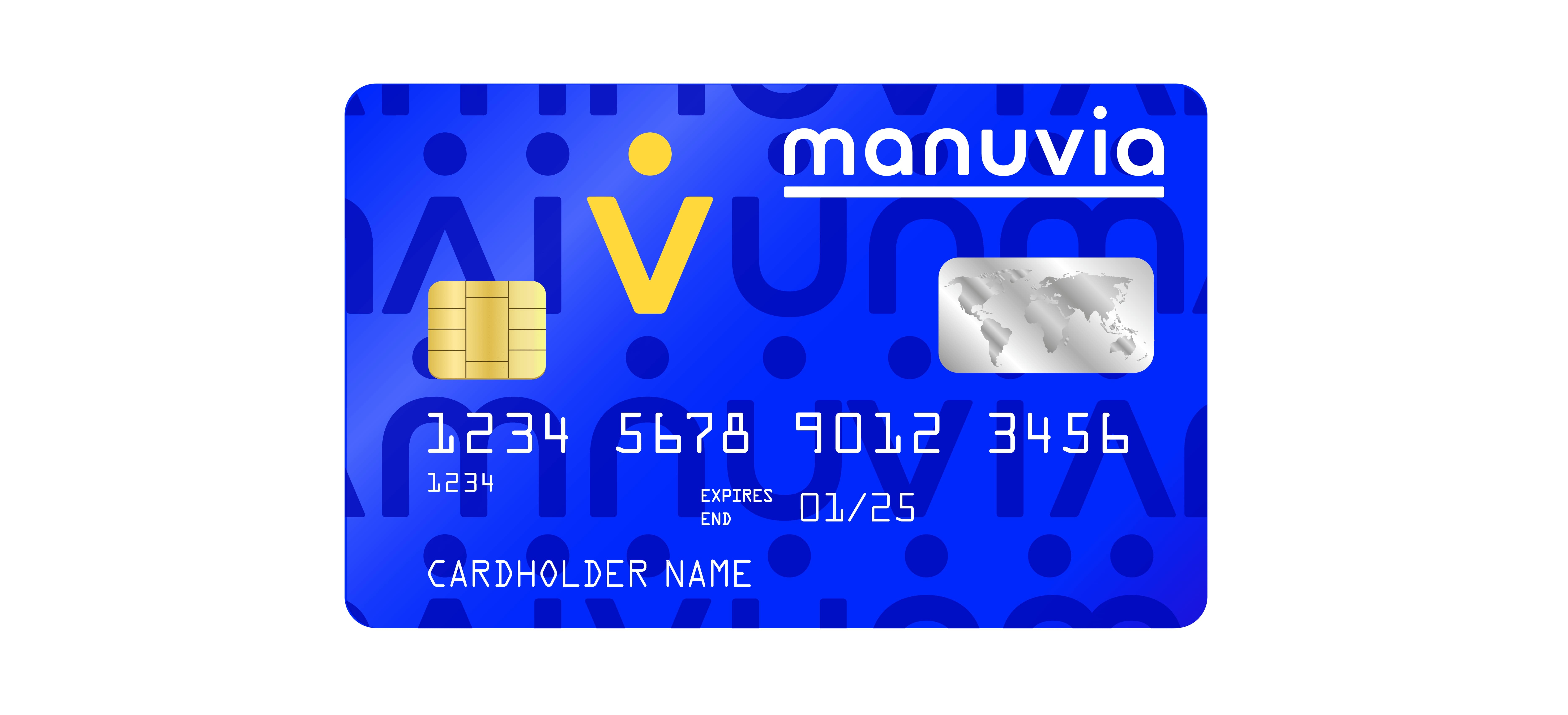
The conceptual idea of Manuvia’s visual identity is rooted in the foundations of the brand and inspired by the brand’s purpose – it offers people jobs and the opportunity of a better life. It is all about people. Although Manuvia employs thousands of people, its identity tries to emphasize the fact that the individual character of each person matters.
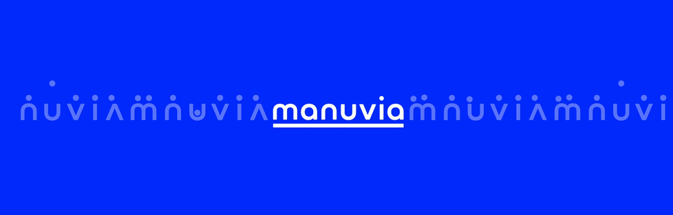
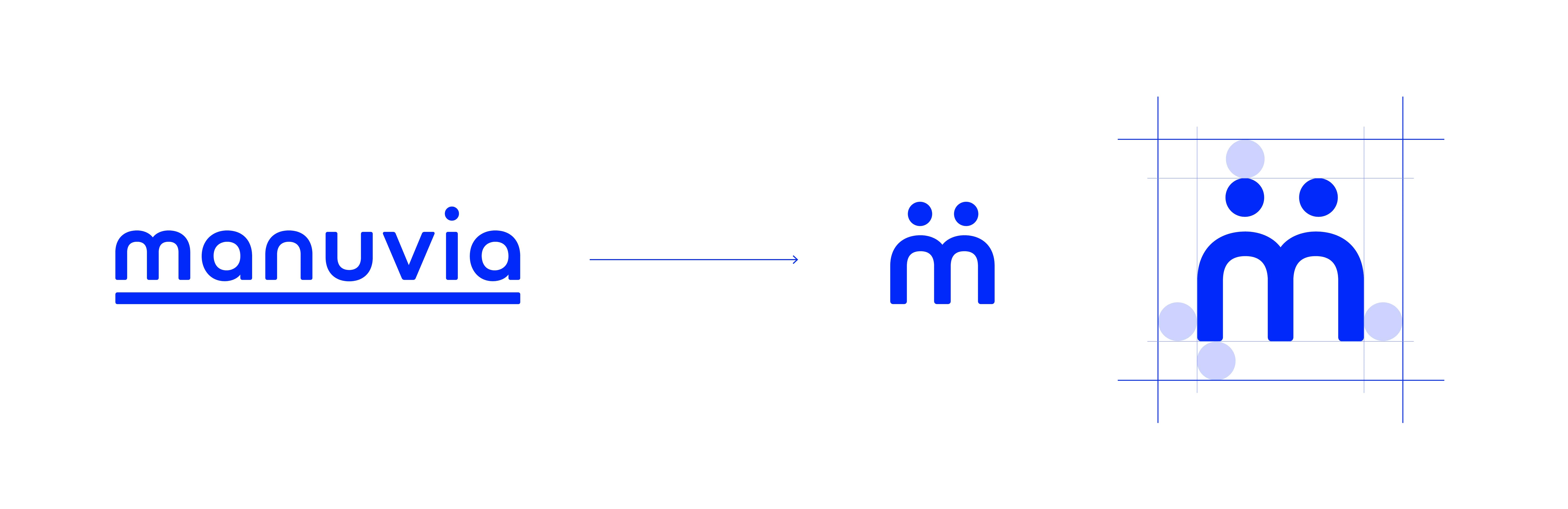
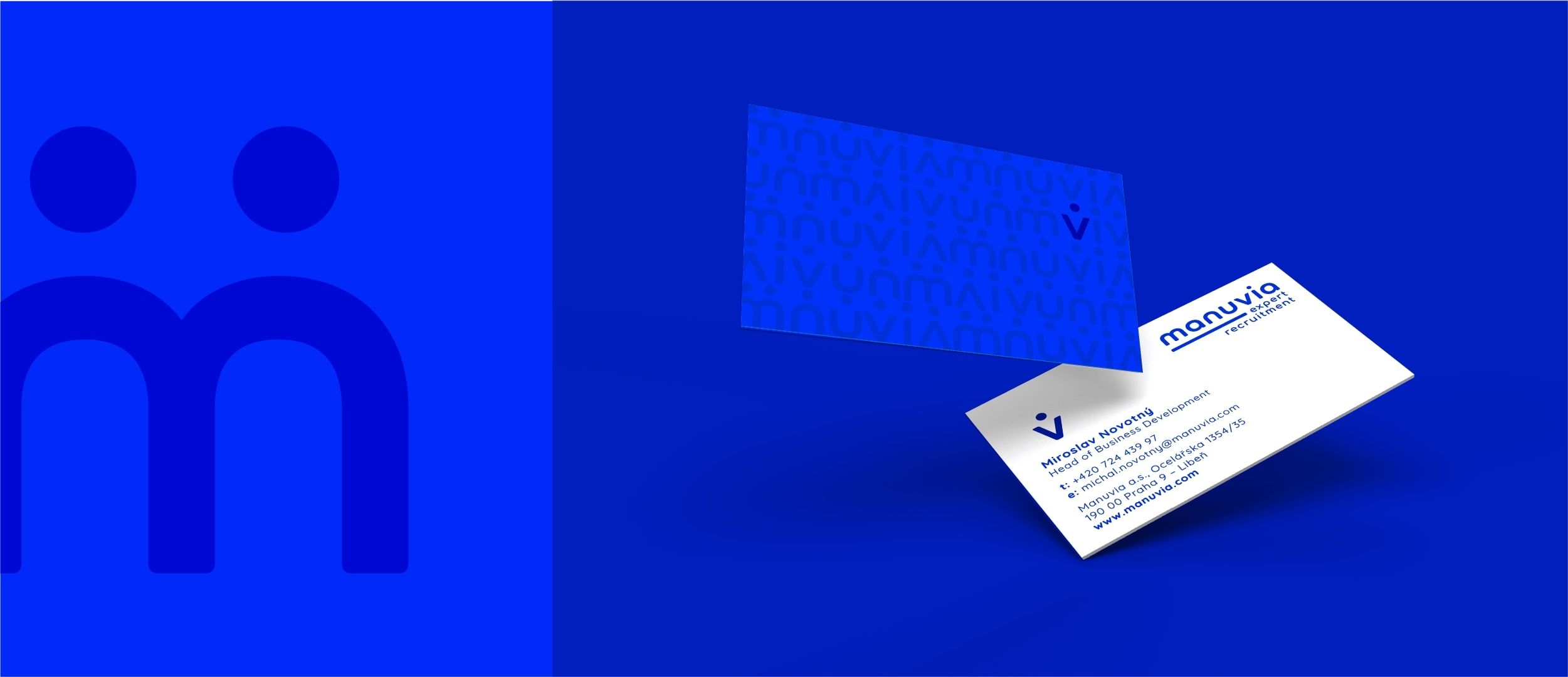
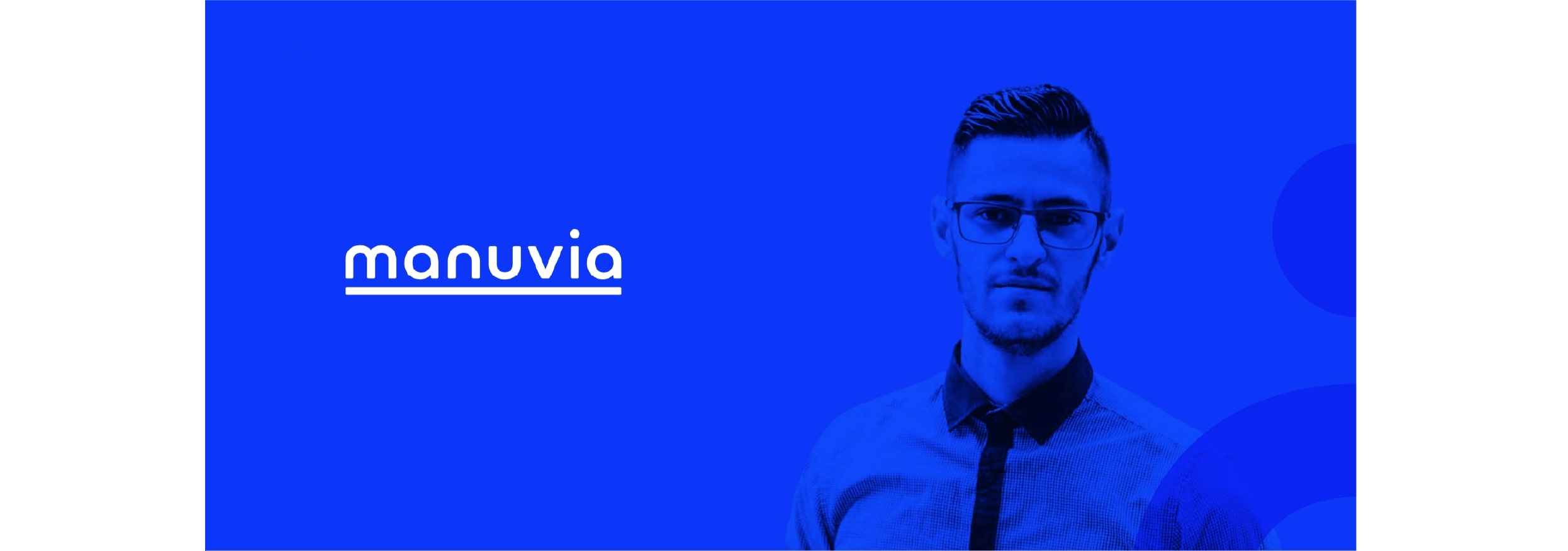
The logo stands for the main asset and all the other elements of identity derive from it. The small letters of the logo symbolize a human-centred approach and make the brand friendlier, while underlining the whole name together with the cobalt blue colour add impetus, stability, assurance and security. The letters of the logo are further developed into icons depicting simplified human silhouettes and emphasizing the importance of individuality, which becomes apparent especially in the pattern. The care and wisdom represented by the colour blue is complemented by the colour yellow conveying joy and optimism.
Letter “M” plays a special role representing the symbol and, in special cases, substitutes the entire logo as a responsive one – mainly as an application icon – favicon, on social networks and profile pictures. All participating Cocooners worked hard to ensure that the identity could comprise the motto of the new company: “Your work, your better life”.
CREDIT
- Agency/Creative: Cocoon Prague
- Article Title: Manuvia Branding Case Study by Cocoon Prague
- Organisation/Entity: Agency
- Project Type: Identity
- Project Status: Published
- Agency/Creative Country: Czech Republic
- Agency/Creative City: Prague
- Market Region: Europe
- Project Deliverables: Brand Creation, Brand Design, Brand Guidelines, Brand Identity, Brand Naming, Brand Strategy, Branding
- Industry: Human Resources
- Keywords: brand strategy, brand and product naming, visual identity, brand identity, brand building
-
Credits:
Branding Agency: Cocoon Prague


