Architecture, interiors and rebellion.
Manu Pagliosa is an architect and interior and furniture designer from Balneário Camboriú/SC. With a vast cultural background, experience in the market and solid training, she is now seeking to balance her professional trajectory with an identity that reflects her experience and, at the same time, highlights her personal style in an authentic way.
When Manu approached us to help develop a new brand and reposition her image, it was clear from the beginning that the project needed to be unique, breaking with the standards of the segment.
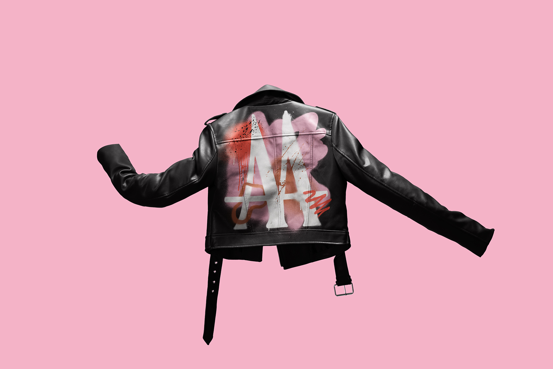
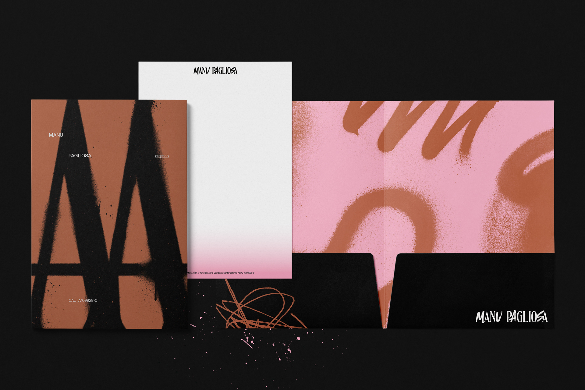
To achieve this, we looked for references in fashion, punk, the streets and contemporary architecture, creating a proposal that combined rebellion, sophistication and attitude – characteristics that reflect her own personality.
Manifest
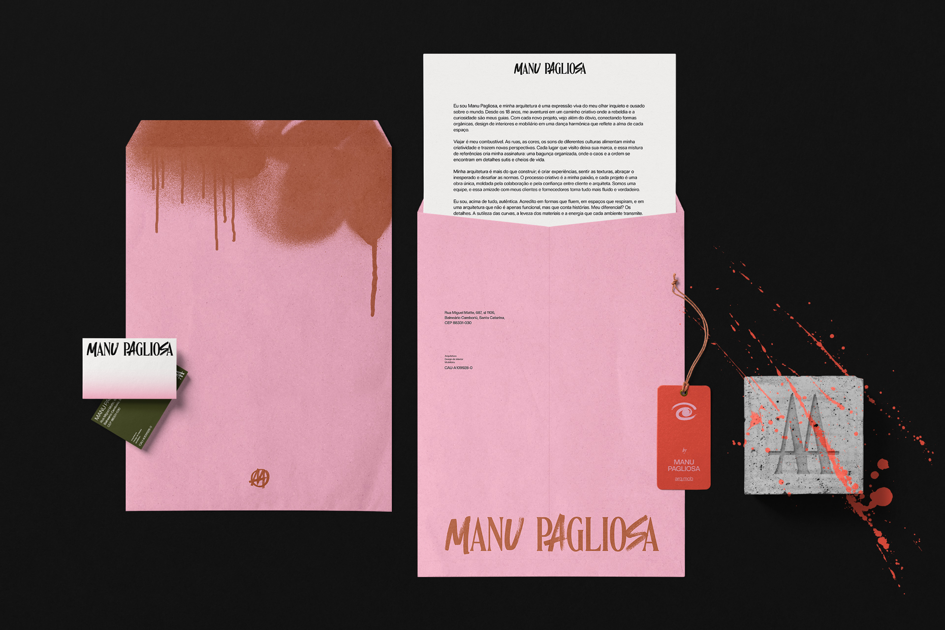
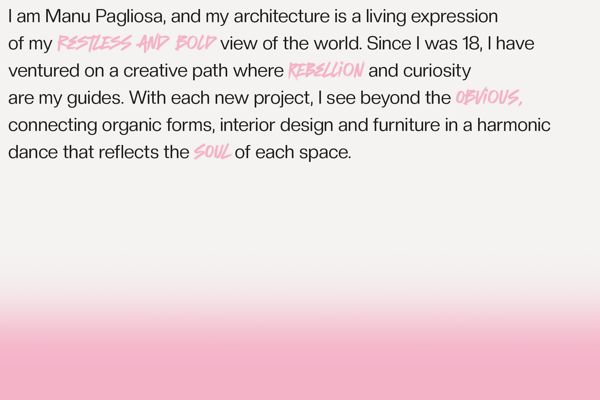
I am Manu Pagliosa, and my architecture is a living expression of my restless and bold perspective on the world. Since I was 18, I have embarked on a creative path where rebellion and curiosity are my guides. With each new project, I see beyond the obvious, connecting organic forms, interior design and furniture in a harmonic dance that reflects the soul of each space.
Traveling is my fuel. The streets, the colors, the sounds of different cultures feed my creativity and bring new perspectives. Each place I visit leaves its mark, and this mix of references creates my signature: an organized mess, where chaos and order meet in subtle and lively details.
My architecture is more than building; it is creating experiences, feeling textures, embracing the unexpected and challenging norms. The creative process is my passion, and each project is a unique work, shaped by the collaboration and trust between client and architect. We are a team, and this friendship with my clients and suppliers makes everything more fluid and true.
Above all, I am authentic. I believe in flowing shapes, in spaces that breathe, and in architecture that is not only functional, but also tells stories. What sets me apart? The details. The subtlety of the curves, the lightness of the materials and the energy that each space transmits.
Nice to meet you! I’m Manu.
Two sides of the same coin.
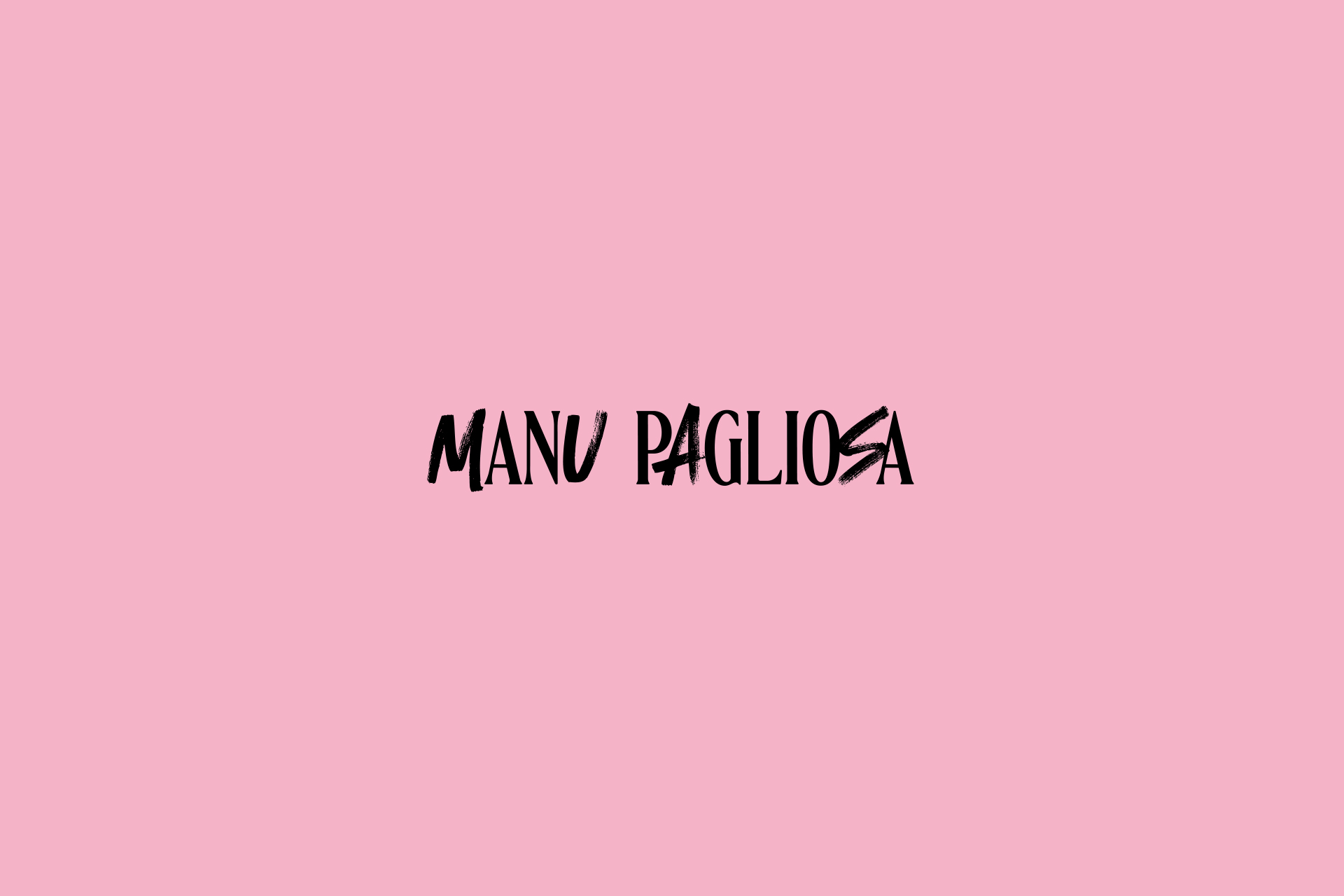
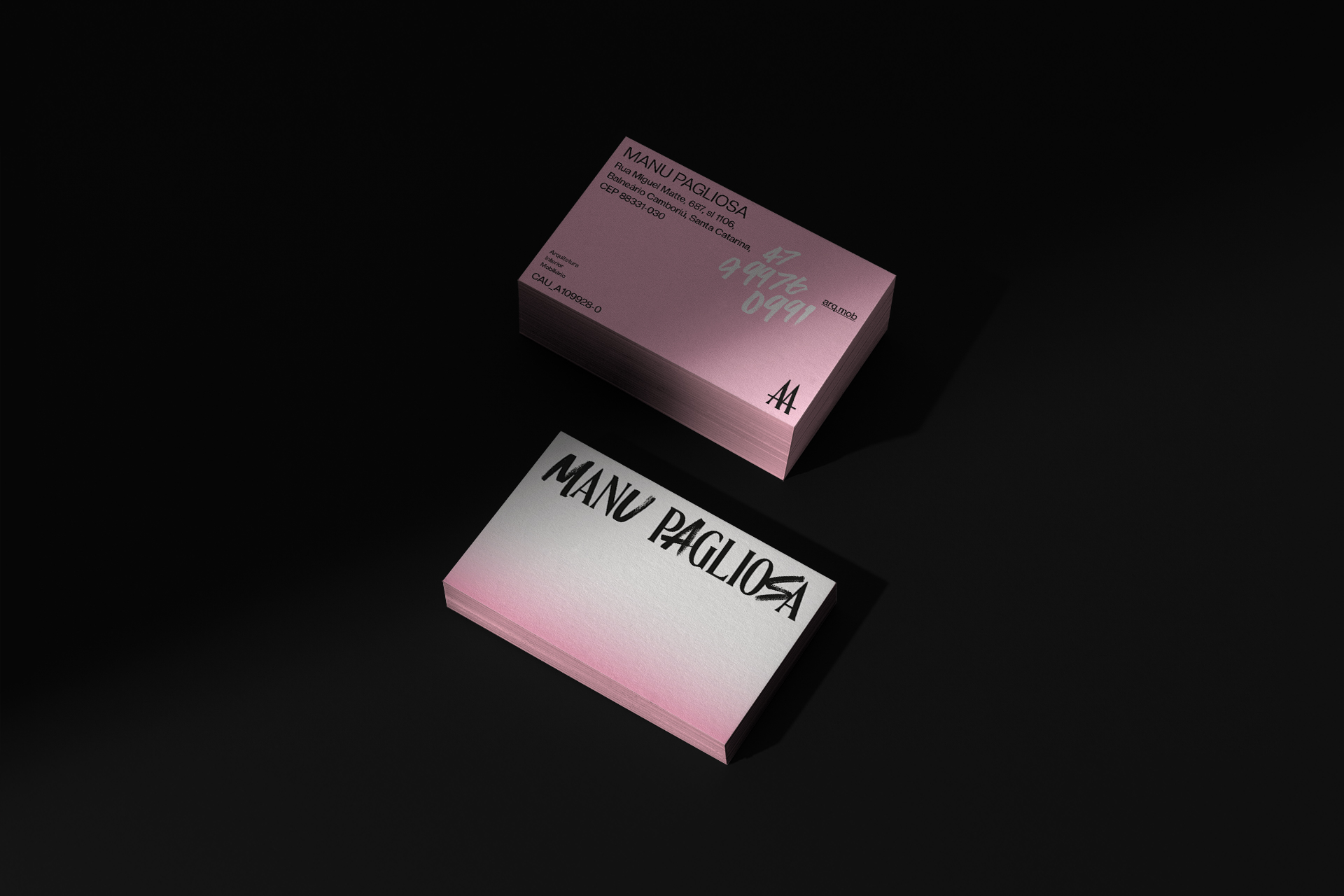
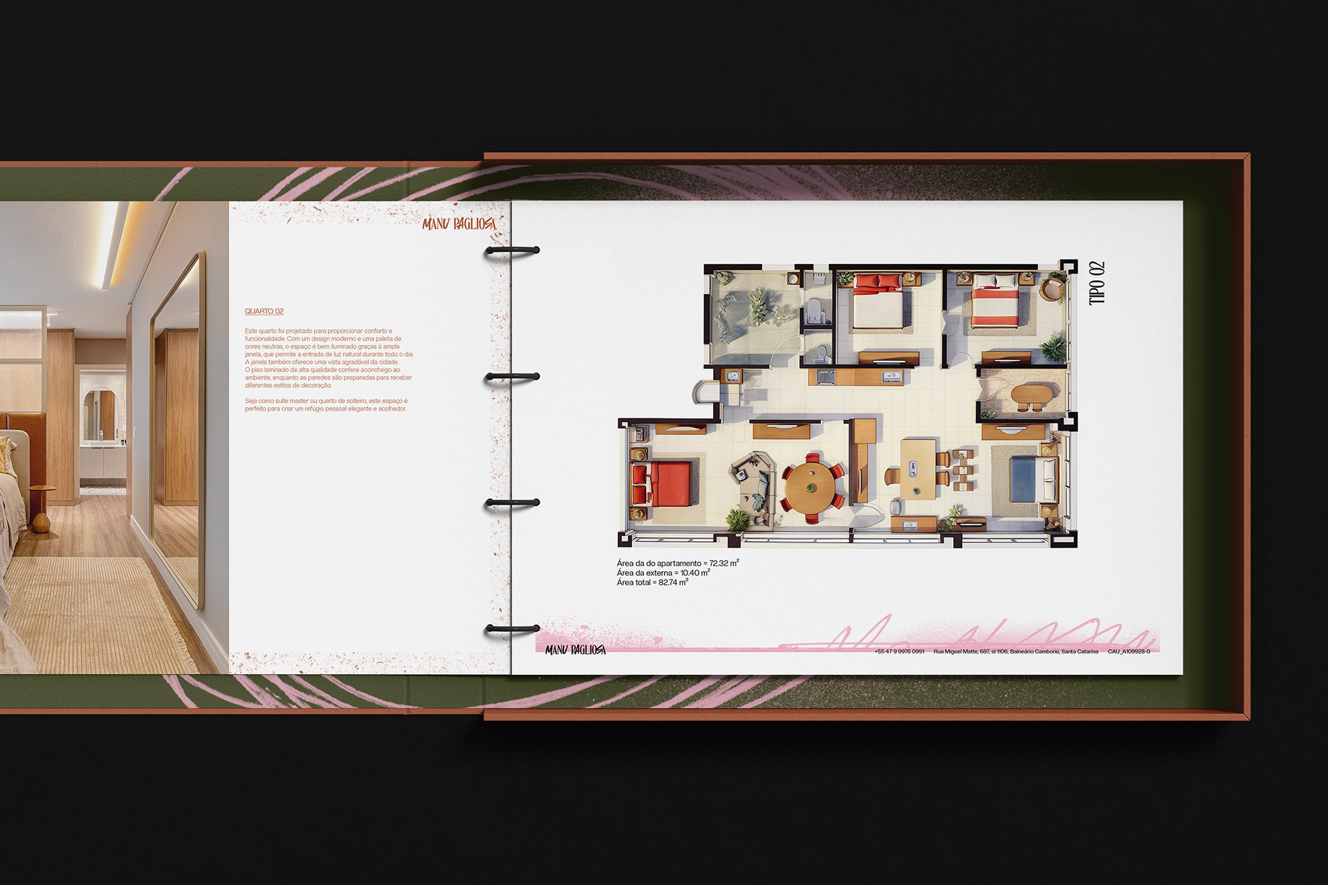
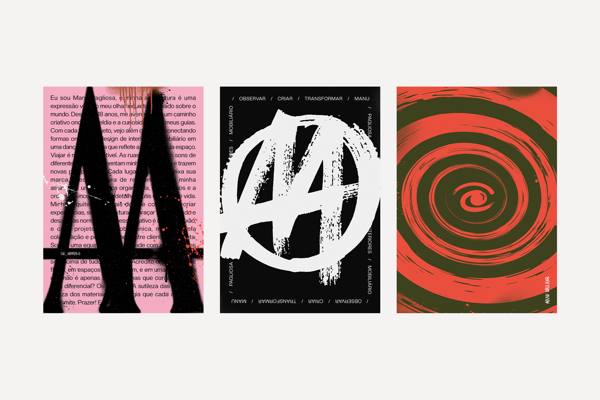
The main characteristics of the logo and brand identity are the fusion of visual techniques, such as brushes, fonts, textures and styles. This combination was essential to represent Manu’s two universes in the brand: on the one hand, pop culture and fashion; on the other, the attention to detail and care present in his projects.
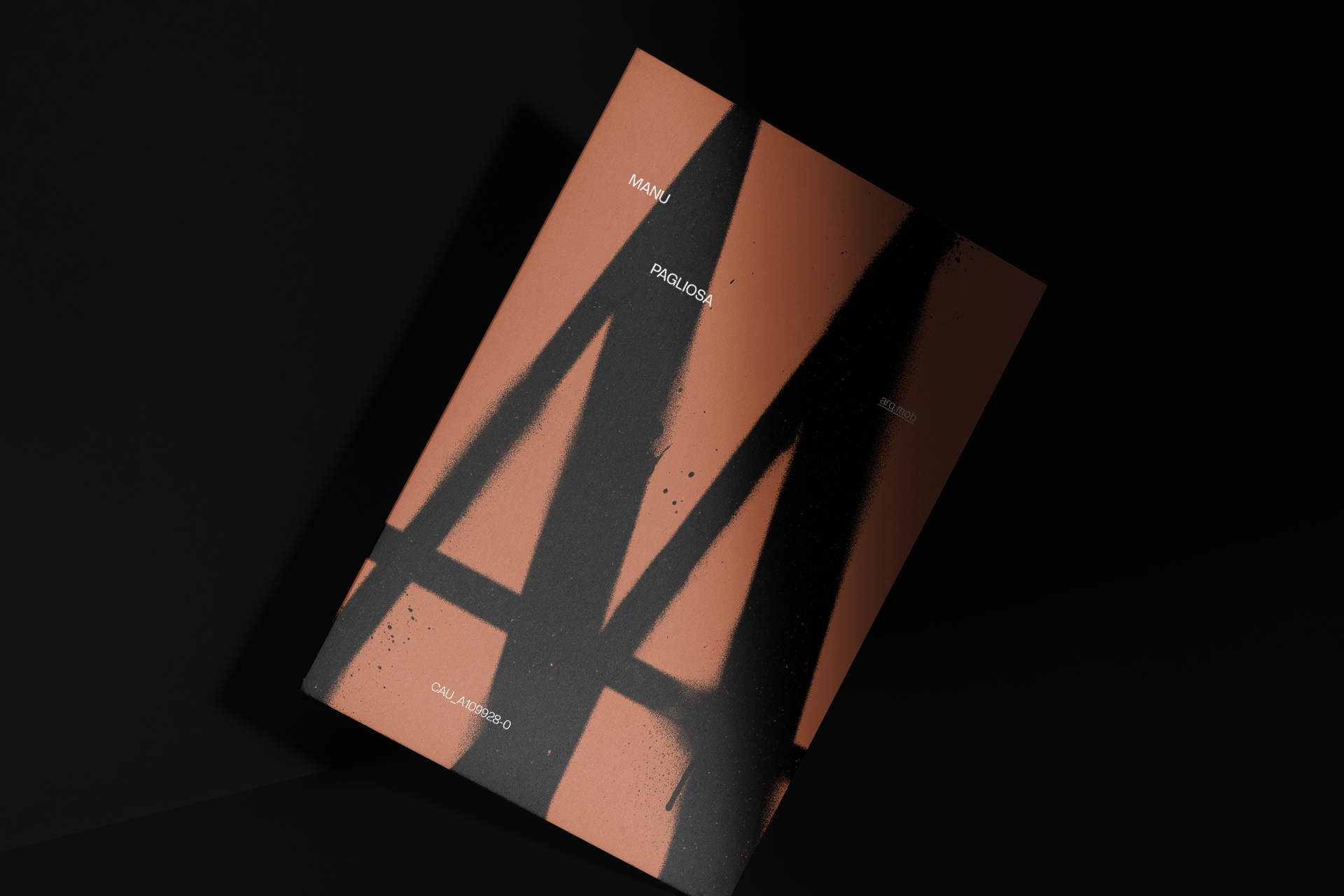
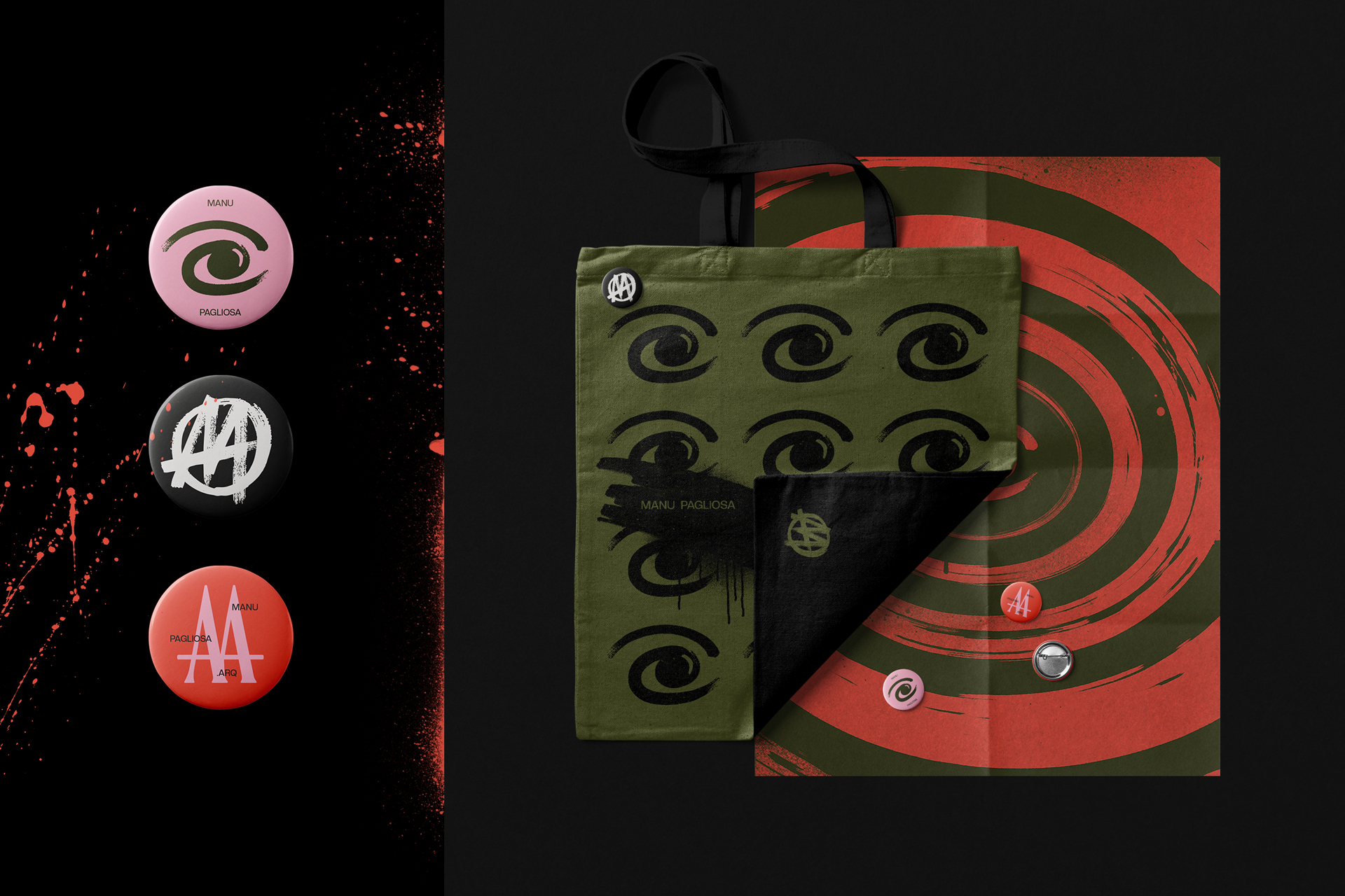
In addition, three symbols were created to illustrate the stages of Manu’s creative process. The first is an eye, which represents observation and absorption of the world. The second is an “M” inspired by the “A” symbol of anarchy, symbolizing the sketch and the beginning of creation. The third is another “M”, which reflects the final result – the refined work, polished to the smallest detail.
In the end, the project, which initially seemed to be just a collaboration with a new brand in the architecture sector, turned into something much more significant: a true immersion in music, fashion, architecture, art and the freedom that permeates this entire journey.
CREDIT
- Agency/Creative: Feitoria
- Article Title: Manu Pagliosa: Architecture, Interiors and Rebellion by Feitoria
- Organisation/Entity: Agency
- Project Type: Graphic
- Project Status: Published
- Agency/Creative Country: Brazil
- Agency/Creative City: Balneário Camboriú
- Market Region: South America
- Project Deliverables: Brand Design, Brand Redesign, Creative Direction, Graphic Design
- Industry: Professional Services
- Keywords: arch, logo design, punk, interior design, furniture, graphic design
-
Credits:
Customer service: Alex Reuter
Graphic designer: Alex Reuter
Graphic designer: Juliano Jover
Approval: Emanuella Pagliosa


