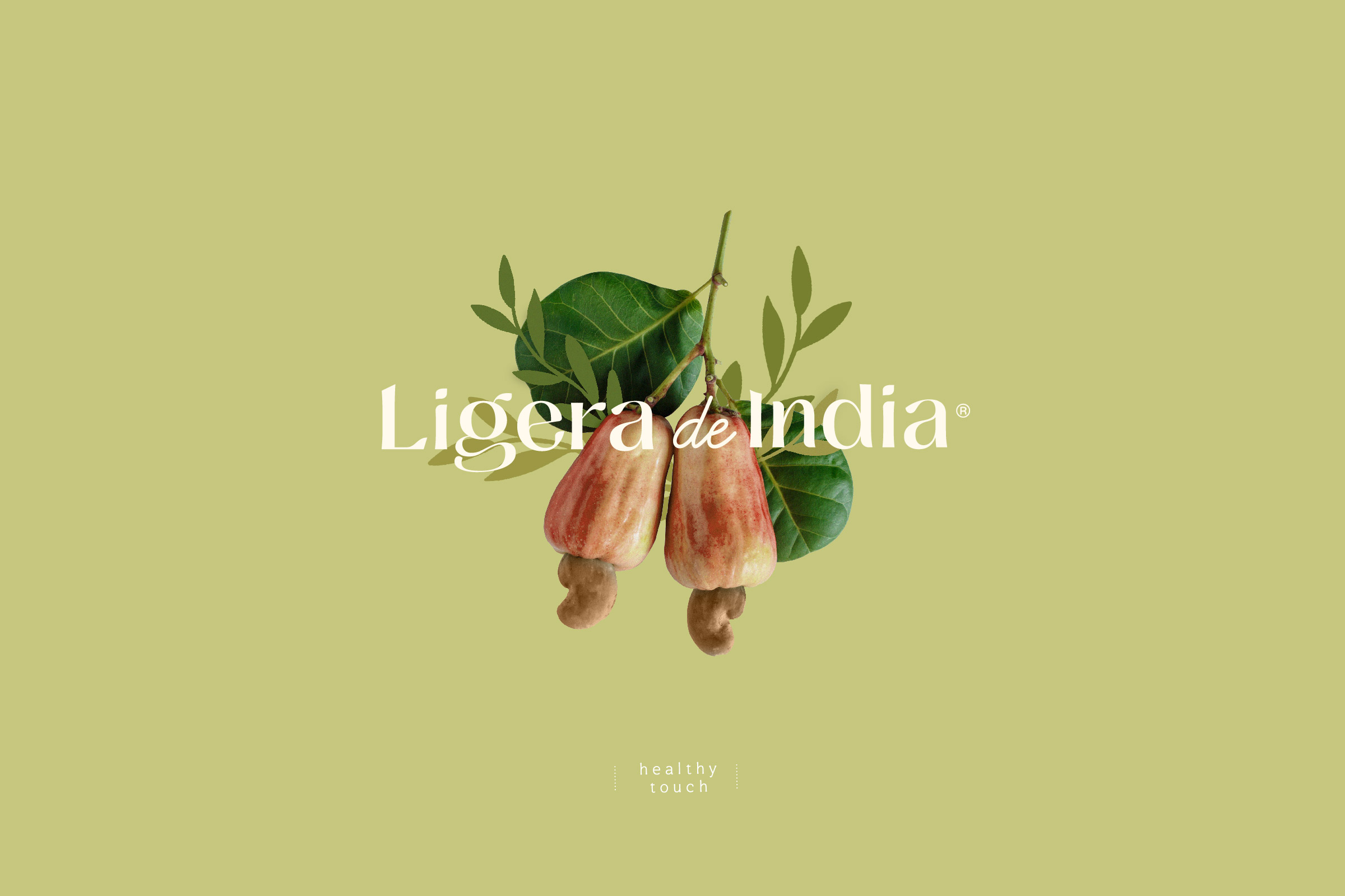
“I have traveled through life and the world, discovering the ingredients of nature and the freshness of moments, I learned to live free and clean of everything that is left over”.
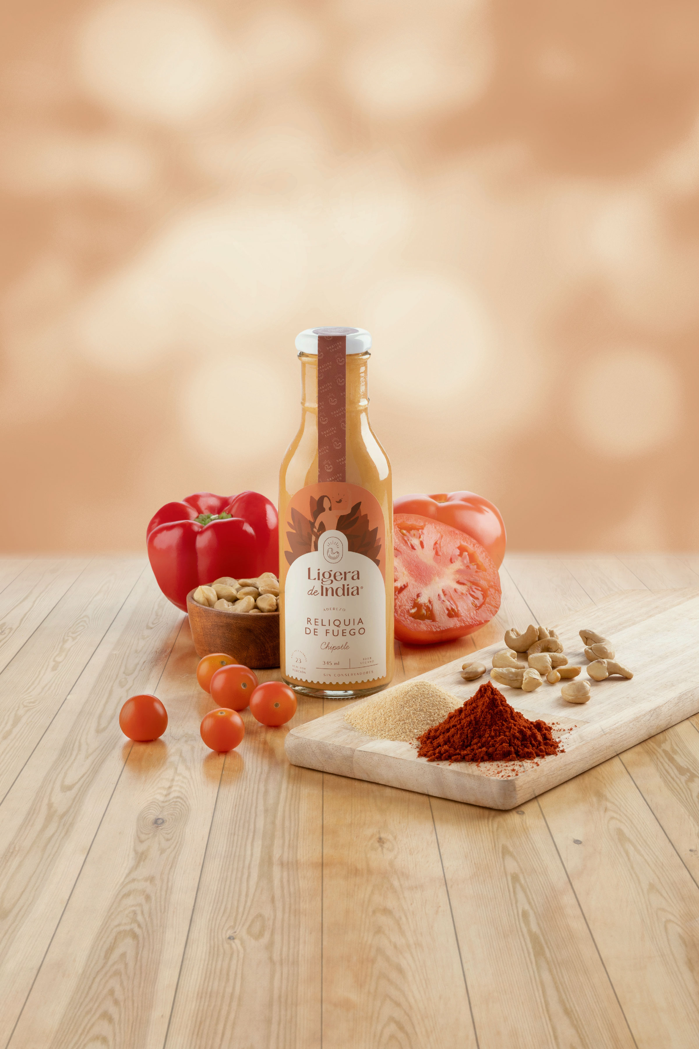
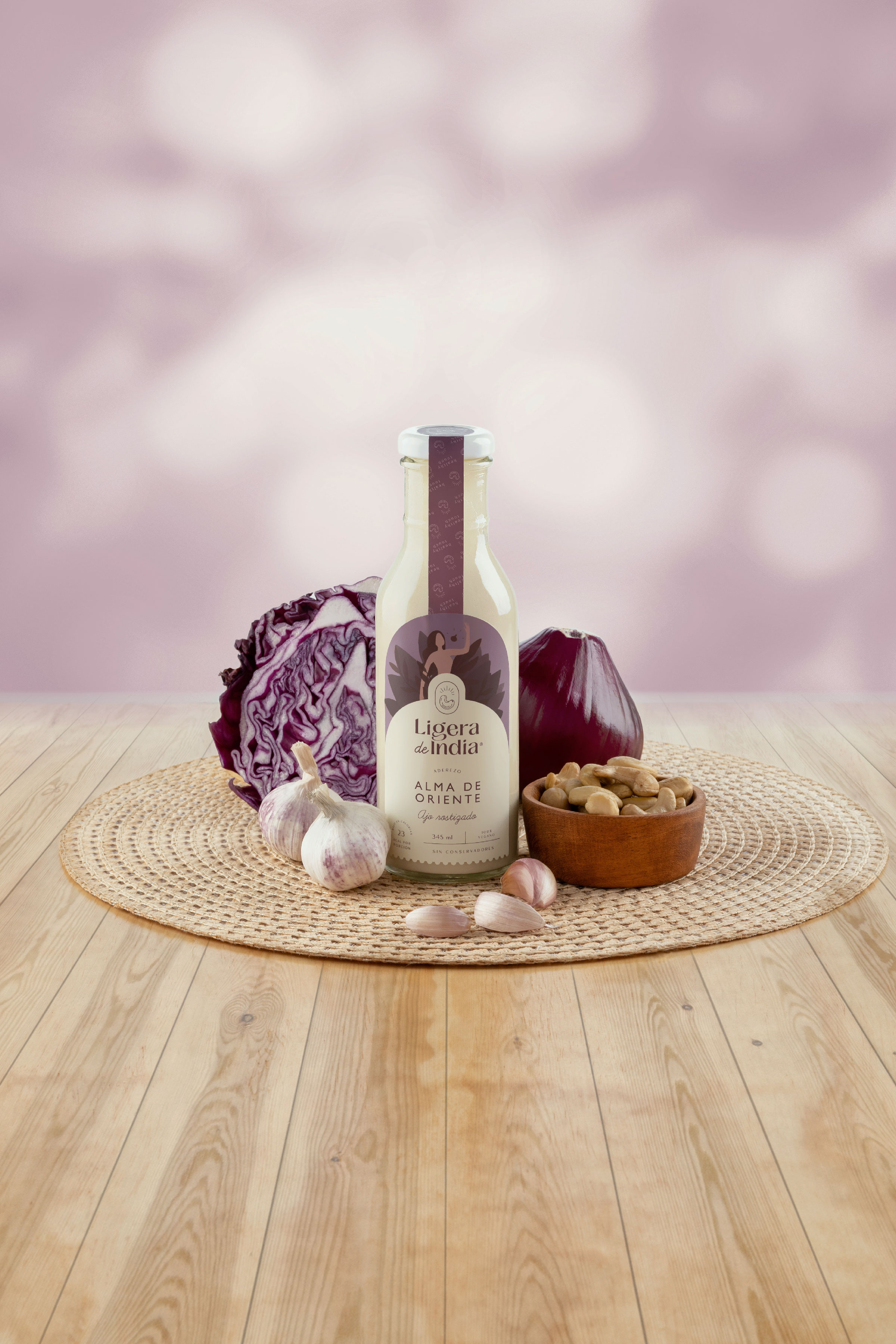
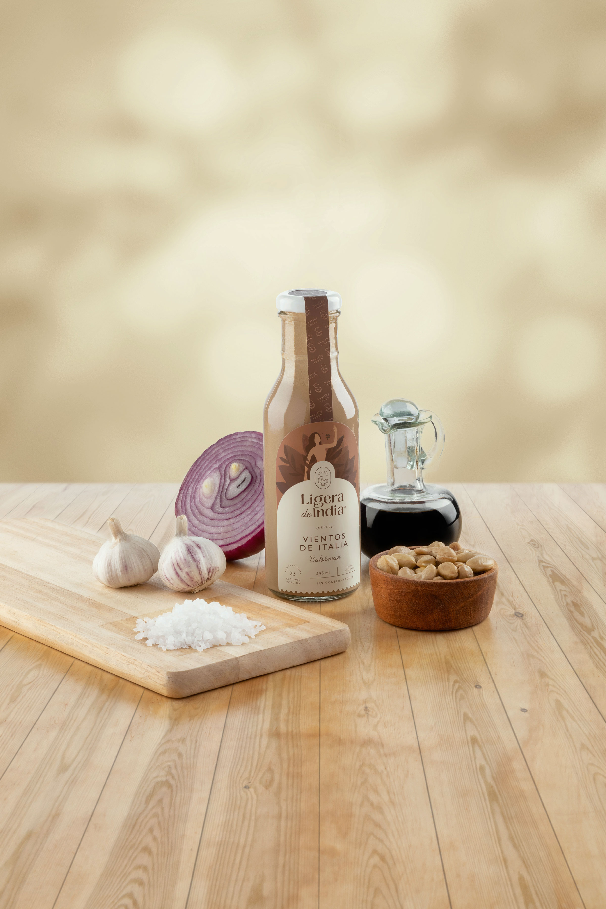
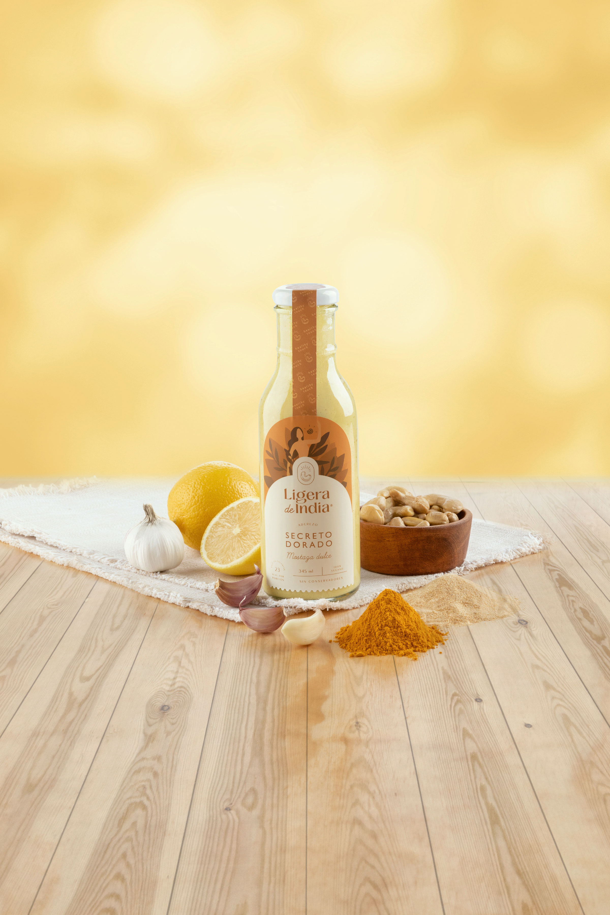
Ligera de India is a line of handmade dressings based on Indian nuts, prepared by Mexican hands and fresh, natural and organic ingredients that will make you enjoy precious flavors and moments encapsulated in each dressing.
The journey continues through you. Each flavor of Ligera de India represents a different journey of sensations and experiences that portray the story of a woman who in the search for her reunion with nature discovers a precious element: the Indian nut and decides to share it with the world.
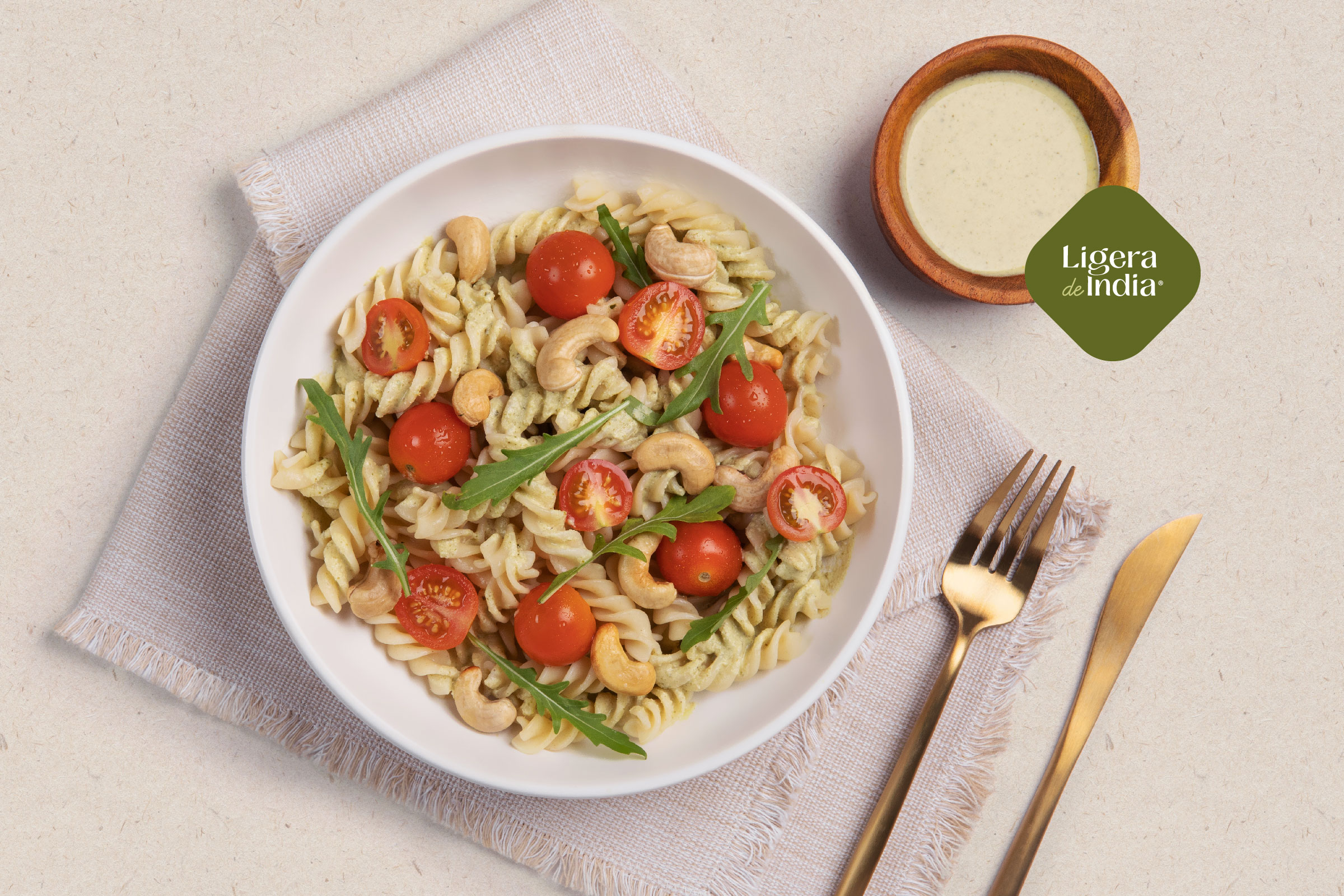
Ligera de India is an empathetic, organic and serene brand; it is a touch of natural flavor. Nature merges with the flavors of Mexico to create one-of-a-kind gastronomic experiences. With vegan and preservative-free ingredients, Ligera de India is the perfect option to complement meals in a healthy and delicious way.
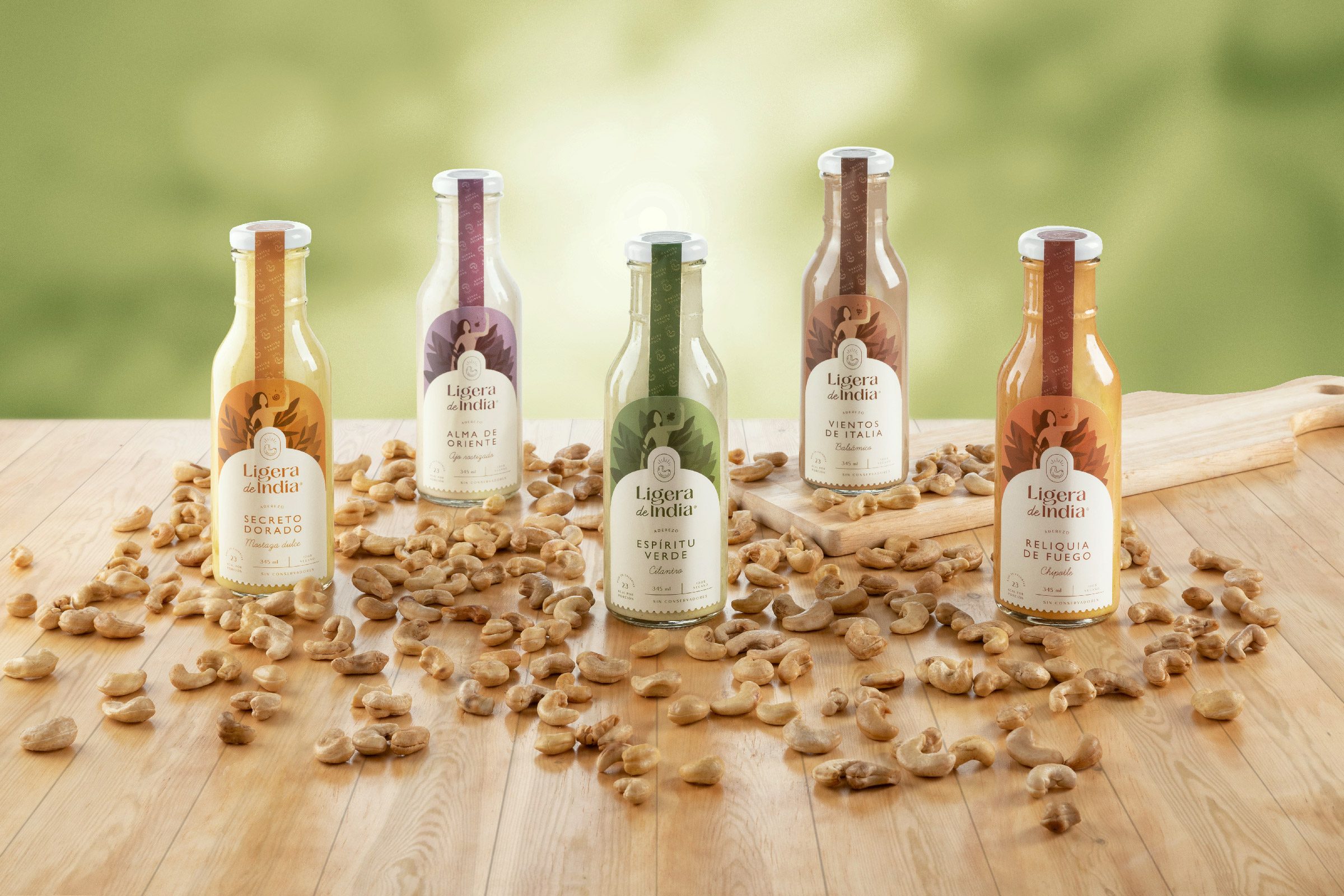
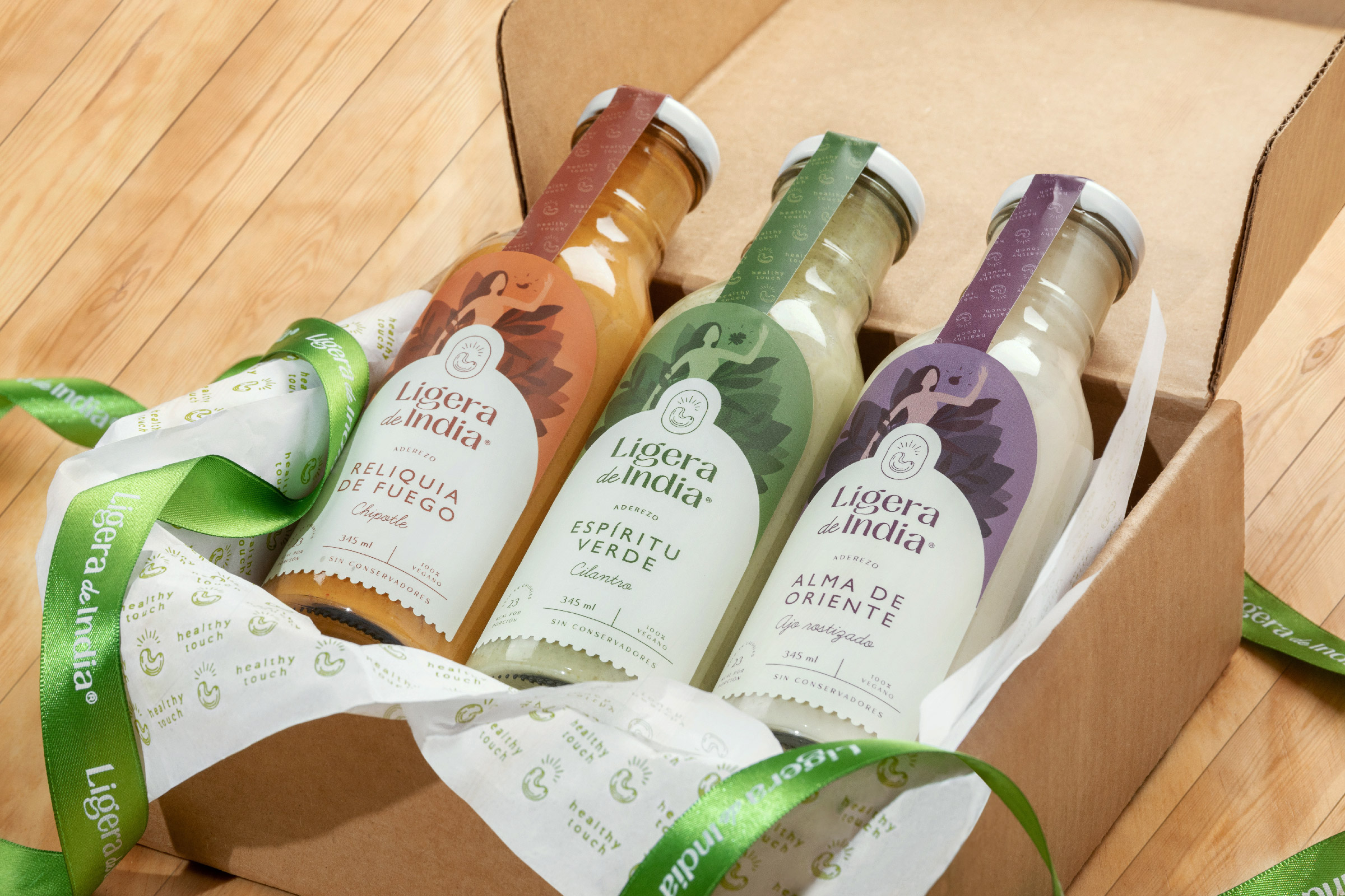
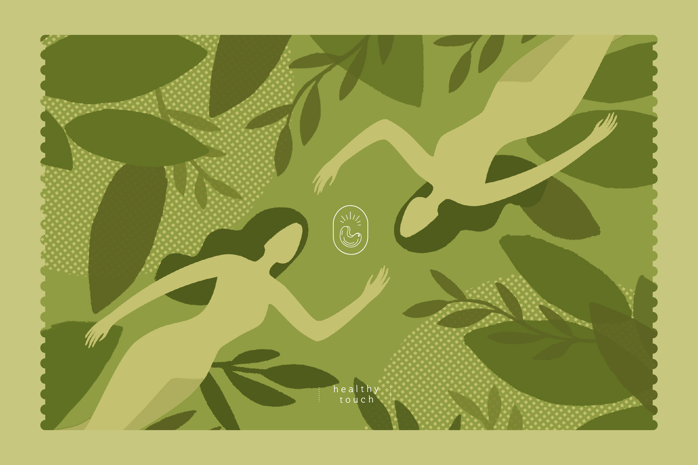
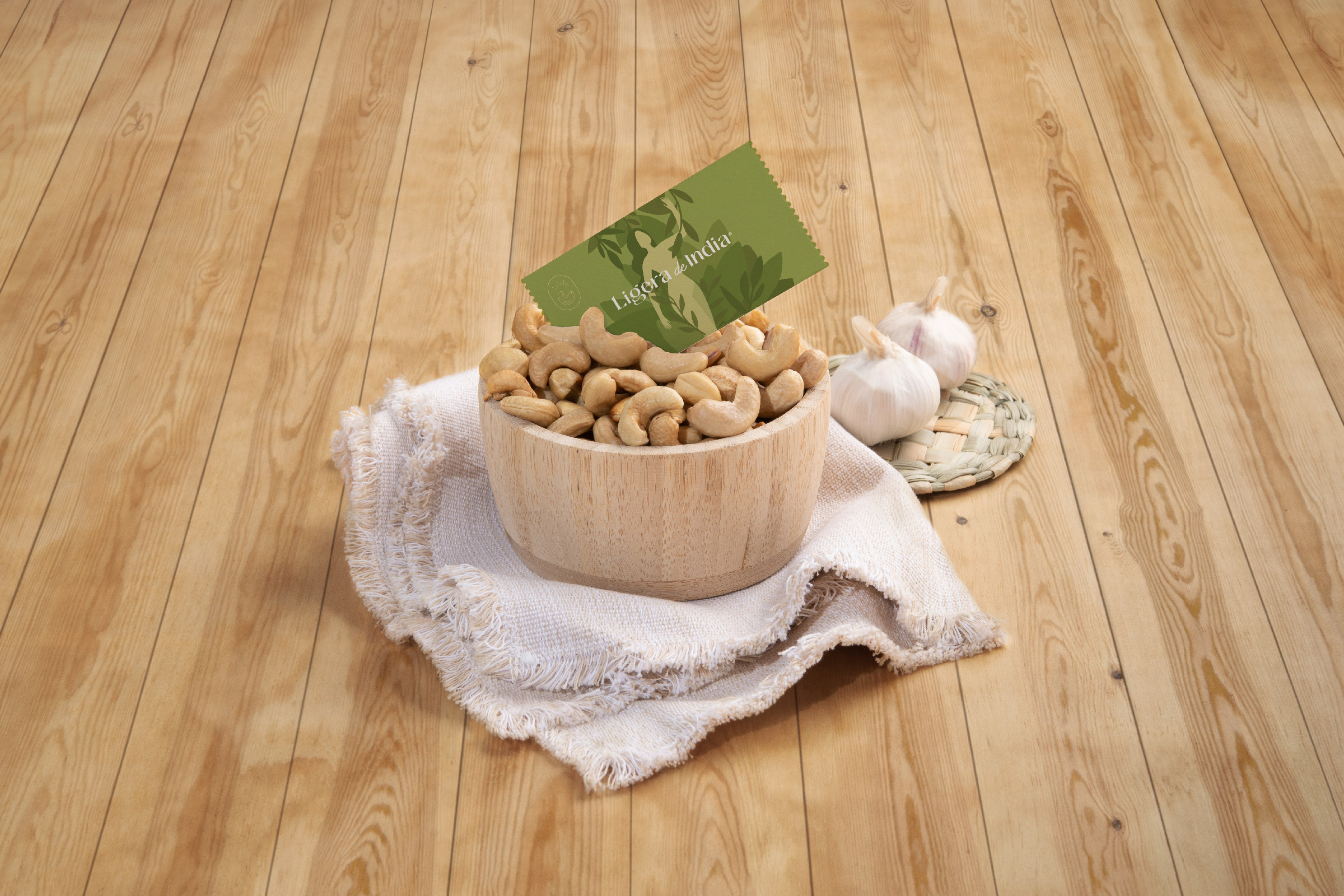
The branding is inspired by the graphics of postcards, travel, and the memories that travelers write in their diaries. The visual identity is complemented by an illustration that portrays the story of a woman who, in her quest to reconnect with nature, discovers a precious element: the cashew nut. The isotype represents this valuable ingredient, unique in the world, with its irregular shapes highlighting the organic nature of the product and the imperfection of perfection.
The logotype creates a contrast between typeface families (script and serif), to make a more dynamic and elegant brand, with details reminiscent of nature, such as curves or drop-shaped endings.
Thanks to the look and feel developed for the brand, it seeks to empathize with a young public that likes to take care of their health, cook creatively and achieve dishes with extraordinary flavors.
“To breathe the wind of health and good decisions.
But I also learned to enjoy the flavors and the moments. I found in the Indian a precious element.
I decided to share it through the seasonings I discovered along the way.”
My path continues through you.
-Ligera de India
CREDIT
- Agency/Creative: Mantra
- Article Title: Mantra Helps Ligera de India Put Nature and Design in One Place
- Organisation/Entity: Agency, Published Commercial Design
- Project Type: Identity
- Agency/Creative Country: Mexico
- Market Region: North America
- Project Deliverables: Brand Creation, Brand Experience, Brand Identity, Brand World, Branding, Graphic Design, Identity System, Illustration, Packaging Design, Photography, Product Naming
- Industry: Food/Beverage
- Keywords: Branding, nature, healthy, illustration, food, fitness, dessing, packaging, design


