


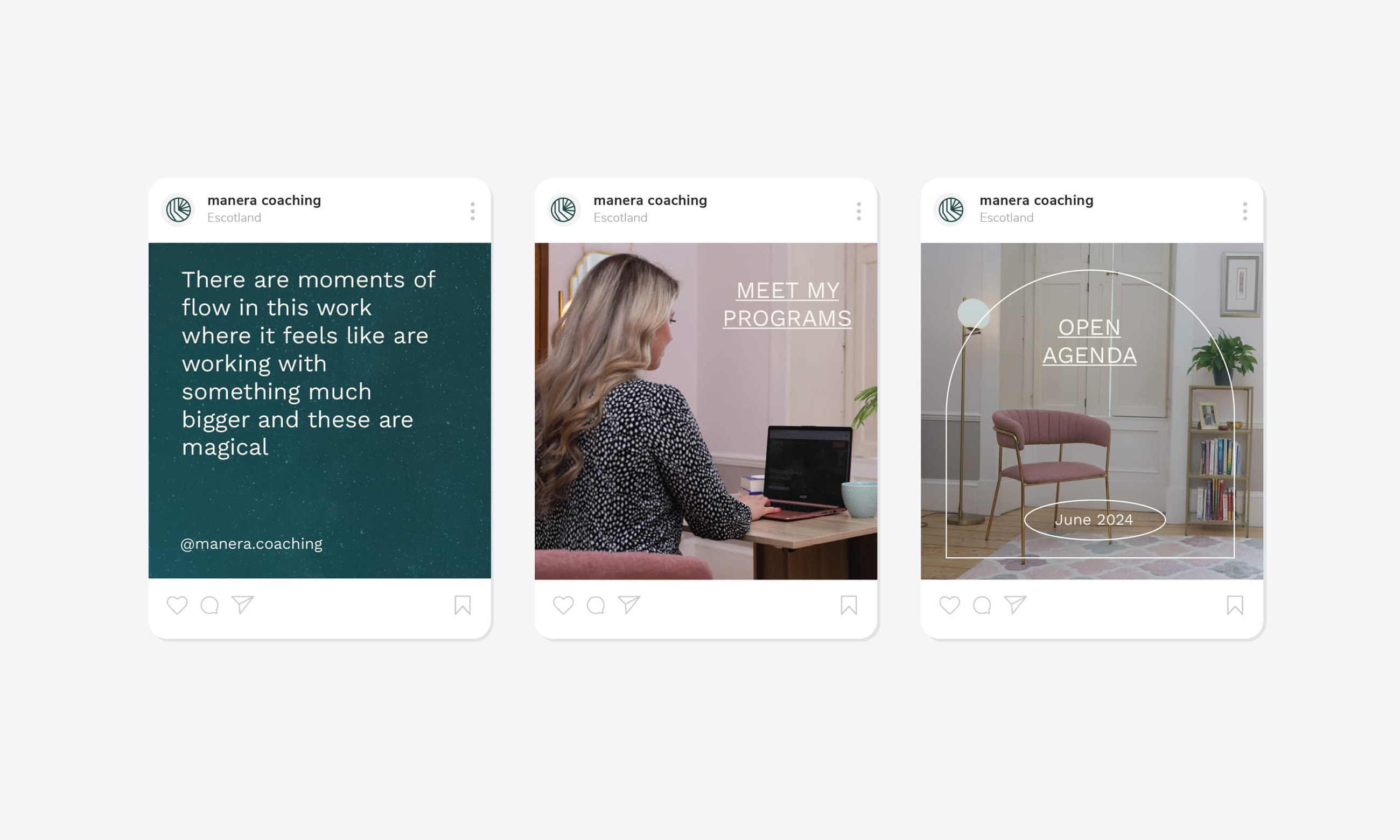
Manera Coaching is a forward-thinking company that provides guidance and support to entrepreneurs and leaders, helping them achieve clarity in their goals. The brand’s mission centres on empowering clients to unlock their potential and discover new pathways towards success. Through a unique combination of coaching, Reiki, and EFT tapping techniques, Manera offers a holistic approach to personal and professional development.
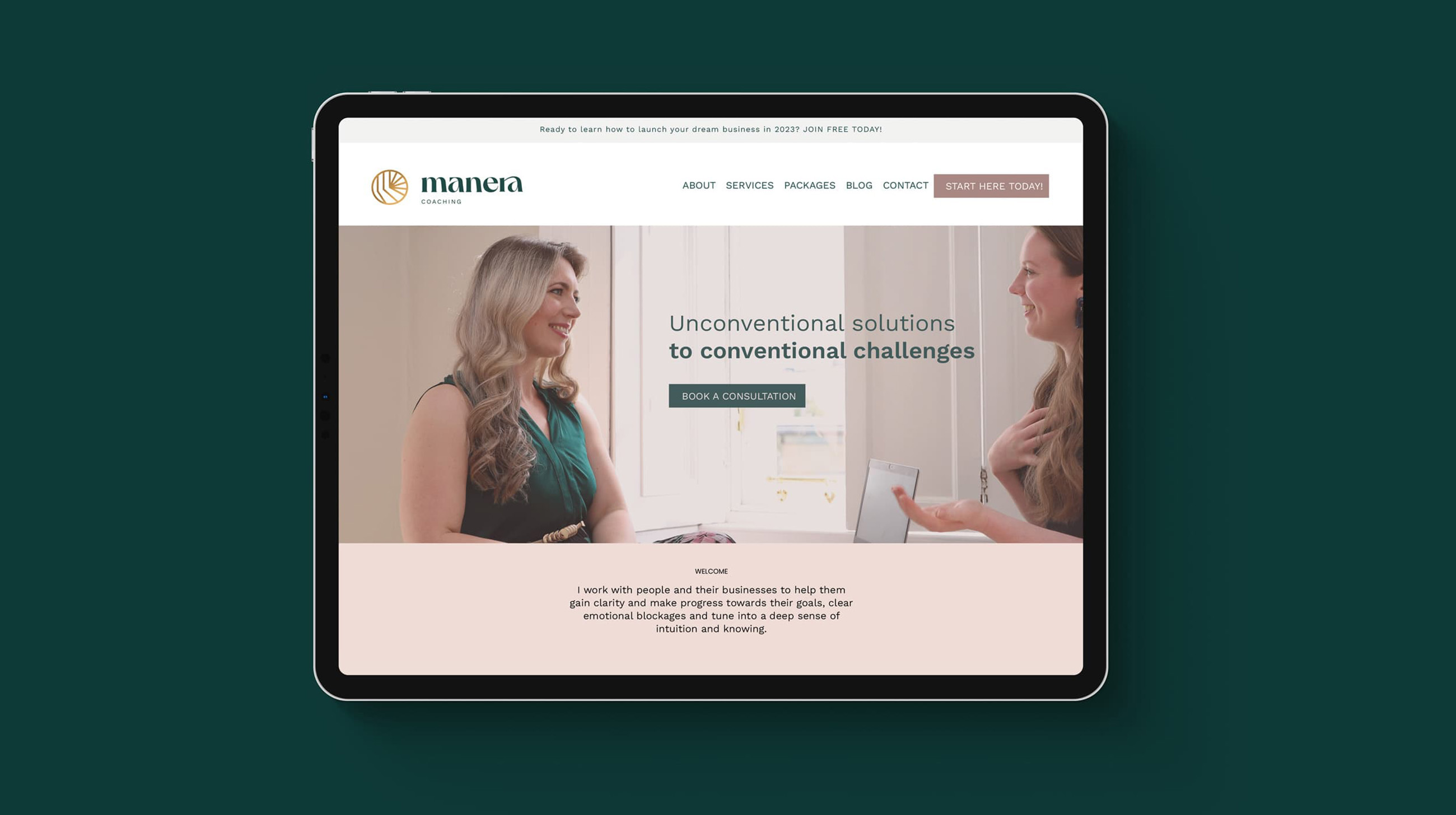
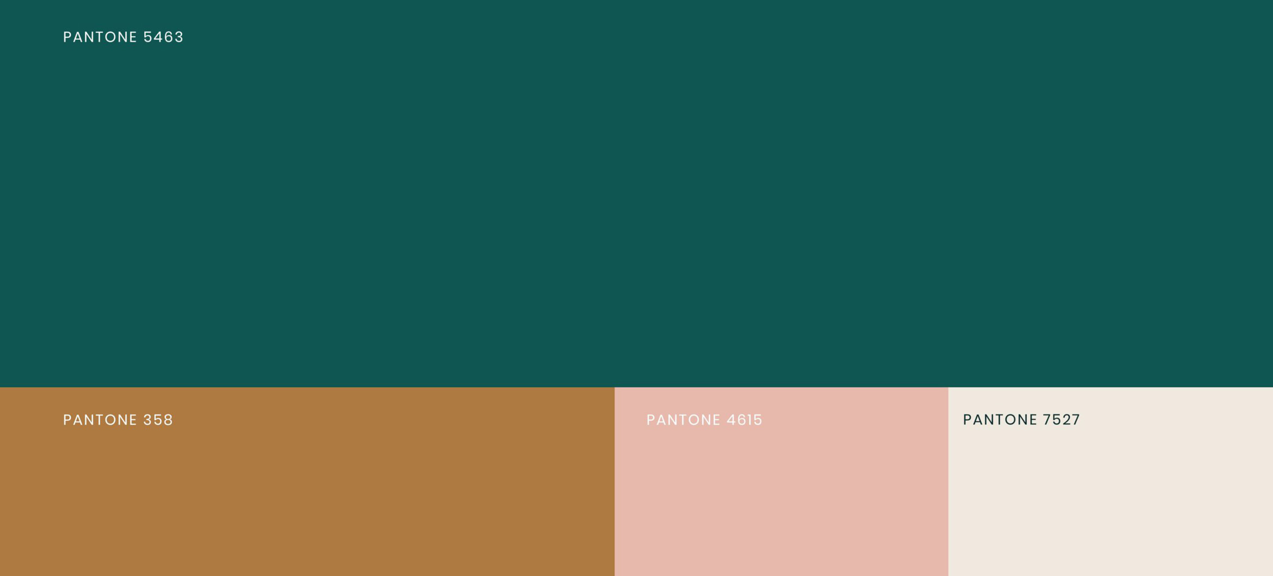
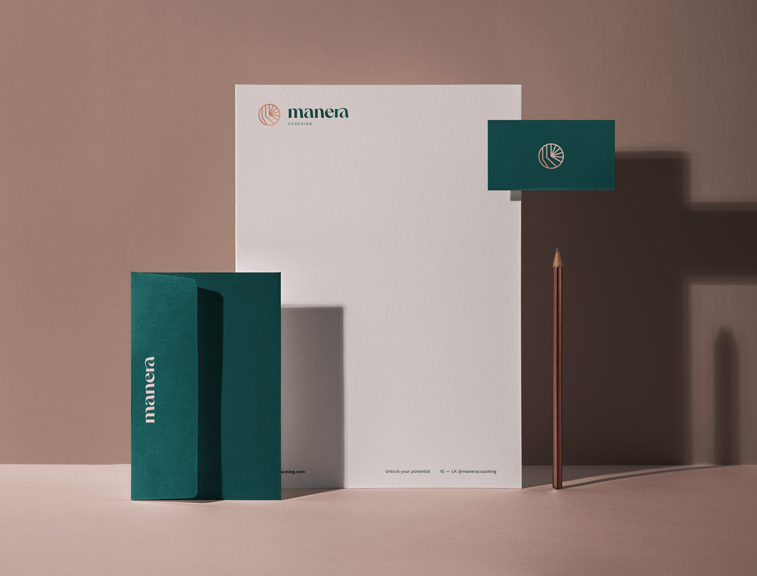
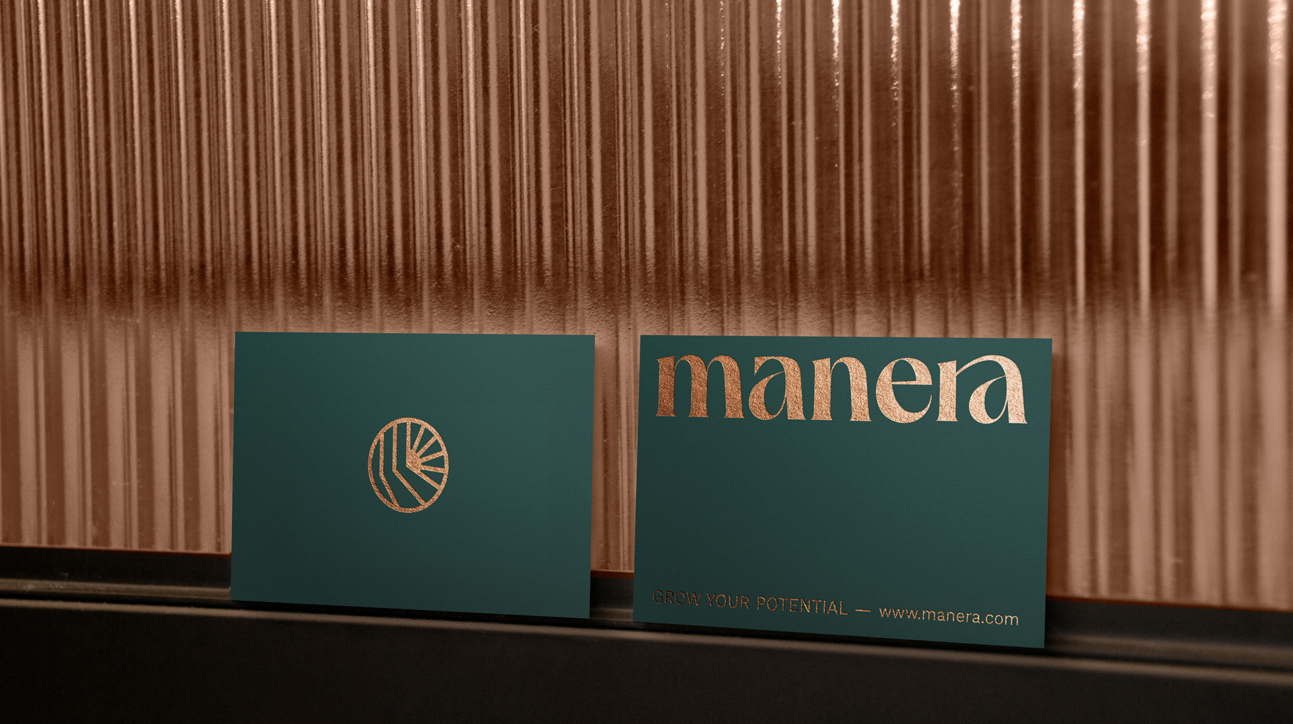
The central concept behind Manera’s visual identity is clarity—guiding individuals to find solutions, gain self-awareness, and move forward with confidence. The imagery of sunlight filtering through trees plays a pivotal role in this identity. As light passes through the canopy, it transforms into radiant beams that illuminate both light and shadow, symbolising the journey from uncertainty to clarity.
The brand’s logo and design elements draw inspiration from this metaphor. The sun’s rays, a universal symbol of enlightenment and insight, represent the clarity that Manera aims to provide. This guiding light concept is woven into every aspect of the visual identity, reflecting the supportive yet non-directive nature of Manera’s approach: it’s not about leading clients, but accompanying them as they uncover their own paths.
The choice of typeface was crucial in conveying the brand’s essence. It needed to be both approachable and friendly, yet possess enough character to stand out. The selected typography strikes this balance perfectly, embodying a blend of warmth and professionalism that resonates with Manera’s ethos.
The brand name, “Manera,” has a distinctive and inspiring sound, especially in the UK, where it subtly hints at ‘manner’ or ‘way’—echoing the brand’s multifaceted approach. Overall, the visual identity captures the essence of Manera Coaching: a beacon of clarity for those navigating their personal and professional journeys.
CREDIT
- Agency/Creative: Mang Studio
- Article Title: Mang Studio Transforms Manera Coaching’s Vision into a Radiant Visual Brand Identity
- Organisation/Entity: Student
- Project Type: Identity
- Project Status: Published
- Agency/Creative Country: Spain
- Agency/Creative City: Valencia
- Market Region: Europe
- Project Deliverables: Art Direction, Brand Creation, Brand Design, Lettering, Type Design
- Industry: Health Care
- Keywords: Coaching, identity, brand
-
Credits:
Art Director: Mang Sánchez


