


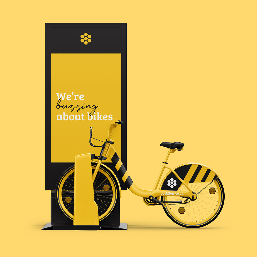
This project was a response to a D&AD New Blood Awards brief and won a wooden pencil. Bee Bikes is a bike hire scheme for Manchester, we took an icon of the City and built our brand around it, embedding the identity into Manchester and it’s culture.
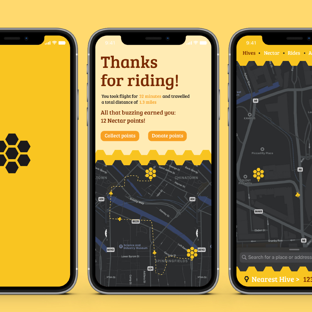
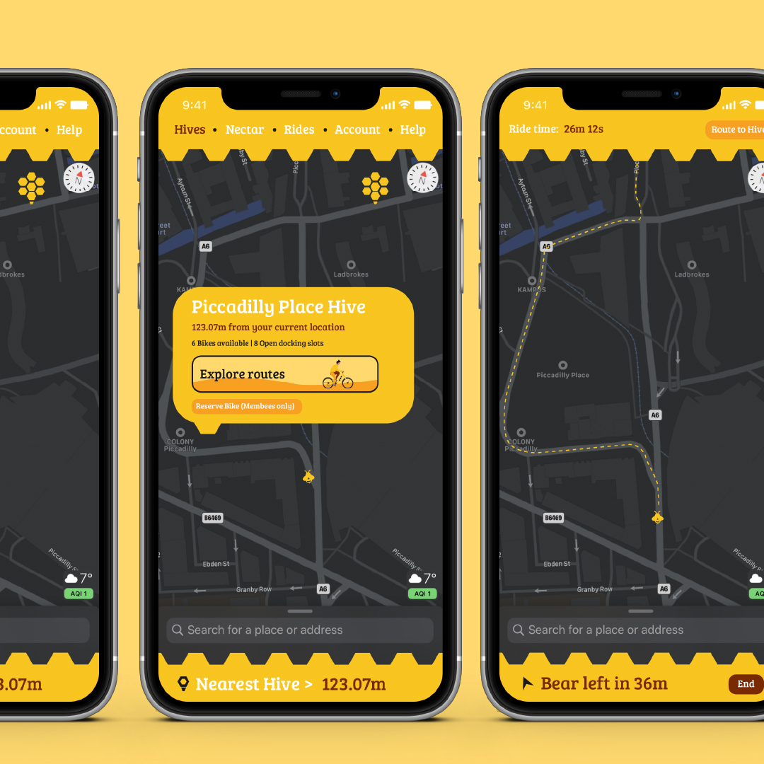
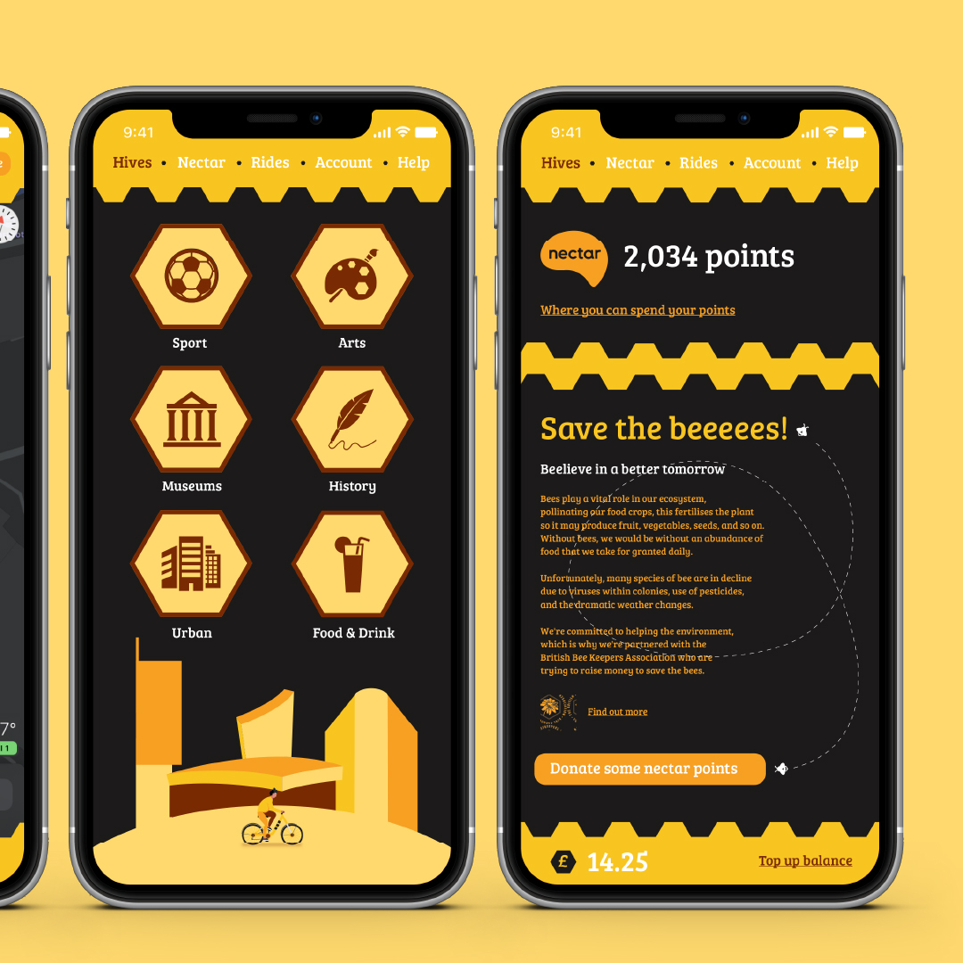
Whilst celebrating Manchester, we also made a special effort to sell cycling, meaning people would want to hop on a Bee Bike, whether for their health, the environment, or for some sweet free Nectar Points.
We had a lot of fun stretching the identity and language across a range of applications, even down to hexagon reflectors and tire tread.
CREDIT
- Agency/Creative: Tom Horbury
- Article Title: Manchester Bee Bikes Branding by Tom Horbury
- Organisation/Entity: Student, Published Commercial Design
- Project Type: Identity
- Agency/Creative Country: United Kingdom
- Market Region: Europe
- Project Deliverables: Brand Creation, Brand Identity, Brand Naming, Branding, Graphic Design, Tone of Voice
- Industry: Transport
- Keywords: bee, bikes, hire, scheme, manchester, dandad, newblood, branding, app
FEEDBACK
Relevance: Solution/idea in relation to brand, product or service
Implementation: Attention, detailing and finishing of final solution
Presentation: Text, visualisation and quality of the presentation


