Concept
Derived from a biblical story, the Mana cake represents God’s love and provision for the Jewish people throughout their journey into the promised land. Mana in the Austronesian language also means strength and prestige.
Brand
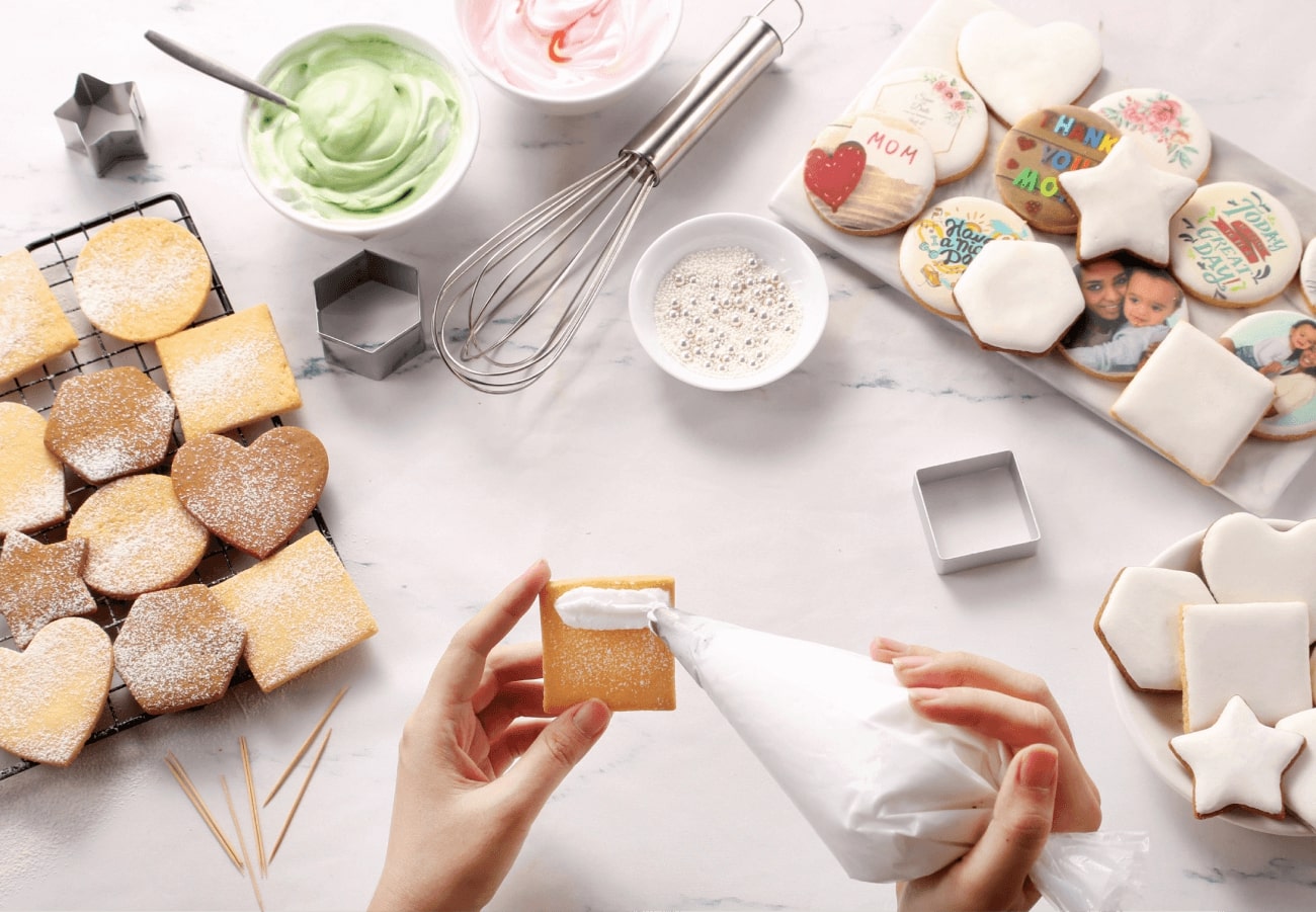
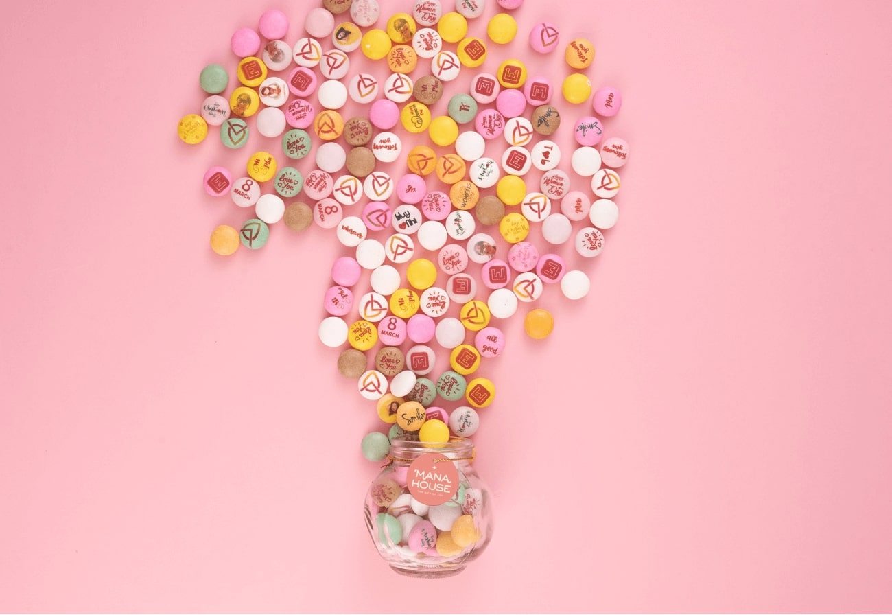
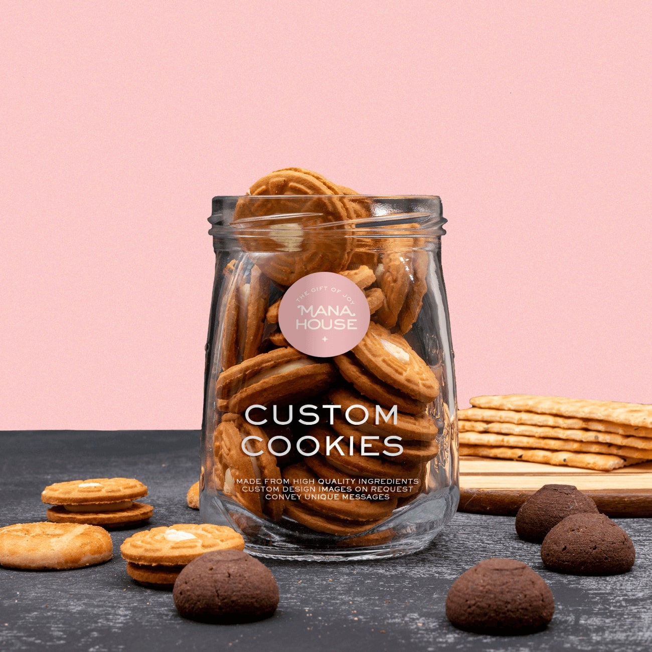
Mana House was built with the desire to blow into each cookie and candy, seemingly ordinary confectionery with messages of love and connection, creating a close and lasting bridge between the giver and the receiver.
Each handcrafted confection whispers untold stories, waiting to be savored. Imagine biting into a delicate cake infused with a hidden message written in edible ink, a secret shared only between giver and receiver. Perhaps it’s a tender phrase of “I love you,” a playful joke to brighten someone’s day, or a heartfelt note of encouragement.
Visualize
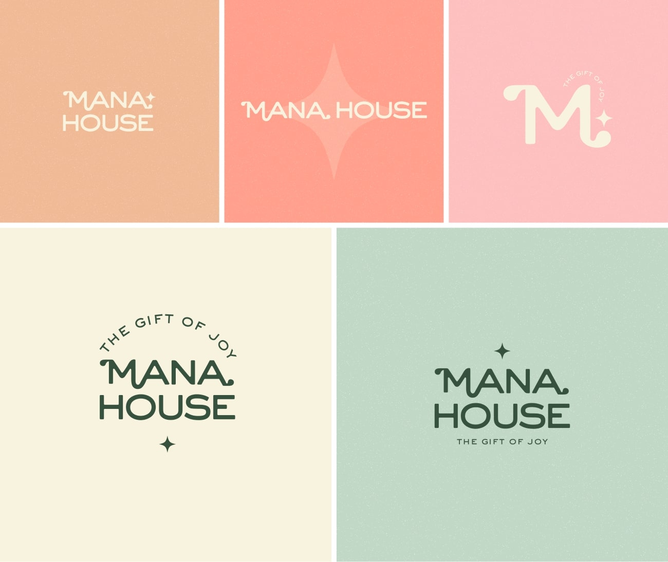
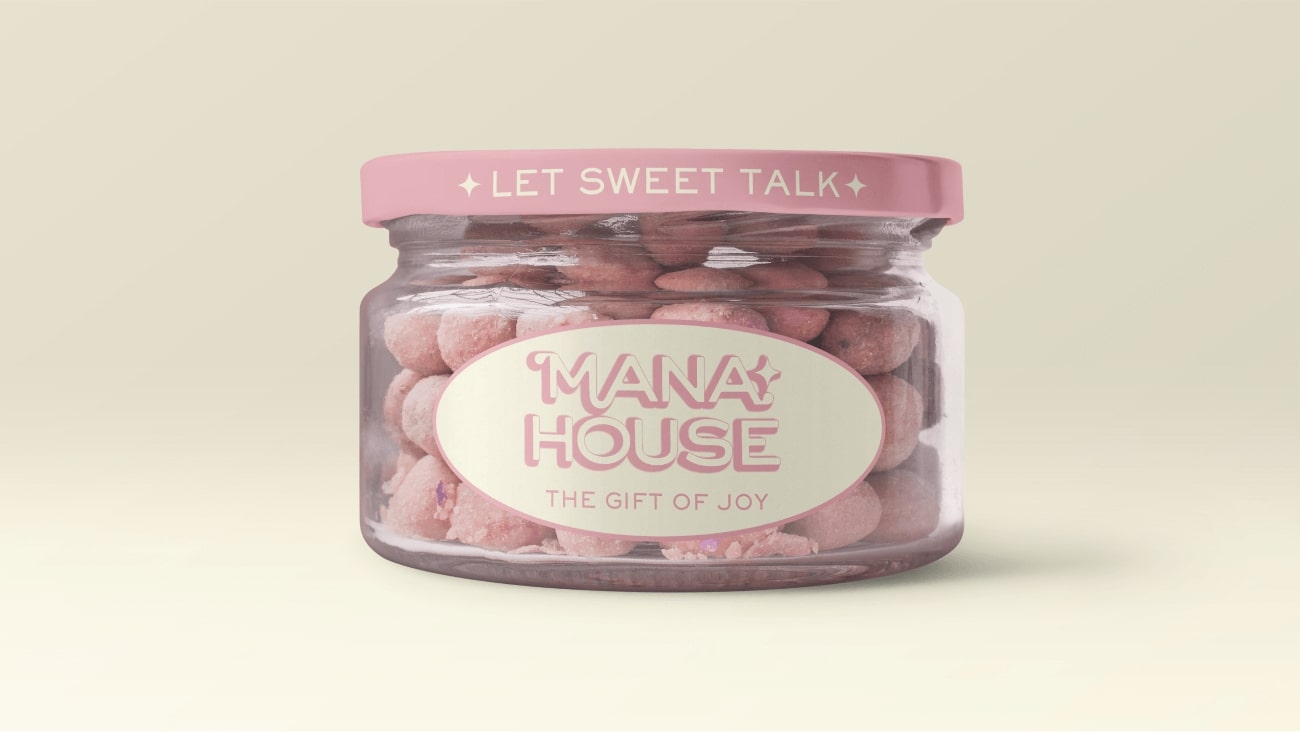
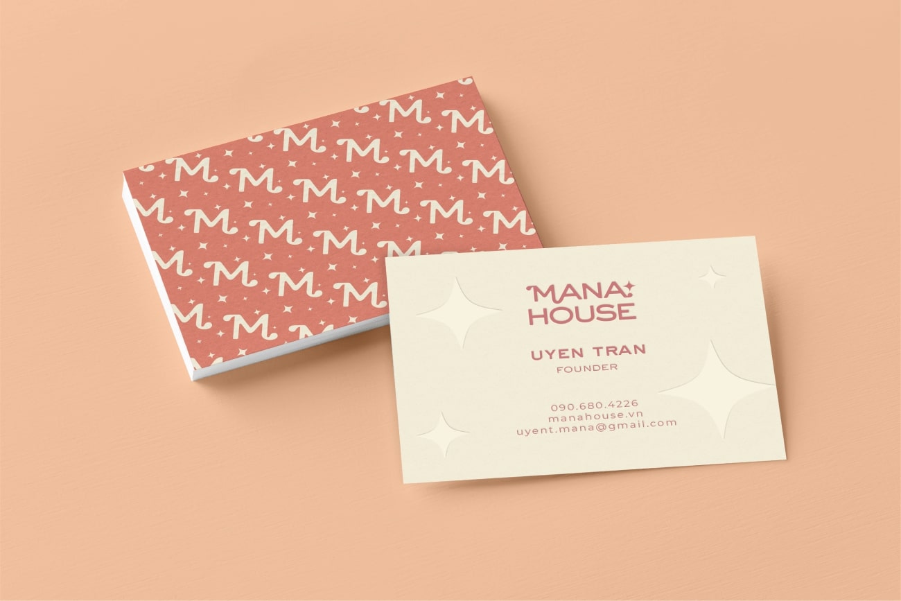
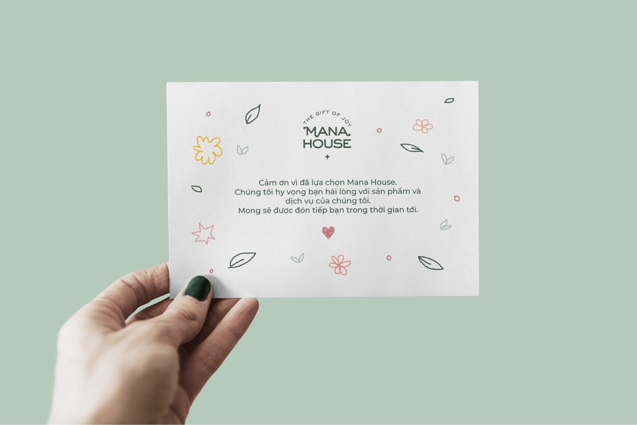
The color use was a scene of the first blush of dawn on the promised land, a pastel palette that awakens the senses. This shade perfectly captures the playful aspect of love and connection. Let the sans-serif characters dance across pastel colors, each letter a little burst of delight. By embracing the vibrant harmony of playful pastels and customized sans-serif typeface, this approach reflects the brand’s dedication to infusing sweetness and love into every bite, while maintaining a fresh and modern appeal.
Mana House is more than just a confectionery shop; it’s a conduit of love, strength, and connection. At Mana House, a single bite can bridge hearts, uplift spirits, and whisper stories that linger long after the last crumb is savored. So step into our world, explore the delicious possibilities, and let us help you write a sweet chapter in the beautiful story of connection.
CREDIT
- Agency/Creative: Lynn Tran
- Article Title: Mana House: A Sweet Connection Brand Design By Lynn Tran
- Organisation/Entity: Freelance
- Project Type: Identity
- Project Status: Published
- Agency/Creative Country: Vietnam
- Agency/Creative City: Ho Chi Minh City
- Market Region: Asia, Global
- Project Deliverables: 2D Design, Brand Redesign, Branding, Design, Food Photography, Logo Design
- Industry: Food/Beverage
- Keywords: cookie, pink, beige, coral, bake, sweet, logo design
-
Credits:
Designer: Lynn Tran


