Il Mio is not just chocolate. It’s a story where classic and contemporary, art and flavor merge into a single moment of pleasure. The Il Mio packaging project is more than just a wrapper; it’s a holistic piece of art that evokes associations with refined still lifes of old masters, where every detail speaks of perfection, sophistication, and the pursuit of excellence. We have created visuals that awaken emotions at first glance.
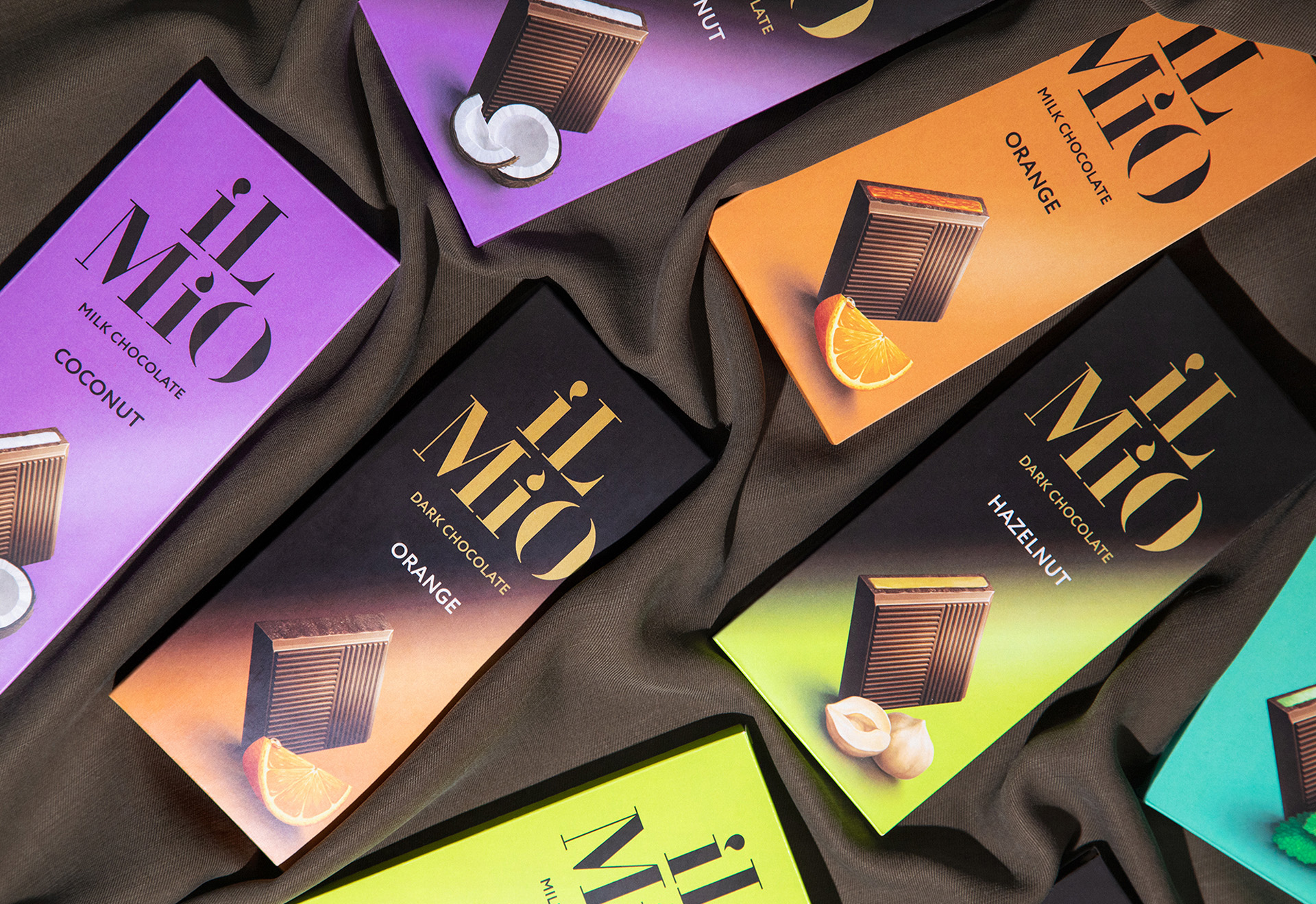
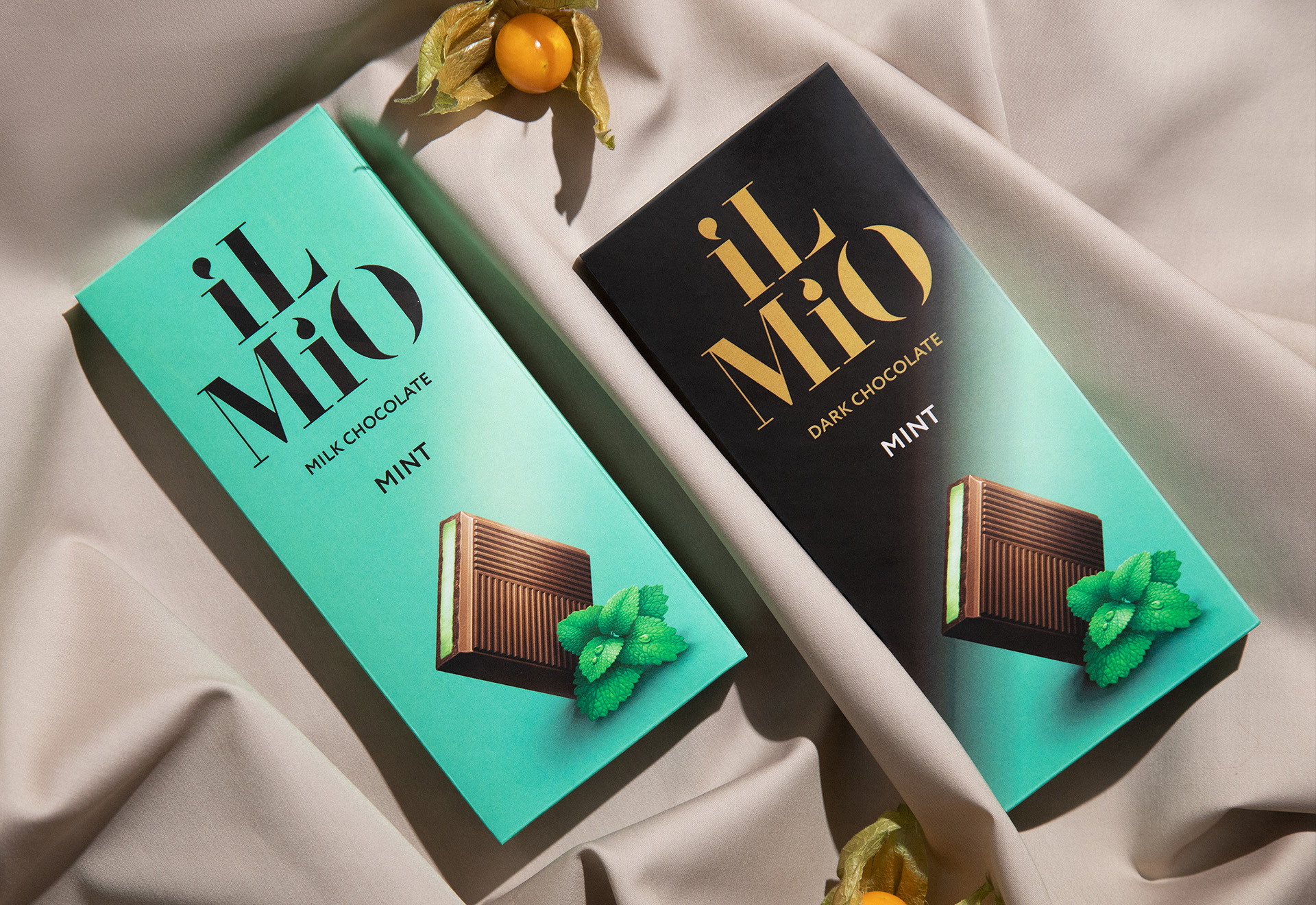
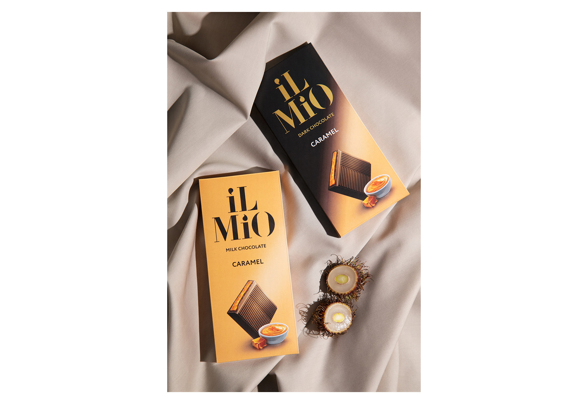
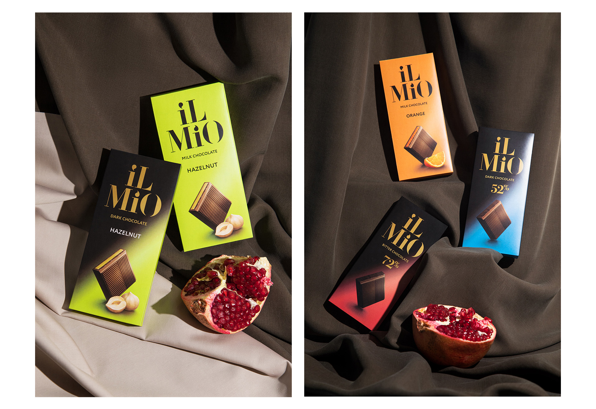
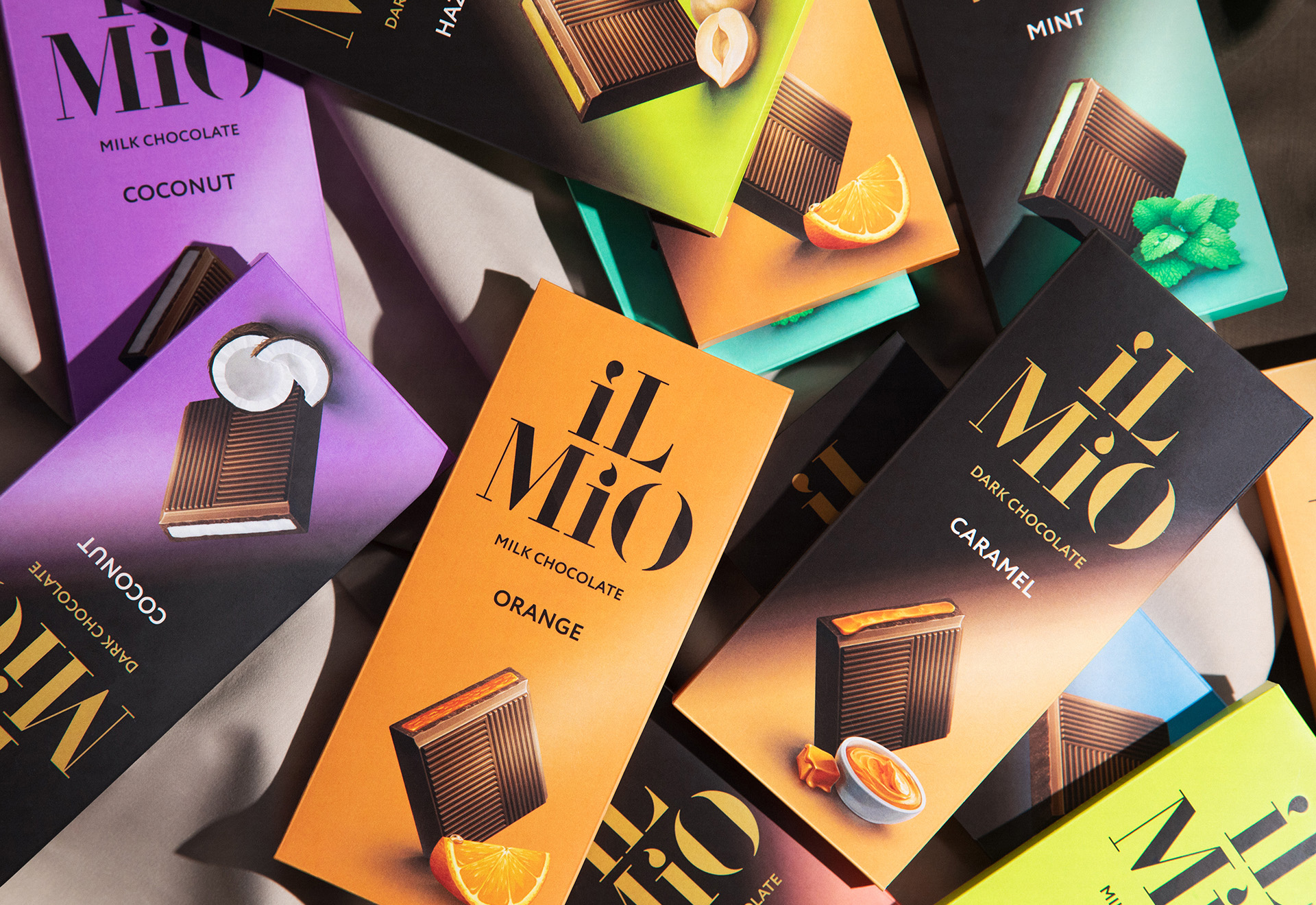
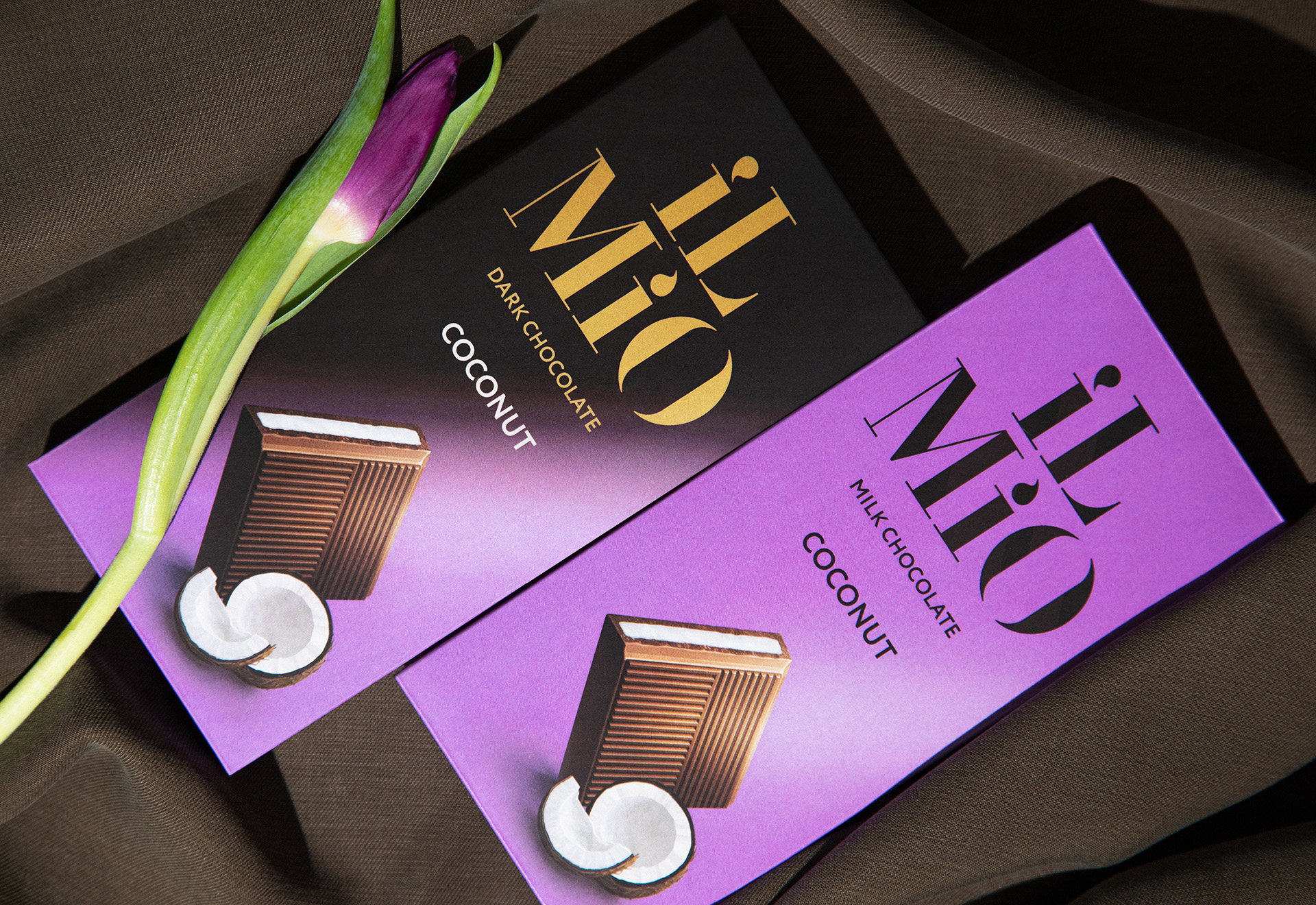
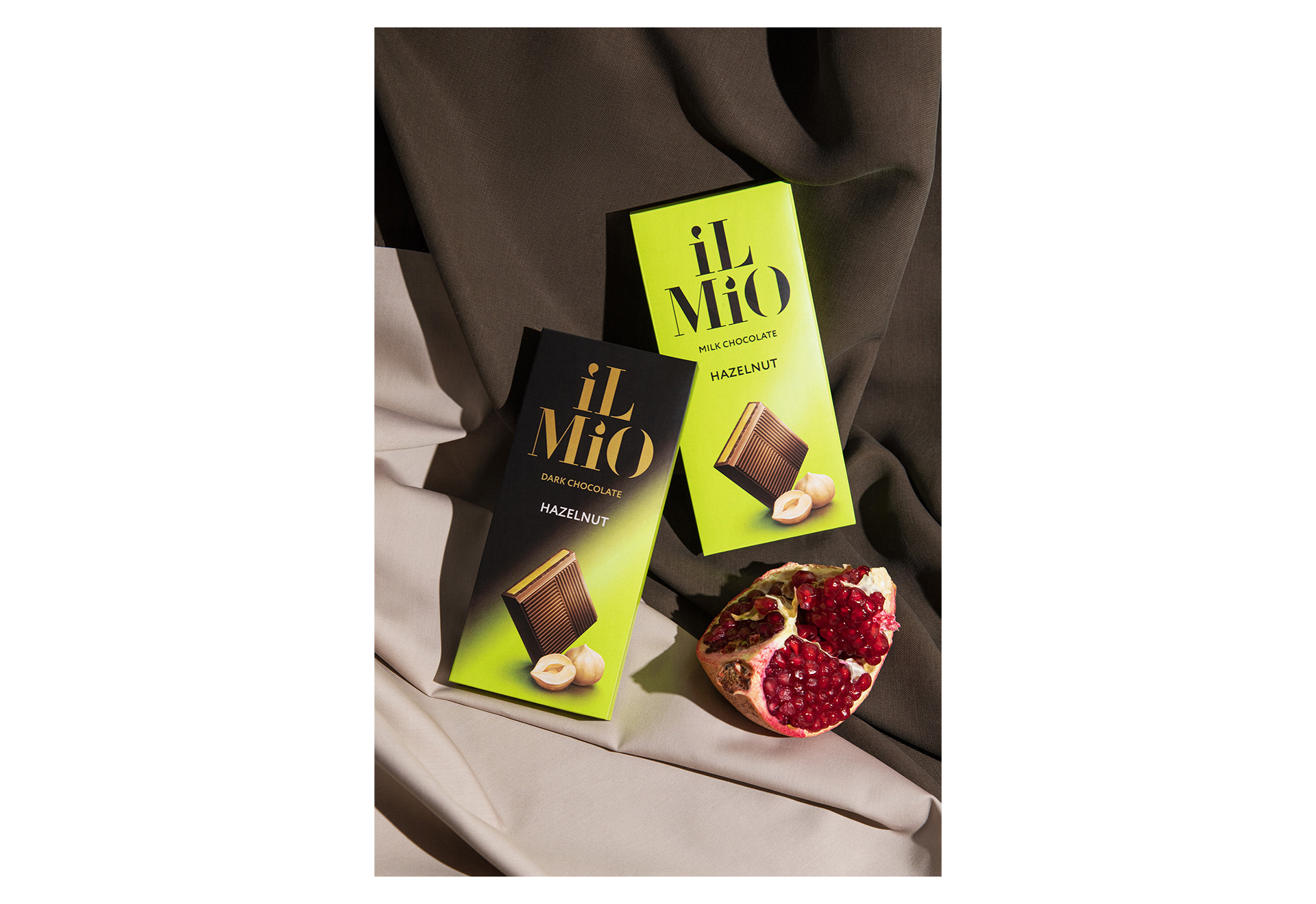
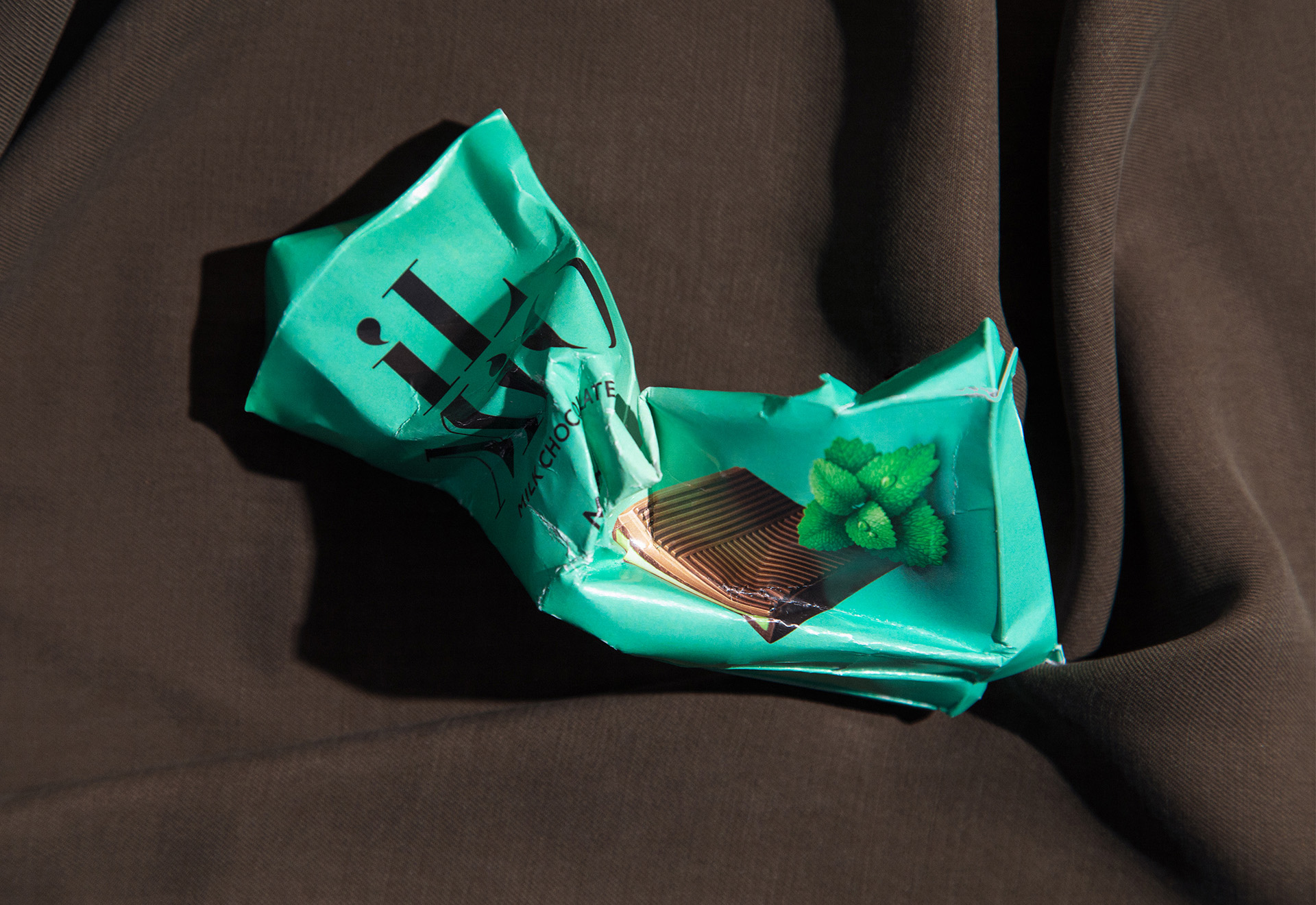
The packaging design of Il Mio is based on a simple yet expressive differentiation system: for milk chocolate, we chose a solid, smooth background, resembling a creamy flow that envelops you in comfort. For dark chocolate, we used rich gradients, a play of light and shadow that echoes the luxurious feel of Baroque, creating an atmosphere of mystery and depth. Thus, each package contains not only a visual code but also an emotional hint — giving a taste of what to expect even before the first bite.
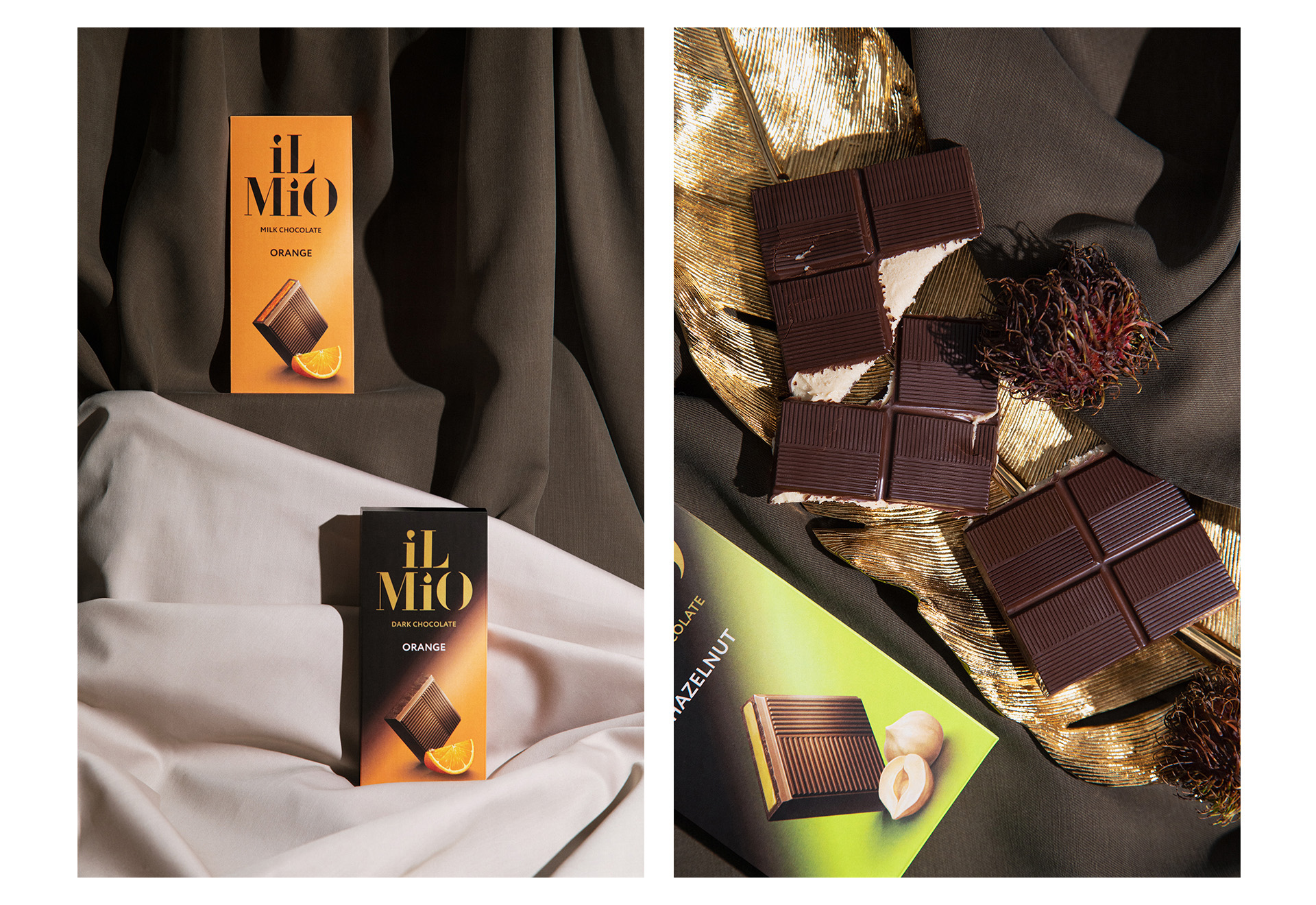
The illustrations for Il Mio are crafted in 3D, adding visual texture and depth. It’s as if we’ve lifted objects from classical paintings, bringing them to life and making them play anew on the packaging. The compositions resemble traditional still lifes with fruits, nuts, and spices, complementing the flavor profile of each type of chocolate. This is a nod to art, where each ingredient is like a brushstroke on a canvas, contributing to the overall mood and enhancing the taste experience.
Il Mio chocolate itself is a creation worthy of respect. We approach the product as an artist approaches their painting: paying attention to the smallest details while maintaining focus on the overall composition. In our case, it’s the unique combination of taste and visual storytelling, turning each chocolate bar into a small wonder, worthy of a gallery display. Each package is not just part of the assortment but a unique story conveying the complexity and richness of the flavors.
The visual identity of Il Mio conveys the premium nature of the product while remaining accessible and clear. We wanted to create packaging that you’d be proud to present at a party, yet it doesn’t intimidate with exclusivity. It’s chocolate for those who appreciate quality but are not afraid to experiment, for those who see small masterpieces in the simple joys of life.
Il Mio reflects the philosophy that chocolate can be art if you put your heart into it.
CREDIT
- Agency/Creative: Mål
- Article Title: Mål’s Packaging Design for Chocolate Crafted as Fine Art
- Organisation/Entity: Agency
- Project Type: Packaging
- Project Status: Published
- Agency/Creative Country: Russia
- Agency/Creative City: Perm
- Market Region: Europe
- Project Deliverables: Packaging Design
- Format: Box
- Industry: Food/Beverage
- Keywords: Luxury, Chocolate, Design, Packaging, 3D Illustrations, Art, Illustrations, Identity, Premium, Branding, Flavor, Aesthetic
-
Credits:
Art Director: Vika Baida


