In 2017, Tony Madalone was a 7-figure entrepreneur, traveling the world, and climbing the status ladder. He was also really unhappy.
So in 2019, he made up his mind: no matter what anybody else expected or how they defined success, he was going to choose himself. He stripped his life down to the studs, selling everything he didn’t need and moving to Mexico. He slowed life down to a crawl, biking everywhere, ditching processed food, and working out at a free beach gym in community with others who were making choices for their health. And while living this life with near-total devotion, he got a tattoo on the side of his hand: Worship Yourself.
This mantra became the namesake for a fitness and wellness brand Tony started with his wife, Elle. Together, they’ve combined their expertise to offer a whole range of offerings for people ready to make a radical commitment to themselves. With workouts, nutritional advice, and tips for a balanced lifestyle, WRSHP YRSLF believes in tending to your mind and body, all to create a healthier and happier you.
But in an industry marked by expensive subscriptions and even more expensive equipment, WRSHP YRSLF made the choice to create affordably priced content across all major social platforms, with workouts that don’t require fancy equipment or years of practice to get right. Tony and Elle’s simple, bold, and almost gritty approach toward personal wellness inspired us to create a brand identity to match.
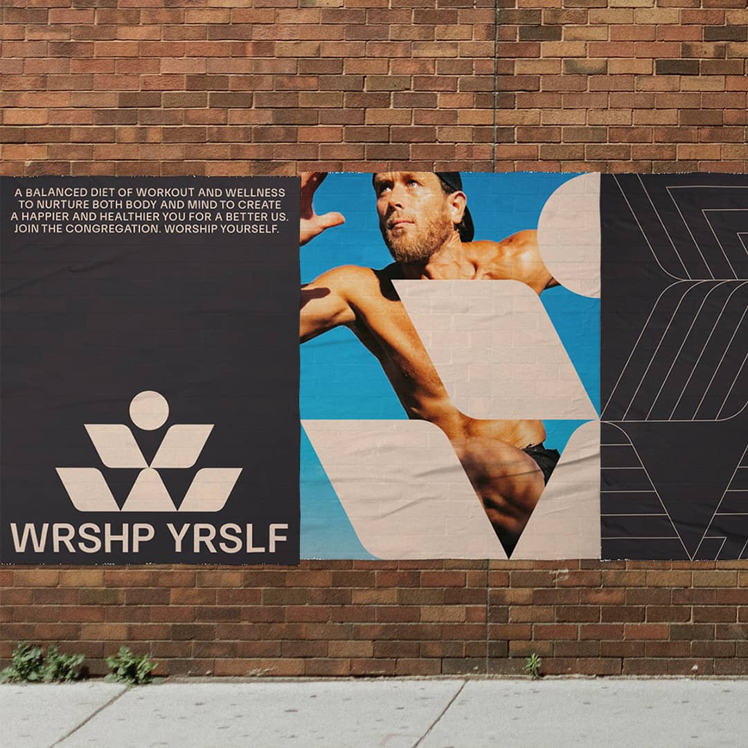
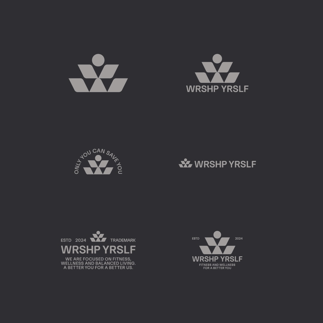
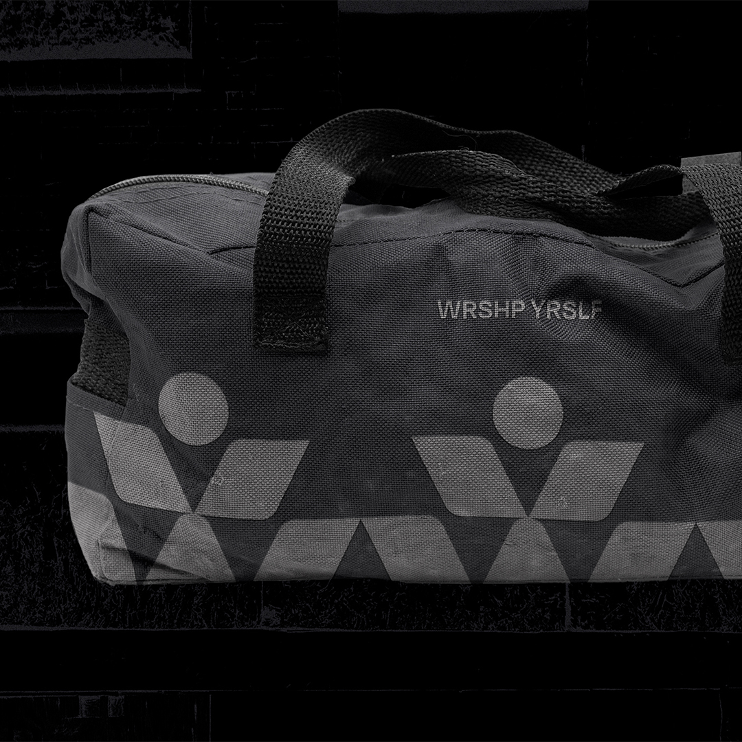
We wanted the mark to work as a monogram for WY, resemble the human form, and strike a balance between body and mind, masculine and feminine. We chose the primary typography to reflect both the logo’s geometry and the balanced aesthetic we sought to create. To pair with it, we utilized a secondary typeface that’s bold and extended to get your attention while you’re scrolling.
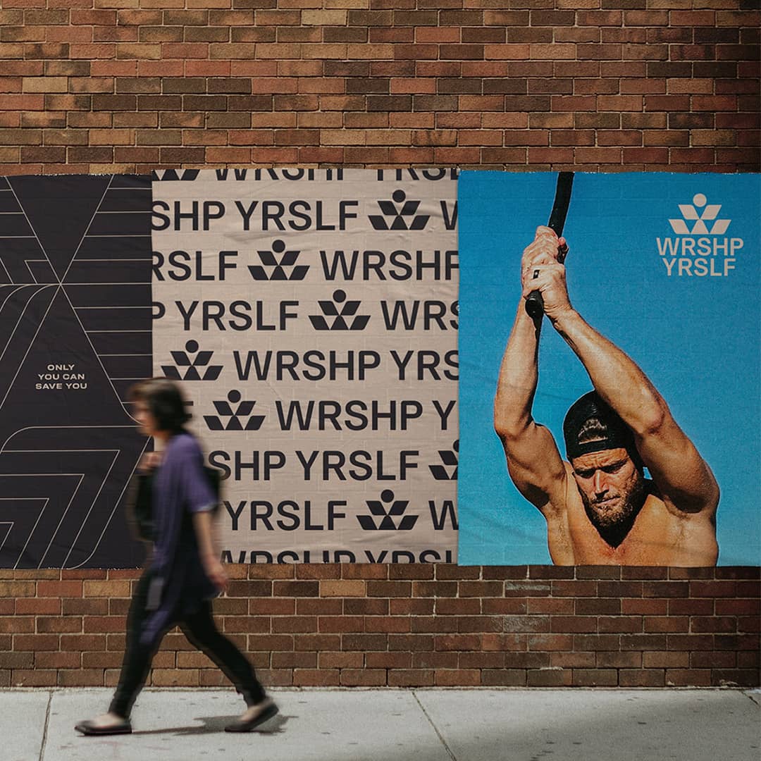
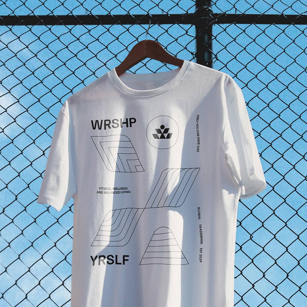
We used color to bring in the brand’s organic and grounded feel, taking our cues from dirt, sand, stone as well as the weights that ring a bell for anybody tuned into all things fitness. To round it out, we created social media templates along with patterns and shapes that are built from the same shape and geometry found in the primary mark.
We love how it came together — when we zoom out to the whole brand, it looks and feels transformative. And maybe that’s fitting. Because ultimately, WRSHP YRSLF isn’t about inflated egos or having it all together. It’s about the single-minded devotion it takes to tune out expectations and make the ordinary, everyday, and ultimately transformative choice to choose yourself, over and over again.

CREDIT
- Agency/Creative: Malley Design
- Article Title: Malley Design Captured the Spirit of Self-Worship in WRSHP YRSLF Branding
- Organisation/Entity: Agency
- Project Type: Identity
- Project Status: Published
- Agency/Creative Country: United States
- Agency/Creative City: Minneapolis
- Market Region: North America
- Project Deliverables: Brand Design, Brand Identity, Brand Mark, Branding, Logo Design
- Industry: Professional Services
- Keywords: fitness, wellness, gym, workout
-
Credits:
Creative Director: Bryan Malley
Sr. Designer: Ian Kolstad


