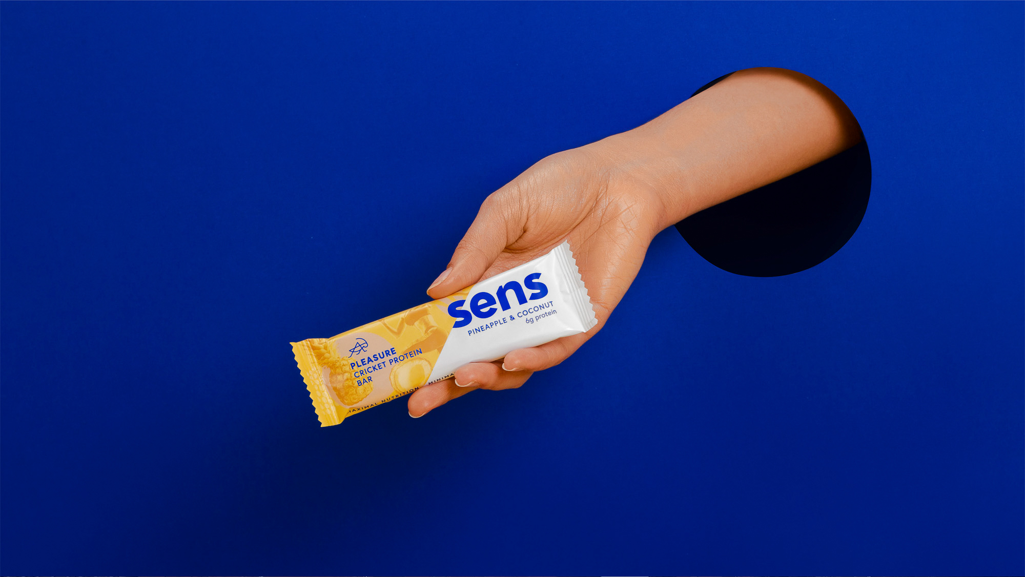
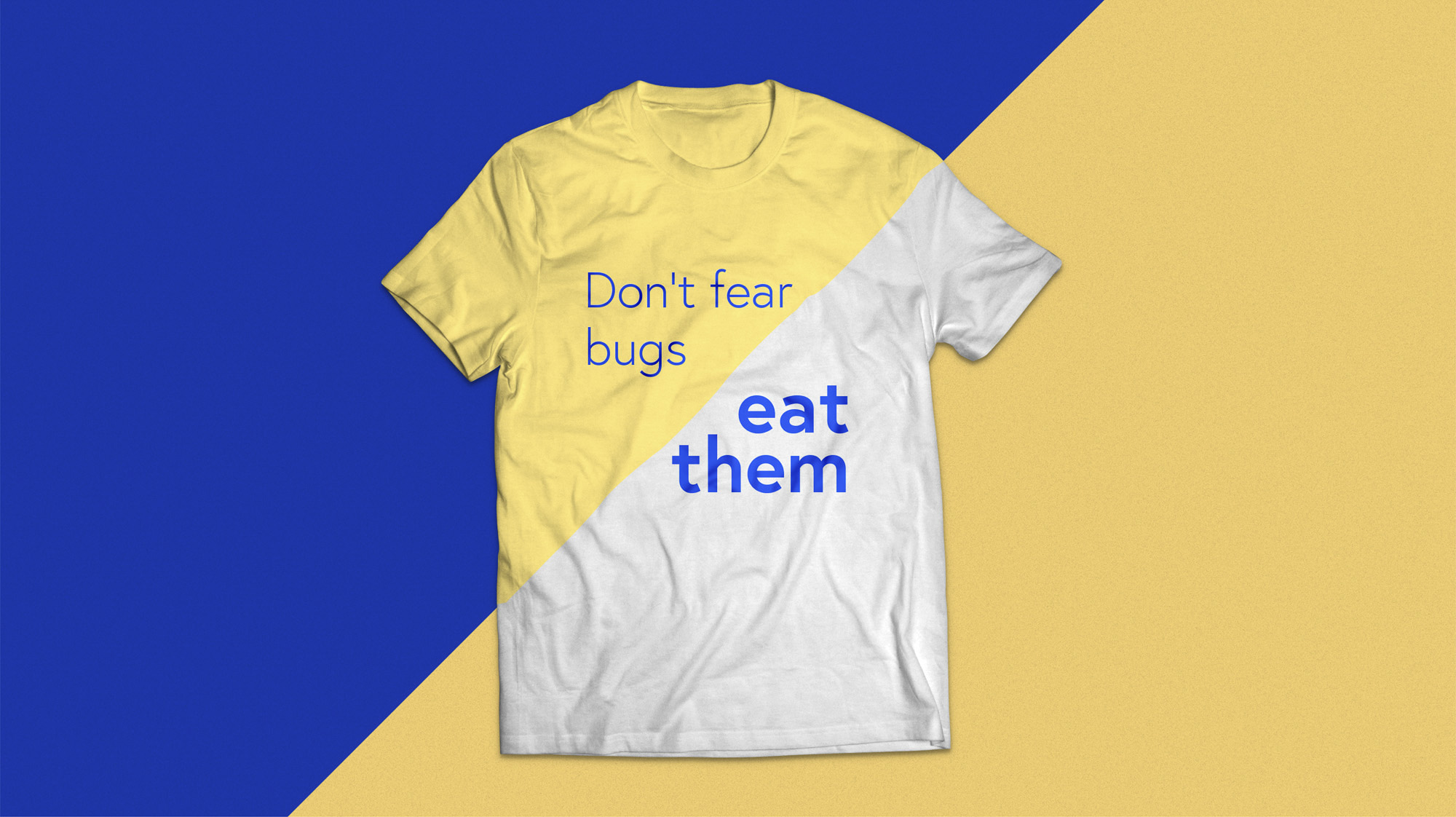
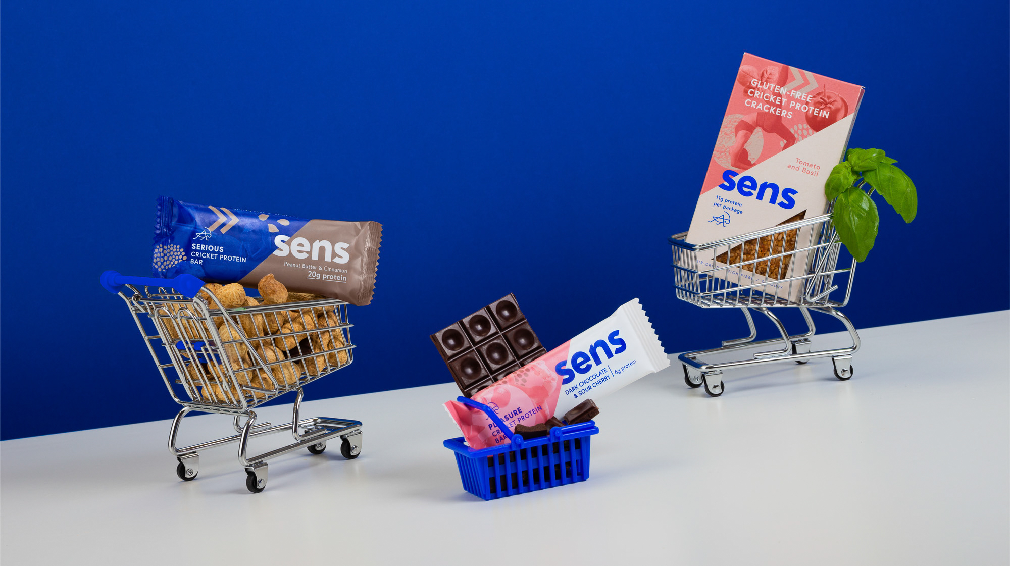
Sens is a company with a mission: to change the way we eat. They hope to teach people that there is a sustainable alternative to conventional protein sources — insects. The challenge of the project was to create a visual identity that is modern and communicates the futuristic ideas of the company, while also building an appealing food brand for regular consumers.
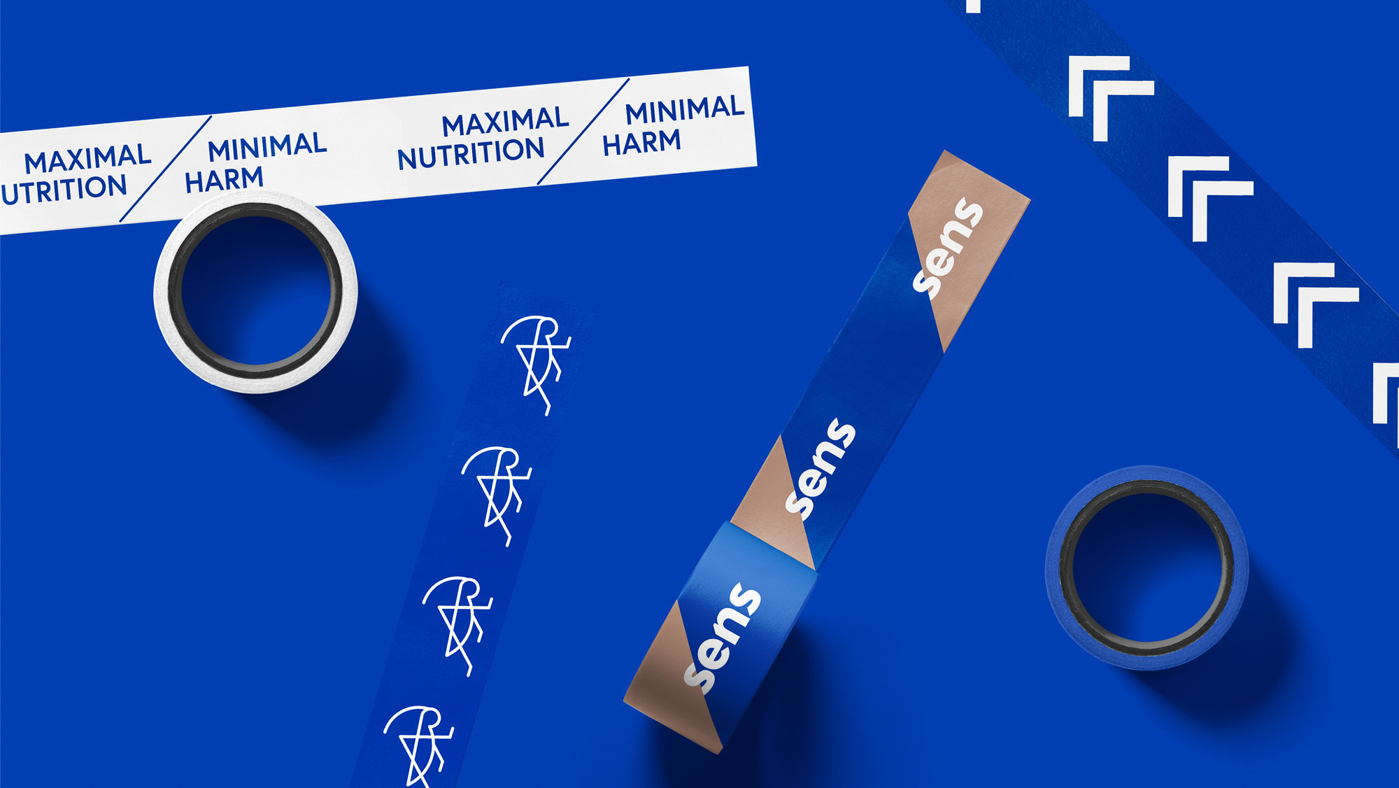
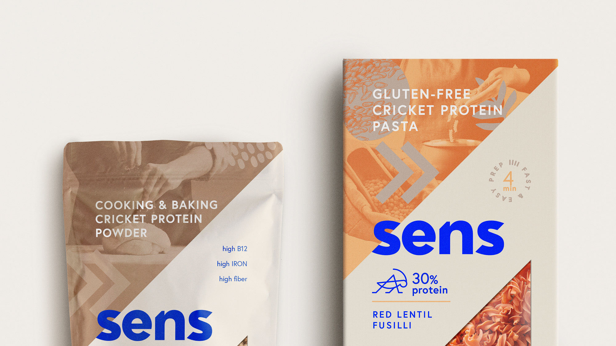
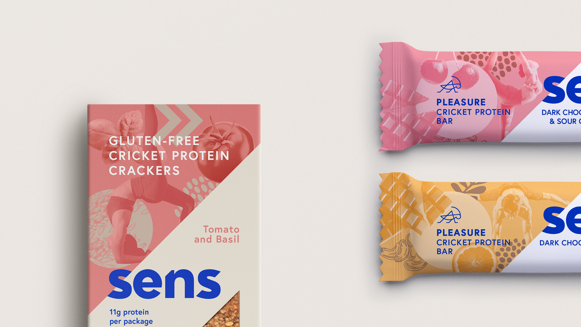
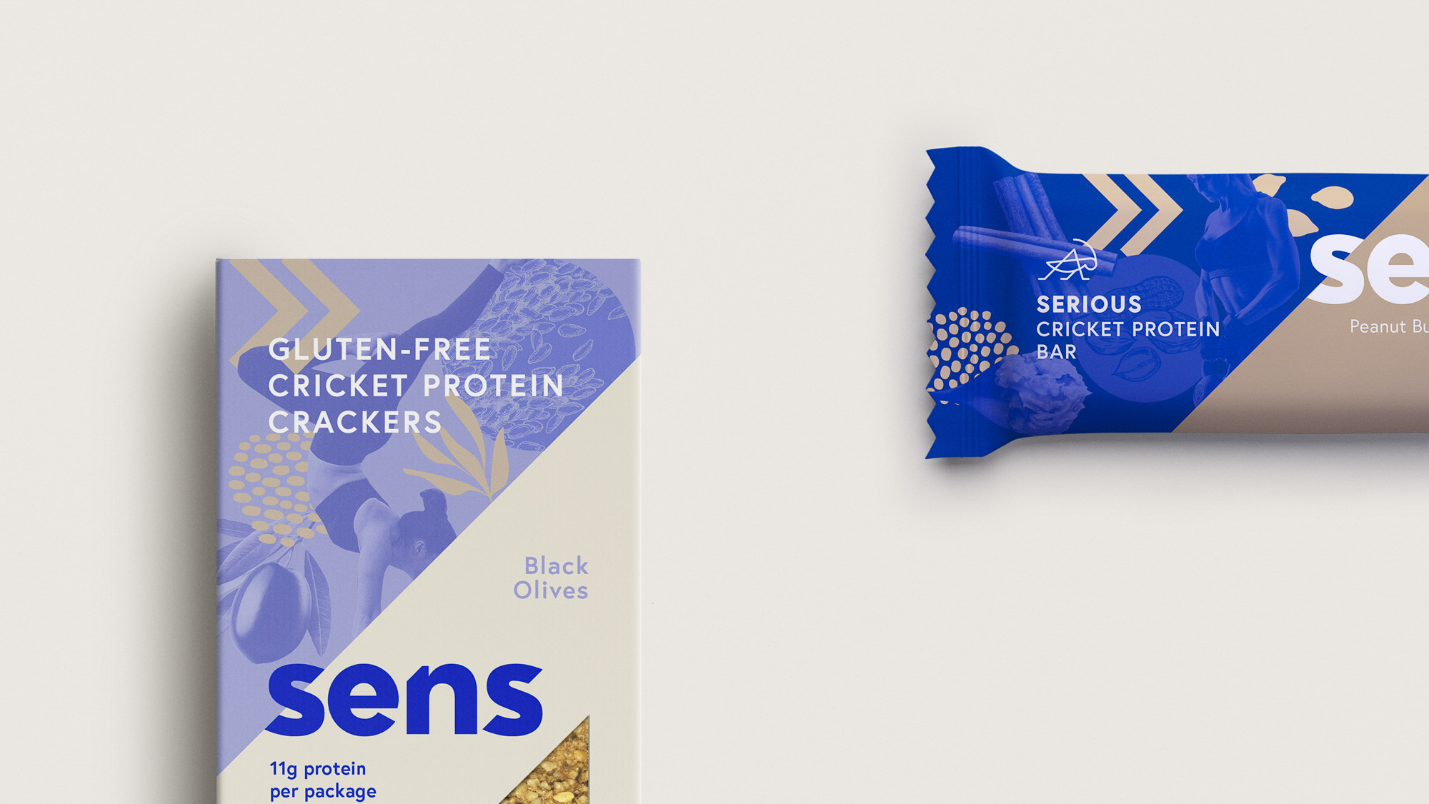
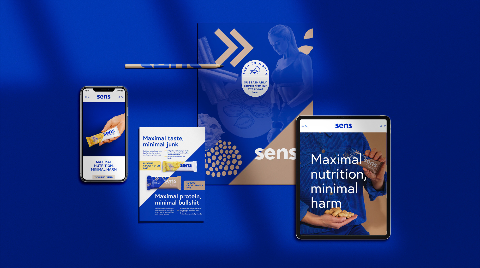
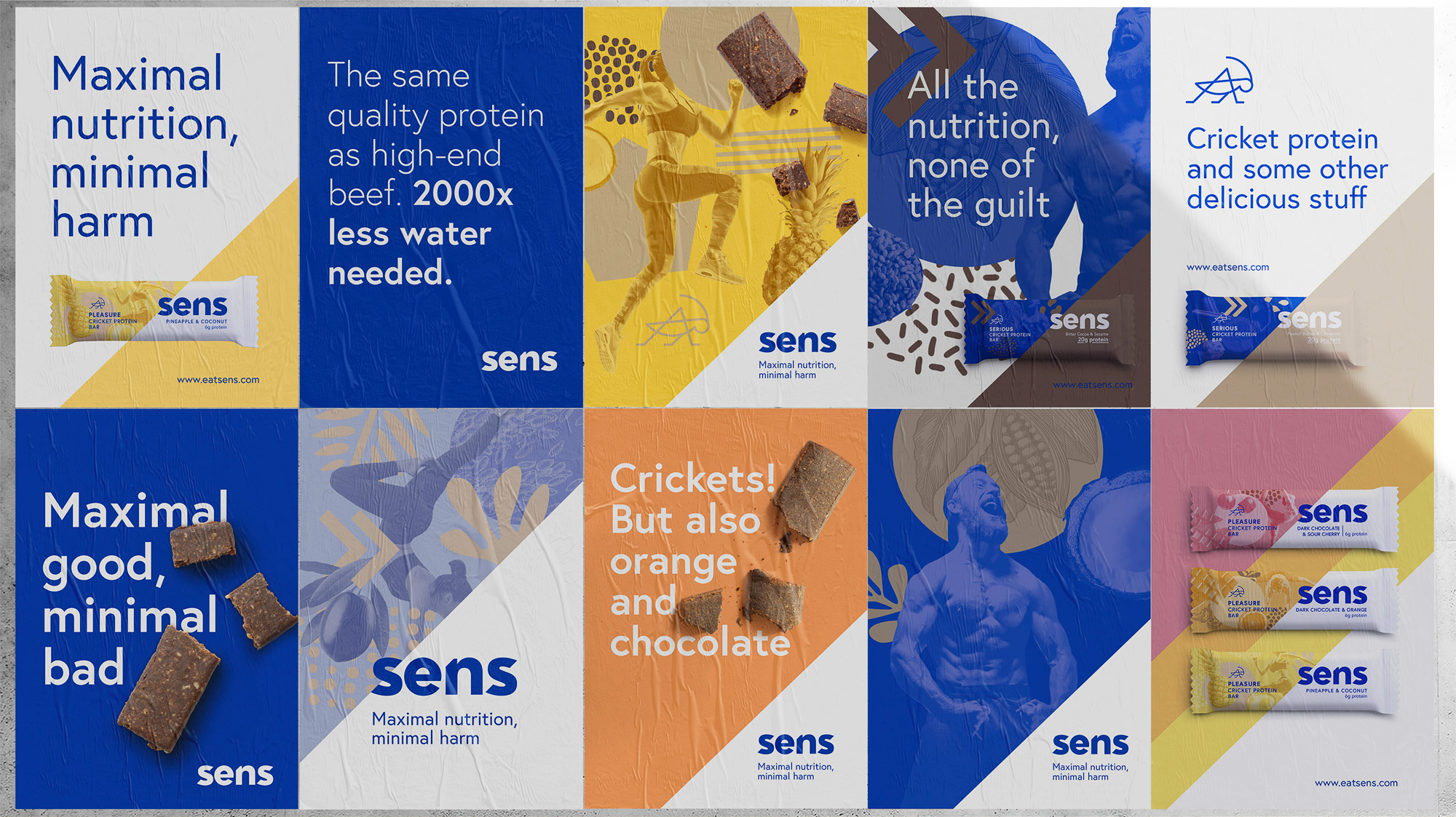
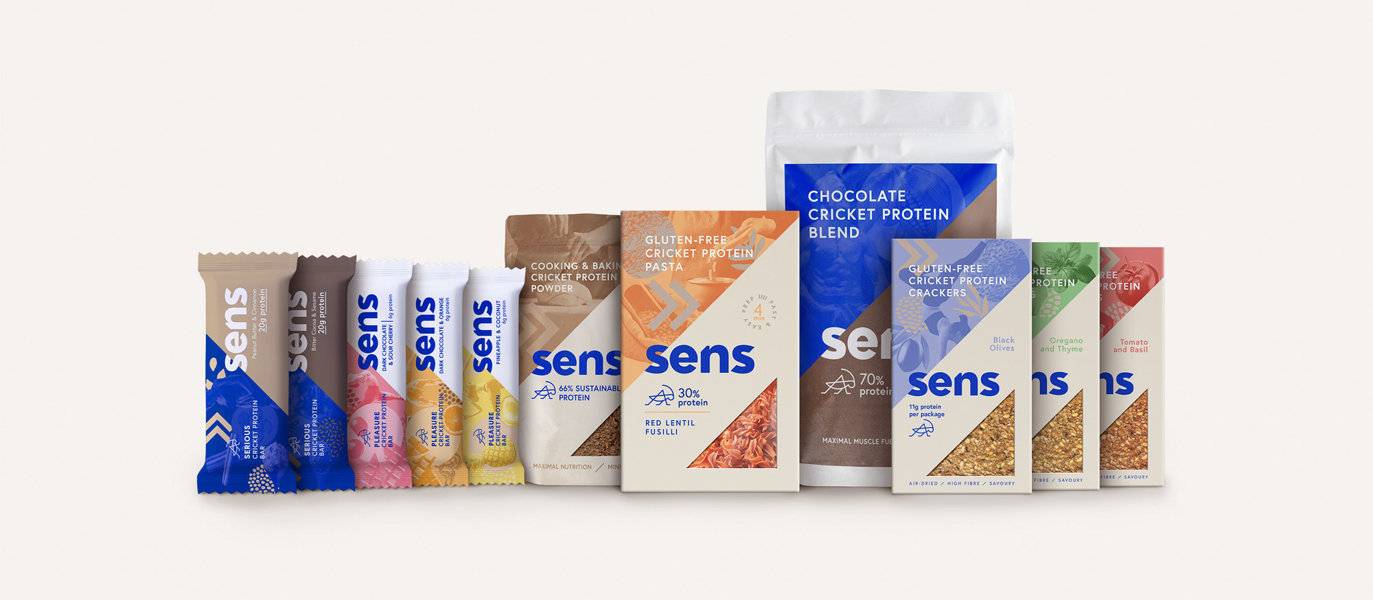
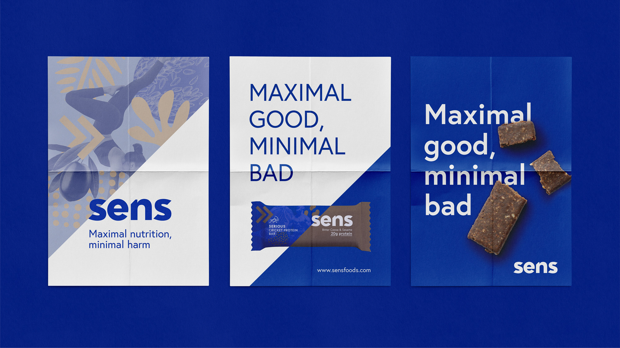
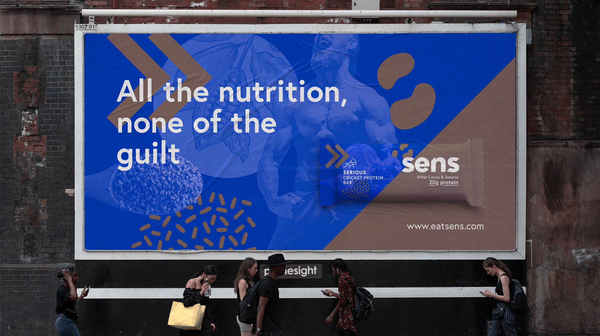
The solution came from the brand’s new claim: maximum nutrition/minimal harm. Starting from this idea, I created a visual identity rooted in contrasts, based on 45-degree angles inspired by the slash symbol. A style of collage was also created in order to bring emotion and taste appeal to the packaging design and brand communication.
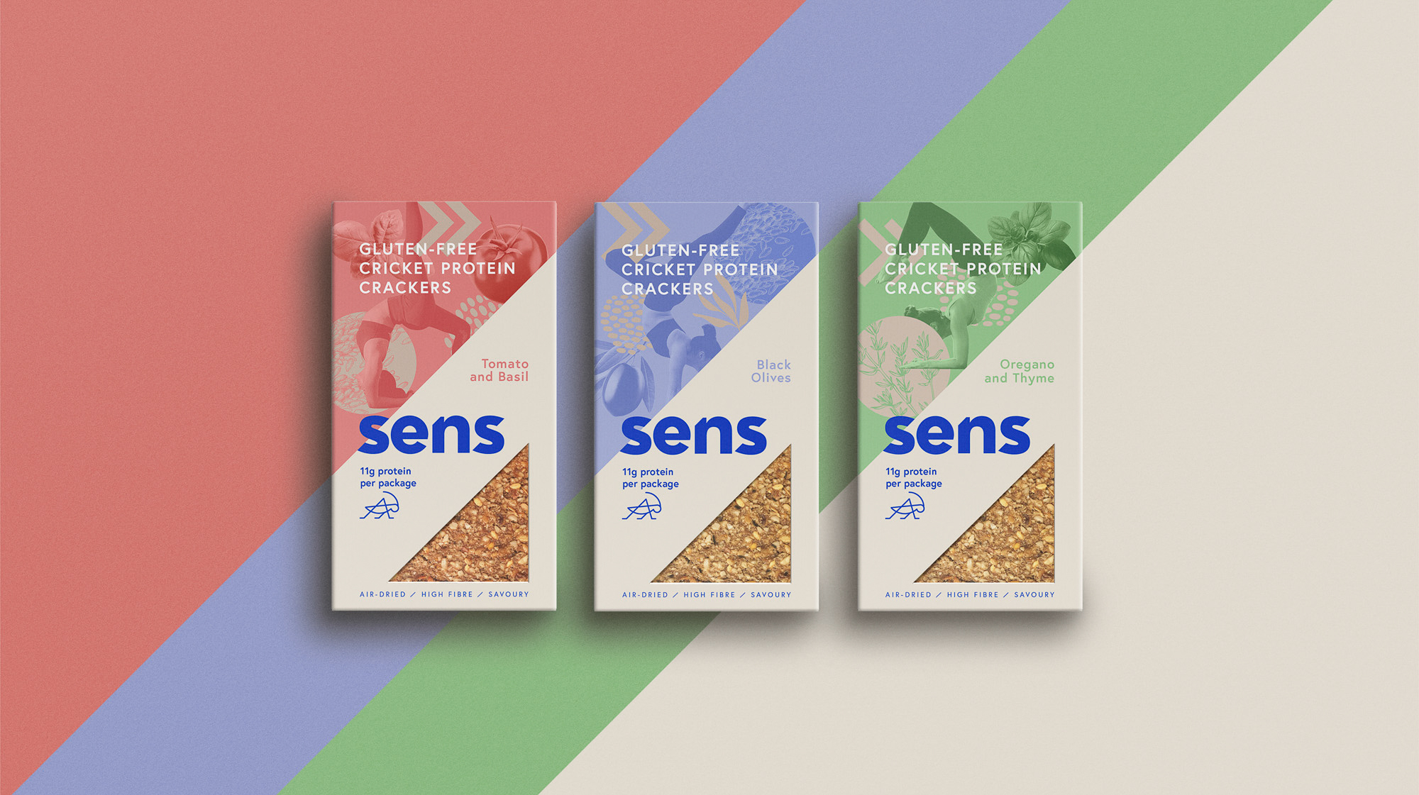
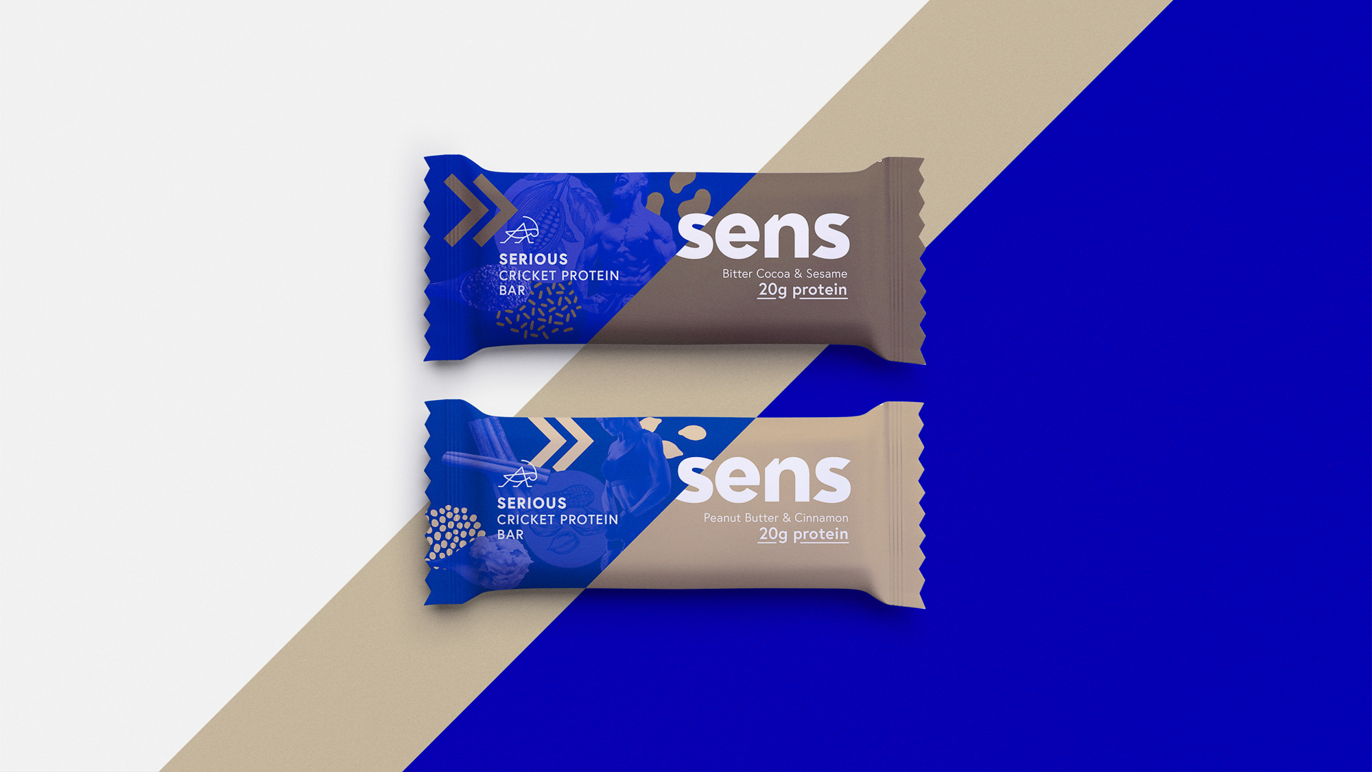
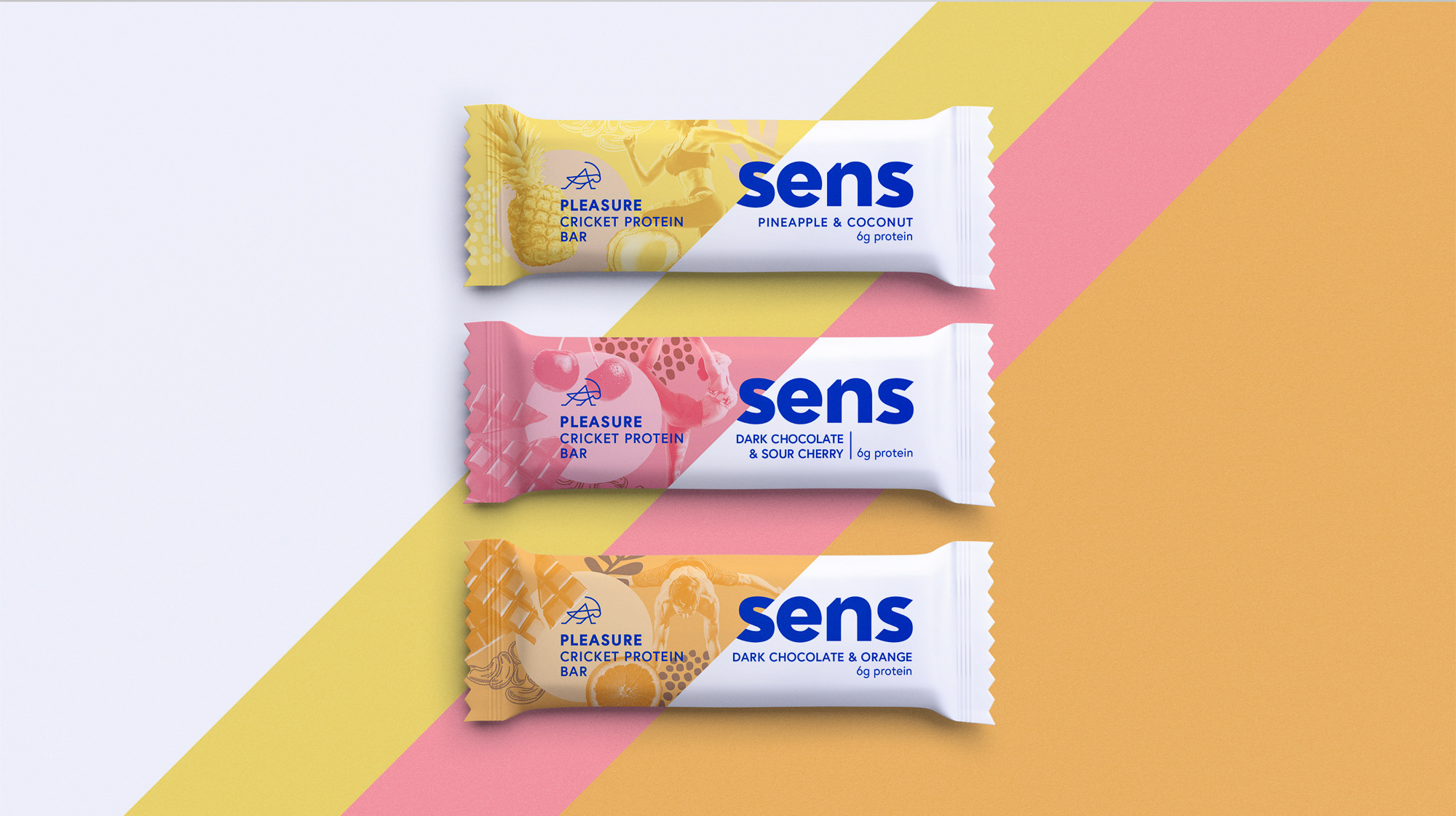
The packaging design part of the project was challenging because of the multiple types of products and the different needs of the portfolio architecture. The resulting packaging design system includes a way of differentiating the high protein content from the low protein content products, as well as a consistent way of creating the collage for each SKU.
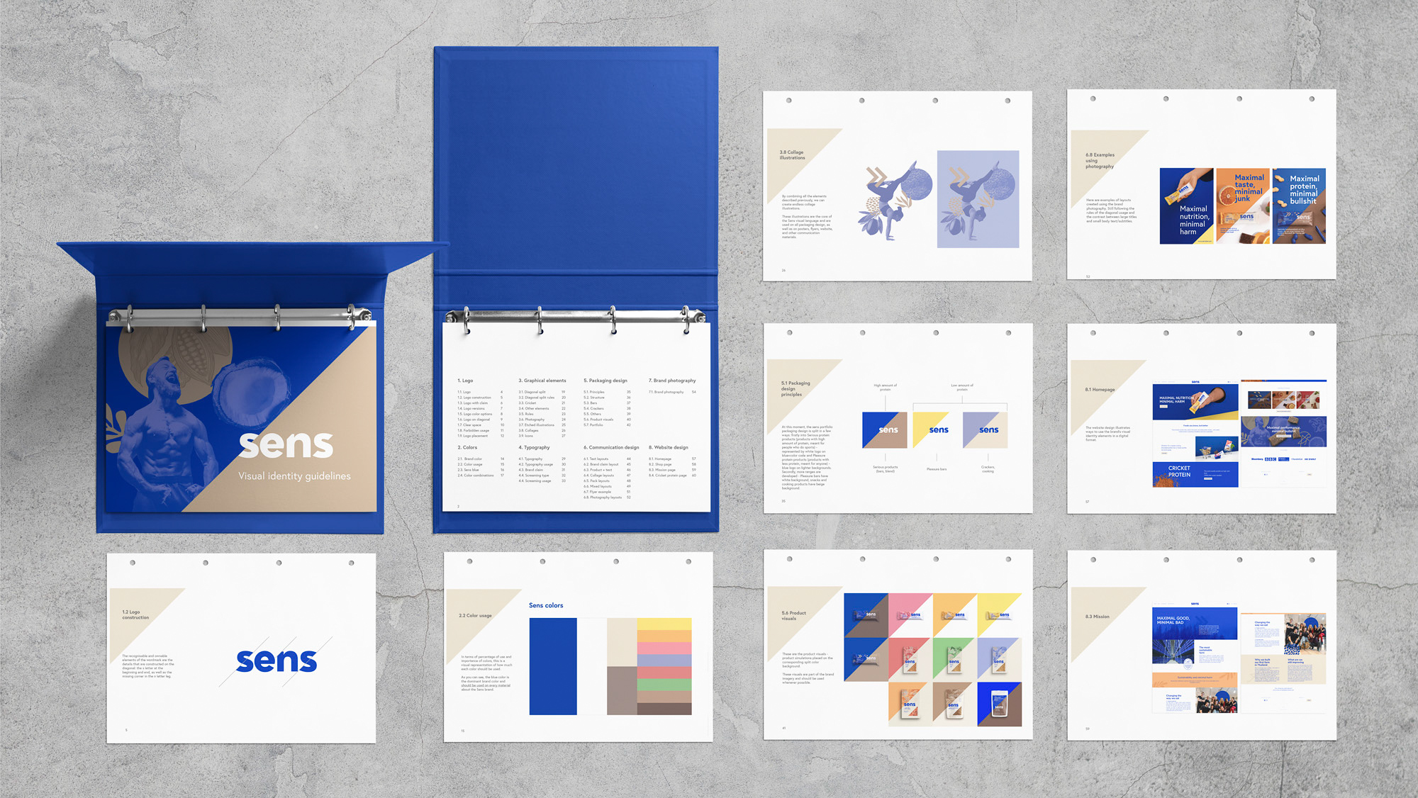
The redesign included visual identity guidelines, packaging design, as well as communication design, web design, and POSM materials.
CREDIT
- Agency/Creative: Andreea Bora
- Article Title: Making Sens of Eating Insects the New Normal Designed by Andreea Bora
- Organisation/Entity: Freelance, Published Commercial Design
- Project Type: Packaging
- Agency/Creative Country: Czech Republic
- Market Region: Europe
- Project Deliverables: Brand Design, Brand Guidelines, Brand Redesign, Graphic Design, Identity System, Illustration, Packaging Design, Photography, Product Architecture, Retail Brand Design
- Format: Box, Flow-Pack, Pouch
- Substrate: Plastic, Pulp Carton


