Project: This project is a special one cause not only did we design it but also helped the client conceptualise it as a part of their expansion strategy.
Makhanawala’s brand had been in the category for more than 8 decades but is seen as a traditional company that offered only makhanas in both retail spaces as well as a supplier to other retail brands in India and abroad. They came to us for a brand repositioning strategy ( that is a separate case study on its own ), so as a part of that strategy, we also presented them with an extensive study of the growing health snacking market and suggested they adopt a newer product strategy as part of repositioning the brand as a more contemporary snacking brand. After a hiatus of 1 long year, the range was materialised and that is how we got this exciting brief.
The Brief: The brand Makhanawala’s was foraying into the new age healthy snacking category, where many brands including new startups were already playing with different offerings. When we sampled the products first, to our delight, they were so flavourful and crunchy, just perfect for any time snacking, the fact that they were made of millets and super grains was just a cherry on the cake. The project thus started on a great mutual trust where we believed in the potential of the product and brand legacy and the brand team trusted us without expertise.
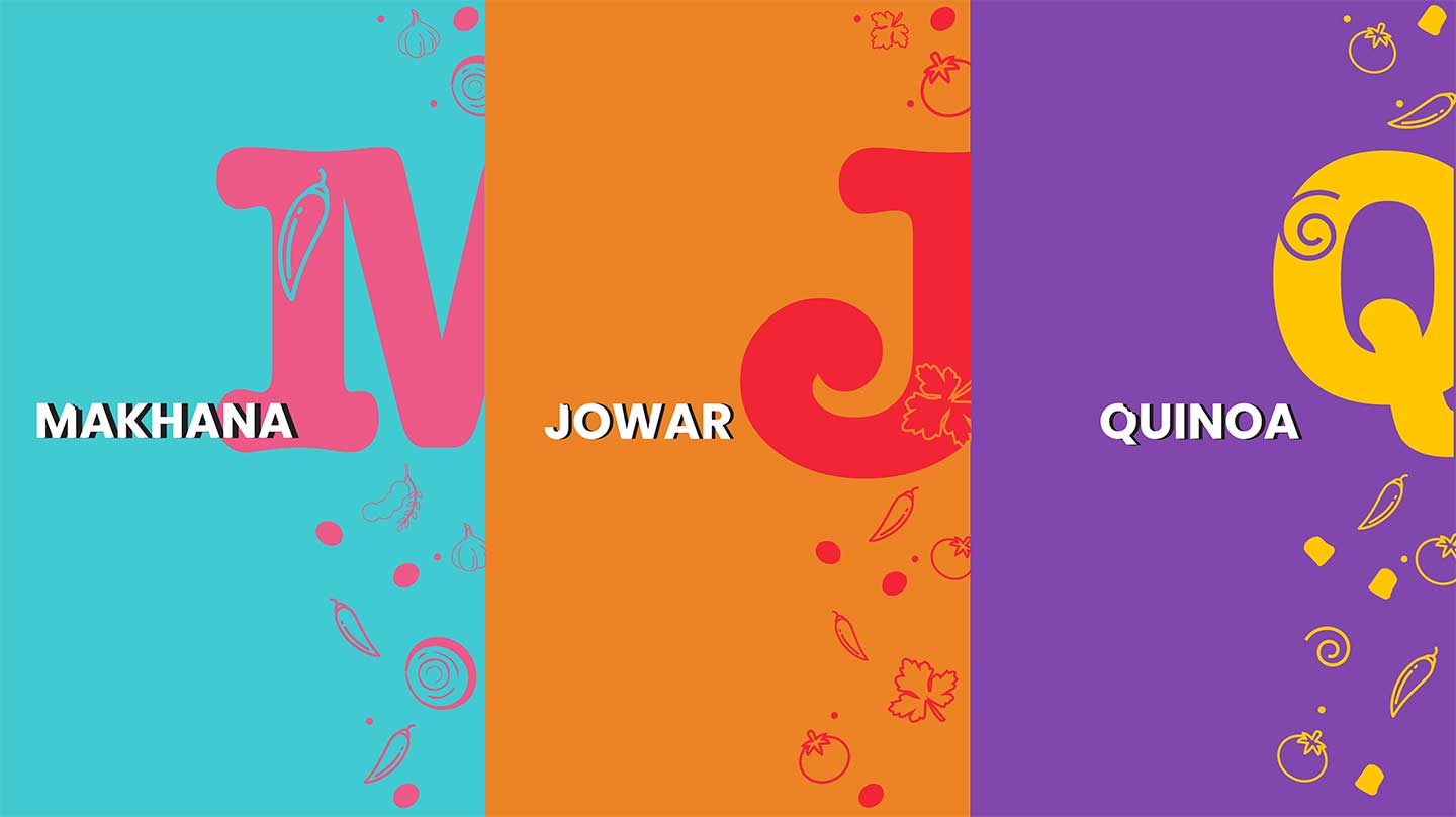
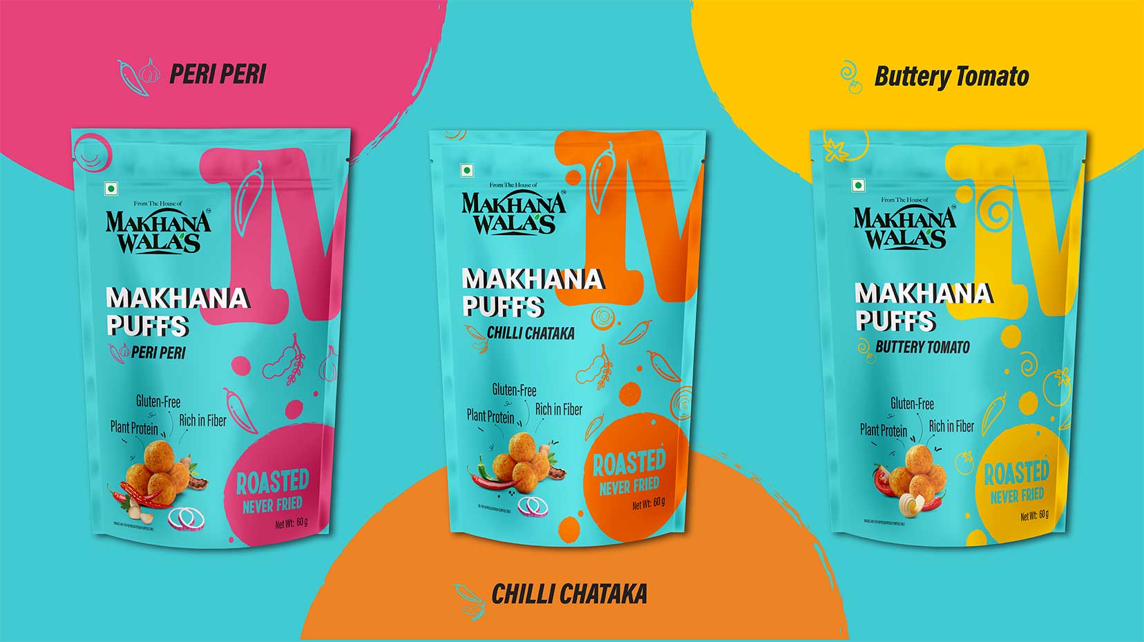
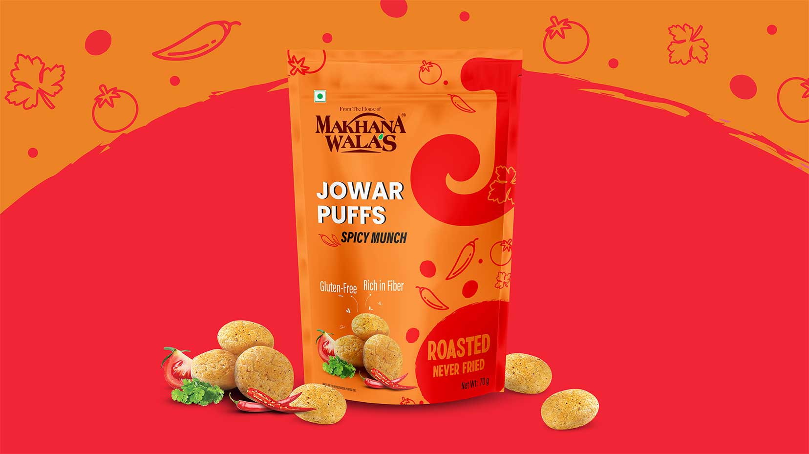
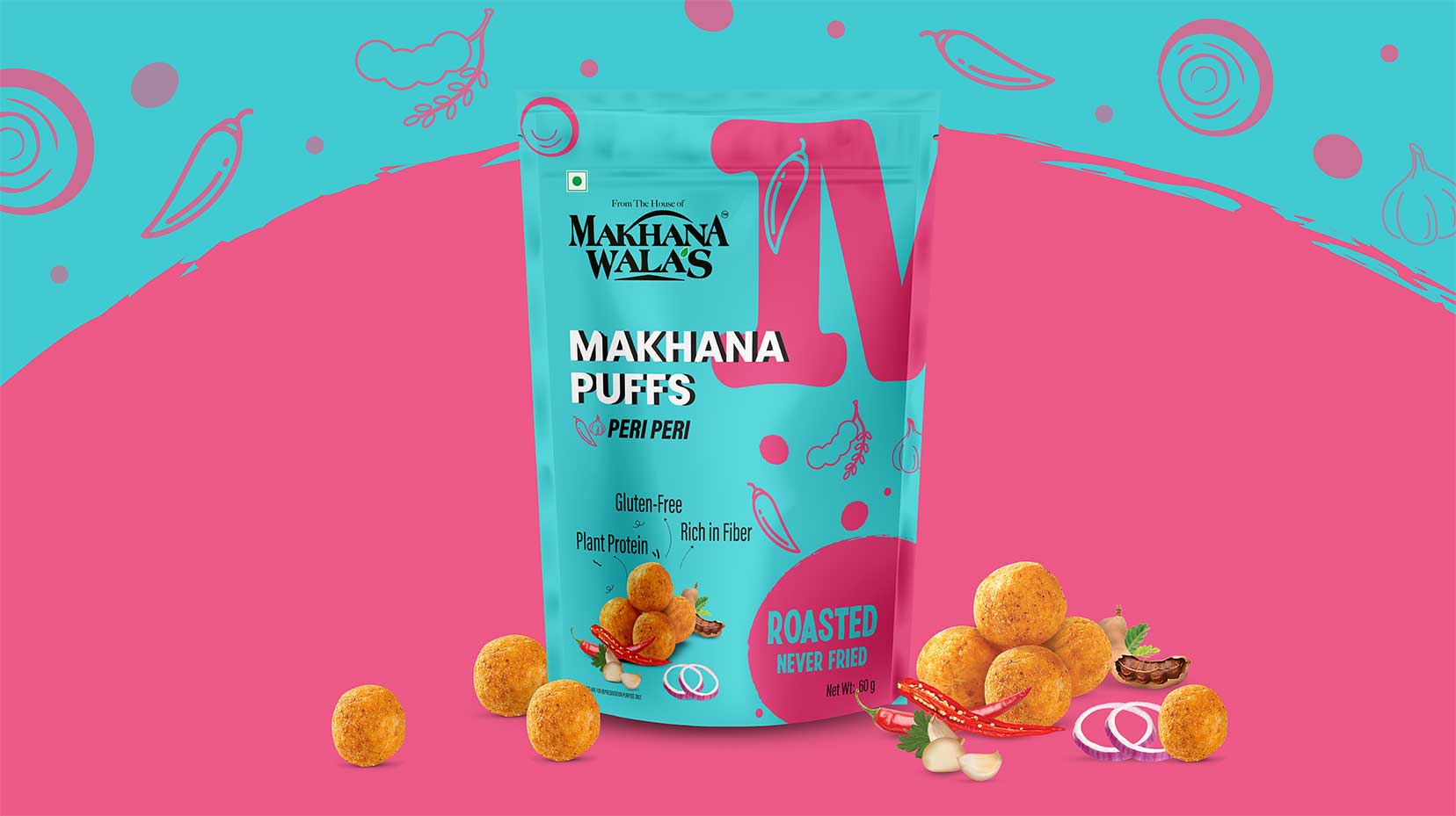
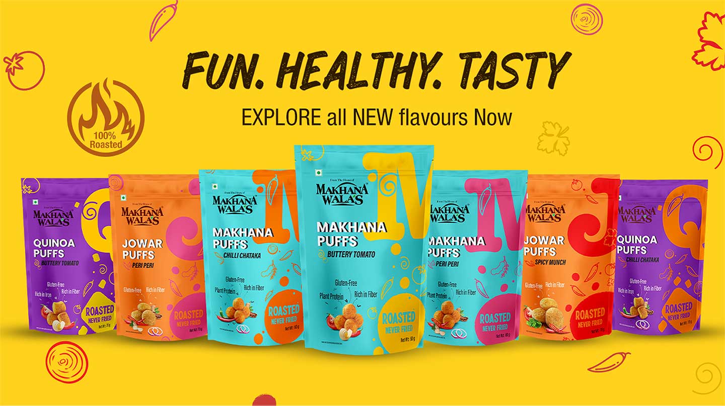
The Approach: Since the hero of the product composition was the grains that they were made from, we proposed to name them loud and bold as a part of differentiating strategy for the brand. Consumers of healthy snacking are conscious of what they choose in all their meals, so making the pack informative yet interesting was being empathetic towards solving their biggest concern in snacking. Another insight we got from the research was that healthy snacks meant boring snacks, also Millet and super grains are associated with boring salads to be boiled and steamed, it was a myth that we had to break. We knew the product is a cracker in the category so we decided to make the packaging no less. Contrary to the earthy, bland hues we developed a POP Color palette for the different grains and the flavor combo. We chose to keep slightly rough, unfinished textures to the graphics to bring out the crunchy texture of the product.
CREDIT
- Agency/Creative: TCT Branding
- Article Title: Makhanawalas Multigrain Healthy Snack Packaging Design
- Organisation/Entity: Agency
- Project Type: Packaging
- Project Status: Published
- Agency/Creative Country: India
- Agency/Creative City: Mumbai
- Market Region: Asia
- Project Deliverables: Packaging Design
- Format: Flow-Pack
- Industry: Food/Beverage
- Keywords: Health Snacks, Millet Puffs
-
Credits:
Creative Director: Deepti Kshirsagar


