When MakerX approached us, they brought with them an inspiring challenge: update their logo and overall brand identity to better reflect who they are—a company of “makers” and “builders” shaping industries and crafting the future. Known for turning bold ideas into scalable ventures, MakerX is deeply rooted in innovation and strategy, with a team that thrives at the intersection of research, technology, and business.
As an agency, we were tasked with delivering three distinct concepts that embodied MakerX’s essence. This particular direction was one of those three—though it didn’t make the cut as the final choice, it holds a special place in our hearts.
In exploring the visual identity for MakerX, we wanted to dive deep into what makes them unique—”makers” and “builders” who thrive on turning raw ideas into groundbreaking ventures. We started by studying their processes, their DNA, and the industries they aim to disrupt. This wasn’t just about creating a logo; it was about designing a system that embodies their ethos of precision, adaptability, and fearless exploration.
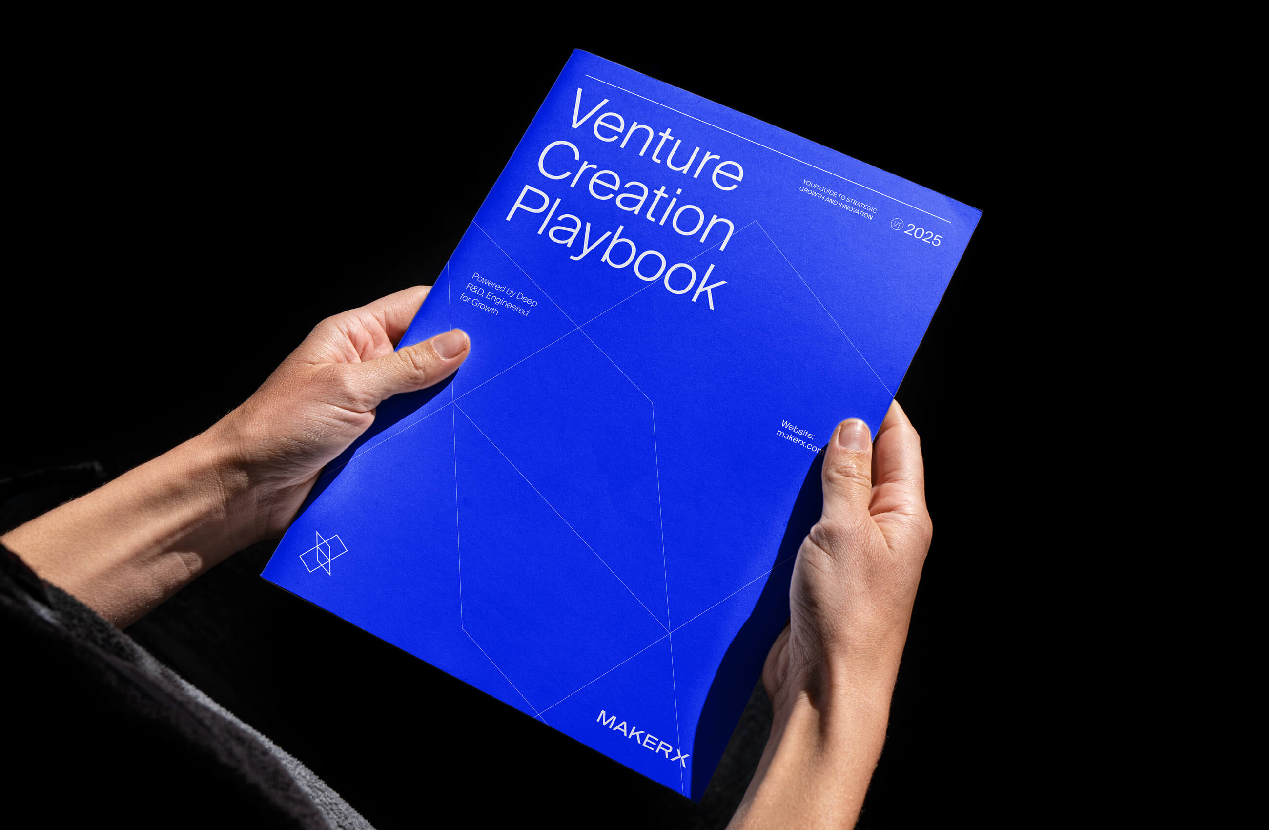
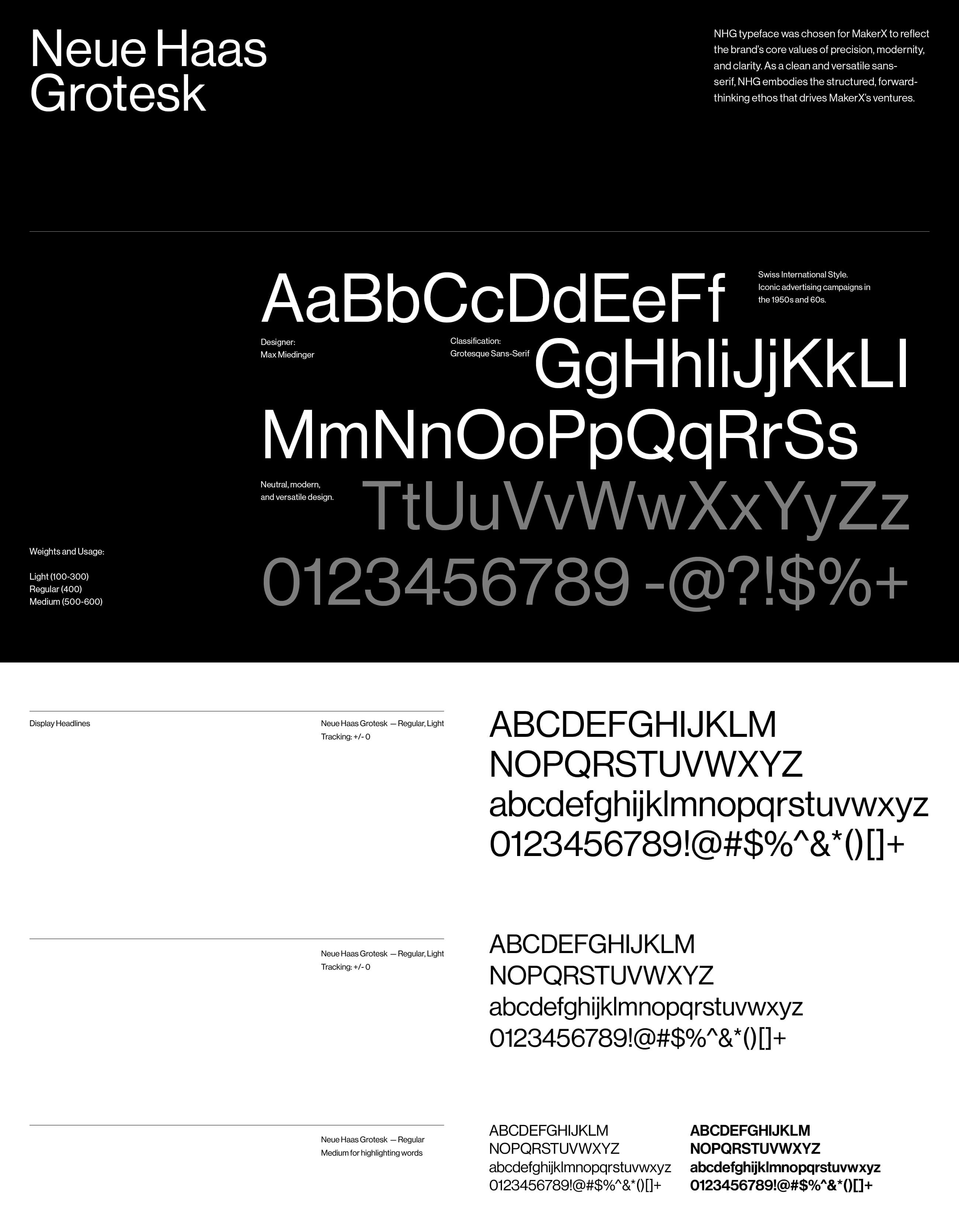
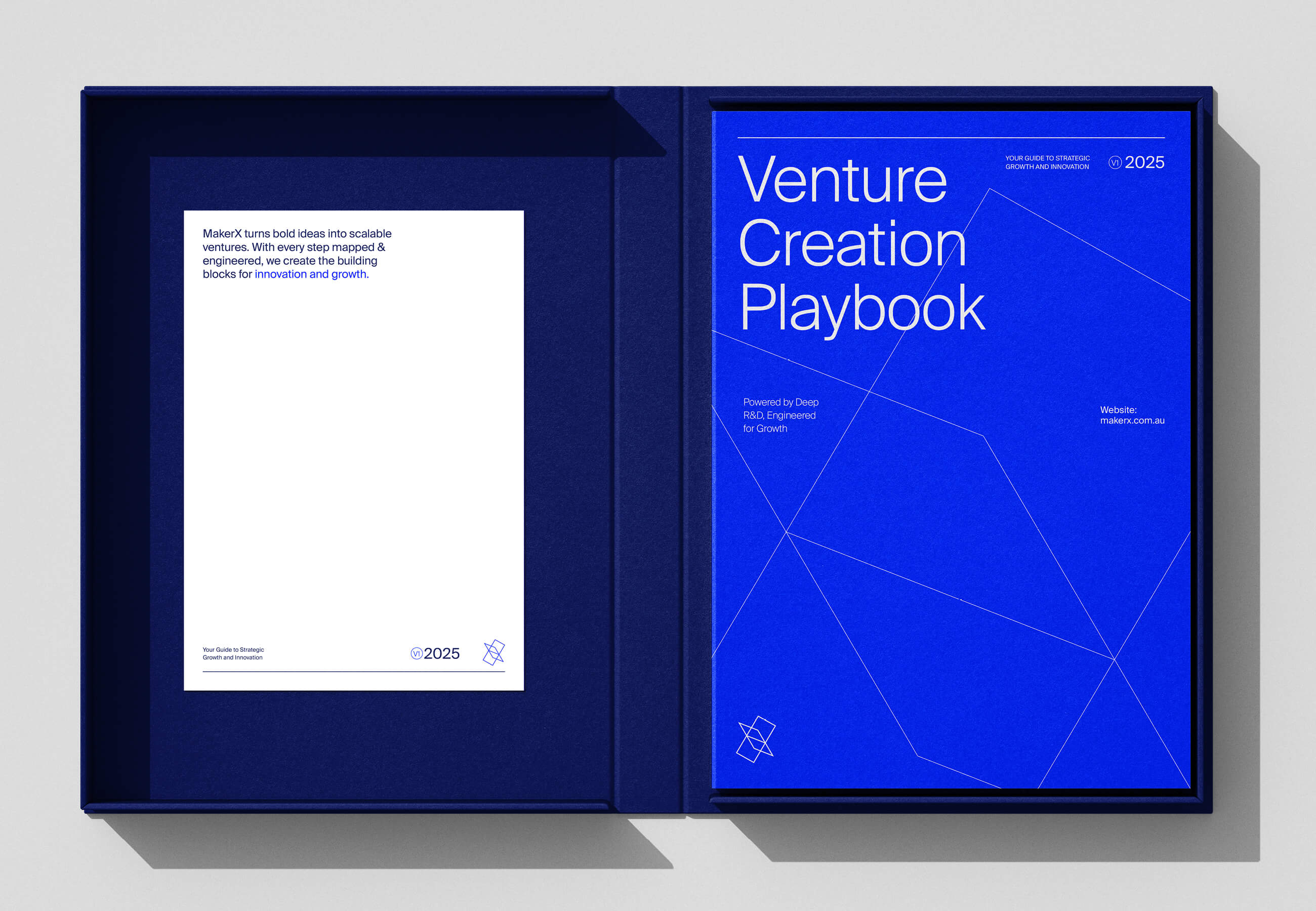
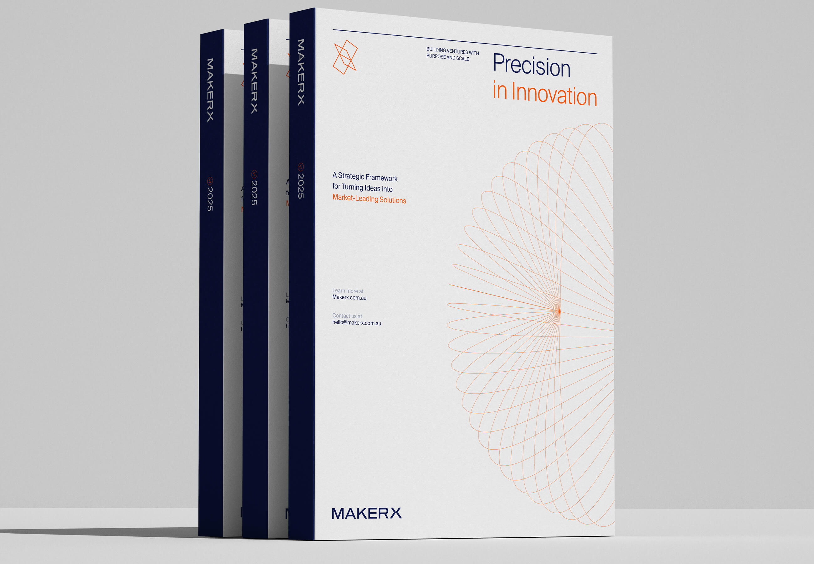
The concept began with the foundation of all creation: the blueprint. Blueprints are where structure meets vision, where ideas take their first tangible form. They became the core inspiration for this concept, informing the geometric patterns, structural alignments, and modern minimalism seen throughout the system. We leaned into clean lines and industrial aesthetics to highlight the maker spirit, while embracing flexibility in the design to mirror the adaptability at the heart of MakerX.
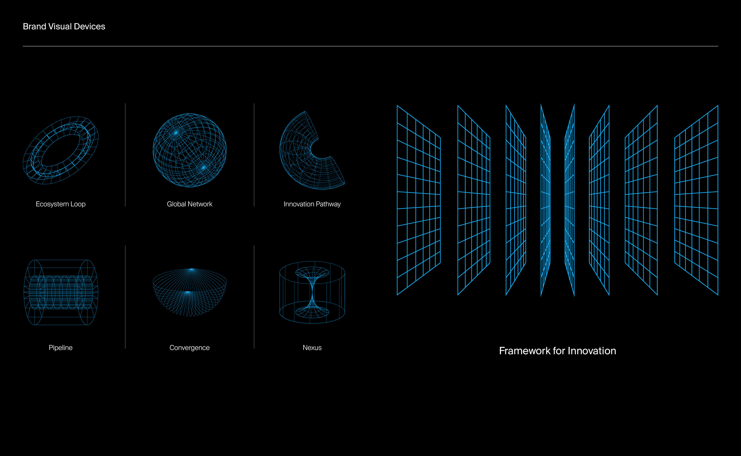
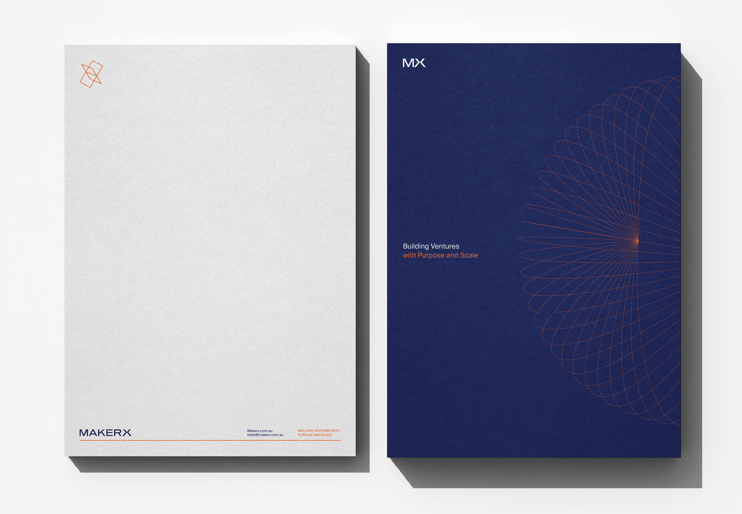
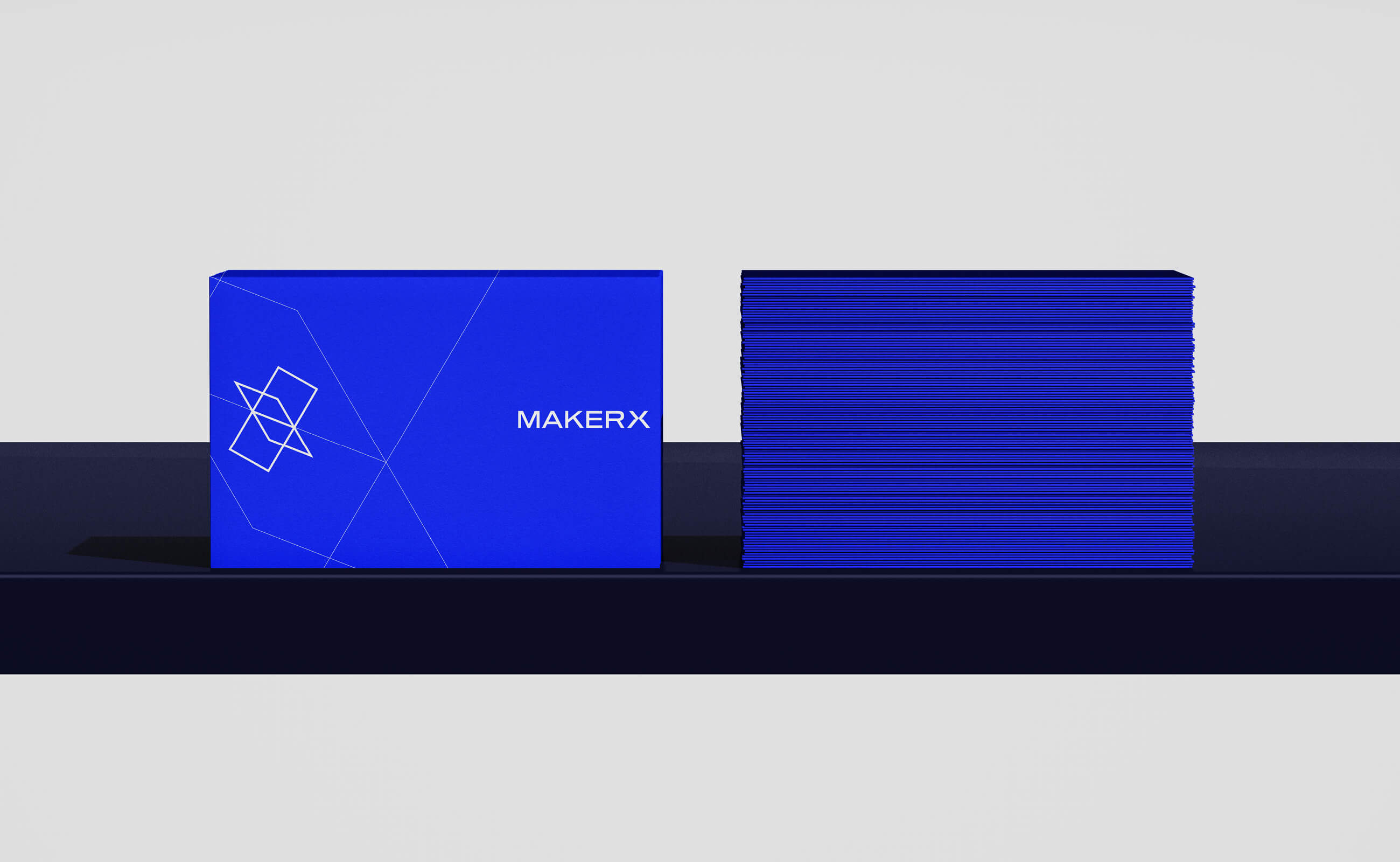
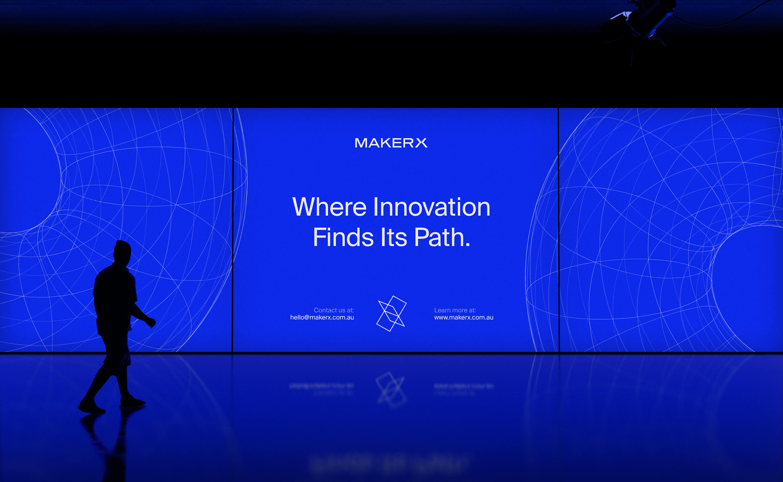
The logo itself represents a harmonious intersection of form and function. The interlocking shapes evoke a sense of precision and connectivity, nodding to the collaborative, multi-disciplinary approach that MakerX brings to every venture. The supporting visual elements—like the grid systems and bold use of color—were carefully crafted to give the identity a sense of balance, dynamism, and structure, all while leaving space for creativity to shine.
While this concept didn’t make its way to the final selection, it served as a valuable exploration into the core of MakerX’s brand. Each iteration brought us closer to uncovering what makes their identity resonate—proof that even in concepts that don’t make the final cut, there’s meaning, craft, and growth.


CREDIT
- Agency/Creative: Numinous Agency
- Article Title: MakerX: Reimagining the Identity of Innovators by Numinous Agency
- Organisation/Entity: Agency
- Project Type: Identity
- Project Status: Published
- Agency/Creative Country: United States
- Agency/Creative City: CASCO
- Market Region: North America
- Project Deliverables: Brand Design, Brand Guidelines, Brand Identity, Identity System, Logo Design
- Industry: Technology
- Keywords: Venture, R&D, Branding, Identity design, Logo
-
Credits:
Creative Director/Founder: Geovanie Radcliffe


