Maitá is a cosmetics line that believes in conscious consumption and on the impact that good actions have in society. In this project, we worked on all aspects of the brand: Naming, concept, logo, visual identity and packaging. The main idea was to transmit the purpose of the company, bringing a true and human brand to the market, that symbolizes both the individual and their collaboration in collective society.
While building the name we searched for something feminine and strong. We wanted to assure that this would be a brand with personality, that had body, mind, heart and soul, generating thus a more personal relationship with the public. Maitá is natural, it is everything that surrounds brazilian biodiversity and its ecological richness. A suitable name, a friend to Mother Earth.
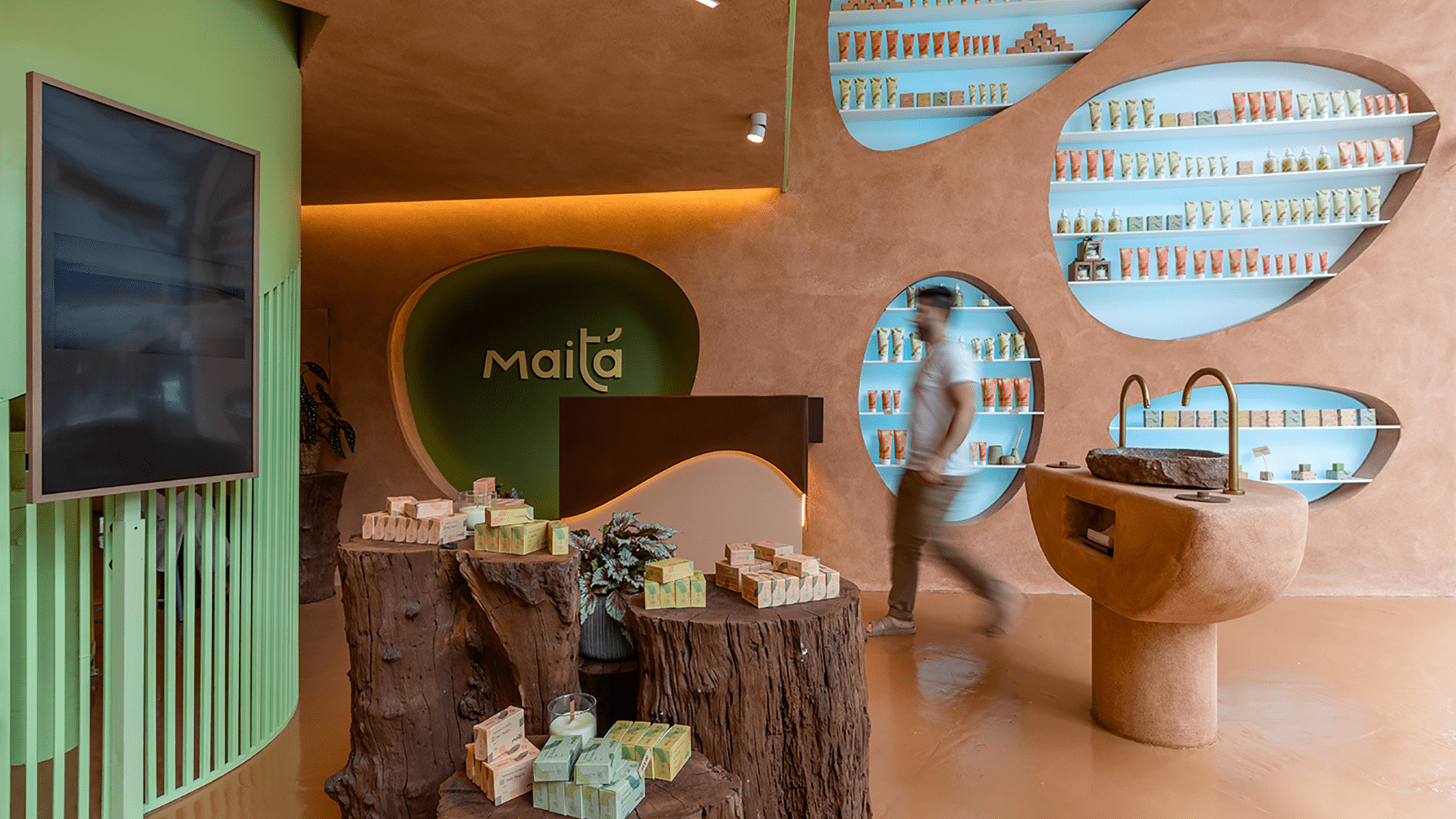
We were inspired by the expressions and features of the human face into creating a series of shapes and curved lines that are present on the brand and in all of the visual identity. The typography of the logo carries the base shape, a quarter circle. From it, the main lines appeared and from there, they evolved into textures, symbols and shapes.
Nature, people and source materials were the inspiration for the color tones that surround the brand. An eclectic and versatile palette, inspired by the individuality of all beings.
The chosen fonts aimed to balance out the visual identity. Trispace: modern, variable, and spacious, helps to wrap the design with style. Lora: human, trusty, friendly, shows the respectful tone of the brand.
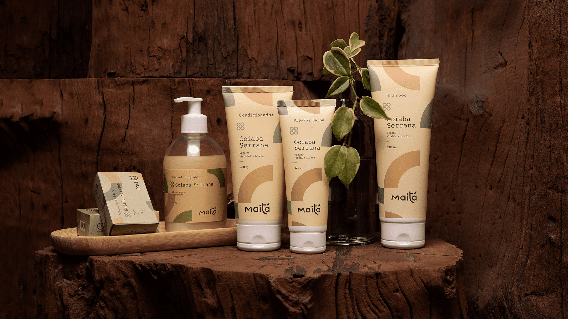
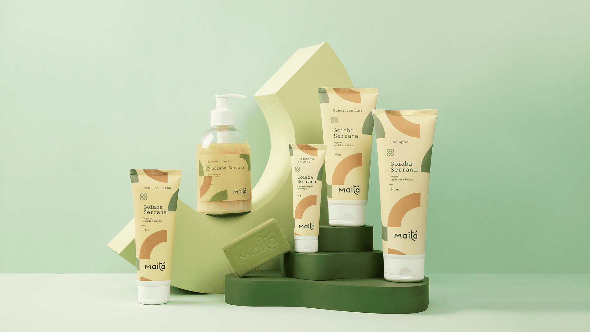
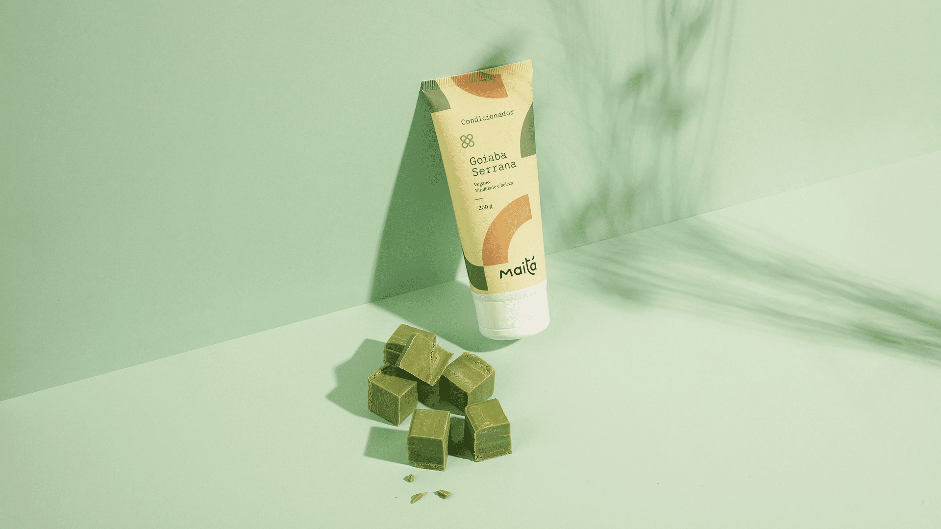
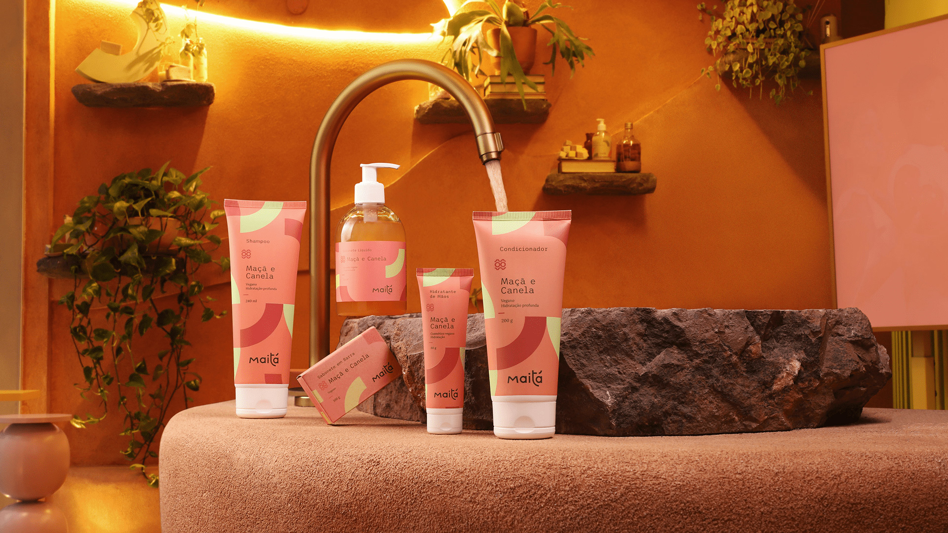
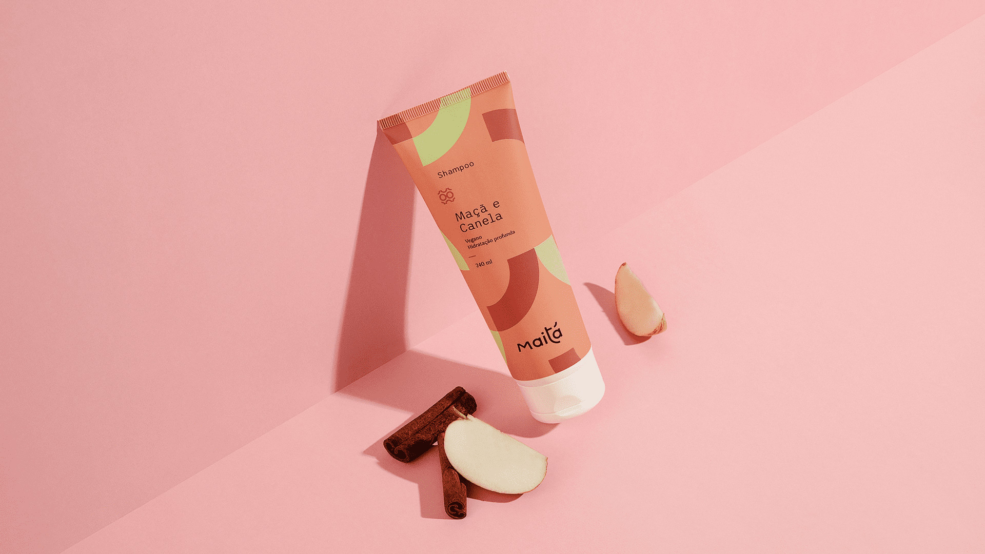
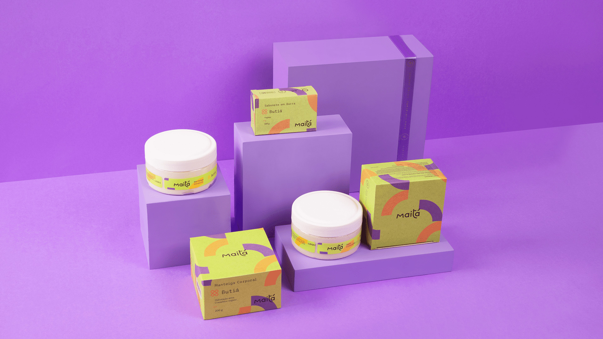
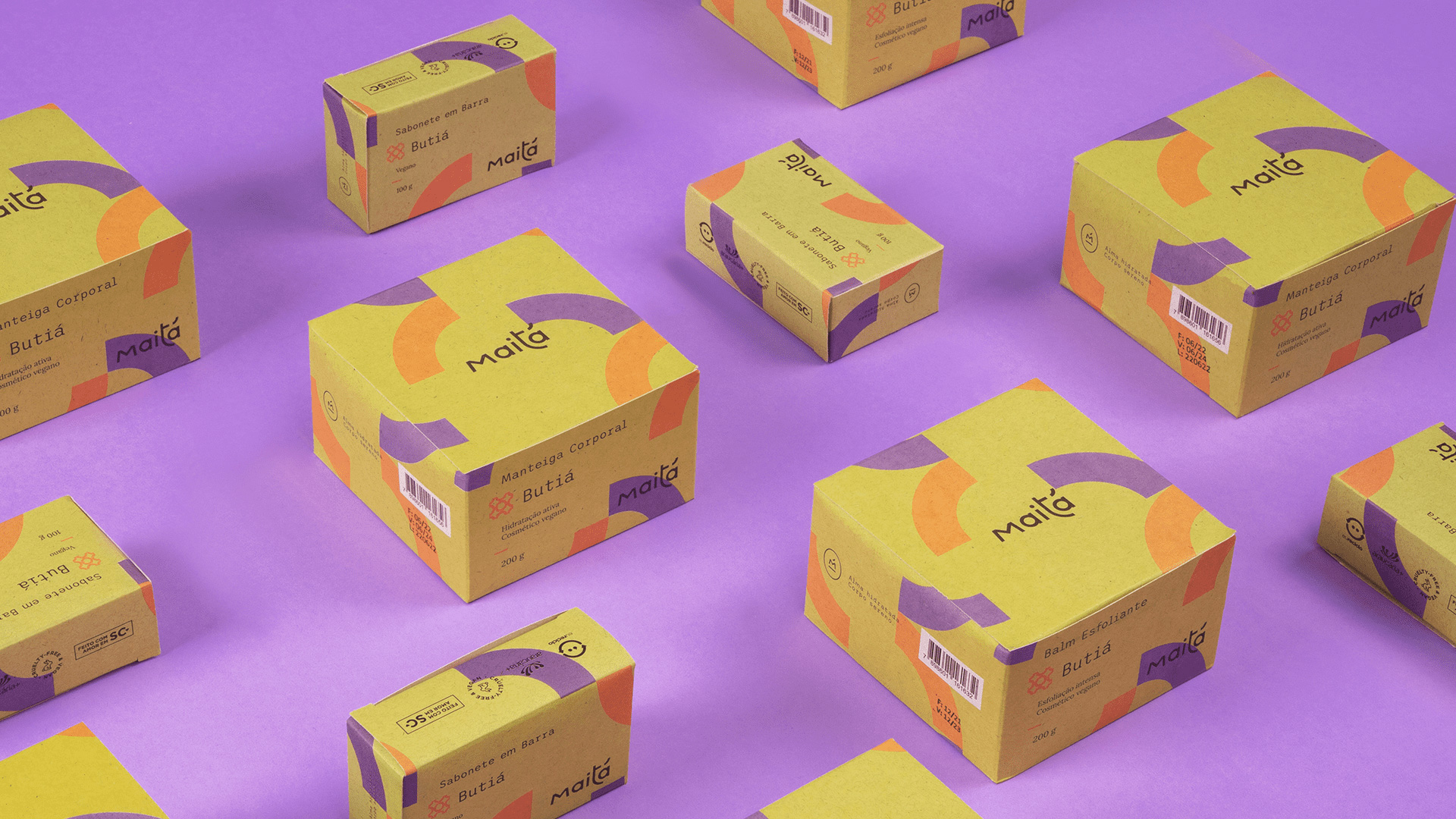
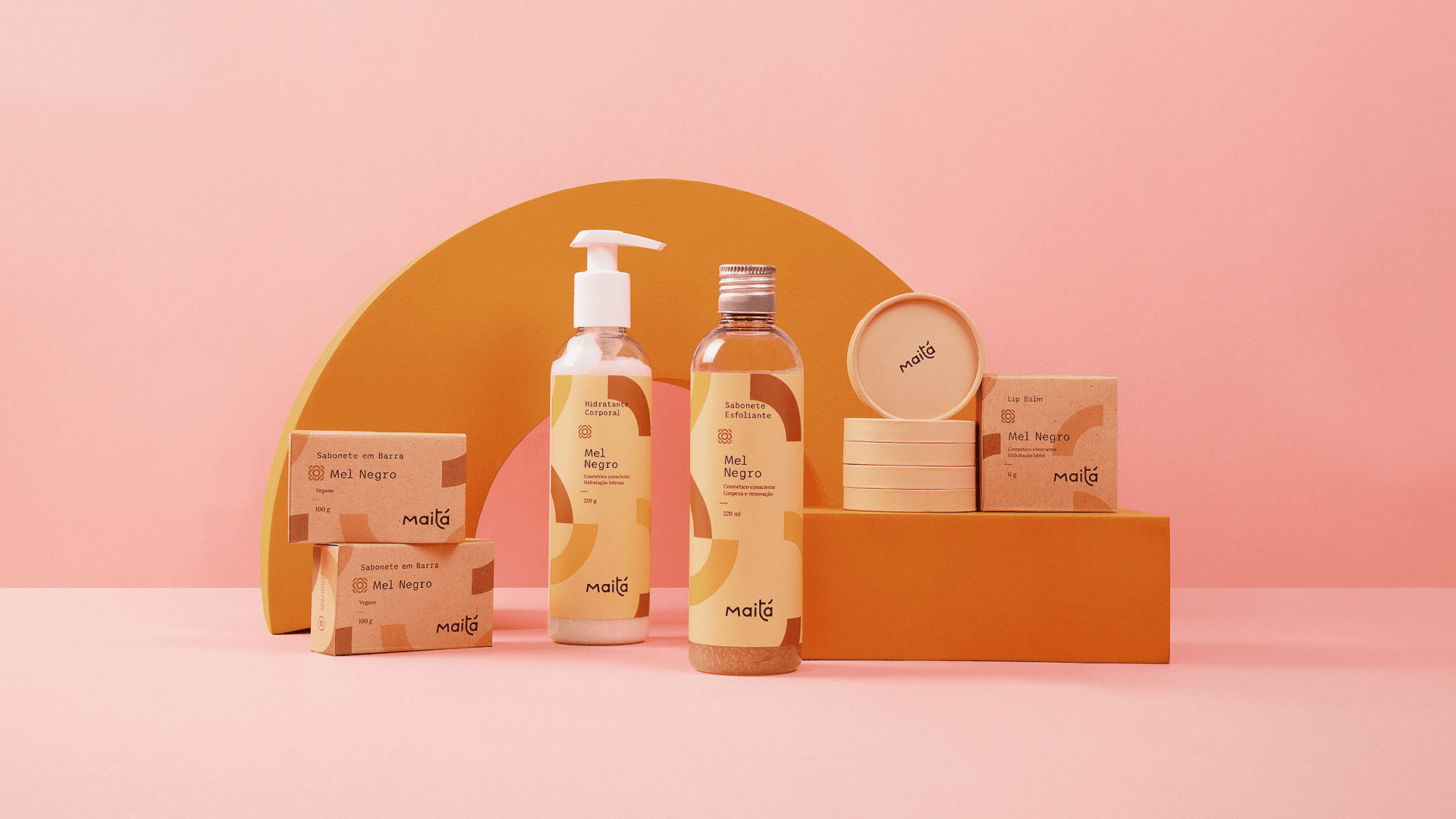
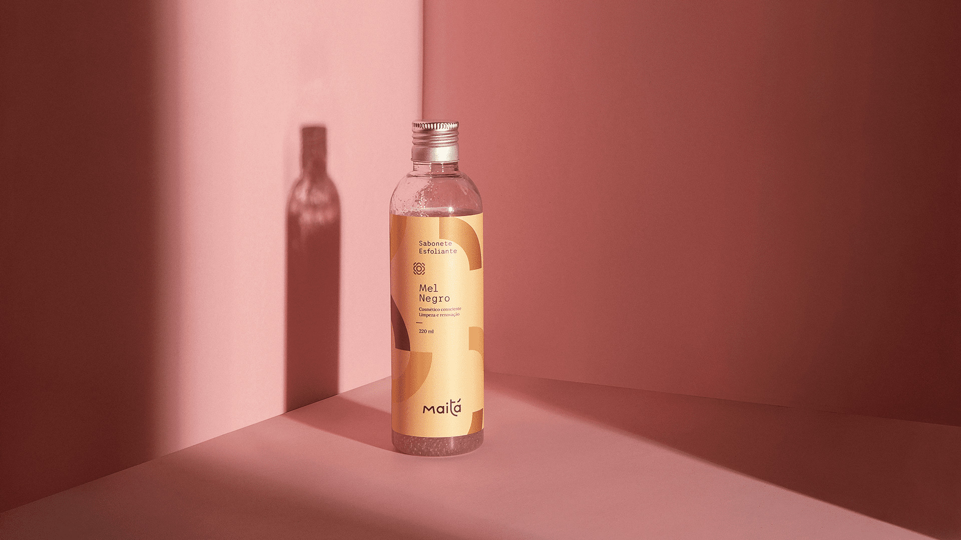
For the packaging, we created a unique texture that represents the power of expansion and possibility of applications, where a fragment multiplies and generates a group of elements in the most diverse angles, transmitting the idea that the brand is the main character at all times. The colors, inspired by the source materials of each product, help the visual and sensory recognition.
The display of information was planned using a hierarchy for diagramming, transmitting the message in a clear and objective manner. These choices were fundamental to highlight and distinguish the brand from its competitors and display the concepts of community and plurality of the company.
Maitá brings the brazilian biome and the natural processes of production in its essence. A brand that is aware of the world in which it is inserted in and of the impact that it causes on it. A brand made with love, that develops cosmetics through a partnership with nature and with regional brazilian manufacturers, transmitting the knowledge it acquires to its customers through products that are real and for everyone.
CREDIT
- Agency/Creative: Feitoria
- Article Title: Maitá Cosméticos by Feitoria
- Organisation/Entity: Agency
- Project Type: Graphic
- Project Status: Published
- Agency/Creative Country: Brazil
- Agency/Creative City: Balneário Camboriú
- Market Region: South America
- Project Deliverables: Brand Design, Brand Guidelines, Branding, Creative Direction, Graphic Design, Packaging Design
- Industry: Manufacturing
- Keywords: #cosmetics #skincare #haircare #packaging #skin #hair #nature #vegan #cosmetic
-
Credits:
Customer service:: Alex Reuter
Creative direction:: Alex Reuter
Creative direction:: Guilherme Rosa
Creative Direction: Juliano Jover
Naming:: Karine Bono
Architecture:: Vanessa Larru00e9
Photography:: Andru00e9 Vandelo
Implementation:: Amanda Brandu00e3o


