


Maison Marmalade is a premium wine brand identity concept designed to celebrate the richness of French winemaking heritage while embracing a refined, contemporary design sensibility. Rooted in tradition yet elevated through modern aesthetics, the brand represents a harmonious balance between craftsmanship, sophistication, and indulgence. Conceived as a complete brand identity and packaging system, Maison Marmalade explores how thoughtful design can transform a bottle of wine into an immersive luxury experience.
The project was envisioned as a high-end wine label based in Bordeaux, France, targeting discerning consumers who value artistry, heritage, and refined taste. The aim was not merely to design a logo or a label, but to create a comprehensive visual world that reflects the depth, emotion, and culture associated with premium winemaking. Every detail was carefully considered to evoke elegance, authenticity, and timeless appeal, allowing the brand to sit confidently among boutique vineyards and luxury wine houses on a global stage.
At its core, Maison Marmalade is inspired by the poetic relationship between nature, craftsmanship, and indulgence. The brand narrative draws from the idea of transforming fine fruits into exceptional wines through patience, expertise, and reverence for terroir. Rather than relying heavily on traditional vineyard imagery or rustic symbolism, the identity explores a more refined expression of luxury, where subtlety, restraint, and balance define the visual language. This approach allows the brand to feel modern and international while remaining deeply connected to French viticultural heritage.
The strategic foundation of Maison Marmalade is built around a premium positioning that prioritizes emotional resonance and aesthetic refinement. The brand is aimed at collectors, wine enthusiasts, fine-dining patrons, and luxury lifestyle consumers who seek experiences rather than commodities. It speaks to individuals who appreciate craftsmanship, cultural depth, and understated opulence. The visual identity reflects these values through an elegant and confident tone, avoiding excessive ornamentation in favor of precise execution and timeless design.
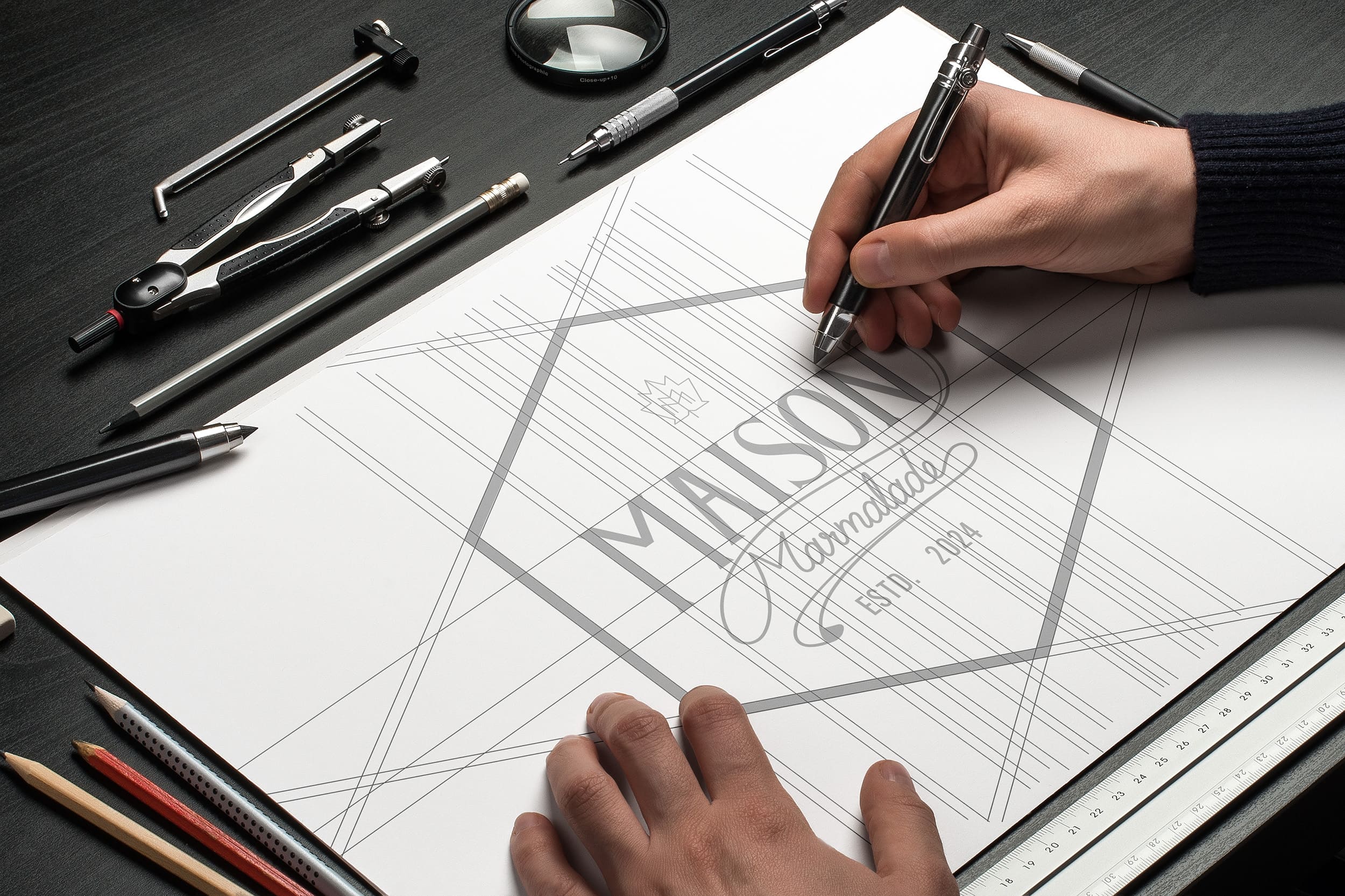
The design objective was to craft a cohesive identity system that balances heritage and modernity without compromise. The challenge lay in expressing traditional winemaking values in a way that feels relevant to contemporary audiences. The brand needed to communicate authenticity without appearing dated, luxury without excess, and sophistication without rigidity. This required a restrained design approach rooted in strong conceptual thinking, refined typographic choices, and a carefully curated material palette.
The concept development phase centered around the idea of refined indulgence — the art of savoring life’s finest moments through taste, texture, and sensory harmony. Wine, at its best, is an emotional experience, and the brand identity was designed to reflect this philosophy. Rather than focusing solely on the product, the design tells a story of atmosphere, emotion, and ritual. Every element, from the logo construction to the packaging finishes, contributes to a narrative of quiet luxury and contemplative pleasure.
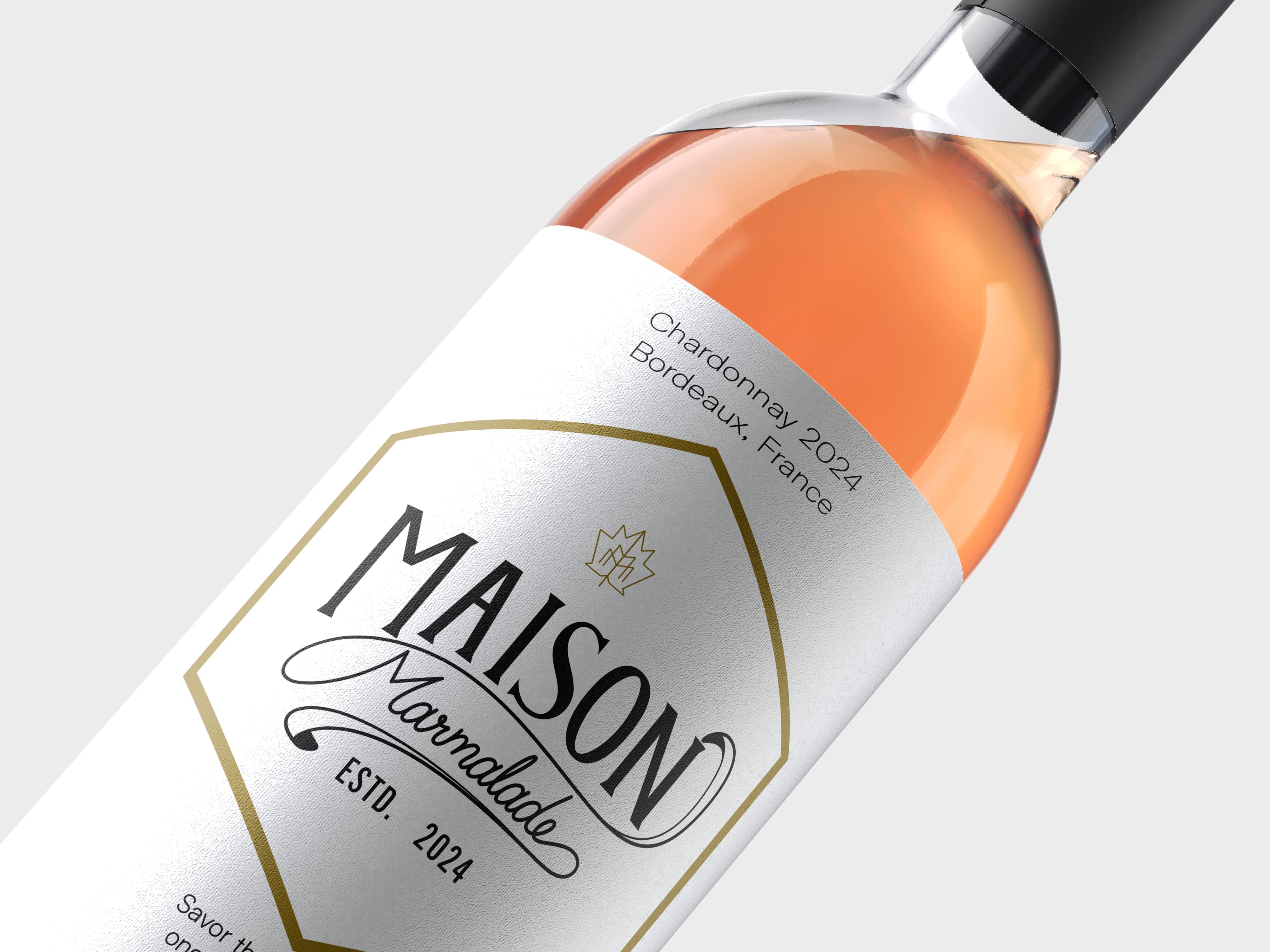
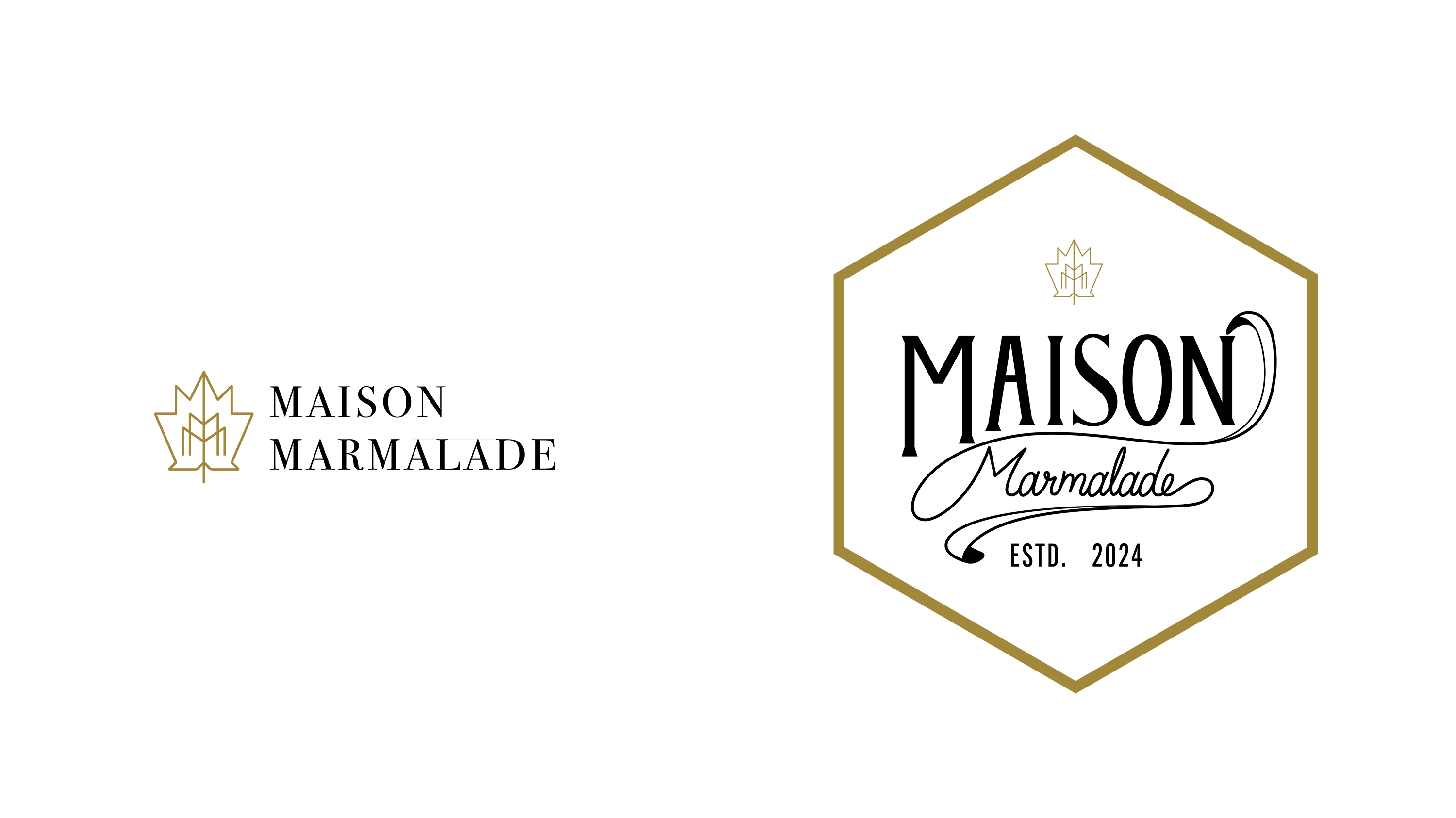
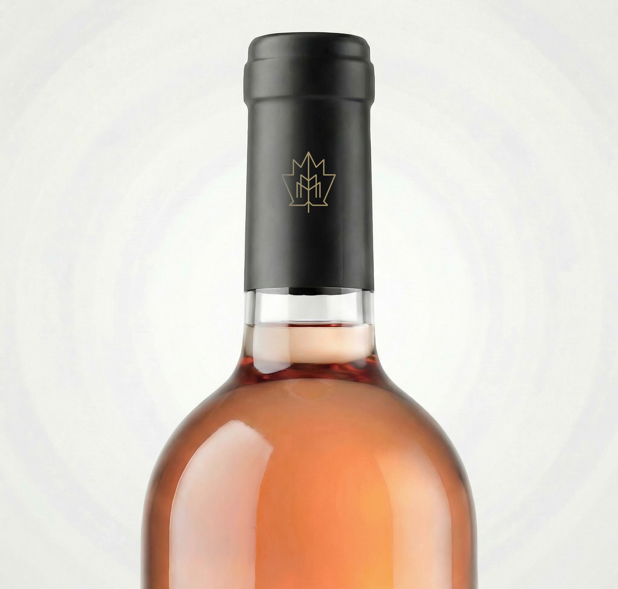
The visual identity of Maison Marmalade is anchored by a distinctive logomark inspired by the grape leaf, a timeless symbol of viticulture, growth, and heritage. The mark is constructed using precise geometric principles, resulting in a symmetrical and balanced form that conveys stability, craftsmanship, and elegance. Subtle internal line detailing hints at vineyard rows and botanical veins, reinforcing the brand’s deep connection to nature and terroir. Rendered in metallic gold, the logomark becomes a luxurious signature element, designed to shine across packaging, foils, seals, and embossed applications.
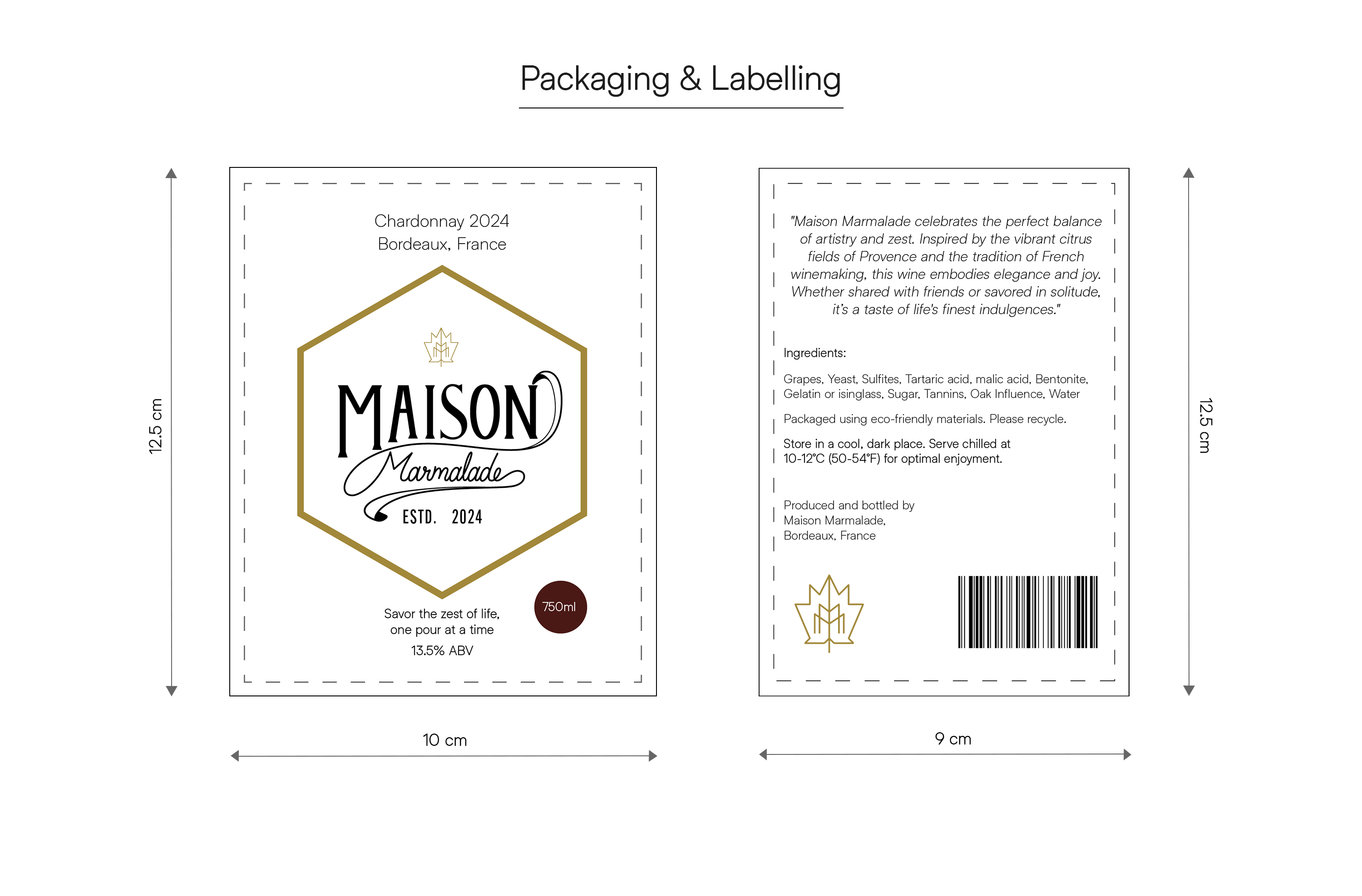
The primary logo system combines classical and contemporary typographic elements to create a refined brand signature. A serif wordmark conveys authority, heritage, and trust, while an elegant script treatment introduces warmth, fluidity, and artisanal character. This typographic contrast allows the identity to feel both timeless and expressive, capturing the emotional richness of the brand. The emblem format, enclosed within a structured hexagonal frame, introduces architectural balance and visual clarity, providing a strong, recognizable silhouette ideally suited for premium wine labeling.
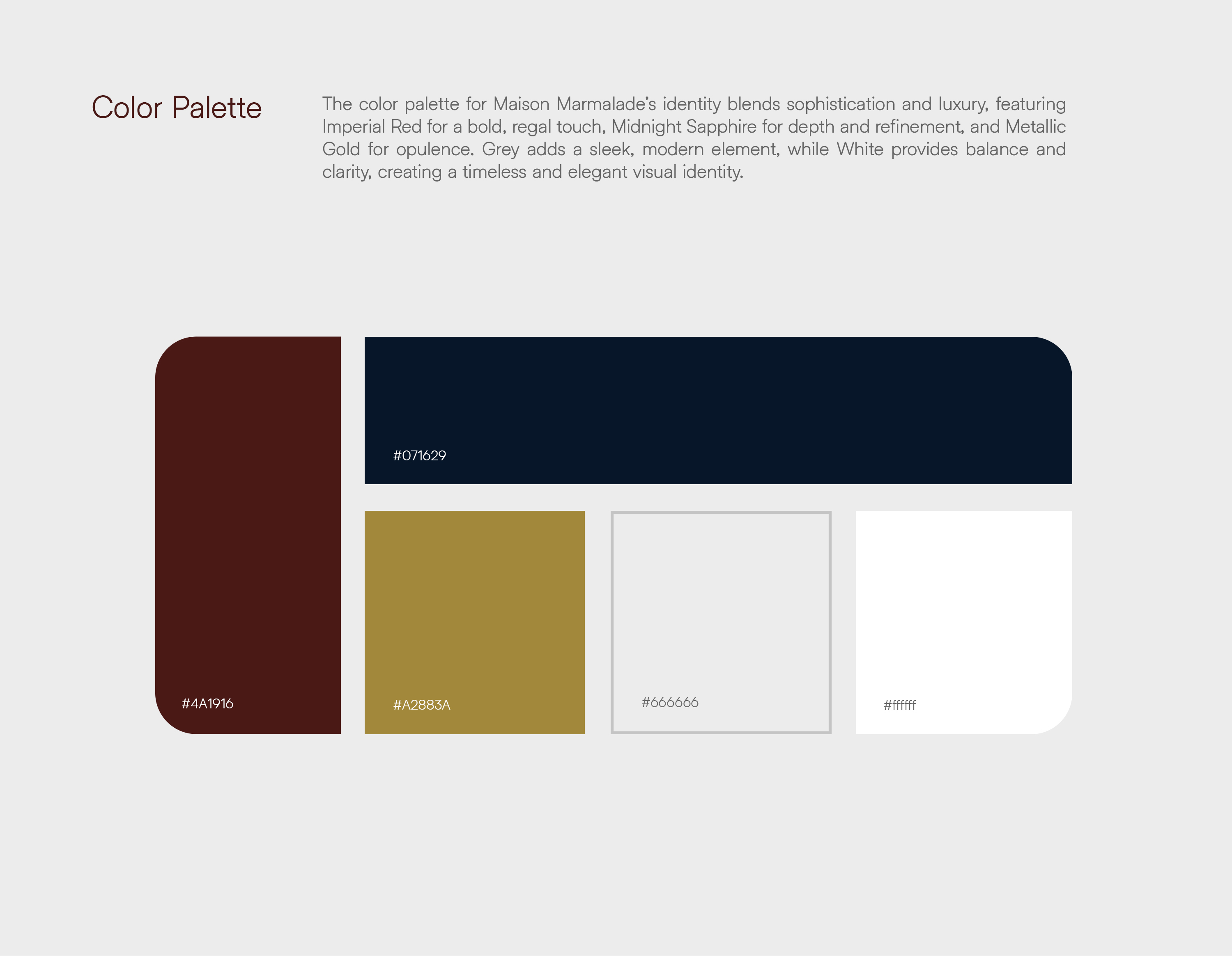
Color plays a crucial role in shaping the emotional language of Maison Marmalade. The palette was carefully curated to evoke luxury, depth, and timeless sophistication. Imperial Red, a deep and regal tone, forms the emotional foundation of the brand, symbolizing indulgence, passion, and opulence. This shade draws inspiration from aged wines, velvet interiors, and classic European luxury, creating a sense of warmth and depth. Midnight Sapphire introduces contrast and refinement, adding a layer of mystery and elegance that enhances the premium character of the brand. Metallic Gold serves as the primary luxury accent, representing craftsmanship, exclusivity, and prestige, while soft greys and whites provide clarity, balance, and modern restraint.
Typography plays an equally vital role in the identity system. Helixa, a contemporary neo-grotesque typeface, was selected to complement the classical logo with modern clarity and functionality. Its clean geometry and subtle sophistication ensure readability while maintaining a premium tone across packaging, editorial layouts, and digital platforms. The interplay between expressive logo typography and minimalist body type creates a harmonious balance that reinforces the brand’s refined aesthetic.
The packaging and label system were designed to deliver maximum shelf impact while preserving understated elegance. A structured grid system ensures clarity, hierarchy, and consistency across all applications, allowing the design to breathe through generous negative space. The central emblem acts as the focal point, framed by subtle detailing and metallic accents that elevate the tactile experience. Every layout decision was guided by the principle of restraint, ensuring that the brand communicates luxury through simplicity rather than excess.
Material selection and finishes were carefully curated to enhance the sensory quality of the packaging. Metallic gold foil stamping, subtle embossing, matte textured paper, and soft-touch finishes combine to create a refined tactile experience. These elements add depth and richness to the physical product, transforming the label into an object of desire rather than a mere informational surface. The packaging is designed not only to be seen, but to be felt, reinforcing the brand’s emphasis on craftsmanship and quality.
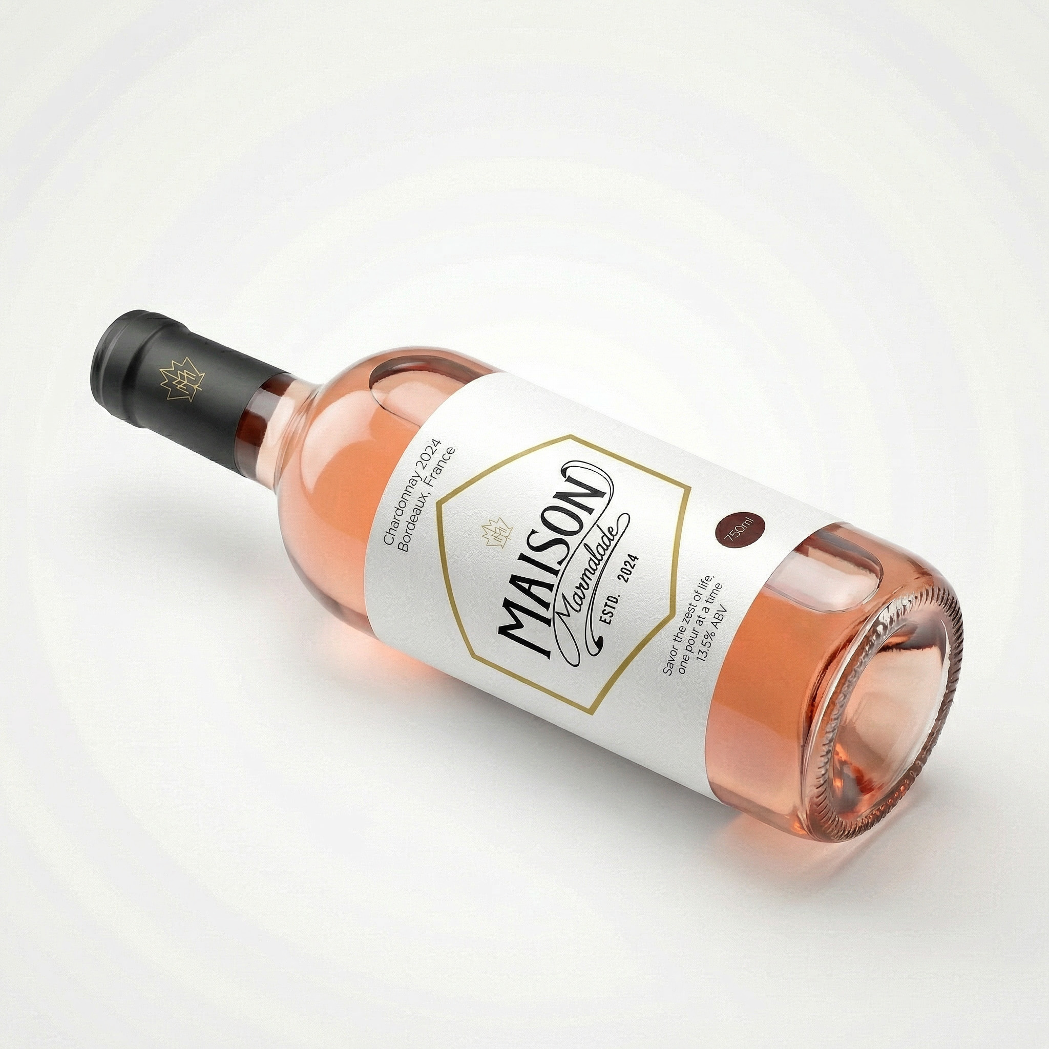
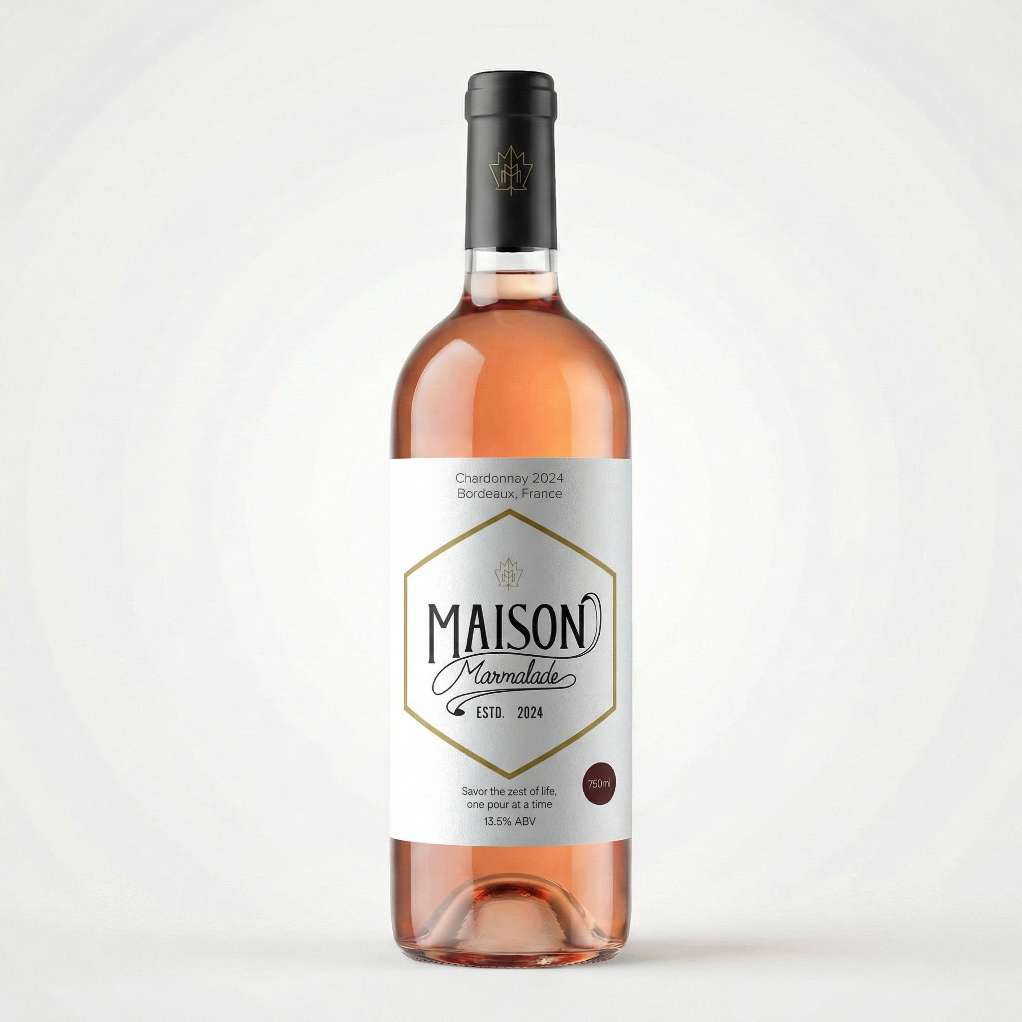
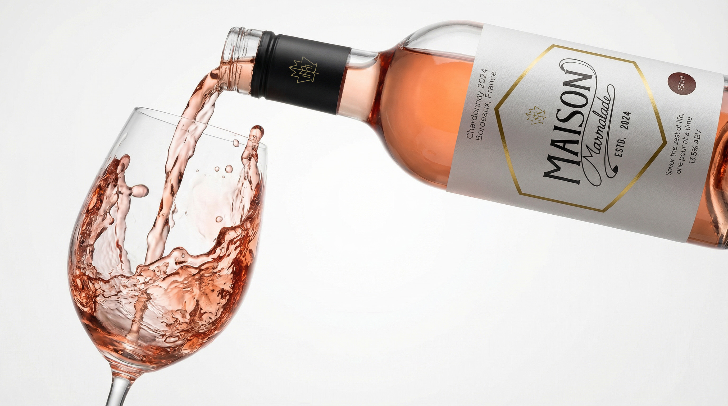
The bottle design was approached with equal care, ensuring that the proportions, label placement, and foil detailing work harmoniously with the physical form. The black neck foil, accented with the gold grape leaf emblem, acts as a distinctive brand marker, enhancing recognition and reinforcing luxury. The overall bottle presentation is designed to feel elegant and balanced from every angle, making it equally impactful on retail shelves, dining tables, and digital platforms.
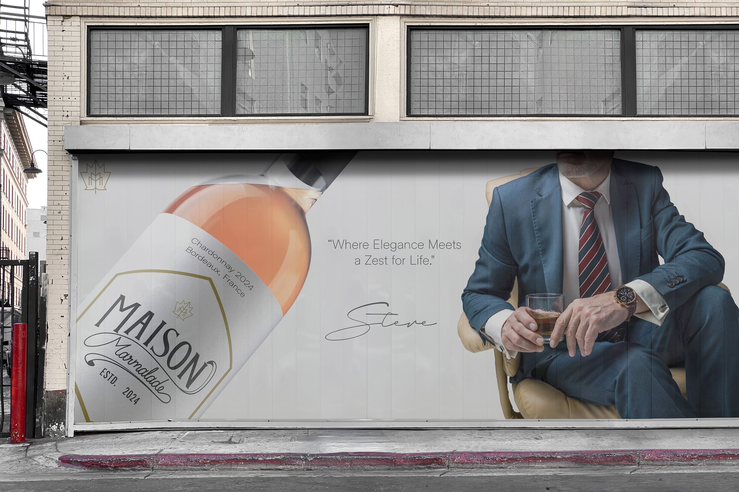
Art direction and product visualization were integral to expressing the emotional depth of the Maison Marmalade brand. High-end studio renders were developed to capture realistic glass reflections, accurate liquid translucency, and premium lighting conditions. These details ensure that the product visuals maintain authenticity and sophistication, suitable for marketing campaigns, advertising, and e-commerce platforms. The visual language extends beyond static bottle imagery, incorporating dynamic pouring scenes and lifestyle compositions that convey motion, texture, and indulgence.
The lifestyle imagery introduces a sensorial dimension to the brand, portraying moments of refined enjoyment and quiet celebration. Flowing liquid, soft fabric textures, and elegant lighting environments work together to create atmospheric scenes that elevate the emotional narrative. These compositions reflect the idea that Maison Marmalade is not merely consumed, but experienced – a ritual of indulgence that transforms everyday moments into something memorable.
Brand storytelling plays a central role in shaping the Maison Marmalade experience. The narrative is built around authenticity, emotion, and poetic restraint, allowing consumers to form personal connections with the product. Rather than overwhelming audiences with technical detail, the story focuses on the essence of winemaking: patience, craftsmanship, and reverence for nature. Each bottle becomes a
vessel for this narrative, carrying within it a sense of place, culture, and tradition.
The result of this comprehensive design approach is a cohesive brand world that seamlessly integrates strategy, visual identity, packaging, and art direction. Maison Marmalade emerges as a sophisticated and aspirational wine brand that feels both timeless and contemporary. The identity system balances heritage and innovation with precision, ensuring long-term relevance and emotional resonance.
This project reflects a design philosophy centered on clarity, restraint, and emotional depth. Rather than chasing visual trends, the focus remains on crafting a timeless aesthetic that will endure beyond seasonal shifts. The Maison Marmalade identity demonstrates how thoughtful branding can elevate a product into a cultural experience, strengthening emotional connections and enhancing perceived value.
Maison Marmalade stands as a testament to the power of strategic design and meticulous craftsmanship. By harmonizing tradition with modern elegance, the brand transcends conventional wine packaging, offering a refined and immersive experience defined by subtlety, emotion, and lasting beauty. It is a celebration of heritage, artistry, and indulgence – a luxury wine brand designed not just to be seen, but to be felt, savored, and remembered.
CREDIT
- Agency/Creative: Jupitr Studio
- Article Title: Maison Marmalade Premium Wine Brand Identity and Packaging Design by Jupitr Studio
- Organisation/Entity: Agency
- Project Type: Identity
- Project Status: Published
- Agency/Creative Country: India
- Agency/Creative City: Hyderabad
- Market Region: Global
- Project Deliverables: Brand Design, Brand Guidelines, Brand Identity, Label Design, Logo Design, Packaging Design
- Industry: Food/Beverage
- Keywords: bottle, wine, packaging, visual Identity, label, logo, wine label, packaging design, beverage, drink, emblem
-
Credits:
Creative Director & Designer: Sabit Hazari


