Twinings Unveils a New Way to Enjoy Tea. This week, Twinings launched its latest innovation: a range of ready-to-drink sparkling teas, that not only taste good, but are also good for you. Developed in partnership with brand agency Magpie Studio, the new packaging reimagines Twinings’ role in our daily lives, blending tradition with modernity.
A Legacy of Innovation
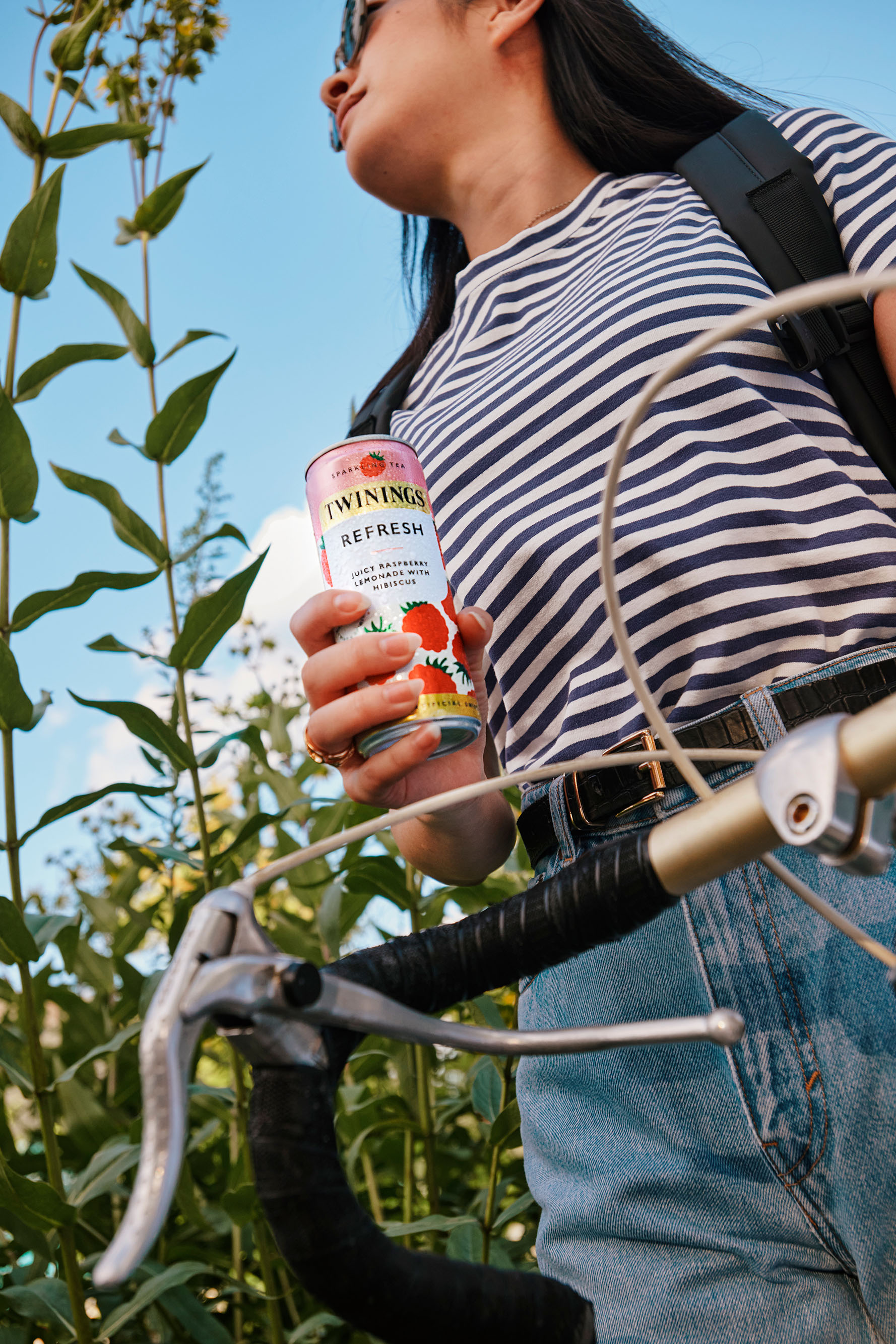
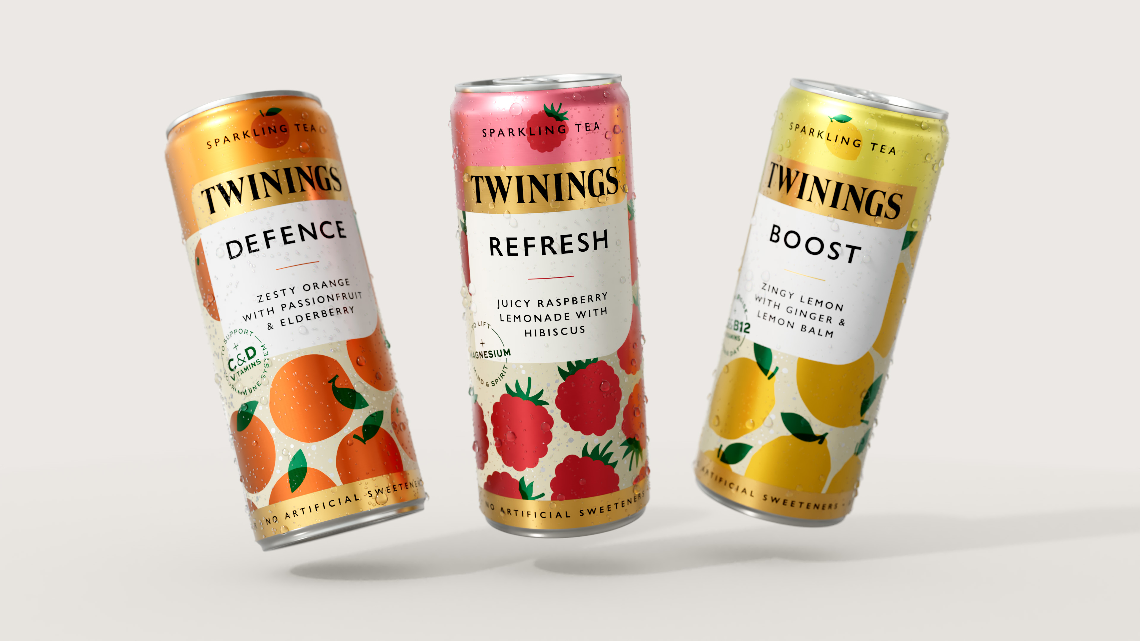
With over 300 years of expertise in tea, Twinings is a brand synonymous with quality, craft and innovation. Throughout its history, the business has continually evolved, responding to shifting consumer behaviours, tastes and preferences. Twinings’ latest innovation is no different, responding to consumer demand for a fresh, new way to enjoy tea. Its New Sparkling Tea range is a refreshing and delicious alternative to traditional grab-and-go beverages. The range of three flavours is the perfect afternoon pick-me-up, aimed at combatting an afternoon slump and that is good for you. Magpie Studio was commissioned to design the packaging for the new range as part of a long-standing collaboration with the innovations team at Twinings. Claire Forster, Head of Upstream Innovation at Twinings UK & Ireland, shares, “We partnered with Magpie when developing innovation concepts as they are brand first, and share our drive to push the boundaries and challenge the status quo. With their brand expertise and design craft, we knew Magpie would bring immense value to the project.”
The Creative Challenge
“The brief was clear from the outset,” says David Azurdia, Creative Partner at Magpie Studio. “to help Twinings take its products from the tea aisle to the chiller, positioning the brand for a broader audience.” As the brand enters the highly competitive ready-to-drink category, a key challenge was to harness the gravitas of the much-loved heritage brand. “We set out to retain the huge value of the brand’s visual DNA,” Azurdia explains, “whilst embracing the modernity and immediacy of the crowded chiller aisle.” As a brand out of context, it was also important to avoid any confusion. “Consumers won’t expect to see Twinings in the chiller,” continues Azurdia “so the design needed to be direct, with succinct messaging and explicit flavour cues.”
A Modern Take on Tea
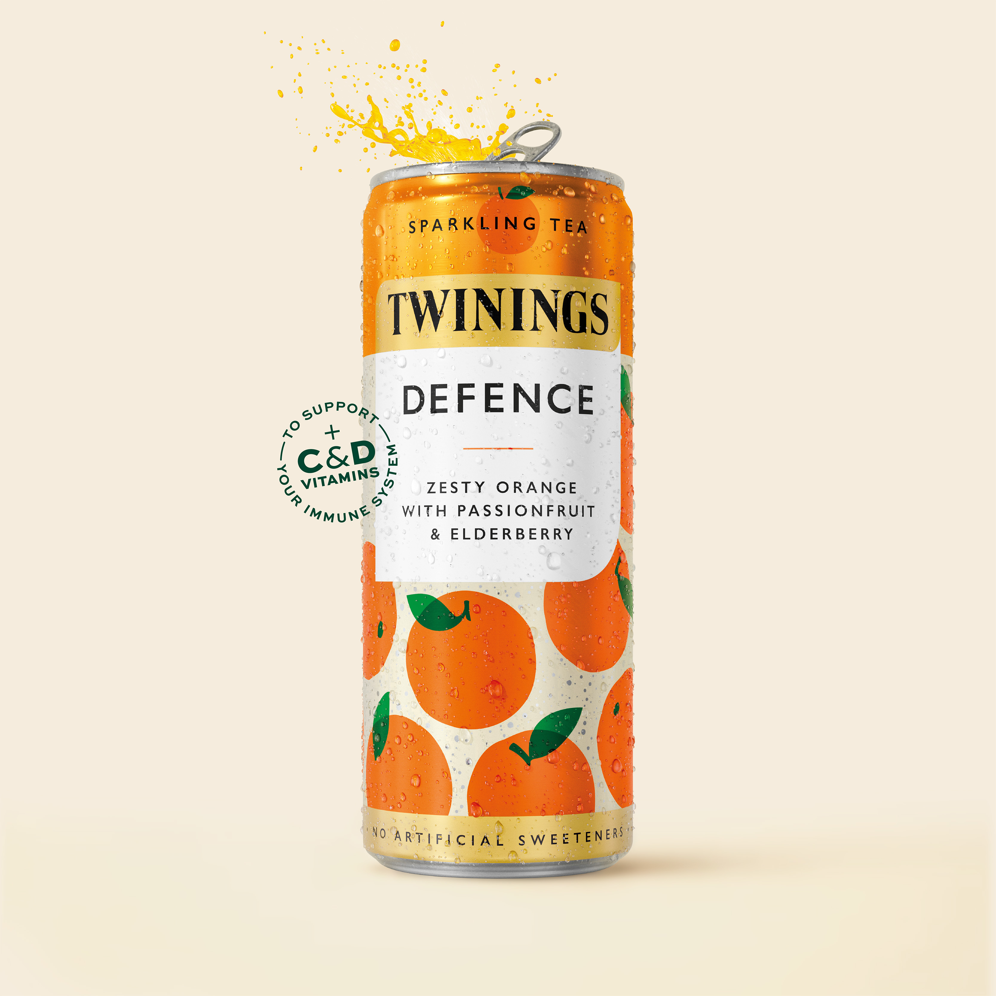
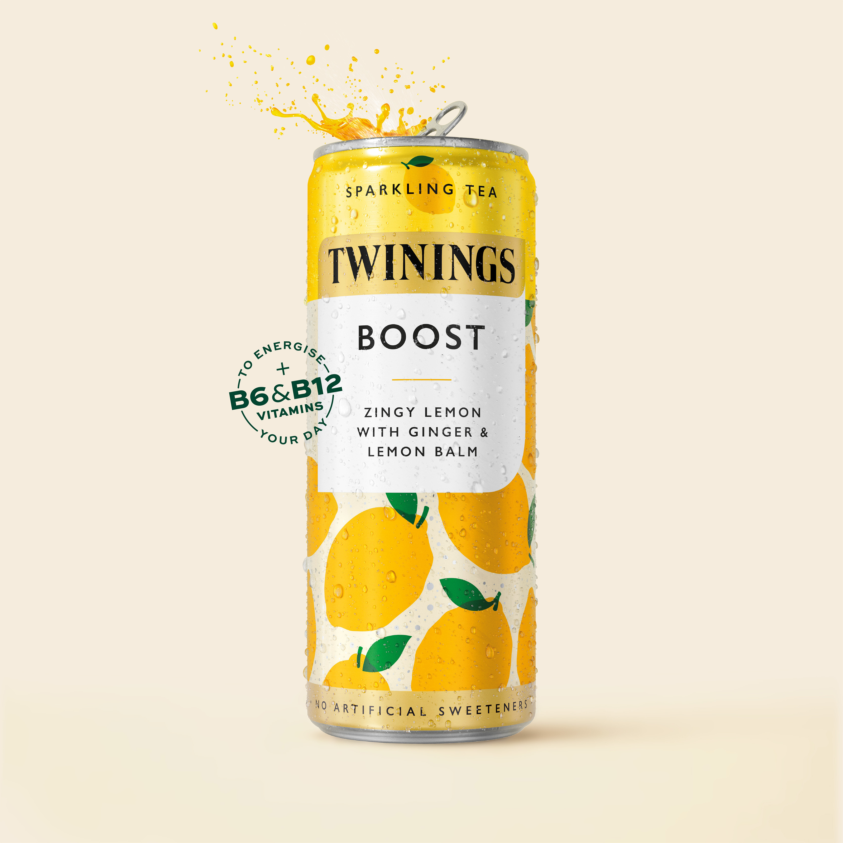
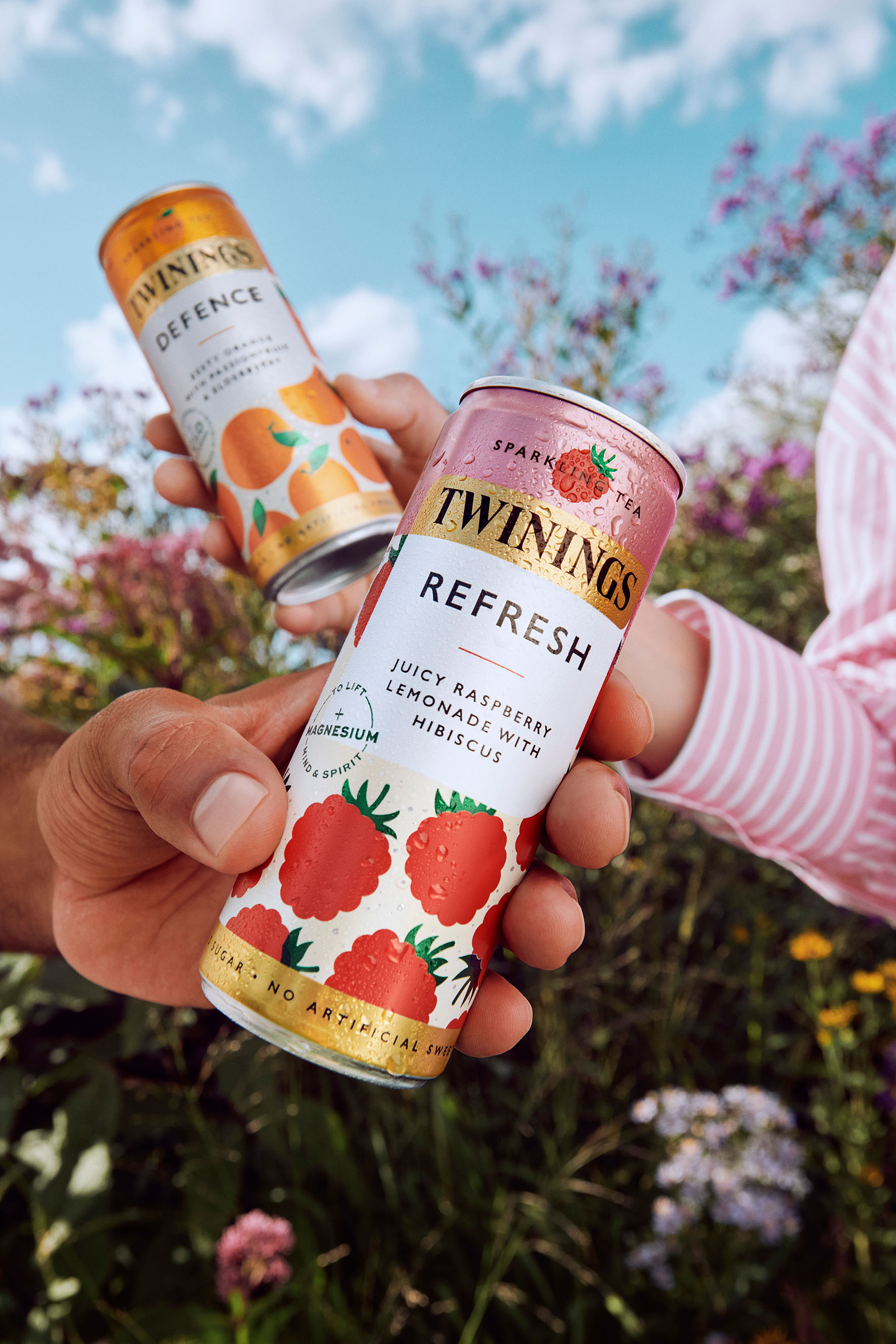
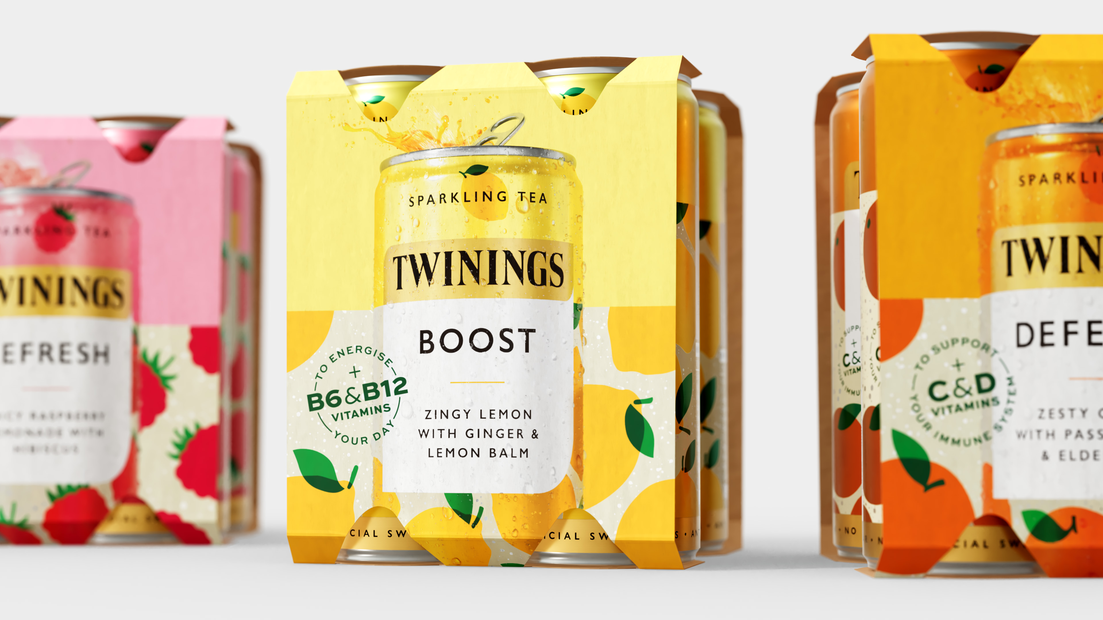
“It was a hugely collaborative process, working closely with Claire and a cross-functional team to stress-test how far we could push the design – how much of a statement we could make – whilst harnessing the strong recognition and equity within the brand and existing portfolio”, says Azurdia. After a series of design and consumer testing sprints, Magpie focused on an execution that built immediate recognition and credibility, evolving the familiar logo and lozenge lock-up that feature across the wider product portfolio. However, to stand out in the chiller aisle and appeal to a new generation of consumers, the packaging also needed to convey a sense of modernity. “We drew on the semiotics of the chiller, moving away from traditional tea aisle aesthetics,” says Azurdia. “Establishing a design that features clean typography to signal wellbeing, bold colours to create standout and highlight flavour, and a reductive yet joyful illustration style for instant recognition.” The can design, driven by vibrant illustrations and bold colours, captures the complexity of a Twinings’ blend in a simple, yet unique and ownable way.
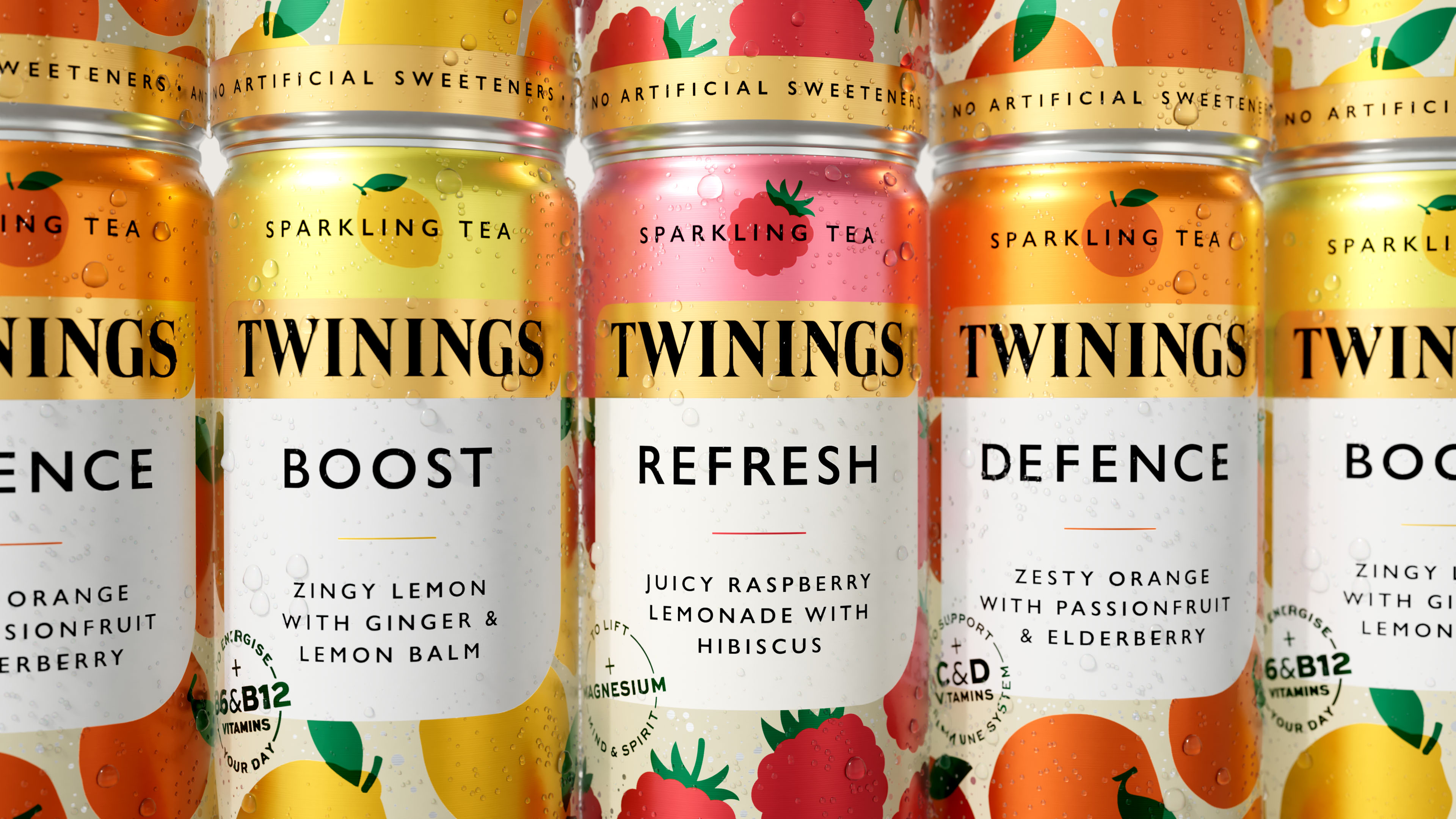
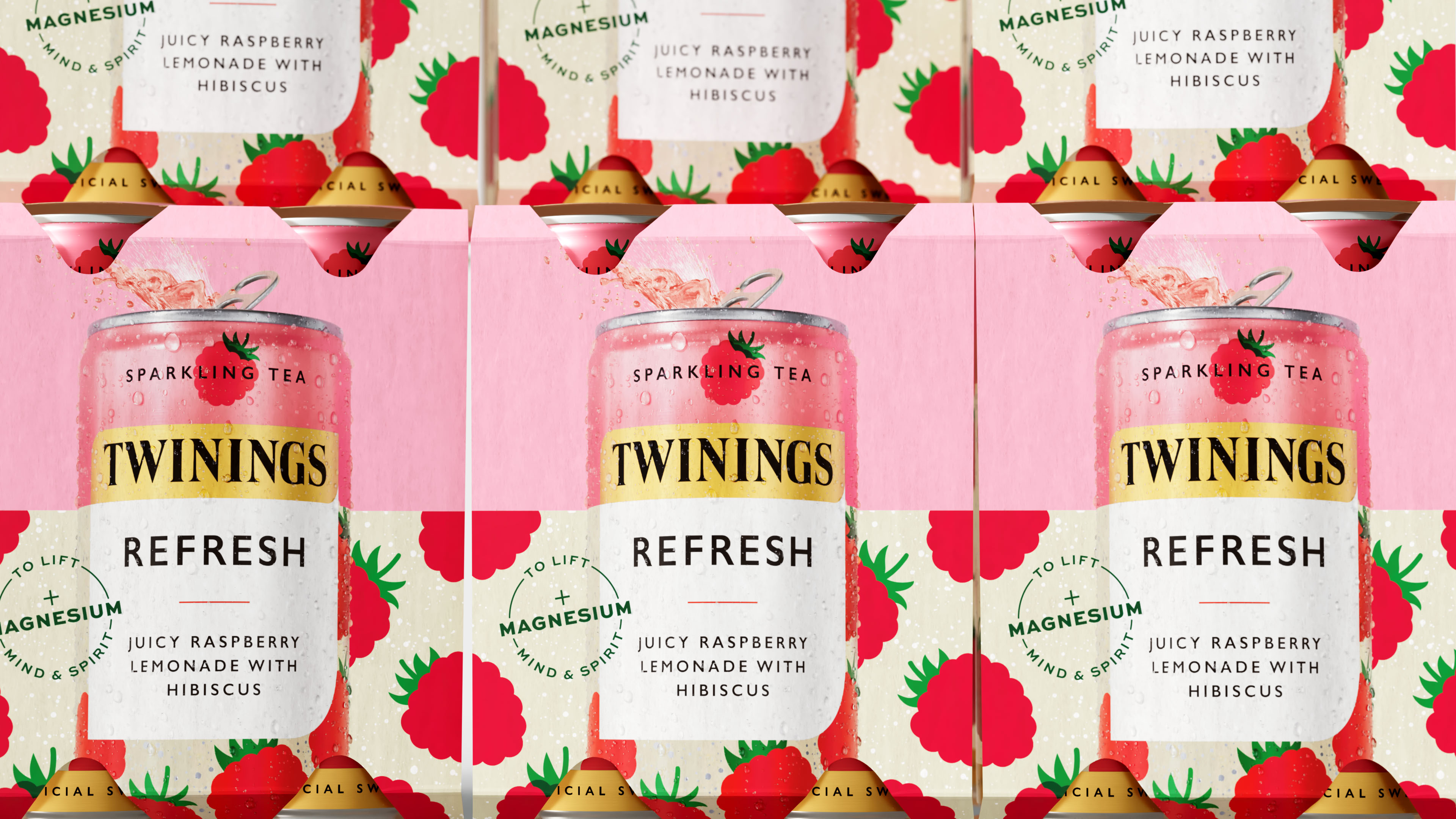
The result is a mouthwatering, modern look that’s unmistakably Twinings, making the product look delicious, healthy and instantly recognisable. “The designs feature a spritz effect to the multipack to differentiate them from an iced or traditional tea, while subtle bubbles in the background on the cans hint at the lightly sparkling, refreshing nature of the drink,” says Forster.
One of the new design’s playful features is its application to multipacks. To enhance standout, the illustrations tessellate from pack to pack, creating a visually striking moment on the shelf. This approach builds brand presence and aids in shelf blocking, making the product easier to find.
Beyond visual design, Magpie Studio also focused on product naming and storytelling. To effectively communicate the product benefits, Magpie collaborated closely with cross-functional teams to develop concise yet emotive copy, benefit roundels and custom icons that quickly convey key product attributes, ensuring that consumers can easily grasp the benefits at a glance.
Azurdia explains, “Our goal was to distil the essence of the product into clear, accessible on-pack messaging that aligns with the overall brand narrative. The icons and copy were designed to speak directly to the consumer, so that the packaging is both engaging and informative.”
The result of Magpie Studio’s collaboration with Twinings is packaging that honours the brand’s heritage with a modern twist for its new ready-to-drink range. By blending timeless elements with modern design cues, the new design reflects Twinings’ commitment to innovation, ensuring the brand remains front of mind and appealing in an ever-evolving market.
Twinings is available to purchase on Amazon, in retailers nationwide,
CREDIT
- Agency/Creative: Magpie Studio
- Article Title: Magpie Studio Collaborates With Twinings on a New Packaging Design for Its New Ready-to-Drink Sparkling Tea Range
- Organisation/Entity: Agency
- Project Type: Packaging
- Project Status: Published
- Agency/Creative Country: United Kingdom
- Agency/Creative City: London
- Market Region: Europe
- Project Deliverables: Packaging Design
- Format: Can
- Industry: Food/Beverage
- Keywords: Sparking Tea Packaging Design Twinings Magpie Studio Modern Heritage Innovation
-
Credits:
Creative Director: David Azurdia
Client Services Director: Alice Thompson
Design Director: Eilidh Brosnahan
Senior Designer: John Randall
Artworker: Tim Howcroft
Client: Claire Forster
Client: Iain Amos
Client: Meryl Allderidge


