


Introduction
Magna Kw, a pioneer in educational furniture, approached Erahaus with a goal larger than just a rebrand: they sought to reimagine how a visual identity could communicate innovation, strength, and friendliness within a traditionally utilitarian industry. As a trusted provider of functional, eco-conscious furniture, Magna’s mission is rooted in sustainability and modern learning environments. The creative journey we embarked on together became a study in how sharp design clarity can bridge form, function, and philosophy.
The Challenge
Magna’s previous brand identity lacked distinction in a growing and increasingly competitive market. The logo and corporate visuals failed to reflect their core values, sustainability, innovation, and harmony in education. They needed a cohesive brand language that would align with their forward-looking product designs and environmental mission, without sacrificing clarity or credibility. Most importantly, the design needed to be scalable across everything from classroom labels to large-scale trade booths.
The Strategy
Our approach focused on turning Magna’s values into a visual voice. The strategy revolved around three principles:
Clarity & Cohesion: Develop a uniform identity system that performs consistently across print, digital, and physical applications.
Symbolic Meaning: Every element had to hold meaning, not just aesthetics, but rooted in educational symbolism and function.
Memorable & Modern: Create a clean yet iconic logo and system that speaks the visual language of innovation, friendliness, and discipline.
Design Execution
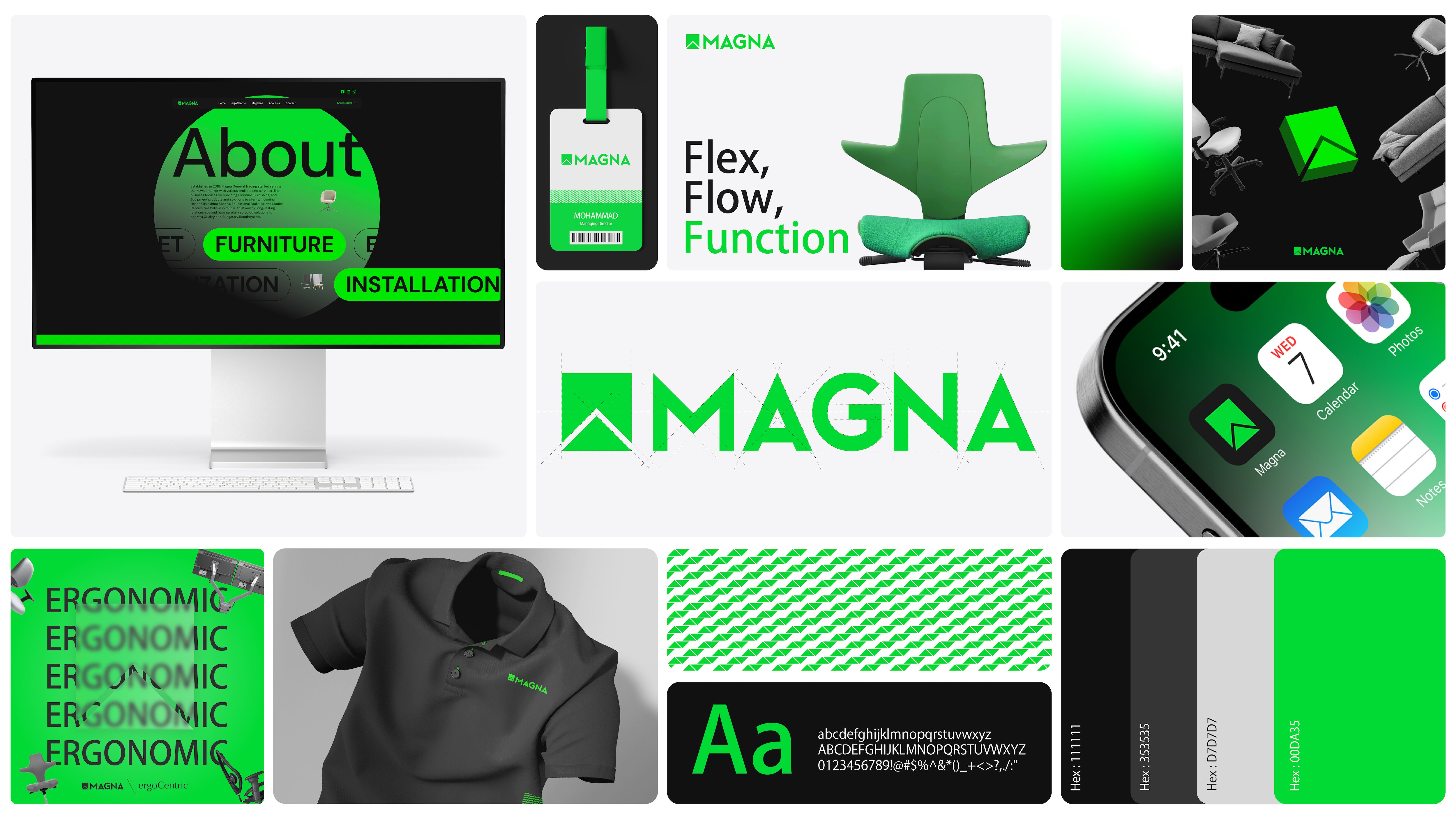
Logo Design
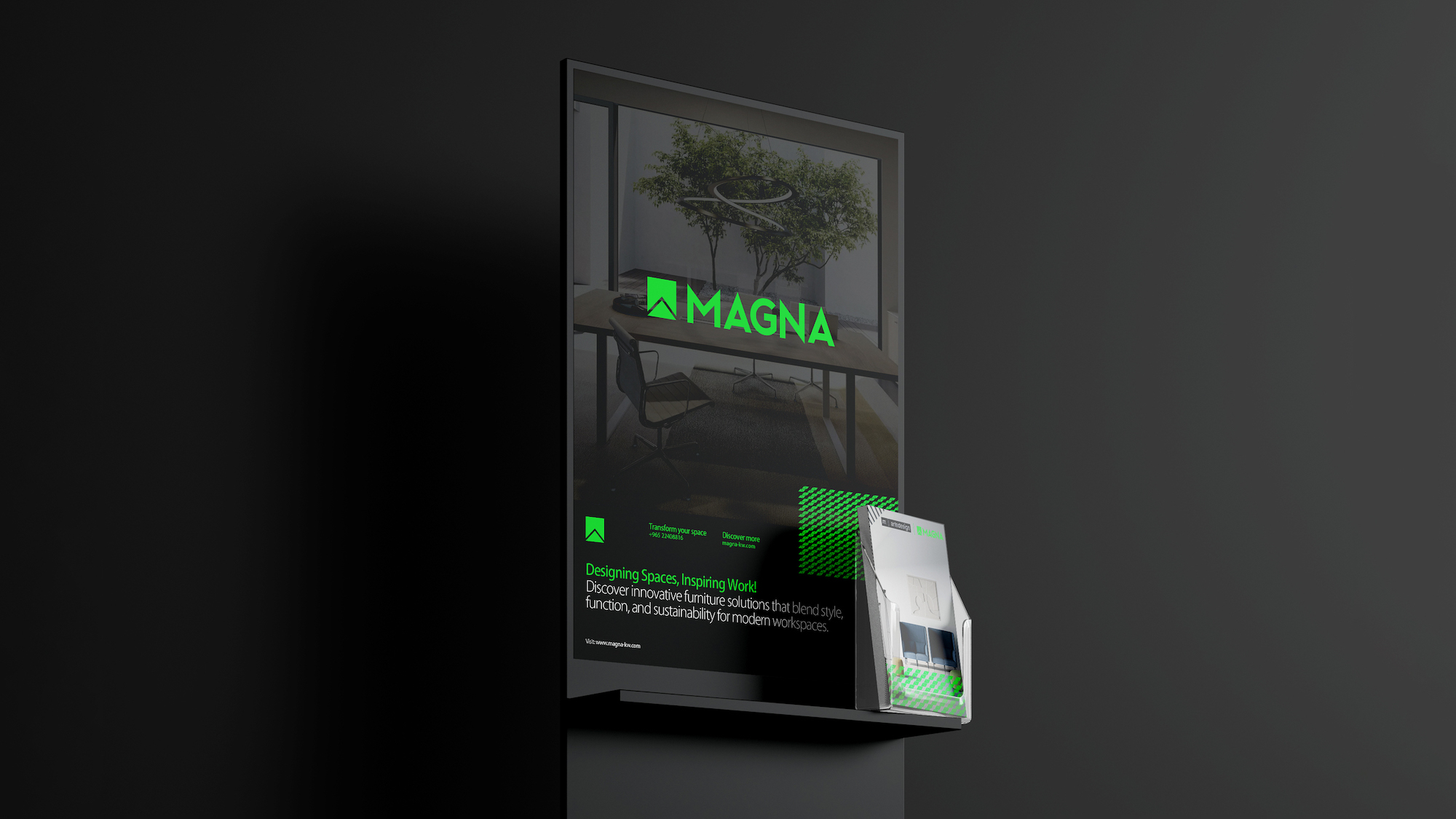
The logo embodies strength and structure while remaining approachable. The geometric emblem blends the letters “M” and “A” into a unified triangular form, symbolizing upward growth, connectivity, and academic discipline. The shape also subtly resembles a classroom frame or architectural structure. The thickness and symmetry of the lines reflect years of experience and reliability, while maintaining a modern, minimal appeal.
Color Palette
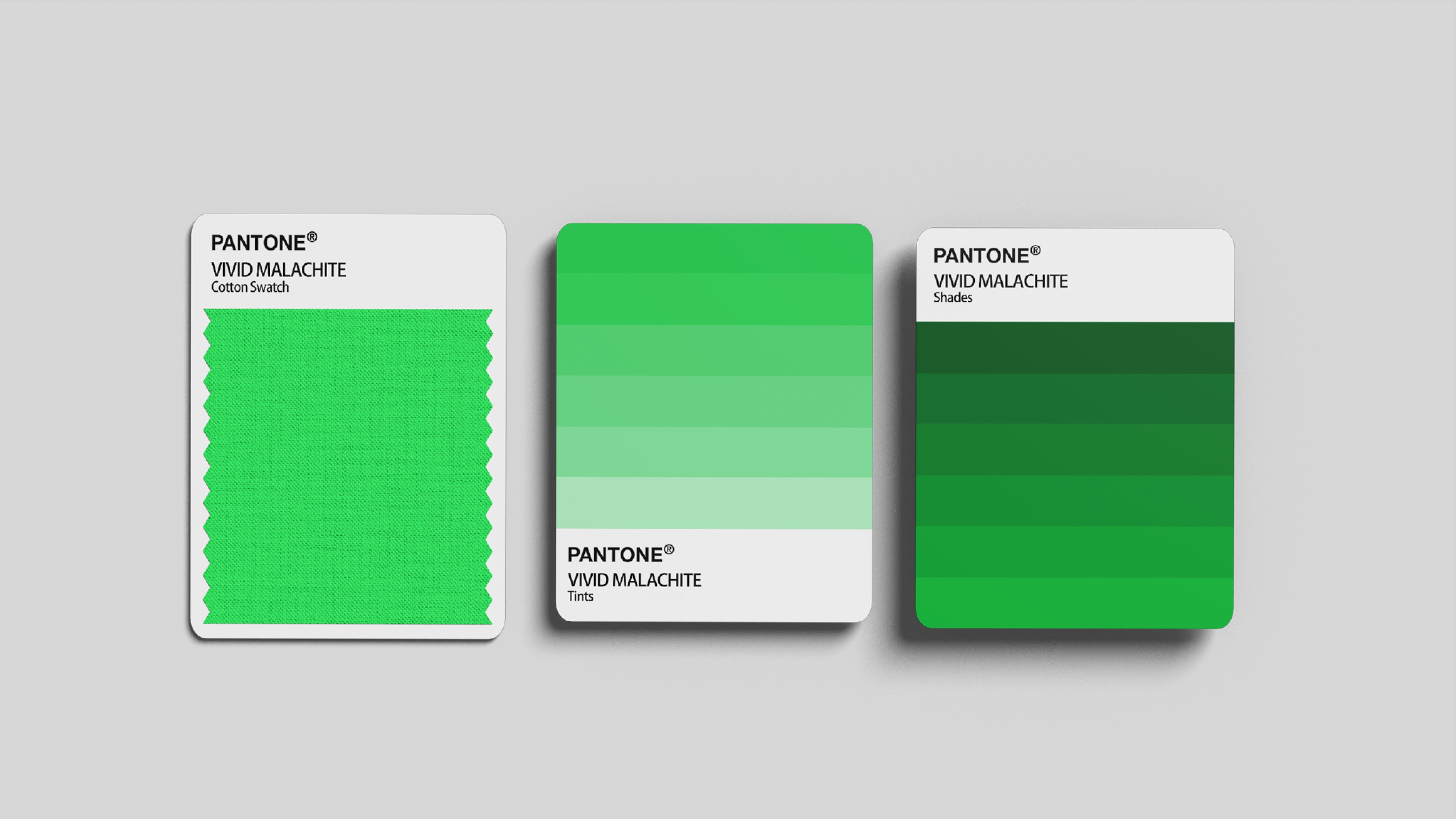
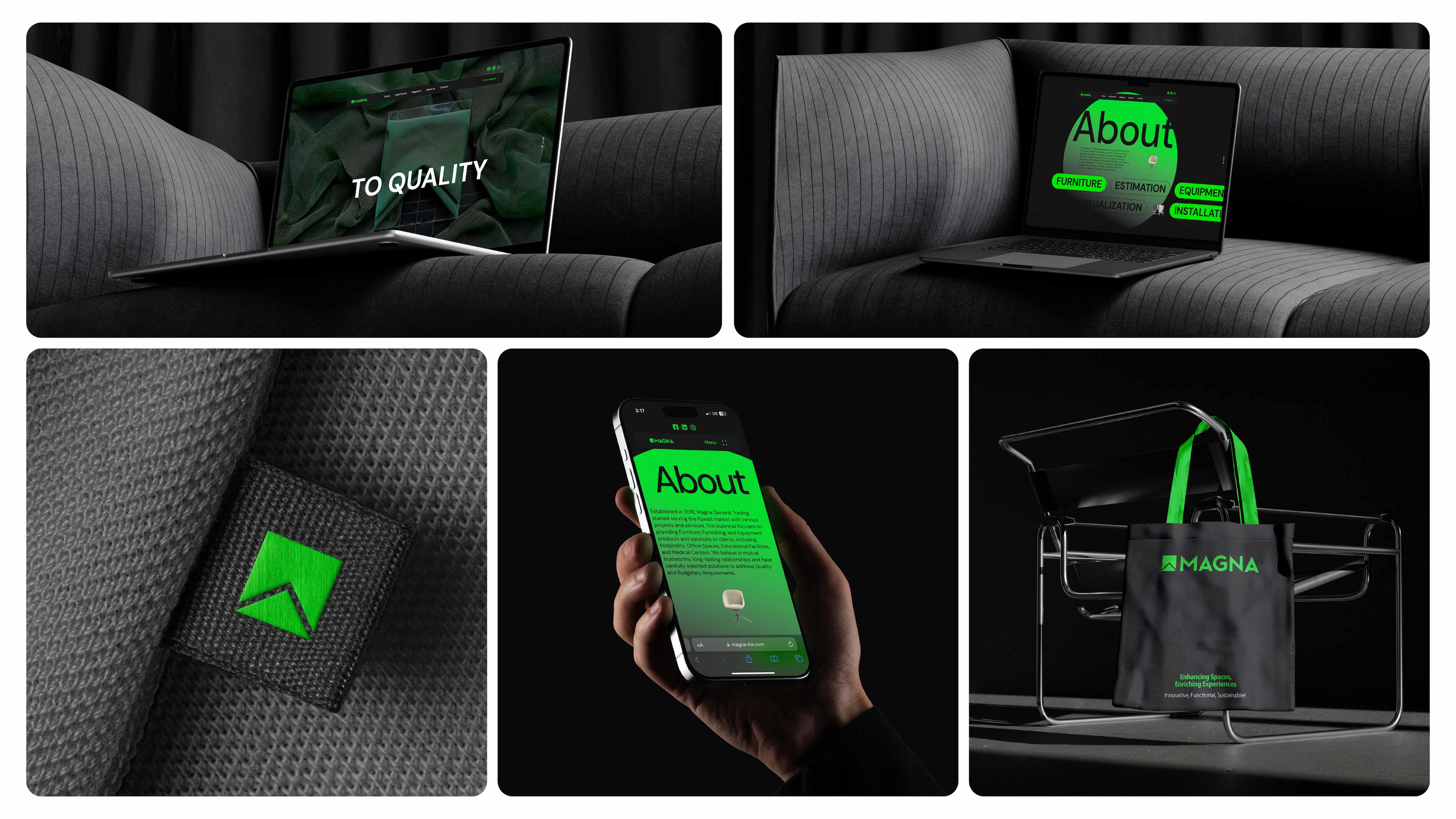
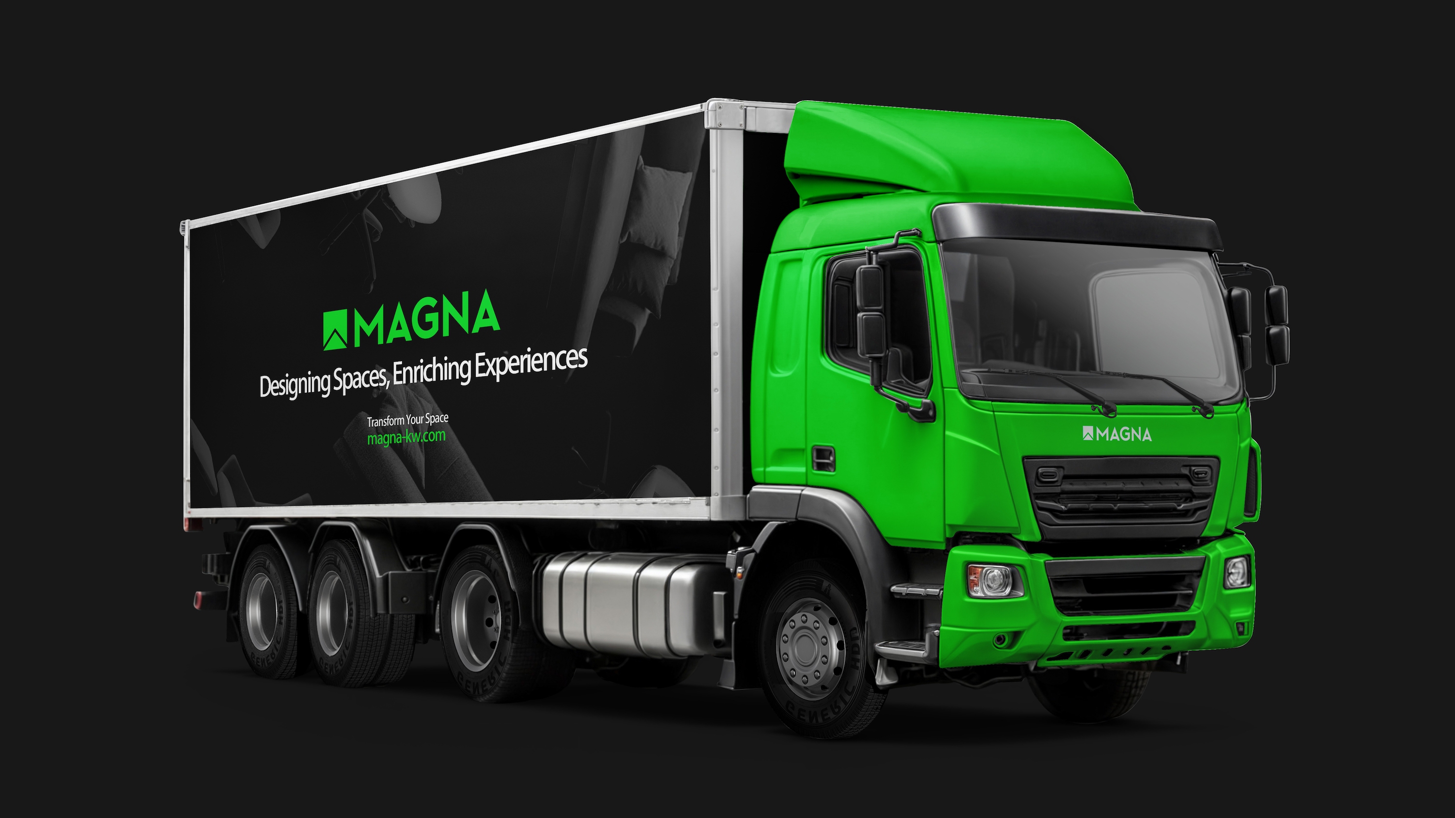
Vivid Malachite, a bold, high-energy green, was chosen as the brand’s core color. It evokes renewal, sustainability, and clarity of vision. It’s balanced by neutral tones: Charcoal, Dark Jet, Steam, and Mist. These create a flexible visual system capable of delivering both energetic and serious tones as needed. The palette ensures standout visibility and instant recognition.
Typography
We used Kozuka Gothic Pro for its technical precision and modern clarity. Its balance of rounded corners and rigid structure aligns well with the duality of friendly innovation and institutional reliability. This single-font solution ensures visual unity across all brand touchpoints.
Visual Grid & Patterns
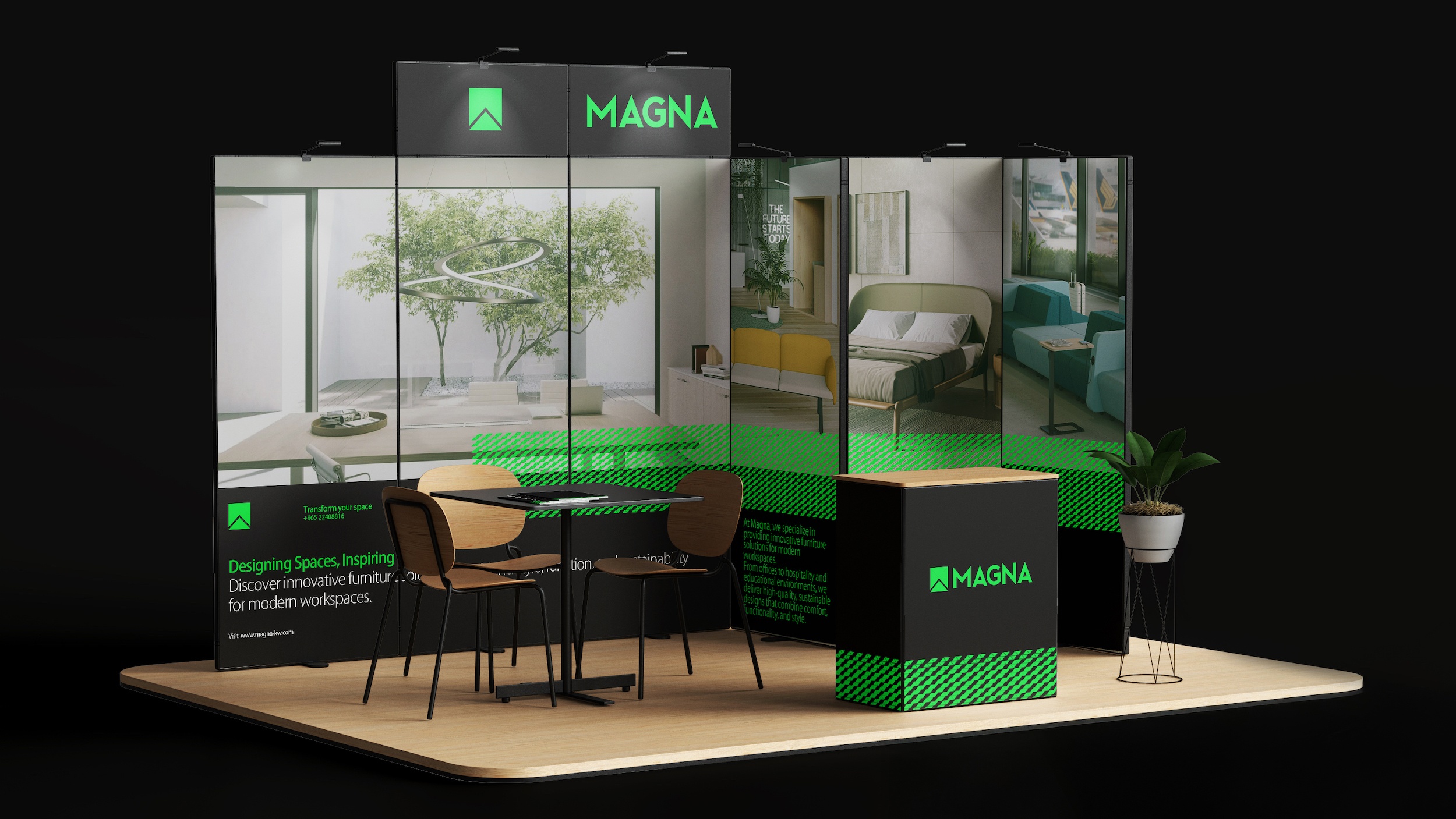
To create visual rhythm and enhance brand recall, we built a visual system using the triangular shape from the logo to form a repeatable pattern. This pattern is applied subtly across stationery, packaging, and print materials. It reflects the core themes of discipline, connectivity, and modularity.
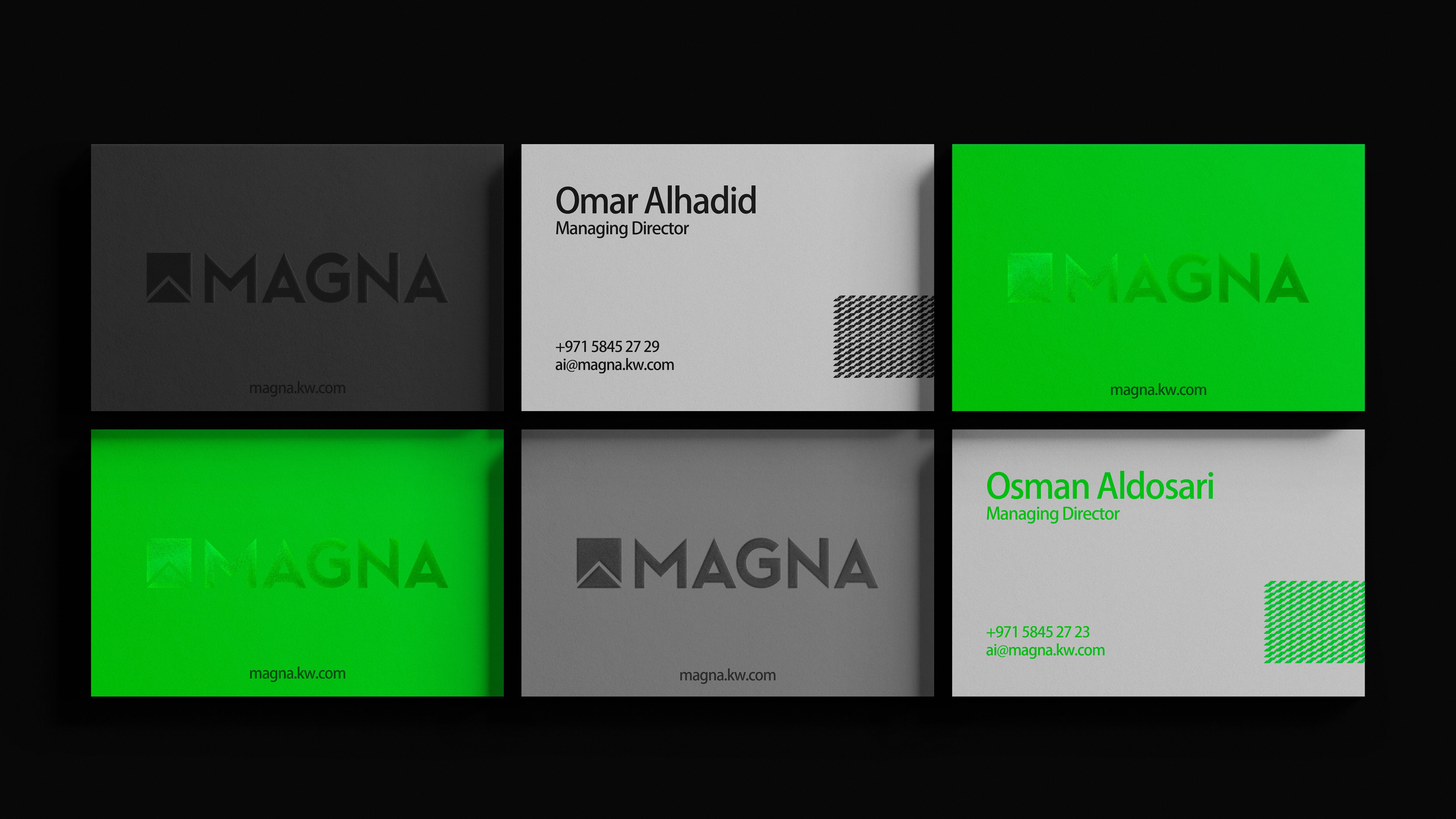
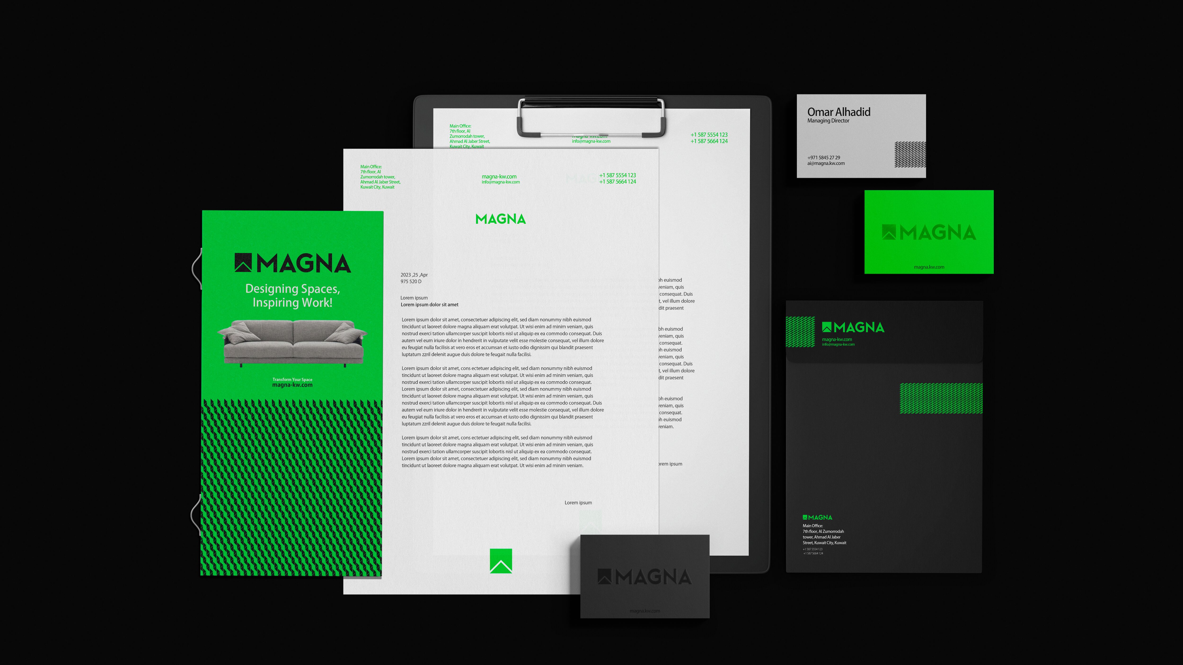
Corporate Stationery
From business cards to letterheads, envelopes, and invoices, the visual system was deployed with precision. Every item reinforces the core identity. The green triangle appears as a visual anchor. Paper choices, Transparent Blur for cards, Art Paper for documents, elevate tactile experience while maintaining sustainability.
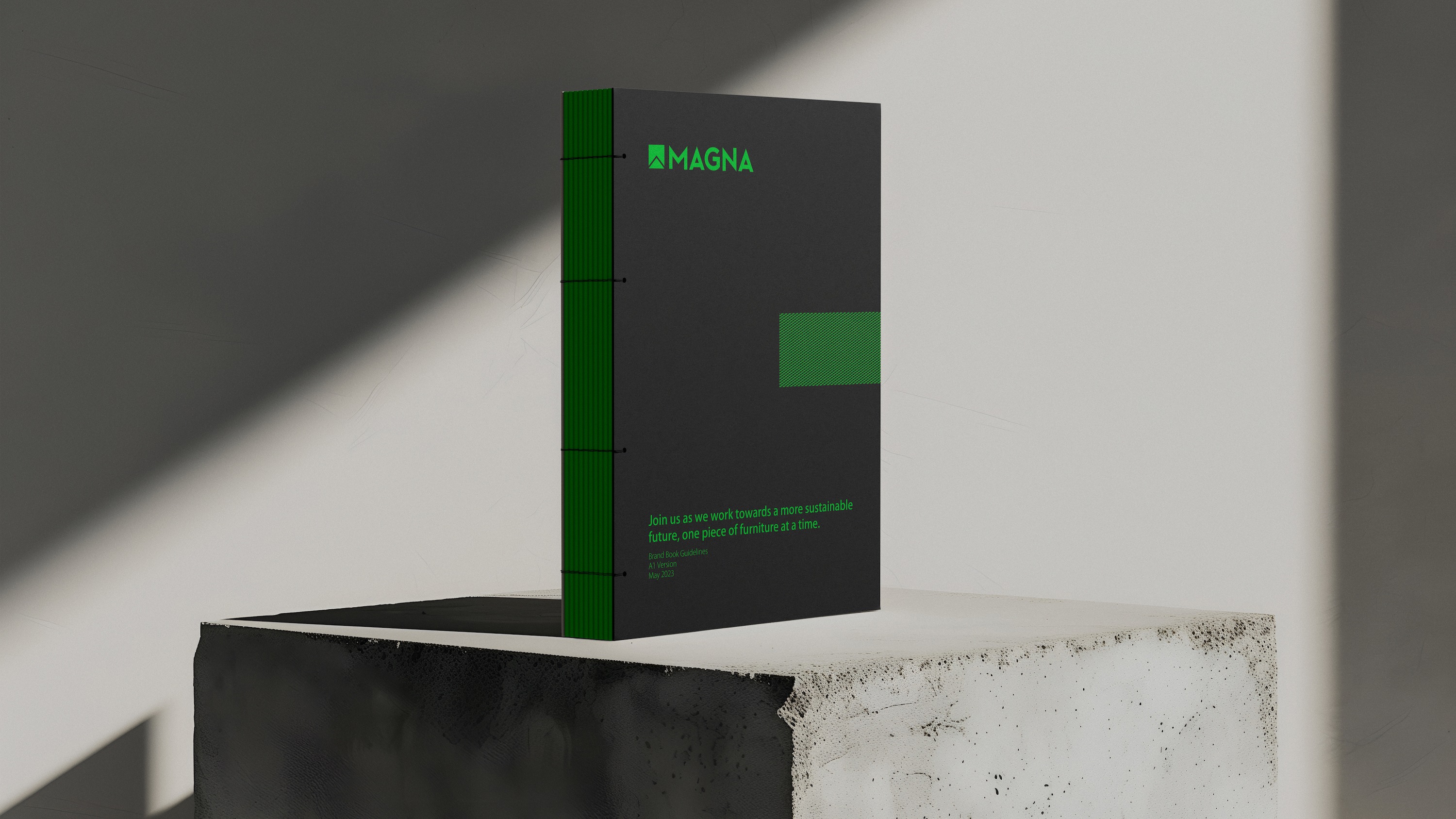
Brand Guidelines & Rules
We created a comprehensive brand book covering clear space, minimum size usage, color code systems, and font hierarchies. This ensured that anyone using the brand, internally or externally, would maintain consistency across the board.
Brand Storytelling
An infographic-style concept board shows how each element ties back to brand values. “Connectivity,” “Growth,” “Discipline,” and “Sharpness” are not just words but visualized through form and layout. These were vital tools in aligning internal stakeholders and onboarding external partners.
Results & Impact
Magna’s new identity became a cornerstone of their growth strategy in 2023–2024. Not only did the visual overhaul result in a 40% increase in B2B inquiries within the first quarter of launch, but trade show performance metrics also jumped, with 2x the engagement in booth footfall and brochure pick-up rates. Internal employee engagement with branded tools improved by over 60%, with teams expressing pride and clarity in the company’s new direction.
Educators and institutional buyers reported stronger recall of the brand compared to prior years, and the packaging updates resulted in higher shelf visibility in partner showrooms. Most importantly, the new identity communicated what the brand stands for: high-performance, human-centered learning design.
Conclusion
The redesign of Magna Kw was more than an aesthetic facelift; it was a redefinition of how an educational brand can feel both professional and personal. By embedding meaning into every design decision, from typography to textures, we transformed Magna from a functional provider to a brand of purpose. This project demonstrates the power of clear visual identity in building trust, creating memorability, and supporting long-term brand equity.
CREDIT
- Agency/Creative: Erahaus
- Article Title: Magna Kw: A Triangular System for Structured Growth by Erahaus
- Organisation/Entity: Agency
- Project Type: Identity
- Project Status: Published
- Agency/Creative Country: United Arab Emirates
- Agency/Creative City: Dubai
- Market Region: Middle East
- Project Deliverables: Rebranding
- Industry: Retail
- Keywords: Brand identity design, Modular visual system, Logo construction, Typography system, Color strategy, Visual grid, Pattern design, Iconic rebranding, Scalable design system, Design consistency, Minimalist branding, Architectural visual language
-
Credits:
Creative and Art Director: Emad Rahimi
Graphic Designer: Fatima Rahmani
Web Designer: Amir Eghbali


