Branding the food of the future.
In the dark depths of the clear Norwegian sea, a nutritious delicacy has been hidden.
With innovative farming and modern harvesting methods, seaweed has become the new superfood. Kind has branded a gourmet-standard seaweed of unparalleled quality; Mǽr.
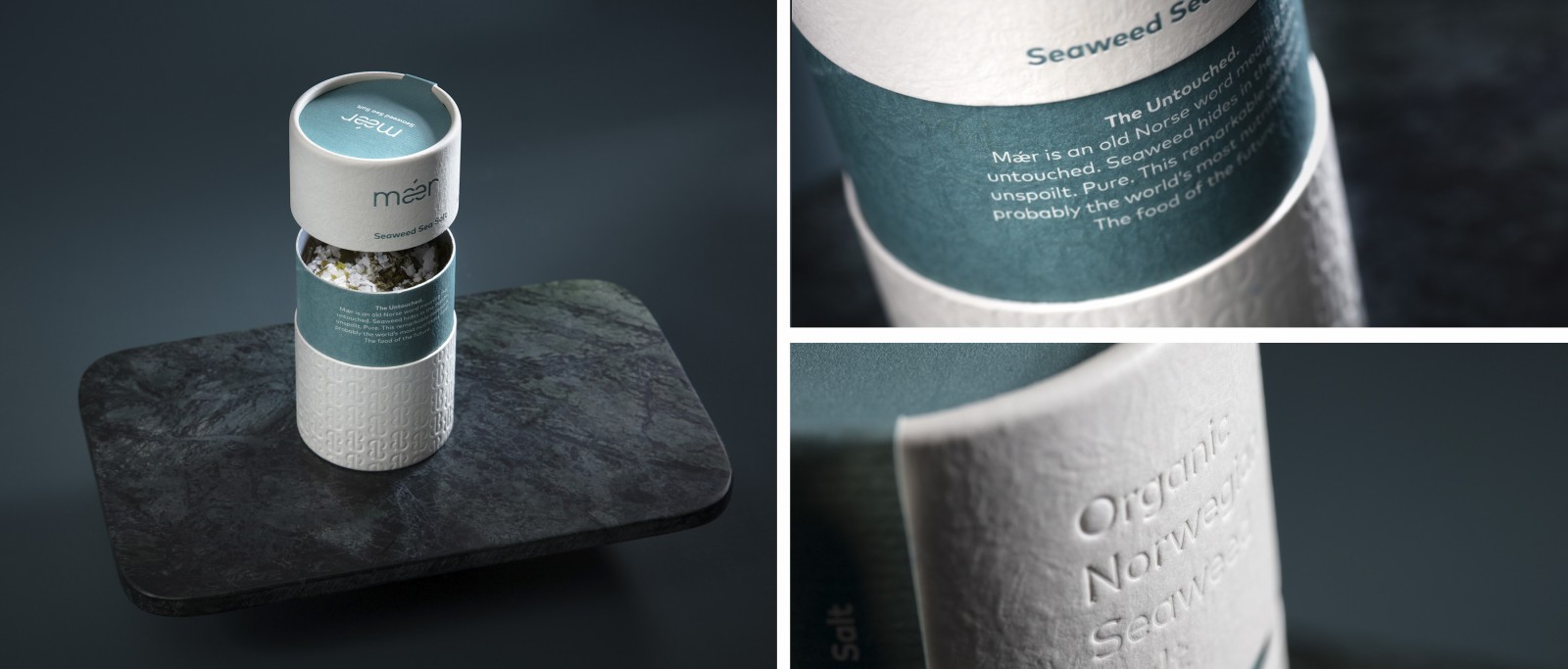
The name ‘Mǽr’ is old Norse and means is «the untouched». It is drawn from the nature of the seaweed; hiding in the depths of the ocean, staying pure and unspoiled.
Seaweed is loaded with nutrients and flavour, it is possibly the world’s most nutritious food. Because of this, adding small amounts of Mǽr will produce a big impact. This has formed the slogan; Less is Mǽr. The design philosophy ‘Less is more’ is one of the characteristics of Scandinavian minimalism. This aesthetic formed the brand visuals.
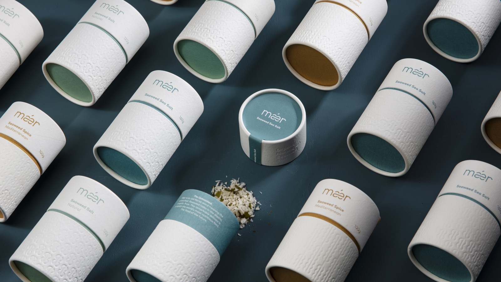
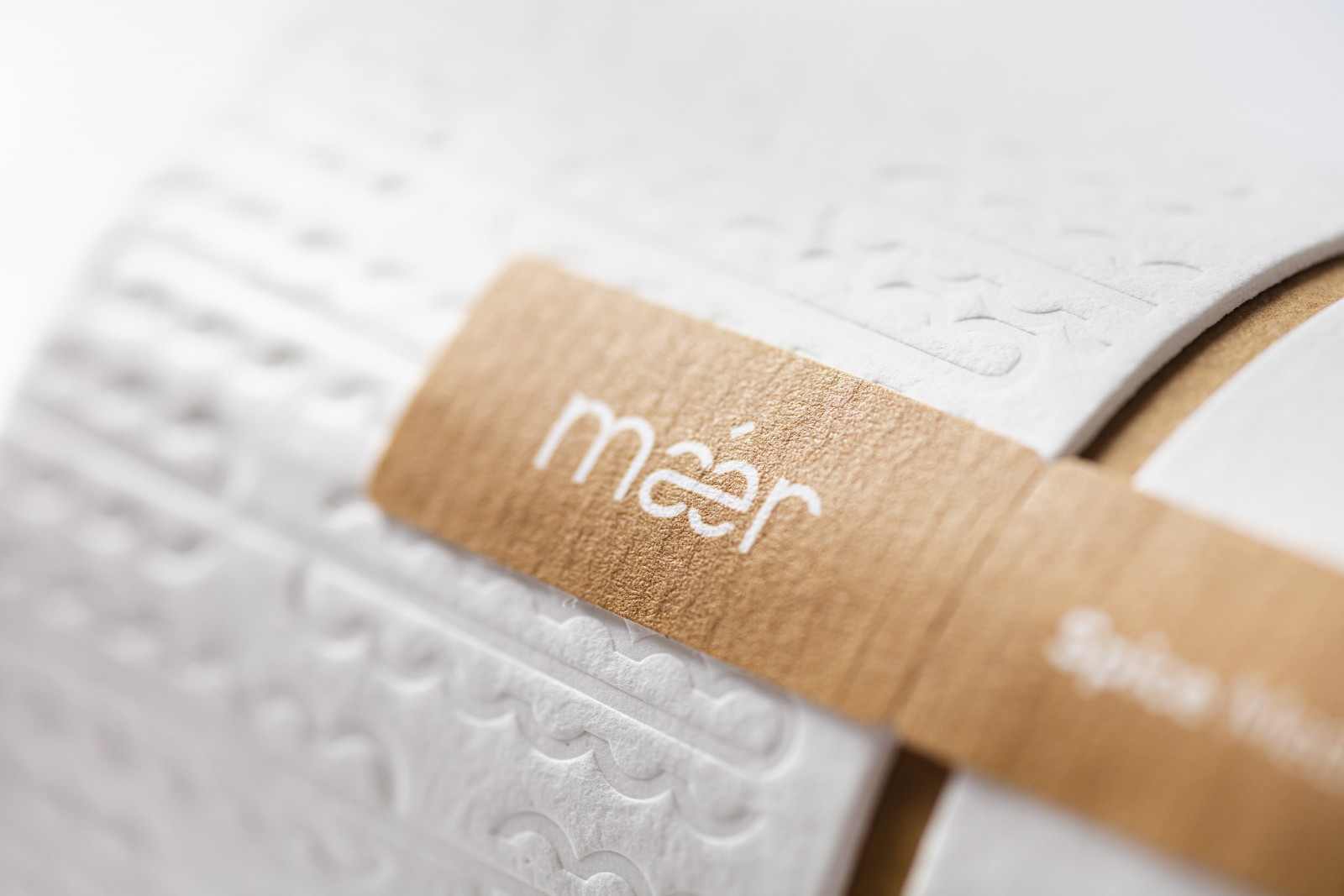
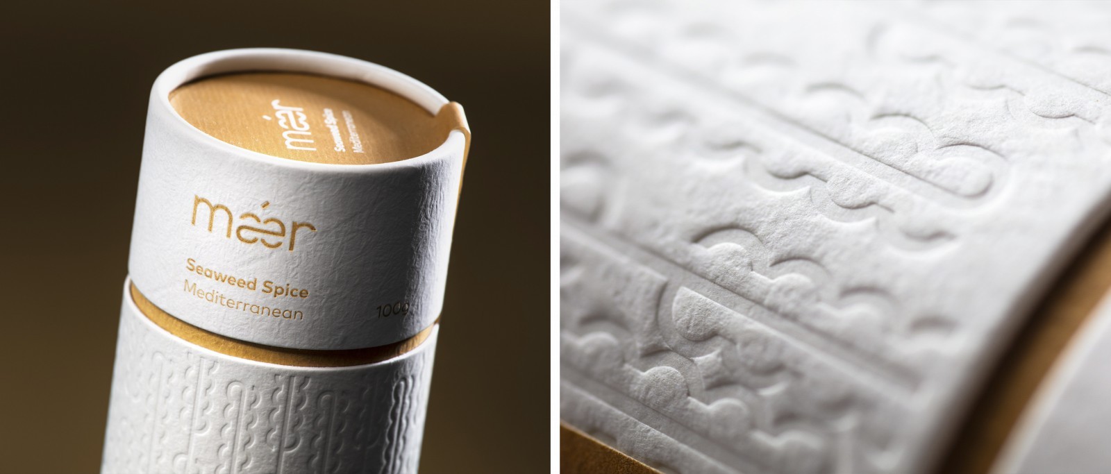
The Mǽr typography has a Nordic minimalist look, with a friendly rounded sans serif. A customized logotype was created, with a distinctive customized ‘ǽ’. The logotype is inspired by the product itself and created to be dynamic and stretchable to generate seaweed shapes. The ǽ is drawn with an idea of continuation, a shape that can grow, flow and be stretched out to create graphic elements and patterns that represents seaweed. It has a central stem where “leaves” can be added and repeated to create a new seaweed shape.
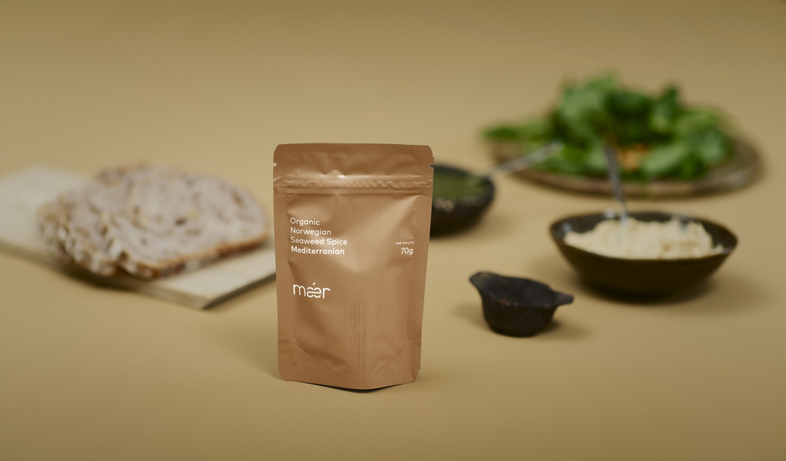
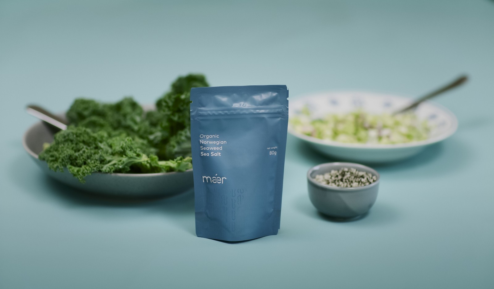
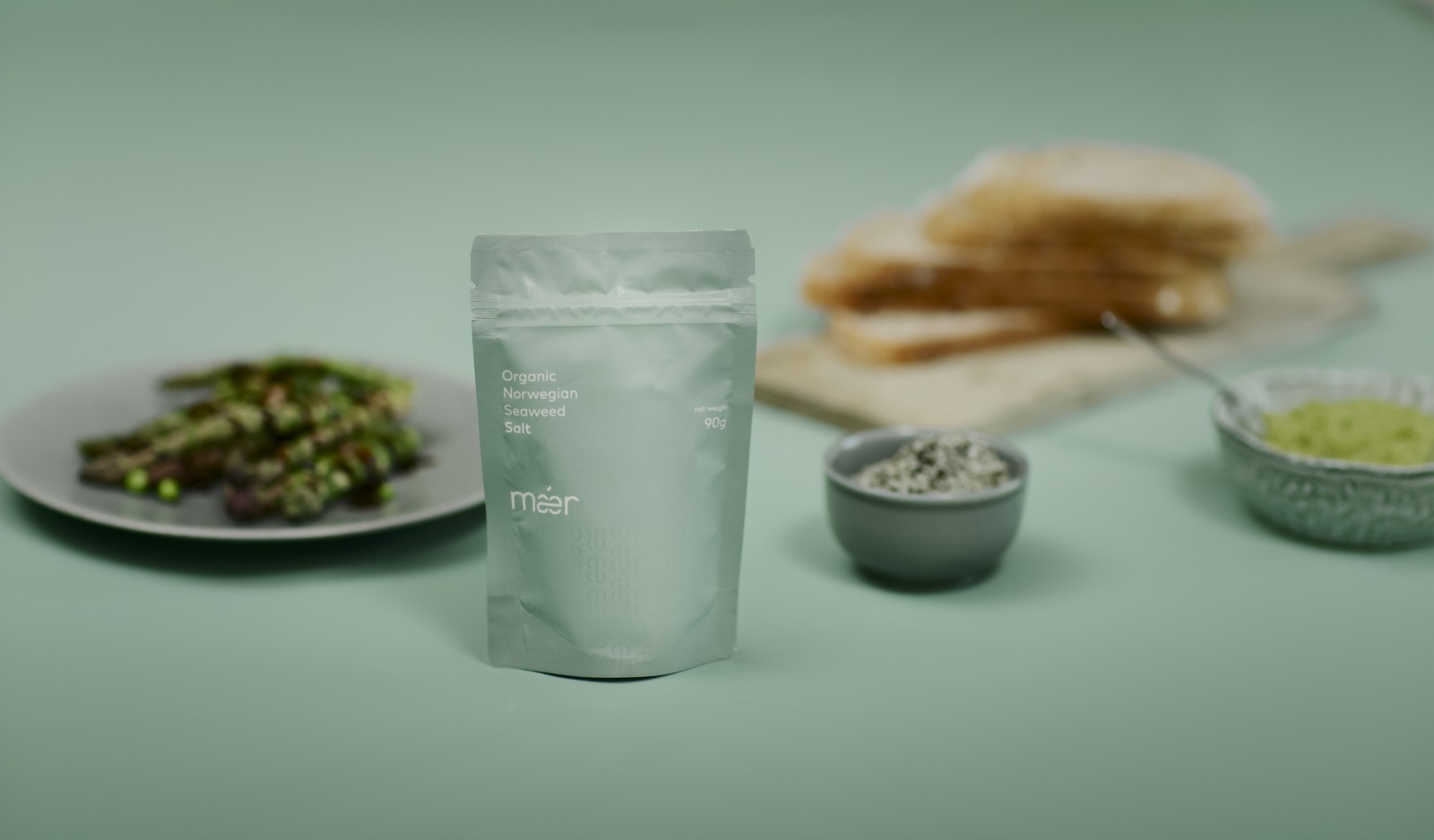
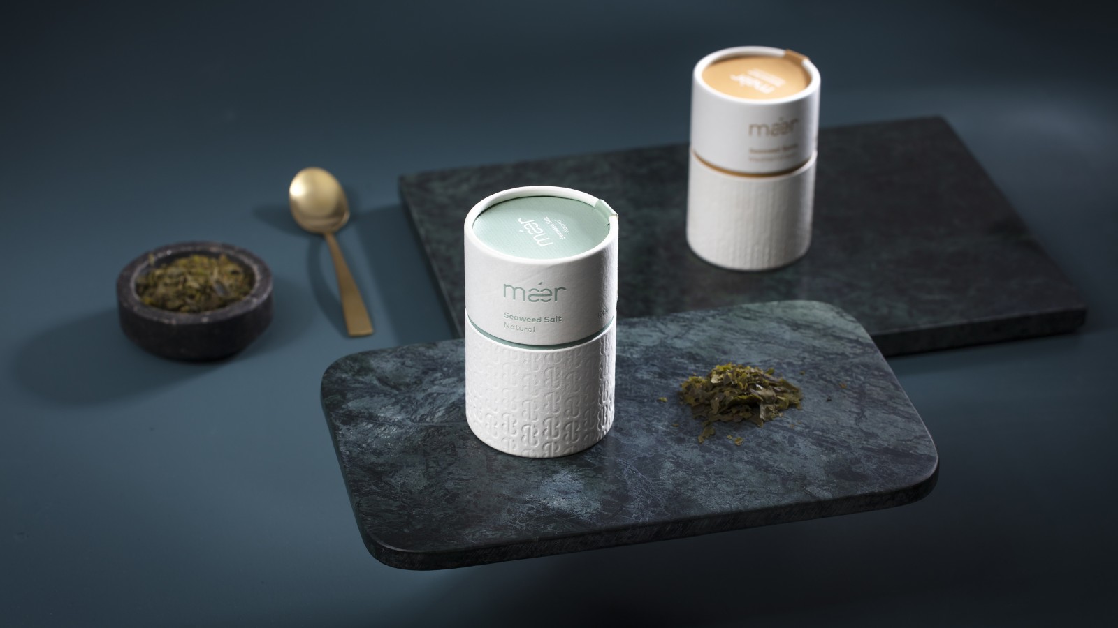
The pattern is embossed into exclusive and minimalistic paper tube used as packaging, discreetly mimicking the ‘shy’ nature of the seaweed. It is used to define and differentiate the different flavour categories. Another differentiator is the mild colours, that compliments the clean sandy tubes with grainy texture. The hues are drawn from the nature of the deep and kept in a natural saturation. The flavours have been put into categories, with a colour for each category and a different hue for each flavour. Along with the paper tubes, the coloured pouch bags are used as packaging. The pattern applied as a shiny UV varnish creates the same subtil and discreet expression and is used to differentiate the products along with the colours.
The respect that Mǽr has for this remarkable natural treasure – and its source – is demonstrated by the absolute commitment to sustainability. From the sea to the shelf, the environment is always in focus, therefore the packaging materials have all been chosen for their environmentally responsible qualities, while also ensuring that the seaweed reaches the customer in perfect condition.
Mǽr is simply the food of the future.


