


The Brand: Maēmo means “mother earth.” Maēmo stands for food and beverage concepts in which innovation, high-quality enjoyment and organic production are combined in a consistent way. Maēmo has focused on uncompromising quality from the very beginning. Where, for example, the legislator organic certification requires only 95% organic ingredients, Maēmo products are deliberately 100%.
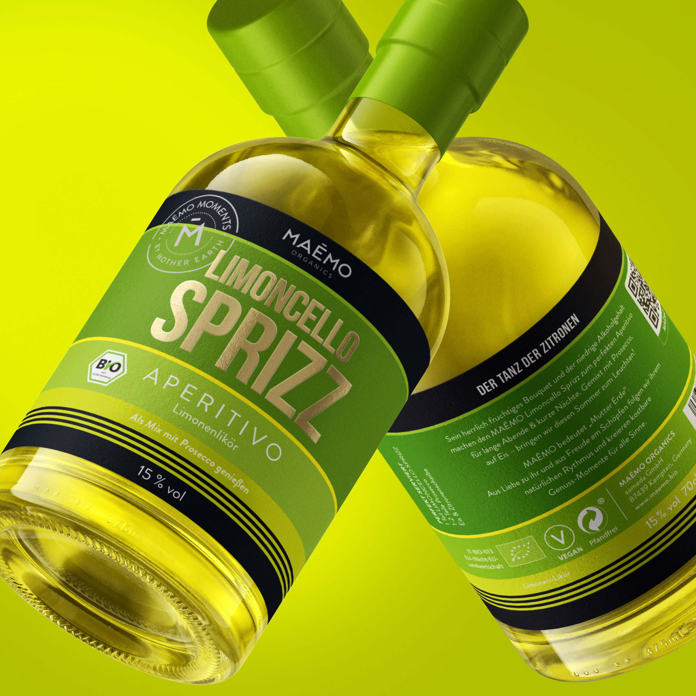
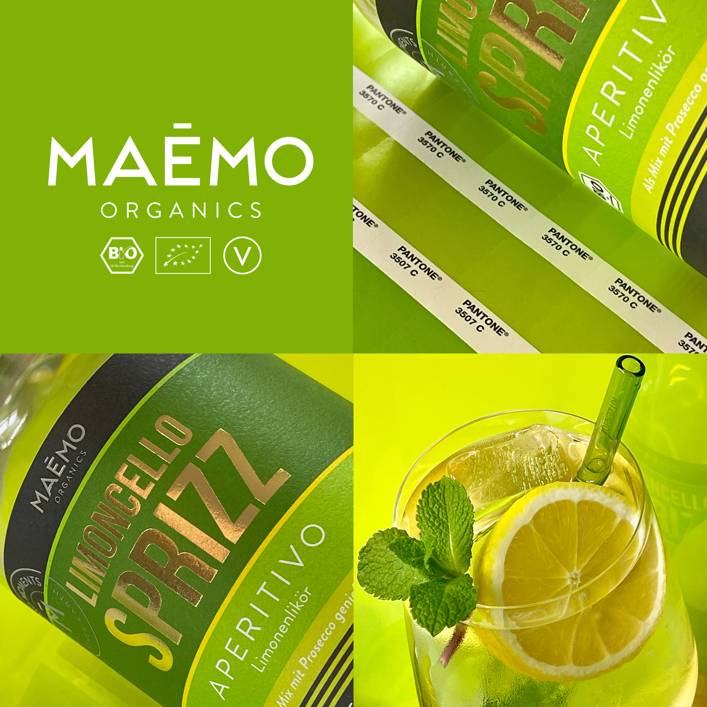
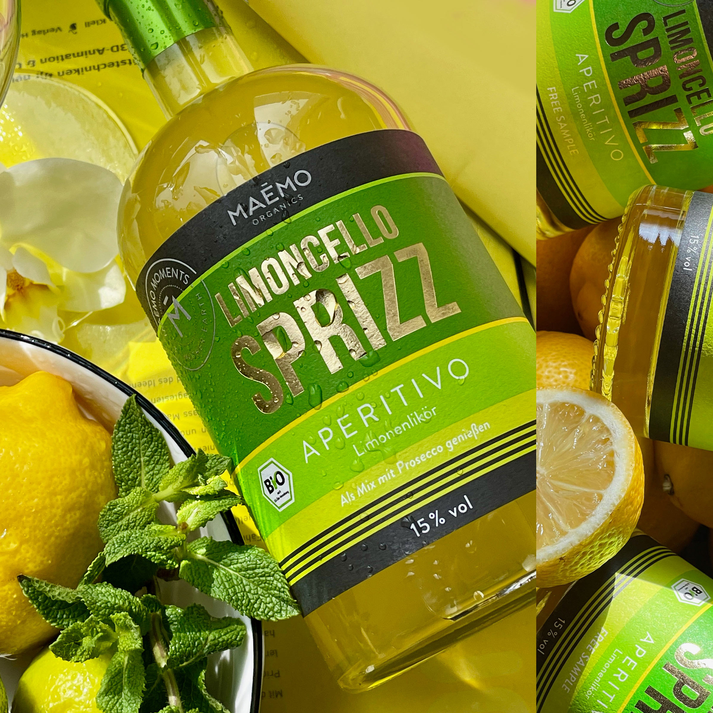
The Design: The design concept of the new brand shines just as resolutely. Warm colours are graphically combined in different tones. The design in modern stripe optics codes in each case with the color impression – the ingredients of the respective product. With bright hues, gold lettering in hot foil stamping and clean lines, the label exudes elegance, warmth and high-quality enjoyment. The brand logo is a simple sans-serif font that matches the versatile products in its modern and timeless aesthetic. The Maēmo logo is paired with a “seal” that reinforces the brand promise. “Maēmo Moments by Mother Earth”. The logo and seal of approval are finished with a relief varnish.
Maēmo’s world of enjoyment includes summery aperitif drinks and winter hot drinks such as Glüh & Gin, Glüh & Sprizz and white and red mulled wine in Winemaker quality. The Maēmo experience is perfectly matched by Mediterranean snacks.
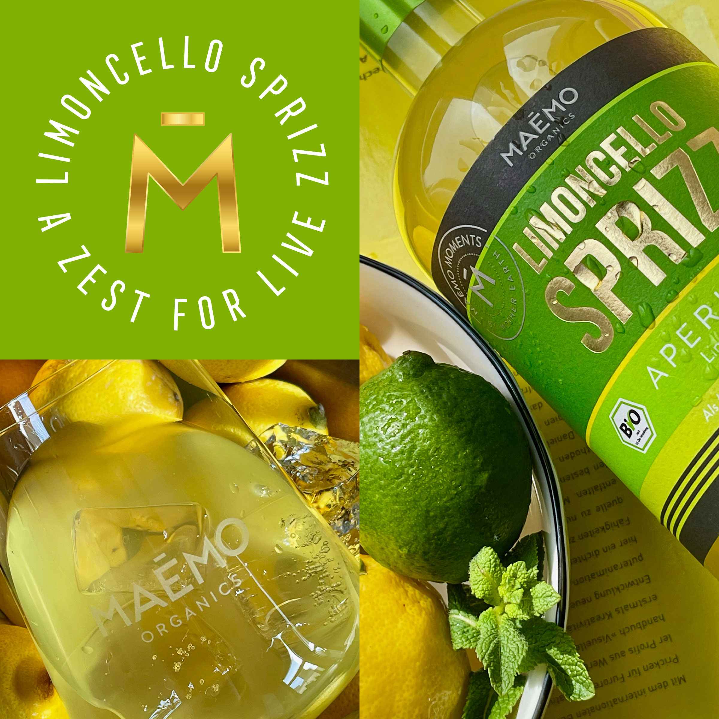
The New Task: Development of a new label for a Limoncello Sprizz, taking into account the existing stripe design. A Spritz is a popular and refreshing drink that originated in northeastern Italy, particularly in the region of Veneto. It has gained international popularity as a classic aperitif. The Spritz is known for its light, bubbly nature and vibrant appearance.
Idea: The first ripe organic lemons are harvested in summer. Their special quality feature: they are bright green. Only with the autumn harvest does the lemon turn yellow, when the temperature differences between day and night are sufficiently great. Then the fruit breaks down the natural green pigment chlorophyll.
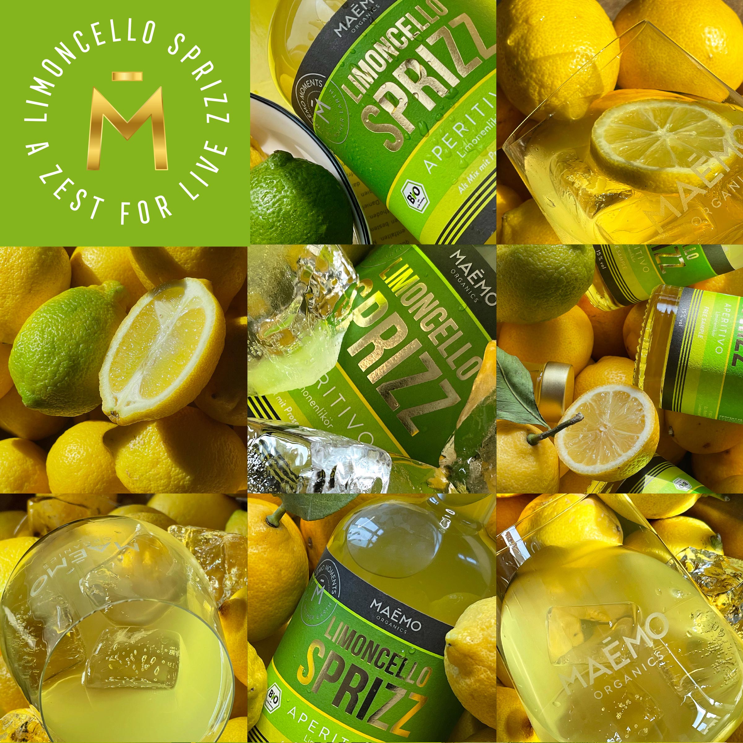
The colour code of the label plays with the ripening process from green to yellow.
Available in Stores: From the beginning of May this year.
CREDIT
- Agency/Creative: TIBOR+, Tibor Hegedues
- Article Title: Maēmo Organics, the New Organic Food and Lifestyle Brand
- Organisation/Entity: Agency
- Project Type: Packaging
- Project Status: Published
- Agency/Creative Country: Germany
- Agency/Creative City: HAMBURG
- Market Region: Europe
- Project Deliverables: Packaging Design
- Format: Bottle
- Substrate: Glass Bottle
- Industry: Food/Beverage
- Keywords: organic, limoncello, lemon power, lemon love, aperitif culture
-
Credits:
CO-Funder & Creative Director, Designer: Tibor Hegedues


