Struggle for visibility
Local small producers must constantly find ways to remain competitive, to have the resources to survive alongside large retailers and multinationals. One of the biggest challenges and problems is visibility. Although quality, sustainability, and healthy ingredients – everything that local producers’ products stand for – are increasingly important factors for consumers, in many cases they know little or nothing about local, region-specific quality products. Most producers lack the resources to promote their businesses and products, and in most cases, there is no common organization to unite and represent the producer community.
Recently, associations, organizations and local authorities have initiated the creation of several regional trademarks across the country to support the local producer community. One such region is the Niraj Valley, which includes 68 municipalities. These settlements are home to 35.000 inhabitants, almost 50% of whom are second or third generation farmers.
Made in Niraj Valley
Purpose:
Local producers from Niraj Valley are an honest, hardworking community of rural people who respect nature and tradition, and who create and live from these values. The purpose of the brand is to support, help and unite the local farming community.
Mission:
The guarantee of honest work, love of nature and good quality made in the Niraj Valley.
The label is a long-term initiative that offers security and visibility to local producers. It also guarantees consumers that they are buying a quality product made by local ingredients form the Valley.
The idea
Qualitative research was conducted with local producers and customers. Through competitive analysis and qualitative research, we identified an idea that is defining for the producers of the region but missing from the brands of the competition: the fair, honest, decent work behind it and the recognition of the producers and the people. The slogan was born: With honest work, naturally (In Hungarian: Becsülettel, természetesen – with a linguistic twist: naturally also meaning the aim to respect nature. In Romanian: E în natura noastră – It’s in our nature.)
THE TASK
The aim was to create a coherent visual identity that would ensure that the producers and their products retained their own brand design, meanwhile customers can link these to the region. An identity that represents the farming community from Niraj.
THE CHALLENGE
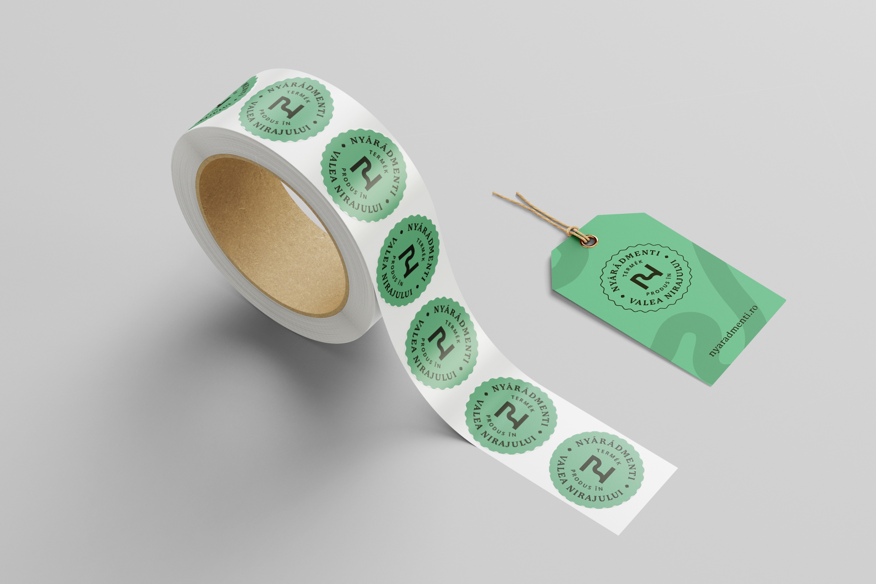
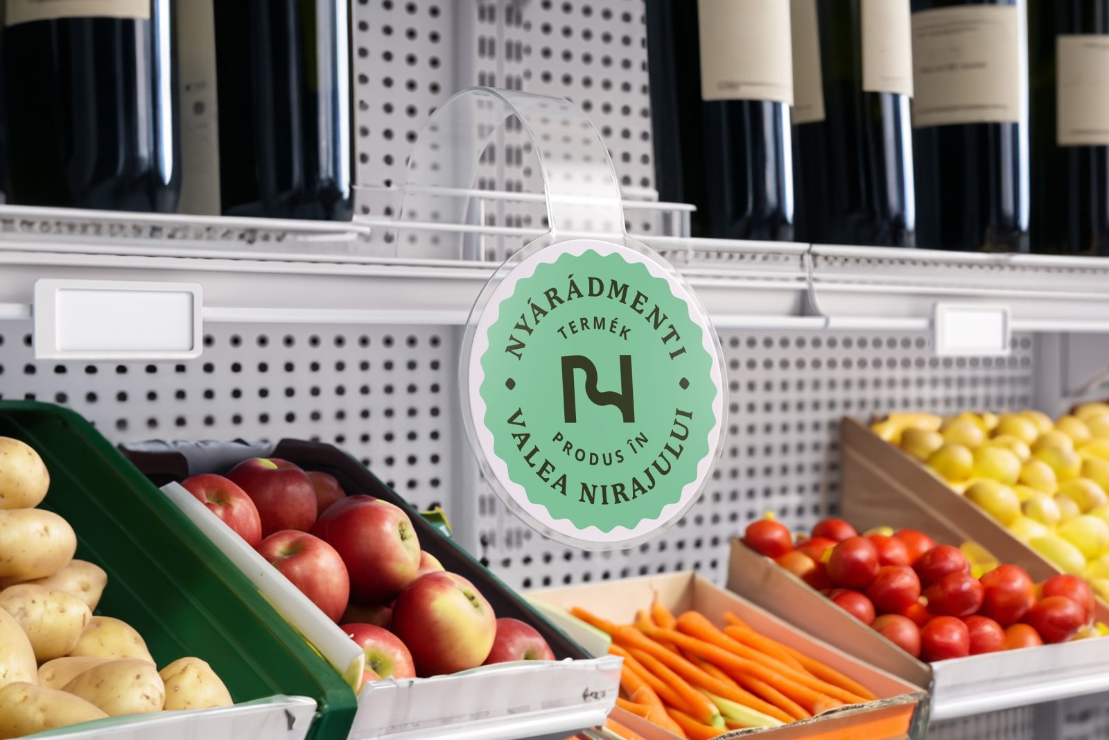
The primary audience live in the 3 surrounding counties (approx. 350,000 people, age 25-50) who knew some of the products or brands but did not connect it to the Niraj Valley as the source region. They needed a symbol and logo that can also be used as a label, that would:
Work with the product packaging design of the current 50 producers,
Differentiate it from all other regional labels,
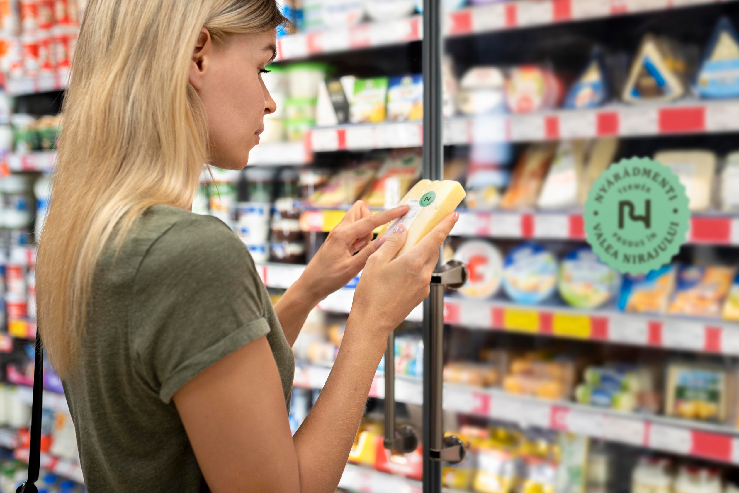
Responsive, working in all sizes: from small cheese wrappers to crates,
Timeless, recognizable and in line with the brand values and all communication platforms.
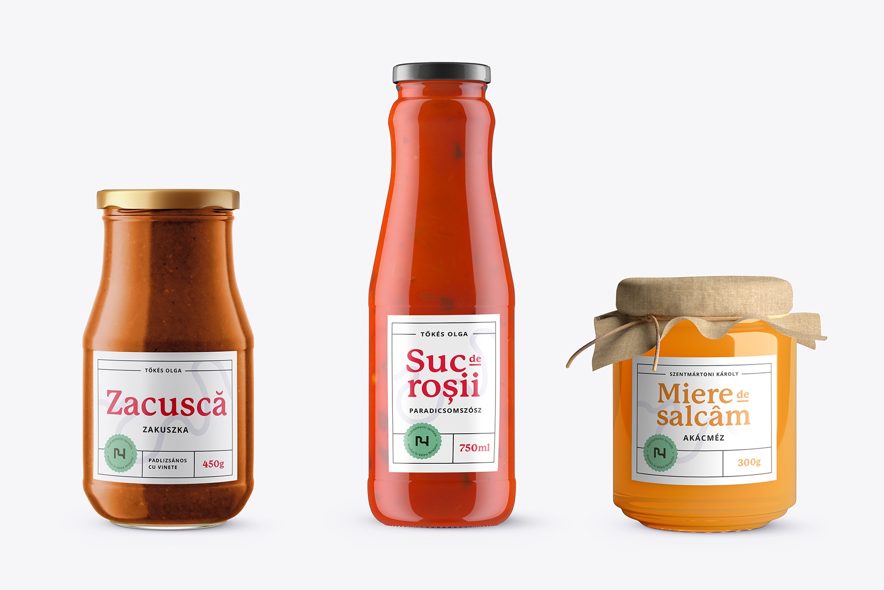
An important consideration was that many tiny companies (monthly profit <2,000 euros) pre-produced already their labels for cost efficiency. Therefore, we created stickers of the label that they can apply to their existing product packaging.
At the same time, there are manufacturers who do not yet have their own packaging design, or their label design is very outdated. We created a very simple and functional packaging design template that followed the principles of our design, that can be edited even in MSWord.
The Solution
The main symbol of this identity is the Niraj (Nyárád) River, which gives the area its name, connects the settlements and has been the source of agriculture and farming for generations.
The people of this region are closely linked to the river. The identifying letter N, the initial, carries the characteristics of the river (shape, color, name) as the defining symbol of its image.
Bilingualism was an important aspect and expectation in the development of the identity. Most of the producers are native Hungarian speakers, but most of the audience is Romanian speaking. The first letter of the river can be identified in both languages by the symbol N, but it also evokes nature (in Romanian: natura).
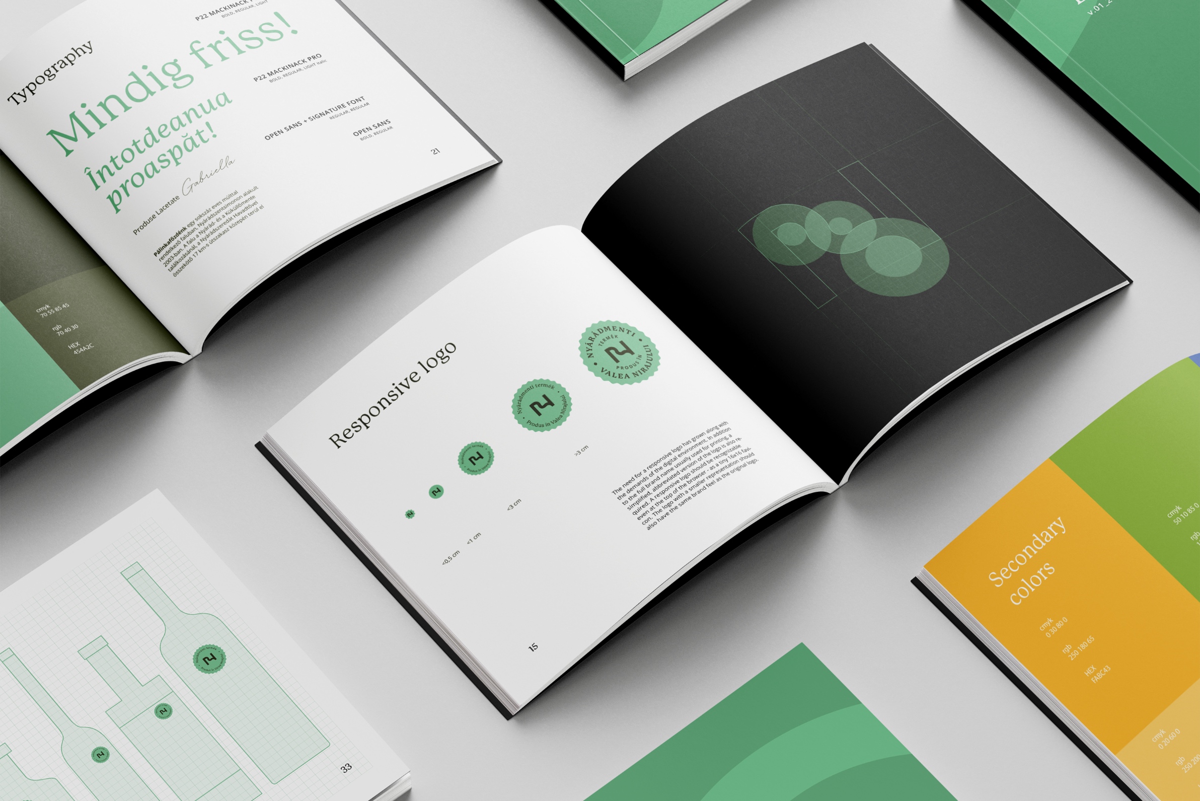
The primary turbid green is the real color of the river. The secondary colors distinguish the categories.
The river is also part in the secondary graphic element, a free running symbol that links together the farmers, can be used in a variety of ways, yet is coherent.
The Mackinac Pro typeface is modern and distinctive, great for digital and print usage.
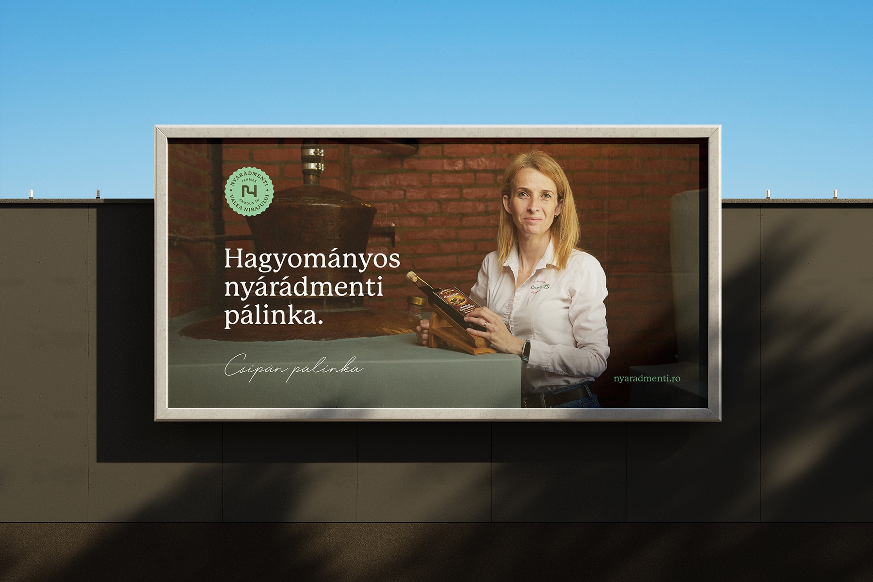
The low-budget brand launch campaign focused on the personality and stories of the producers, highlighting the brand idea. The photos show these people in their own, natural environment. It was important to catch an honest, realistic picture of the farming community, without filters or retouching.
The outcome
The brand launch in summer was the first step, making headlines in the local press and on the social media. A bigger brand marketing campaign is planned for March 2024 together with the launch of the website, that will be designed using the style guide. The trademark label will be used on products for the first time also in the beginning of 2024.





CREDIT
- Agency/Creative: Rubikom
- Article Title: Made in Niraj Valley Brand Identity
- Organisation/Entity: Agency
- Project Type: Identity
- Project Status: Published
- Agency/Creative Country: Romania
- Agency/Creative City: Transylvania
- Market Region: Europe
- Project Deliverables: Brand Identity
- Industry: Food/Beverage
- Keywords: WBDS Agency Design Awards 2023/24
- Keywords: Identity, Brand Design Creation
-
Credits:
Creative Direction/Strategy: Porcsalmi Balázs
Identity & Lead Graphic Design: Domokos Zsolt
Graphic Design: Szabó Zsolt
Graphic Design: Csergő Szabolcs


