


Mad Muse — Creating a rebellious brand for two tonic lines
Task
We created a brand for two lines: a core range of flavored tonics and a limited edition of ready-to-drink cocktails made with those tonics. One ideology — two different drinking scenarios.
The challenge: tonics are usually functional, not emotional, and the shelf is visually overcrowded. Our goal was to rethink the product’s role and make the brand stand out — culturally relevant, visible, and engaging.
Brand Strategy & Naming
Interviews showed a clear shift: since the pandemic, home mixology has only grown. For many, tonic is the universal base — the “background” that lets the main ingredient shine.
People also admitted they often choose by the label, because “tonic is just tonic.”
So we flipped the logic:
If tonic is the background for cocktails, we’ll become the background that sparks experimentation.
Inspiration instantly points to a muse — but ours isn’t soft or obedient. She’s bold, a little wild, and unapologetically free.
That’s how Mad Muse was born.
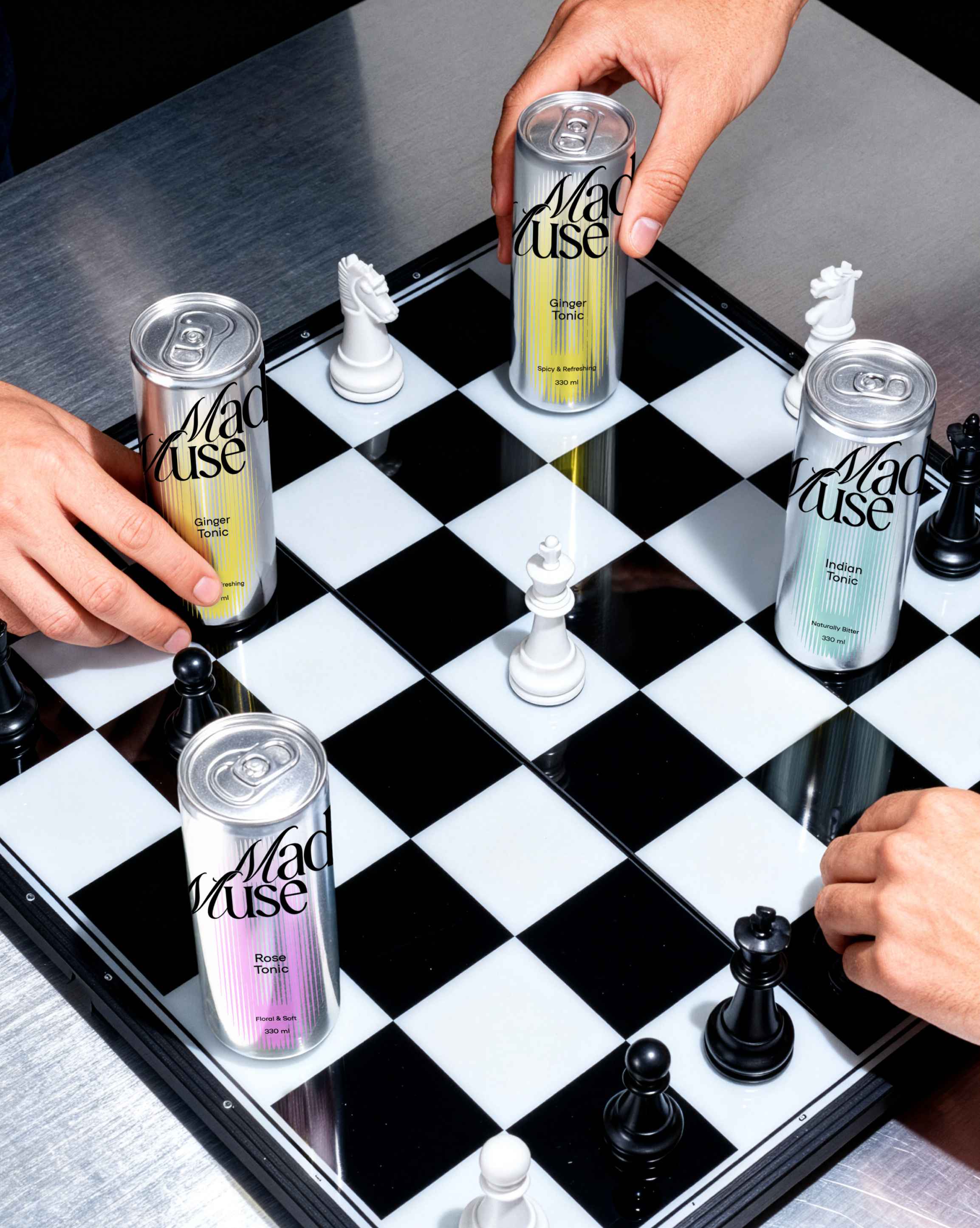
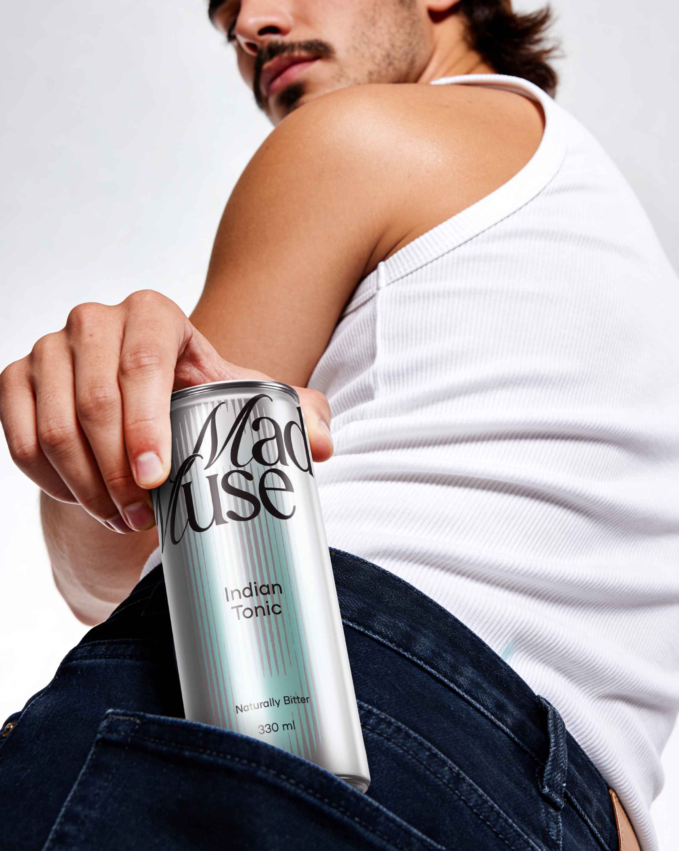
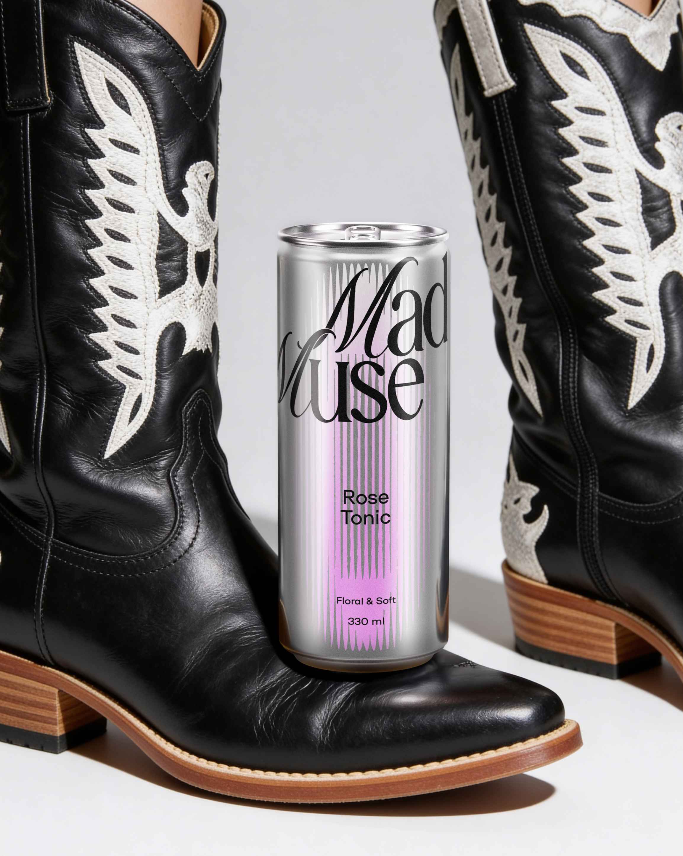
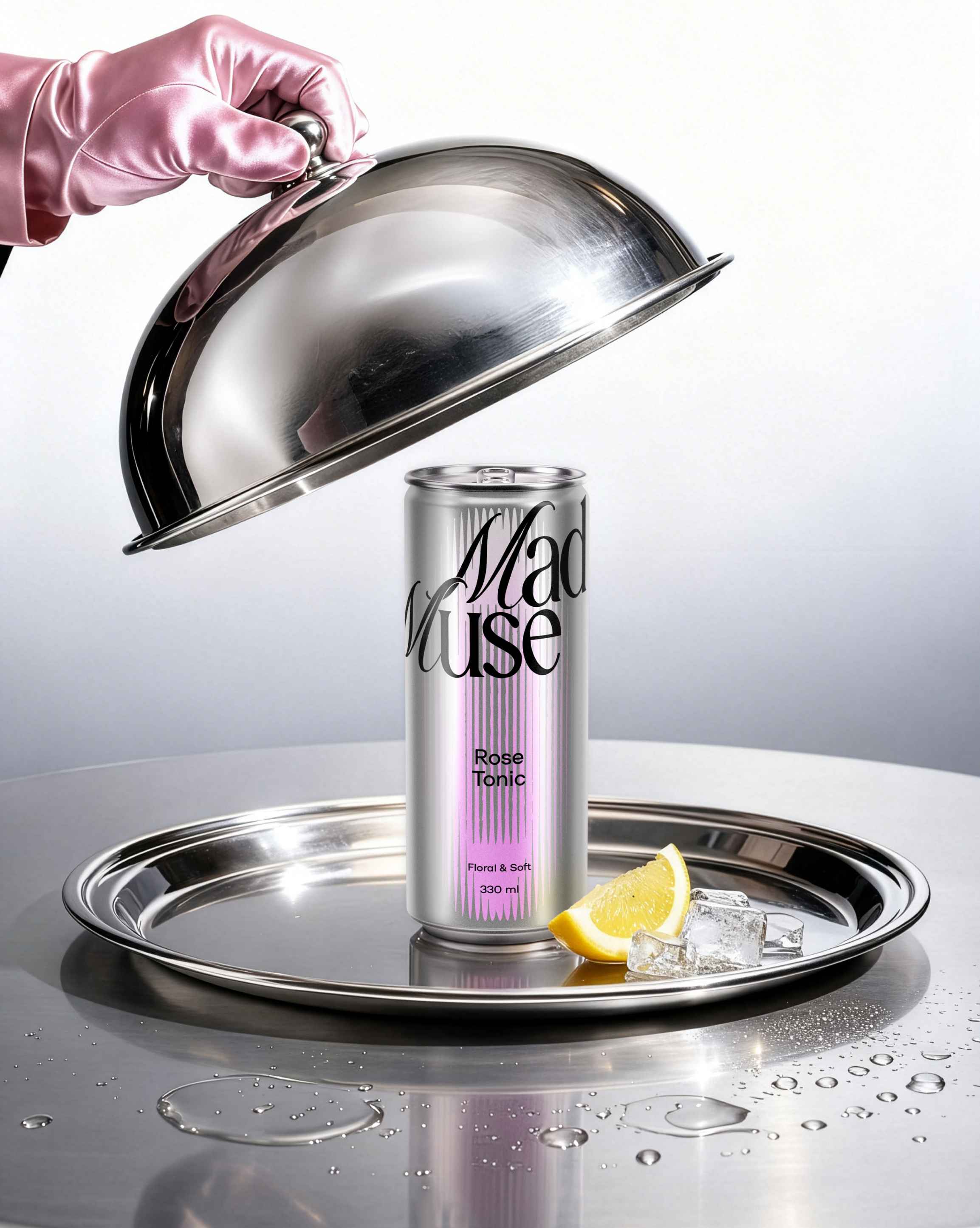
Core Line (Tonics)
We treated the can as a clean canvas for creation. A metallic finish becomes the neutral base, open to any mix.
On top of it we introduced “auras” — abstract forms that capture the moment inspiration hits. Each aura is different, because inspiration never repeats. Clear color coding makes flavor navigation instant.
The logo mixes two distinct typefaces — controlled chaos: rebellious energy with enough structure to stay sharp and recognizable.
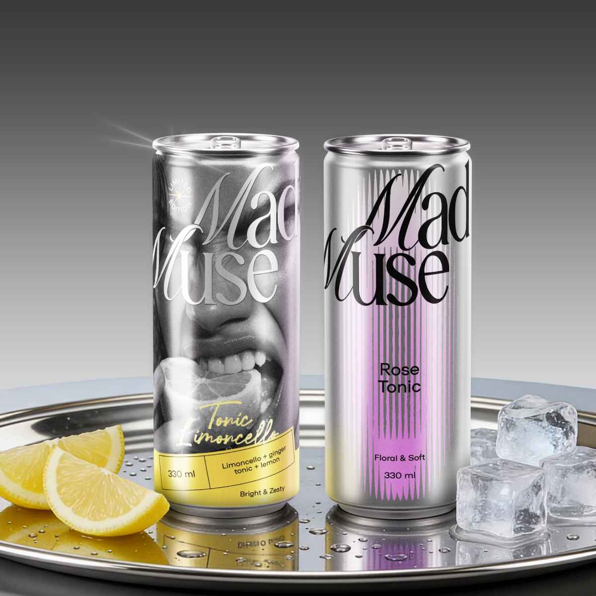
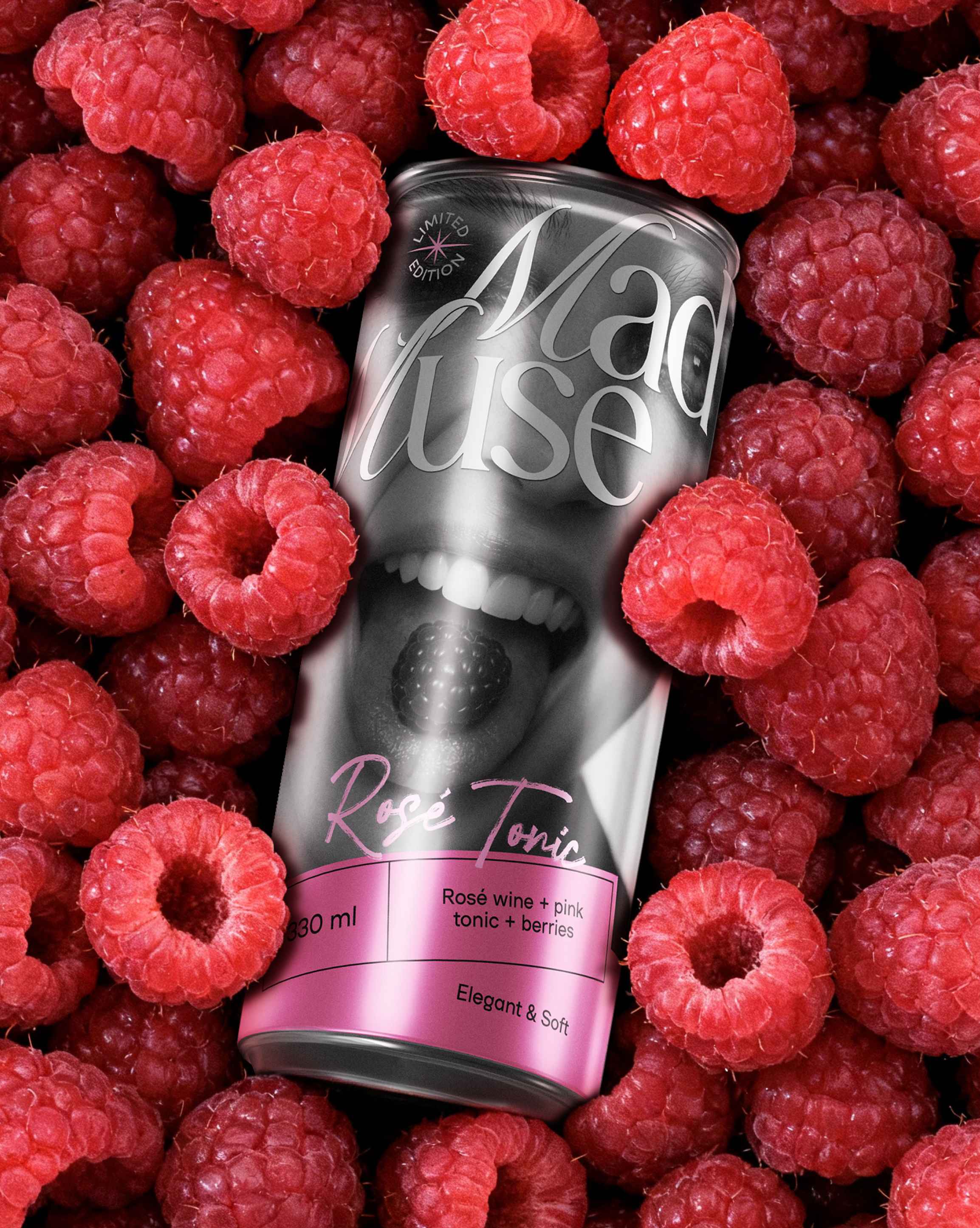
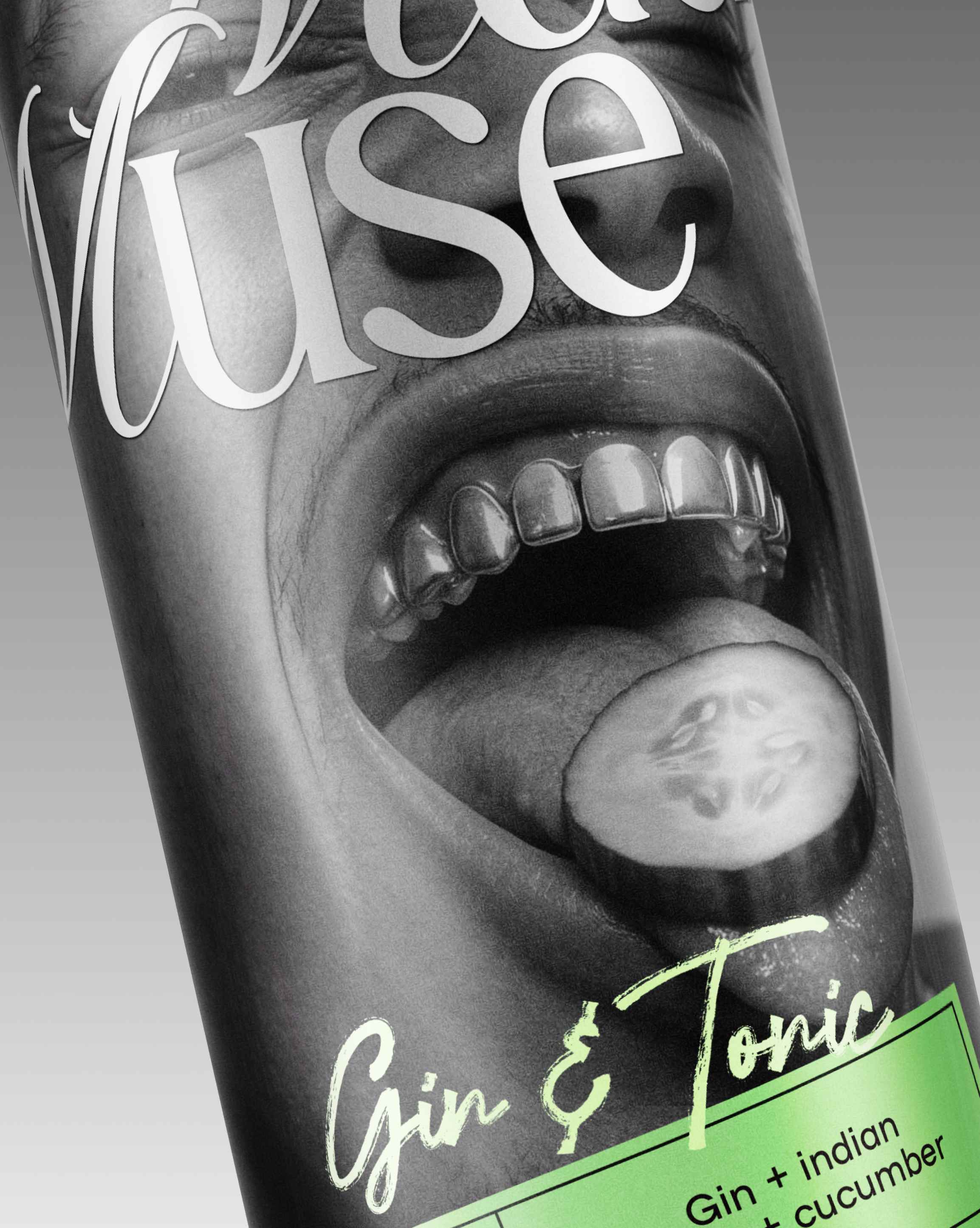
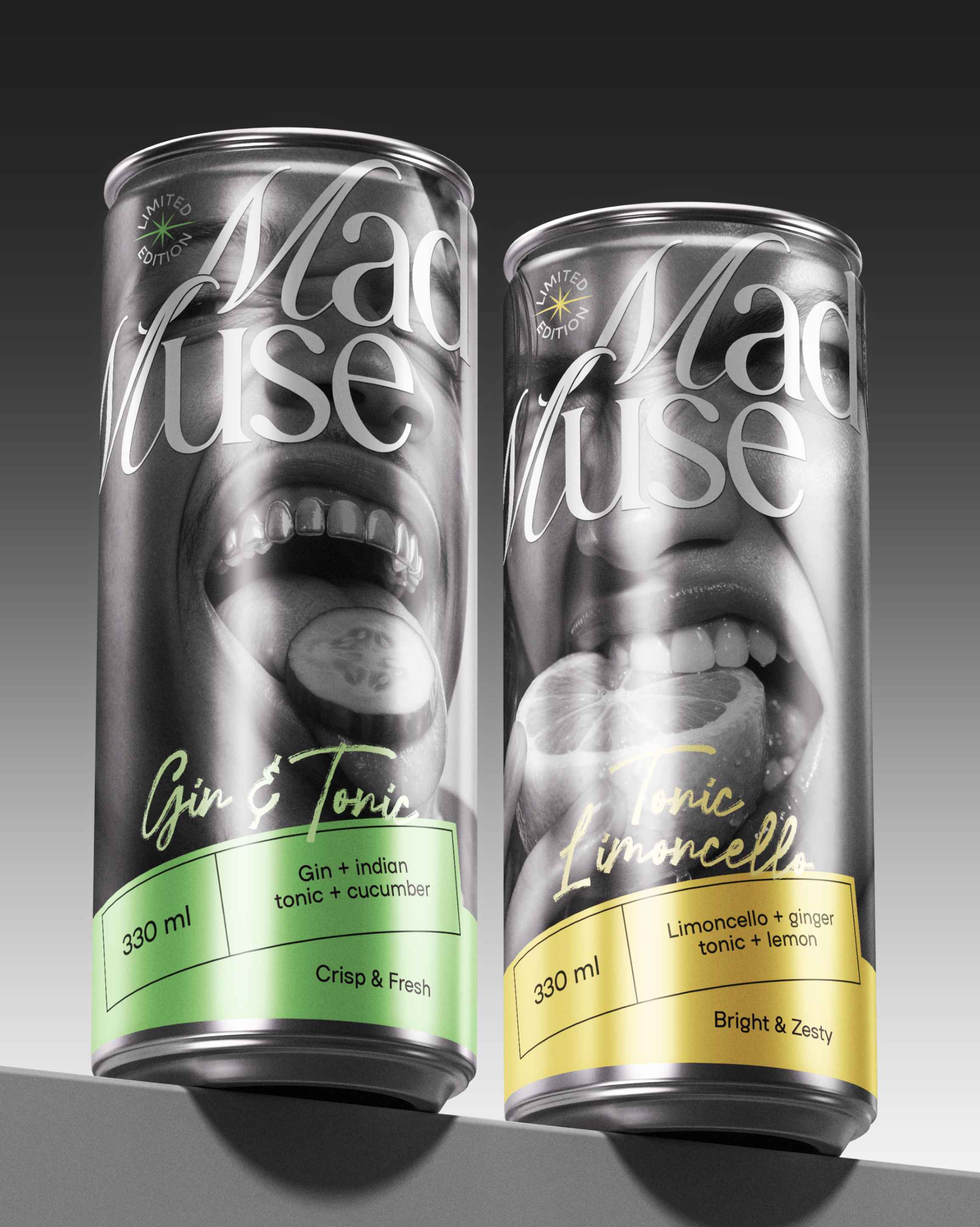
Limited Edition (Cocktails)
Here, we moved from the act of mixing to the emotion of the moment. The brand stops being the muse and suggests: anyone can become one — anyone who chooses self-expression.
We intentionally challenged the stereotypical “fragile muse.” In this line, the muse is confident, loud, and expressive — regardless of gender. The narrative shifts from “we inspire you” to “you inspire.”
Visually, the line stays connected to the core range through metallic elements, while bold ingredients + strong color coding make flavors readable at first glance, supported by short expressive descriptors.
Result
Mad Muse is designed to break category conventions — a bold move that matches the brand itself. It’s a story about creative freedom, experimentation, and choosing what feels right over “the right way.” Sometimes, that’s exactly what a tonic needs to become something more.
CREDIT
- Agency/Creative: Bloom Büro
- Article Title: Mad Muse Branding by Bloom Büro Reimagines Tonic Packaging as a Catalyst for Home Mixology
- Organisation/Entity: Agency
- Project Type: Packaging
- Project Status: Non Published
- Agency/Creative Country: Ukraine
- Agency/Creative City: Lviv
- Market Region: Europe
- Project Deliverables: Brand Creation, Brand Naming, Brand Strategy, Logo Design, Packaging Design
- Format: Can
- Industry: Food/Beverage
- Keywords: Brand identity, brand strategy, naming, packaging design, beverage branding, tonic packaging, RTD cocktails, limited edition packaging, FMCG design, shelf impact, category disruption, visual system, flavor navigation, color coding, metallic finish, can design, typography, logotype, rebellious tone of voice, home mixology insight, muse concept, brand storytelling, contemporary brand narrative, design for differentiation, consumer insights, experimental branding, expressive branding
-
Credits:
Art Direction: Oleksandra Bobak
Graphic Design: Valeria Dutka
Brand Strategy & Naming: Elza Sagura
Project Management: Marta Tynna


