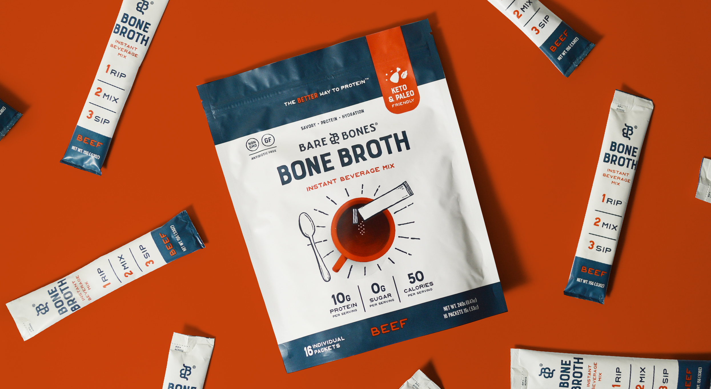
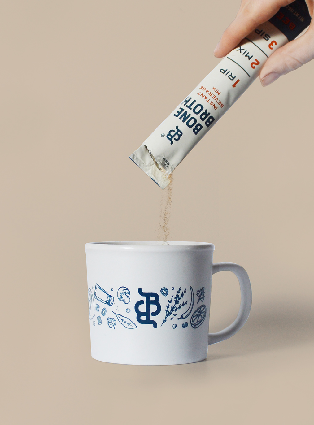
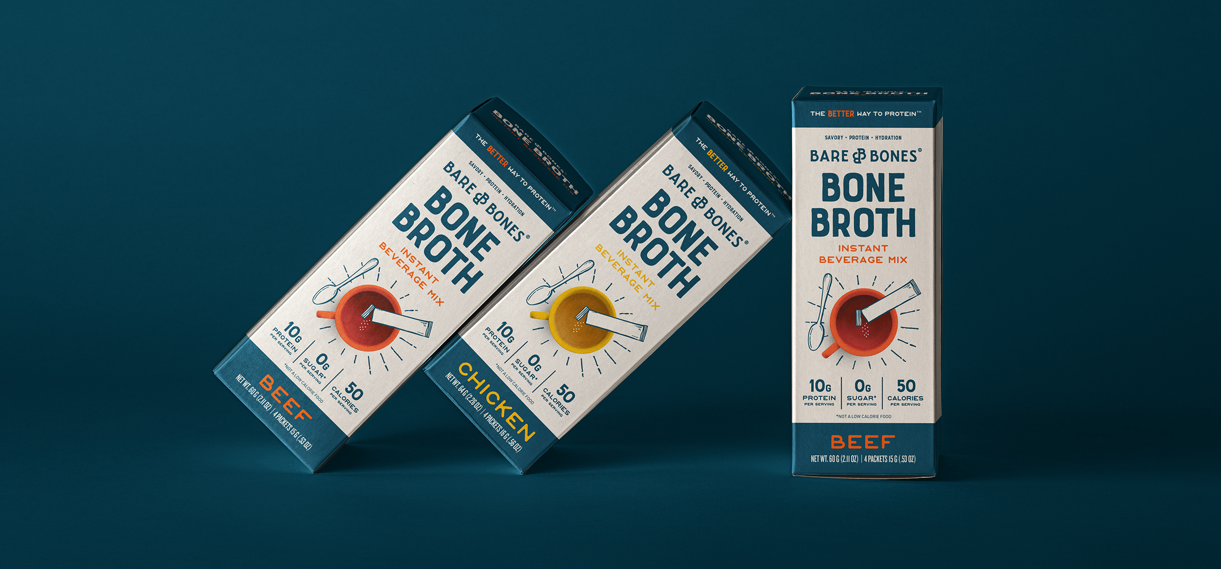
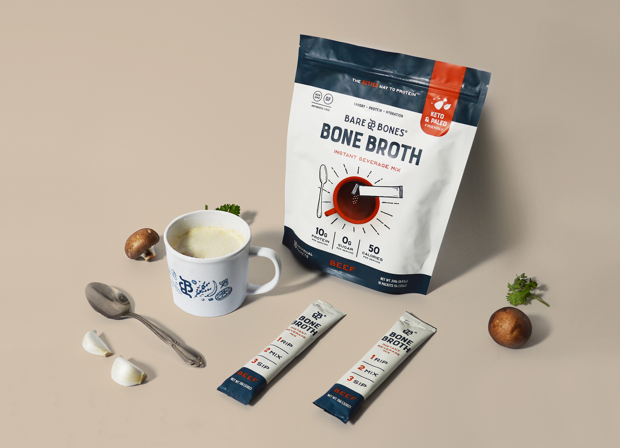
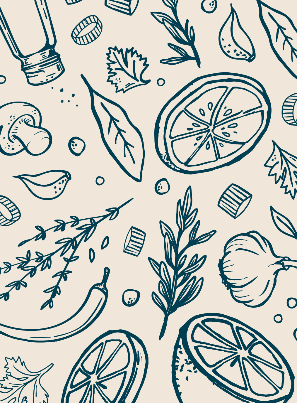
When Bare Bones was approached with a huge opportunity from a major nation-wide retailer, they came to us looking to develop a new look for their exciting new product. Our challenge was finding a way to communicate the convenience and health benefits associated with bone broth as a beverage and snack. We chose to use the mug as a focal point, to clearly communicate how to use the product. We then paired it with whimsical illustrations and hand-done accents to add a sense of playfulness to the brand.
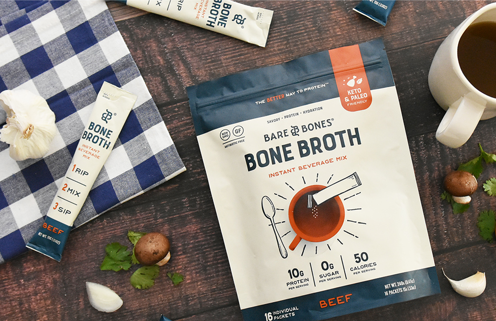
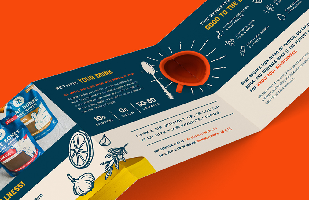
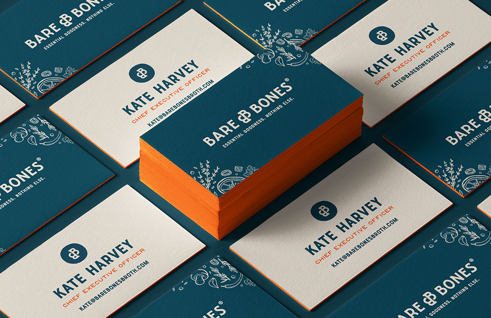
Following the initial launch, the brand identity was expanded to different packaging and marketing materials to create a cohesive experience throughout.
CREDIT
- Agency/Creative: Macaroni Creative
- Article Title: Macaroni Creative Creates New Look for Bare Bones Bone Broth
- Organisation/Entity: Agency, Published Commercial Design
- Project Type: Packaging
- Agency/Creative Country: United States
- Market Region: North America
- Project Deliverables: Brand Identity, Brand Redesign, Brand Refinement, Branding, Graphic Design, Illustration, Packaging Design, Research
- Format: Box, Pouch, Sachet
- Substrate: Plastic
FEEDBACK
Relevance: Solution/idea in relation to brand, product or service
Implementation: Attention, detailing and finishing of final solution
Presentation: Text, visualisation and quality of the presentation


