


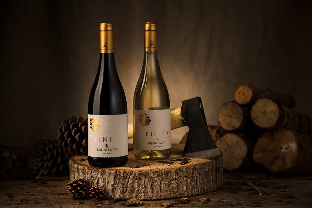
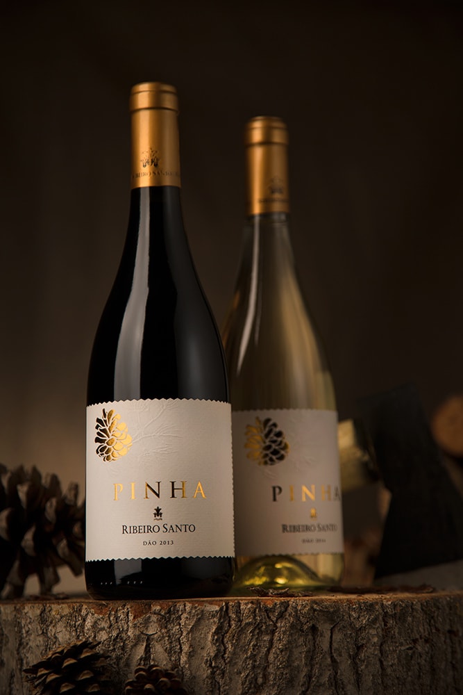
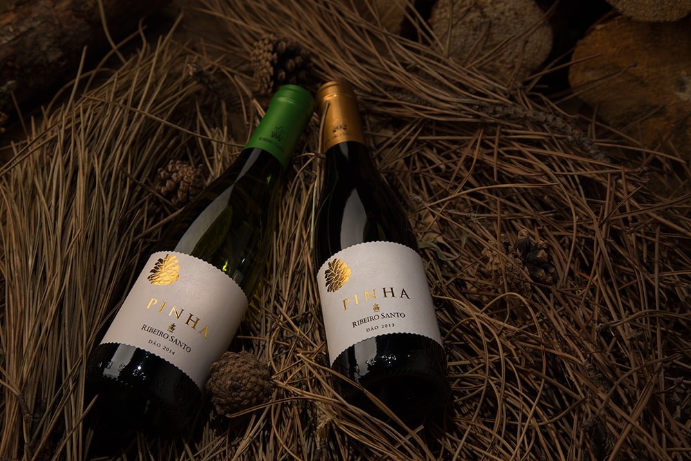
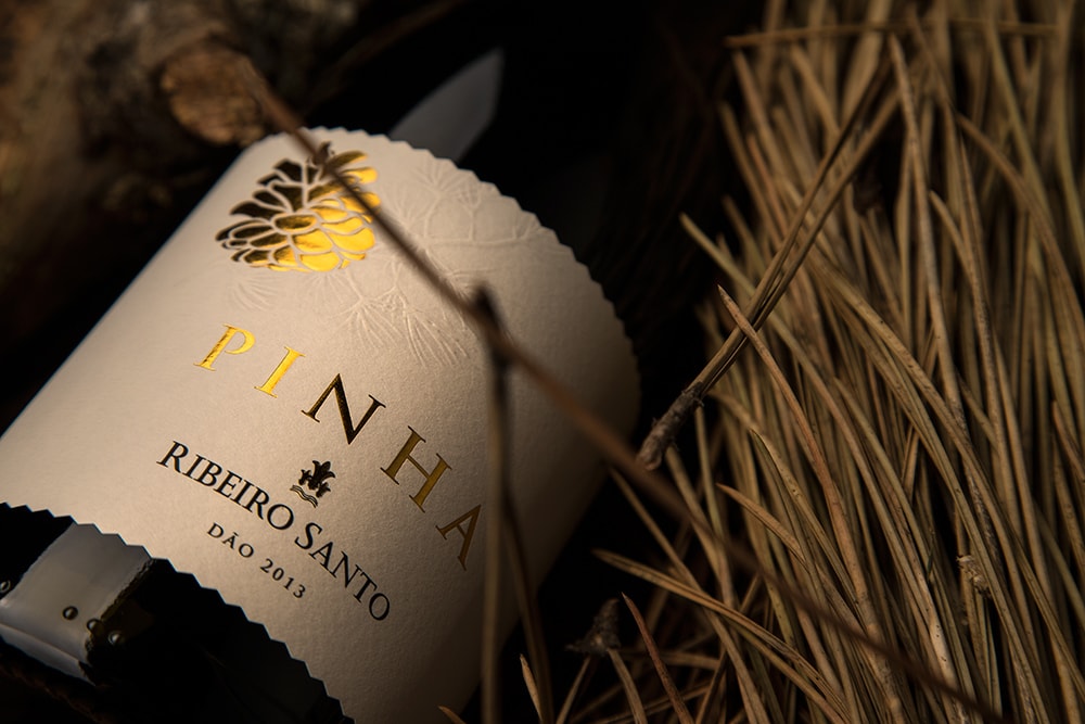
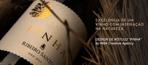
“Pinha is the Portuguese word for pine cone. This is a label design project inseparable from the importance of the surrounding pine forests of the vineyards where the grapes from which the wine Pinha comes, mature. The existence of pine forests around Dão vineyards, plays an important role in the flowering process, helping the distribution and retention of pollen, allowing the wine to acquire new flavors.”
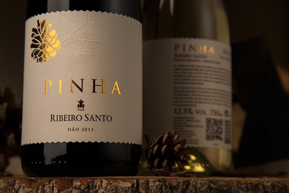
“Honoring the importance of the existence of pine forests to the unique characteristics of these wines, the pine cone inevitably emerges as the single element and highlight of this label, even naming the wine. The gold used urges the autumnal colors giving themselves prominence to label the stamp and printed applied. The detail of the unique label that wraps around the bottle, joining the front with the back side, with the cut in triangle in the top and bottom even adds a touch of distinction. Trully inspired by nature, the graphic design emphasizes the elegance and simplicity with the minimal lines and soft drop shadows, strengthening the visual effects of the golden stamped details.
A label that transmits sobriety and distinction of Dão DOC wines produced in the estate of Ribeiro Santo.”
Designed by M&A Creative Communication Agency
CREDIT
- Agency/Creative: M&A Creative Communication Agency
- Article Title: M&A Creative Communication Agency – Pinha Wine
- Project Type: Packaging


