


Defined by time, guided by touch, and destined to endure.
This marks our first collaborative project in 28 years, three agencies coming together to create an outstanding visual, technical, and functional result.
M&A Creative Agency – Technical Fine-Tuning, Project Development & Production
Working closely with all partners, respecting the original guidelines while refining and adjusting critical details to achieve the intended objective, was a highly demanding process.
Initially, the wooden tube was designed to function in a specific way. However, after technical testing and physical prototyping, it became clear that improvements were necessary. The real challenge was developing a mechanism that had never been designed or tested before, allowing the piece to open and close in a completely new way. Our product design team successfully solved this complexity, resulting in an innovative and exceptional final piece.
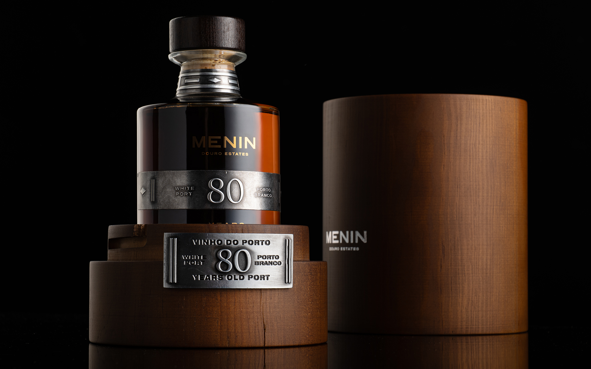
Every detail required precision and care: the interior and exterior wood finishing, technical closing system, bottle fitting, overall color consistency and the hot stamping foil in round surface . Wood is a living material, with its own character and unpredictability, making it especially challenging to achieve both visual perfection in two pieces and a refined tactile experience. Ensuring the softness, balance, and quality of the packaging in hand was a complex challenge, one that was successfully accomplished.
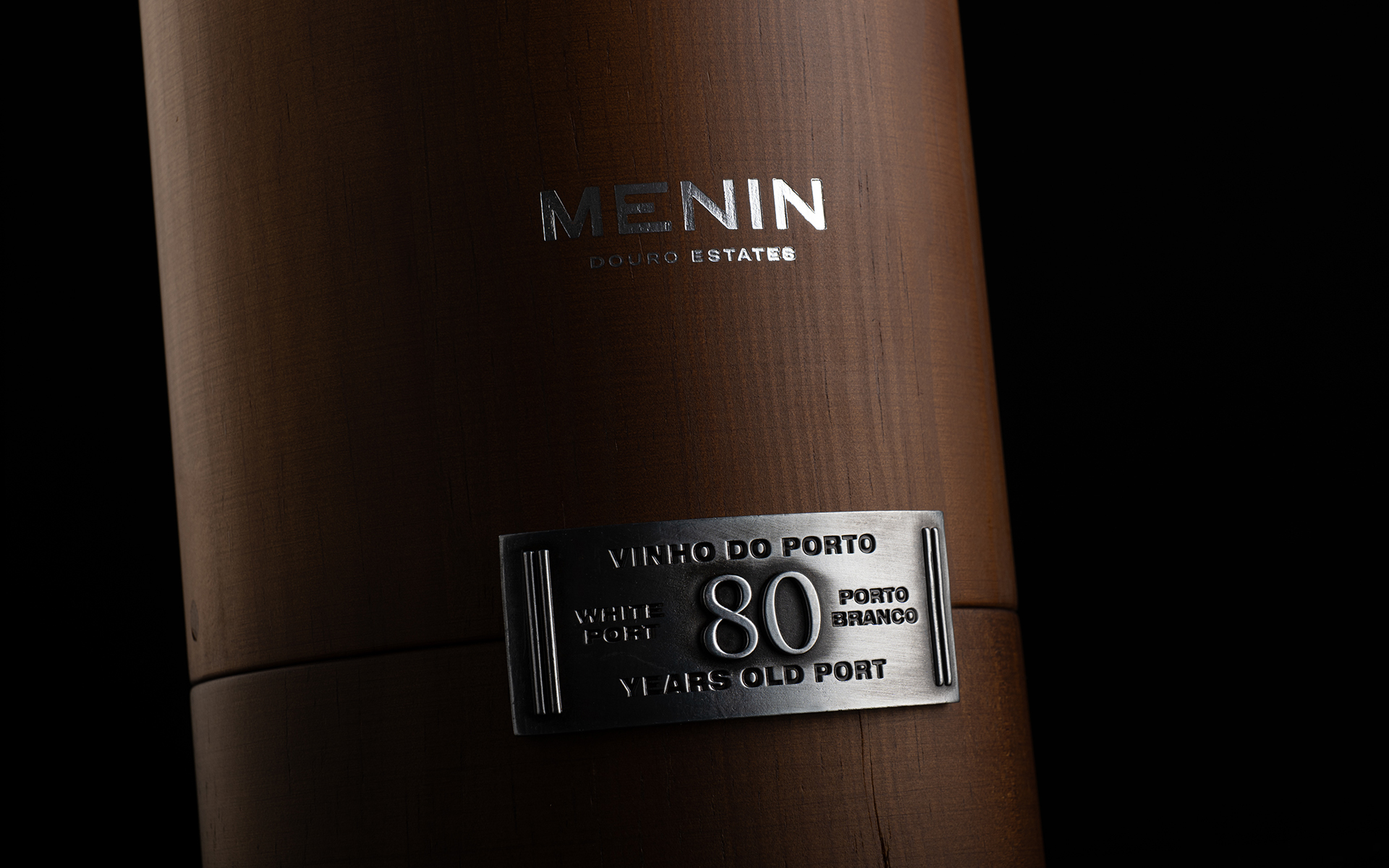
The aluminum labels also presented a significant technical challenge. Our goal was to faithfully reproduce the texture and tonal richness of aged brass, gold, and silver. Through extensive testing, multiple samples, and careful color refinement, we achieved an authentic and sophisticated result.
Our technical development and production control team followed the highest standards of quality at every stage. The objective was not only to create a beautiful design, but to deliver a true piece of art, where concept, engineering, material, and craftsmanship exist in perfect harmony.
ZUKO METAL LABELS – The art that lasts forever
We were entrusted with the final chapter of its creation, where vision becomes object, and precision becomes permanence.
Our process began in silence, through meticulous 3D modeling and successive prototypes, each one bringing us closer to a singular ambition: to create a piece that transcends function and becomes presence.
The metal label became the soul of this expression. We sought to sculpt it with depth and quiet strength, through a pronounced embossing that would capture light and shadow with intention. The curvature of the form resisted perfection, demanding patience and mastery. Many attempts were made. Each one refined. Until, finally, balance was achieved, not forced, but earned.
Production was approached as a ritual, not a process. The old brushed gold and silver finishes were developed through careful experimentation, until the surfaces revealed the character demanded: timeless, restrained, and alive.
Each piece was individually brushed and finished by hand, guided only by the artisan’s gesture and eye.
This is the essence of true craftsmanship, where the human hand leaves its trace, and where rarity is not manufactured, but created.
Bisarro Studio – Design & Art Direction
Designing the identity for two 80-year-old Port wines is not a graphic exercise. It is the responsibility of giving form to something that already carries its own historical weight. For Bisarro Studio, the challenge was to translate time into visual language – without noise, without excess, with the restraint that rare objects demand.
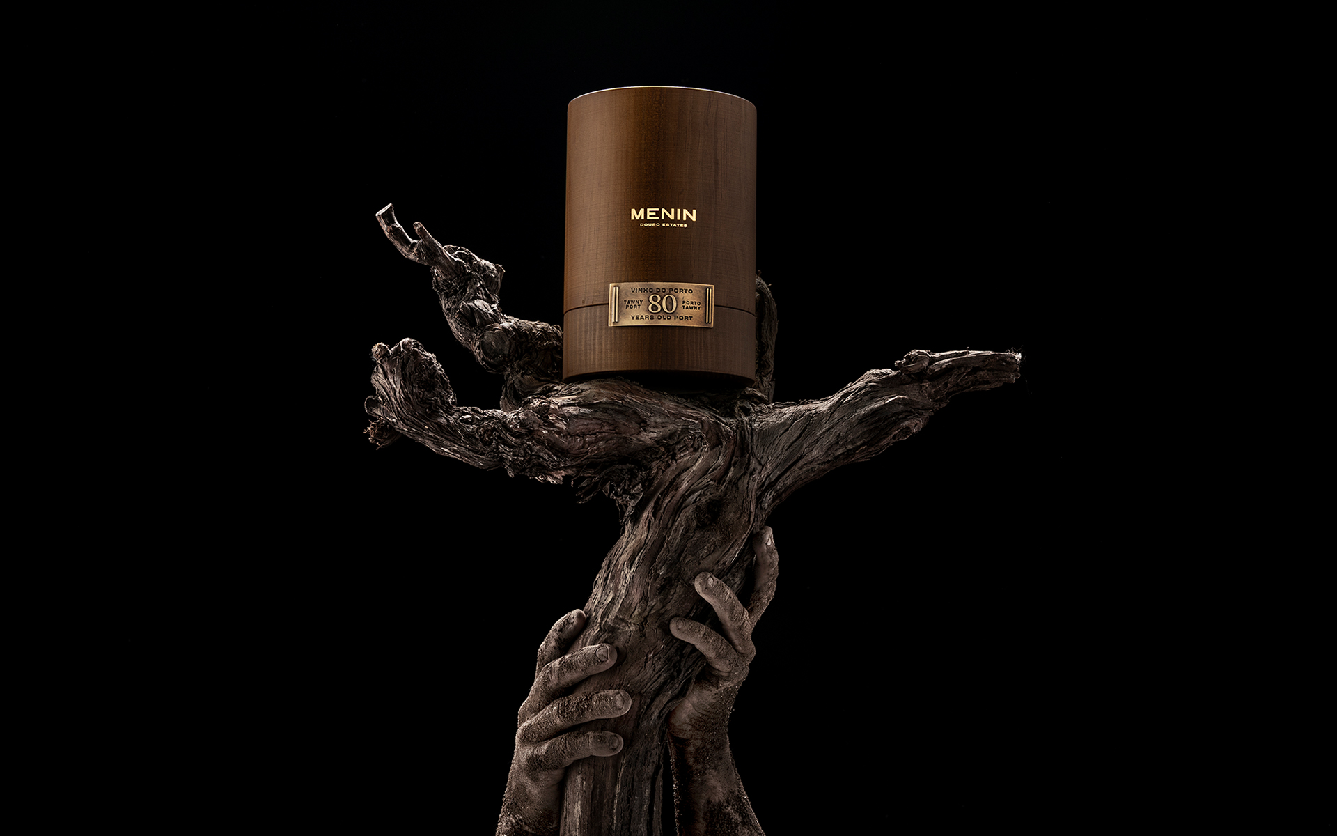
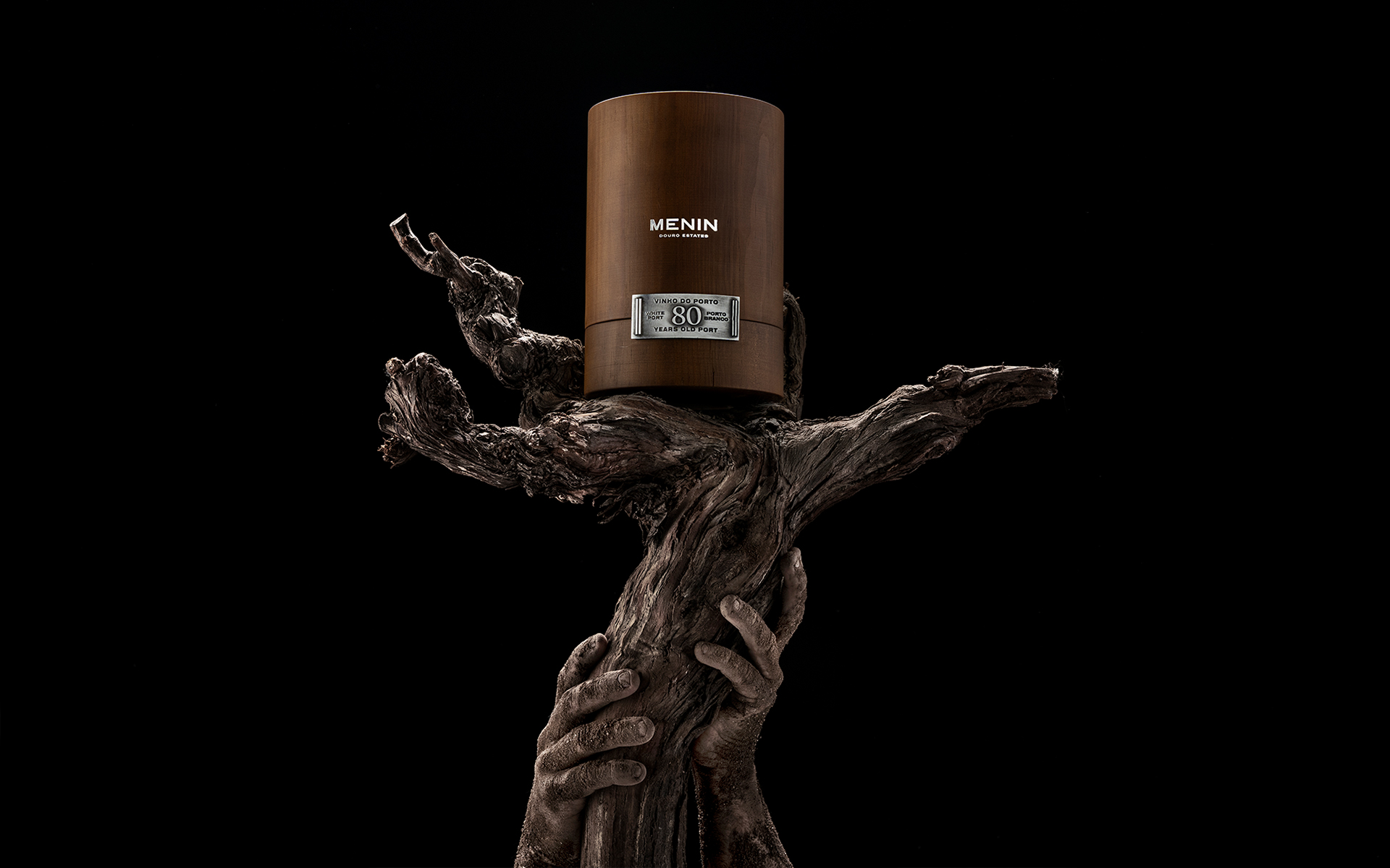
The project’s robustness begins with color. Gold for the Tawny and silver for the White are more than chromatic decisions; they are material metaphors. Gold conveys depth, age and warmth, while silver expresses freshness, clarity and a certain ethereal character. Both finishes are applied with durability in mind, giving the bottles a sense of permanence worthy of their age.
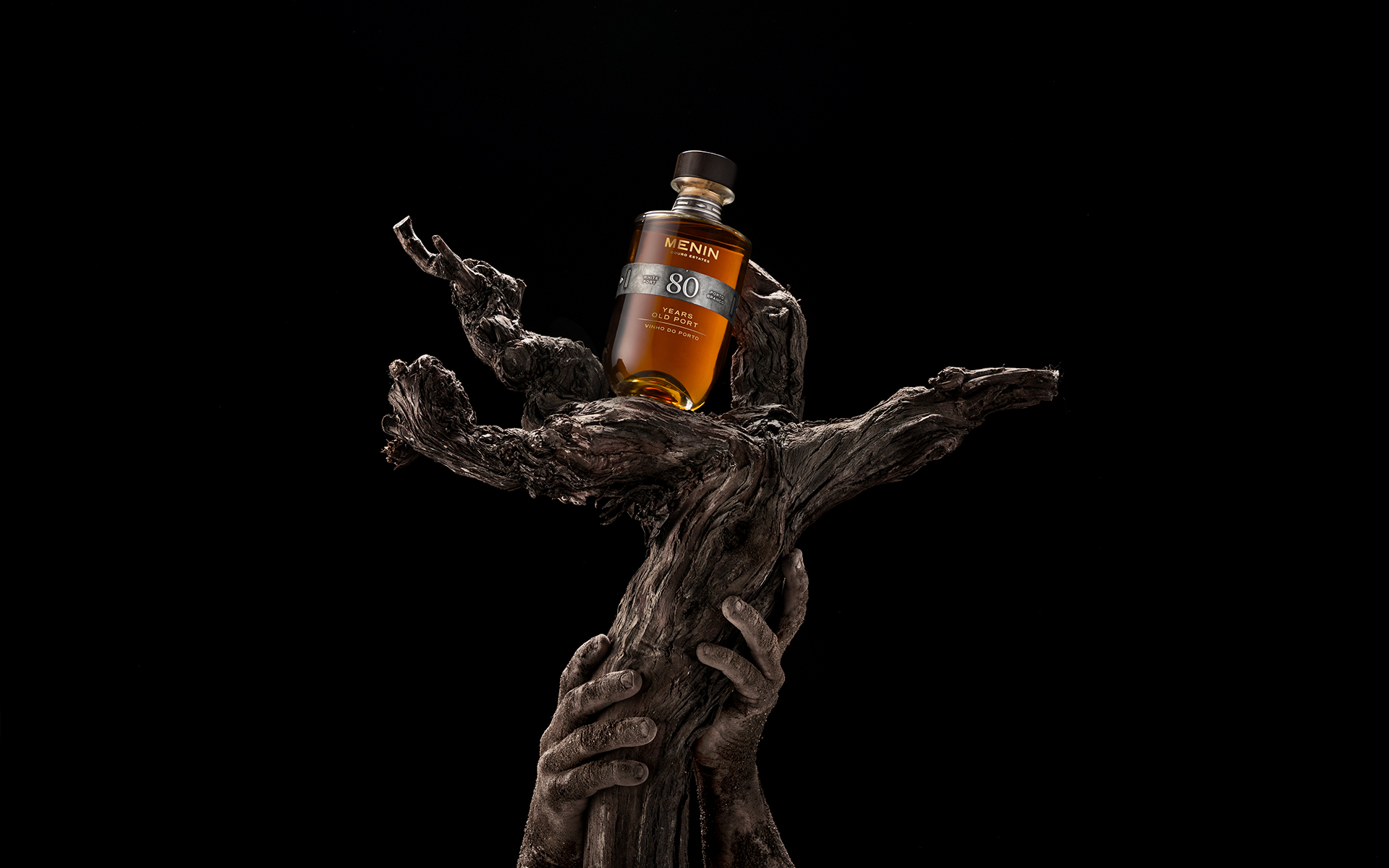
The label, sealed as if protecting a secret, adopts a classic, timeless structure. The typography is assertive and precise, free from unnecessary embellishment. The subtle yet essential embossing adds physical presence – not as decoration, but as a tactile signal of exclusivity. It invites touch before sight, reinforcing the rarity of what it protects.
The visual system was built with the discipline of watchmaking. Balanced lines, careful spacing, and decisions driven by a single question: how do you express eight decades in a graphic object? The answer lies in restraint. In respect for material. In elegance shaped by what is left out rather than added.

CREDIT
- Agency/Creative: M&A Creative Agency
- Article Title: M&A Creative Agency Refines 80-Year-Old Port Wines Into a Packaging Piece Defined by Time and Precision
- Organisation/Entity: Agency
- Project Type: Packaging
- Project Status: Published
- Agency/Creative Country: Portugal
- Agency/Creative City: Anadia
- Market Region: Global
- Project Deliverables: Product Design, Product Photography
- Format: Bottle
- Industry: Food/Beverage
- Keywords: Alcohol Aperitif Wine
-
Credits:
M&A CREATIVE AGENCY: Marques Associados Creative


