


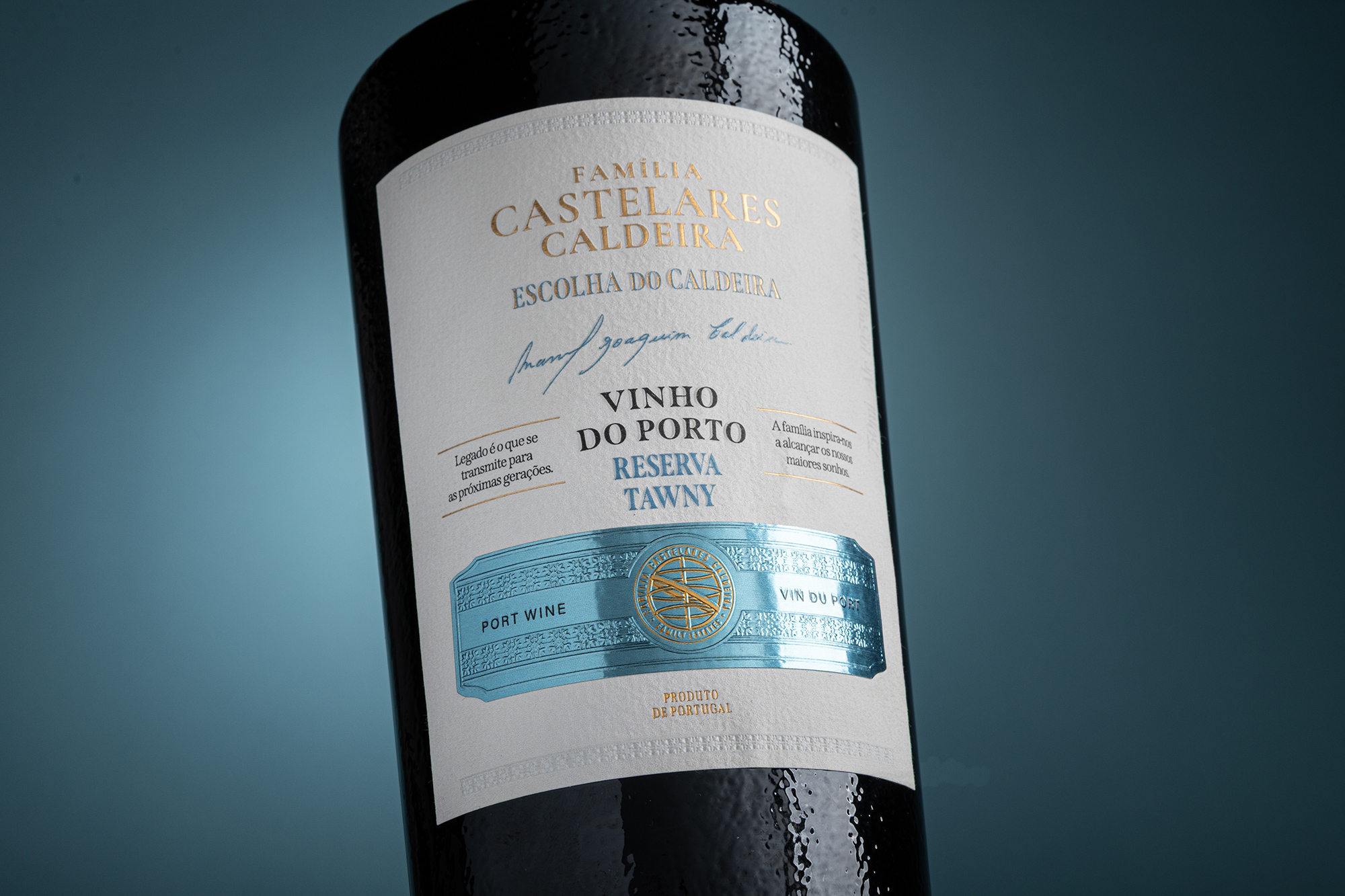
A Escolha do Caldeira
A Legacy Sealed in Every Bottle
For Mr. Caldeira, wine is more than a craft it is a commitment to history, a dialogue between generations, and a quiet promise that the knowledge of the past will continue to live in the hands of those who follow. Every bottle represents patience, dedication, and a deep respect for the land and traditions that shaped his family’s story. Through Escolha do Caldeira, the Família Castelares Caldeira honors the past while raising a glass to the future, preserving a legacy that extends far beyond the vineyard.
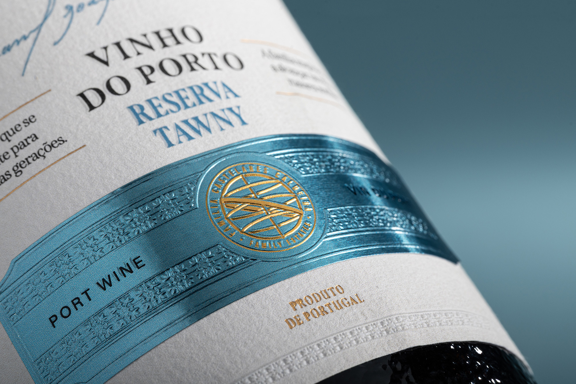
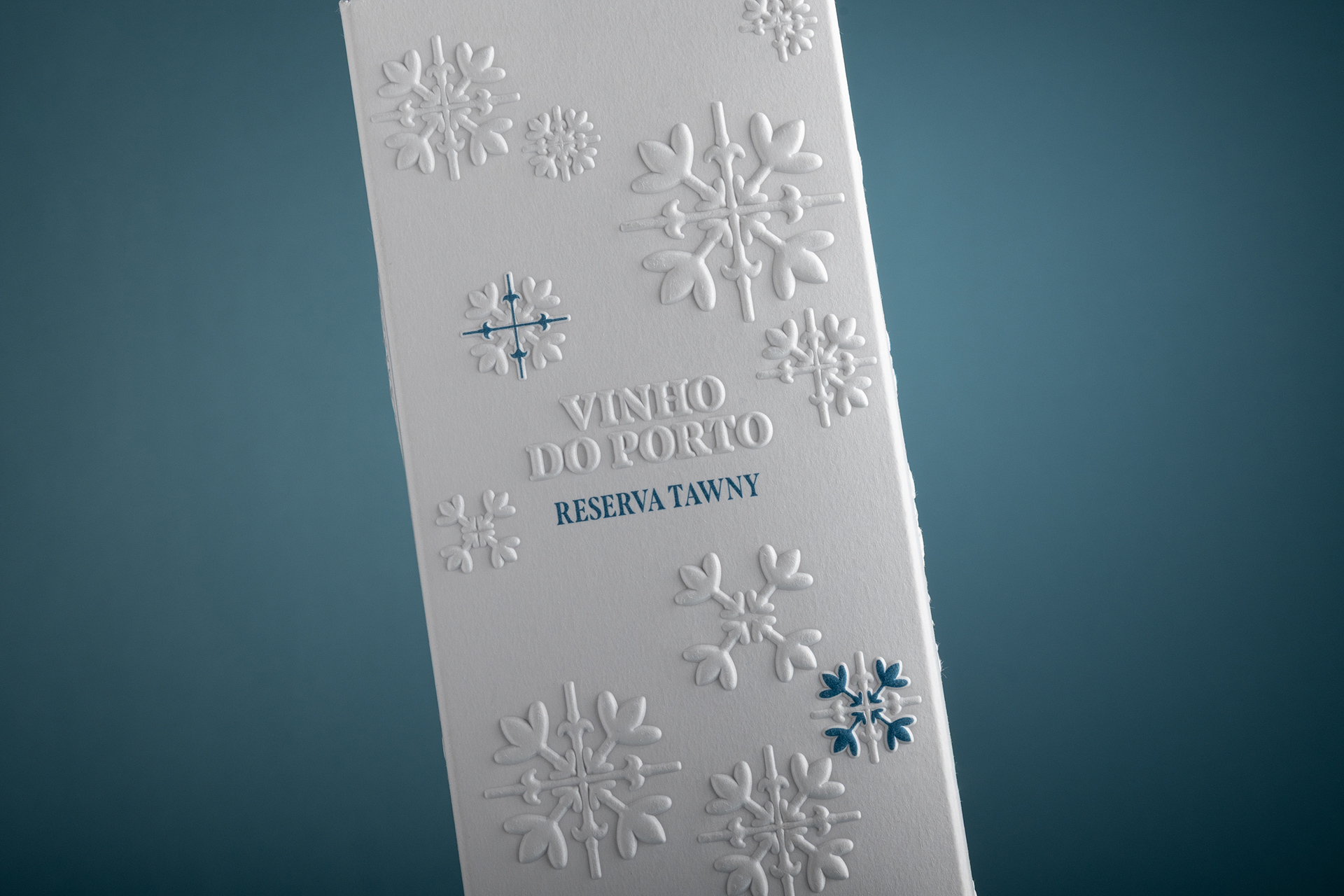
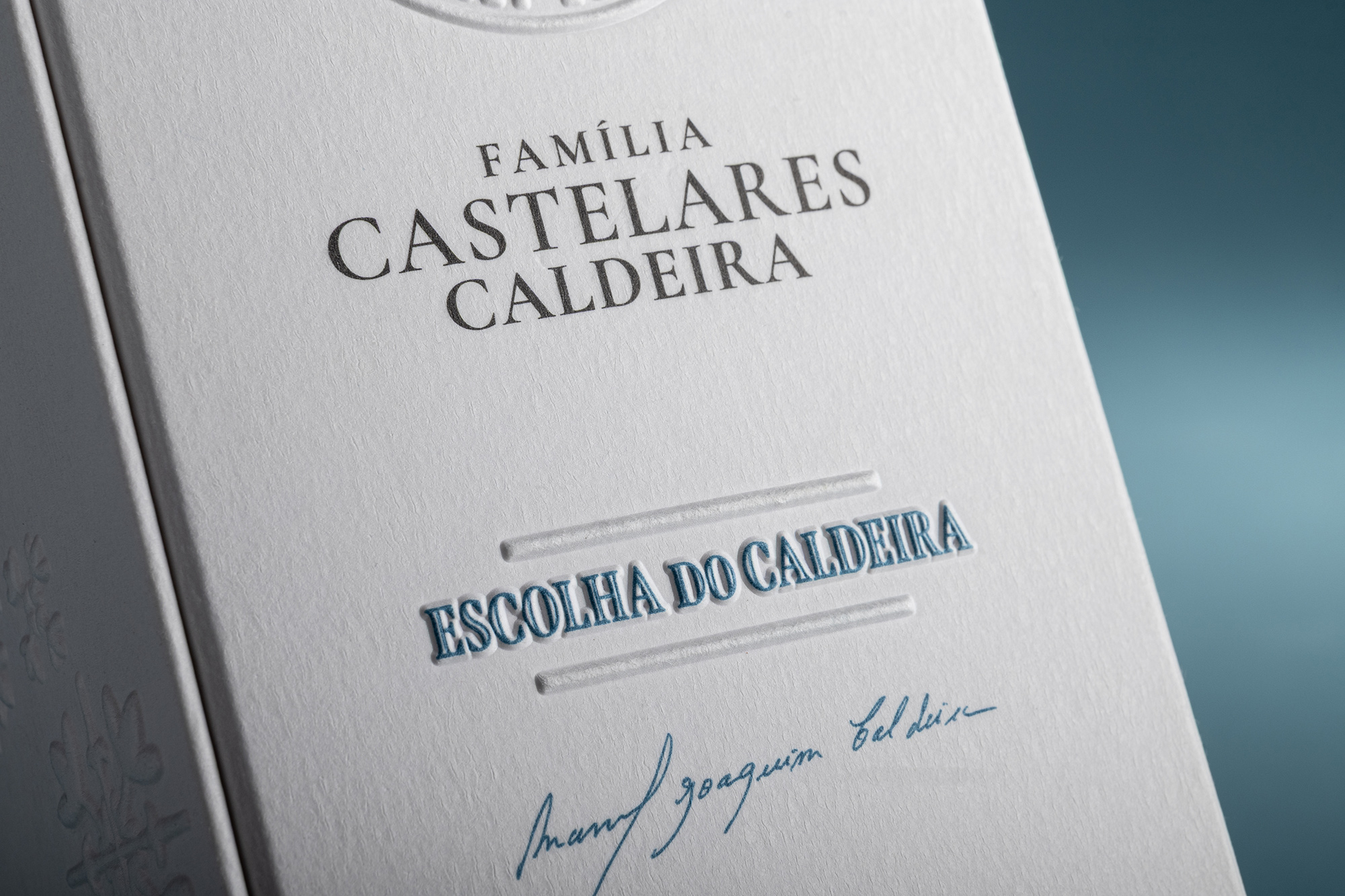
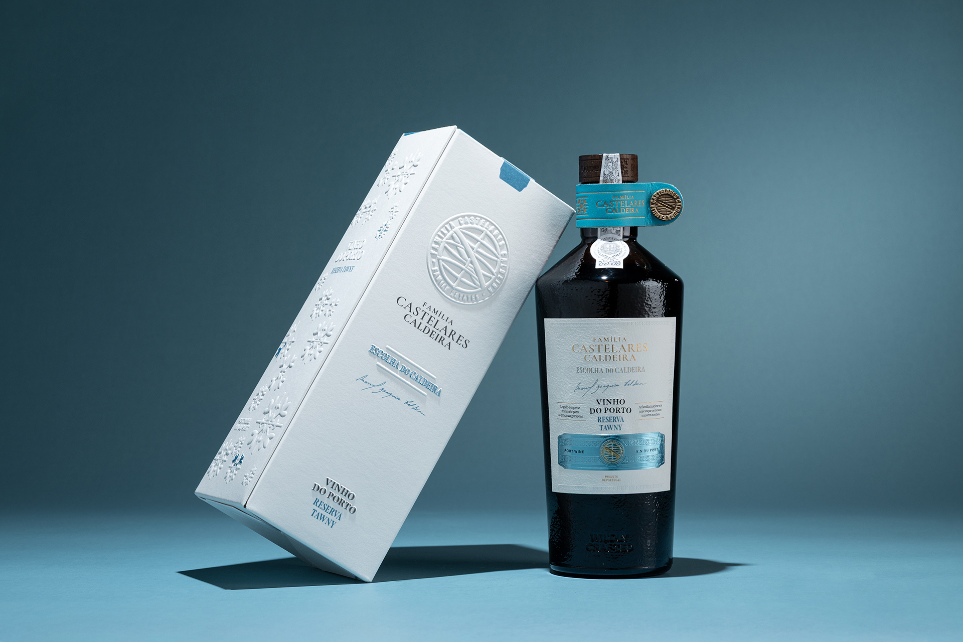
This bespoke packaging was carefully conceived to reflect the prestige and authenticity of the wine it protects. It showcases premium blind embossing with refined spot color highlights, creating a luxurious tactile experience that invites the consumer to interact with the bottle even before tasting its contents. The crisp, deep impression emphasizes the motifs and the text, “VINHO DO PORTO RESERVA TAWNY,” lending an elegant three-dimensional texture to the minimalist white surface.
The subtle interplay between matte white embossing and selective blue ink detailing adds both visual depth and quiet refinement. This contrast enhances the sense of craftsmanship and attention to detail, qualities that are inseparable from the tradition of high-quality wine packaging. The design speaks softly yet confidently, reflecting a balance between modern elegance and the timeless heritage of Portuguese winemaking.
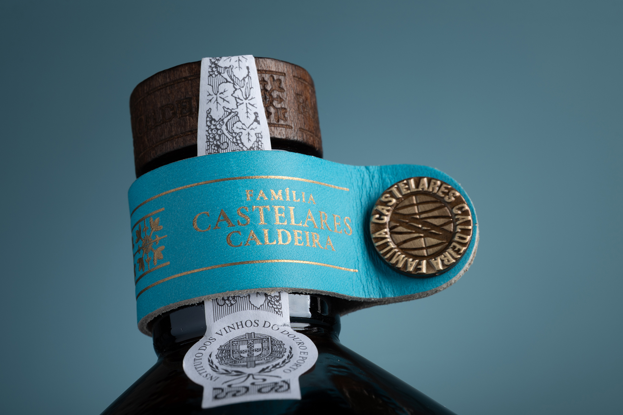
Topped with a custom natural cork, wrapped in deep-toned embossed leather, the bottle evokes the tactile strength of tradition and authenticity. The texture of the leather not only reinforces the sensory richness of the packaging but also symbolizes resilience, heritage, and permanence.
A touch of bespoke personalization completes the composition: a finely crafted leather strip that carries the family name, carefully pressed into the material with intention and respect. This element transforms the bottle into more than a container — it becomes a symbol of identity, lineage, and pride.
Designed and crafted to reinforce the mark of a man building something greater than himself, this packaging stands as a tribute to dedication, legacy, and the enduring spirit of the Caldeira family.
CREDIT
- Agency/Creative: M&A Creative Agency
- Article Title: M&A Creative Agency Presents A Escolha do Caldeira with Luxury Port Wine Packaging Design
- Organisation/Entity: Agency
- Project Type: Packaging
- Project Status: Published
- Agency/Creative Country: Portugal
- Agency/Creative City: Anadia
- Market Region: Global
- Project Deliverables: Label Design, Photography, Product Photography
- Format: Bottle, Box
- Industry: Food/Beverage
- Keywords: Packaging Alcohol Wine
-
Credits:
Design: M&A Creative Agency
Photography: M&A Creative Agency


