


To the Women of our land
“To the Women of our land” gains a new dimension when translated into the language of design, becoming more than just a phrase—it becomes the foundation of a carefully constructed visual narrative. As part of the “Tribute Series,” this piece reveals an aesthetic approach that balances tradition and contemporaneity, creating a strong, elegant, and deeply symbolic identity.
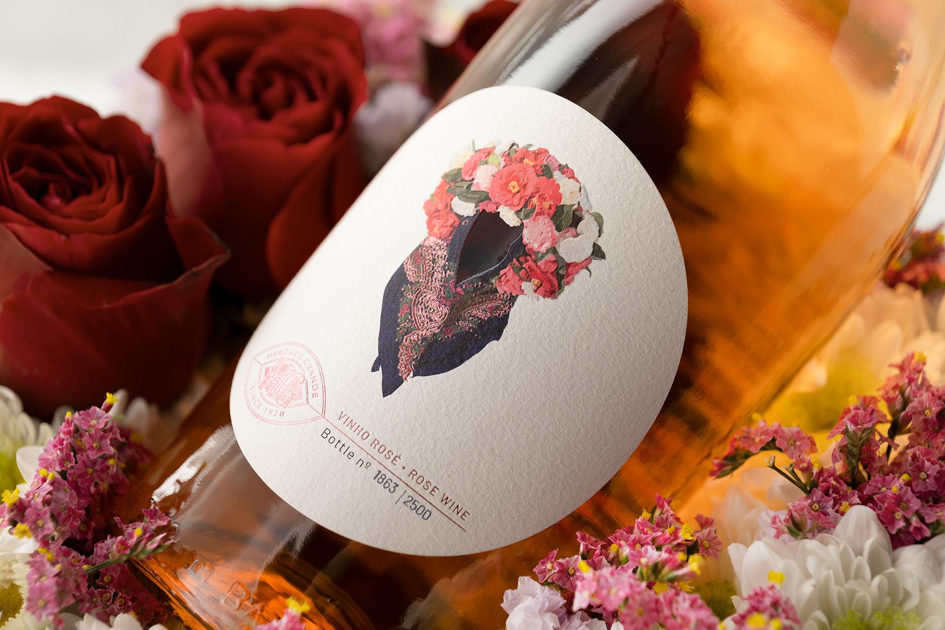
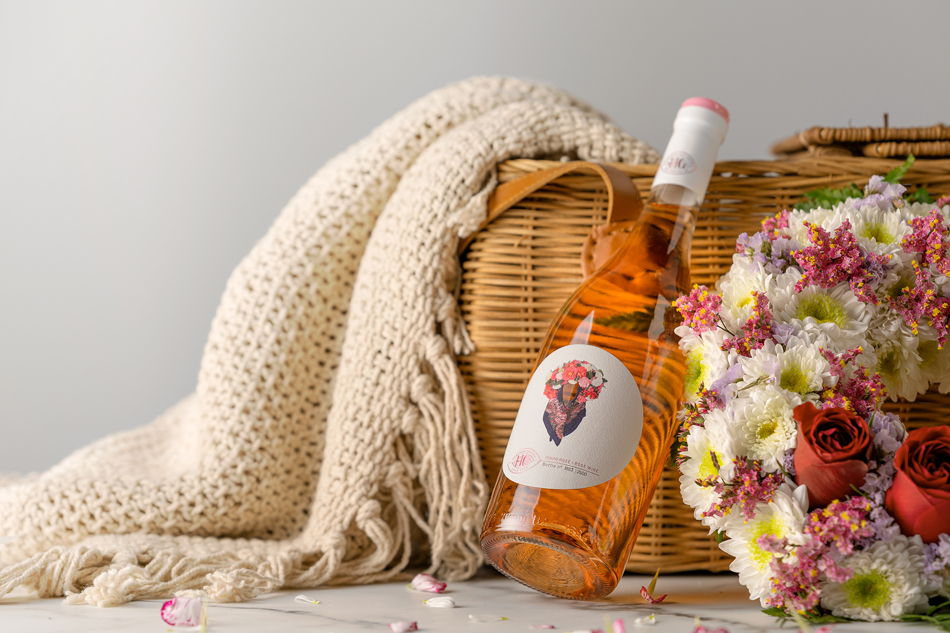
Inspired by the first edition of the olive oil packaging, this design maintains the brand’s creative coherence while evolving through the exploration of new materials, textures, and graphic compositions. The label takes on a central role, with a clean and minimal shape that enhances negative space, allowing each element to breathe and stand out. The typographic choice is subtle, refined, and functional, reinforcing the message without competing with the visual composition.
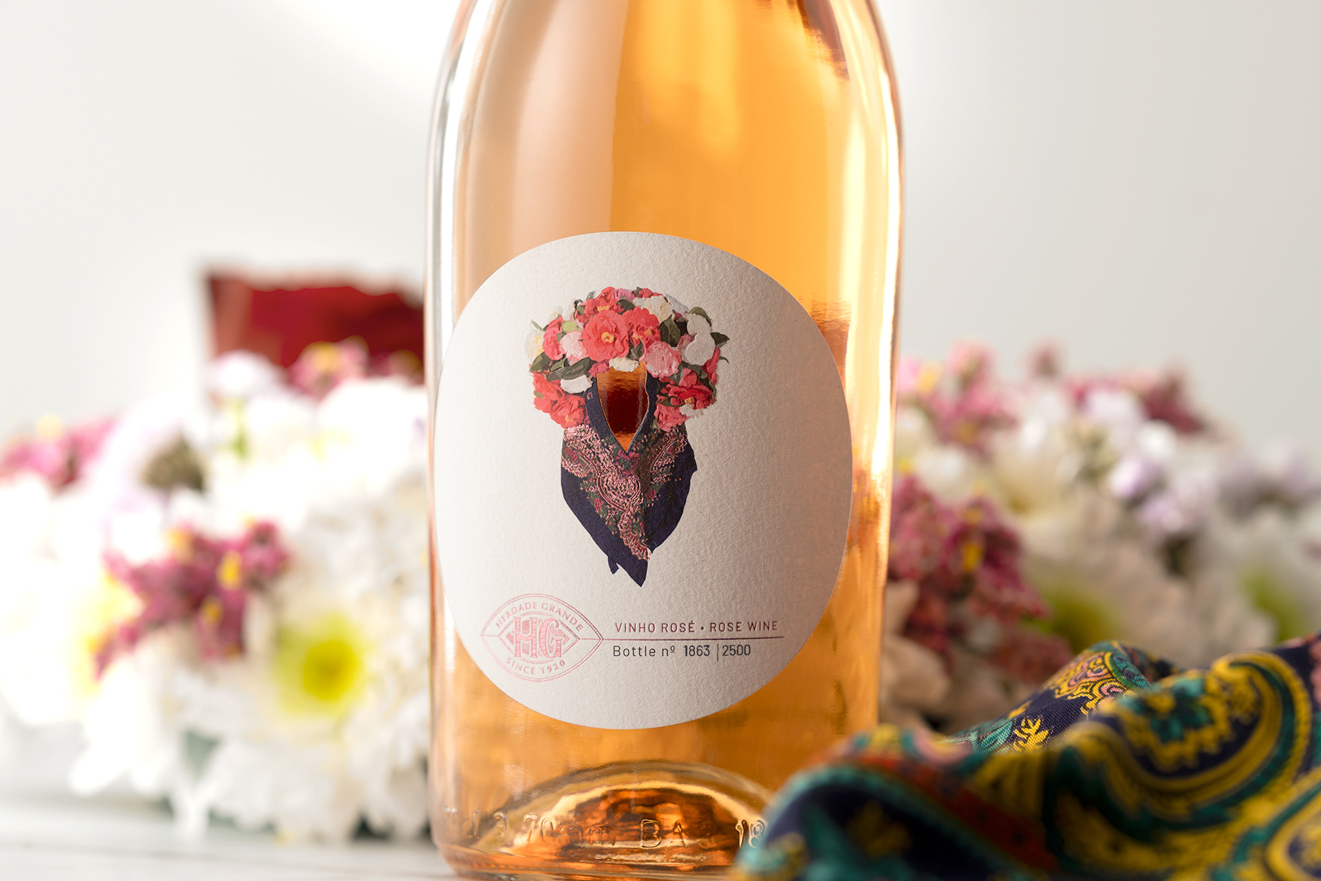
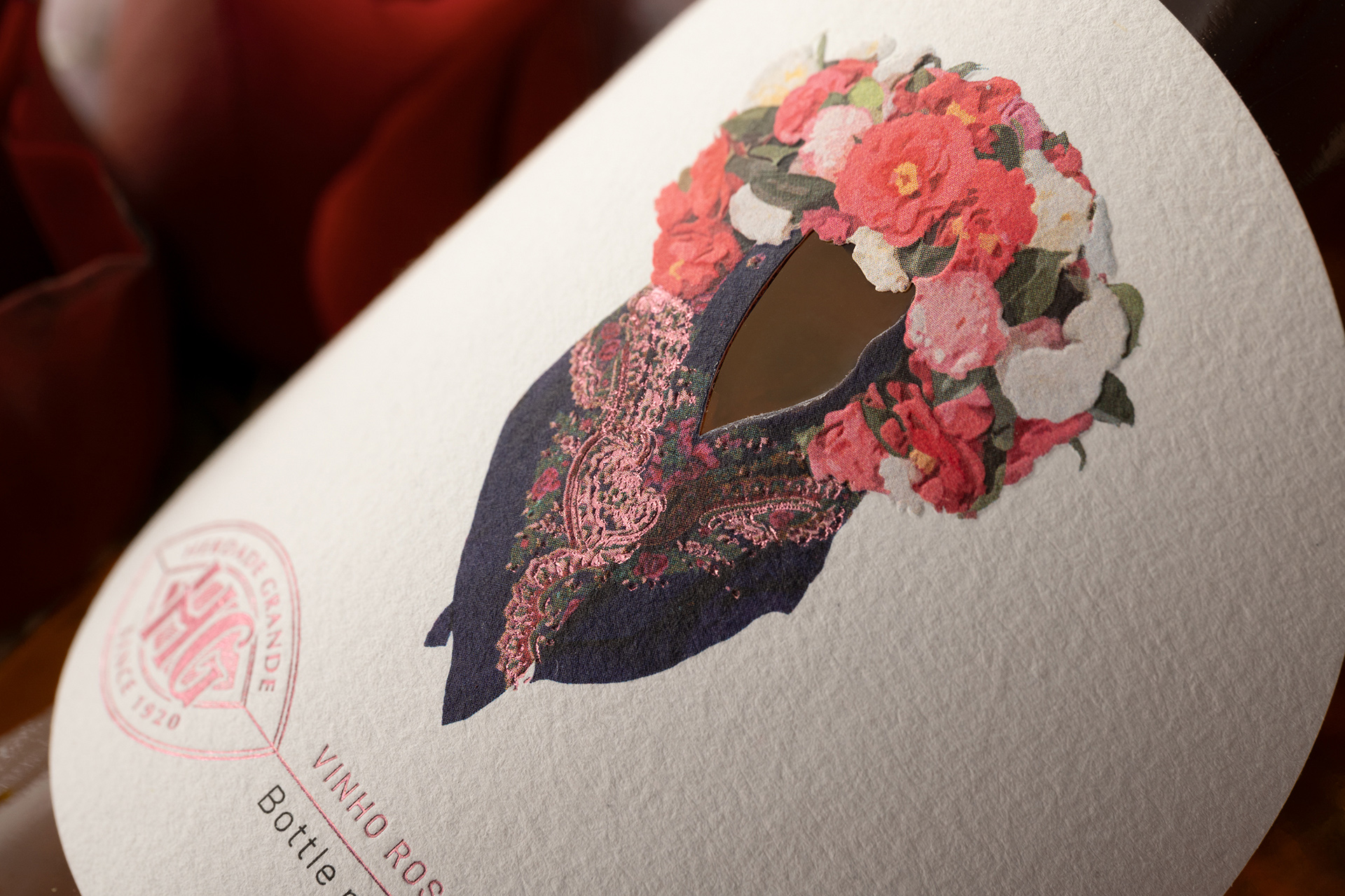
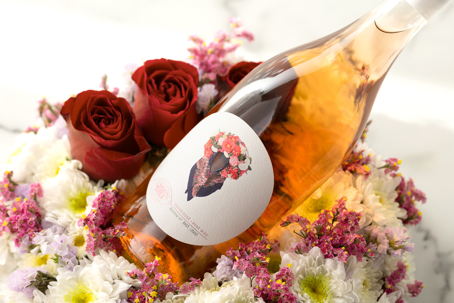
The illustrated element—the scarf—emerges as the true protagonist. More than a decorative detail, it represents identity, memory, and cultural heritage. The richness of its patterns and the delicacy of its colors evoke craftsmanship, referencing the care and dedication passed down through generations. This detail becomes a visual signature of the series, creating immediate recognition and aesthetic continuity across editions.
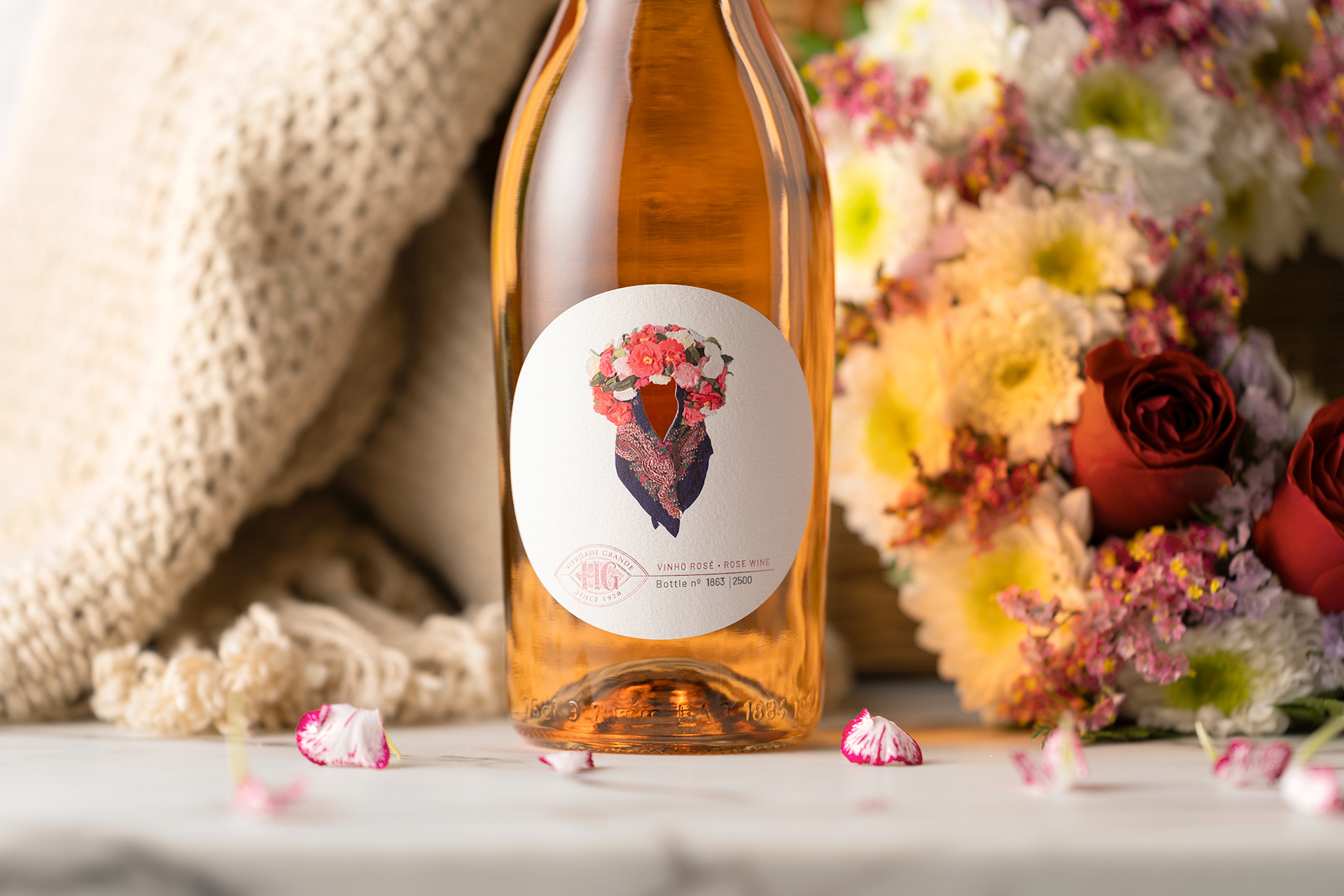
The color palette, while restrained at its base, bursts into life within the illustration, creating a deliberate contrast between sobriety and expression. It is precisely within this balance that the concept of “less is more” is realized: every element has a purpose, every color carries meaning, and nothing is excessive. The translucent glass of the bottle complements this approach, allowing the rosé hue of the wine to interact with the label design and enhance the overall visual experience.
This project is, therefore, an exercise in sensitive and strategic design, where form, color, texture, and narrative come together to create packaging that not only protects the product but also tells a story—a visual tribute to the women of Alentejo and their enduring presence in the history of Herdade Grande.
CREDIT
- Agency/Creative: M&A Creative Agency
- Article Title: M&A Creative Agency Develops To the Women of Our Land for Herdade Grande With a Refined Olive Oil Packaging Tribute Rooted in Heritage
- Organisation/Entity: Agency
- Project Type: Packaging
- Project Status: Published
- Agency/Creative Country: Portugal
- Agency/Creative City: Anadia - Lisbon
- Market Region: Global
- Project Deliverables: Label Design
- Format: Box
- Industry: Food/Beverage
- Keywords: PACKAGING ALCOHOL WINE
-
Credits:
Design: M&A Creative Agency
Photography: M&A Creative Agency


