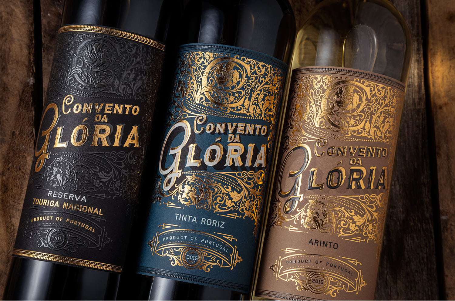
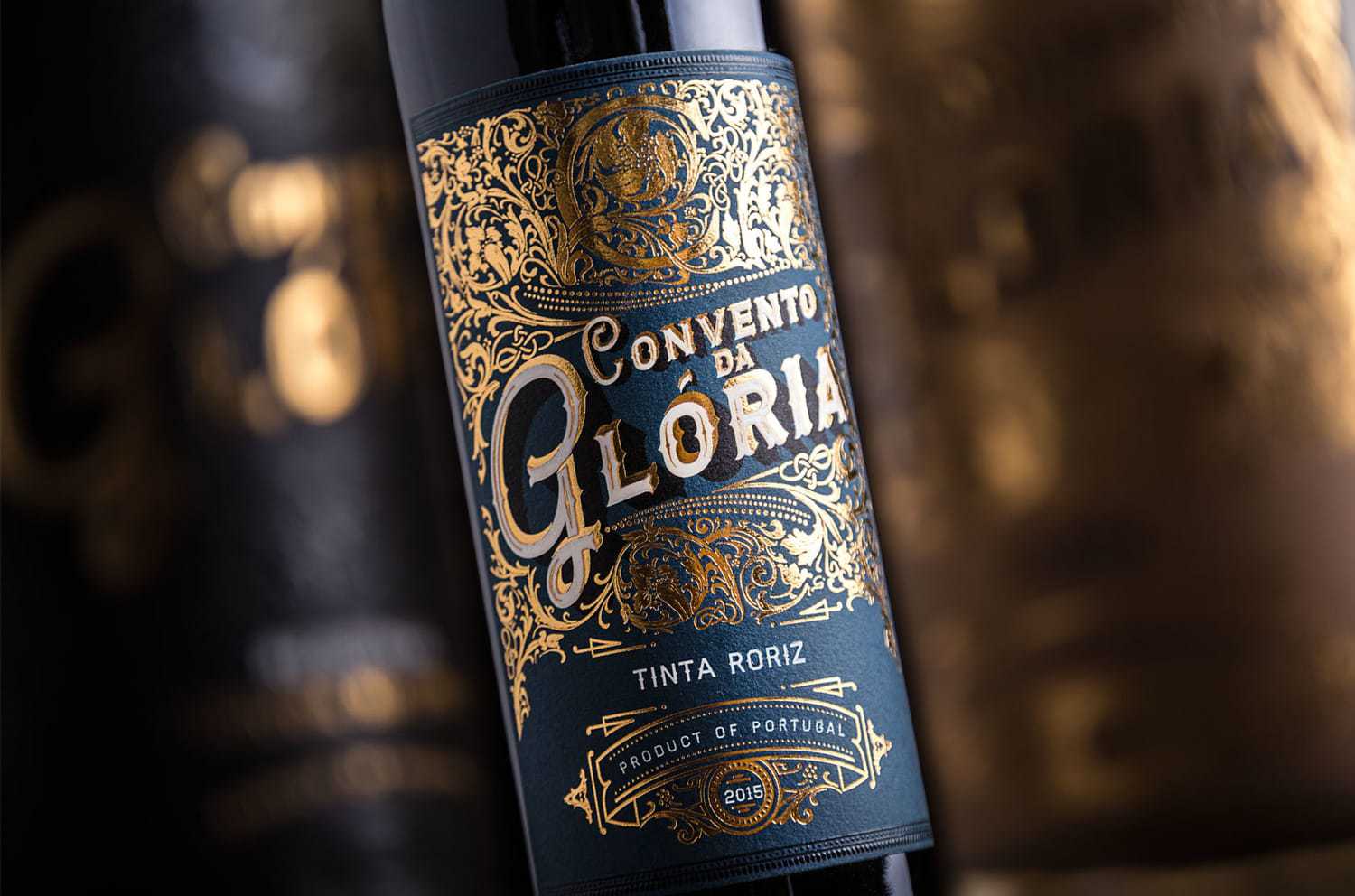
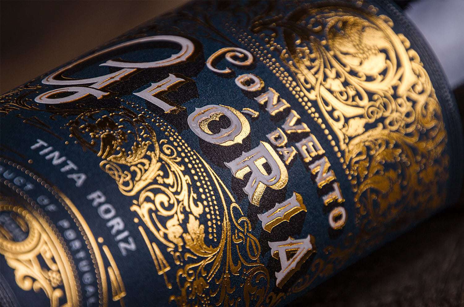
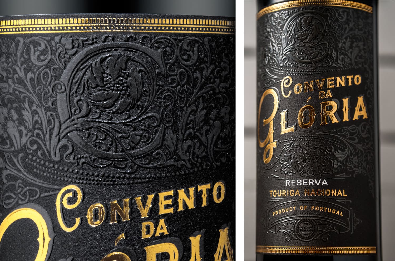
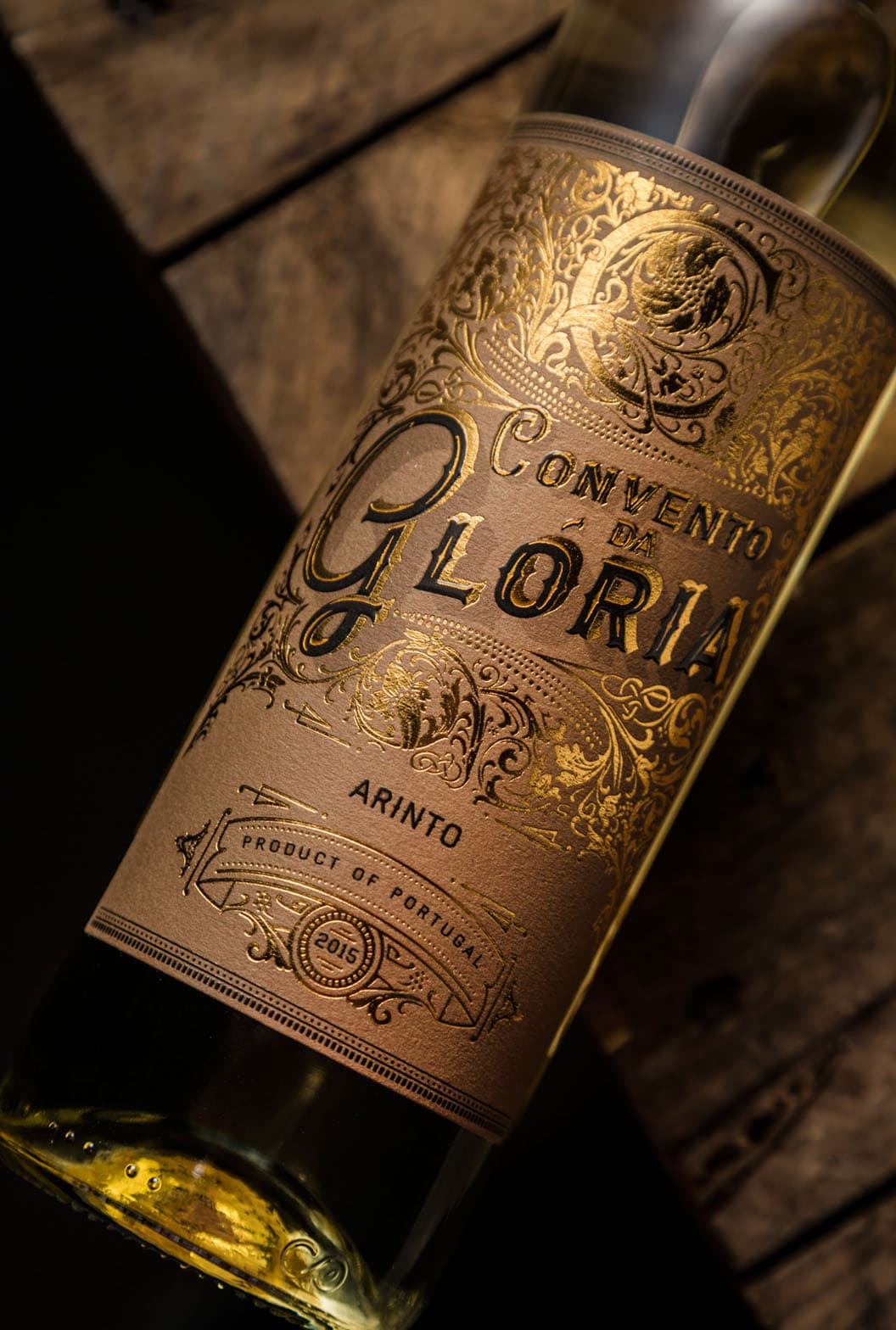
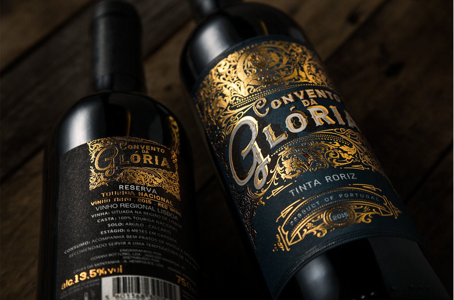
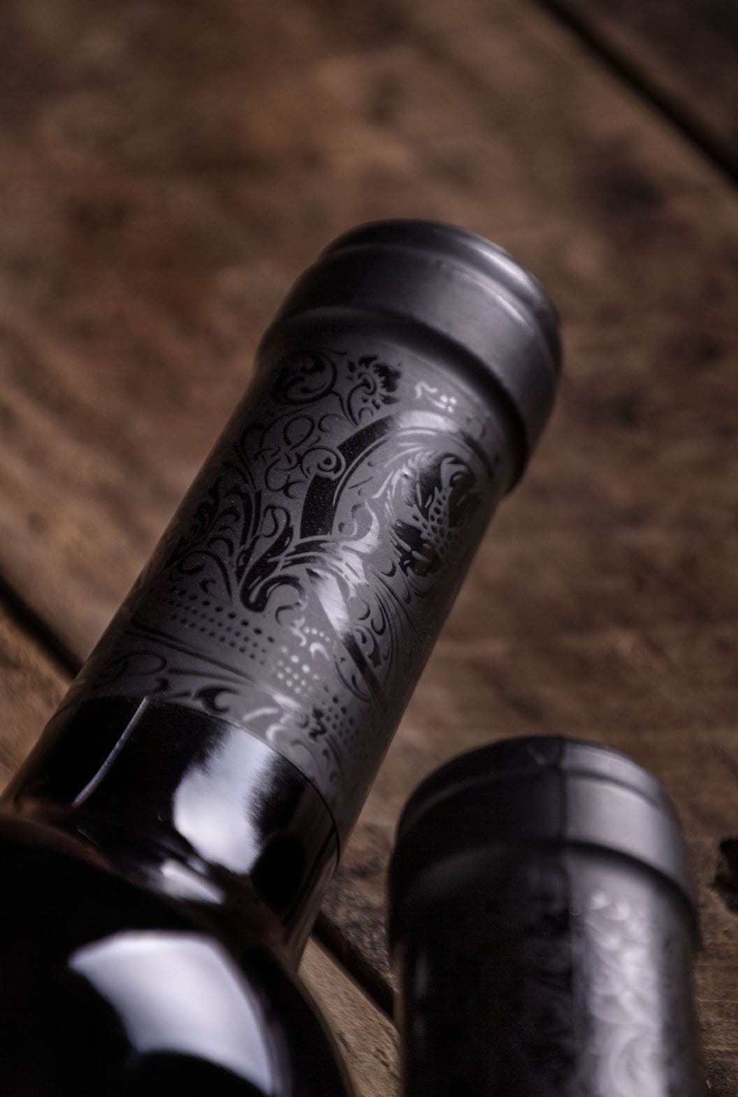
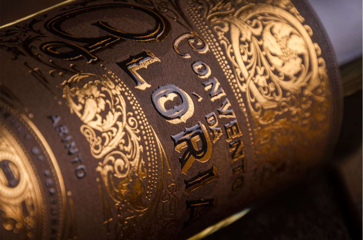
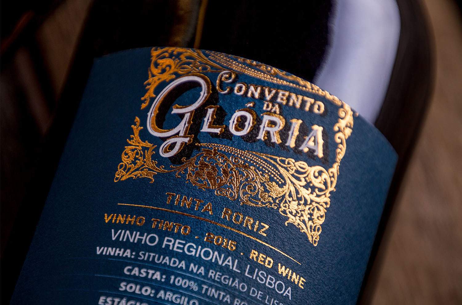
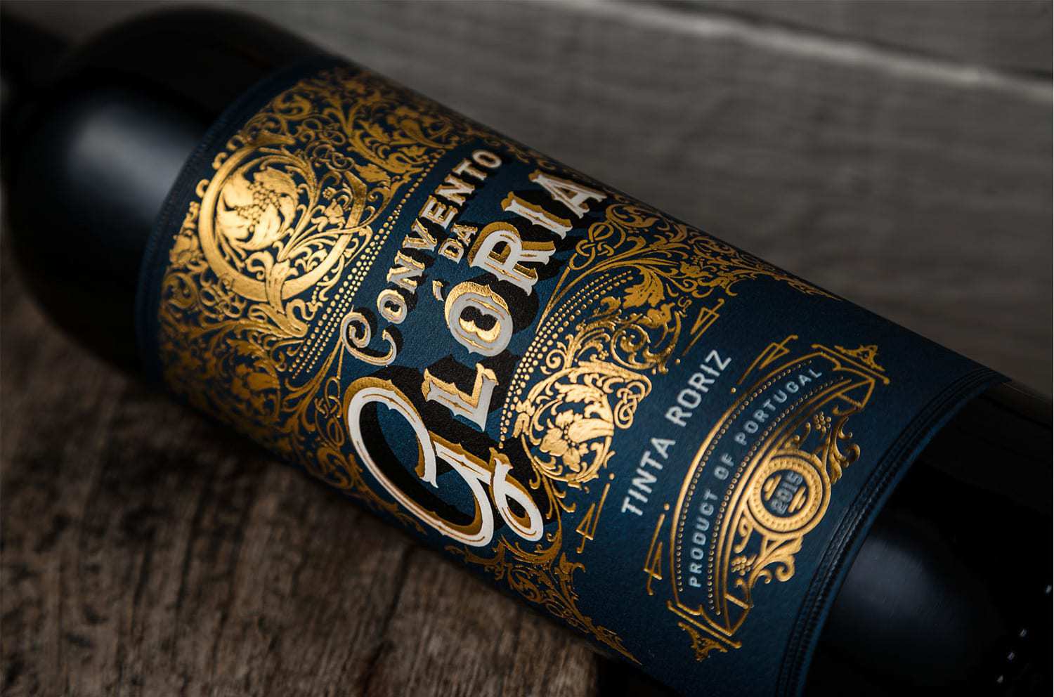
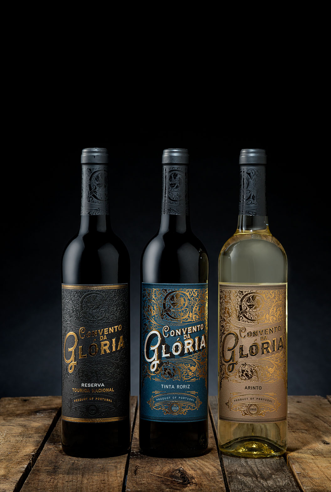
” The design reflects the elegance of these wines, while at the same time creates a magical representation, inspired by the splendor and exuberance of ancient Baroque style. This label design instantly makes us travel in time when monasteries, churches and palaces were enriched with unique and gold decorative details. So much richness could only result in this noble label that captures the essence of these wines and their premium quality.Gold embossed foil illustrations create an illusion of medieval illuminations where the capital letter “C” stands out and represents the original naming – CONVENTO DA GLÓRIA.Arinto, Tinta Roriz and Touriga Nacional are the traditional varieties which inspired the color papers background and together bring to life this special range of wines.”
CREDIT
- Agency/Creative: M&A Creative Agency
- Article Title: M&A Creative Agency – Convento da Glória
- Project Type: Packaging
- Substrate: Glass, Pulp Paper


