


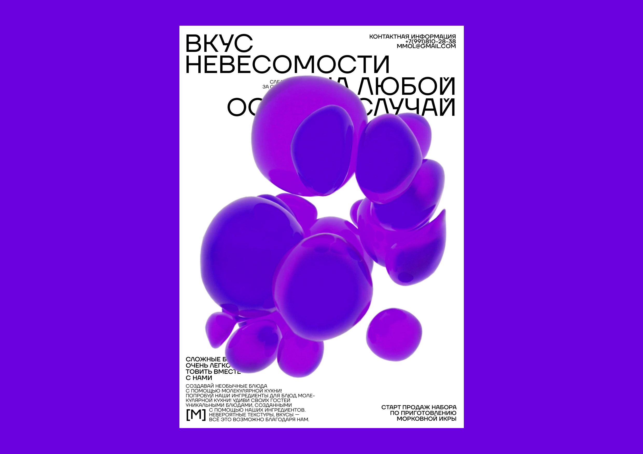
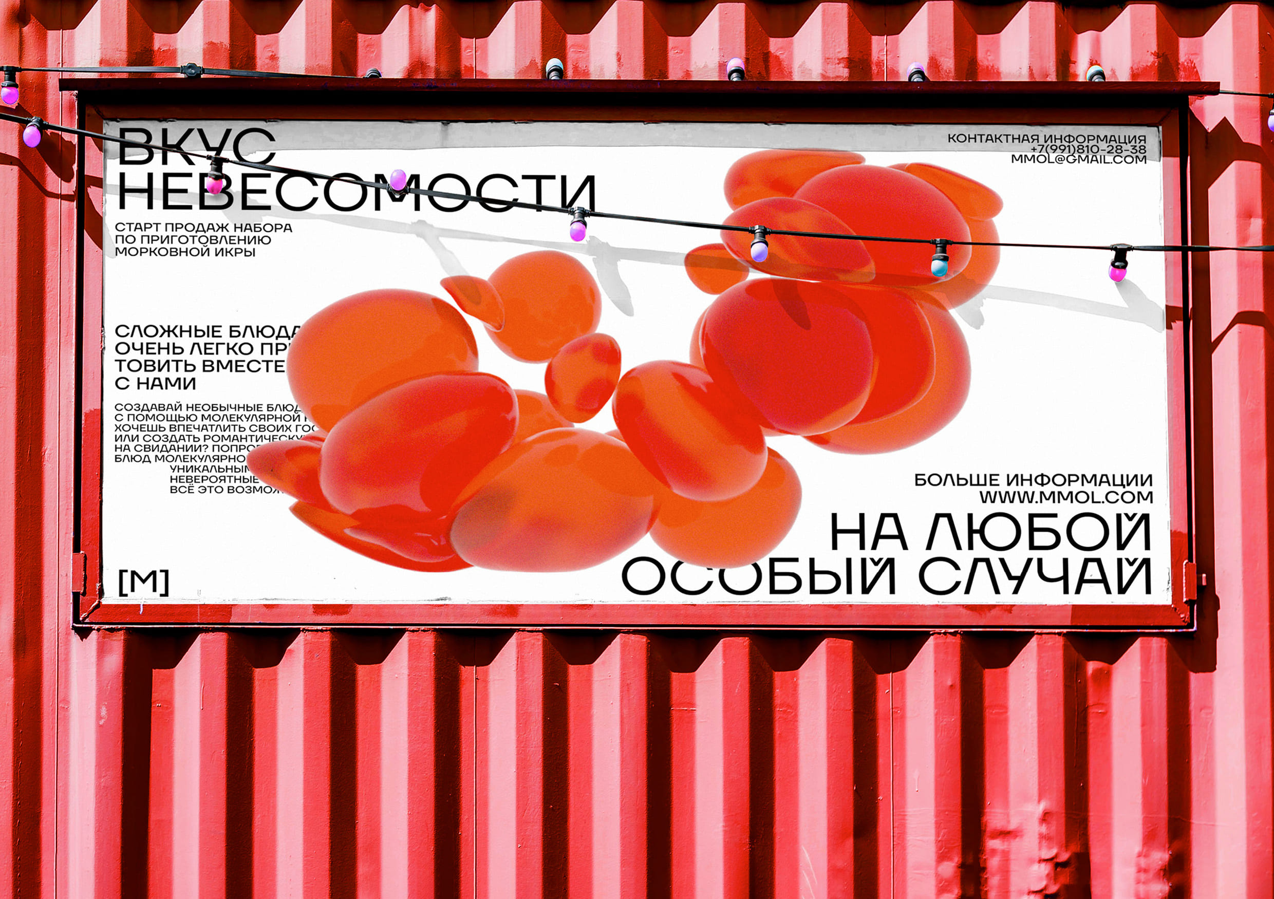
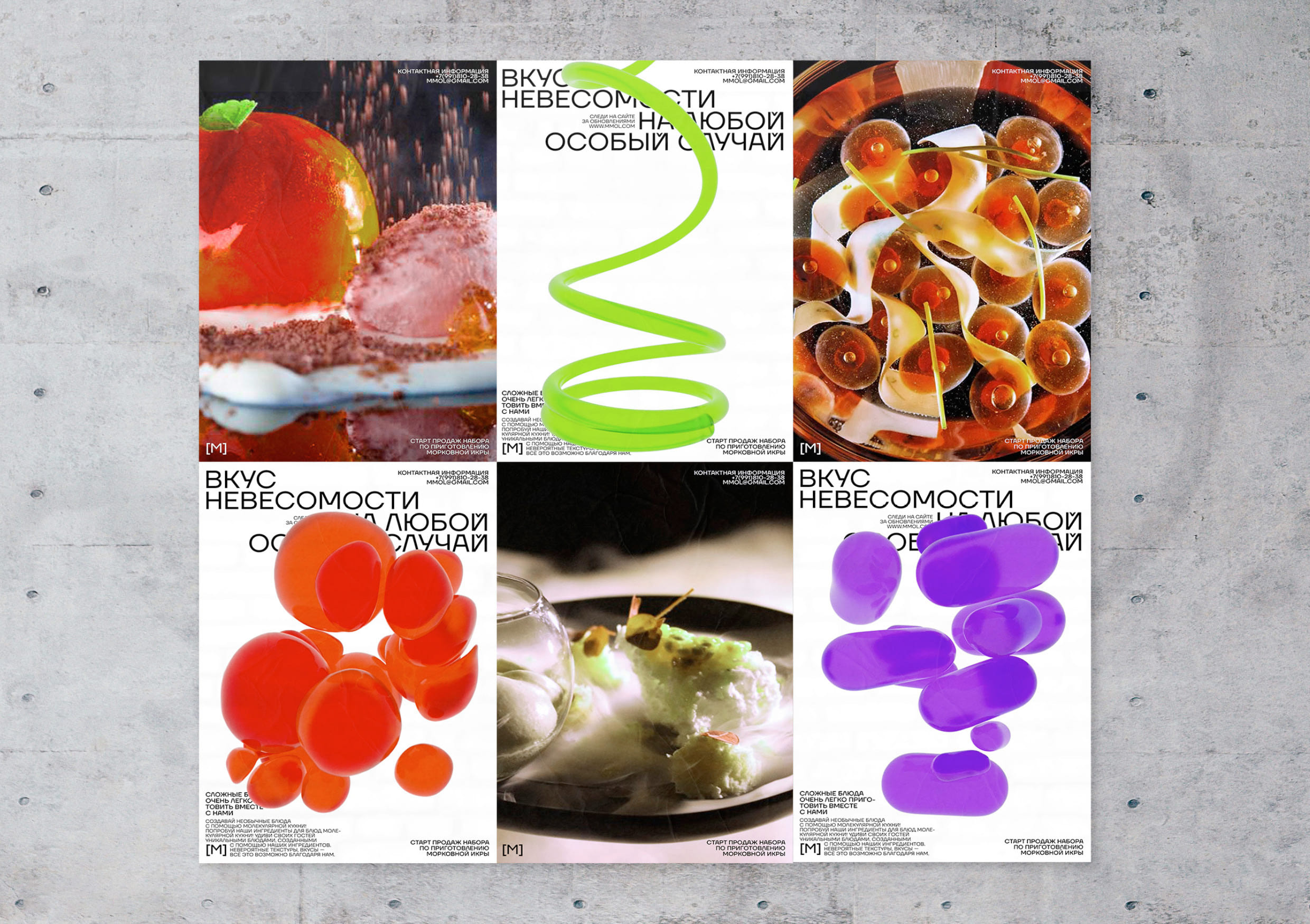
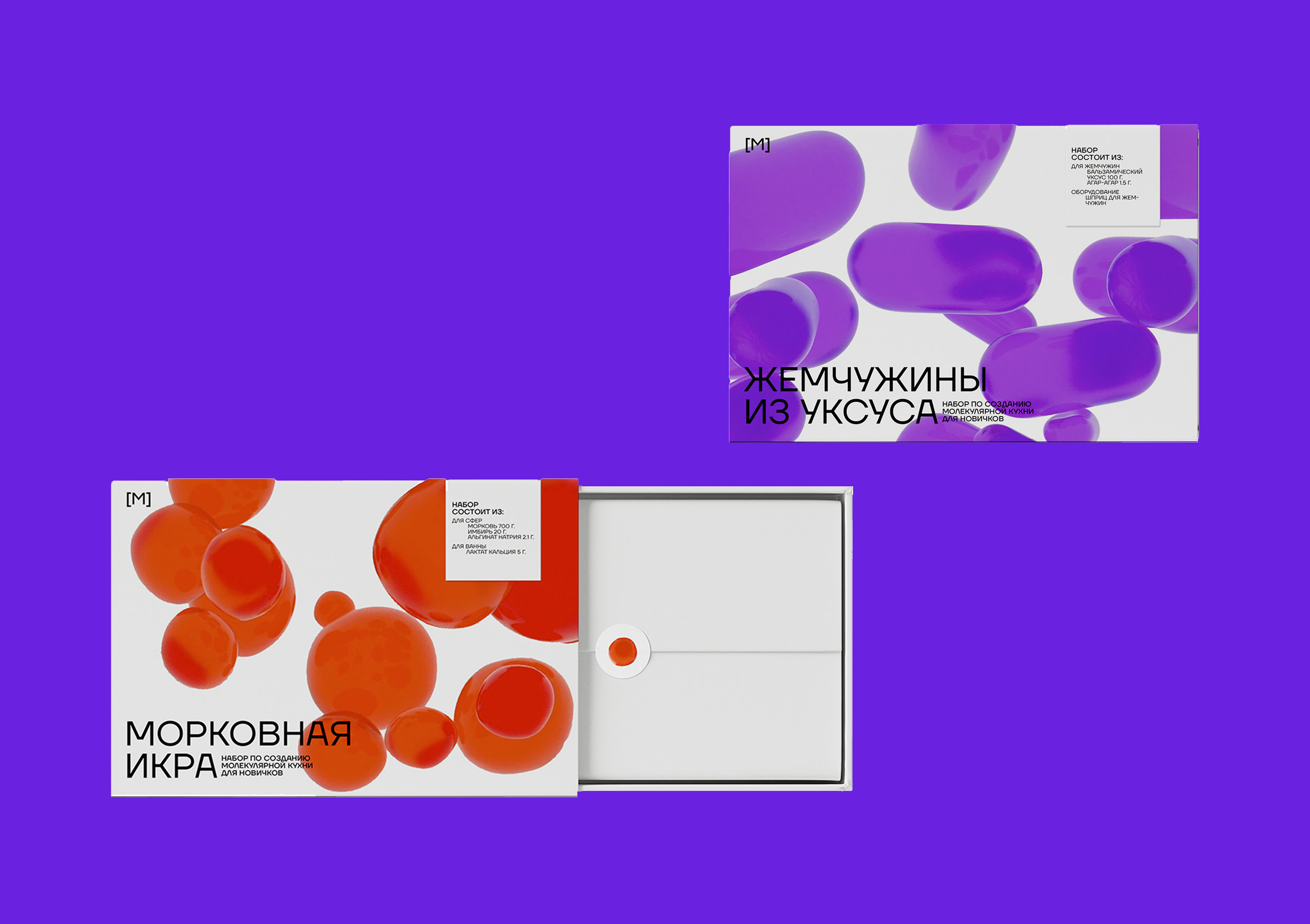
The main idea behind my project was to create a design that reflects the unique and innovative nature of molecular gastronomy, while also capturing the playful and creative spirit of cooking with friends and loved ones.
To achieve this, I used a combination of bold typography and abstract figures that were created in 3D. These figures were inspired by the molecular structure of different ingredients, and were designed to evoke the weightlessness and fluidity of molecular food. I started by researching the different molecular structures of common ingredients used in molecular gastronomy. I then used 3D modeling software to create abstract figures that were inspired by these structures, while also incorporating elements of typography and graphic design. The figures were designed to be both visually striking and conceptually rich, with each shape and texture representing a different ingredient or flavor. By using these abstract figures as the graphic of my project, I was able to create a design that is both visually engaging and conceptually meaningful. The figures are arranged in a way that creates a sense of movement and dynamism, while also suggesting the different ingredients and flavors that can be used in molecular gastronomy. Overall, my design perfectly captures the essence of [M] and its commitment to making molecular gastronomy accessible and fun for everyone.
The logo of [M] is dynamic. The letter M is designed to look like it is flying or floating due to the weightlessness of the structure. This dynamic logo perfectly captures the playful and creative spirit of molecular gastronomy, while also reflecting the innovative and unique nature of [M] and its products.

CREDIT
- Agency/Creative: Sonya Boriskevich
- Article Title: [M] Brand Identity Concept by Student Sonya Boriskevich
- Organisation/Entity: Student
- Project Type: Identity
- Project Status: Non Published
- Agency/Creative Country: Russia
- Agency/Creative City: Sonya Boriskevich
- Market Region: Global
- Project Deliverables: Brand Identity
- Industry: Food/Beverage
- Keywords: Sonya Boriskevich, Brand Identity, Molecular gastronomy, Food
-
Credits:
Tutor: Tanya Dunaeva


