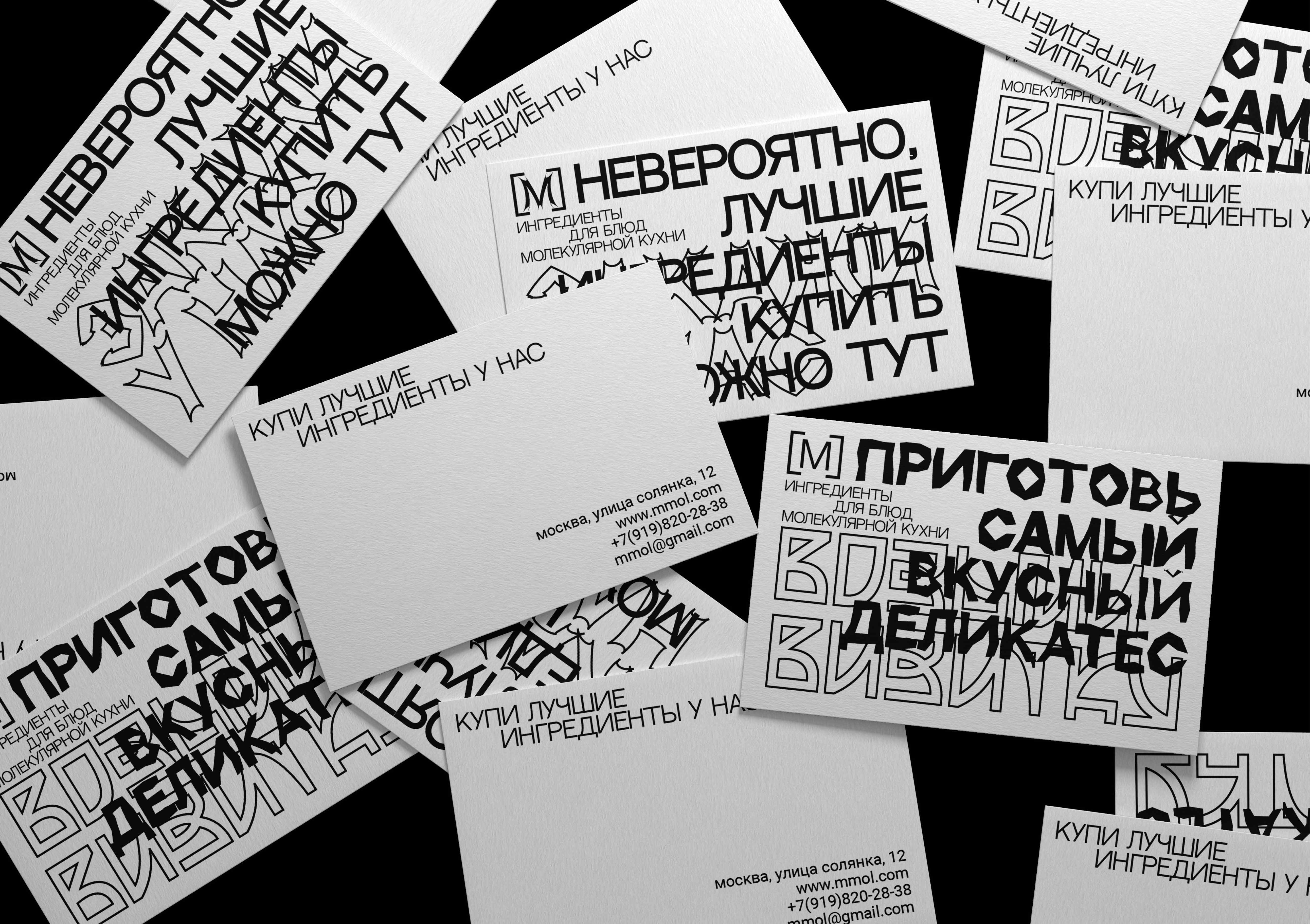
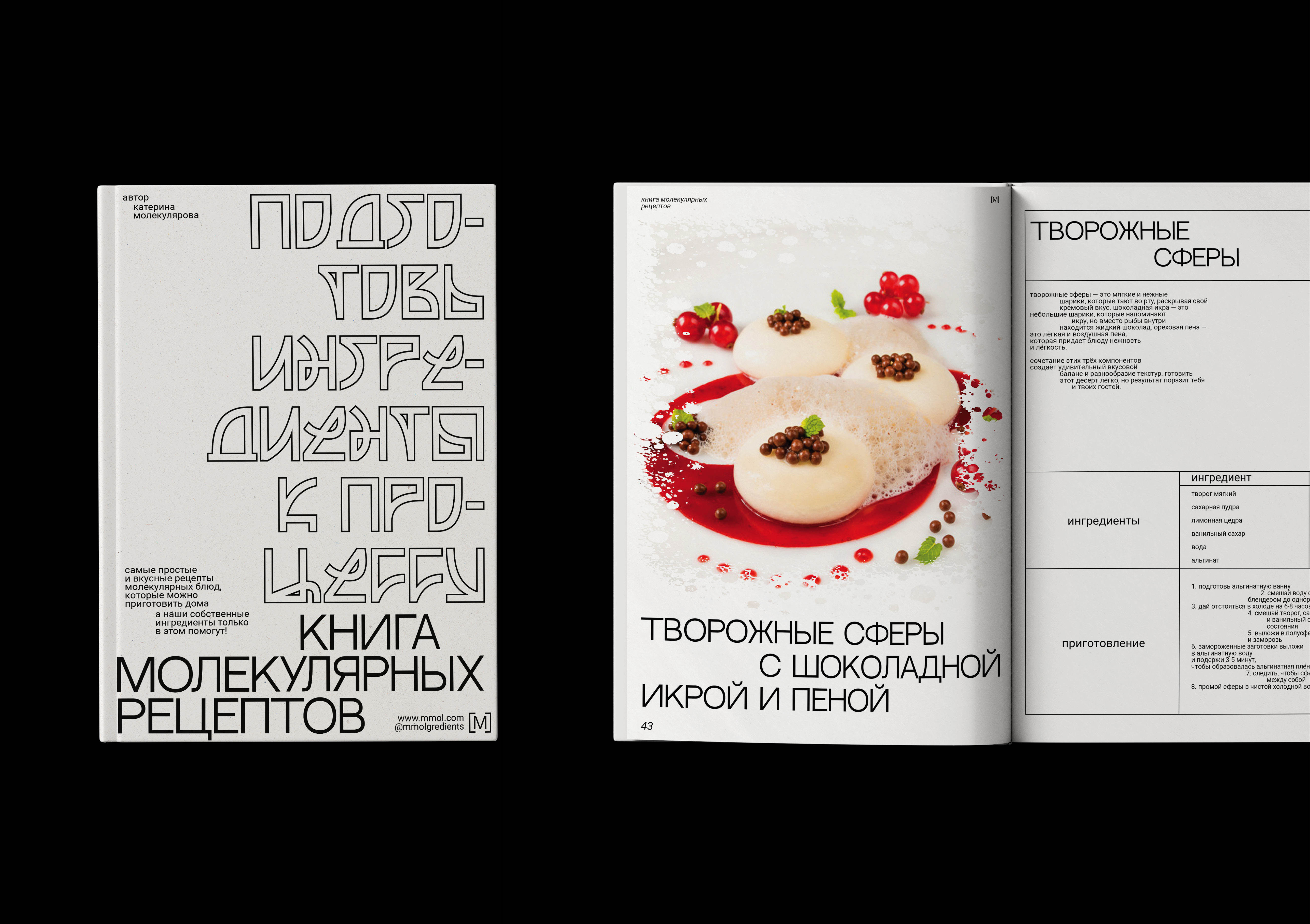
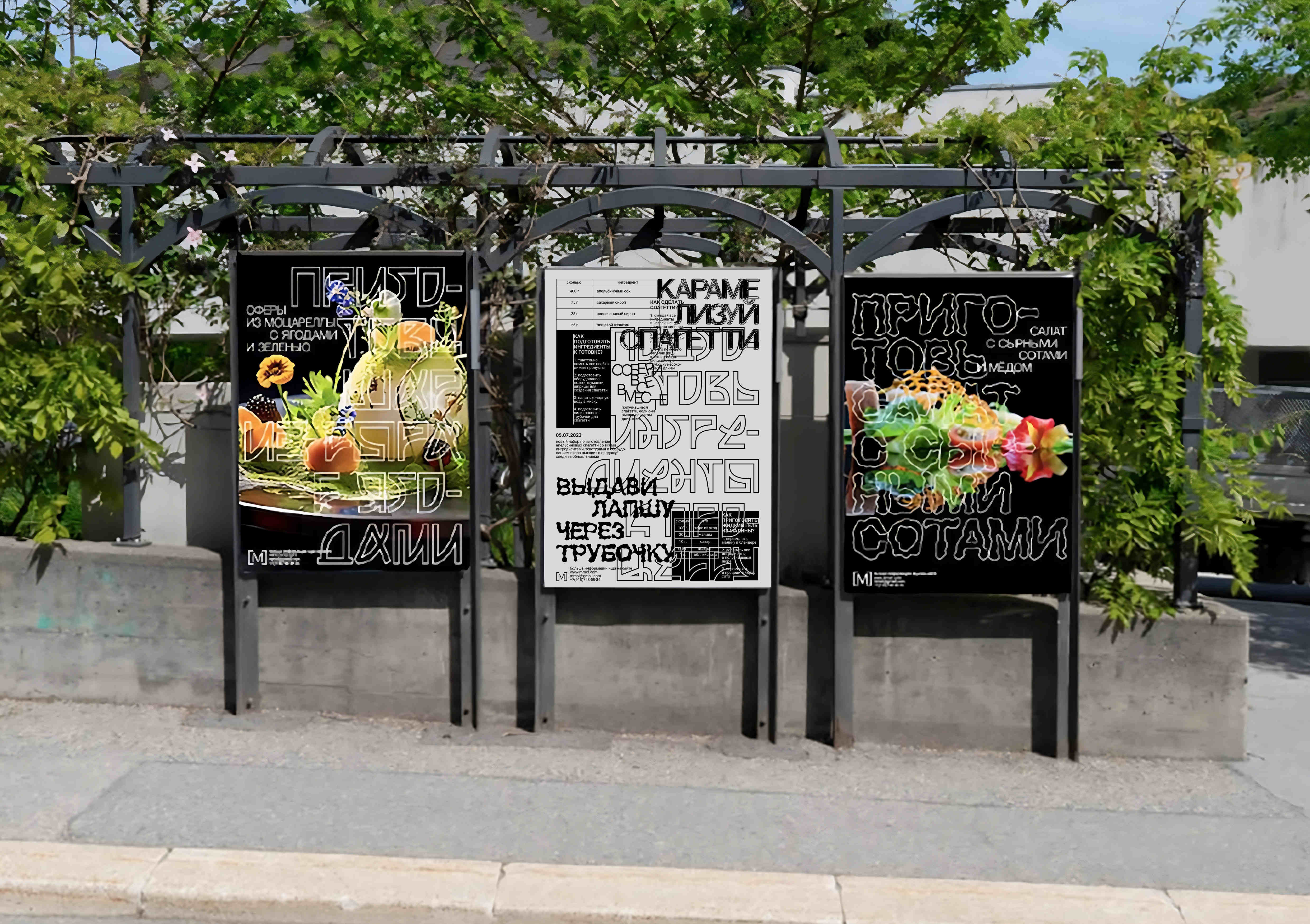
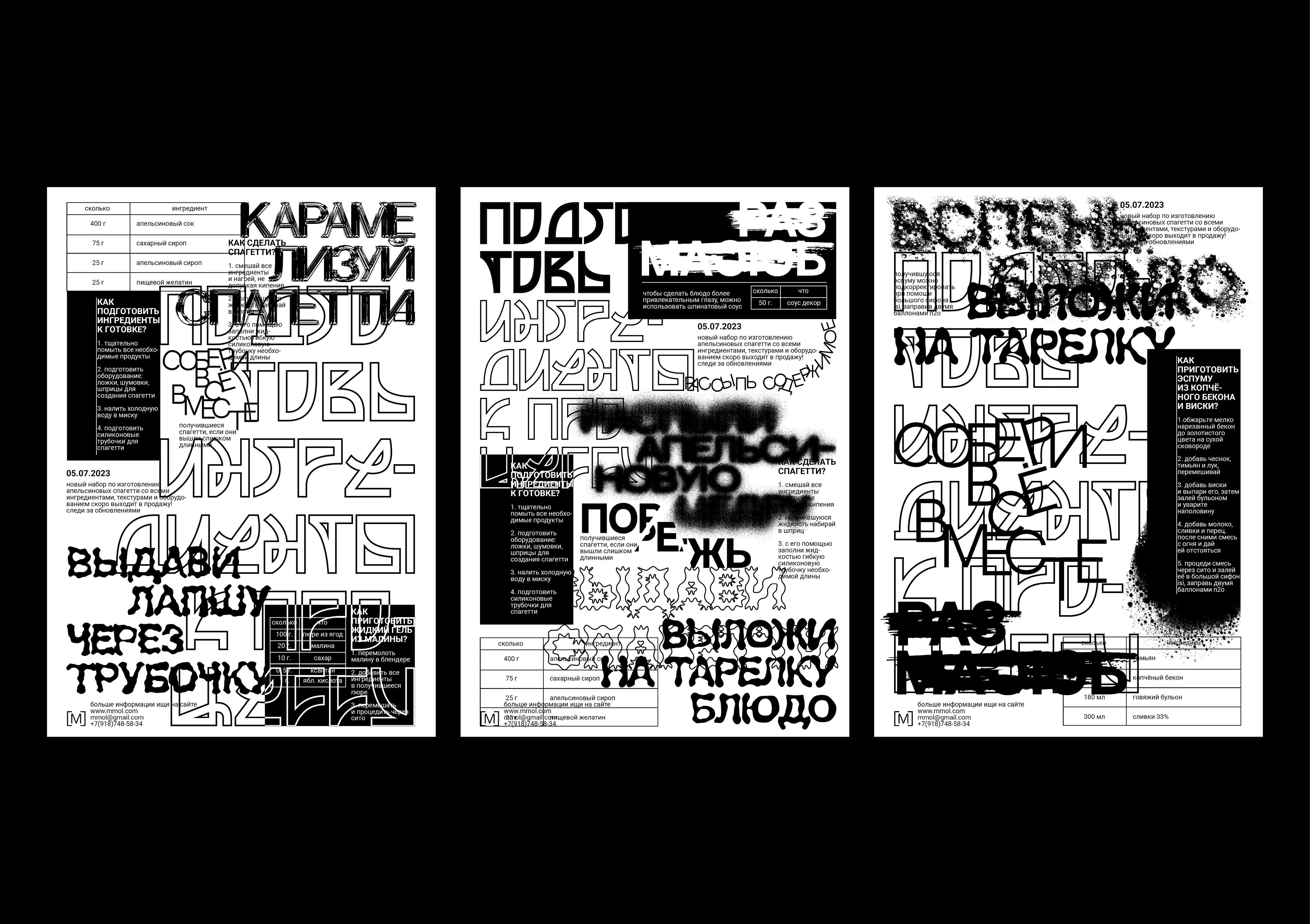
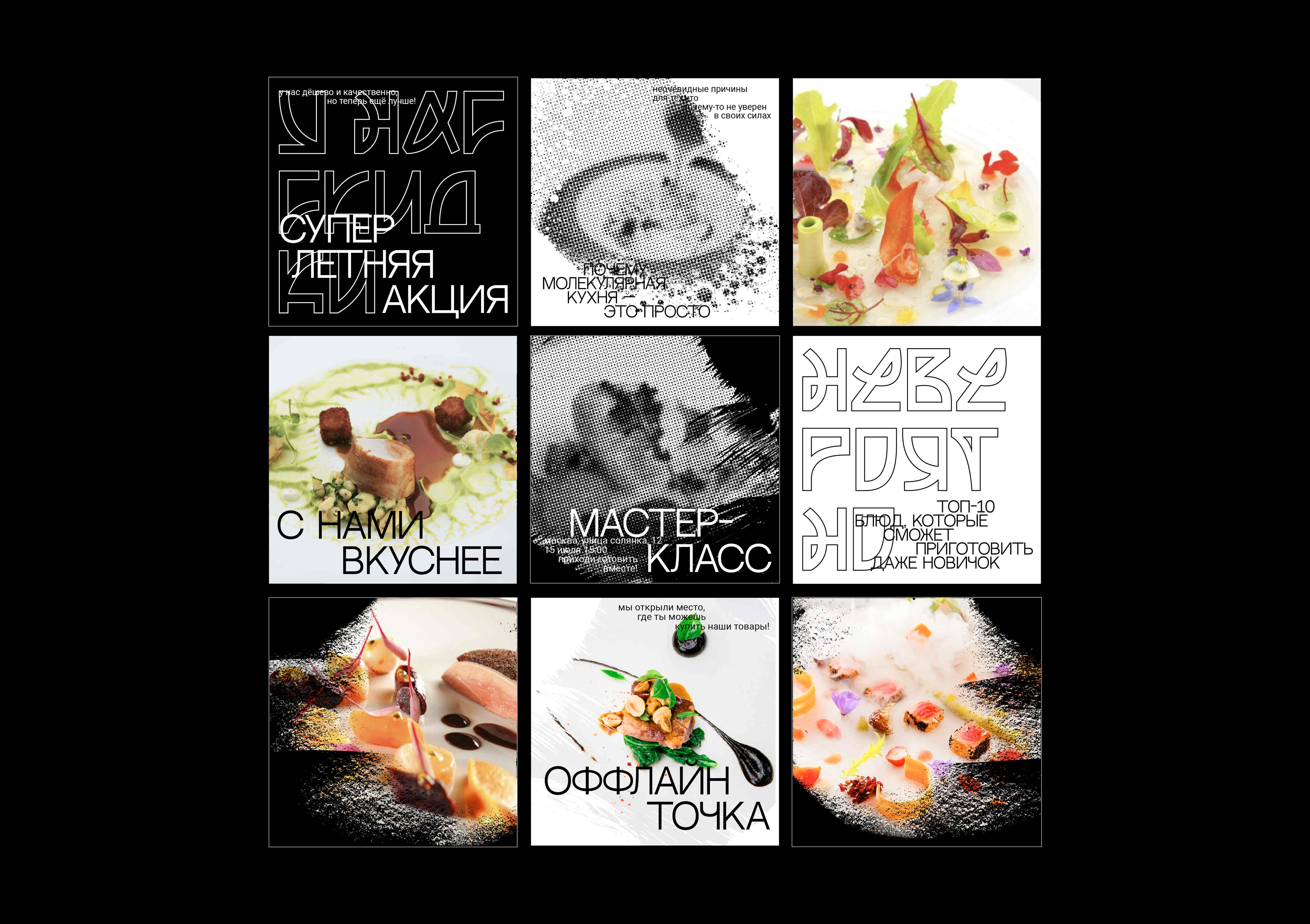
The main idea behind the project is to showcase the unique, experimental and innovative nature of molecular gastronomy through a mix of typography and textures. I wanted to create a design that not only reflects the scientific and experimental aspects of our products but also captures the playful and creative spirit of cooking with molecular gastronomy.
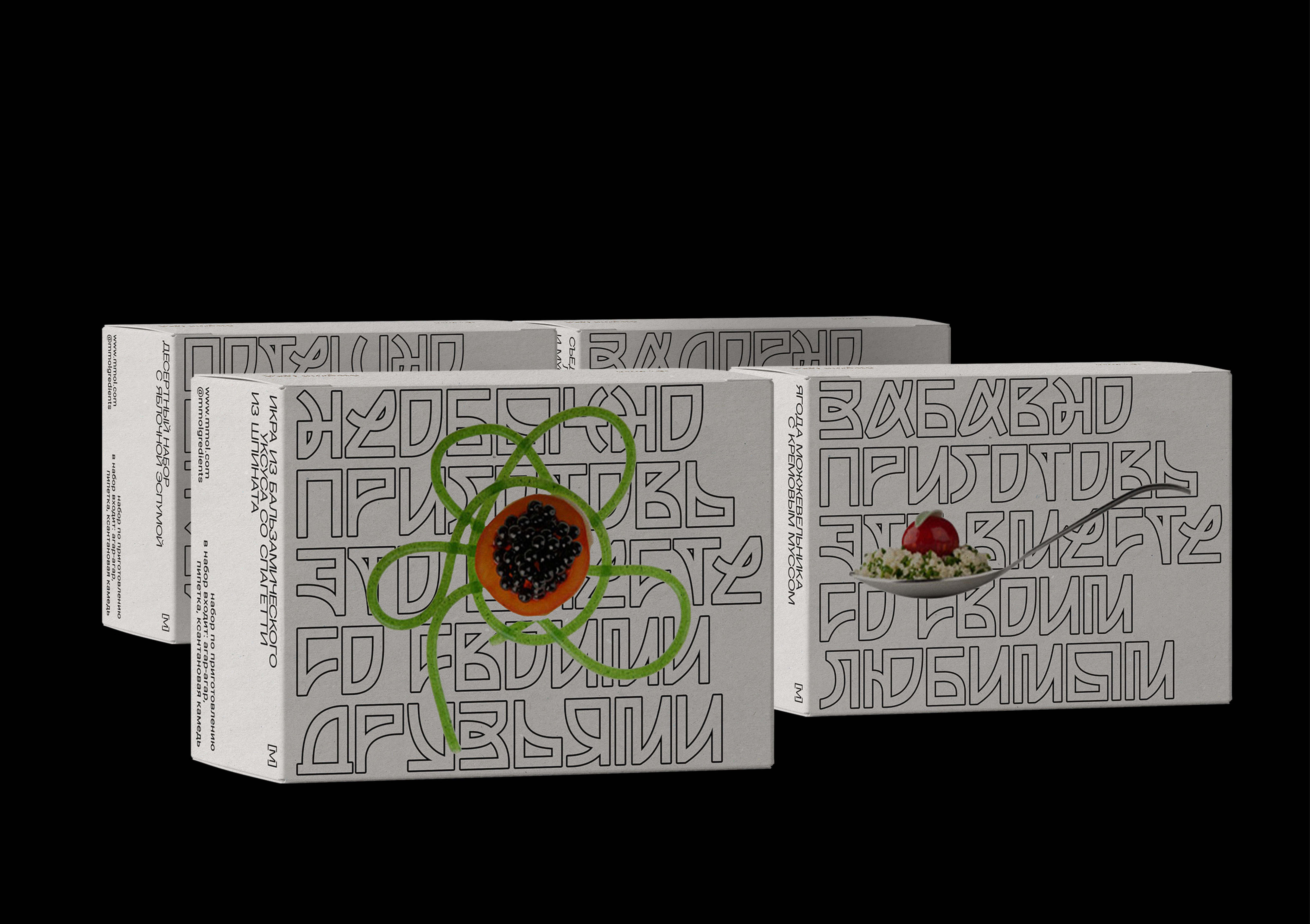
To achieve this, a combination of bold typography and abstract textures was used, such as foamed, cut, and blended ingredients. The typography is inspired by the molecular structure of different ingredients, with each text and phrase representing a different element or compound. The textures, on the other hand, are meant to evoke the different states and forms that ingredients can take on when cooked with molecular gastronomy techniques. For example, I used foamed textures to represent the light and airy quality of foams, and cut textures to represent the sharp and precise cuts that can be made with molecular gastronomy tools. By combining these elements, I was able to create a design that is both visually striking and conceptually rich, and that perfectly captures the essence of the brand.
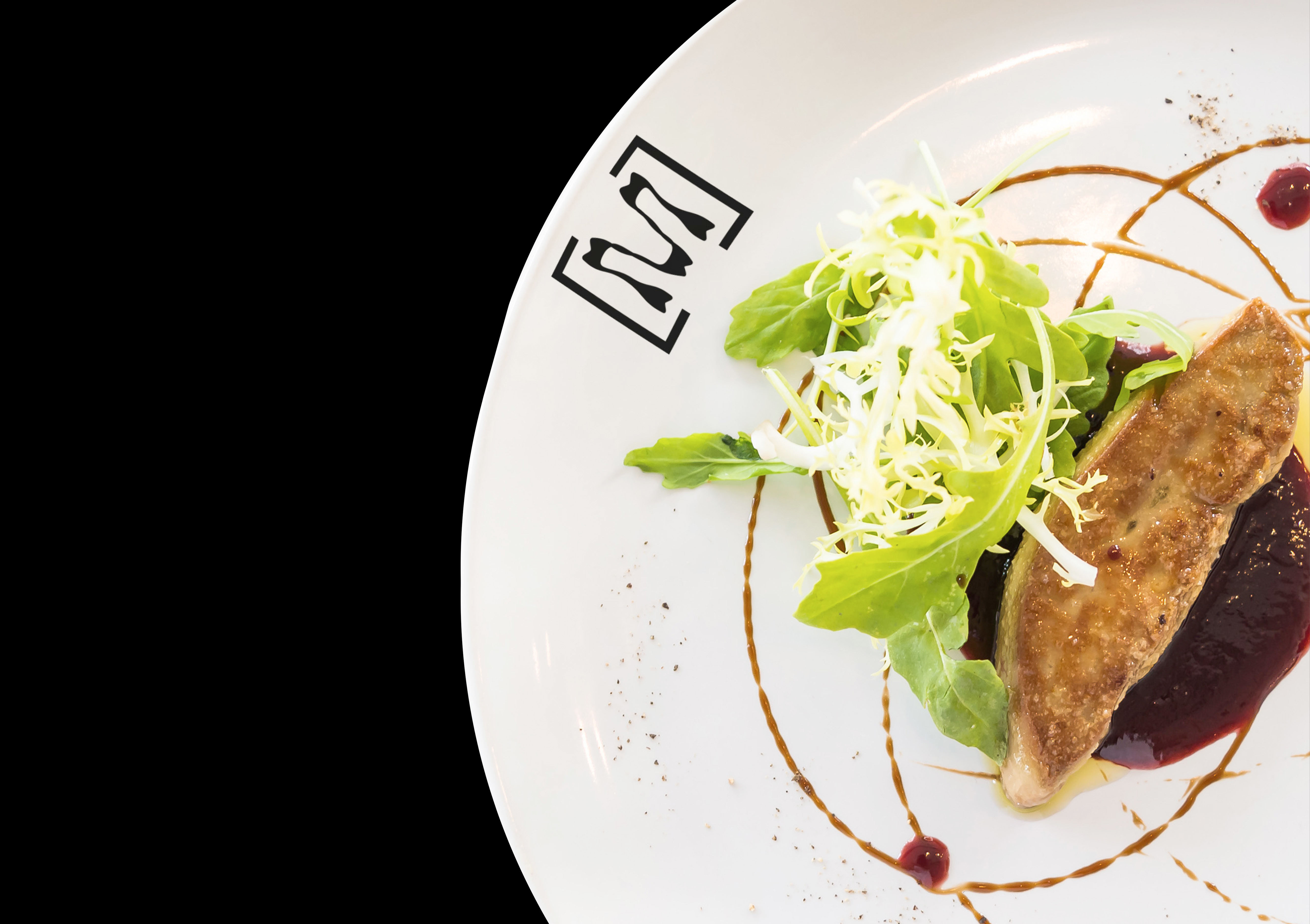
The logo of [M] is a variable design that showcases different textures of molecular gastronomy. The logo is designed to be flexible and adaptable, allowing it to change and evolve over time to reflect the different products and experiences that [M] offers.
CREDIT
- Agency/Creative: Sonya Boriskevich
- Article Title: [M] Brand Identity by Sonya Boriskevich
- Organisation/Entity: Student
- Project Type: Identity
- Project Status: Non Published
- Agency/Creative Country: Russia
- Agency/Creative City: Sonya Boriskevich
- Market Region: Global
- Project Deliverables: Brand Identity
- Industry: Food/Beverage
- Keywords: Sonya Boriskevich, Brand Identity, Molecular gastronomy
-
Credits:
Tutor: Tanya Dunaeva


