


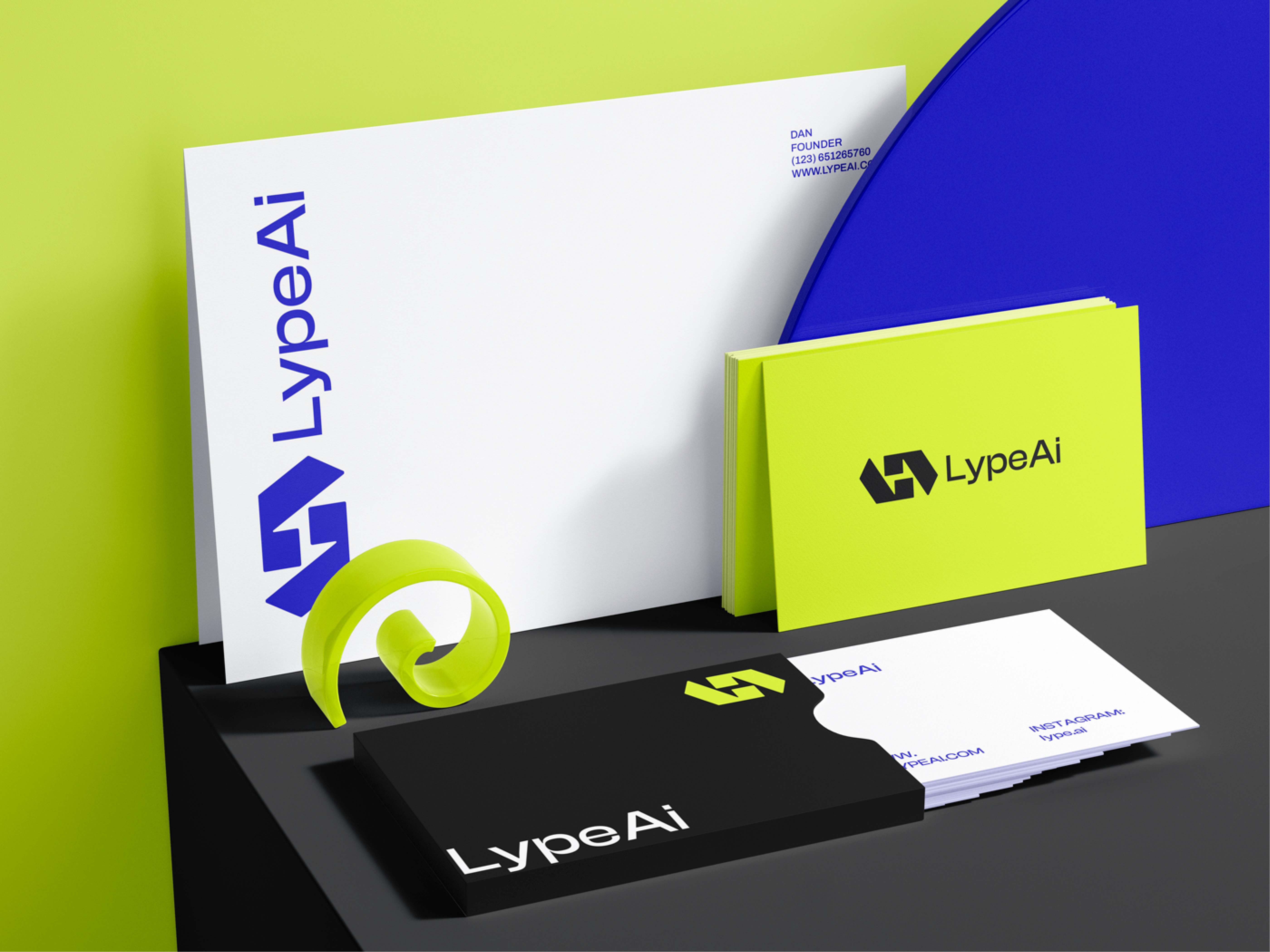
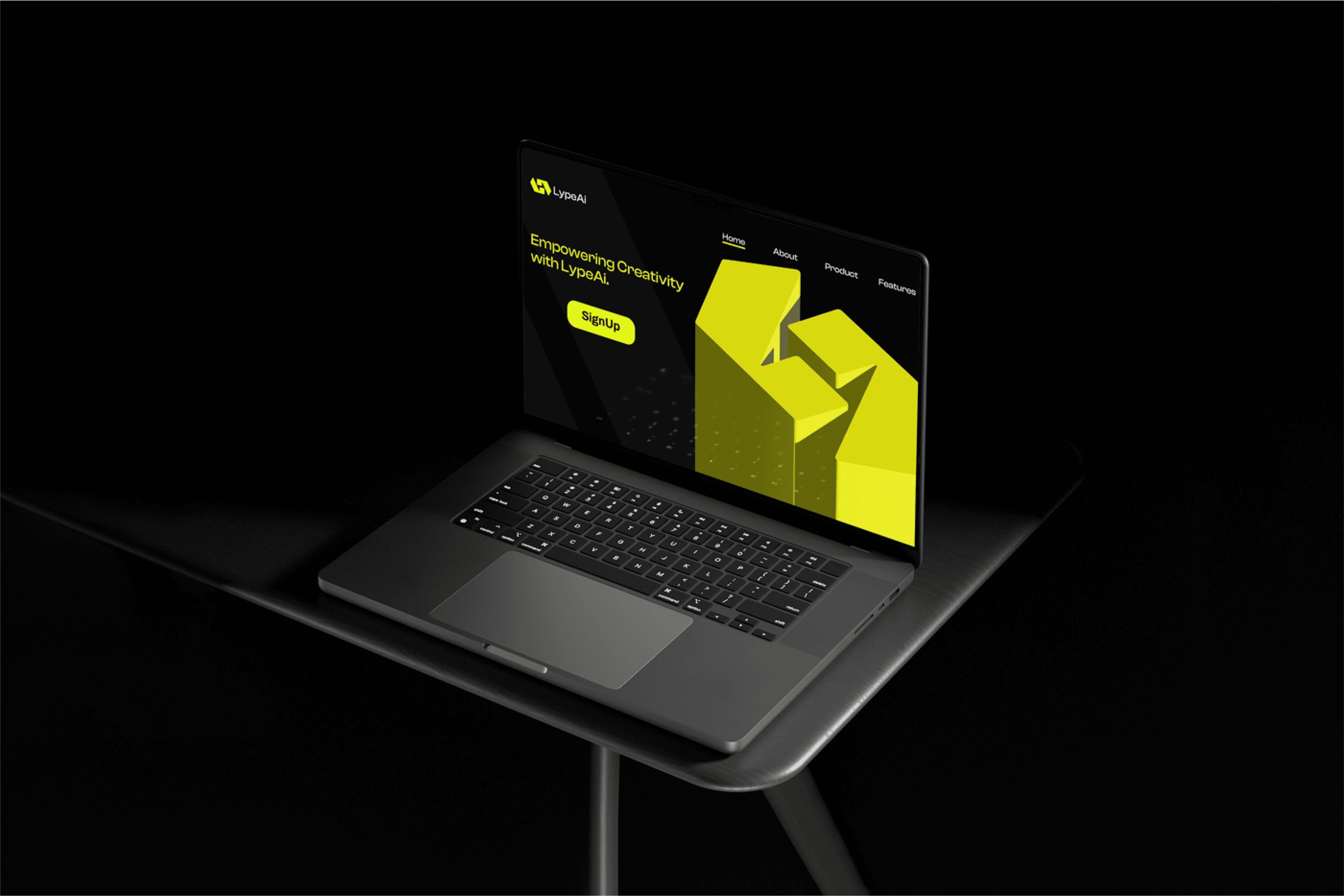
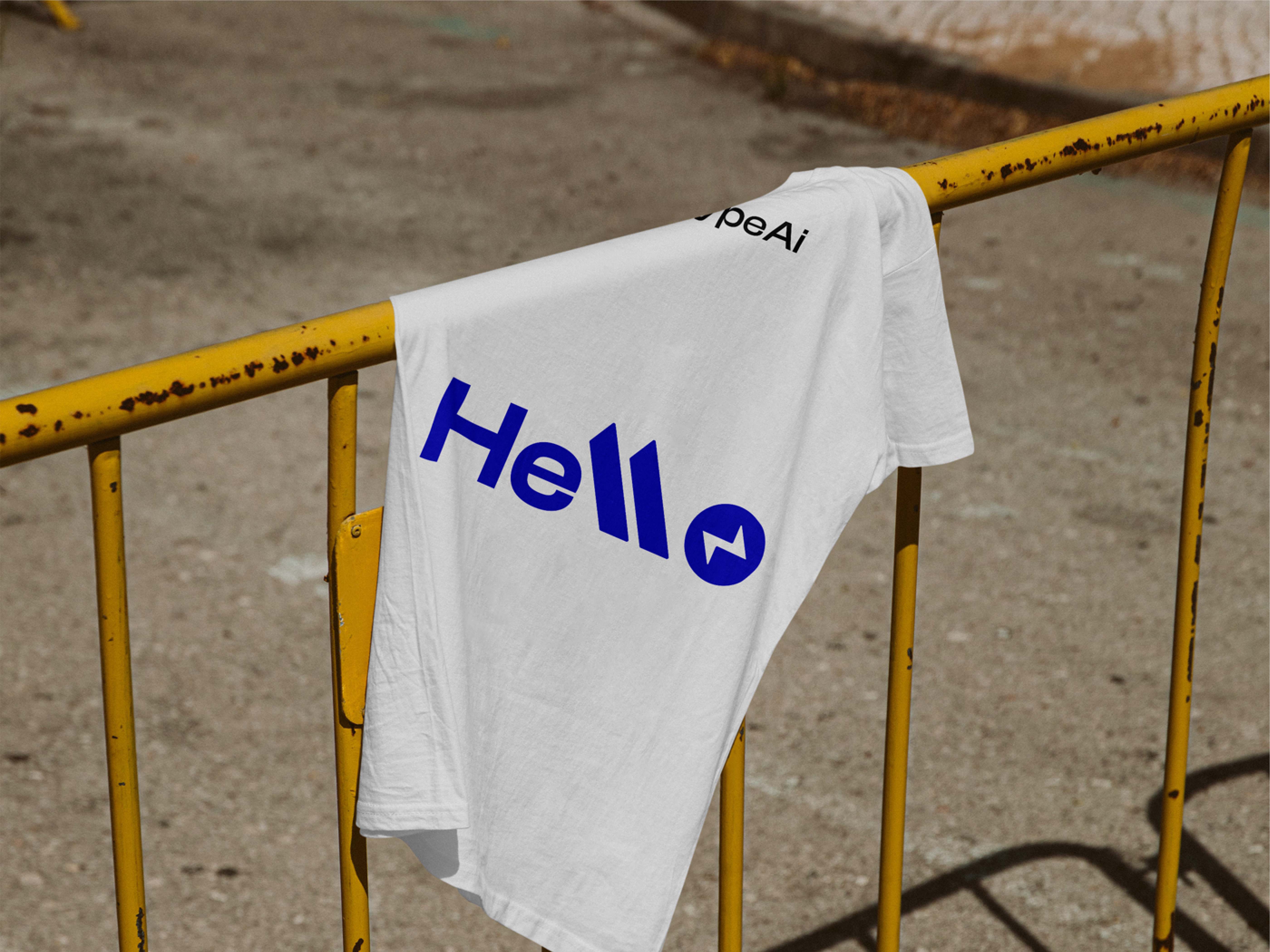
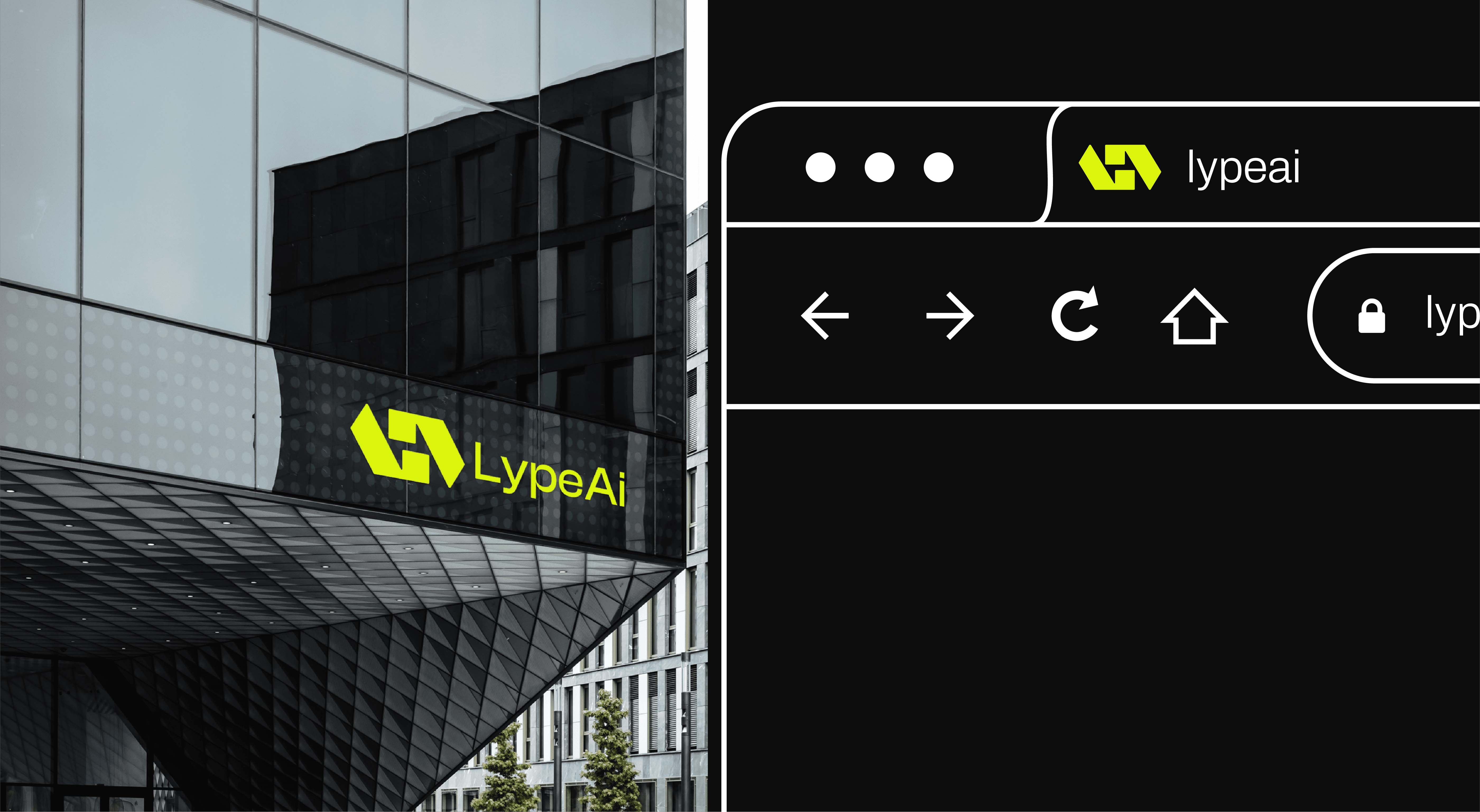
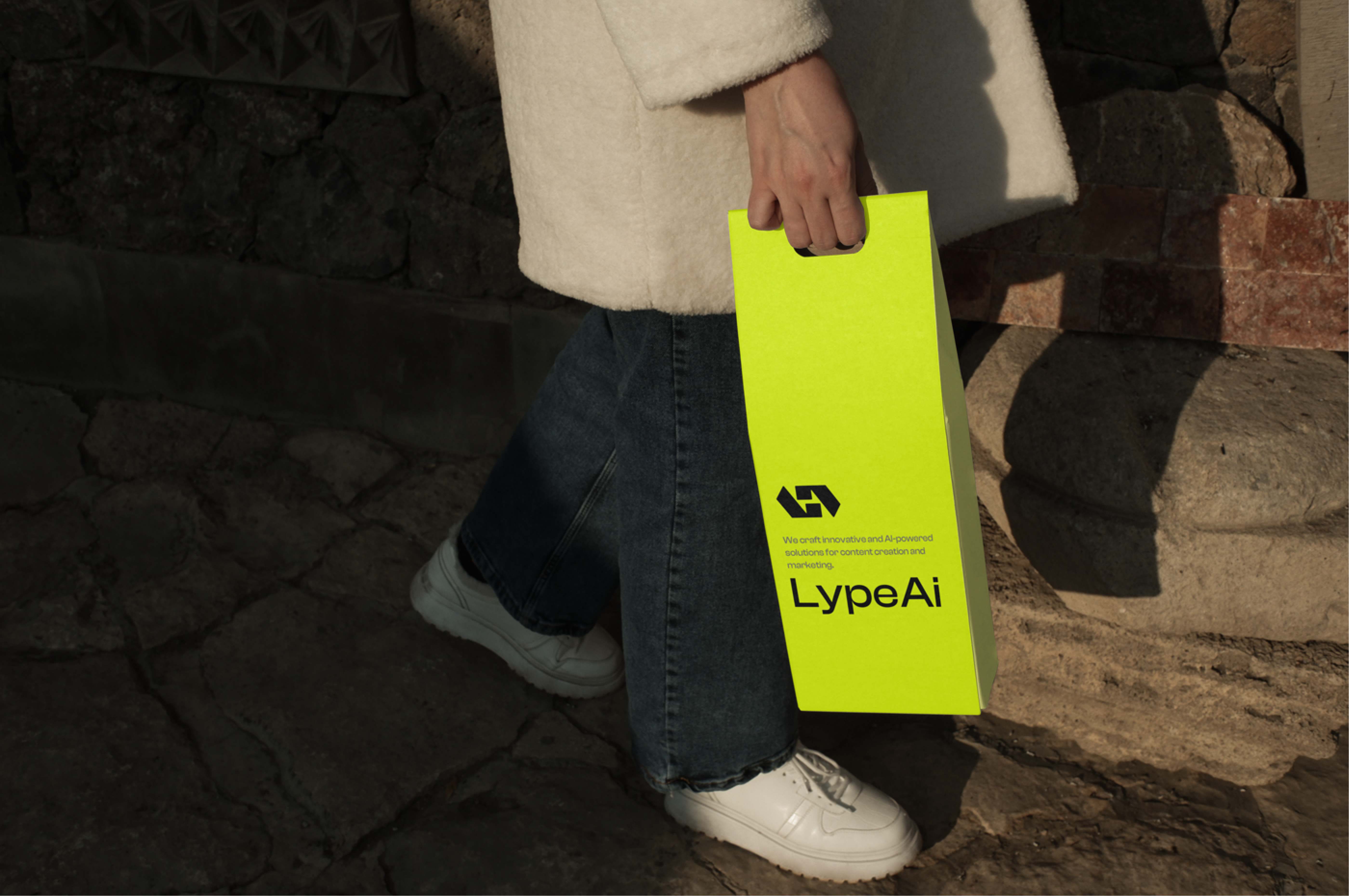
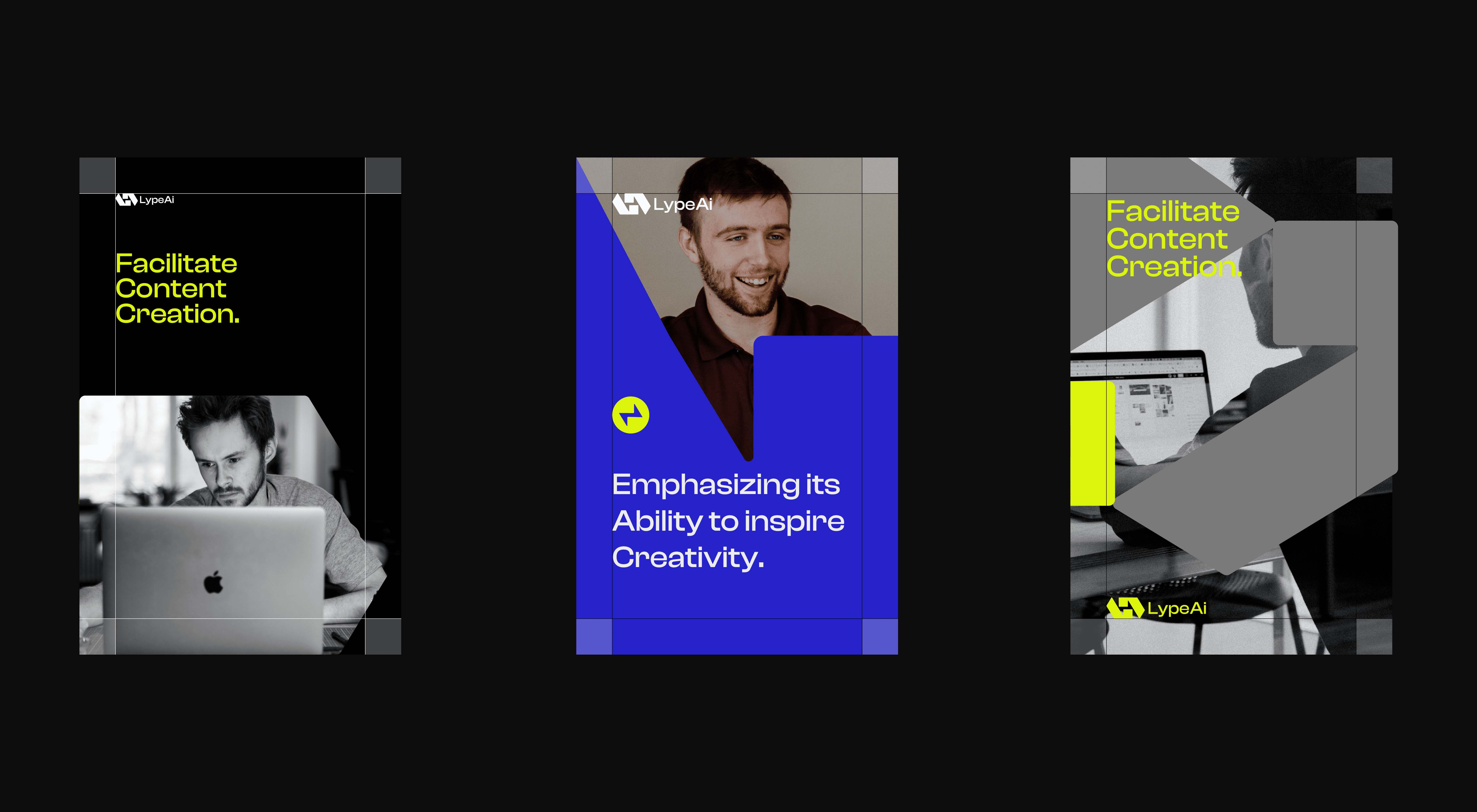
“LypeAI” is a cutting-edge AI-driven content marketing platform that is synonymous with innovation, personalized creativity, and elevating the digital content experience. Functioning as a consultancy and design entity for content, it specializes in content generation, refinement, and optimization, tailoring each piece to the unique needs of individuals and businesses. “LypeAI” strives to unlock the full potential of content marketing, allowing users to effortlessly create on-brand, high-quality content for a variety of purposes.
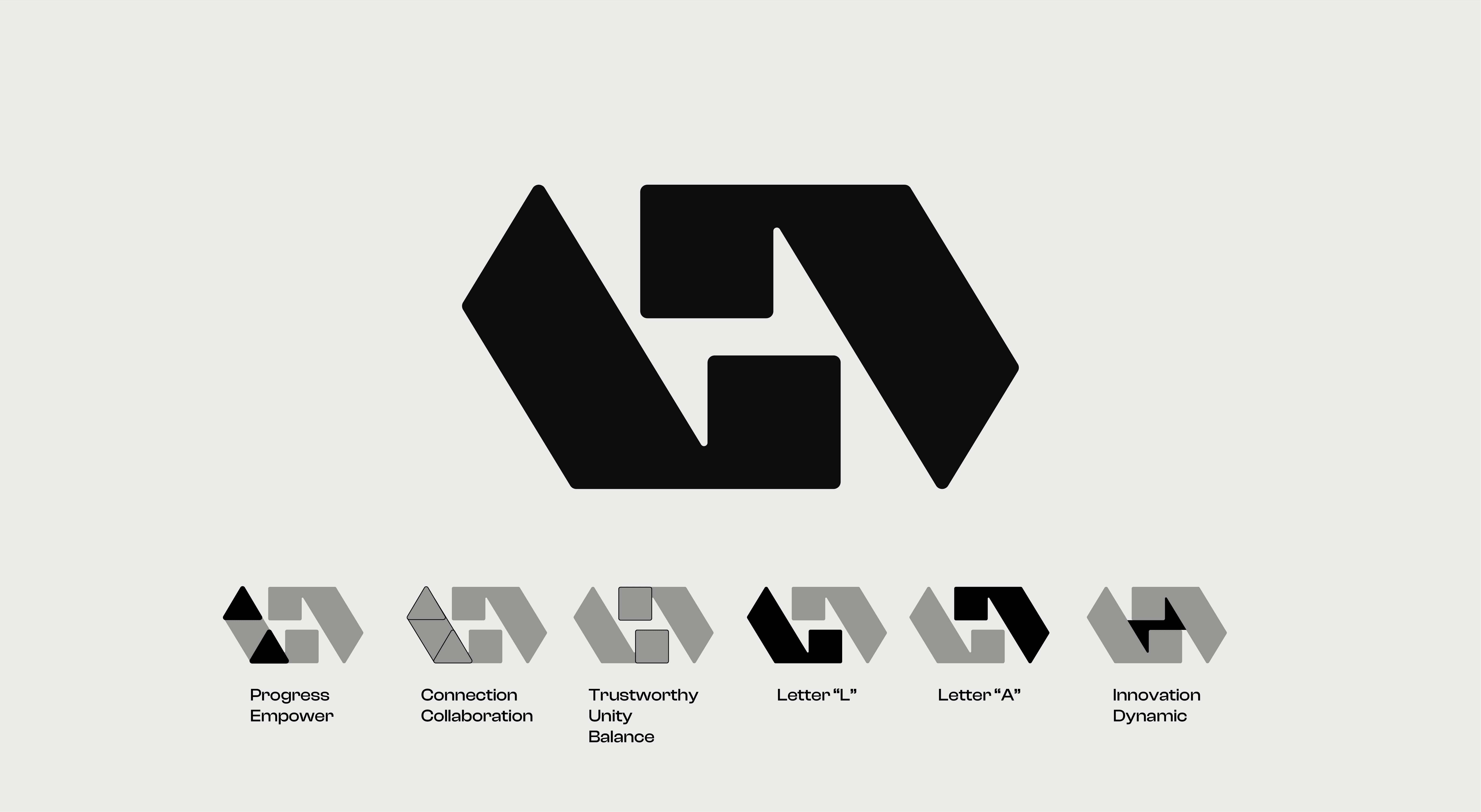
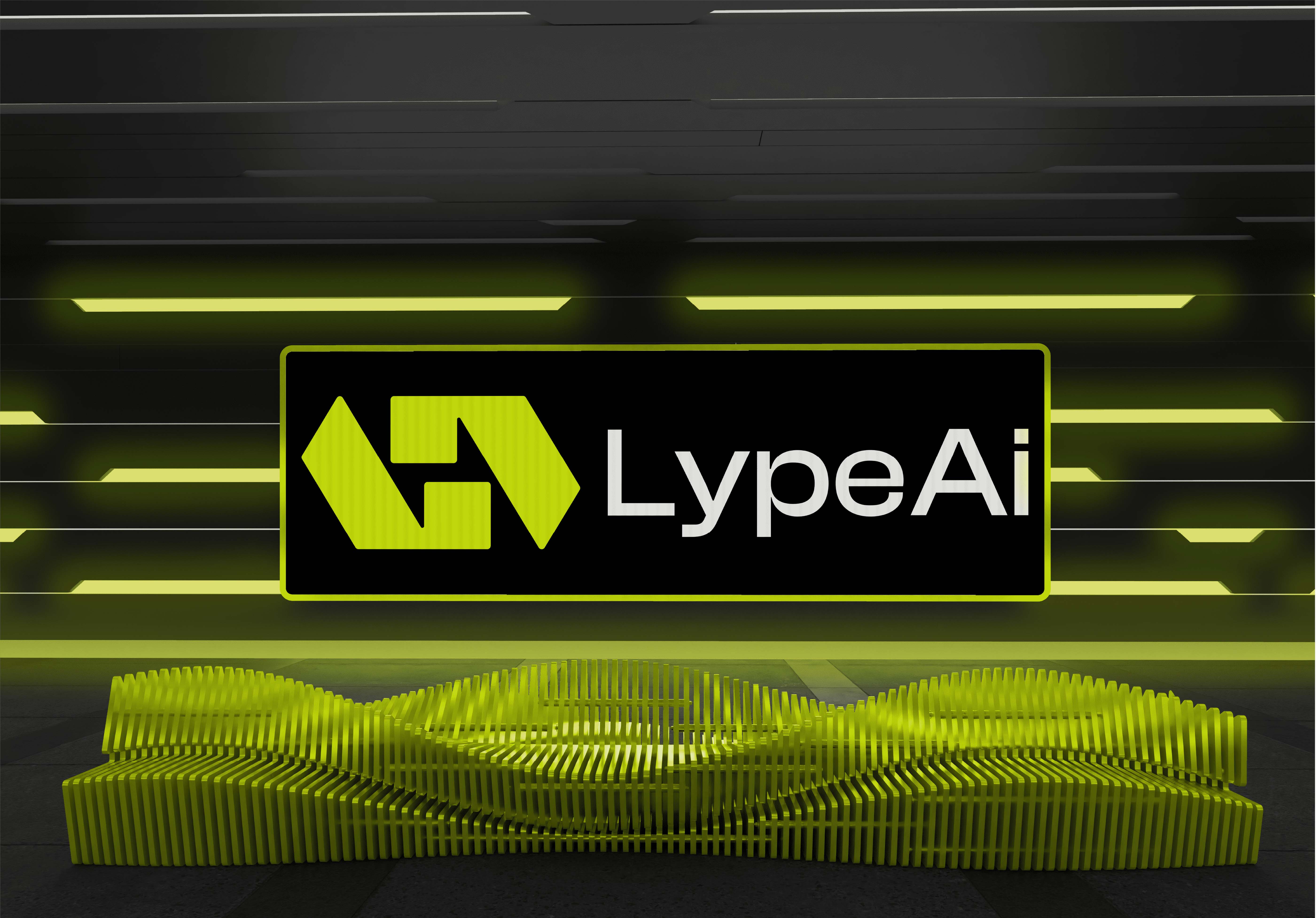
The concept of the “LypeAI” brand icon is a carefully constructed amalgamation of the letters “L” and “A,” ingeniously fashioned from basic geometric shapes, namely triangles and squares. These shapes not only create a distinctive “L” and “A” but also include a bolt of thunder in the negative space that emerges between them. This design encapsulates several symbolic elements and meanings:
Simplicity and Structure: The use of fundamental geometric shapes underscores simplicity and structure in content creation and marketing. It conveys “LypeAI’s” commitment to simplifying complex processes and making content creation more accessible and orderly.
Stability and Balance: The presence of squares and triangles implies stability and balance, indicating that “LypeAI” offers a stable foundation for content marketing, where reliability and equilibrium are paramount.
Innovation and Energy: The inclusion of a bolt of thunder in the negative space adds an element of innovation and dynamism. This signifies “LypeAI’s” role in infusing energy and creative spark into content marketing. The bolt of thunder symbolizes the rapid and transformative nature of content creation with the help of AI.
Clever Utilization of Negative Space: The strategic use of negative space showcases “LypeAI’s” attention to detail and creative design approach. It conveys the brand’s ability to find innovative solutions within spaces that may be overlooked, mirroring its core mission.
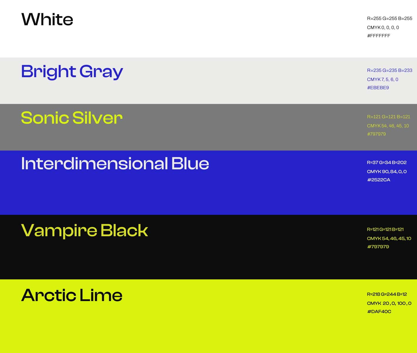
The thoughtful selection and incorporation of Arctic Lime, Black, and Blue as primary colors in the “LypeAI” brand logo are emblematic of the brand’s distinctive character. Arctic Lime exudes a sense of vibrancy, innovation, and progressive thinking, perfectly aligning with “LypeAI’s” commitment to delivering cutting-edge content solutions. Black, on the other hand, lends an air of sophistication, professionalism, and timeless appeal to the brand’s identity. Blue, a color synonymous with trust and reliability, underscores the brand’s dedication to providing dependable content marketing services.
The combination of these primary colors, complemented by the secondary colors of White and Grey, creates a dynamic and versatile color palette. This strategic selection not only reflects “LypeAI’s” innovative and trustworthy nature but also its dedication to clarity, transparency, and user-friendly solutions.
CREDIT
- Agency/Creative: Yacine Ali Moussa
- Article Title: LypeAI Crafting Brand Identity with Geometric Precision and Vibrant Design Innovation
- Organisation/Entity: Freelance
- Project Type: Identity
- Project Status: Non Published
- Agency/Creative Country: Algeria
- Agency/Creative City: Skikda
- Market Region: Africa
- Project Deliverables: Animation, Brand Design, Brand Guidelines, Brand Identity, Design, GIF Animation, Logo Design
- Industry: Technology
- Keywords: logo,Brand Identity , Artificial Intelligence
-
Credits:
Graphic Designer: Yacine Ali Moussa


