Brand Story:
Every child deserves safe and healthy nutrition. However, many foods for young children today are loaded with sugar, salt, and artificial sweeteners. This is a major contributor to the rising cases of obesity, cardiovascular issues, and diabetes among children.
Parents all wish to provide safe and nutritious meals for their children. But choosing the right product from thousands of options, with overwhelming and often unclear information, is a real challenge for families with young kids. Additionally, the limited time of modern parents makes it even harder. Balancing between taking care of their child’s sleep, meals, work, and other plans can be overwhelming.
Understanding these concerns, Lyla Eats was created with the mission of offering safe, healthy, and convenient meal supplements for both little ones and their families. Through its products, Lyla Eats aims to deliver joyful and exciting experiences, allowing children to explore the world through multiple senses, turning each meal into an eagerly anticipated moment.
About:
Lyla Eats is a blend of Vietnamese culture and global innovation. The brand was established to bring fun and unique meals to young children, combining traditional flavors while introducing new international dishes to expand their palate.
The rebranding of Lyla Eats is an opportunity to reaffirm its commitment to providing safe, healthy, and convenient weaning products for both children and parents. Through its products, Lyla Eats aspires to create enjoyable and enriching experiences that help children explore the world, fostering both their physical and mental development.
Concept: Eat Together, Grow Together.
The LylaEats brand is personified as a food-loving friend who accompanies children on their weaning journey. By creating a mascot that “Grows Together” with the child, the goal is to convey the brand’s core message: to be the child’s companion, helping them explore the world through their food adventures!
We aim to develop a consistent and professional brand identity system that embodies the spirit of a Vietnamese product with a distinct, adorable, modern, and global visual identity. The brand identity system will be cohesively applied across all platforms, especially the packaging system for the brand’s various product lines.
Mascot – The Baby Dinosaur:
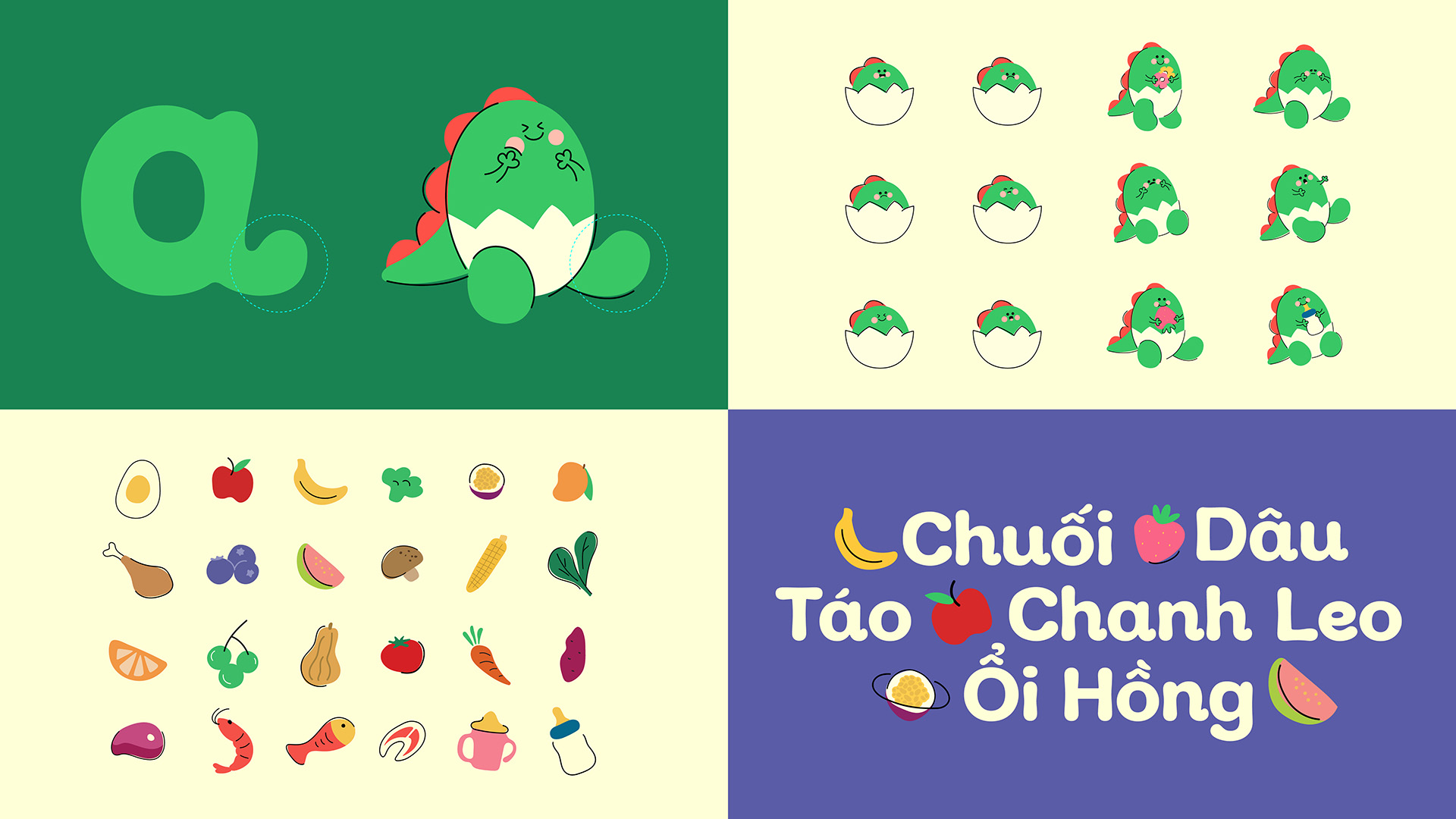
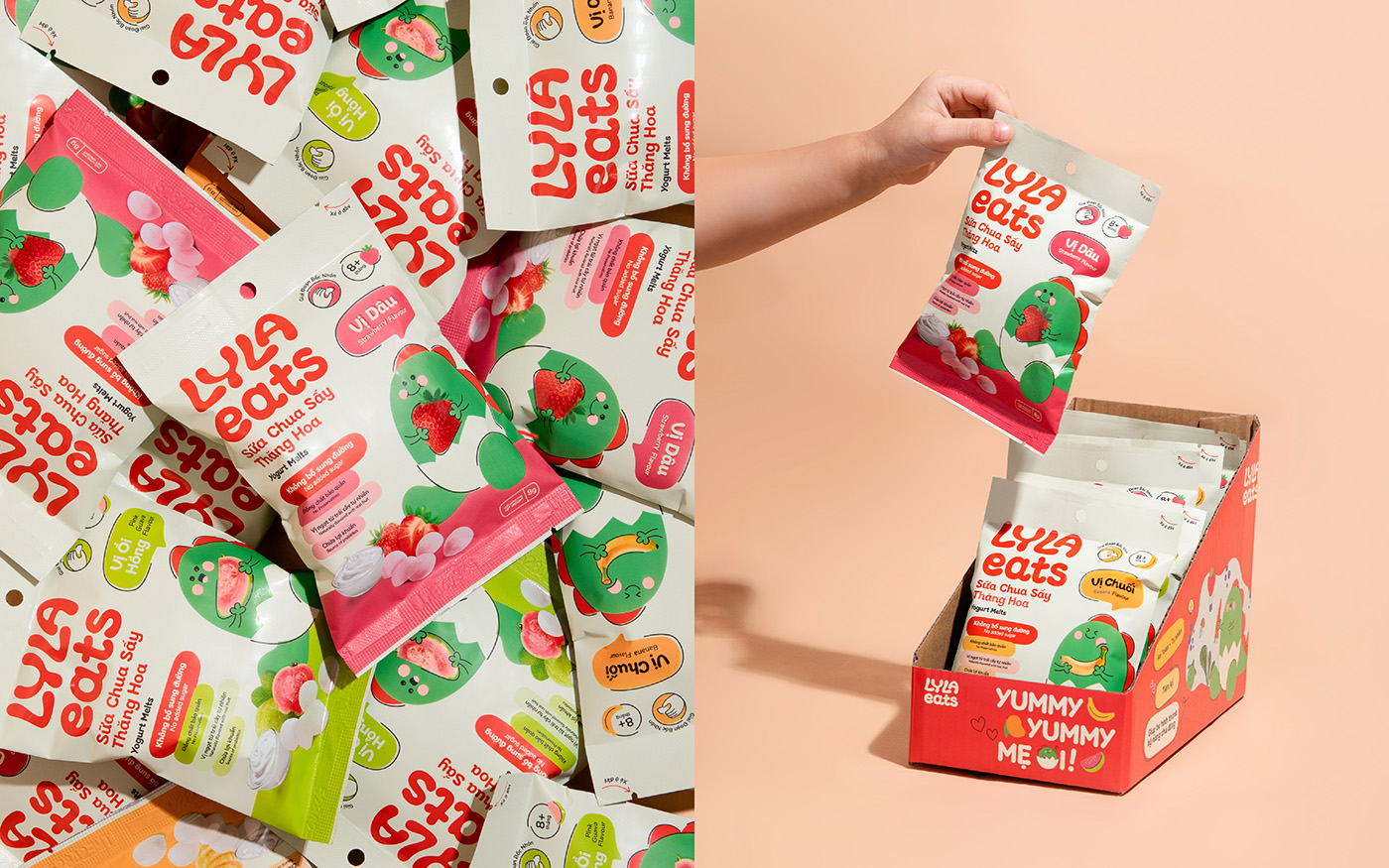
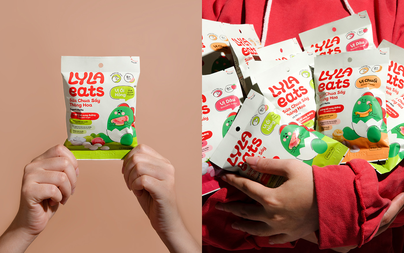
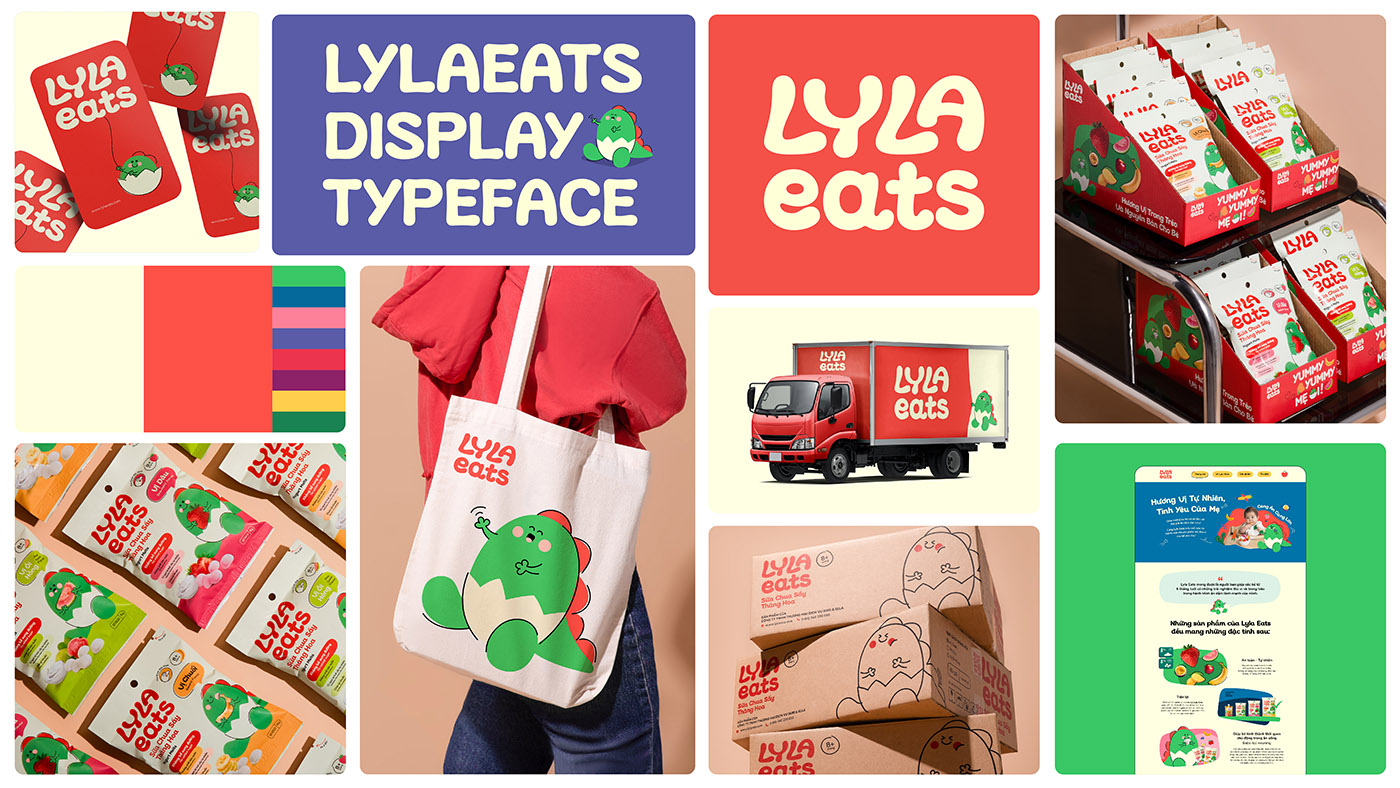
The baby dinosaur Lyla is designed based on the structure of the letter “a” from the brand’s logo. With a chubby, round, and friendly figure resembling a newborn baby dinosaur, Lyla aligns perfectly with the weaning age of children.
The character is crafted with a playful and cheerful design, featuring simple lines that create a friendly and memorable impression. The baby dinosaur’s diaper is inspired by an eggshell, symbolizing the characteristics of the mother and baby demographic.
Colour:
Lyla Eats Cream and Lyla Eats Coral are the signature colors frequently featured in Lyla Eats’ representative designs and communication materials. Additionally, there are supporting colors inspired by the ingredients used in Lyla Eats’ products, such as banana, strawberry, blueberry…
The use of Coral red-orange was chosen to stand out in the Vietnam market, where most competing brands tend to use green as their dominant identity colour.
Illustration & Typography:
Lyla Eats’ illustration style emphasizes simple lines and shapes with playful, fun designs that align with the brand’s essence. This illustration system includes familiar and relatable ingredients and foods often encountered during a child’s weaning process, such as vegetables, fruits, meat, fish, eggs, and dairy…
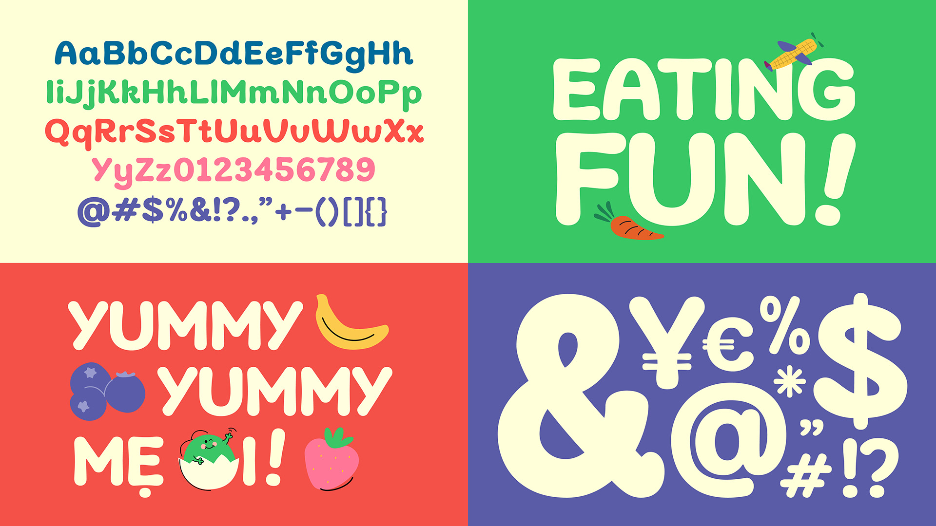
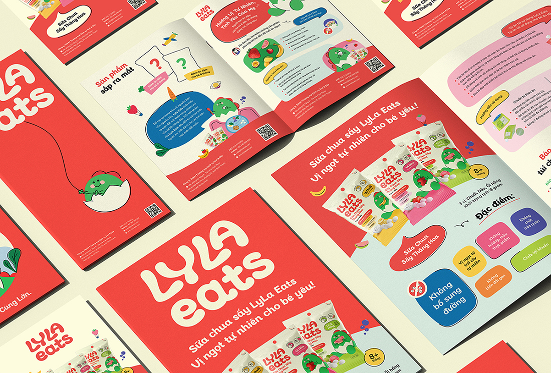
The brand’s typography system features two fonts: Lyla Eats Display and Nunito. Lyla Eats Display is a bespoke typeface designed specifically for headings or emphasized text. The typeface’s development is based on the rounded, soft lines of the logo, creating a friendly and approachable look, perfectly aligned with the brand’s character.
Packaging, Brand Collateral & Digital Application:
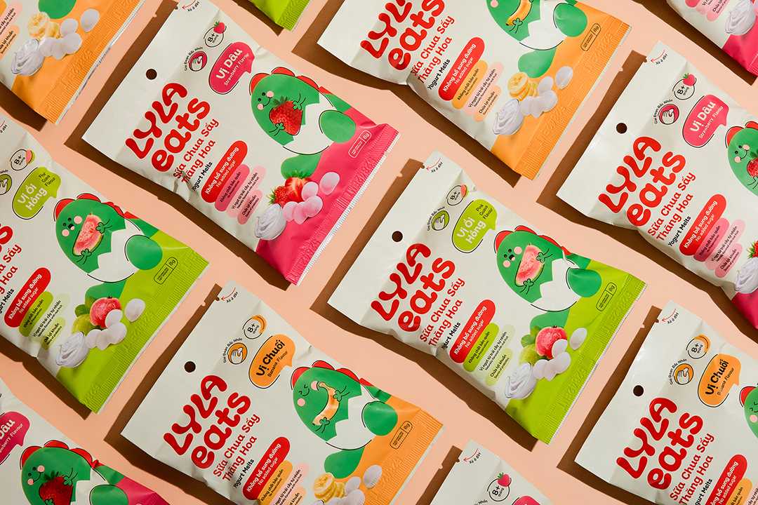
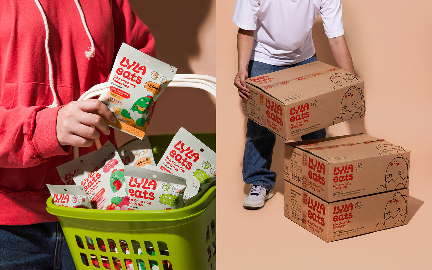
The Lyla Eats packaging system optimally and flexibly applies the brand’s graphic elements, establishing a standardized layout system for different product packaging. This approach makes it easier to implement, distinguish, and visually align the various products within the brand, ensuring a cohesive and eye-catching presentation.
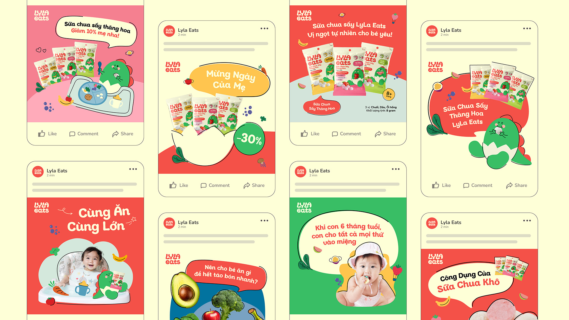
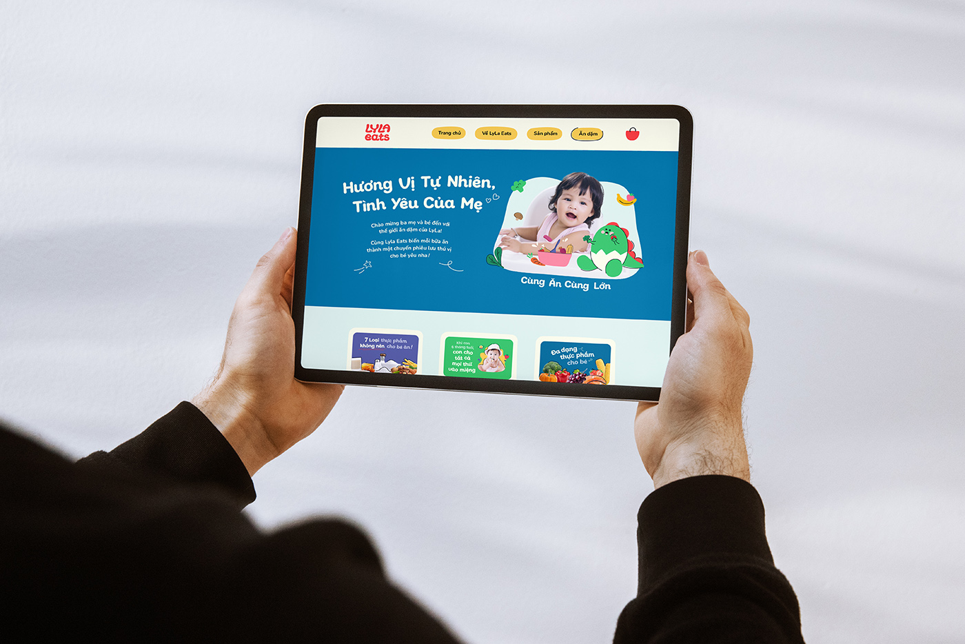
The new brand identity system is optimally applied across platforms from print to digital. Everything is designed with a unified language, color scheme, and typography, ensuring the brand’s overall visual identity remains consistent and cohesive. This consistency brings professionalism, modernity, friendliness, and a global appeal to the brand when displayed across both online and offline platforms.
CREDIT
- Agency/Creative: InSpace Creative
- Article Title: Lyla Eats Redefining Children’s Nutrition with a Playful and Modern Brand Identity
- Organisation/Entity: Agency
- Project Type: Identity
- Project Status: Published
- Agency/Creative Country: Vietnam
- Agency/Creative City: Ho Chi Minh City
- Market Region: Asia
- Project Deliverables: 2D Design, Brand Identity, Illustration, Packaging Design
- Industry: Food/Beverage
- Keywords: WBDS Agency Design Awards 2024/25 , inspace, vietnam, packaging, food, rebranding, visual identity
-
Credits:
Lead Agency: AZED Solutions
Creative Partner: InSpace Creative


