


Popp Studio has redesigned Bristol-based luxury lingerie and swimwear brand Fleur of England, modernising its visual identity and packaging with a sophisticated new look.
Since its 2001 launch, Fleur of England has grown under the leadership of founder and creative director Fleur Turner into a global luxury brand renowned for its classic style and contemporary edge. Underpinned by the belief that when lingerie fits you perfectly, you feel amazing, all garments are of exceptional quality and handcrafted with a focus on fit and silhouette.
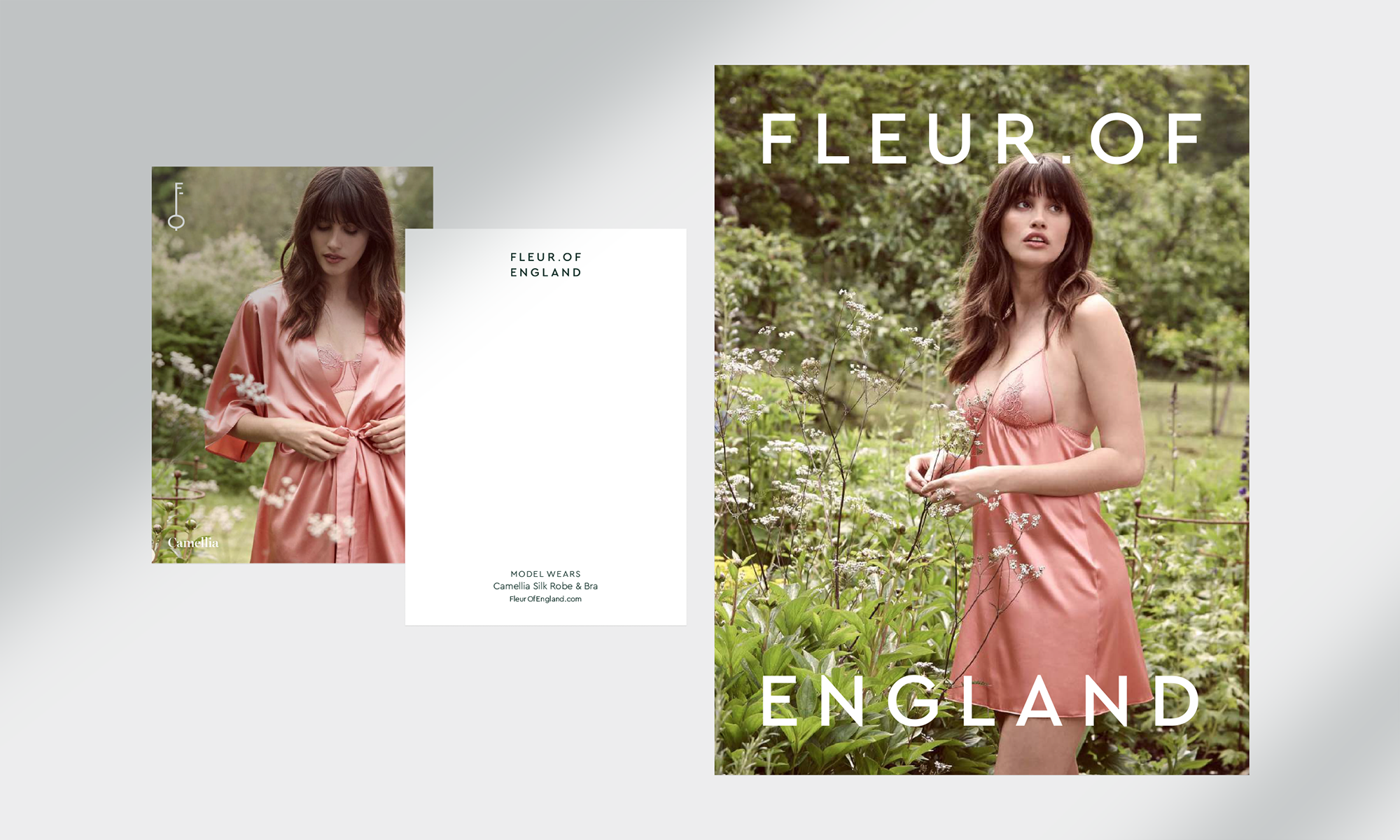
Fleur sees her brand and the collection as a garden, grown and nurtured by her mantra: “If it is not exquisite, it will not leave the door”.
Popp Studio was tasked with modernising and revitalising the Fleur of England identity to better reflect its world of “modern sensuality”, and to express a more open outlook, whilst respecting its classic roots.
Popp Studio embraced these ideas, bringing together the provenance story with the garden muse and the perfect fit — collectively they can help the brand grow as one.
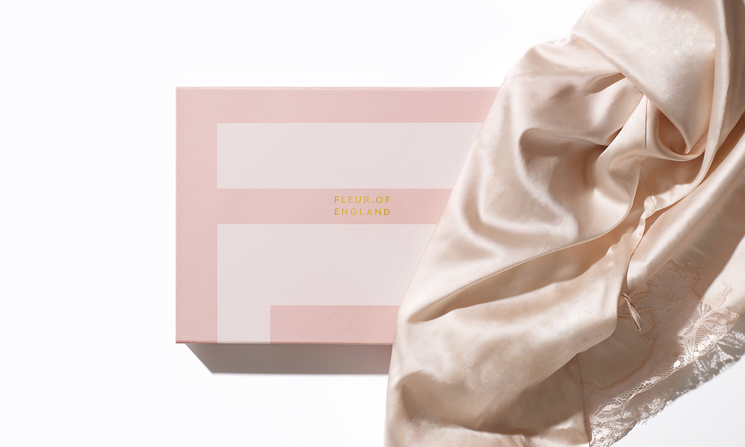
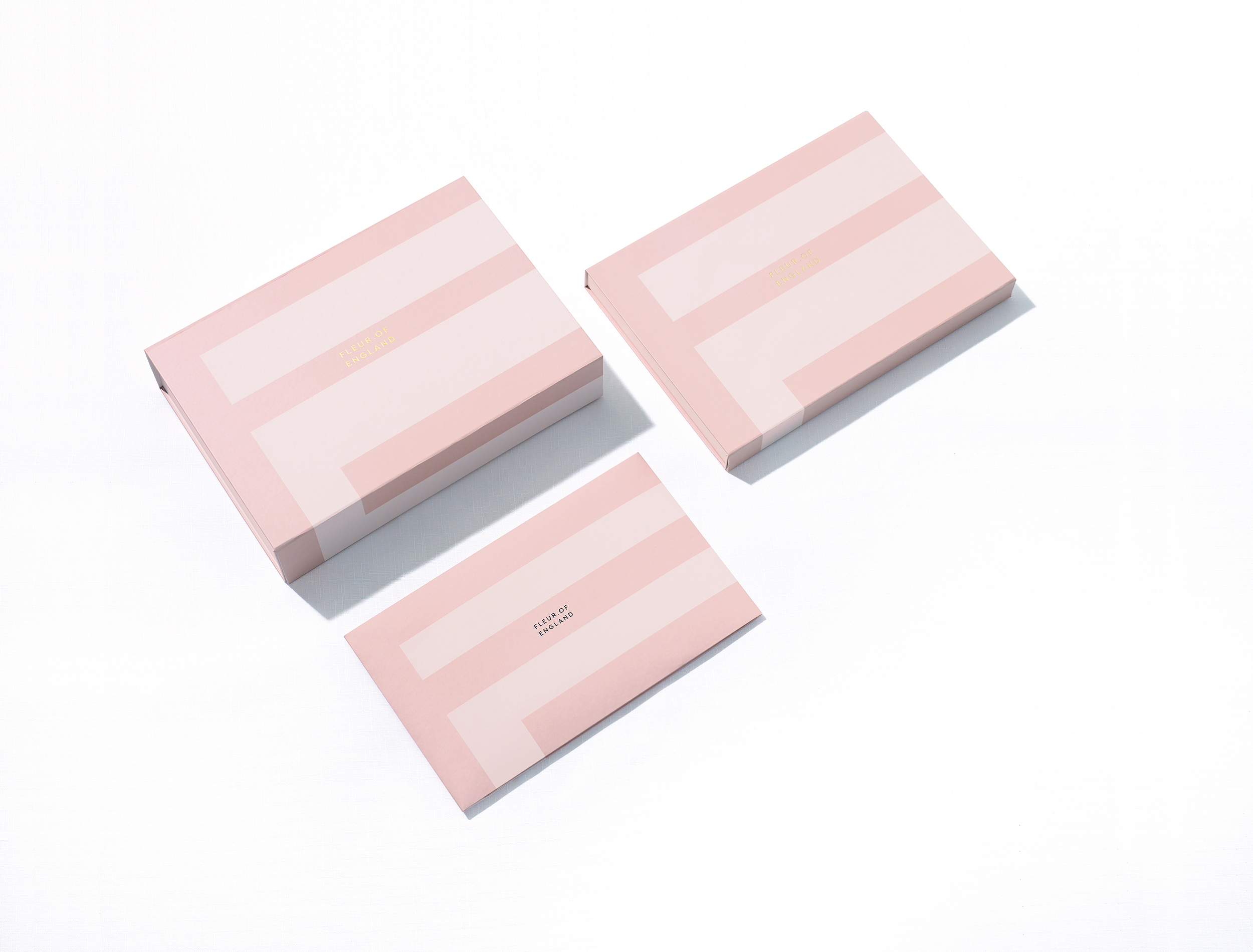
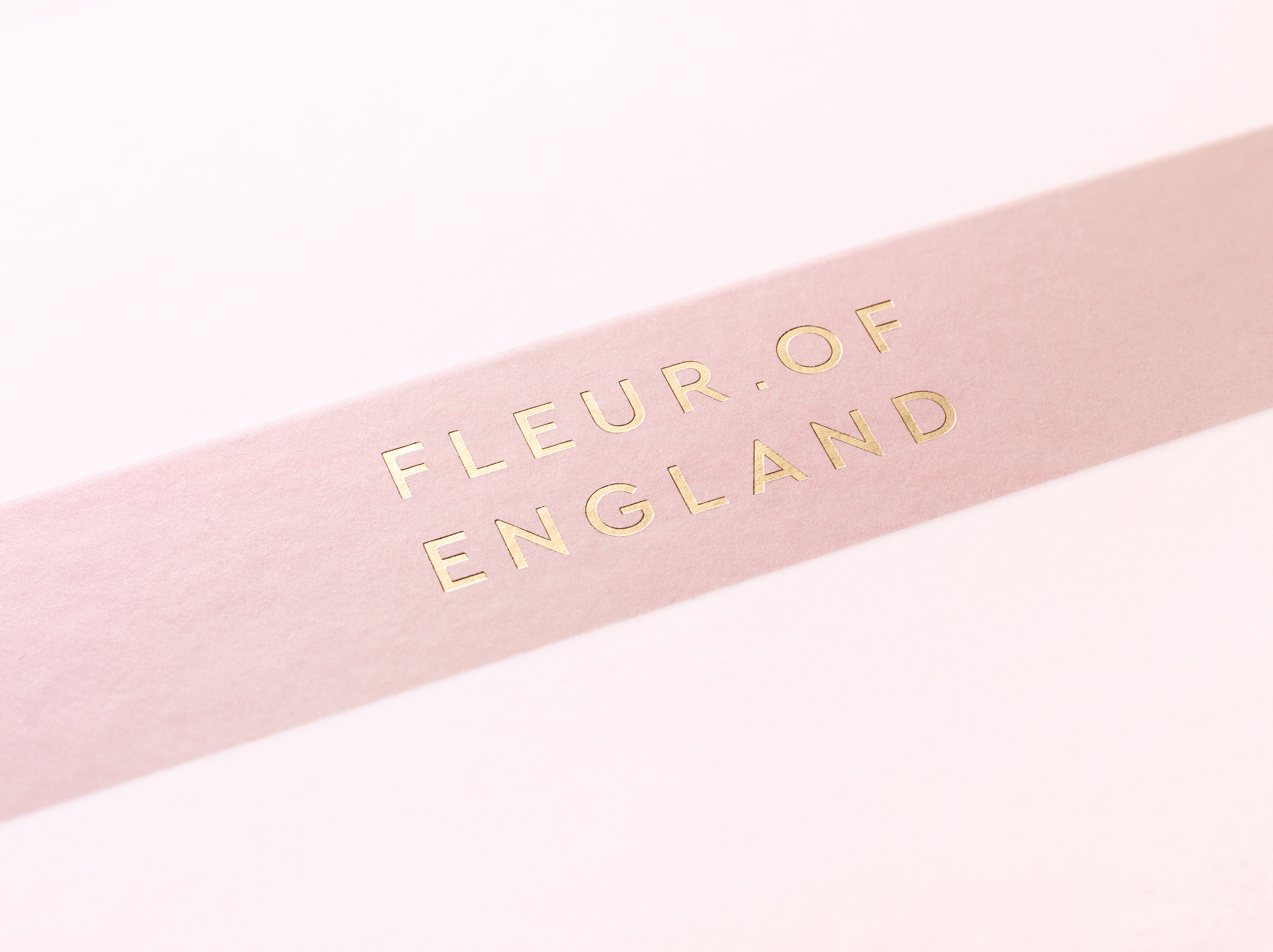
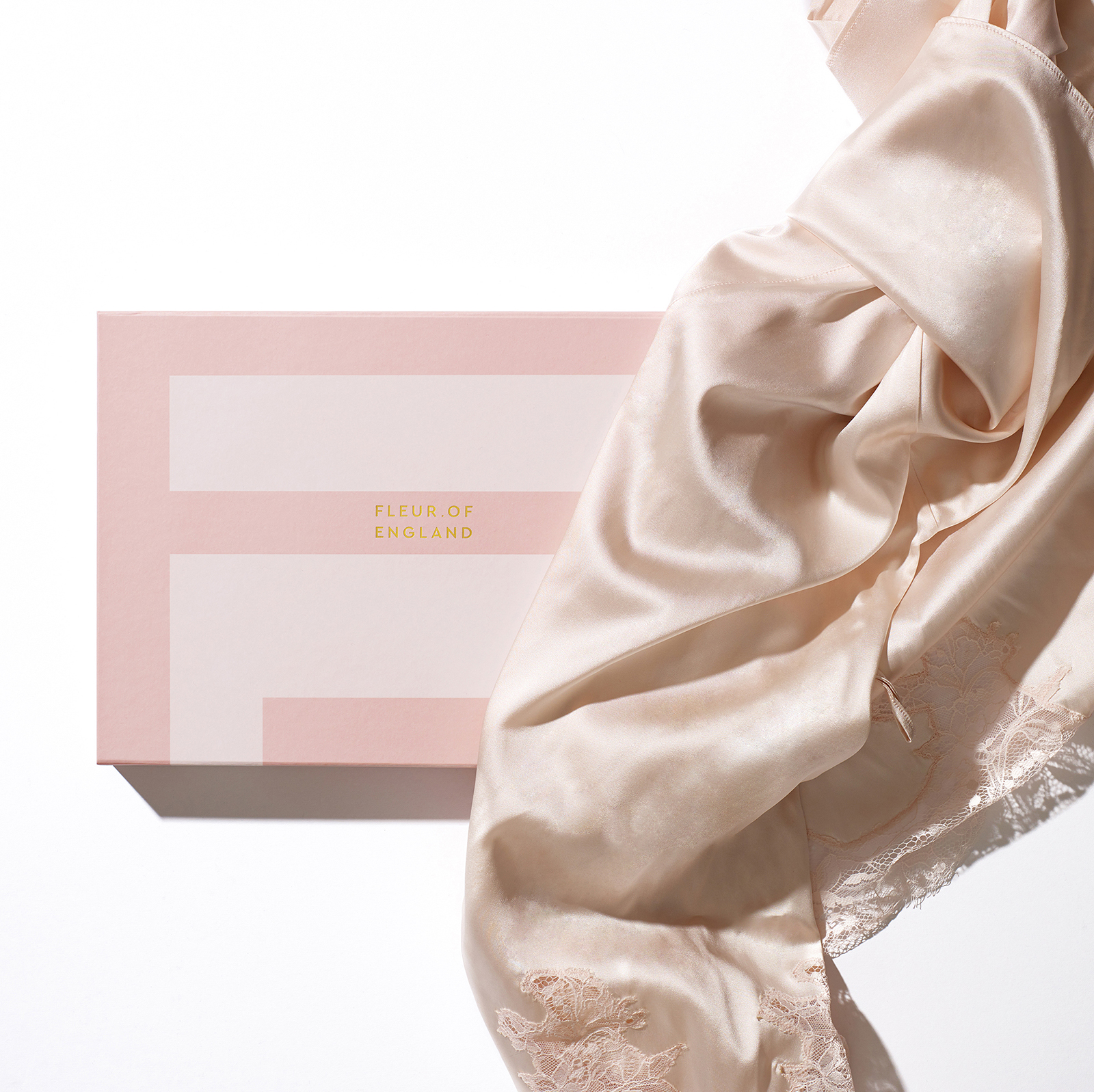
The girly, old-fashioned pink palette and flourishing script logo – generics of the category – were discarded in favour of a bold new colour palette, wordmark and symbol.
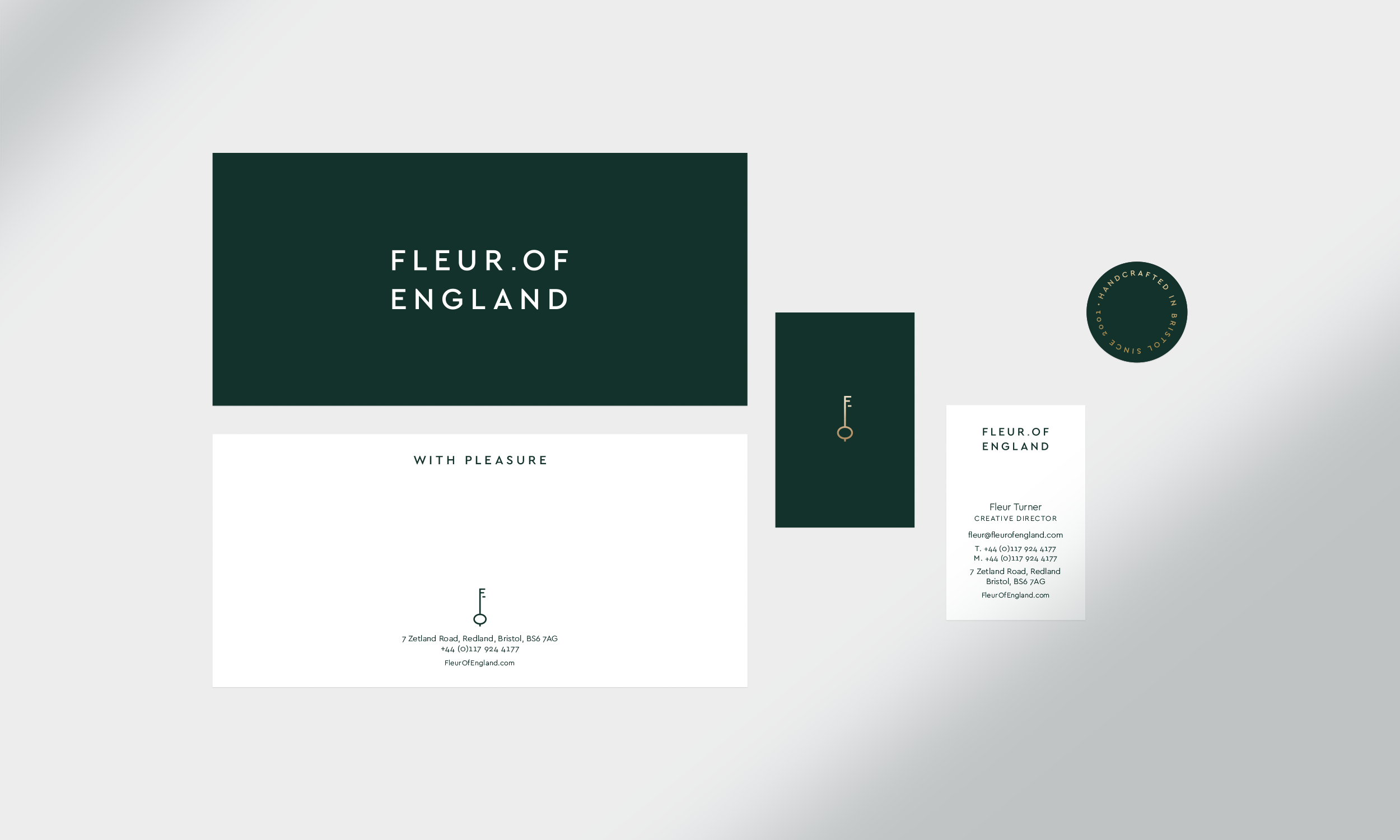
The colour palette now features gold accents alongside a deep green that is not only evocative of a lush English garden, but feels distinctively luxurious, differentiating Fleur of England distinct in a category that all too often uses black-on-white to feel premium.
A secondary palette of softer, deliberately restrained hues have been carefully chosen to feel feminine, sophisticated and complementary to the bolder brand colours.
The Fleur of England wordmark is stacked on two lines. Placing the ‘of’ on the top brings England more visibility and presence. And the confident full stop brings modern emphasis to Fleur’s name.
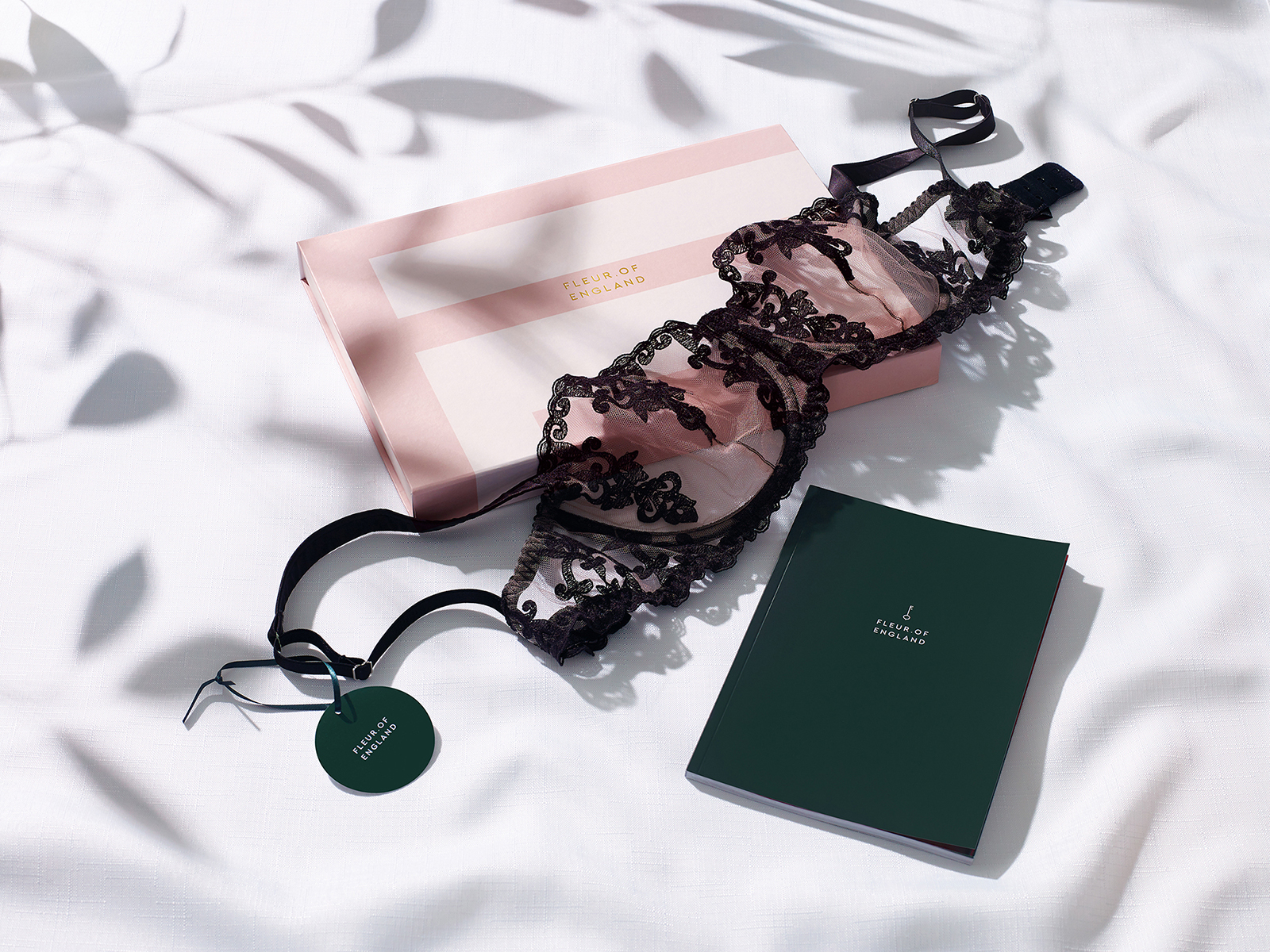
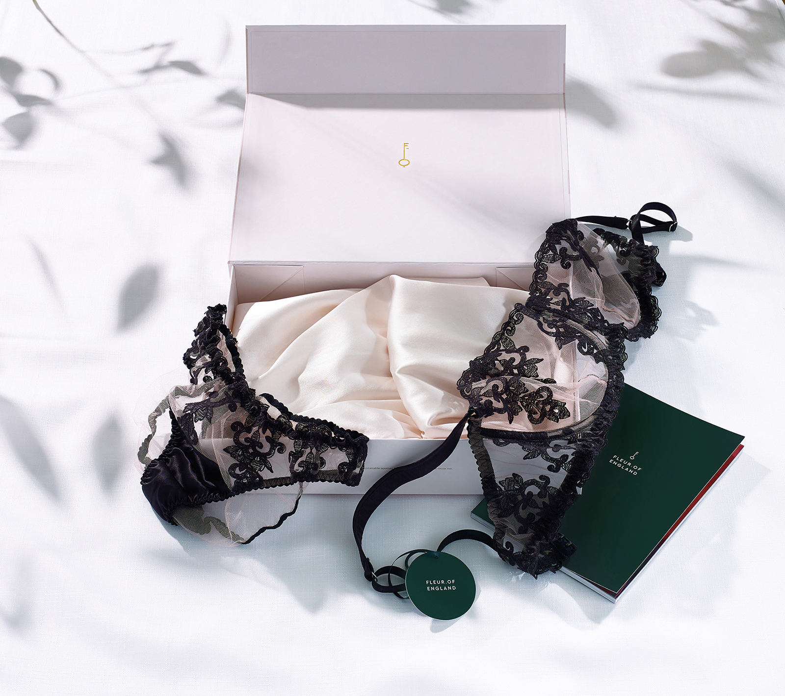
The new logo combines an F and an E in the tip of an elegantly drawn key. It is the key to the perfect fit, and Fleur’s garden, opening up a world of modern sensuality.
This bold, distinctive asset can be cropped or extended to create dynamic and engaging touchpoints across the brand world.
The wordmark and logo have been designed to function either as a master lock-up, or as individual assets that can be used creatively as part of a dynamic visual identity system.
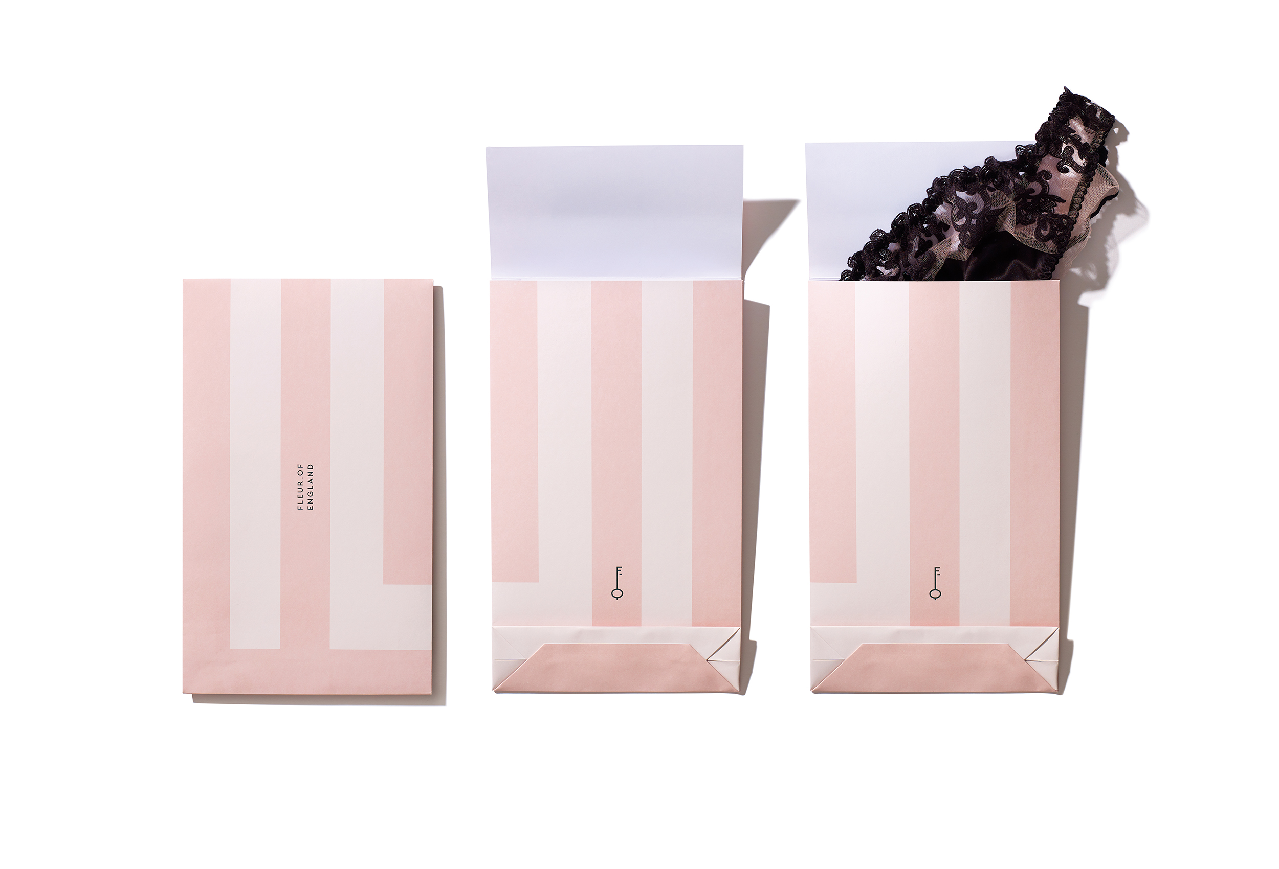
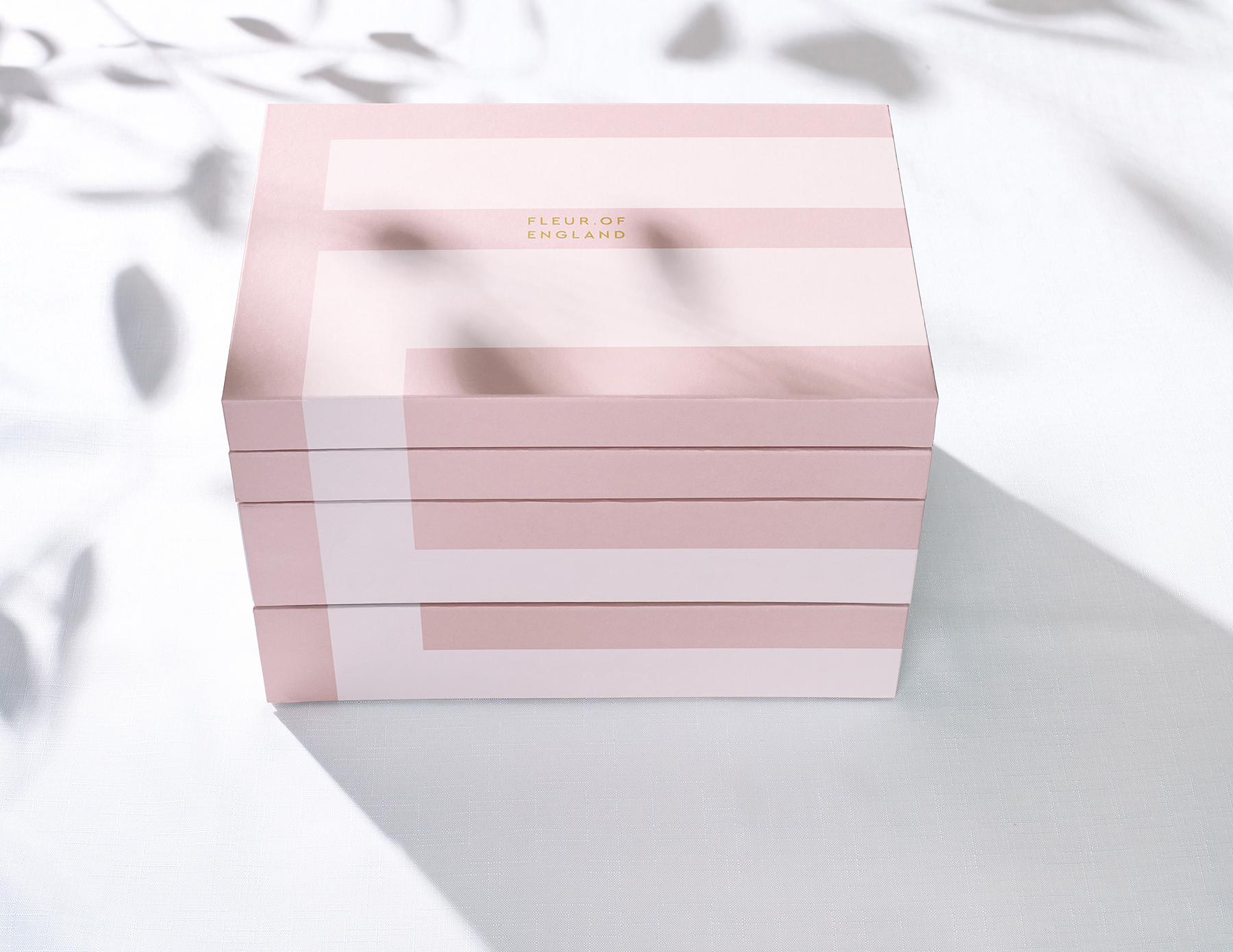
The packaging system has also been completely redesigned to use materials that are more environmentally friendly. Customers are now offered the option of a beautiful recyclable envelope, or a luxurious giftbox that can be kept and reused.
Both feature soft blush colours, and the boxes have discoverable details, such as a gold foiled key on the underside of the box lid, and a tessellating pattern effect when they are stacked.
Poppy Stedman, Creative Director and Co-Founder of Popp Studio, says:
“Our redesign allows Fleur of England to tell her story in an exquisitely confident way. We’ve given Fleur a more distinct visual identity through a process that balanced the bolder use of new assets with a restraint that keeps the brand feeling sophisticated and luxurious.”
Fleur Turner, Founder and Creative Director of Fleur of England says:
“Popp Studio’s reimagining of Fleur of England is feminine, layered and crafted, and the dynamic visual identity system allows our brand to come into full bloom.”
Fleur of England is available online at www.fleurofengland.com, and in luxury retailers in 19 countries.
CREDIT
- Agency/Creative: Popp Studio
- Article Title: Luxury Lingerie Brand Fleur of England Redesigned by Popp Studio
- Organisation/Entity: Agency, Published Commercial Design
- Project Type: Packaging
- Agency/Creative Country: United Kingdom
- Market Region: Multiple Regions
- Project Deliverables: Brand Guidelines, Brand Identity, Brand Redesign, Brand World, Branding, Graphic Design, Identity System, Packaging Design
- Format: Box
- Substrate: Pulp Paper


