


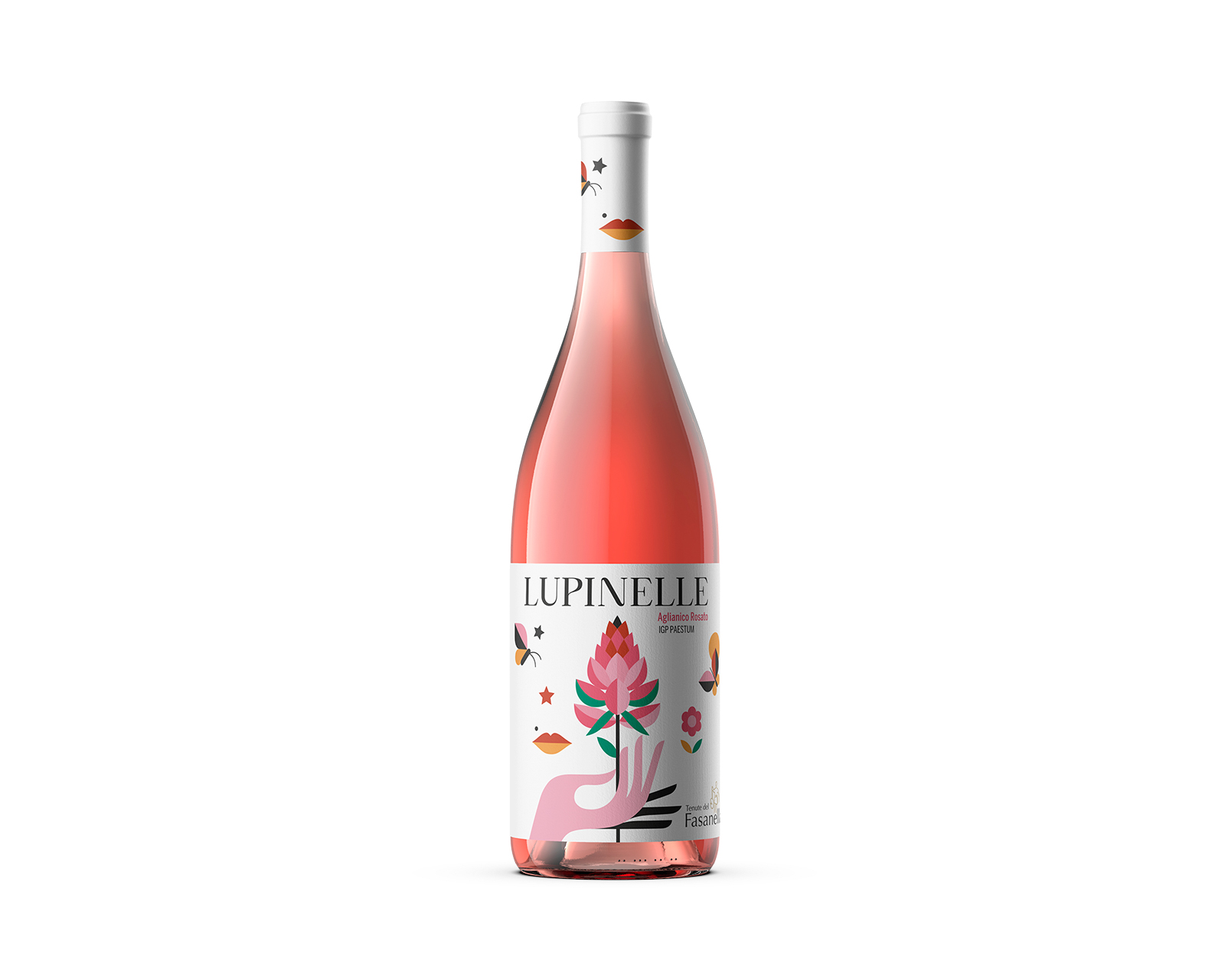
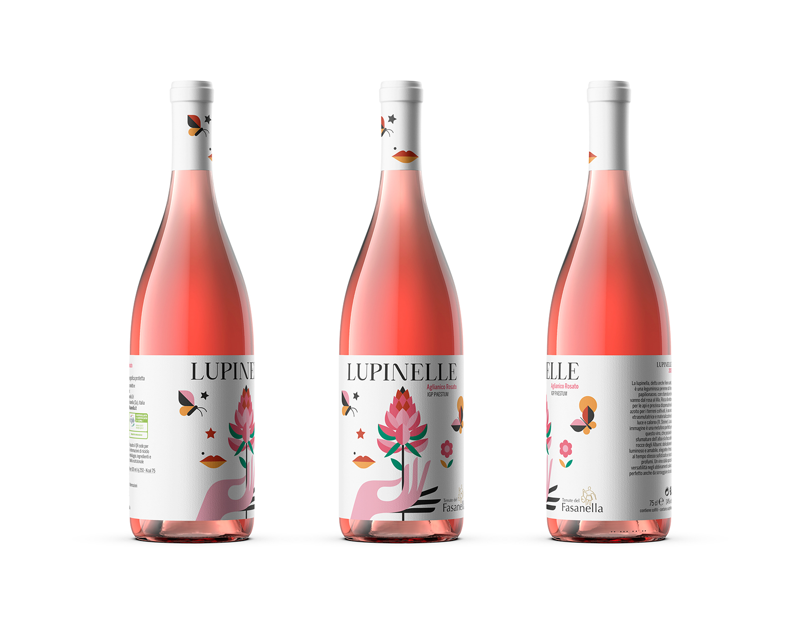
The restyling of the rosé label for Tenute del Fasanella was conceived with the intention of renewing the product’s visual language, making it more aligned with the tastes of a younger audience and with contemporary aesthetic trends. The primary objective was to create an image capable of conveying freshness, immediacy, and authenticity, while preserving the deep connection with the territory and the agricultural values that define the winery’s identity.
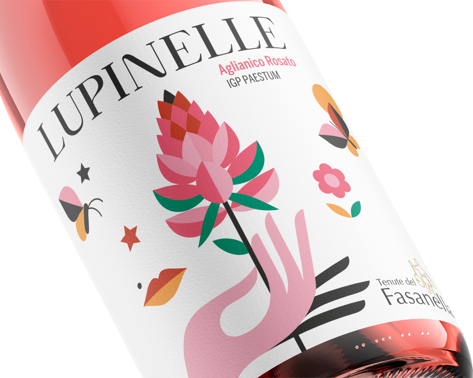
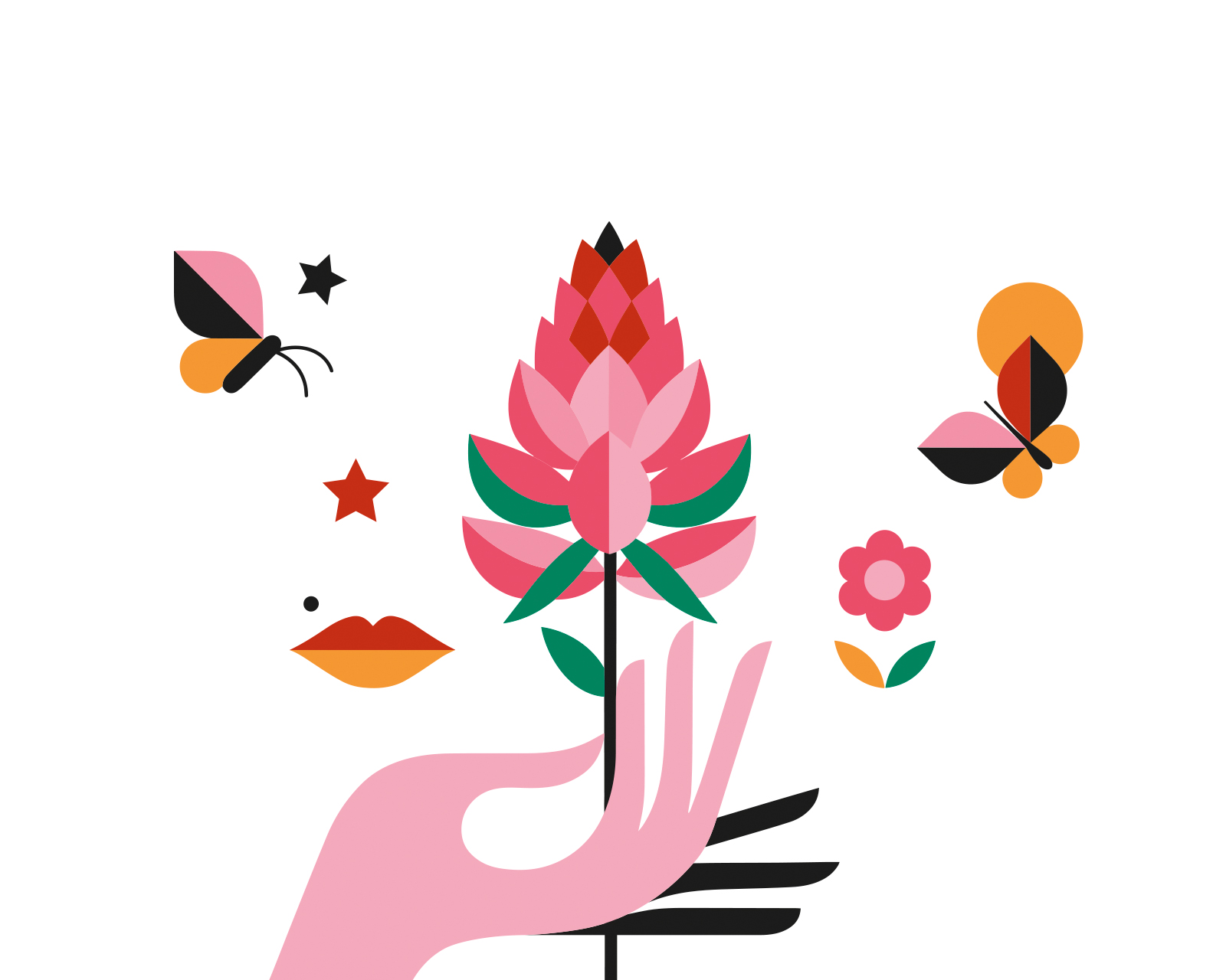
The entire concept revolves around the Lupinella, a spontaneous wildflower native to the surrounding lands and chosen as the central identity element for several reasons. Beyond its agronomic importance—contributing to biodiversity and enriching the soil—the Lupinella naturally displays a chromatic range that echoes the delicate shades typical of rosé wines, from soft pink to subtle lilac. This visual affinity establishes an immediate and intuitive connection between the imagery and the product itself. Elevating a humble, naturally occurring flower to the status of a distinctive symbol becomes a way to highlight the richness of the territory and to anchor the wine more deeply to its place of origin.
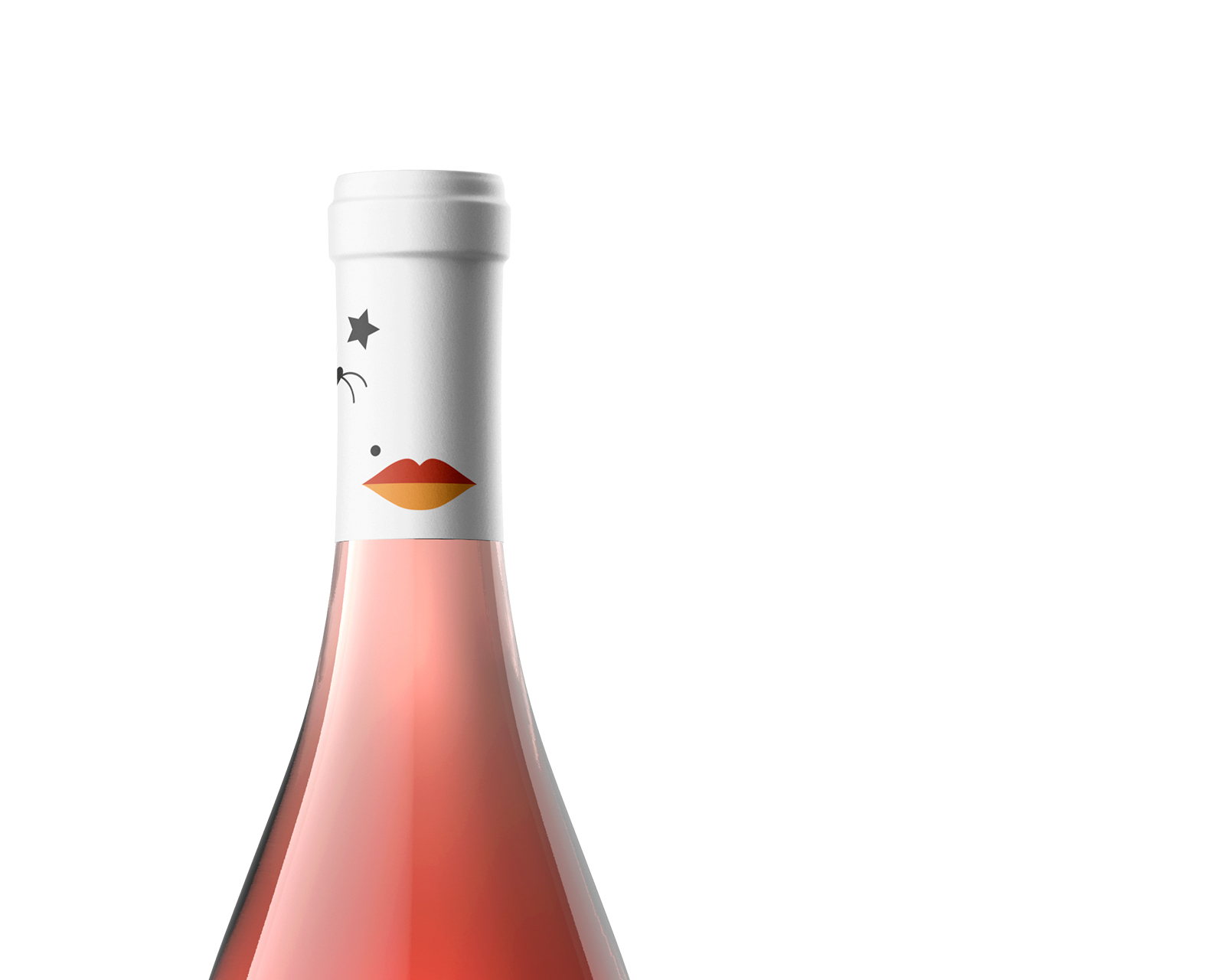
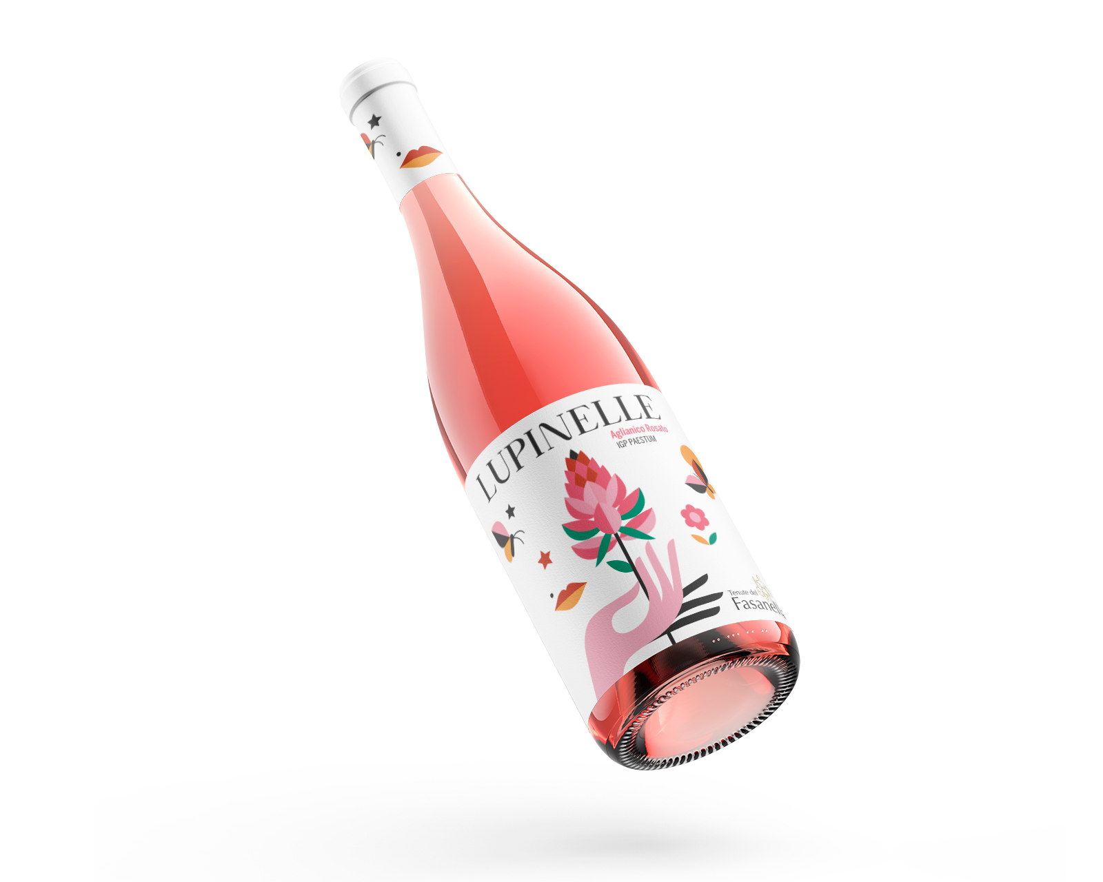
The new label embraces a clean, minimal, and pop-inspired aesthetic, aiming for a balance between essential elegance and strong visual impact. The chosen color palette is directly drawn from the flower’s hues, resulting in a coherent, luminous identity that immediately stands out. Typography plays a key role as well: essential, highly legible, and consistent with the brand’s tone, it avoids unnecessary embellishment and enhances clarity, ensuring that the focus remains on the central visual symbol.
At the heart of the label lies the stylized illustration of the Lupinella, rendered in an iconic and almost logotype-like manner. This graphic treatment transforms the flower from a simple botanical reference into a powerful visual marker capable of drawing attention even from a distance, significantly improving the product’s recognizability on the shelf. The iconic quality of the illustration resonates with the pop language of the design, turning a natural and often overlooked element into a modern, memorable signature.
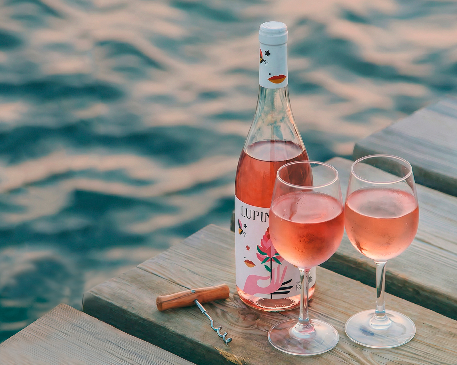
The final result is a youthful, light, and contemporary label that succeeds in communicating the delicacy and freshness of the wine, while maintaining a strong connection to the agricultural heritage and territorial roots of the winery. It represents a harmonious balance between tradition and innovation—a project that uses design not merely as decoration, but as a narrative tool capable of expressing identity and origin. By transforming a spontaneous flower into a symbolic visual element, the label enriches the rosé with new meaning, personality, and emotional resonance, offering a fresh yet deeply authentic expression of the land it comes from.
CREDIT
- Agency/Creative: Max Lippolis
- Article Title: Lupinelle Rosé Wine Label Design by Max Lippolis
- Organisation/Entity: Freelance
- Project Type: Packaging
- Project Status: Published
- Agency/Creative Country: Italy
- Agency/Creative City: Salerno
- Market Region: Europe
- Project Deliverables: Art Direction, Graphic Design, Illustration, Label Design
- Format: Bottle
- Industry: Food/Beverage
- Keywords: Wine, Rosé, Wine Rosé, Wine Label, Illustration, Graphic Design, Art Direction
-
Credits:
Art Direction / Graphic Design: Max Lippolis


