


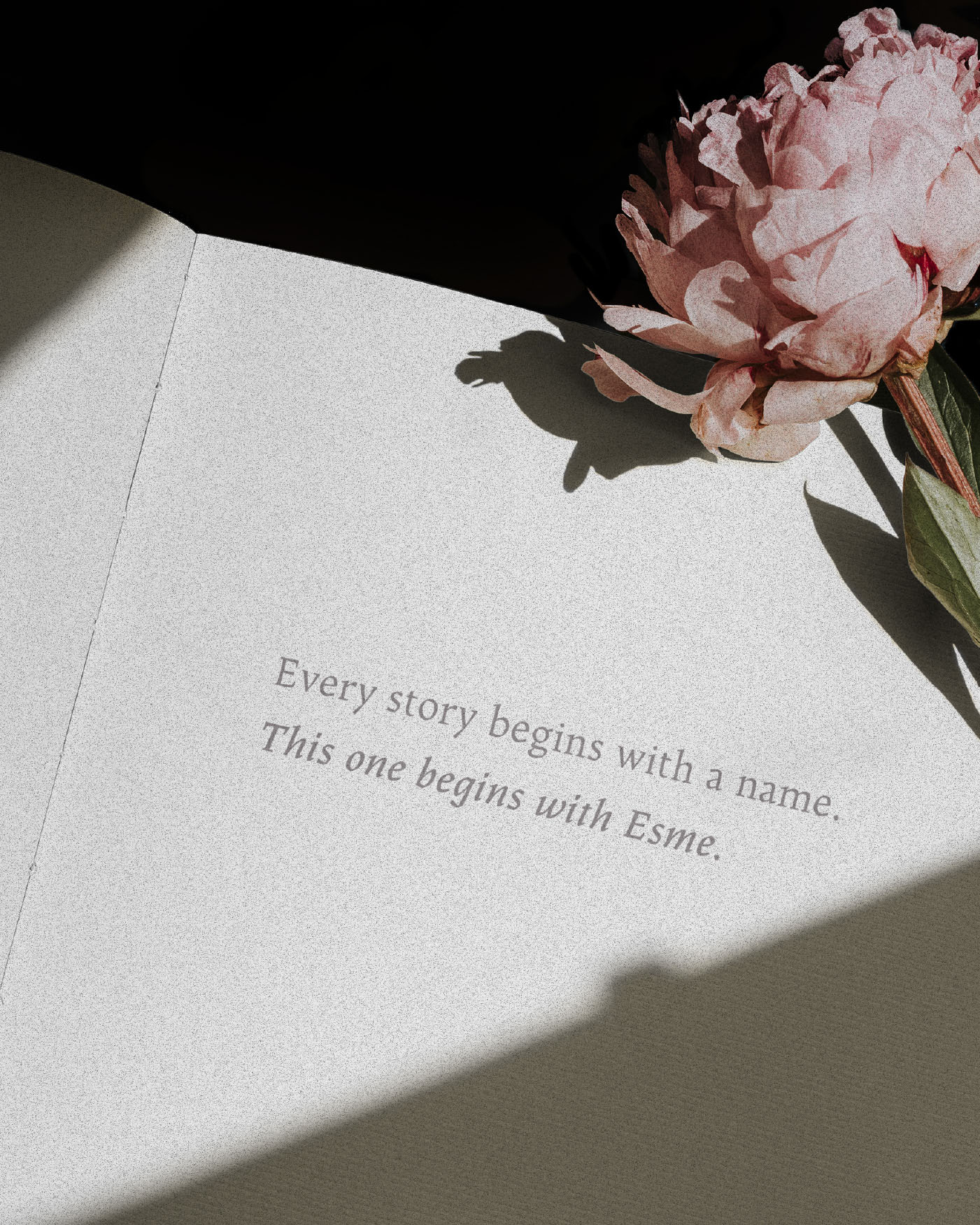
Esme Rose, A love letter from a Father to his Daughter
Esme Rose is a wine created as a personal tribute from a father to his daughter. The project explores how packaging design can communicate emotion, memory and identity through subtle and carefully crafted visual elements.
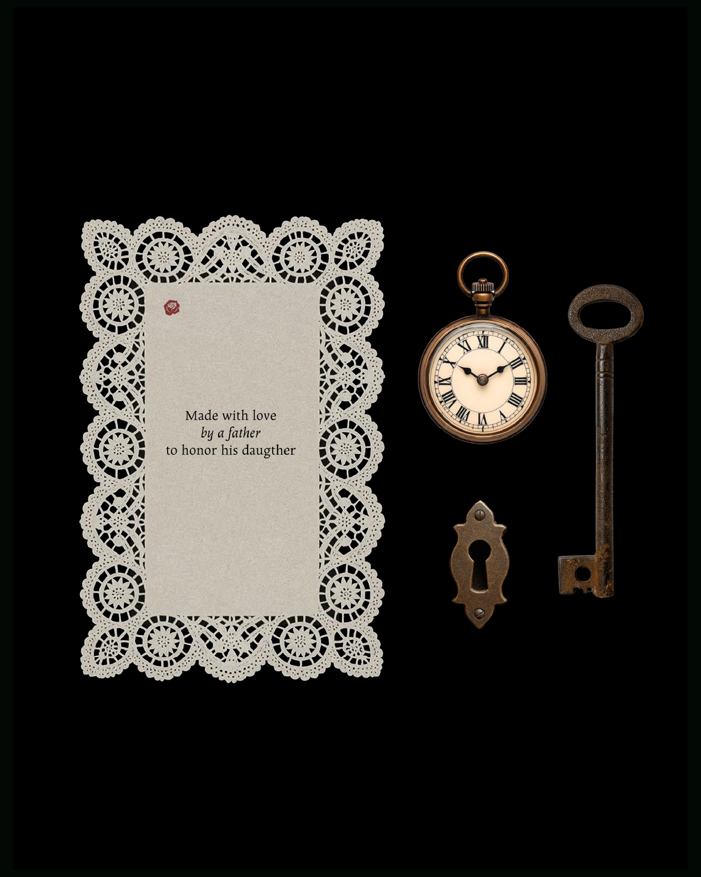
The concept behind the label originates from the idea of childhood imagination and the stories that accompany personal growth. Inspired by the world of literature and classic tales of wonder, the design evokes a poetic atmosphere without relying on explicit illustration. Instead, the label uses restraint and elegance to create a quiet and intimate narrative.
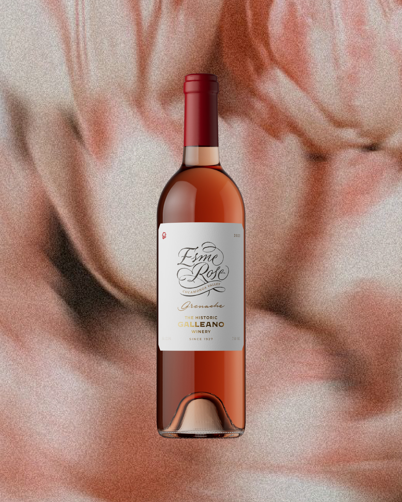
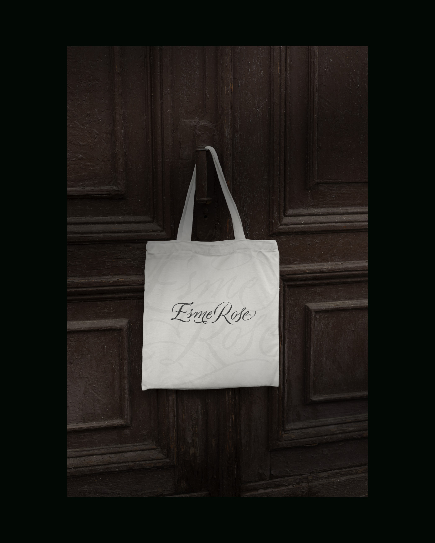
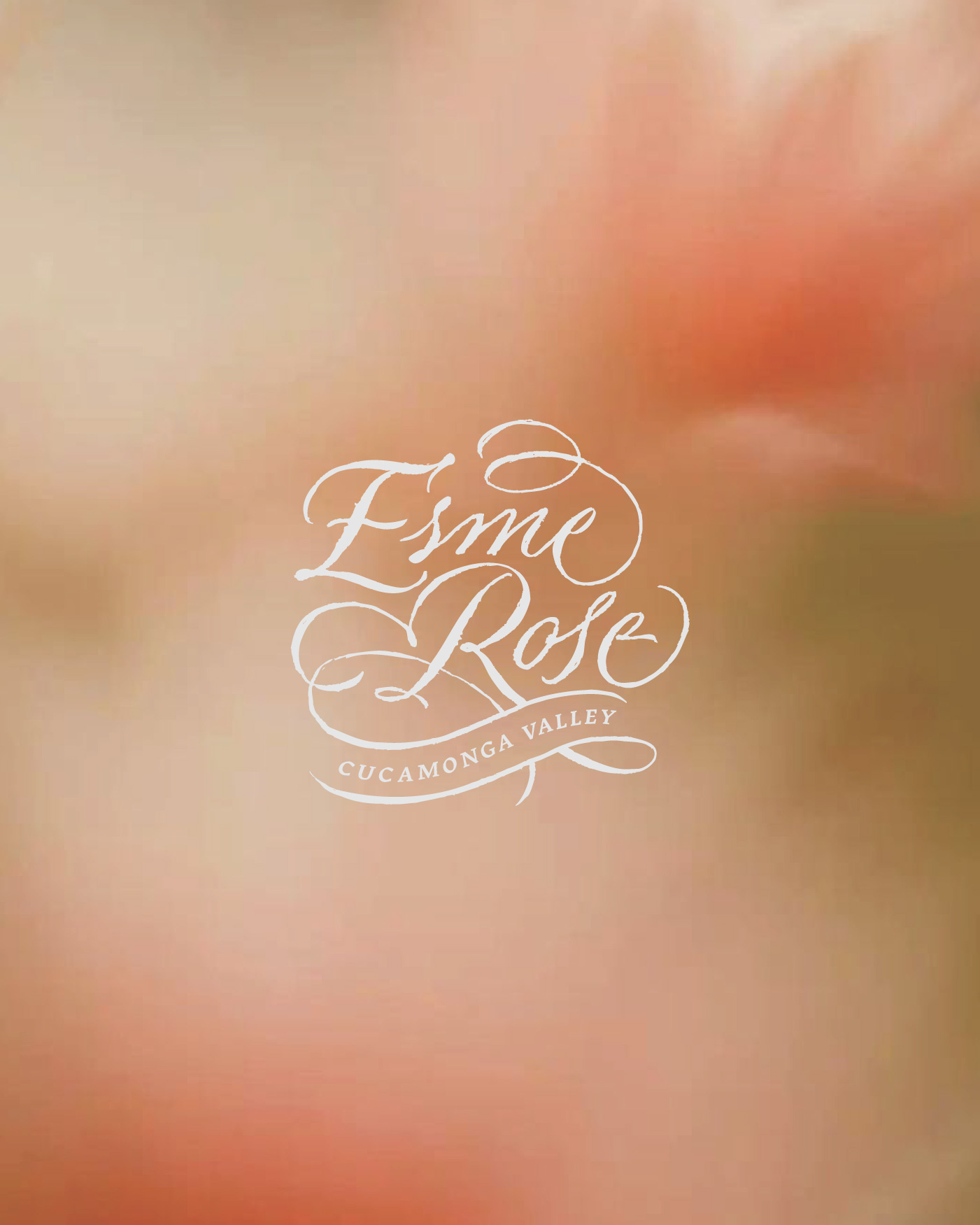
At the center of the composition is the name “Esme”, written in a delicate calligraphic script that conveys personality and warmth. The typography becomes the main expressive element of the label, balancing elegance with a sense of softness and affection.
A small rose accompanies the name as a symbolic gesture. The flower references both the wine style and the emotional dedication behind the project. This subtle detail reinforces the idea of care, growth and tenderness while maintaining a refined and timeless aesthetic.
The rest of the label remains intentionally minimal. A clean white background, balanced typographic hierarchy and restrained color palette allow the wine itself to become part of the visual composition. Gold details and refined spacing give the bottle a premium yet understated character.
The concept also leaves room for future narrative development. As the story of Esme evolves, the brand has the potential to expand its visual language by incorporating elements inspired by childhood stories, books and symbolic objects connected to imagination and discovery.
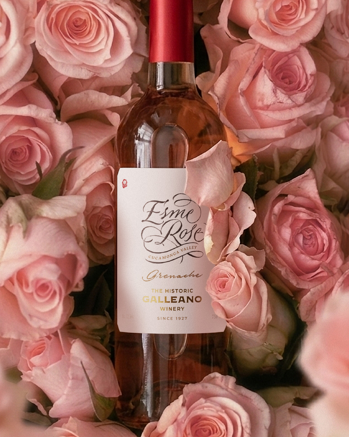
The final result is a packaging design that focuses on emotional storytelling rather than visual excess. Esme Rose becomes more than a wine label, it becomes a personal dedication translated into a refined and timeless design.
CREDIT
- Agency/Creative: Luna & Panda Studio
- Article Title: Luna And Panda Studio Shapes Esme Rose Into an Emotional Wine Identity Rooted in Storytelling and Timeless Elegance
- Organisation/Entity: Agency
- Project Type: Packaging
- Project Status: Published
- Agency/Creative Country: United States
- Agency/Creative City: Upland
- Market Region: North America
- Project Deliverables: Packaging Design
- Format: Bottle
- Industry: Food/Beverage
- Keywords: Wine packaging, Rose wine, Typography label, Minimal packaging, Storytelling design, Premium wine branding, calligraphy label
-
Credits:
Creative Director: Franco Luna
Designer: Gerardo Ruiz Babsia


