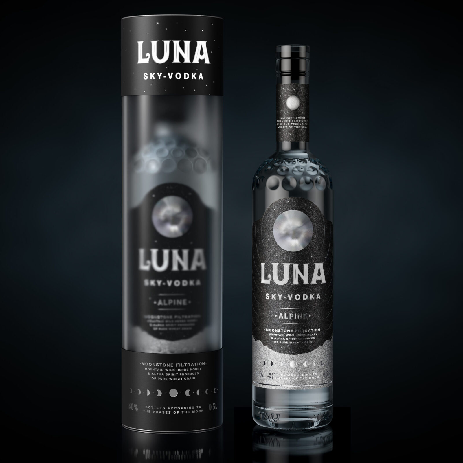
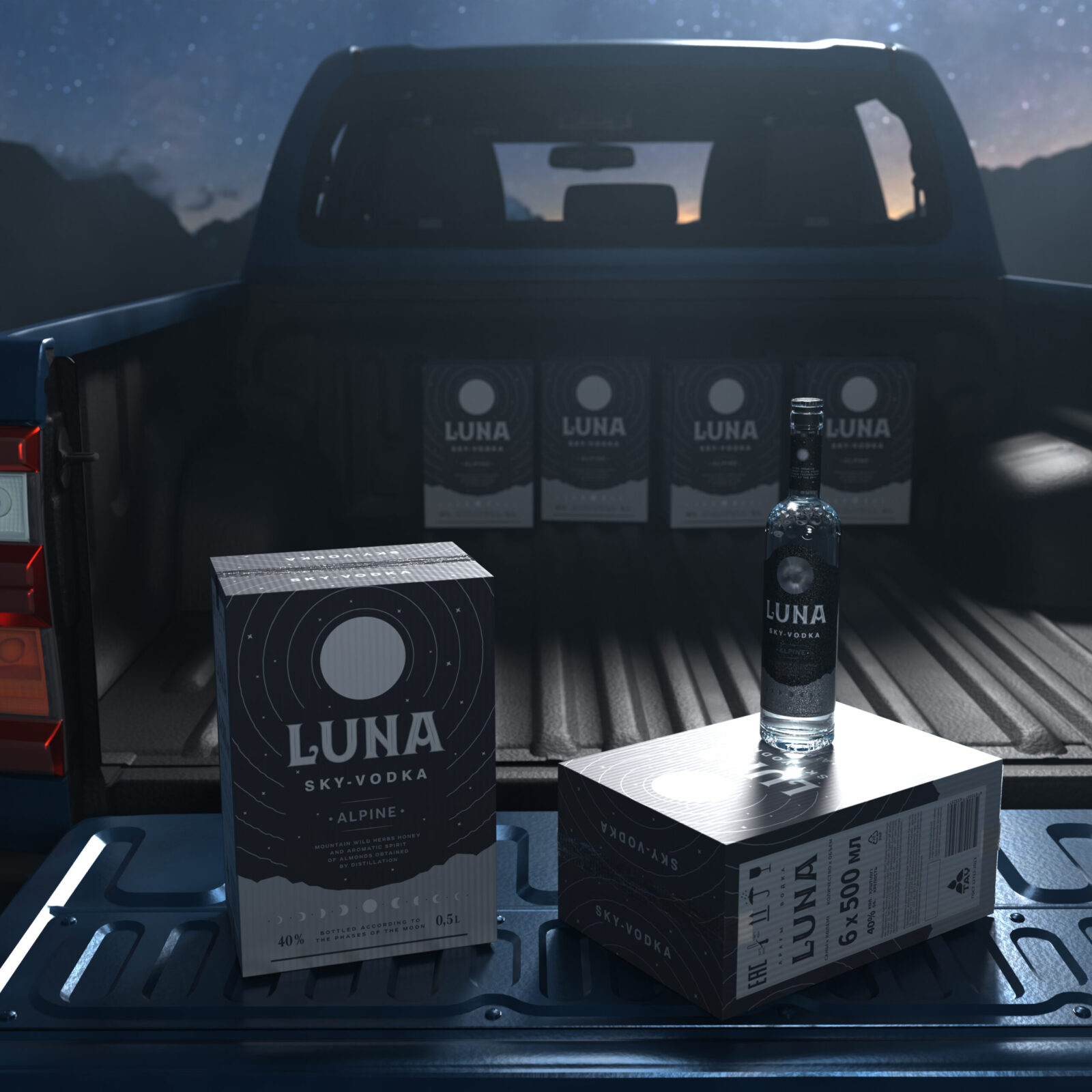
For the local producer from the Republic of Kazakhstan, LLC Eurasia Elite, we have created a complete vodka project that includes positioning, naming, bottle shaping, design of logo, closure and label. The product is intended for domestic sales in Kazakhstan, with the potential capability for global export, so it has to be attractive for the Kazakh mentality and yet contain a message that is understandable for foreigners.
Today’s vodka market is one of the most highly competitive. How to stand out on it if almost all imaginable positions are already occupied? Almost all topics popular on Earth have already been used in vodka design – so, should we turn to the Moon?
The Moon is an archetypical symbol, understandable to everyone and easy to remember. It is often used in literature and art, sounds in poetry and music. Many people believe in its influence on our psychological and even physiological condition.
We decided to create the Image of the Moon and the whole space using clear semantic code and innovative visual solutions based on contrast materials.
The positioning of vodka is supported by two USP (a unique selling proposition) at once: emotional and rational. The emotional USP is that vodka is produced in accordance with the phases of the Moon – many folk traditions consider the connection of the the Moon phases with growing plants, cutting hair, etc. The rational USP is the technological prosses: vodka is cleaned using Moonstone filtration (Moonstone, also known as feldspar mineral Adularia is a famous gem used for jewelry).
For the name we chose the word LUNA, which means “Moon” in the Latin language, as well as in Romance and Slavic languages, and also is understandable in Kazakhstan, where people still speak Russian along with the native language. This short word perfectly personifies the essence of positioning. The full name is LUNA Alpine – this accentuates the fact that the product contains the mountain wild herbs’ honey.
The epithet “SKY VODKA” supports and further romanticizes the look. Also, the Sky has a special, highly respected place in Kazakh mythology.
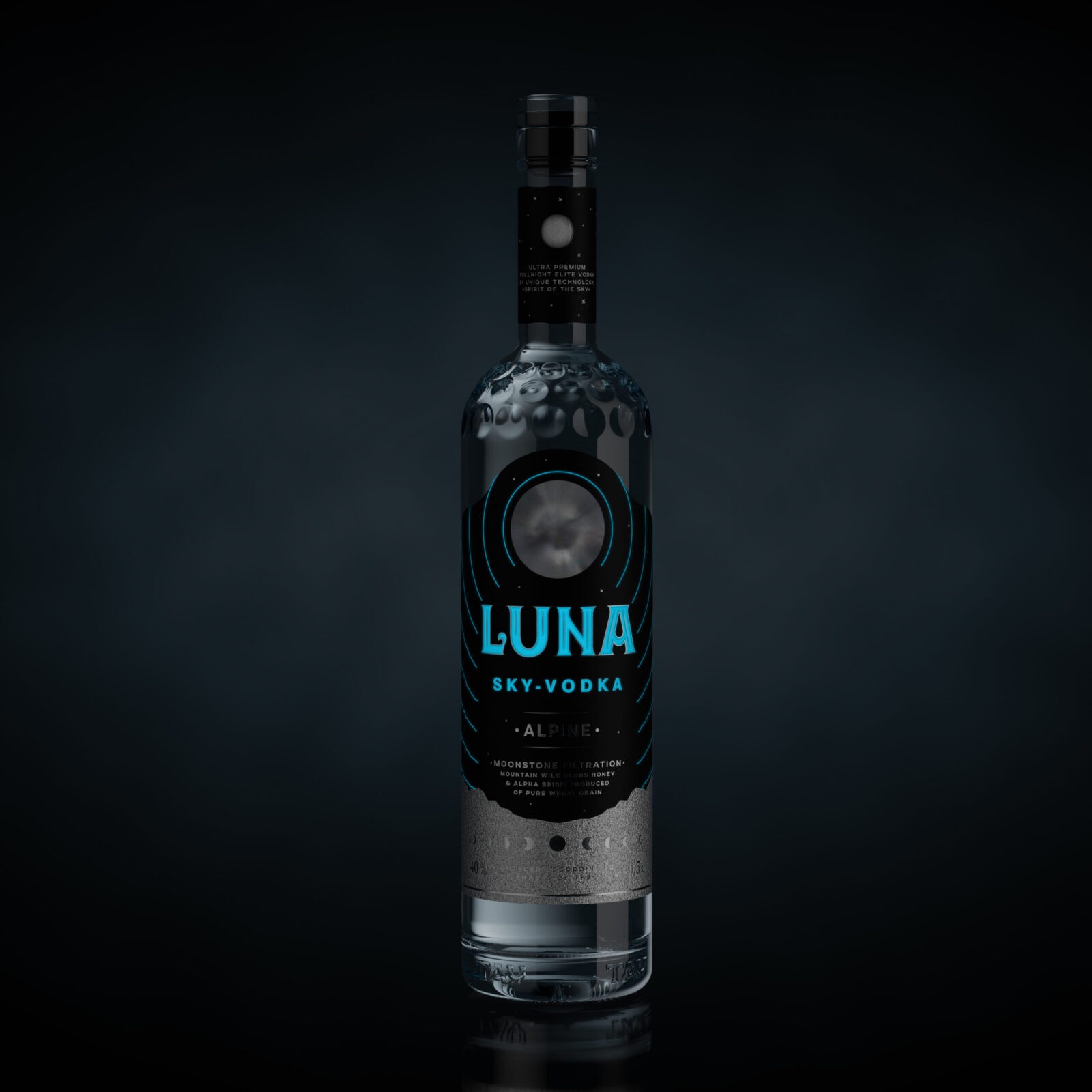
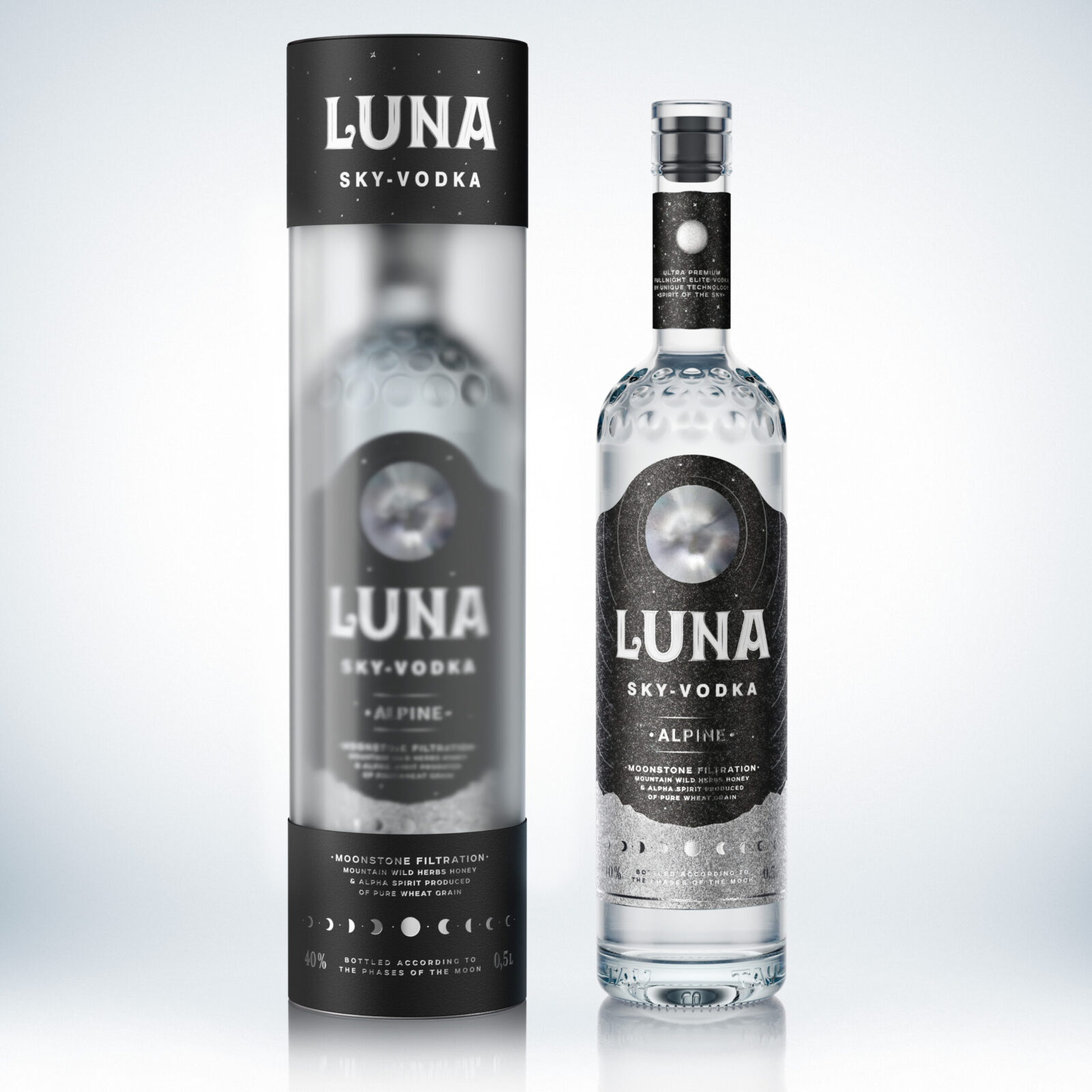
We used various modern technologies that attract attention, such as the unique bottle, Fresnel lens, dynamic star background and the varnish glowing in the dark.
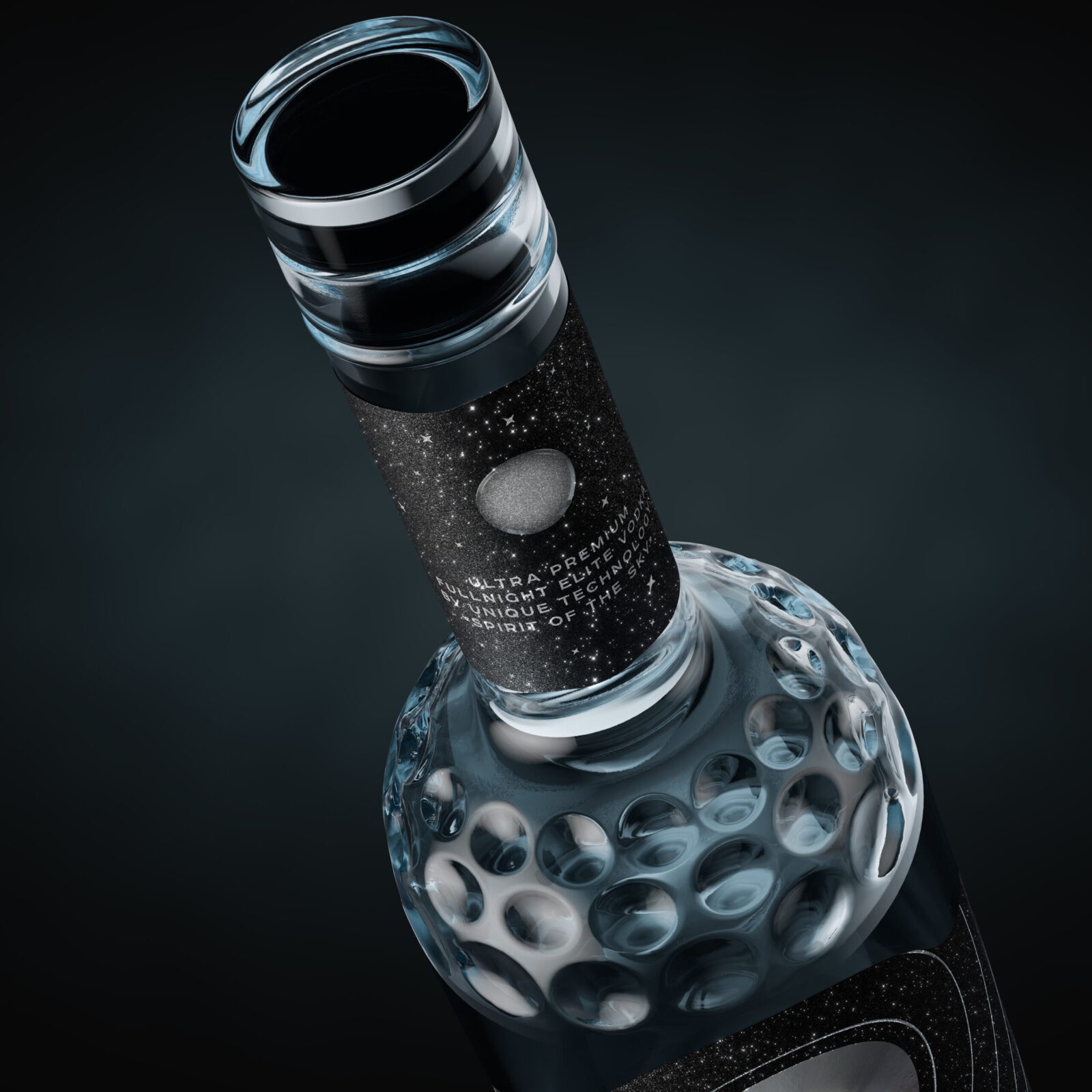
On the personal shaped bottle of slightly tinted glass there’s an unusual debossing having the shape of lunar craters sparkling on the shelf, that enhances communication.
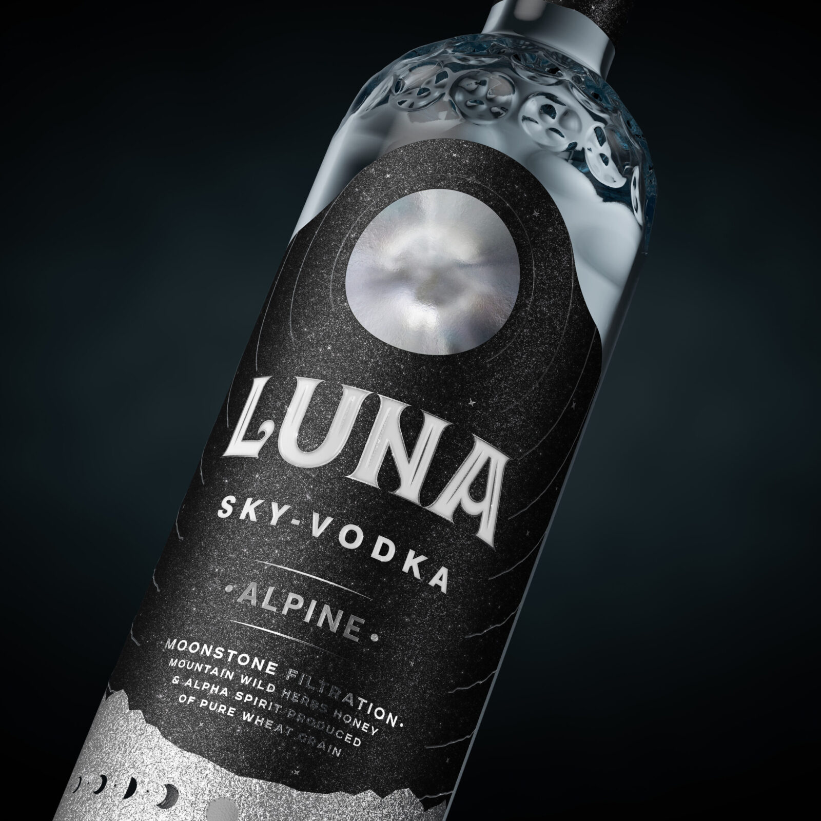
Deep Lens Fresnel on the label creates the effect of a voluminous iridescent moon.
The creative solution was to use a special material with a velvet effect, with millions of glittering crystals, making the image of the starry sky. This dynamic shimmering label certainly attracts the attention of the customer passing by the shelf. It looks premium, it is very impressive and tactilely pleasant, perfectly harmonizes with the moon and supports the trending theme of space. Also, we increased the effect by using the hot foil and Brail glossy varnish glowing in ultraviolet light.
Unusual for the category, a transparent T-shape closure with a black leg crowns the whole appearance.
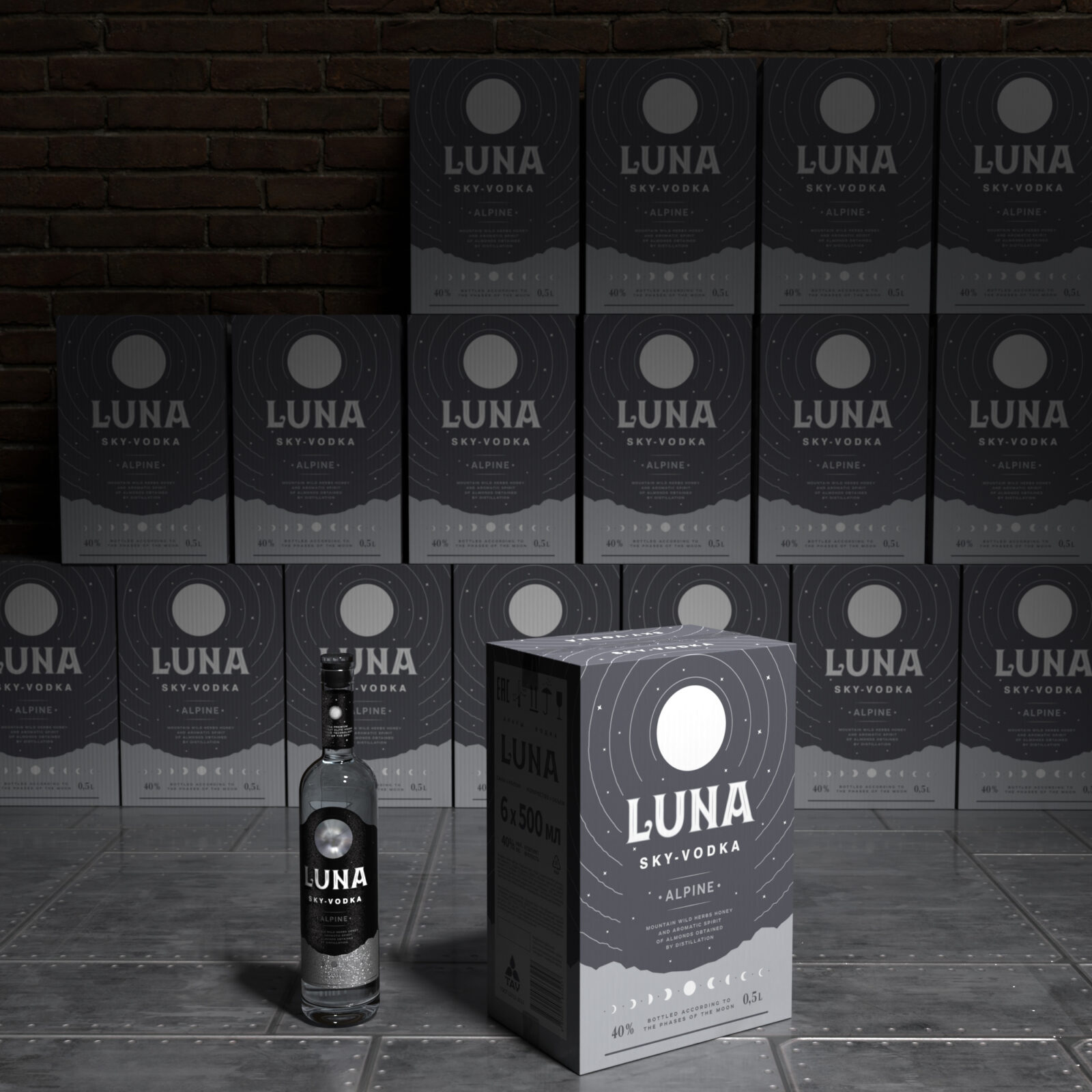
Futuristic gift packaging combines matte plastic and metal. In addition, the special outercase follows the image style.
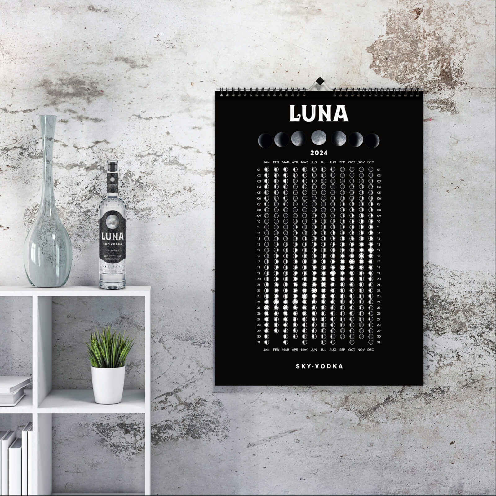
As well, we have created an advertising calendar, supporting the positioning of a potential brand.
The short promo video with a special written music, creates an image of sky-vodka.
As a result, there’s a holistic authentic, contrasting, memorable product that has no analogues on the vodka shelves and can be used for effective marketing communications.
CREDIT
- Agency/Creative: Arman Auzhanov
- Article Title: Luna Alpina Vodka’s Lunar-Inspired Branding by Arman Auzhanov
- Organisation/Entity: Creative
- Project Status: Published
- Agency/Creative Country: Kazakhstan
- Agency/Creative City: Almaty
- Keywords: WBDS Creative Design Awards 2024/25
- Keywords: WBDS Creative Design Awards 2024/25
-
Credits:
3D Artist: Andrei Dubinin
Music composer: Andrei Malakovich


