There are few brands in Greece associated with modern Greek culture as ‘ΦΙΞ ΕΛΛΑΣ’, the beer with a long history and a journey that exceeds 150 years of brand’s presence. As part of the brand image renewal, Olympic Brewery entrusted us with the rebranding of ‘ΦΙΞ ΕΛΛΑΣ’.
Having a new identity that would stand the test of time, ‘ΦΙΞ ΕΛΛΑΣ’ needed to regain its iconic character while staying recognizable. We were therefore led to a strategic yet bold choice: changing the logo to Greek, underlining in the best way the brand’s Greek aura.
Looking back to the brand’s past and drawing on its archives were valuable design references in our effort to re-energize this historic brand. In designing the logo, we discovered elements that we revisited and respectfully approached in a contemporary light.
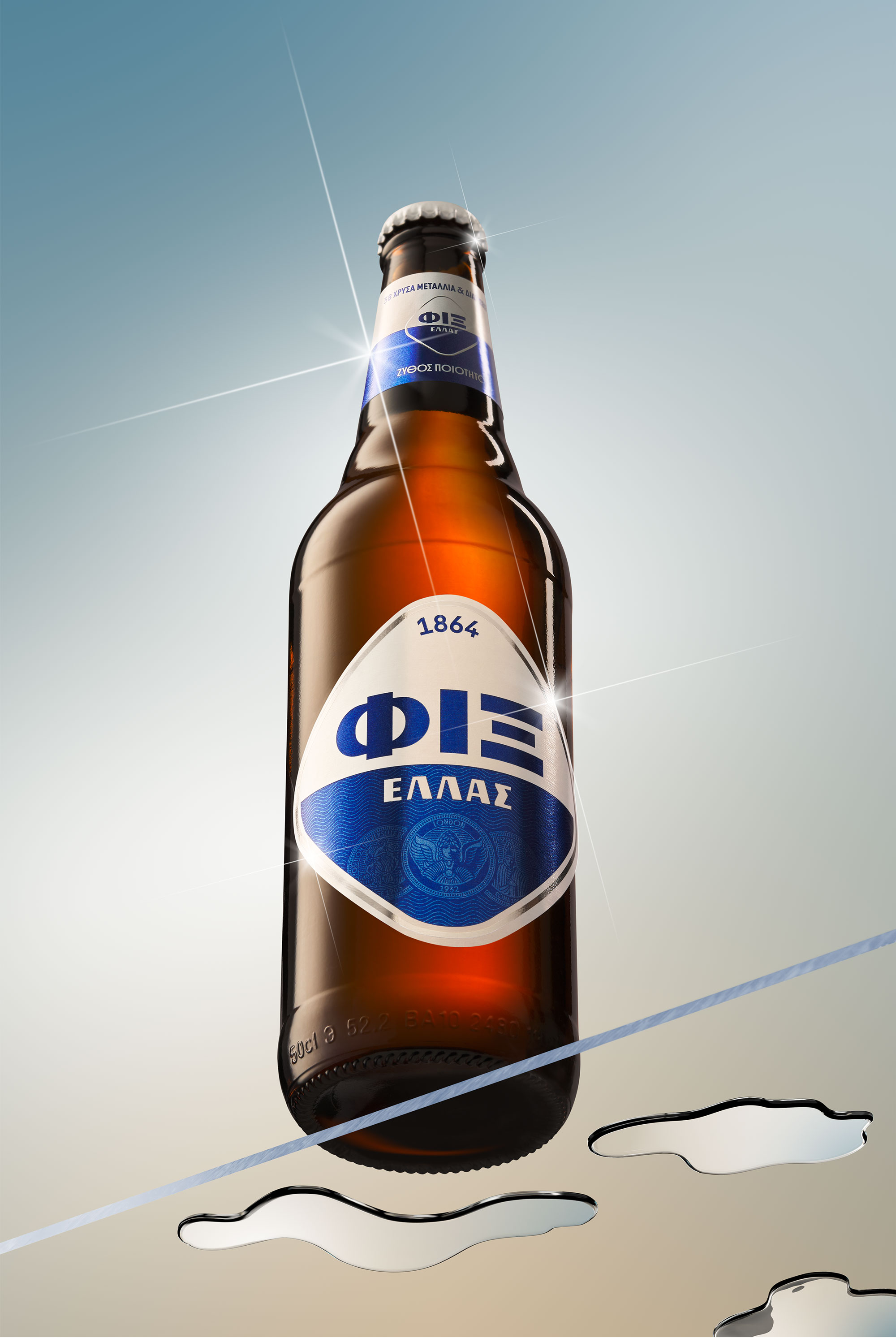
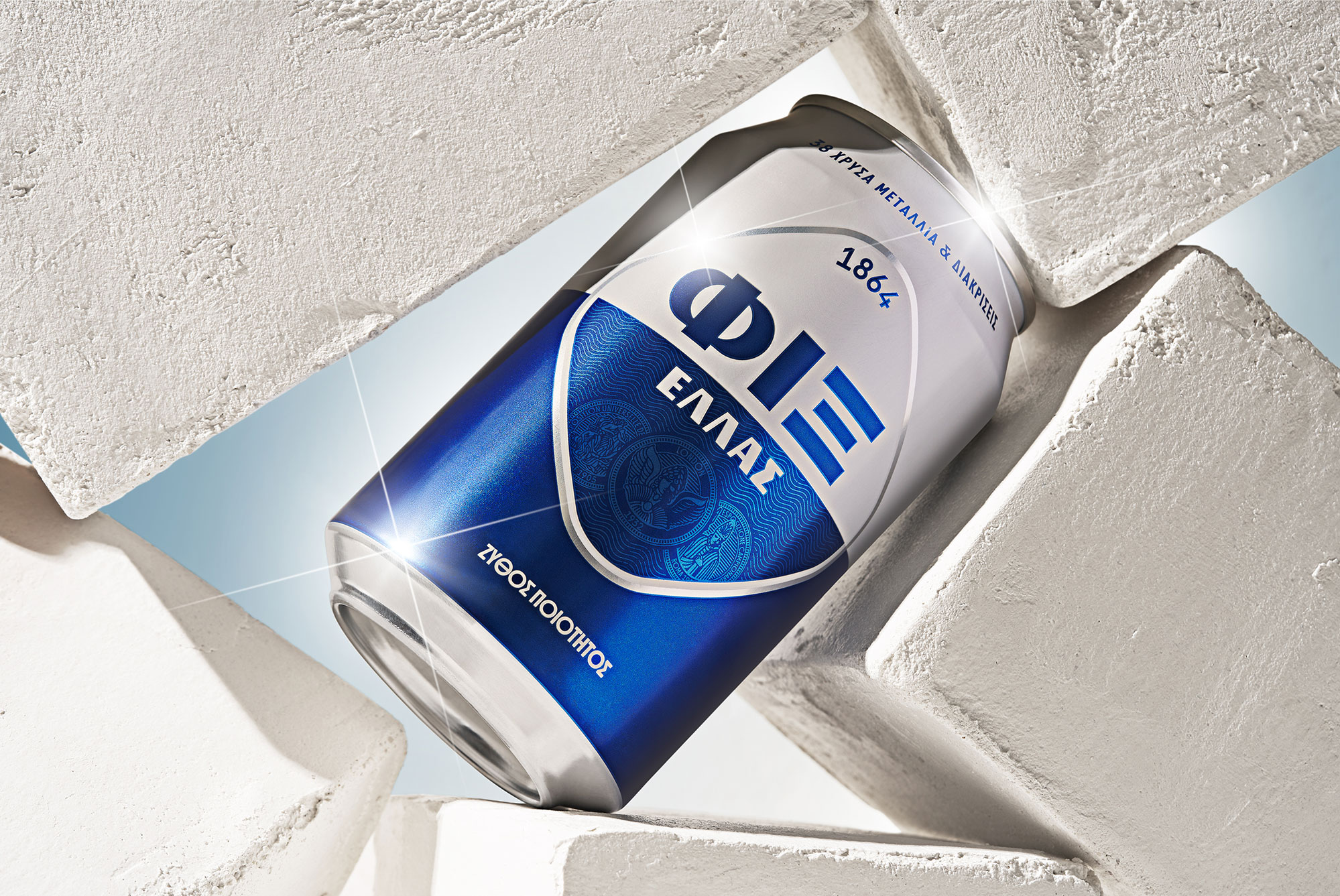
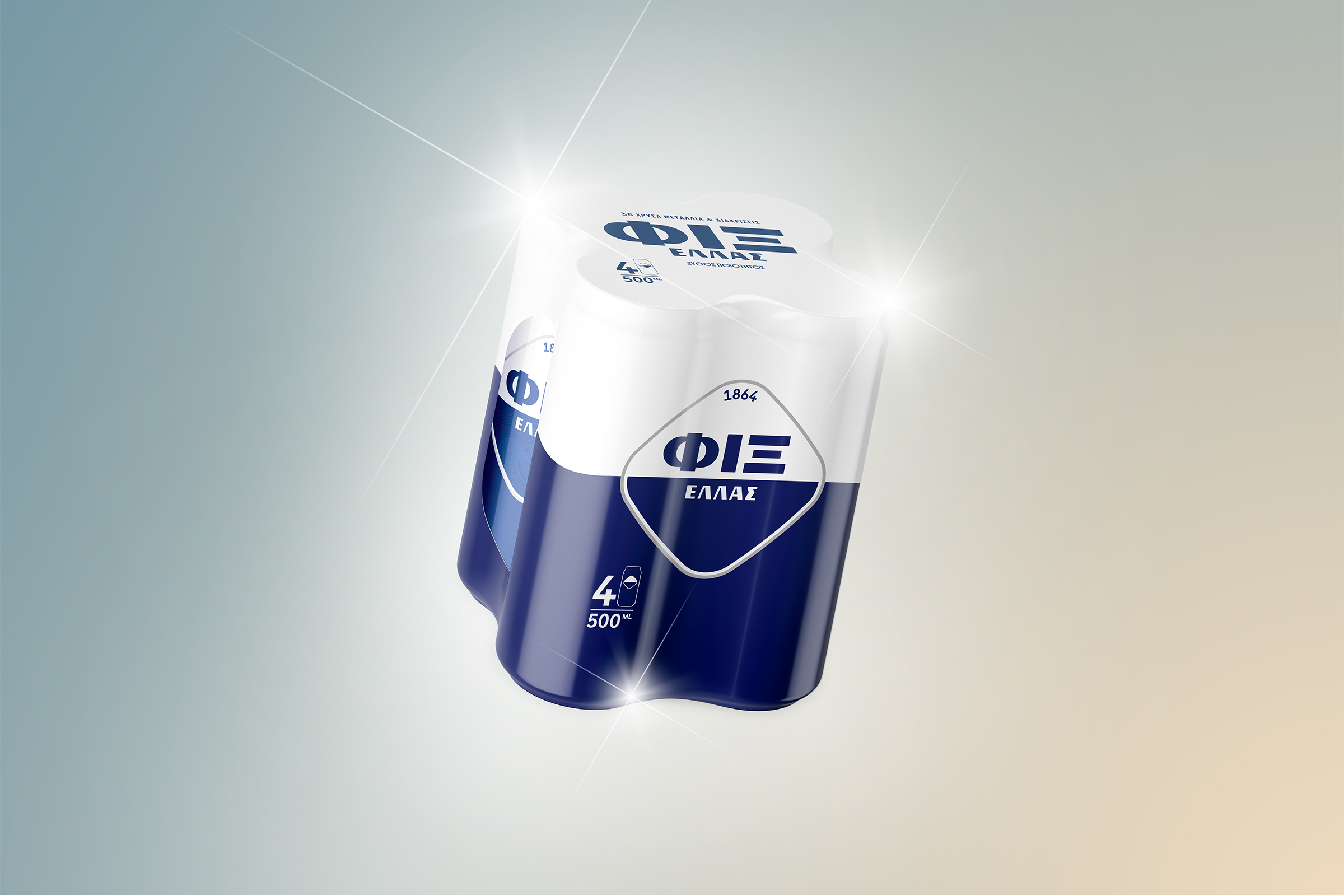
As a result, the new logo maintains the brand’s DNA by being an improved version of its predecessor, balancing aesthetics and functionality. Our new design has allowed both the iconic rhombus and the brand name to ‘grow’ while occupying the same space as before. The addition of the brewery’s founding date to the logo, emphasizes the brand’s heritage.
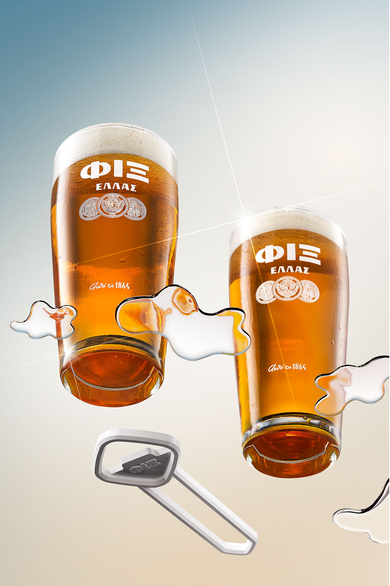
In typography, the design approach of the word ‘ΦΙΞ’, references the brand’s past while free from design excesses it has been rendered in a ‘timeless’ way, allowing it to be used for a long period of time. The design approach of the word ‘ΕΛΛΑΣ’ reinforces the brand’s retrophilia mood.
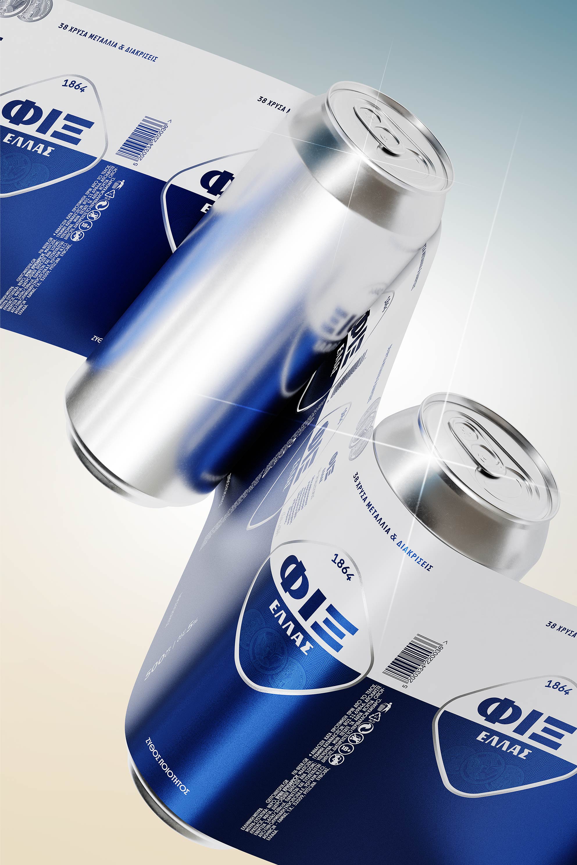
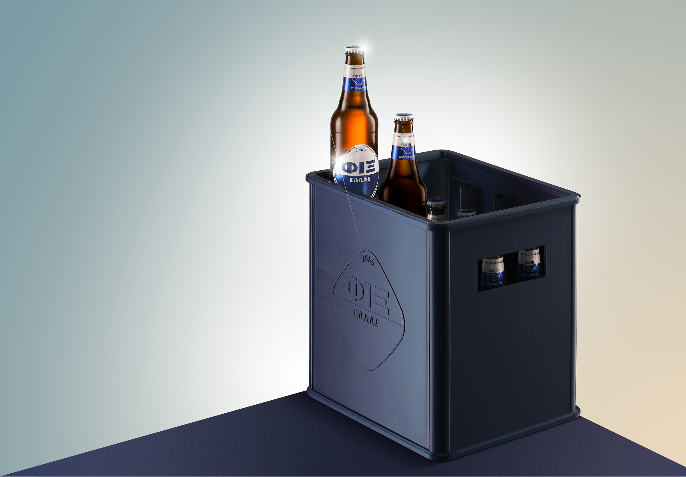
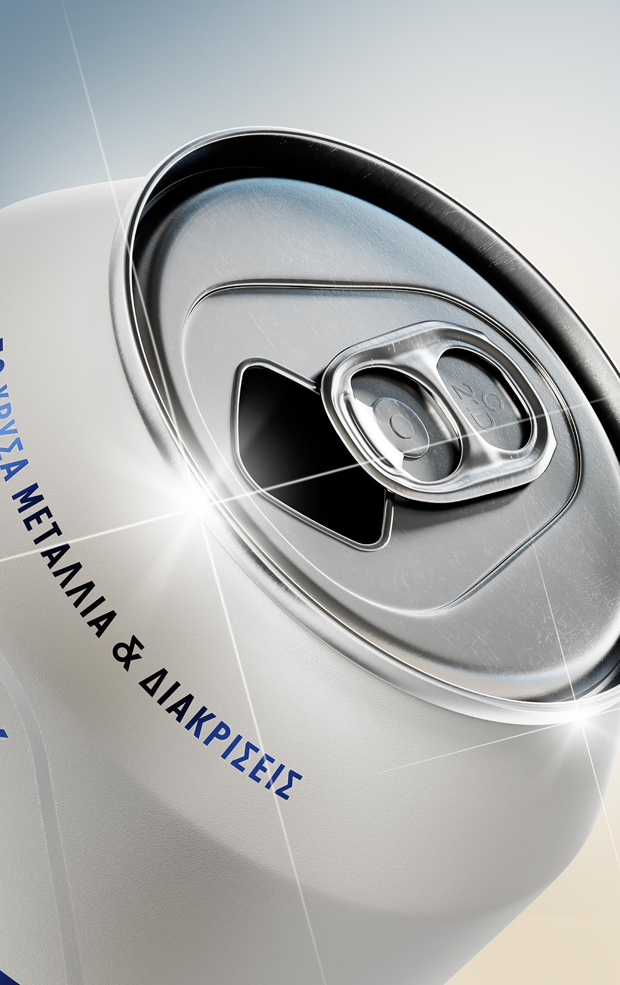
The quality distinctions that adorned the previous logo were valued as an important legacy of the brand and have been retained as well in the new one, after being carefully redesigned. The addition of a distinctive pattern of waves at the rhombus’ bottom contributes to the Greek sea narrative found in the brand story.As part of the brand image renewal, Olympic Brewery entrusted us with the rebranding of ‘ΦΙΞ’, redefining the brand’s positioning.For the packaging series of the ‘ΦΙΞ ΕΛΛΑΣ’, we created a solid visual system where the blue-white palette dominates the containers. More detailed, we developed a bold design approach where the whole space is divided horizontally between white and the revised blue color. Their sides were designed to gain interest as well, reinforcing the narrative of the first Greek beer. Our design tools were reinforced by a character set that offers a dynamic visual rhythm resulting from the combination of narrow and wider letters, contributing to the retrophilia aesthetics that the brand stands for. The result is as contemporary as yet classic, establishing roots with an audience that appreciates authenticity.



CREDIT
- Agency/Creative: Luminous Design
- Article Title: Luminous Design Rebranding for FIX Hellas Packaging
- Organisation/Entity: Agency
- Project Type: Packaging
- Project Status: Published
- Agency/Creative Country: Greece
- Agency/Creative City: Athens
- Market Region: Europe
- Project Deliverables: Packaging Design, Rebranding
- Format: Bottle, Can
- Industry: Food/Beverage
- Keywords: beerpackaging beerdesign
-
Credits:
Luminous: Design


