


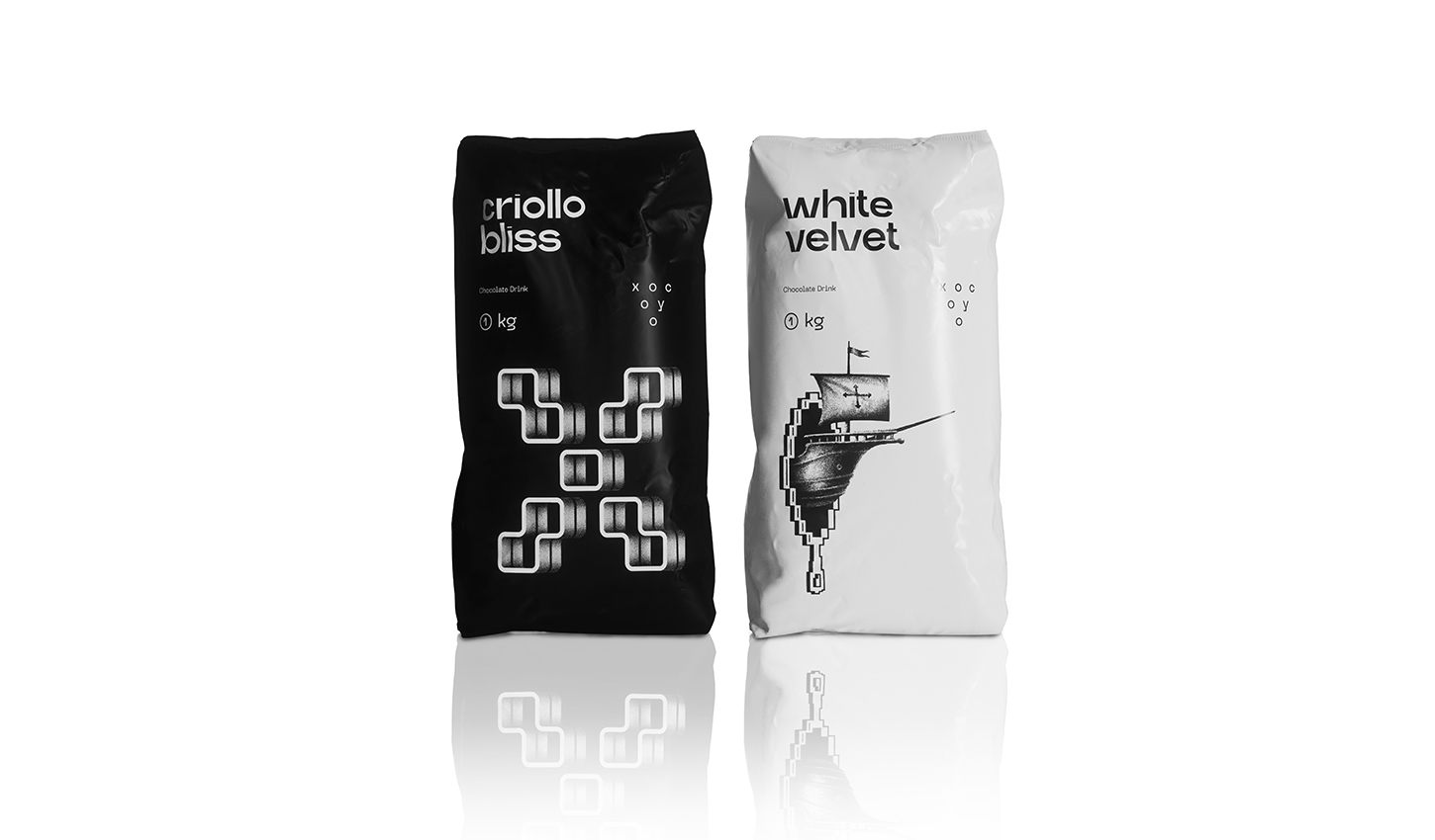
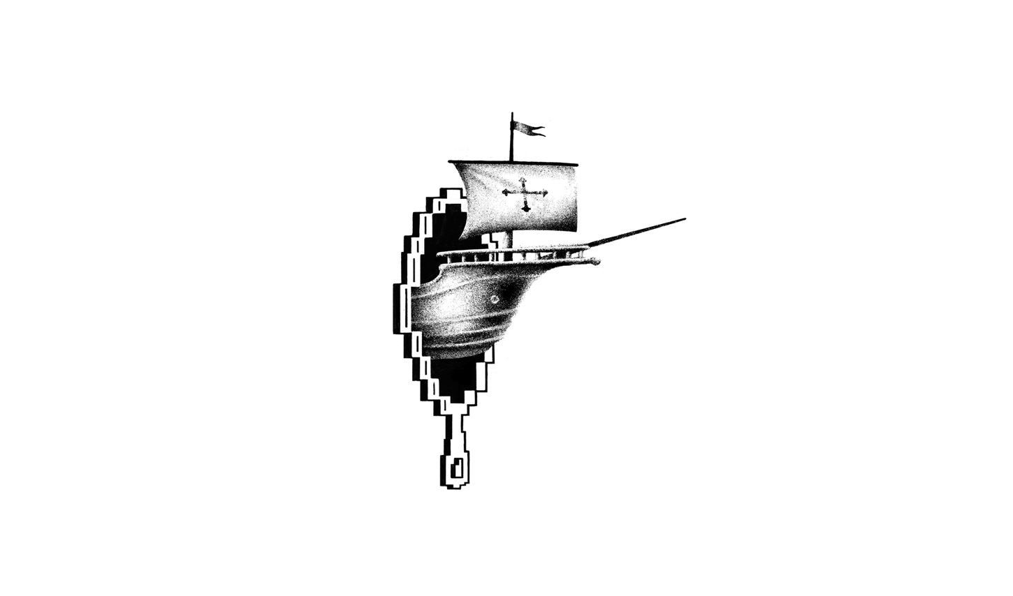
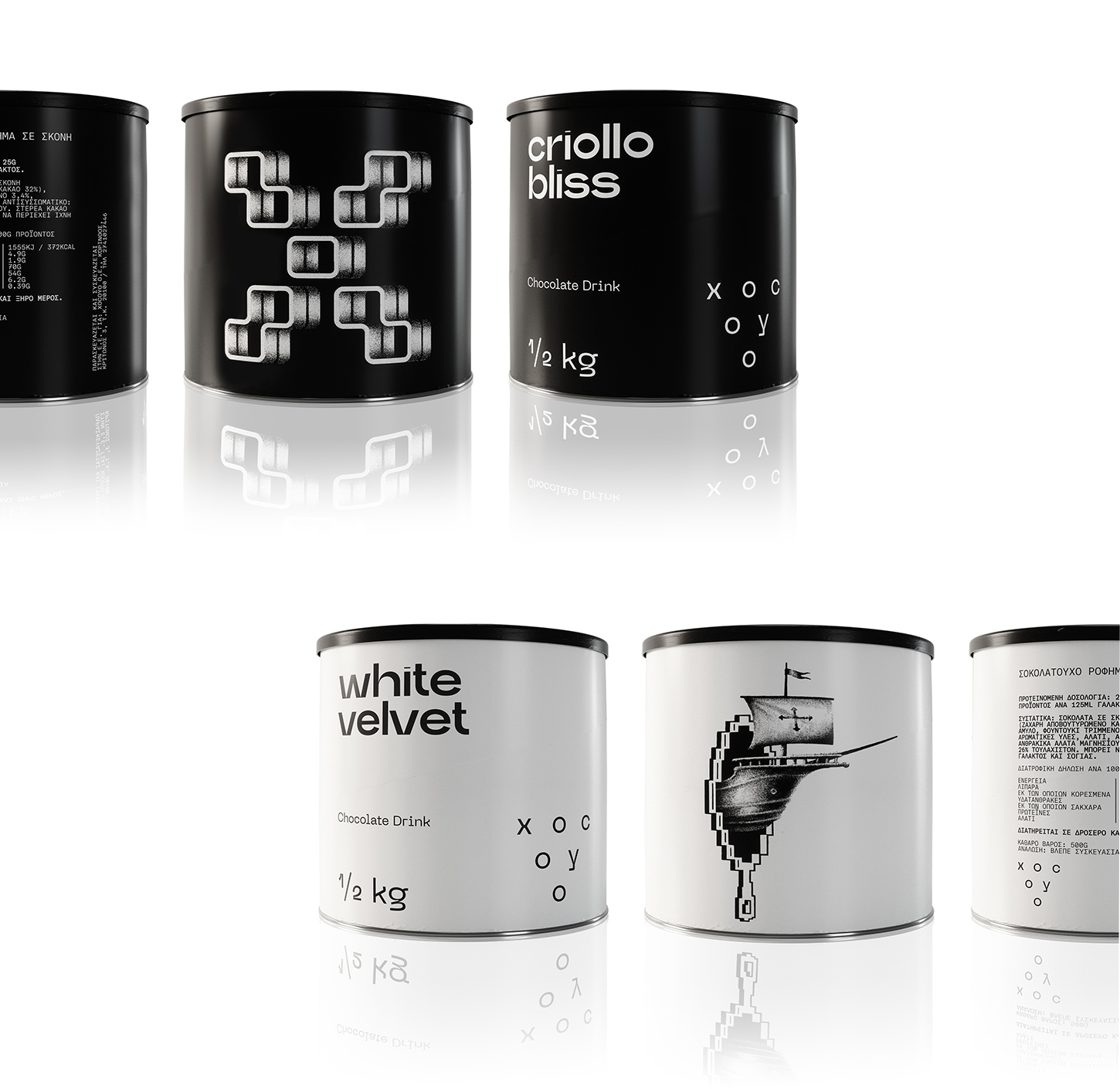
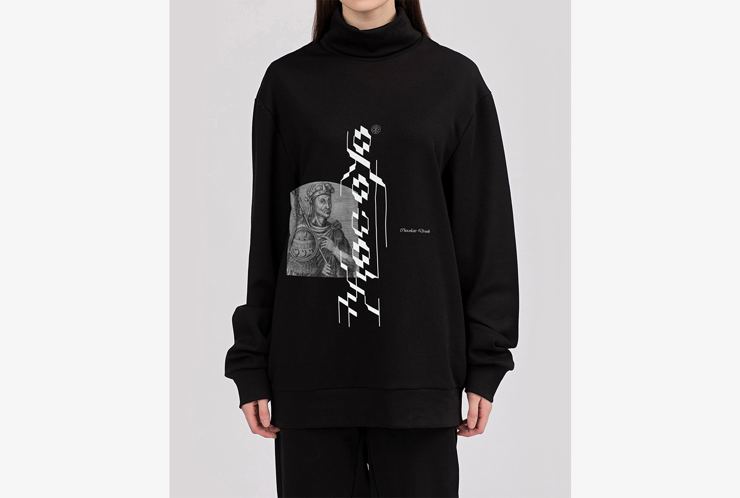
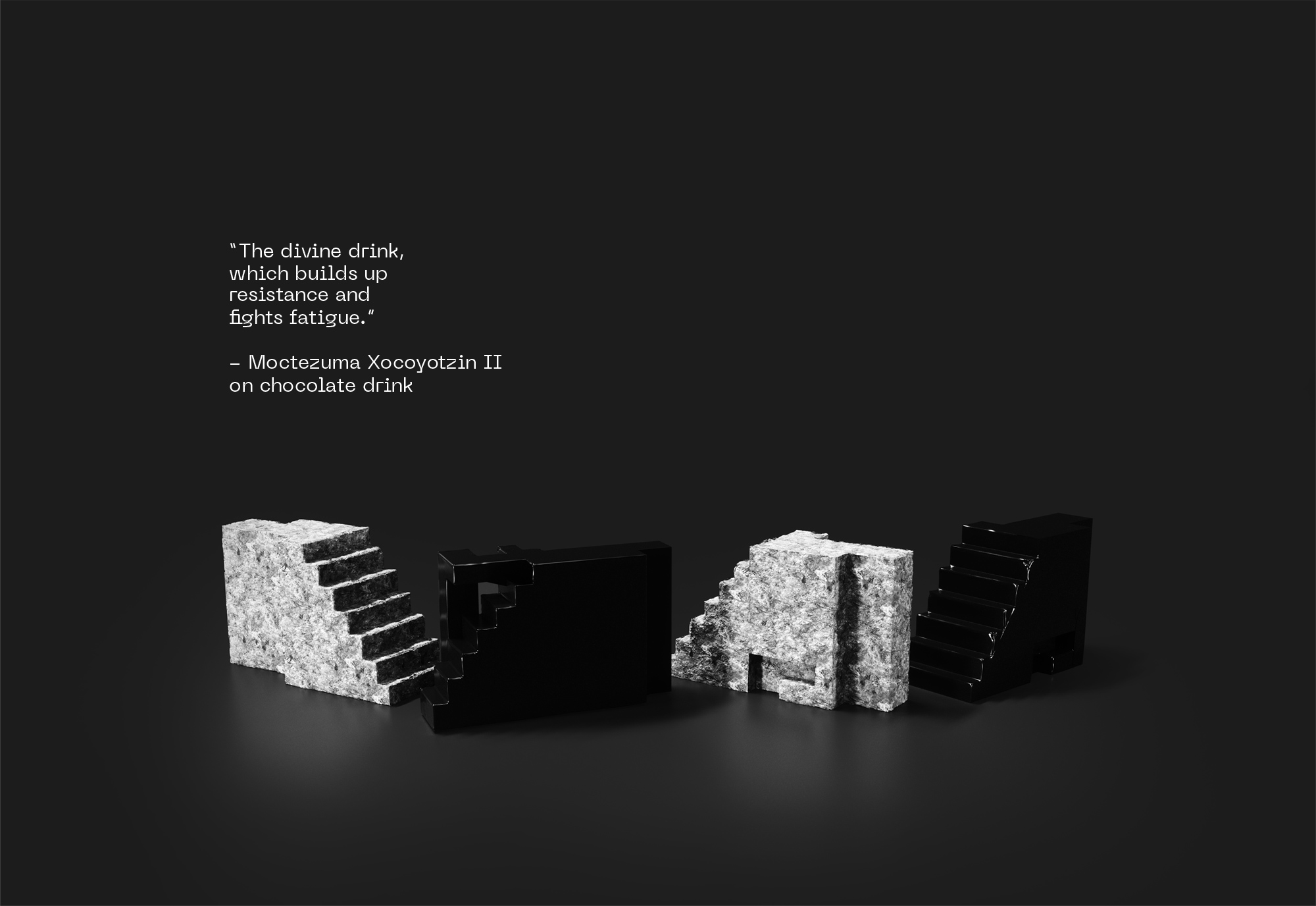
Moctezuma Xocoyotzin II was a man who admired chocolate drink. The last Aztec emperor was consuming a huge amount of liquid chocolate on a daily basis, and he cherished it so that he was describing it as a drink with godlike quality, building stamina and fighting fatigue away.
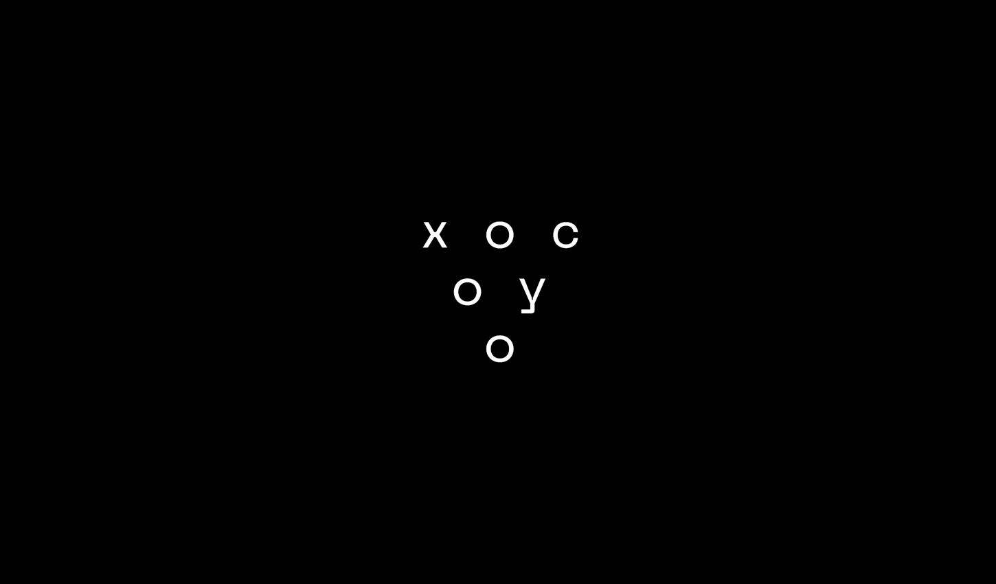
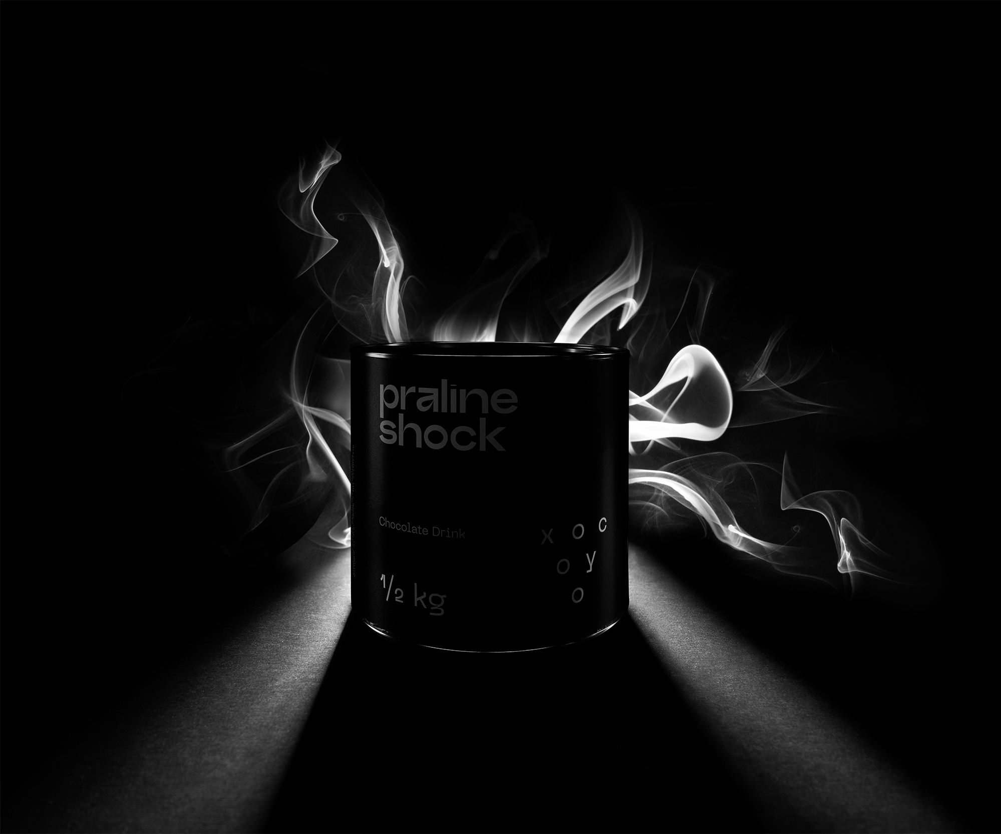
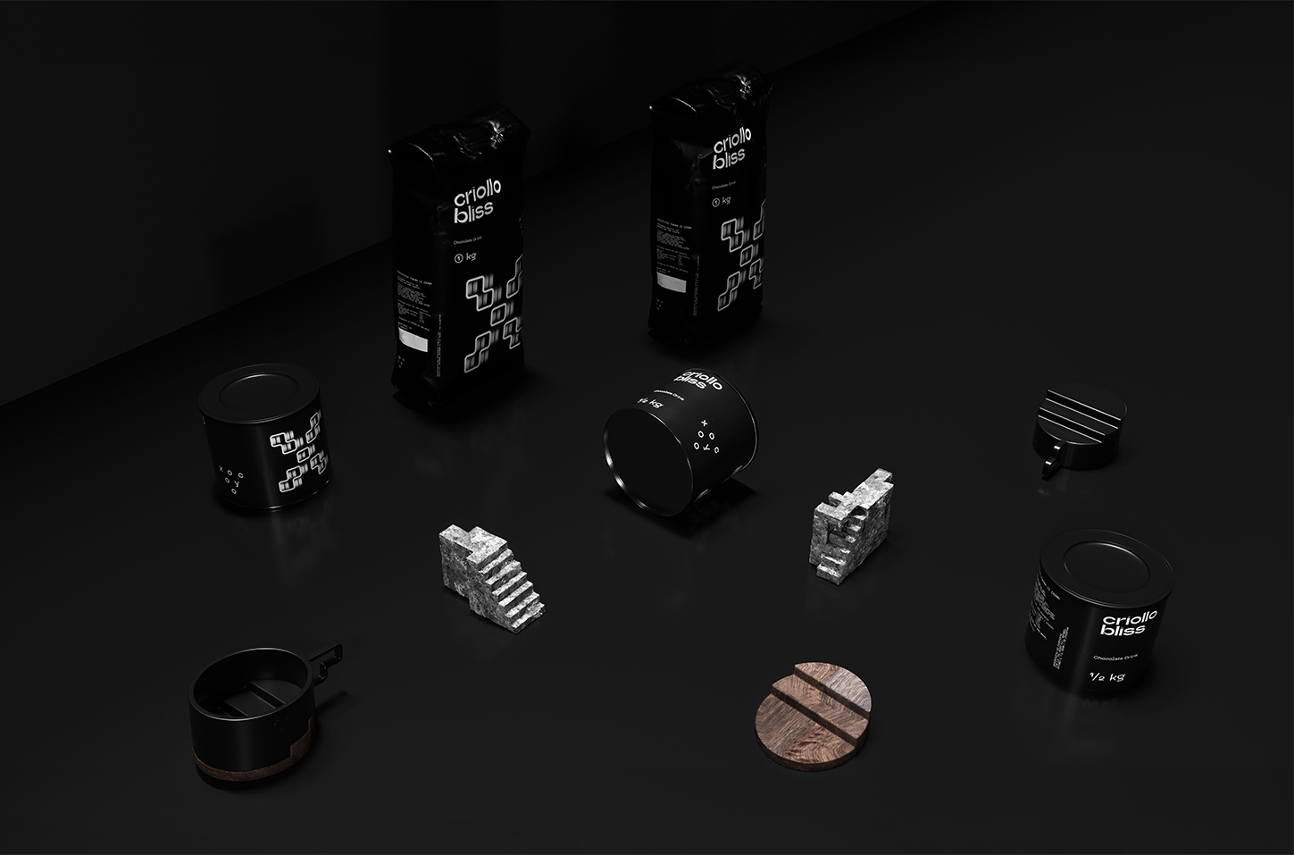
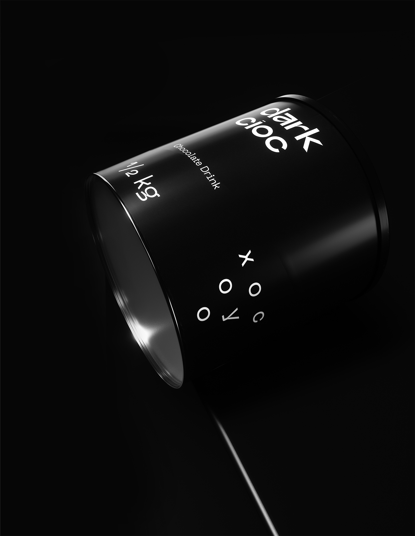
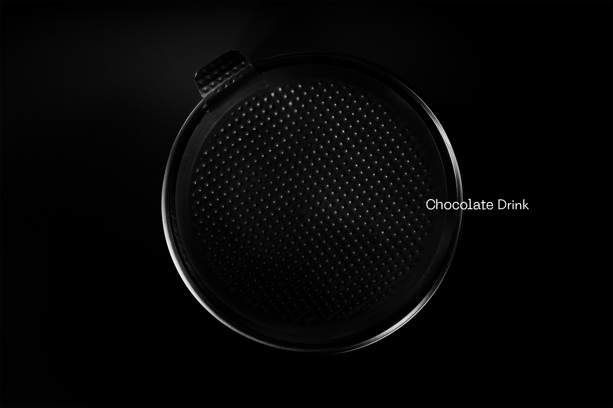
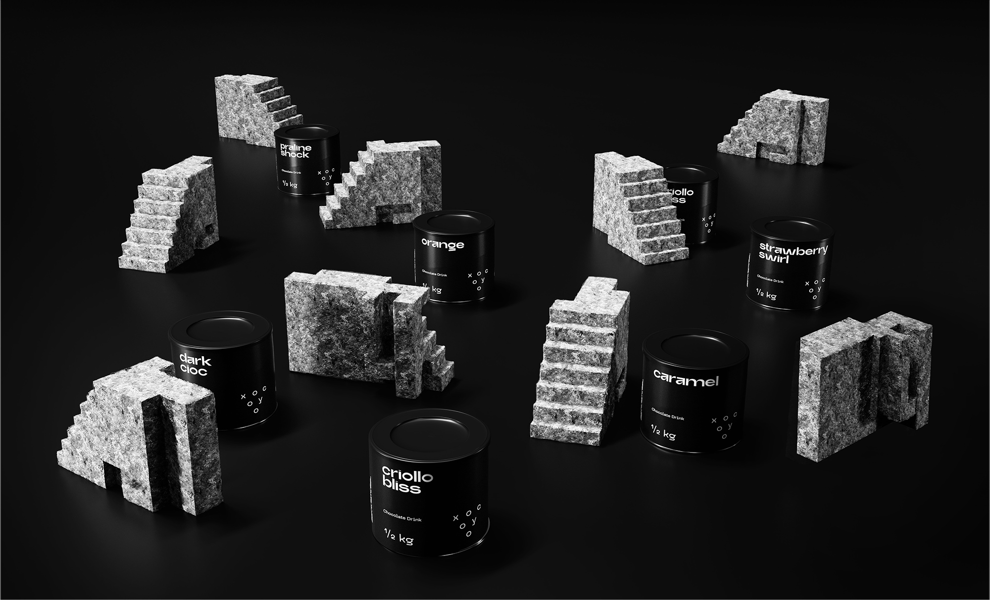
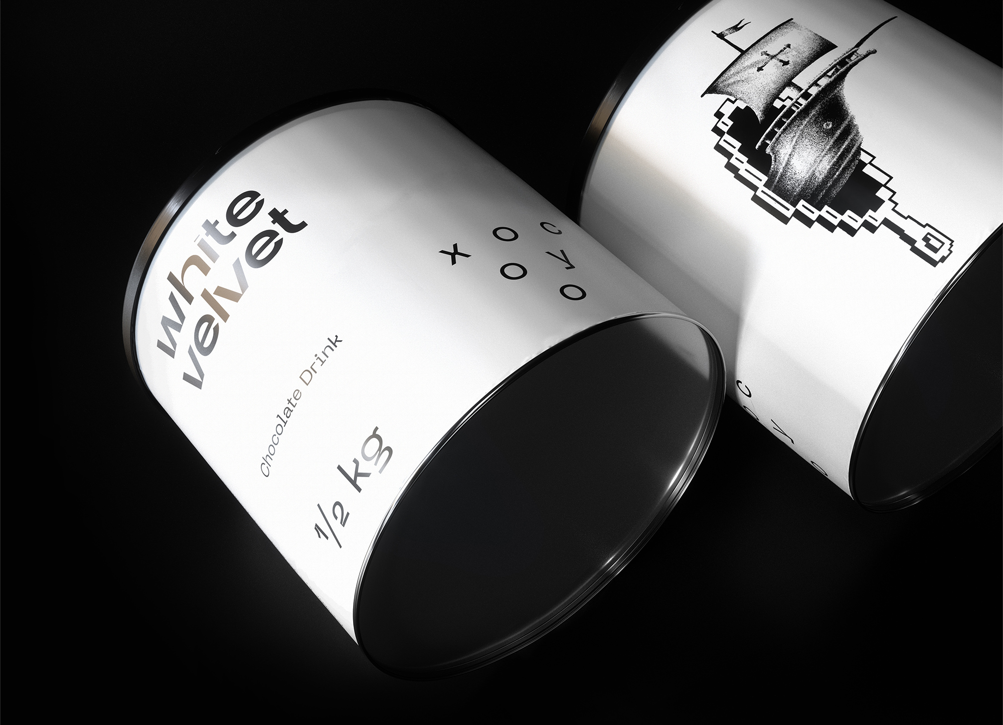
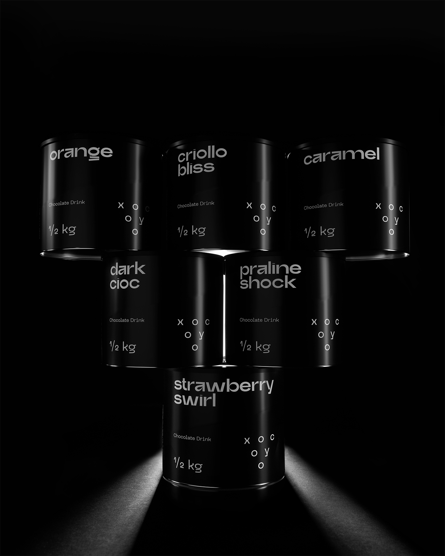
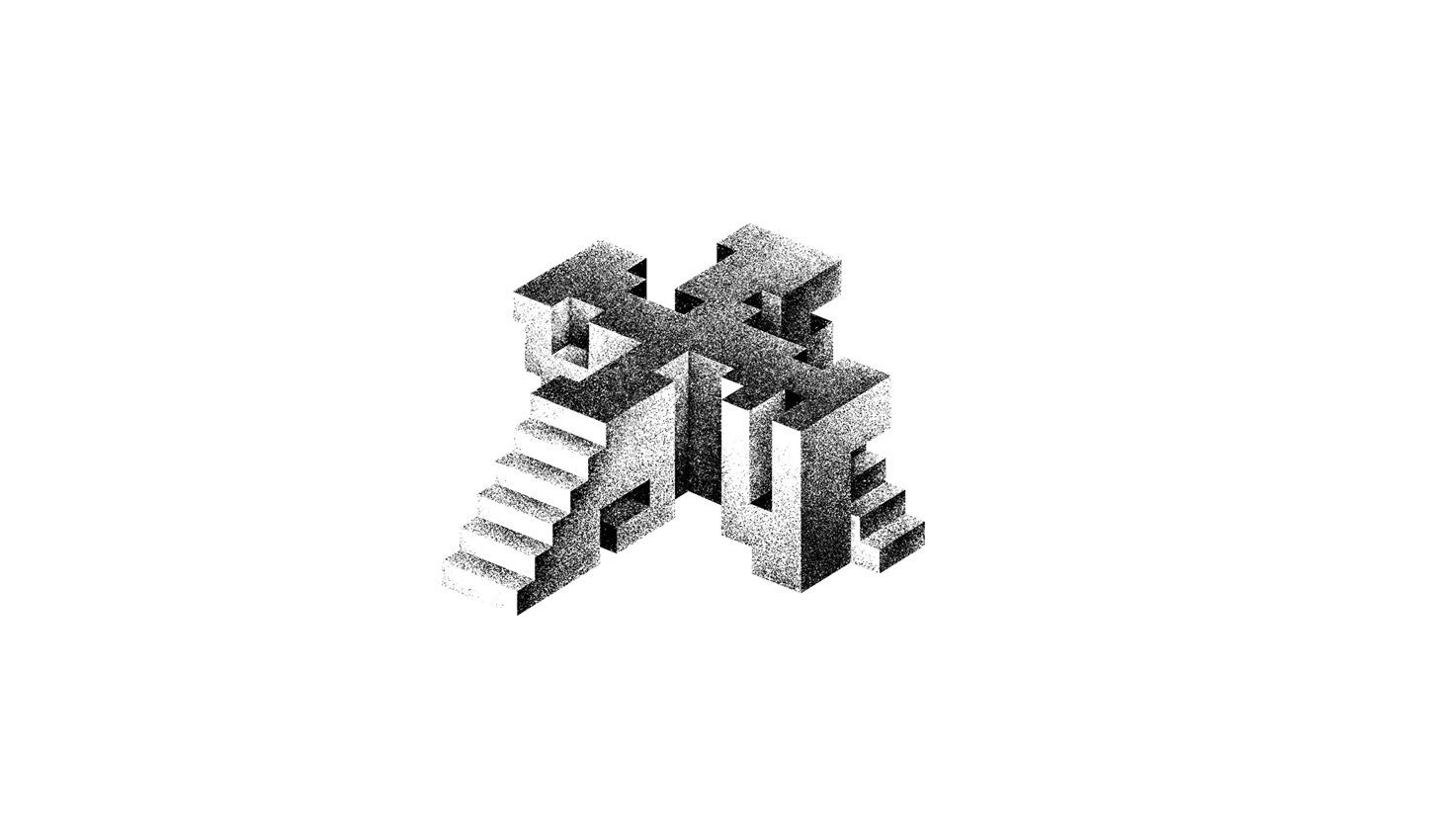
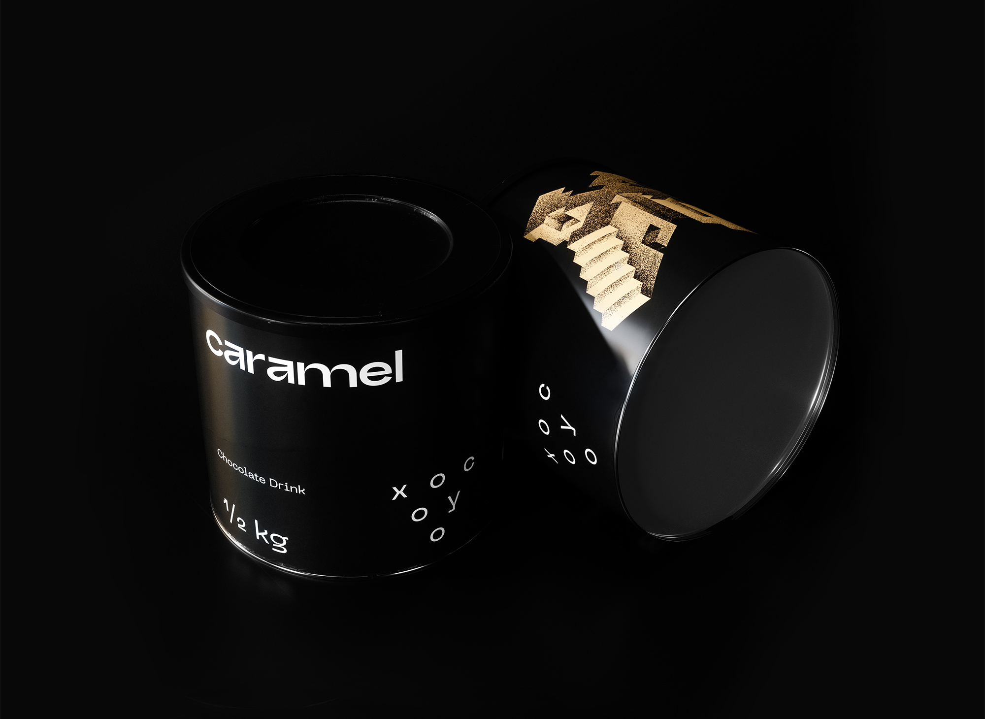
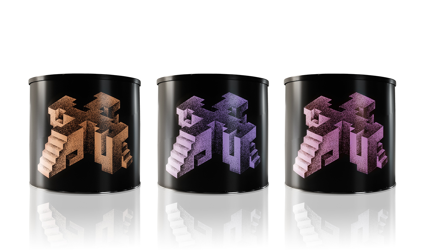
That story of the 13th century Mexican valley led us to create the name and the visual identity for the chocolate drink, Xocoyo. The obvious geometry of the logotype is a reference to the triangular forms that are common around that era across South America. The packaging revolves around the grandiose character X – the first letter of the brand’s name – while drawing inspiration from the brutalist architecture, which constituted the trademark of the Aztecan culture.

CREDIT
- Agency/Creative: Luminous Design Group
- Article Title: Luminous Design Group Creates Packaging Design for Xocoyo
- Organisation/Entity: Agency, Published Commercial Design
- Project Type: Packaging
- Agency/Creative Country: Greece
- Market Region: Europe
- Project Deliverables: Brand Naming, Branding, Illustration, Packaging Design, Product Architecture
- Format: Bag, Can
- Substrate: Pulp Paper
FEEDBACK
Relevance: Solution/idea in relation to brand, product or service
Implementation: Attention, detailing and finishing of final solution
Presentation: Text, visualisation and quality of the presentation


