


Watermelon Burst Dog Toothpaste — A Gentle Touch, A Moment of Brightness
This project is conceived as a marketing-driven design solution, where packaging is not treated as a standalone outcome, but as a cohesive and layered experiential system that integrates storytelling, sensory perception, and user interaction into a unified brand journey. Rather than focusing solely on visual appeal, the design approach repositions packaging as a strategic medium — one that bridges emotional resonance with functional clarity, while reinforcing brand memorability across multiple touchpoints.
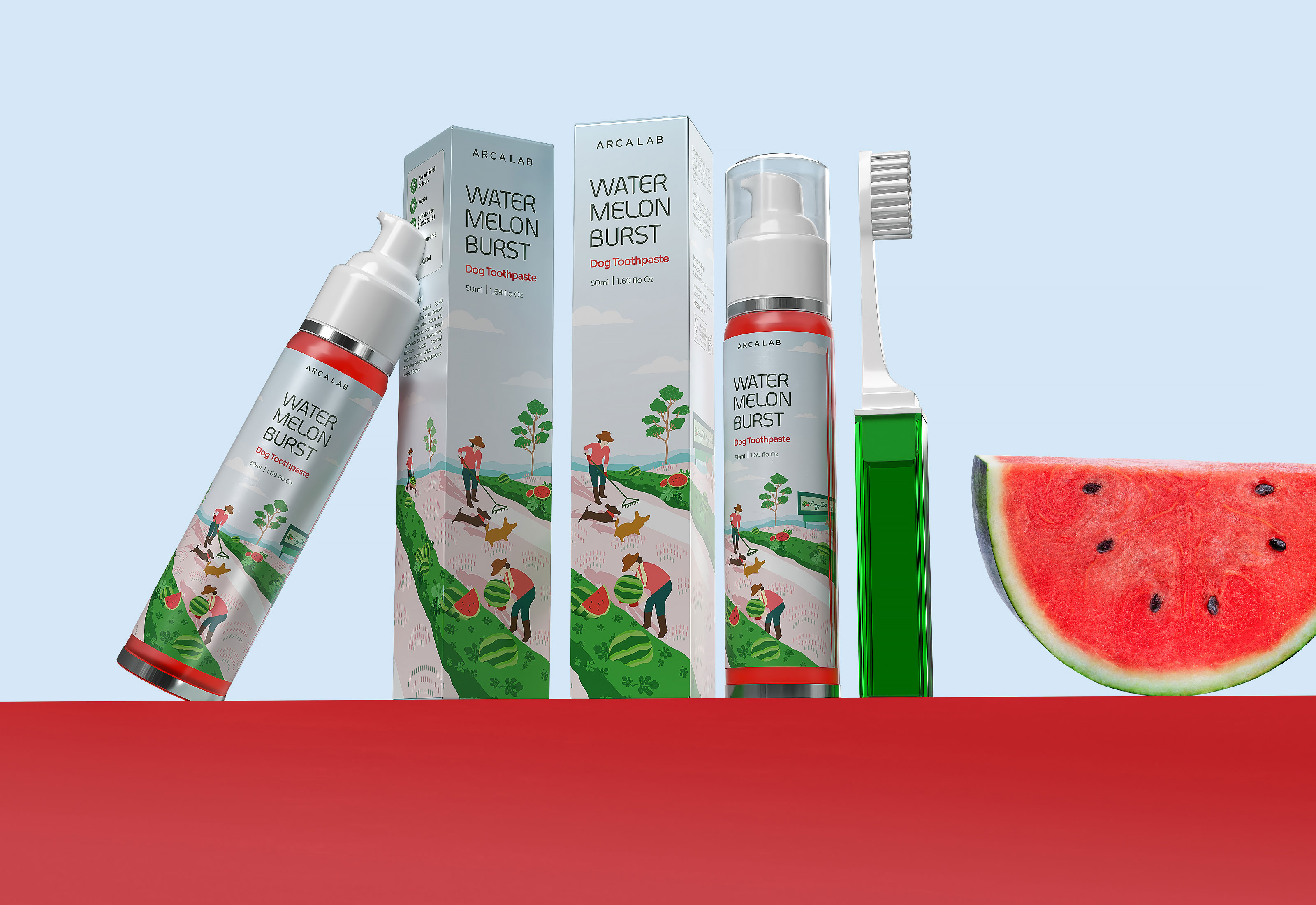
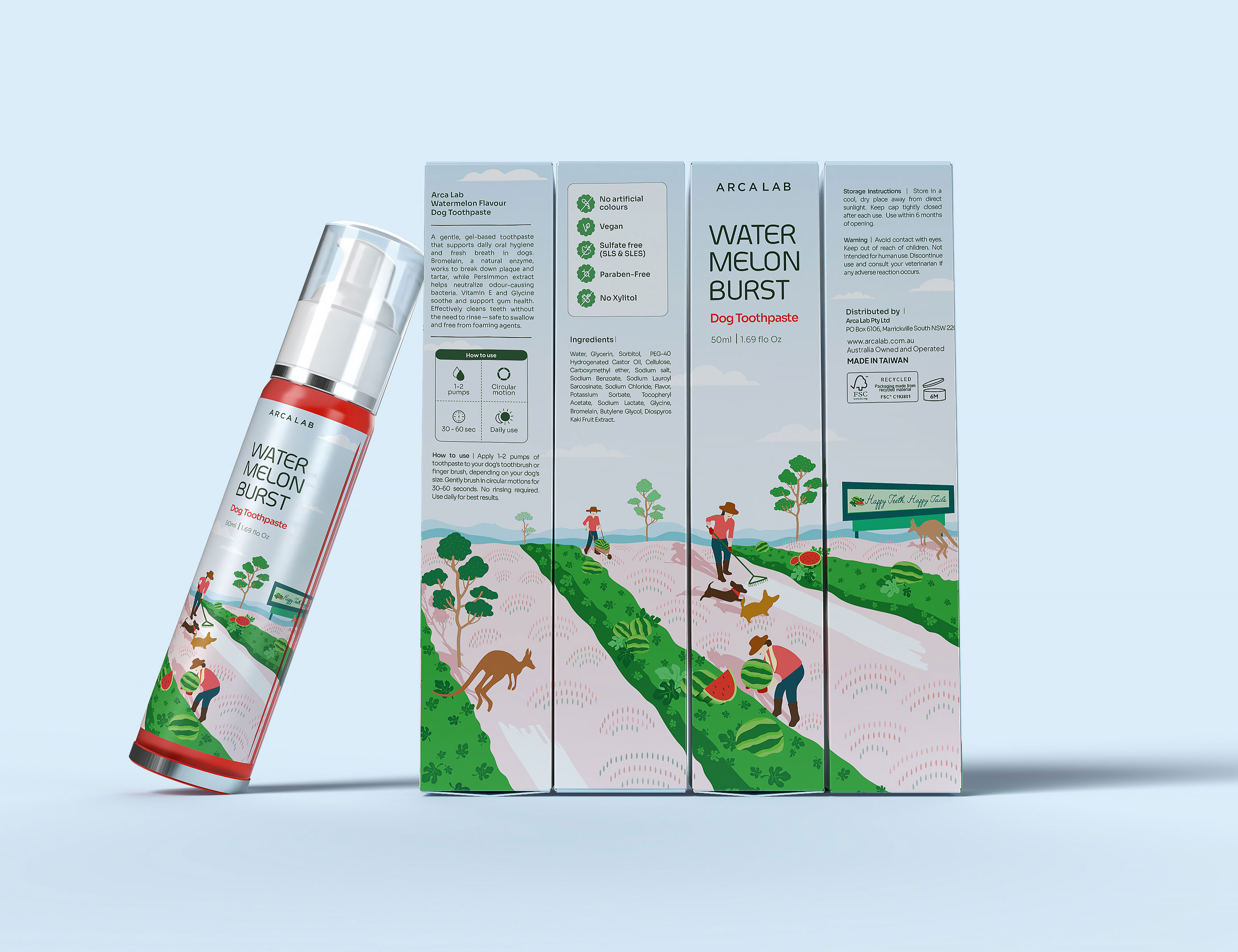
At the core of this concept lies the inspiration drawn from the watermelon farming heritage of Chinchilla, Queensland — a region widely recognized for its expansive fields and strong agricultural identity. This reference is not applied superficially, but translated into a visual and emotional language that evokes openness, freshness, and authenticity. The landscape becomes a metaphor for purity and care, aligning naturally with the product’s purpose: supporting a gentle, enjoyable, and consistent oral care routine for pets. Through this lens, the brand narrative is rooted in nature, yet expressed through a contemporary and approachable design system.
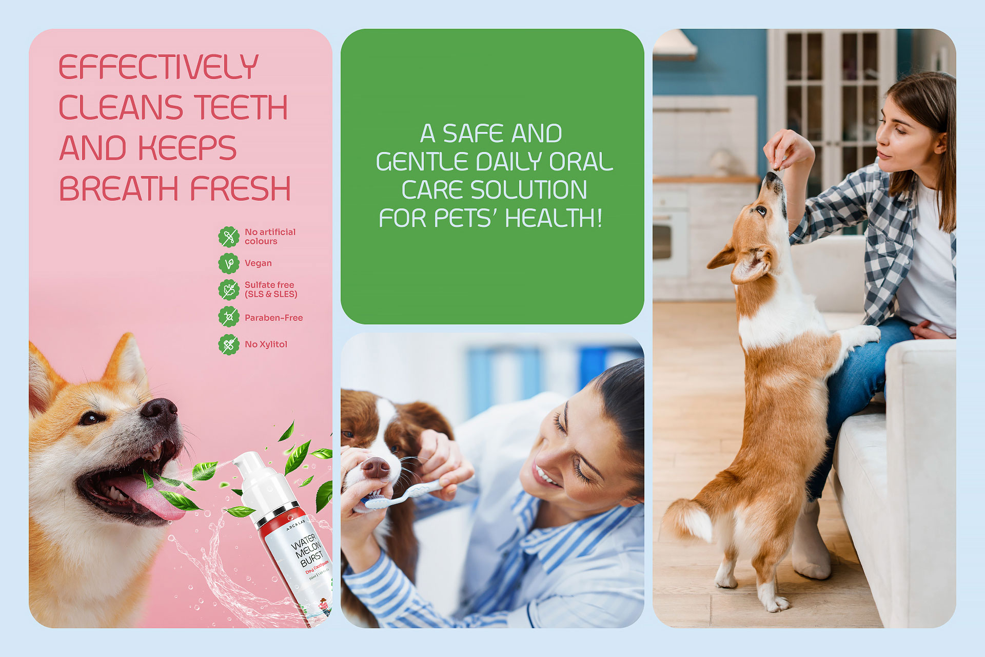
The choice of watermelon as a central element extends beyond flavor positioning. It functions as both a sensory trigger and an emotional anchor. In practical terms, the refreshing taste enhances product usability, encouraging better acceptance from pets and simplifying daily routines for pet owners. On a deeper level, the watermelon becomes a symbolic connector — associated with freshness, hydration, and moments of ease. This dual-layered meaning allows the product to transcend its utilitarian role, transforming into a small yet meaningful part of everyday life.
Visually, the artwork is developed to balance storytelling with clarity. The scene depicts farmers in the act of harvesting, accompanied by playful dogs moving freely across the fields. This composition introduces a sense of liveliness and trust, subtly reinforcing the idea of care that originates from natural sources. The inclusion of dogs within the farming context is intentional — it creates a bridge between origin and end-user, connecting the narrative of cultivation with the daily experience of pet care.
To further integrate function into the visual language, soft light streaks are incorporated throughout the composition. These elements are not merely decorative; they serve as symbolic representations of dental cleansing benefits. Their subtle presence allows the design to communicate efficacy without relying on overly technical or clinical cues. This balance ensures that the product retains a friendly and accessible tone, while still conveying its core functional value.
Color plays a critical role in shaping perception. The palette is built around a pastel blue base, complemented by watermelon-inspired red and green accents. This combination is carefully calibrated to achieve multiple objectives simultaneously. The pastel blue introduces a sense of calmness and cleanliness, aligning with the hygiene aspect of the product. Meanwhile, the red and green accents inject energy and freshness, creating visual contrast that enhances shelf visibility. The overall effect is a harmonious balance between softness and vibrancy — approachable without being muted, distinctive without being overwhelming.
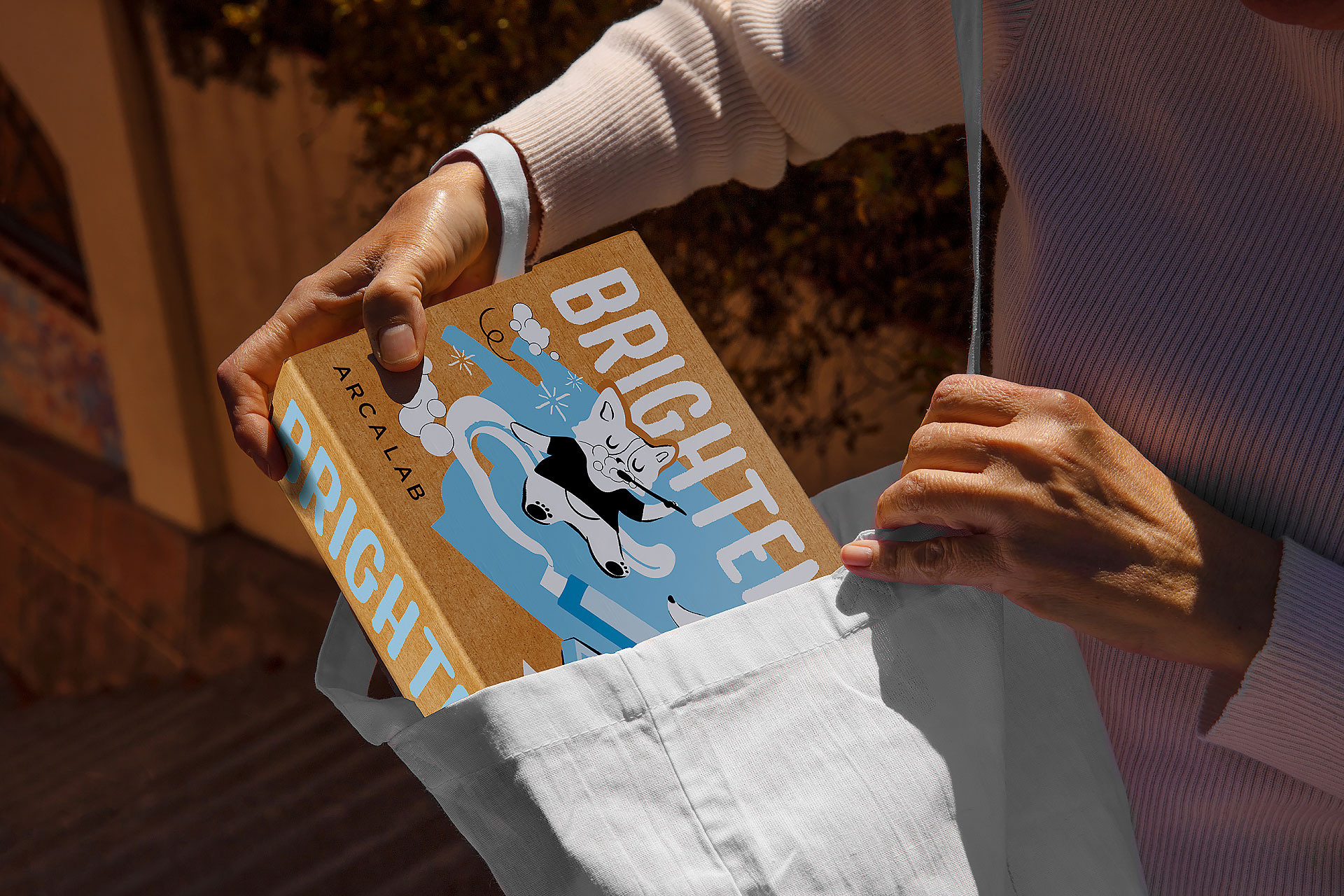
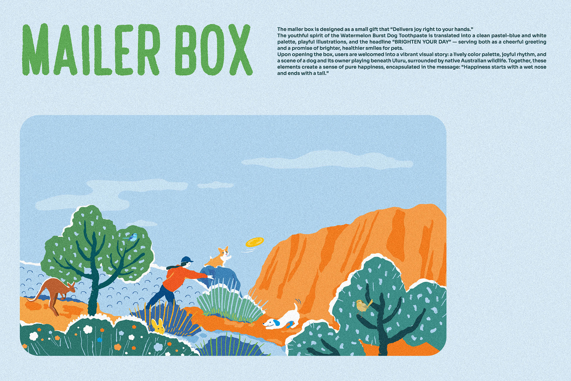
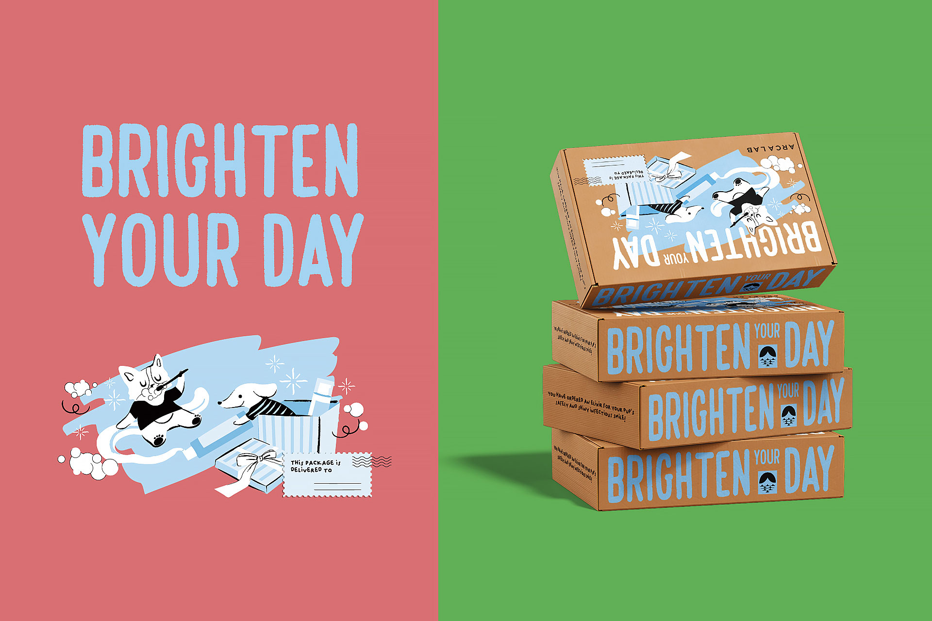
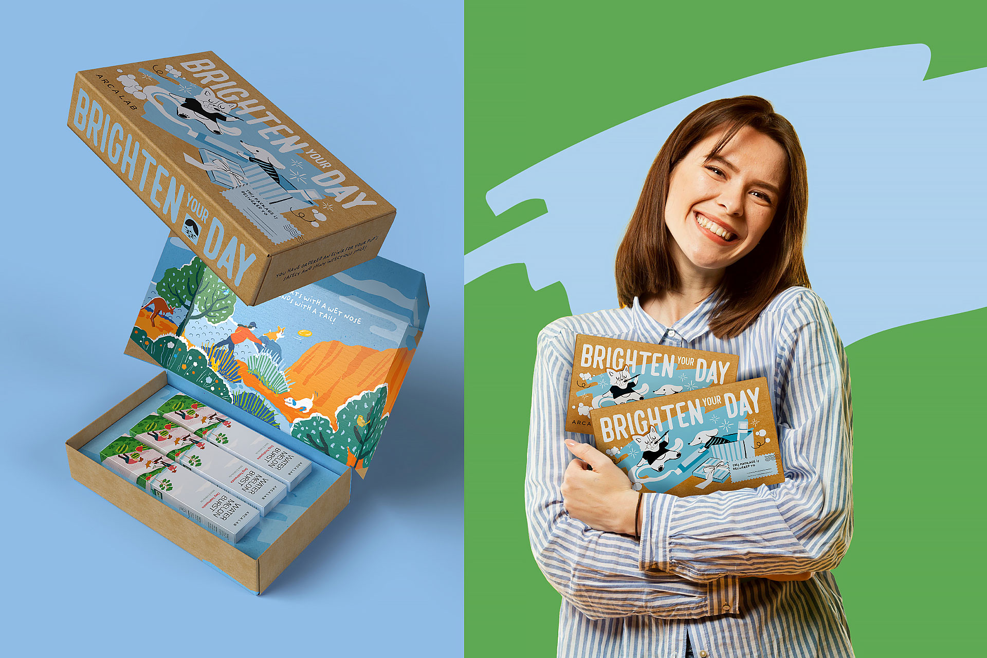
Beyond the primary packaging, the system expands into a broader experiential framework. Every element is designed to contribute to a continuous and coherent journey, where each touchpoint reinforces the brand’s narrative and emotional tone. The mailer box, in particular, is developed as a key moment within this system — not simply as a protective layer, but as an extension of the brand experience.
Externally, the mailer adopts a restrained and minimal aesthetic, carrying the message “BRIGHTEN YOUR DAY” as a subtle invitation. This calm exterior establishes a sense of anticipation, allowing the user to approach the product without visual overload. Upon opening, the interior reveals a contrasting environment — vibrant, warm, and filled with expressive graphics. This intentional contrast is designed to create a moment of surprise and delight, transforming the act of unboxing into an emotionally engaging experience.
This transition from calm to vibrant is more than a visual device; it reflects the brand’s underlying philosophy. The exterior represents the everyday routine — quiet, familiar, and often overlooked. The interior, in contrast, embodies the hidden joy within those routines. By structuring the experience in this way, the design invites users to rediscover small moments of happiness within daily care practices.
Material consideration also plays a role in reinforcing this narrative. Surfaces are selected and finished to support a tactile experience that feels soft, clean, and approachable. The physical interaction — from holding the tube to opening the box — is designed to feel intuitive and comfortable, reducing friction and enhancing usability. This attention to detail ensures that the experience is not limited to visual perception, but extends into the physical realm.
From a strategic perspective, the project positions packaging as a connector between brand intention and user behavior. It acknowledges that daily pet care is often perceived as a task — repetitive and functional. Through design, this perception is gently shifted. By introducing elements of playfulness, warmth, and emotional storytelling, the routine is reframed as a moment of connection between pet and owner.
Importantly, this transformation does not rely on exaggeration or forced messaging. Instead, it is achieved through a series of subtle, carefully orchestrated design decisions — from illustration style and color balance to narrative structure and interaction flow. Each element contributes incrementally, creating an experience that feels natural and cohesive rather than constructed.
The integration of storytelling and function is what defines the strength of this system. The design does not separate emotional appeal from practical value; it weaves them together. The visual narrative attracts attention and builds connection, while the functional cues provide reassurance and clarity. This duality ensures that the product is both engaging and trustworthy — a balance that is essential within the pet care category.
As the system unfolds across different applications — from packaging to communication materials — it maintains consistency while allowing for flexibility. The core visual language can adapt to various formats without losing its identity, ensuring scalability for future extensions. This adaptability is a key consideration, as it supports long-term brand development beyond a single product line.
Ultimately, the project demonstrates how packaging can evolve into a meaningful touchpoint within a broader brand ecosystem. It moves beyond the role of containing and protecting a product, becoming a medium for storytelling, emotional engagement, and behavioral influence. By aligning visual design, sensory experience, and strategic intent, the system creates a cohesive narrative that resonates with users on multiple levels.
Through this approach, daily pet care is redefined — not as an obligation, but as a small, consistent ritual that carries moments of joy and connection. The product becomes part of a shared experience between pet and owner, reinforcing bonds through simple, everyday actions. In doing so, the design fully expresses its core message:
Happiness starts from small rituals.
CREDIT
- Agency/Creative: Lucky Brand Associates
- Article Title: Lucky Brand Associates Develops Watermelon Burst Dog Toothpaste as a Playful Packaging System for Everyday Pet Care
- Organisation/Entity: Agency
- Project Type: Packaging
- Project Status: Published
- Agency/Creative Country: Vietnam
- Agency/Creative City: Hanoi
- Market Region: Asia, Global
- Project Deliverables: Illustration, Label Design, Packaging Design
- Format: Box, Tube
- Industry: Health Care
- Keywords: Lucky Brand Associates , Toothpaste tube packaging, pet Toothpaste tube, https://luckybrand.vn/thiet-ke-bao-bi-kem-danh-rang-thu-cung
-
Credits:
HungZung: Manager


