Lowe’s Sta-Green is a range of high-performing, affordable lawncare and garden products, designed for homeowners who care about having a pleasant, well-maintained outdoor environment, and want to spend time with their families creating and enjoying their outdoor space.
During the pandemic, gardens became a new ‘room in the house’ and an environment in which to socialize, exercise and enjoy the outdoors. This became a catalyst for Lowe’s to undertake a brand refresh to maximize the potential for sales growth from the surge in interest in hobby gardening and consumer willingness to invest in their outdoor areas.
We worked with the Lowe’s team to develop new brand positioning for the Lowe’s Sta-Green range, identifying the characteristics of target consumers and articulating the price and quality propositions and differentiators, along with the brand expression (‘trusted, high-performance lawn & garden products at a value’), the personal voice (‘knowledgeable, approachable, attainable, inspiring’), the emotional benefits (‘more time for fun’, ‘sense of accomplishment’, ‘pride’), and the product attributes (‘long-lasting results, easy to use, quick & consistent results, provides maximum beautification’).
The client wanted a strong logo mark which would be instantly recognizable to consumers, along with a contemporary pack design that would bring the pack into today. The pack design needed to encourage consumers to seek out and try different products from across the range, and nurture brand loyalty. A strategic approach was required to ensure that the brand was differentiated from competitors and appealed to target demographics, with a brand architecture that went beyond a new logo.
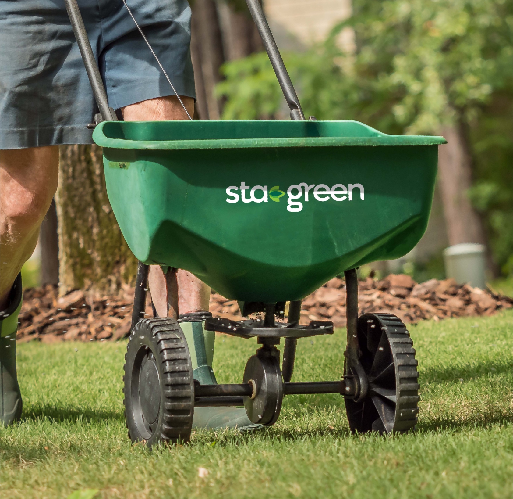
We created a new Sta-Green logo, replacing the existing hyphen with a leaf graphic and using a contemporary and organic font to articulate the purpose and benefits of the product, while providing a strong cue for brand recognition and differentiation.
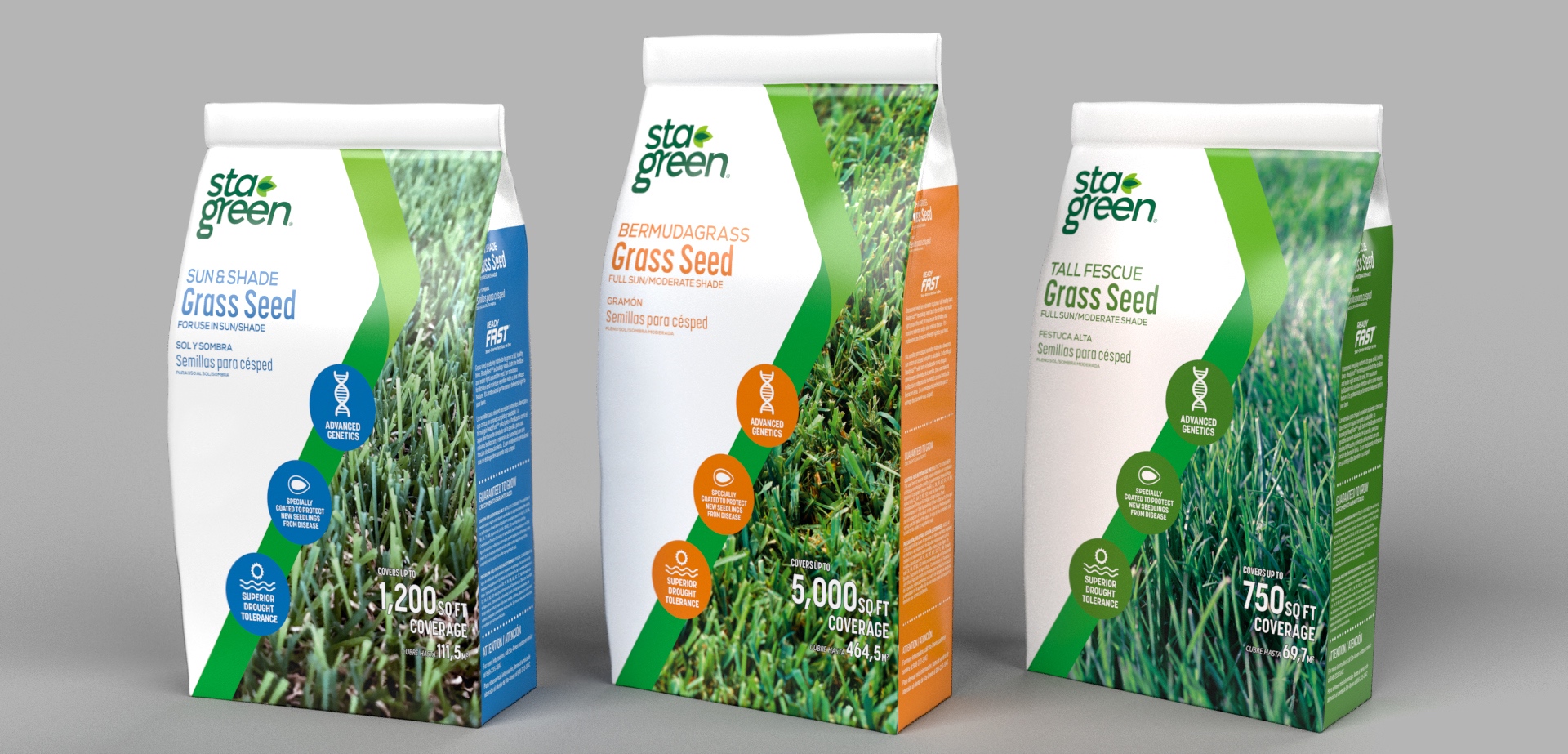
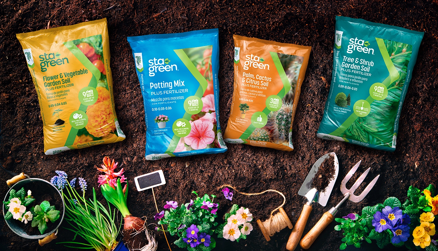
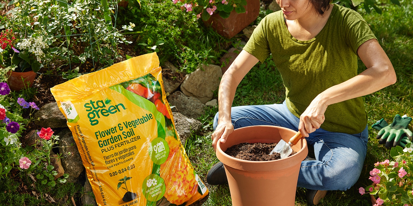
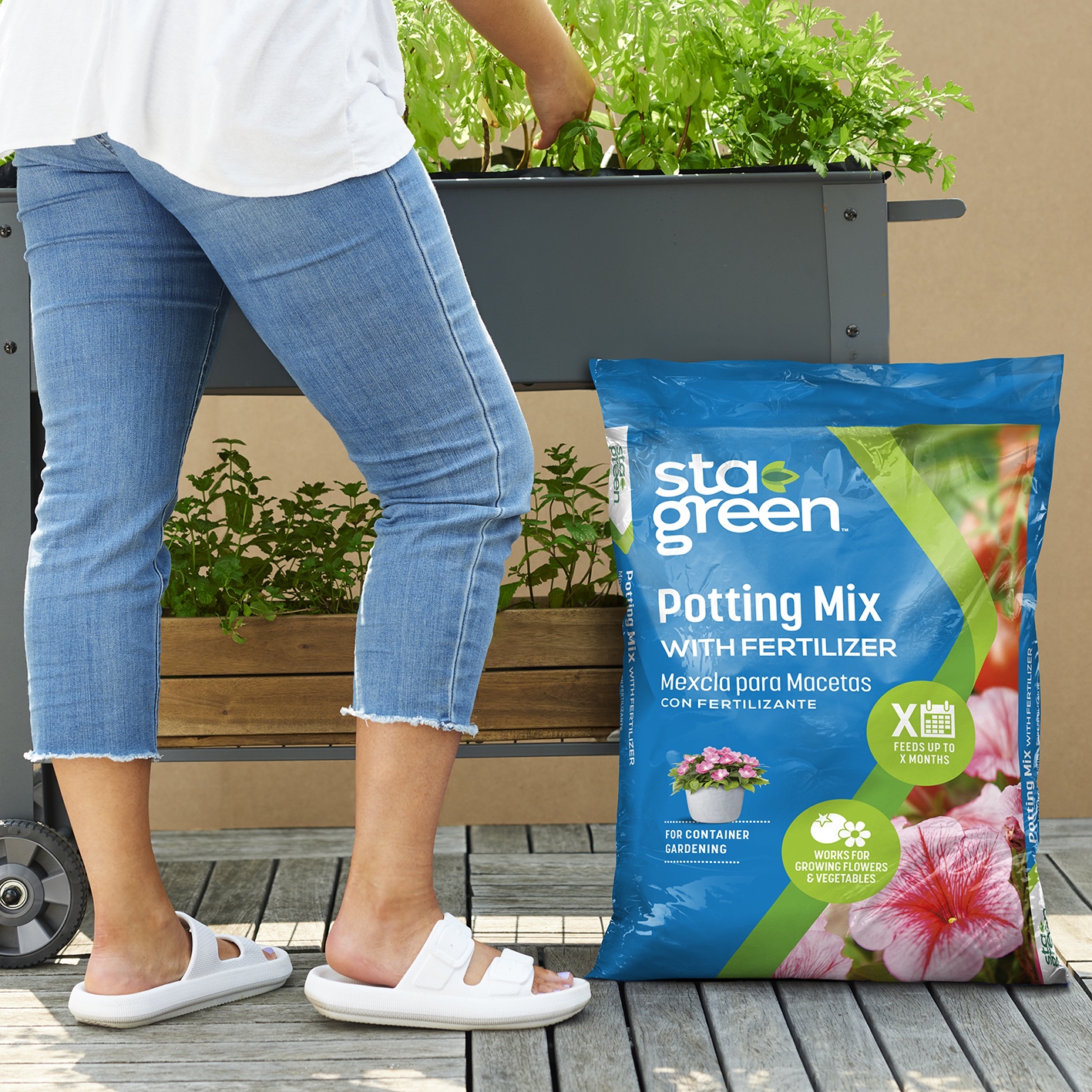
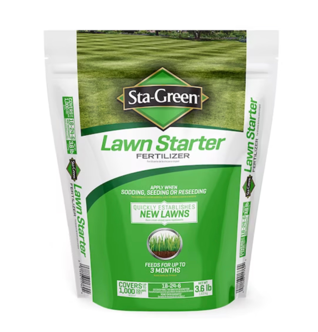
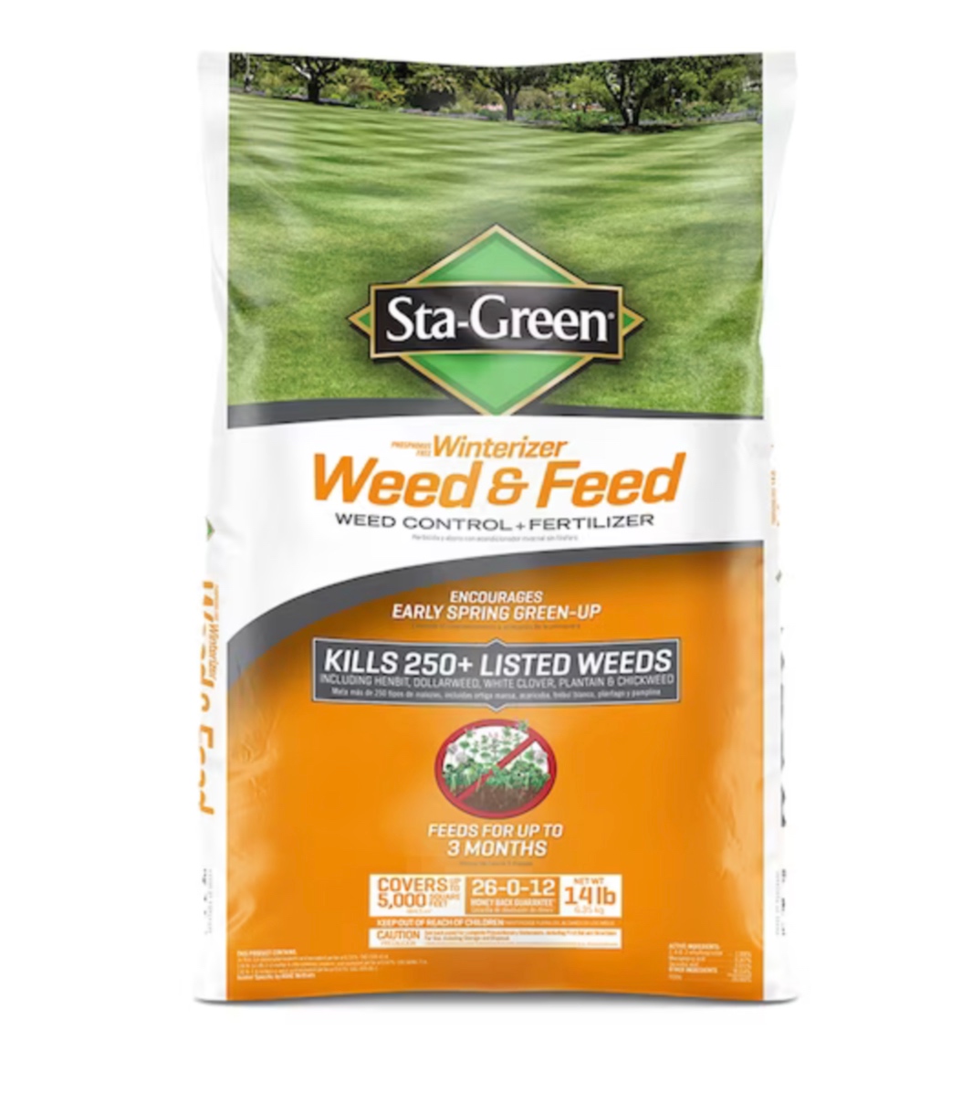
A core element of the new brand architecture is an arrow pointing dynamically across each pack front, which takes inspiration from the brand’s legacy diamond shape packaging design style, bringing continuity to the brand while moving it forward. The consistent green arrow design element is a dividing line down the center of each pack, which enables a color block to the left – with logo, product name, key call-outs and a small plant or lawn image to support the informational side of the pack – and close-up ‘result’ photography to the right. The photography style is consistent, with realistic and attainable shots used for the result image, which is shot as a macro with the hero in front or bottom and soft focus in the background.
Highly graphic icons, placed along the line of the green arrow, form another key element of the brand architecture, providing at a glance signposting to product features and benefits. We created an extensive suite of icons for use across the range, along with clear guidelines for the style of any future icons.
Consistency is carried through the range with a clear color palette and hierarchy of typography to be used across all SKUs.
In essence, the new packaging portrays both the function of each product and the results that can be achieved thanks to the quality and performance of the trusted brand.

CREDIT
- Agency/Creative: Equator Design
- Article Title: Lowe’s Sta-Green Packaging Redesign
- Organisation/Entity: Agency
- Project Type: Packaging
- Project Status: Published
- Agency/Creative Country: United States
- Agency/Creative City: Chicago
- Market Region: North America
- Project Deliverables: Packaging Design
- Format: Box
- Industry: Agriculture
- Keywords: WBDS Agency Design Awards 2023/24
- Keywords: Packaging Design, Product Redesign
-
Credits:
Creative Director: Aaron Funke
Senior Designer: Alysha Balog
Senior Designer: Don Dzielinski


