Lowe’s needed a brand refresh for a new décor line designed for shoppers who want to create a stylish and contemporary home by selecting high quality items. Origin 21 was conceived as a brand for Lowe’s modern customer, widening the retailer’s interior design style offering to a wider demographic.
The goal for the range was to be both attainable and aspirational. It includes hundreds of products, from lighting to furniture, to enable shoppers to create a coordinated look while selecting individual products that reflect their own aesthetic preferences. The brief from Lowe’s was for Origin 21 packaging to catch the consumer’s eye, delivering a destination brand that is clearly differentiated from both other décor brands and national competitors.
We worked closely with Lowe’s to articulate the customer proposition for the new brand. As the retailer’s long-term creative partner, with an excellent understanding of their customer base and attainable quality proposition, we were able to collaborate with them on a strategic approach to developing a head-turning aesthetic that appeals to trend-seeking shoppers. Meanwhile, our strategy provides a consistent look and feel that works well across a broad and extensive product range.
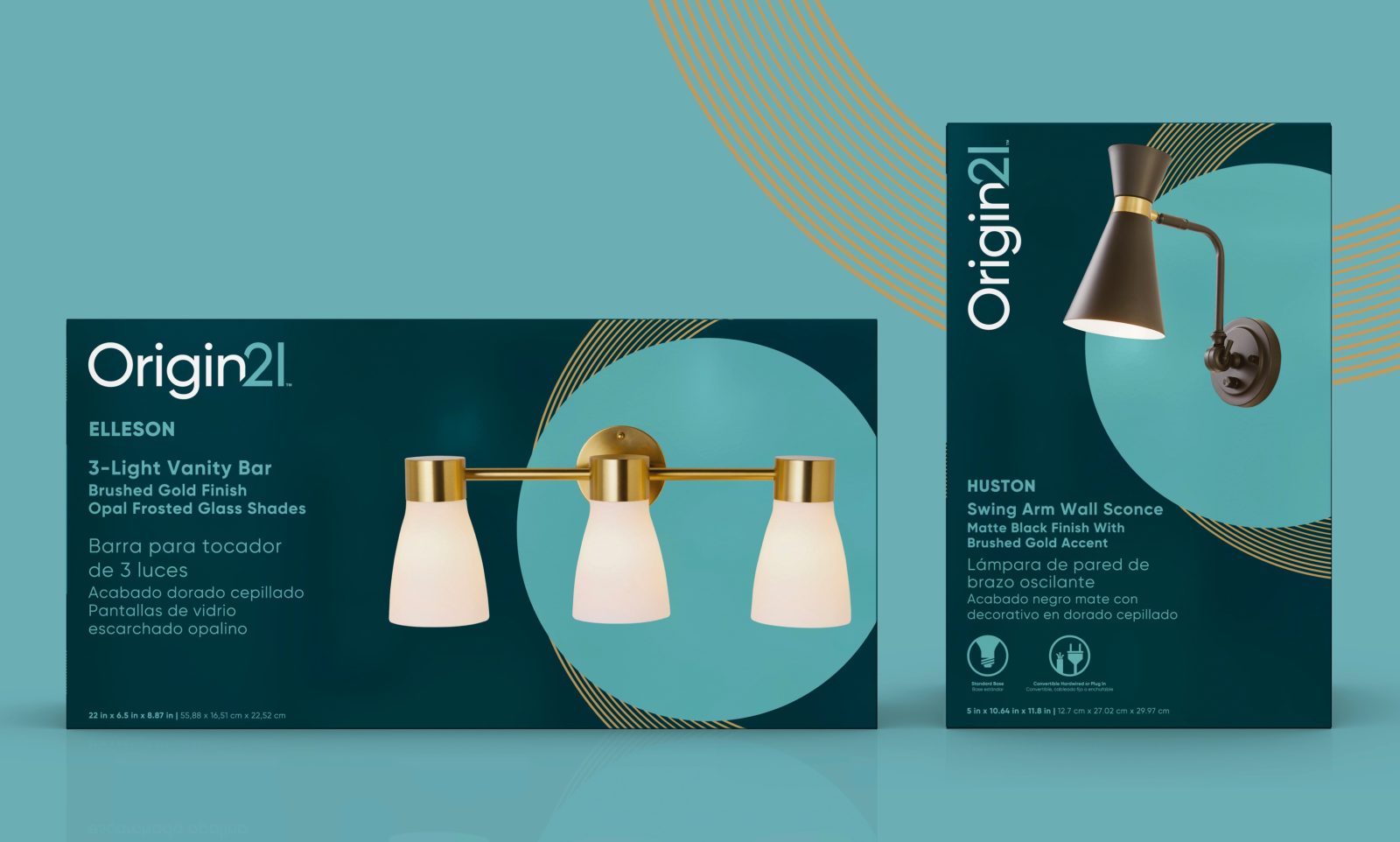
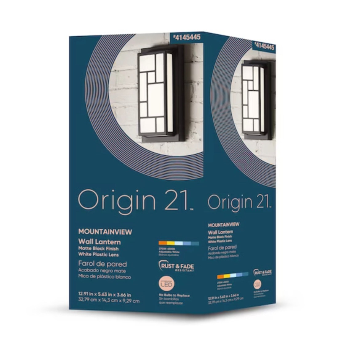
Our goal was to create a brand that felt unexpected and exciting. We used a sumptuous core color scheme of teal, cyan, white and gold, elevating the brand with a palette that gives it a sense of timeless elegance, while providing a chic, contemporary look.
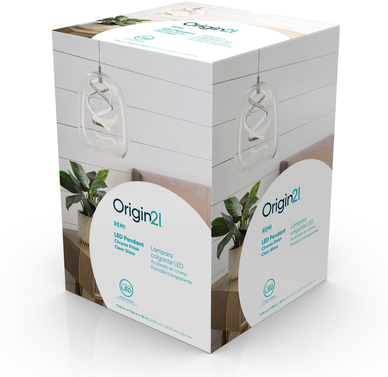
With hundreds of products across the range, a flexible design system was key. We developed two different pack options, both utilizing the same core palette, with lighter packs featuring evocative lifestyle photography, while darker packs make product photography pop with a sense of drama and an almost 3D effect.
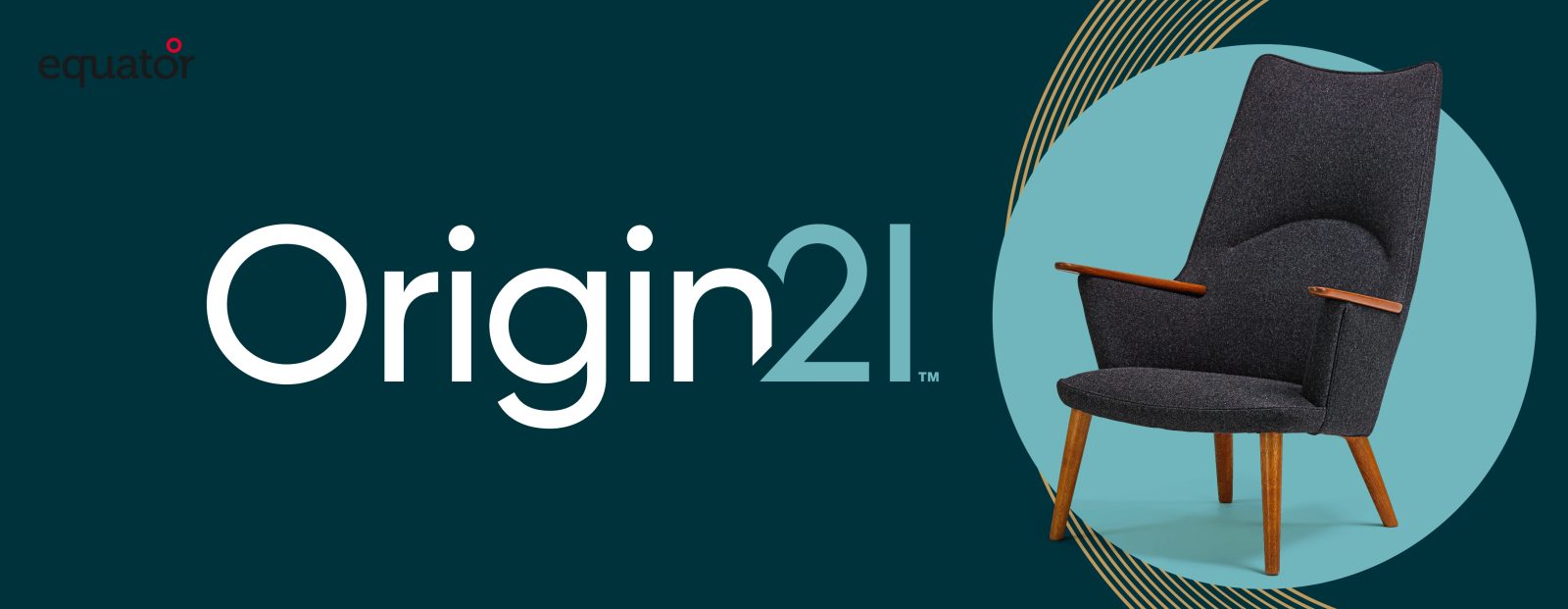
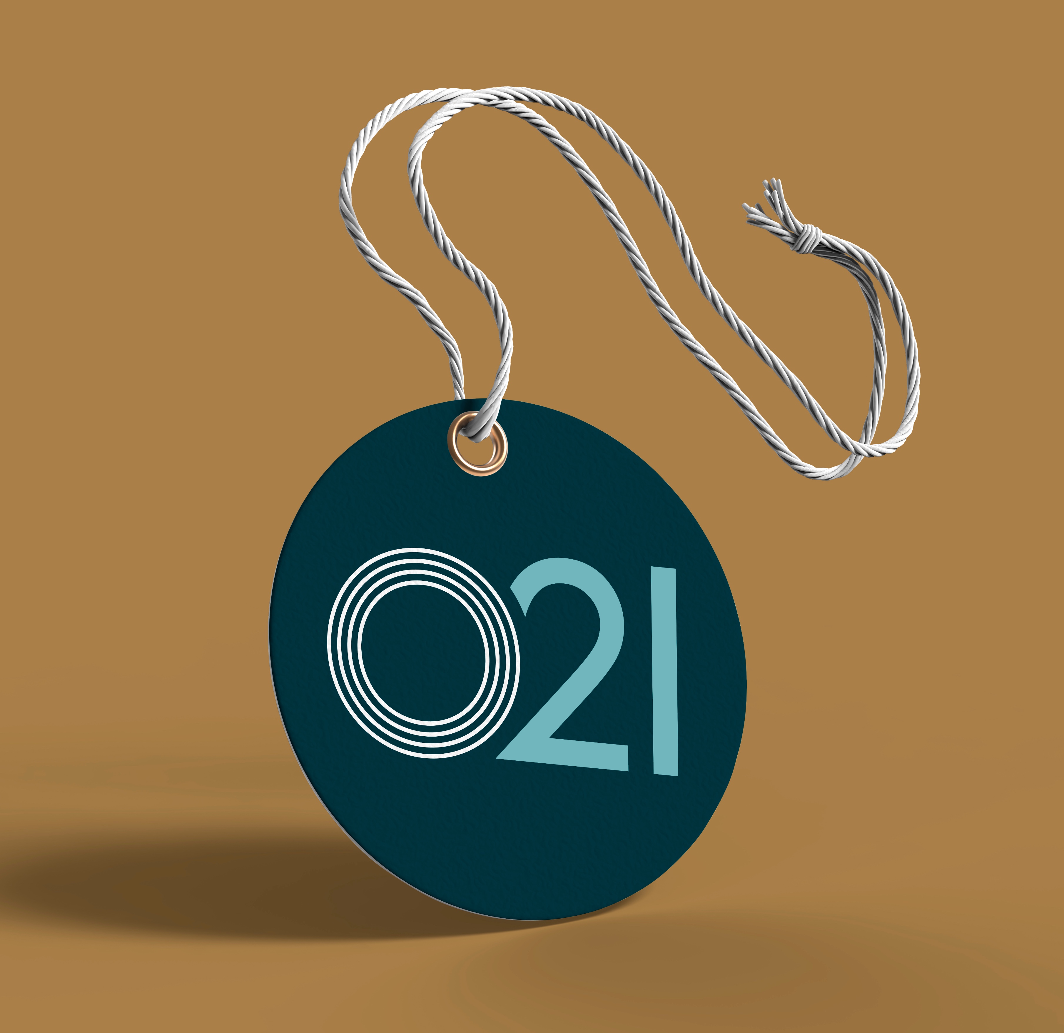
The striking color scheme, clean photography and refreshed logo, create a fresh, modern aesthetic, complemented by the use of circular shapes and arcs on pack, which create a distinctive and welcoming fluidity, while emphasizing the circular ‘O’ of the Origin 21 name.
The design provides structure to the range, while allowing for variation. It reflects the potential for consumers to make individual choices, celebrating the joy of self-expression.



CREDIT
- Agency/Creative: Equator Design
- Article Title: Lowe’s Origin 21 Packaging Design
- Organisation/Entity: Agency
- Project Type: Packaging
- Project Status: Published
- Agency/Creative Country: United States
- Agency/Creative City: Chicago
- Market Region: North America
- Project Deliverables: Packaging Design
- Format: Box
- Industry: Manufacturing
- Keywords: WBDS Agency Design Awards 2023/24
- Keywords: Packaging Design, Product Redesign,
-
Credits:
Creative Director: Aaron Funke
Senior Designer: Charlotte Richards


