


Prisma is Finland’s largest hypermarket chain, a part of one of the oldest Finnish holdings, the S-Group. In Russia, the brand’s assortment is made up of imported (mainly Finnish) goods and locally-produced goods. Most of the Russian stores are located in St. Petersburg; by 2022, their number is going to reach 33.
The existing style of a “Finnish discounter” is not suitable for the Russian market; here, Prisma focuses rather on middle-class customers and offers goods of sufficiently high quality. We were to develop a new corporate identity for this retail brand. It had to be understandable for Russian shoppers and easily usable on any media, by preserving the spirit of Finland.
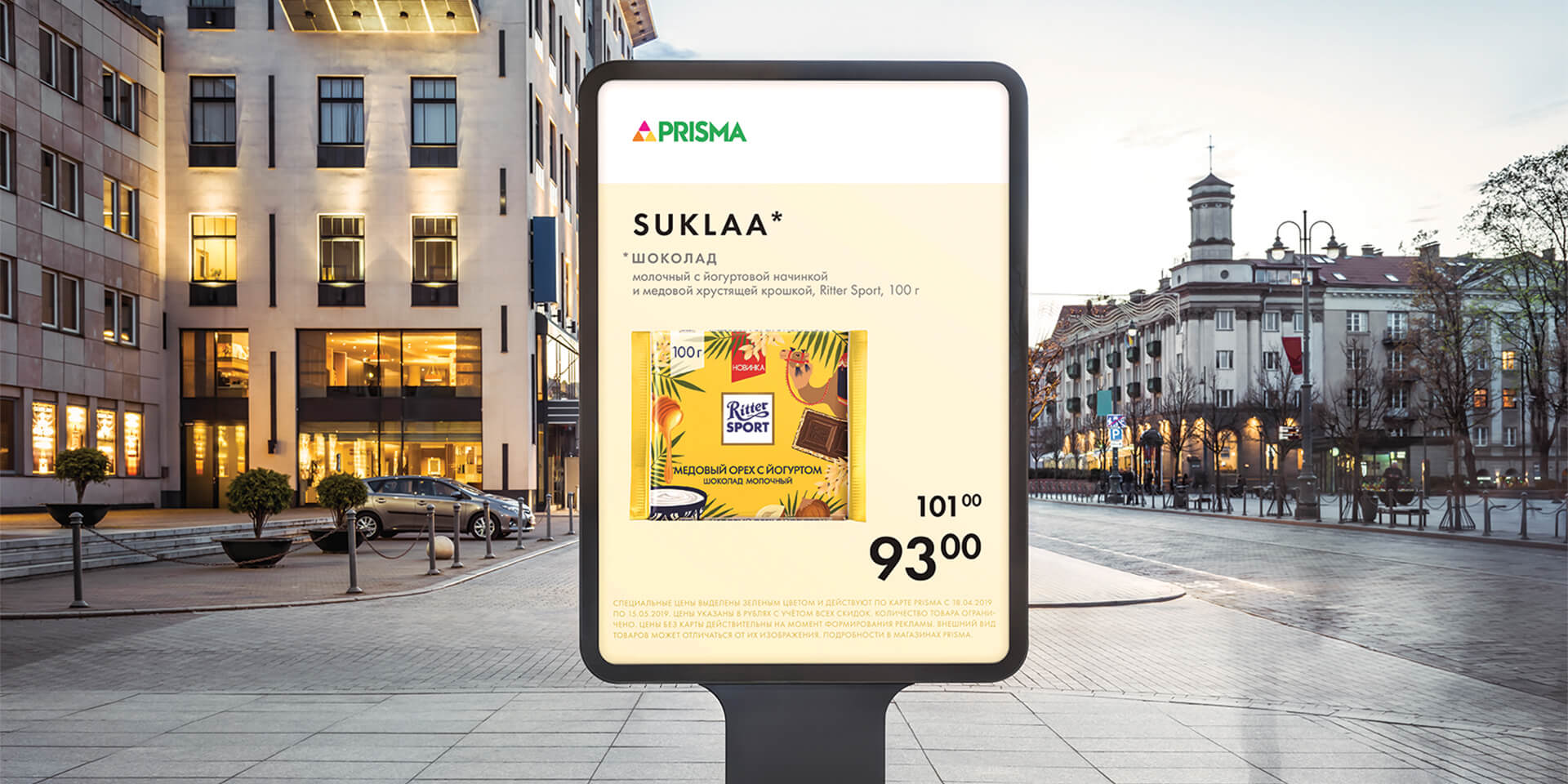
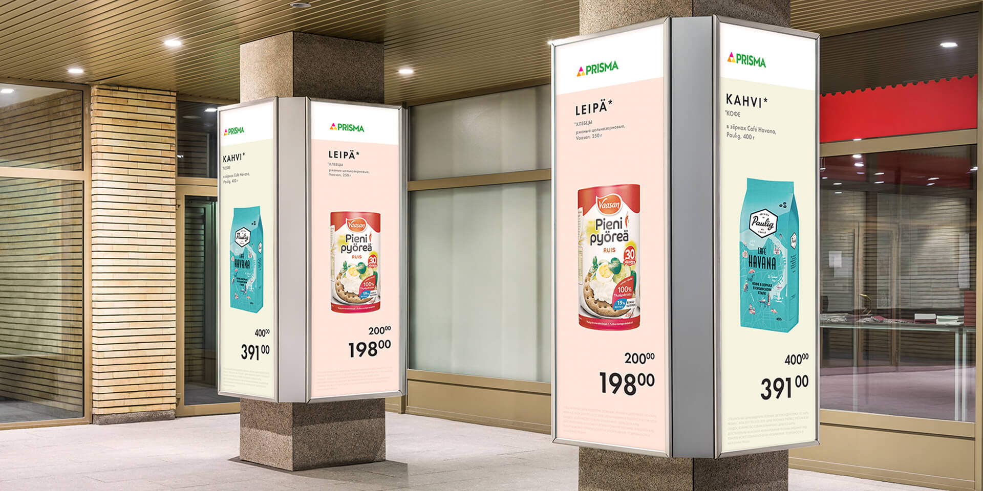
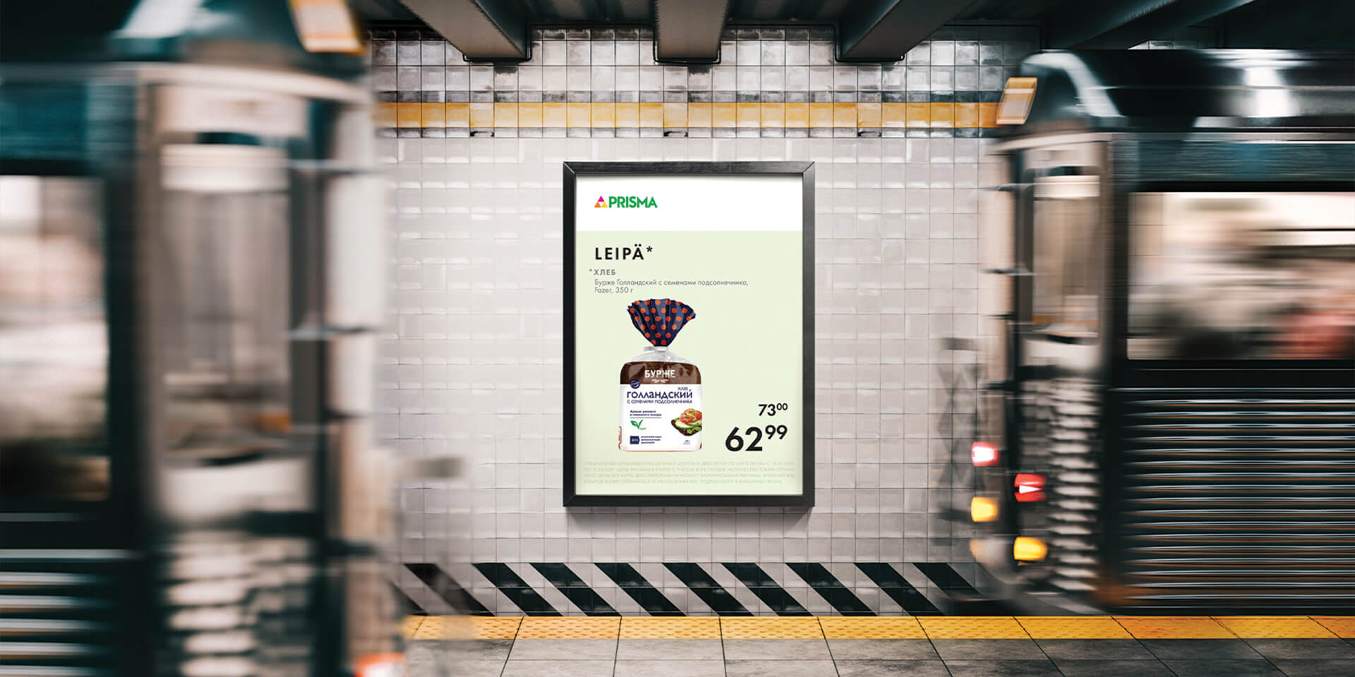
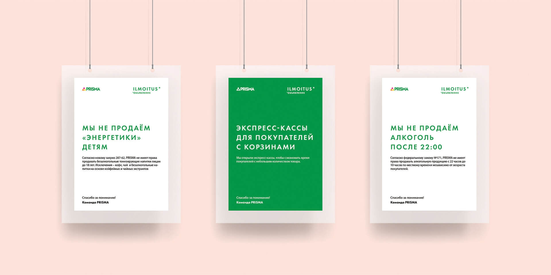
The first step is to bring all communications inside and outside the store to a single layout system; to unify them. We intentionally created a minimalist system without excessive graphics, since the main image in the store should be the product itself. A thoughtful grid design and strict layout rules make the style universal, mobile, easily adaptable to any format, while maintaining the integrity of the entire template.
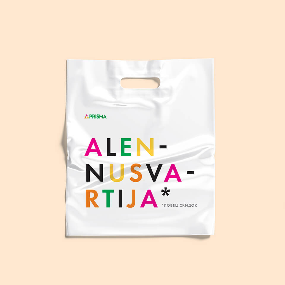
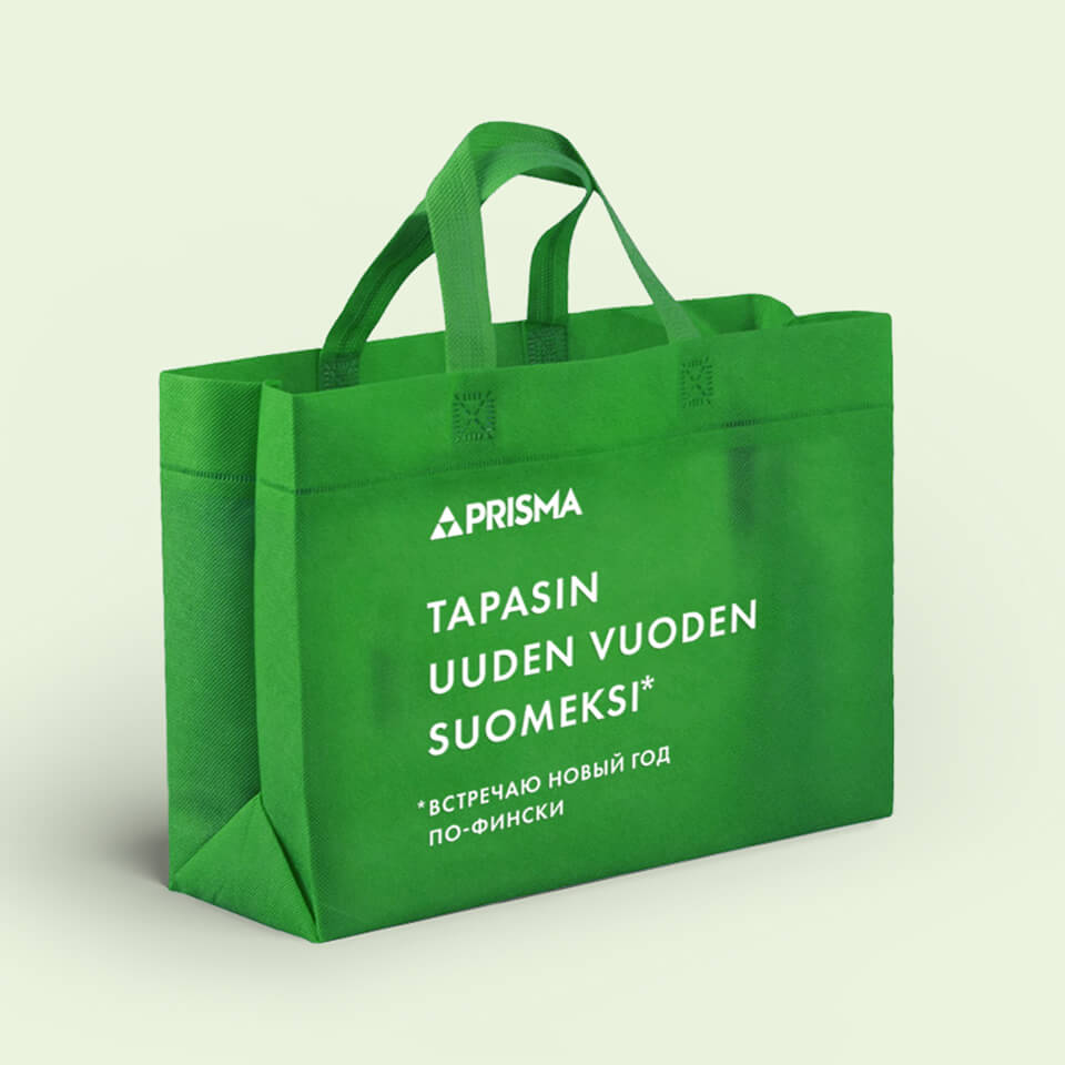
The main colour palette grows out of the logo – yellow, orange, hot pink and green. Muted shades derived from the basic tones make an addition. These are the pastel colors that make a strong connection with Scandinavian design.
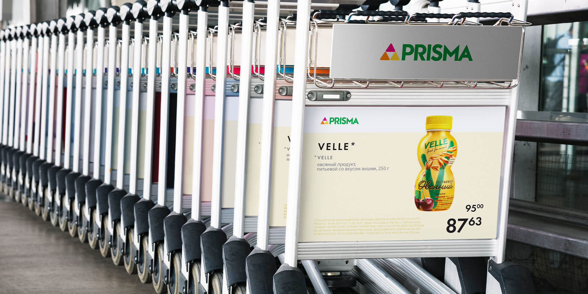
The new style system fits flexibly on any media. Even the simplest ad printed by any store employee in black and white will match the brand image.
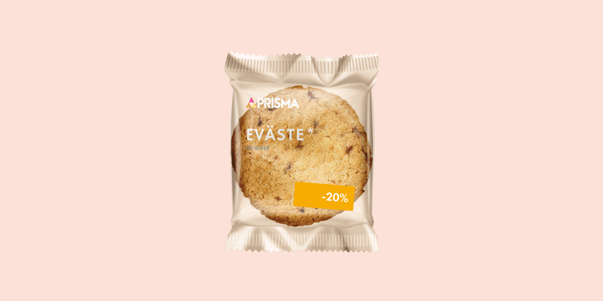
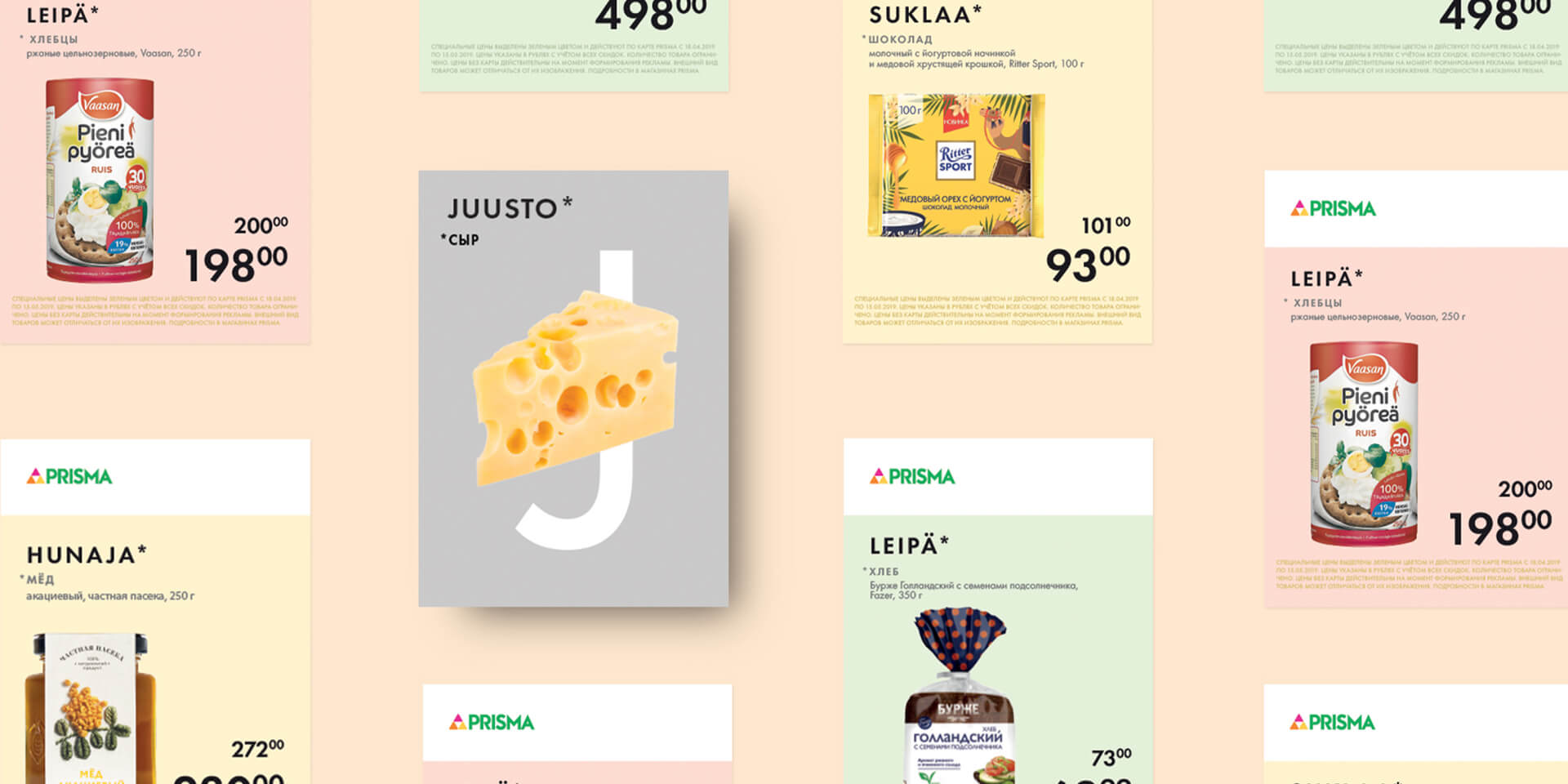
Maintaining the image of a European company, Prisma strives to show: we think about every customer regardless of their preferences. Therefore, colored markers on price tags become an important element of style; they help to find the right product easily – gluten-free, lactose-free, sugar-free, vegan, Finnish.
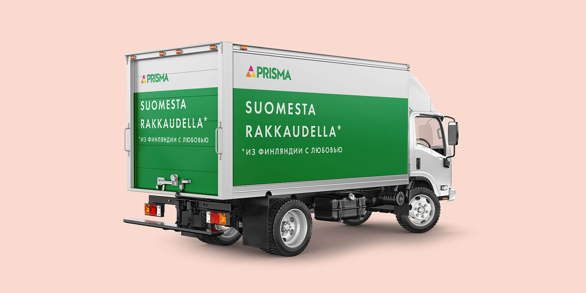
A striking feature of the brand is Finnish product names and sales pitches in the Finnish language. This is how we emphasize the origin of the brand, supporting its positioning – “the Finnish mentality and service right in the heart of the Northern capital.”
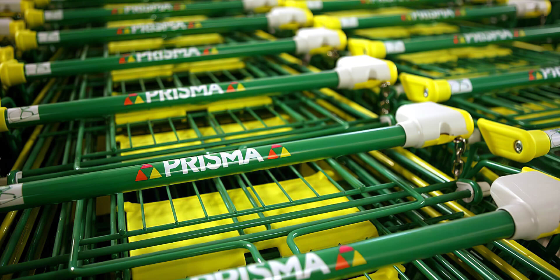
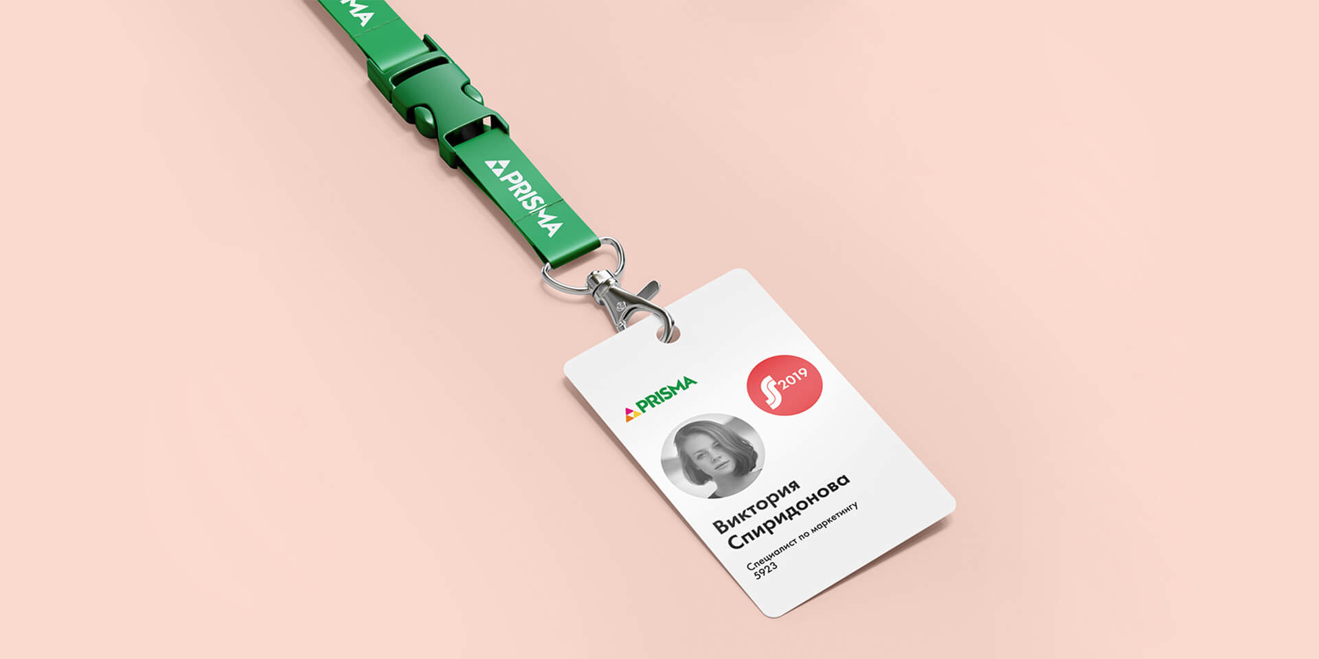
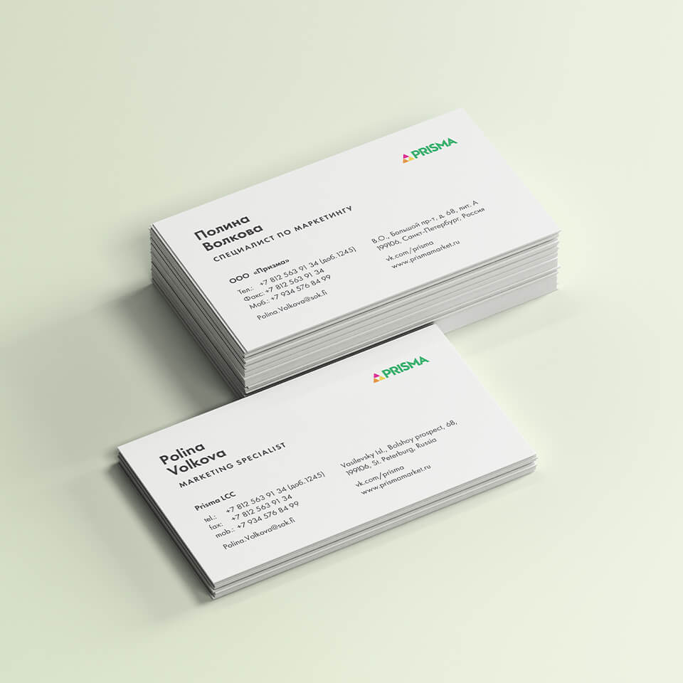
The entire corporate identity is easily adaptable for standard forms, business cards, Christmas and New Year merchandise or branded cars.
The new style is convenient to work with for any employee: a marketer, a PR specialist, a store administrator. In addition, the visual image is now fully consistent with the brand positioning in Russia. Every customer knows for sure that they will find the real Finnish spirit and high-quality Finnish products here.

CREDIT
- Agency/Creative: lovemedo branding agency
- Article Title: Lovemedo Branding Agency Create Corporate Identity for Finnish Supermarkets Prisma
- Organisation/Entity: Agency, Published Commercial Design
- Project Type: Identity
- Agency/Creative Country: Russia
- Market Region: Europe
- Project Deliverables: Brand Identity, Brand Strategy, Research, Retail Brand Design
- Industry: Retail
- Keywords: retailstoredesign / horeca2021 / retaildesigner / horecadesign / visualidentity


