


Concept & Inspiration This project is deeply inspired by Brunette’s latest album, “LOVE REVERSED.” It is not merely a visual accompaniment but a design study that seeks to translate the complex sonic layers of the album into a tangible, industrial aesthetic. The primary objective was to capture the raw, unfiltered emotions of the songs—ranging from intimate vulnerability to powerful self-reflection—and freeze them in a brutalist frame. The title itself, “LOVE REVERSED,” suggested a transformation of traditional romantic imagery into something more structural, echoing the feeling of a memory that has been deconstructed and rebuilt.
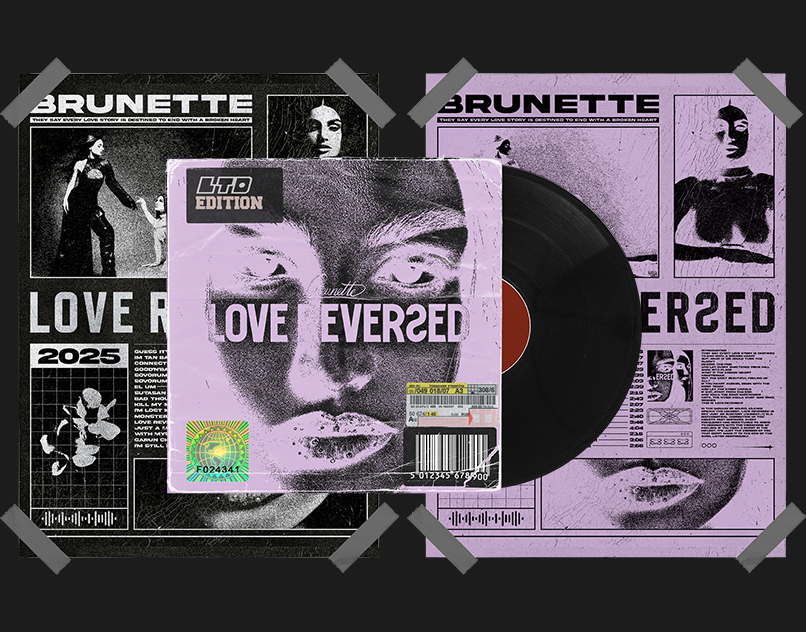
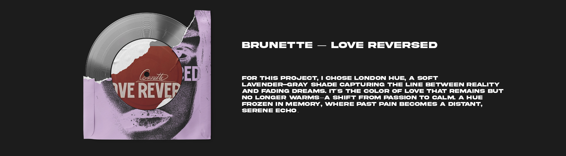
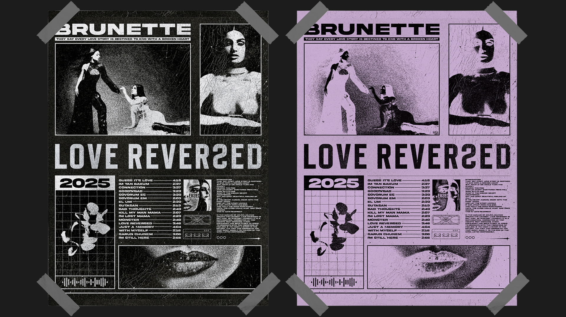
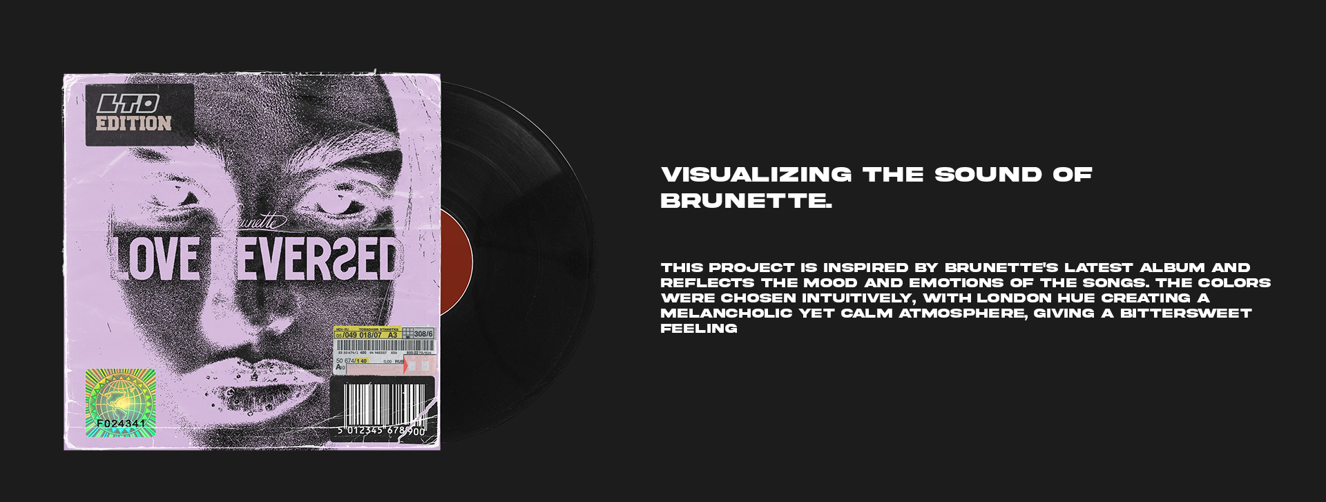
The Philosophy of ‘London Hue’ The color palette was a pivotal decision in this creative journey. Chosen intuitively, the “London Hue” (a muted, atmospheric lavender) serves as the emotional anchor of the project. While the original album’s aesthetic leans toward deeper, warmer tones like dark burgundy, I opted for this cooler, desaturated shade to represent the “aftermath” of emotion. It creates a melancholic yet calm atmosphere, evoking a bittersweet feeling—much like the fog of a distant memory. This color choice aims to distance the visuals from standard pop aesthetics, pushing them into a more editorial and experimental territory.
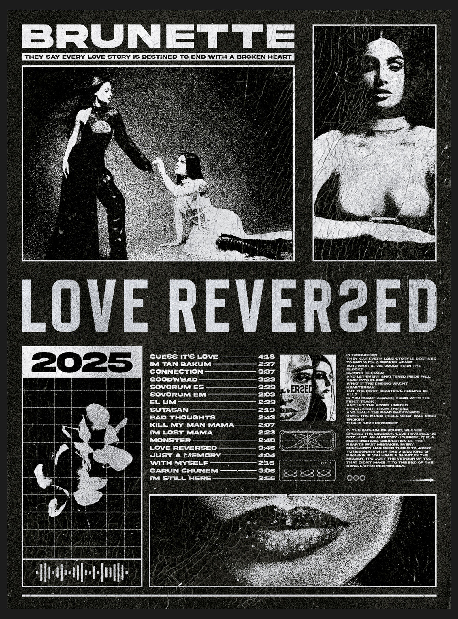
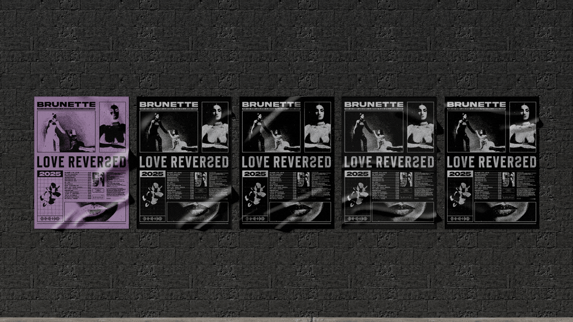
Brutalist Design & Typography The visual language of the project is rooted in Brutalism. I utilized high-contrast grain, distressed textures, and a rigid grid system to contrast with Brunette’s ethereal presence. The typography is bold and unapologetic, featuring a mix of heavy sans-serifs and technical elements like tracklists and barcodes that function as decorative assets. By treating text as a structural element, the design reflects an “industrialized” version of pop culture branding. Every element—from the distorted lip close-ups to the botanical silhouettes—is placed to create a visual rhythm that mimics the album’s pacing.
Packaging & Physical Presence To ground the digital concept, I extended the identity to a physical vinyl format. The vinyl sleeve and label design focus on the “London Hue” and dark-room grain effects, emphasizing the tactile nature of music. The inclusion of a barcode and technical metadata on the front cover is a nod to anti-design principles, where the “functional” is celebrated as “art.” This project bridges the gap between commercial music branding and experimental graphic art, providing a new lens through which to experience the sound of Brunette.

CREDIT
- Agency/Creative: Gevorg Harutyunyan
- Article Title: Love Reversed — Brunette Brutalist Music Branding and Visual Identity by Gevorg Harutyunyan
- Organisation/Entity: Freelance
- Project Type: Identity
- Project Status: Published
- Agency/Creative Country: Armenia
- Agency/Creative City: Yerevan
- Market Region: Global
- Project Deliverables: Graphic Design, Music, Packaging Design, Poster Design
- Industry: Entertainment
- Keywords: Brutalist Design, Music Branding
-
Credits:
Graphic Designer: Gevorg Harutyunyan


