


Online sports brand Wiggle is inspiring consumers to enjoy getting active with a dynamic new identity developed by Manchester creative agency Love.
Already a much-loved retail platform among cycling enthusiasts, Wiggle picked up further momentum when a new wave of fitness fans emerged during lockdown. The brand saw an opportunity to serve a broader multi-sport audience by expanding its offering and celebrating the less serious, more social side of exercise – the joy of getting your Wiggle on, however you do it.
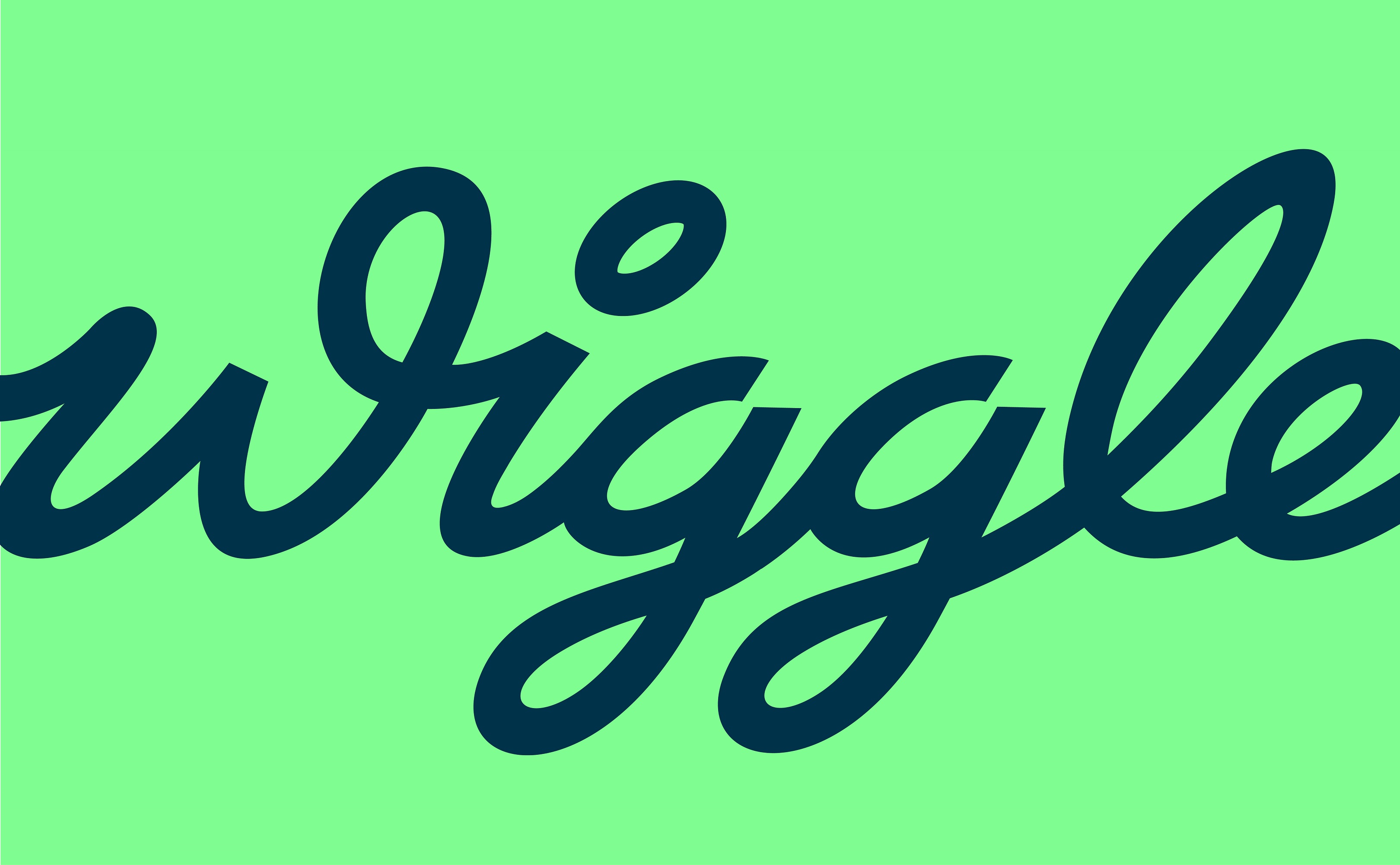
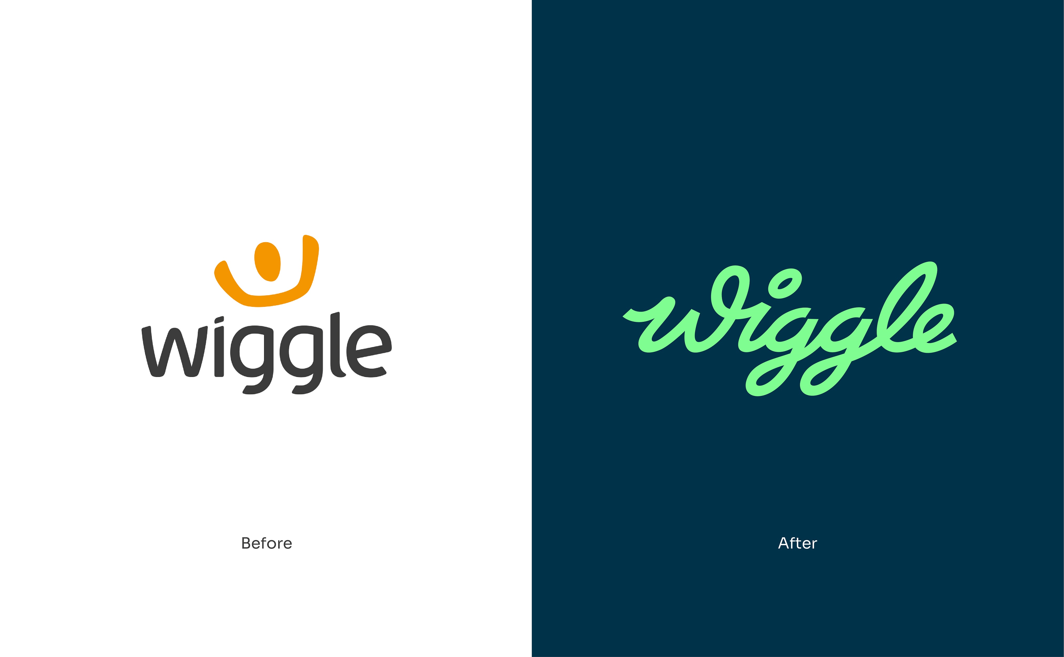
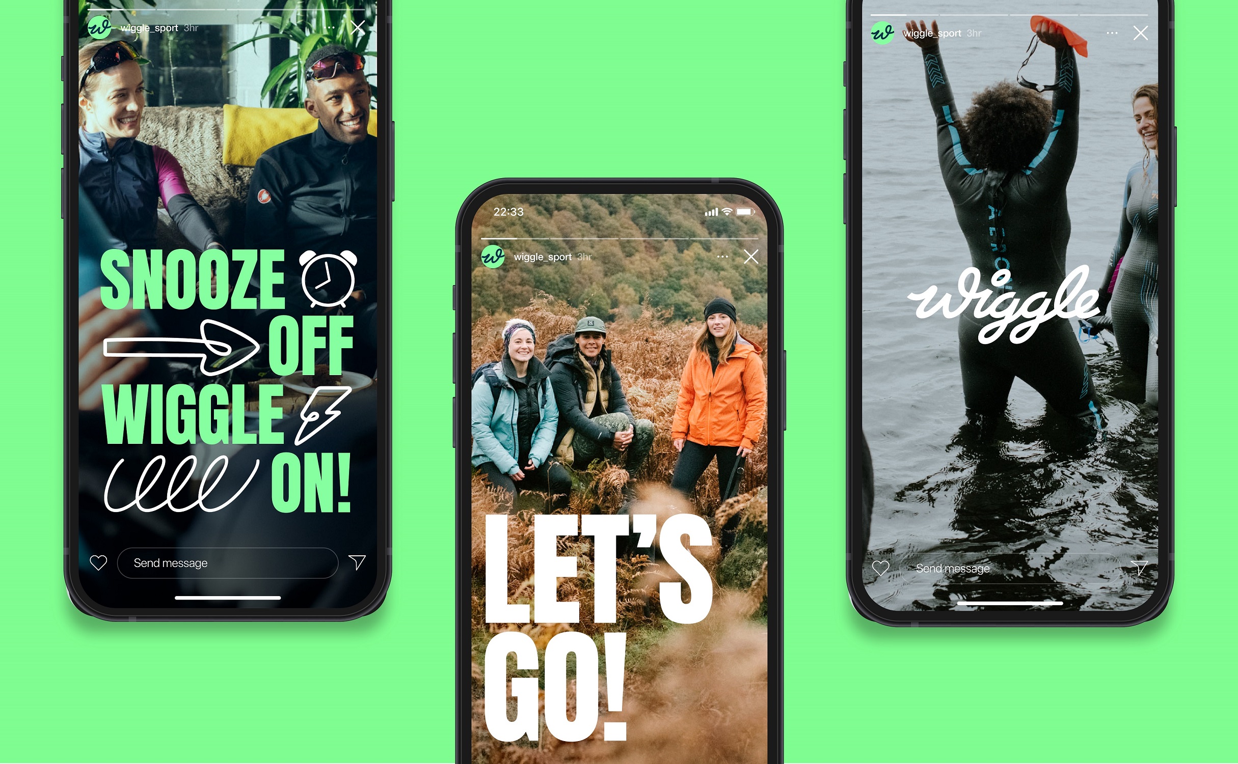
Working closely with Wiggle’s internal brand team and strategic consultancy Eat Big Fish, Love gave the brand a fresh positioning and visual identity that was fully fit for purpose. A new brand proposition – “always up for it” – came first, paving the way for a hand-drawn cursive wordmark inspired by kinetic motion, a vibrant colour palette (check out that digitally optimised Aquamarine) and a positive, playful brand voice equipped to motivate athletes of all abilities.
“Sports retailers often lean into performance-led cues, focusing on the glorious pain and suffering of exercise. With Wiggle, we saw an opportunity to have some fun and give a different perspective,” said Rory Sutherland, creative director at Love.
“Our new brand moves away from a product focus to celebrate the lifestyle around getting active – those moments of community and shared achievement we all love. We wanted to bring some soul and warmth to what is sometimes an ultra-serious category. Let’s go!” added Ed Cracknell, head of brand at Wiggle.
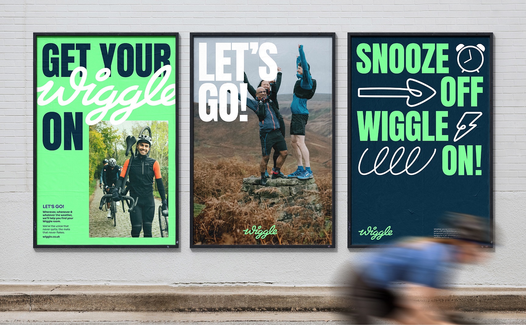
The rollout of new brand assets includes photography produced in collaboration with local running, swimming, and cycling clubs as well as community hiking groups, shot to capture real and relatable exercise moments.
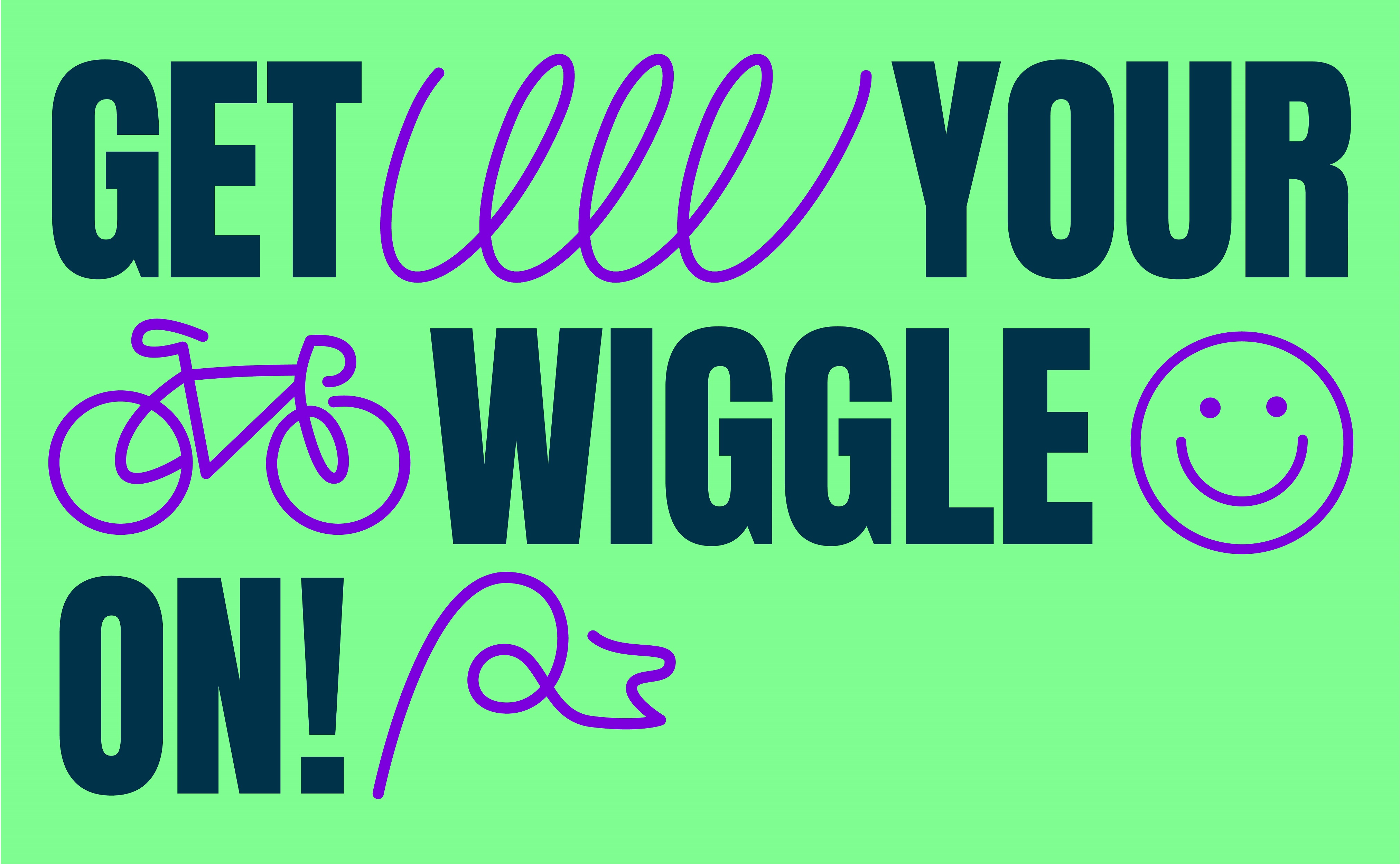
As a primarily online brand, Wiggle needed an identity system that could flex easily across digital platforms. Love created a bespoke suite of icons, ranging from an alarm clock and “power banana” to a coffee cup and well-earned slice of cake, to reflect every aspect of the active lifestyle and give Wiggle’s social channels an even greater energy boost.
CREDIT
- Agency/Creative: Love
- Article Title: Love Gets Moving With Vibrant Brand Identity for Multi-Sport Retailer Wiggle
- Organisation/Entity: Agency
- Project Type: Identity
- Project Status: Non Published
- Agency/Creative Country: United Kingdom
- Agency/Creative City: Manchester
- Market Region: Global
- Project Deliverables: Brand Design, Brand Experience, Brand Identity
- Industry: Retail
- Keywords: Sport, Retail, Identity
-
Credits:
Creative Director: Rory Sutherland


