


Lotus is a cosmetics brand with products focused on black skin for people who want to know more about skin care and its important factors that need to be followed on a daily basis to maintain skin health. Products with rich nutrients that take care of our melanin.
Lotus comes from the name Lótus (lotus flower) but without the accent to keep the idea that you are you and you don’t need to prove or feel that something is missing.
Because Lotus without an accent is still pronounced Lotus and continues to carry its meaning, so all you have to do is see yourself and know that you are you and you are unique. Be your love, be your light, be free and take care of yourself.
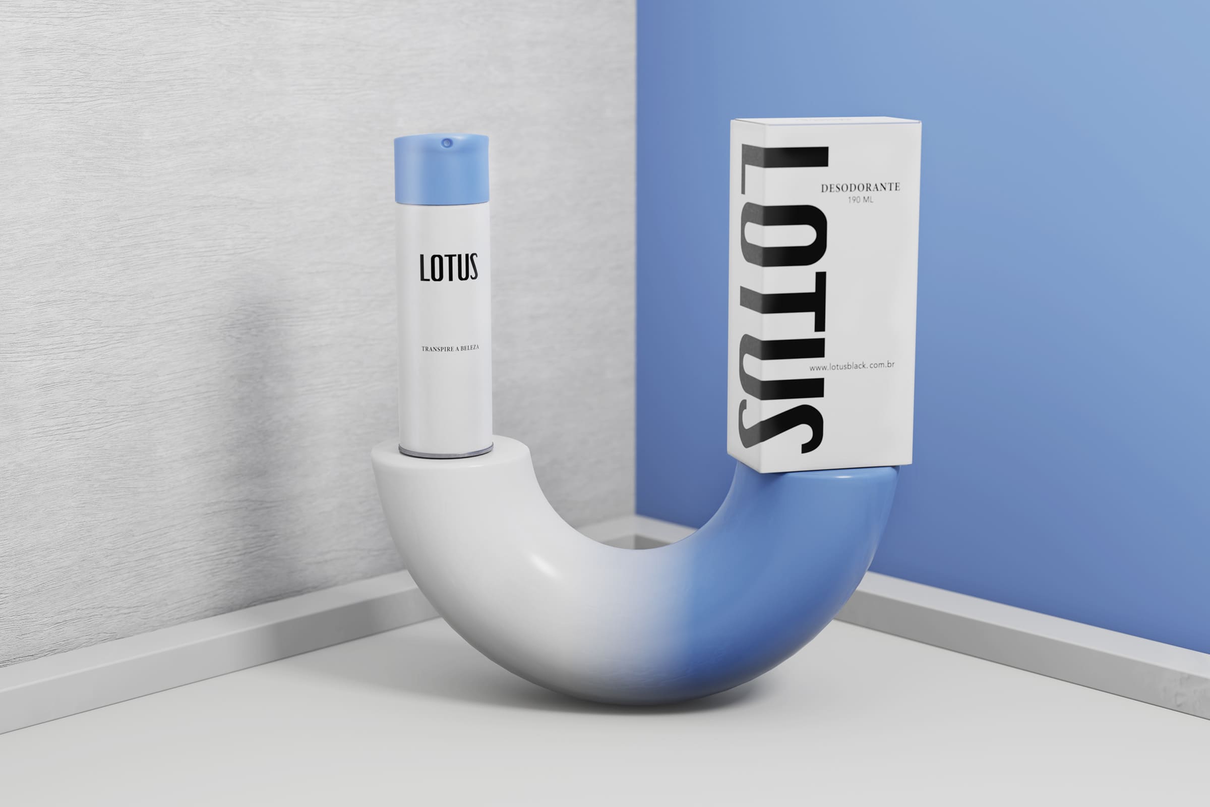
Our challenge was to develop a name, visual identity, positioning and packaging line for 3 products; Moisturizer, deodorant and soap. All products focused on the care of black skin melanin.
We developed a typography to compose the logo, a strategy that exalts black skin and simplifies the brand and products.
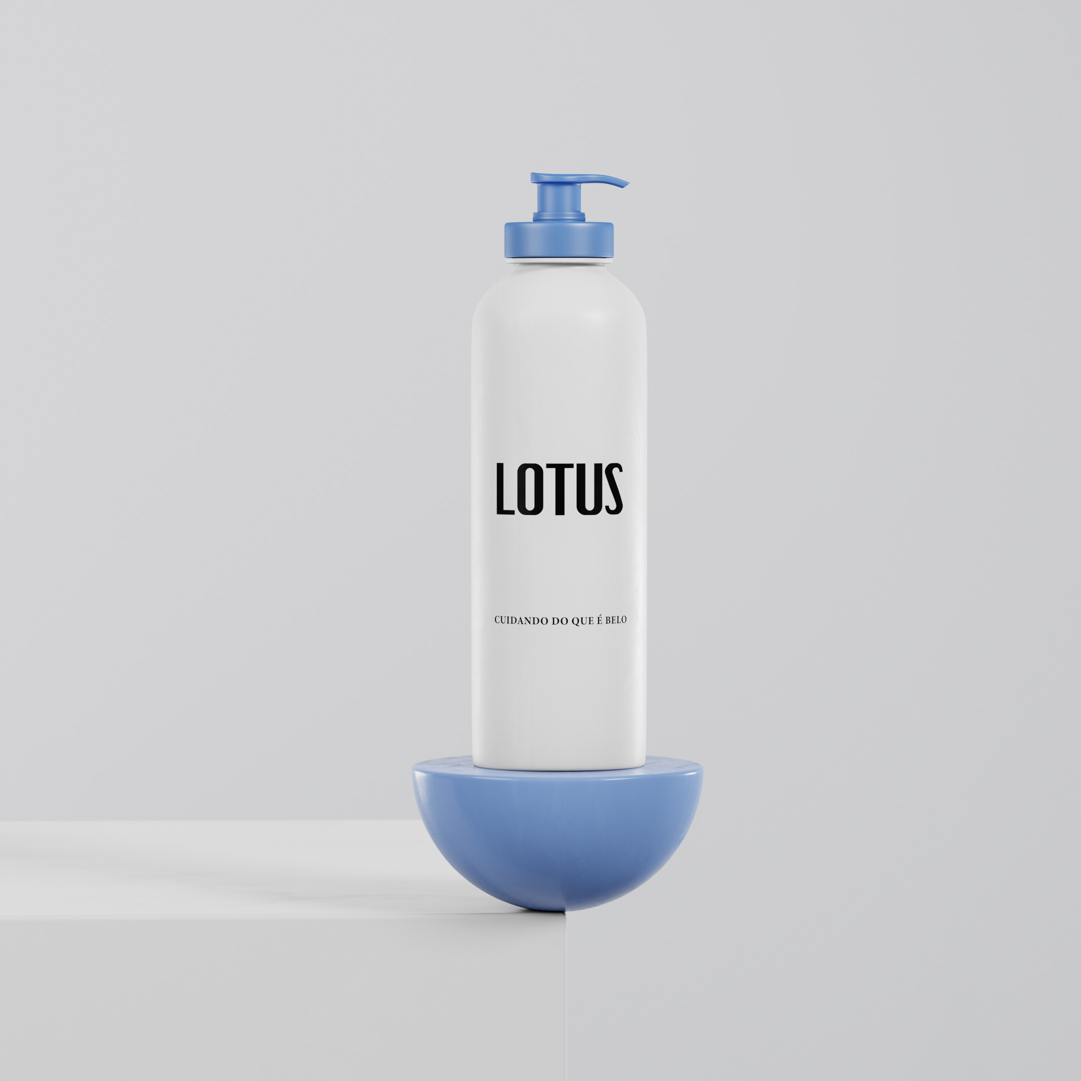
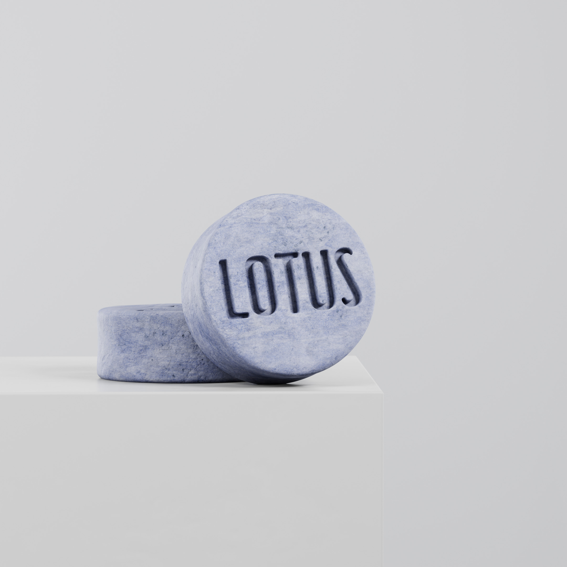
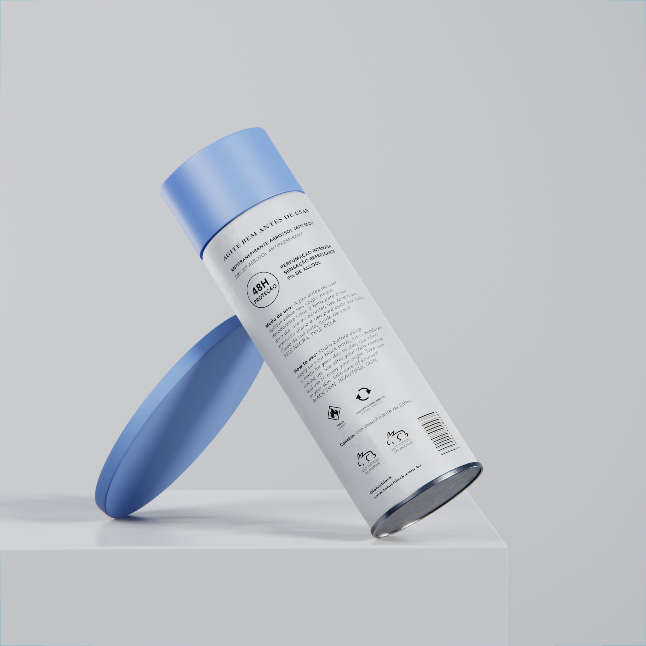
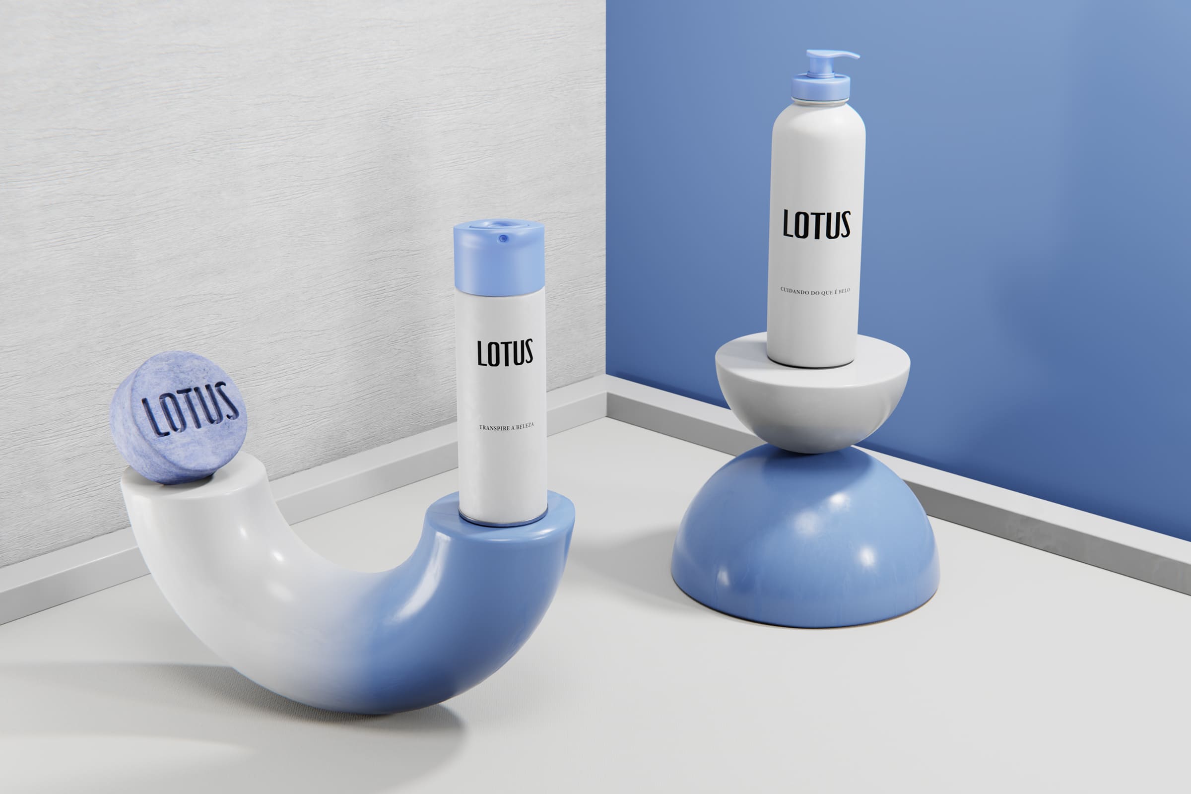
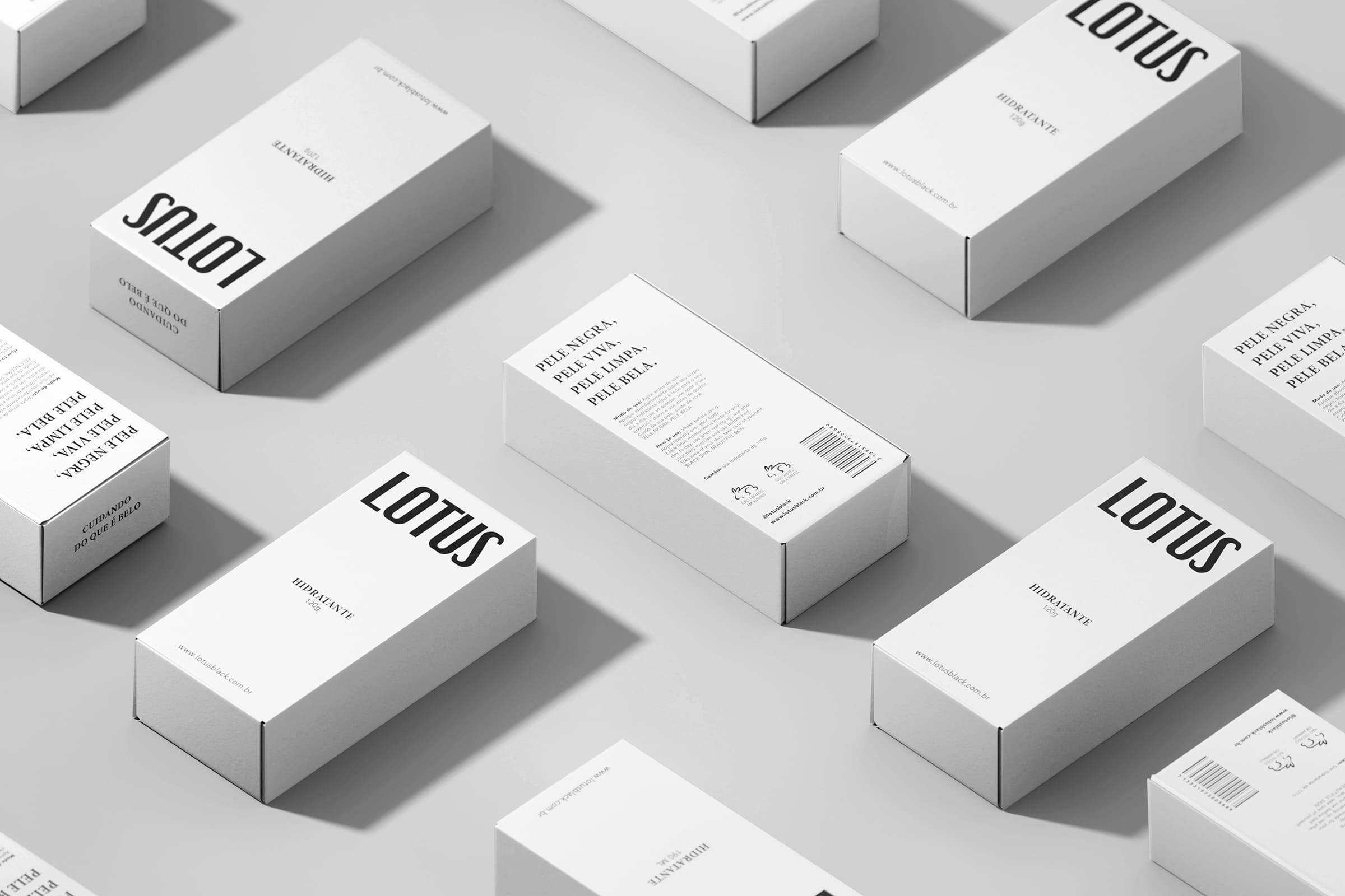
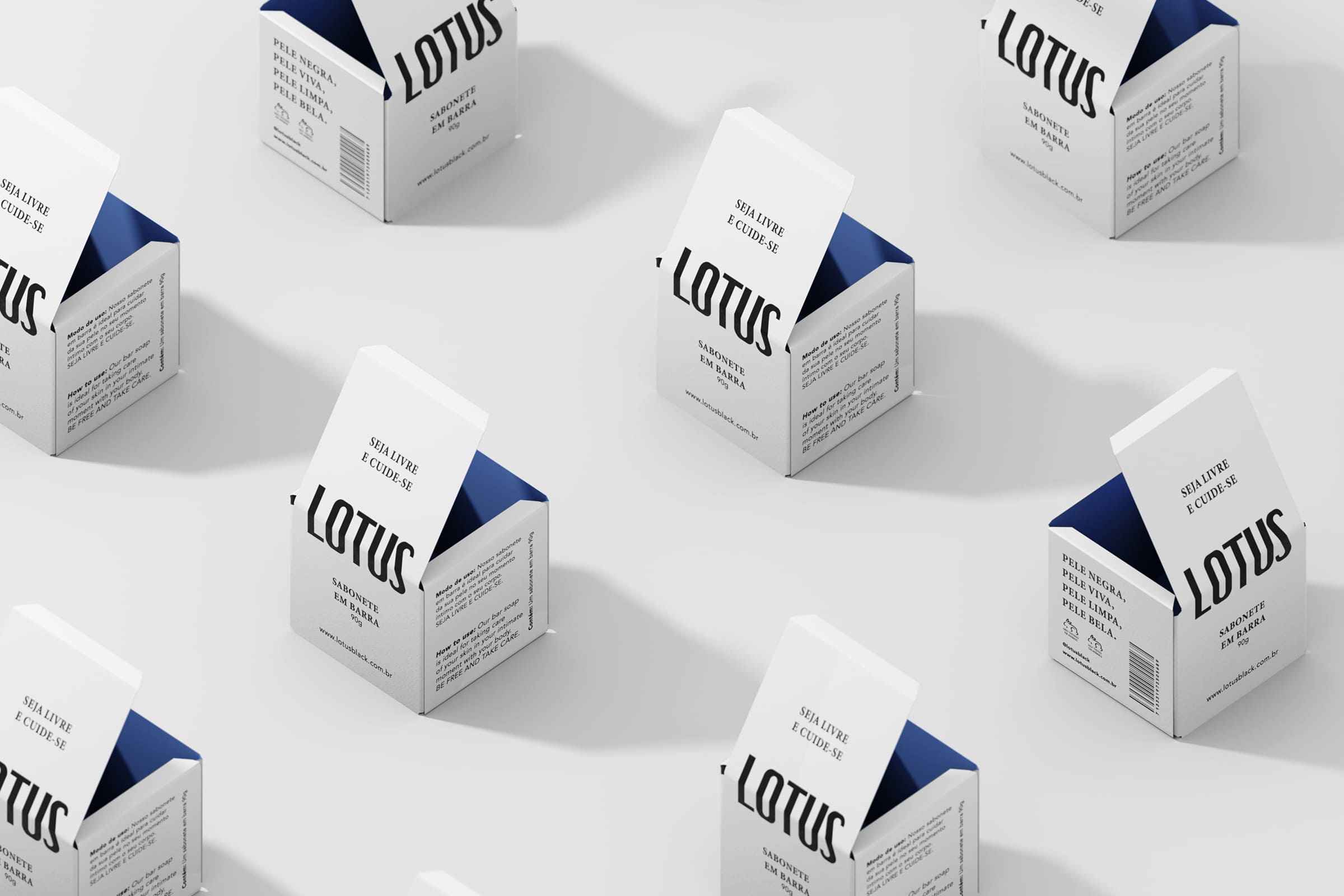
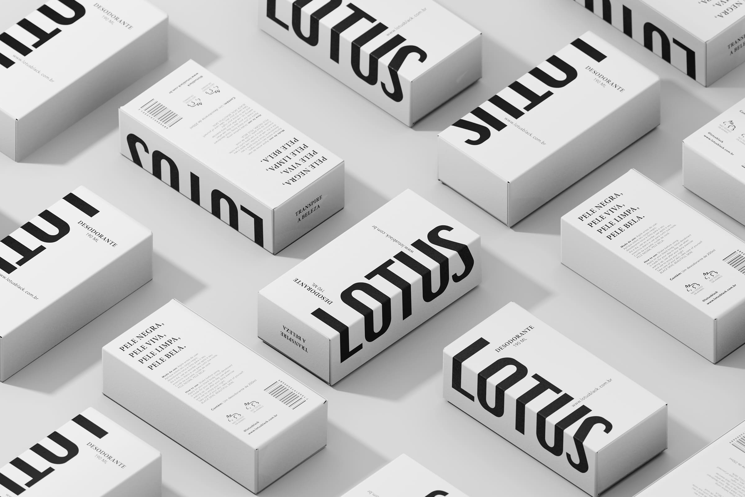
A minimalist, relaxing visual identity focusing on the color palette and supporting typography with a serif style. We value the color palette and clean design for the packaging.
And we signed the packaging with a clean and simple design that highlights the beauty and simplicity of black skin. Each package has its slogan at the top, highlighting the product and its functionality in an abstract way.
We developed the product kit box design that highlights the products, information and their particularities.
CREDIT
- Agency/Creative: Tapa estúdio
- Article Title: Lotus Cosmetics Branding and Packaging Design
- Organisation/Entity: Agency
- Project Type: Packaging
- Project Status: Published
- Agency/Creative Country: Brazil
- Agency/Creative City: Tapa estúdio/Rio de Janeiro
- Market Region: South America
- Project Deliverables: 3D Design, 3D Modelling, 3D Motion, Brand Creation, Brand Identity, Packaging Design
- Format: Tube
- Substrate: Plastic, Pulp Paper
- Industry: Beauty/Cosmetics
- Keywords: Beauty, Cosmetic, Packaging, Branding, Visual identity, Brand
-
Credits:
Criative Director: Hector Henrique
3D Design: Mario Raimundo
Design: Thayná Sprung


