


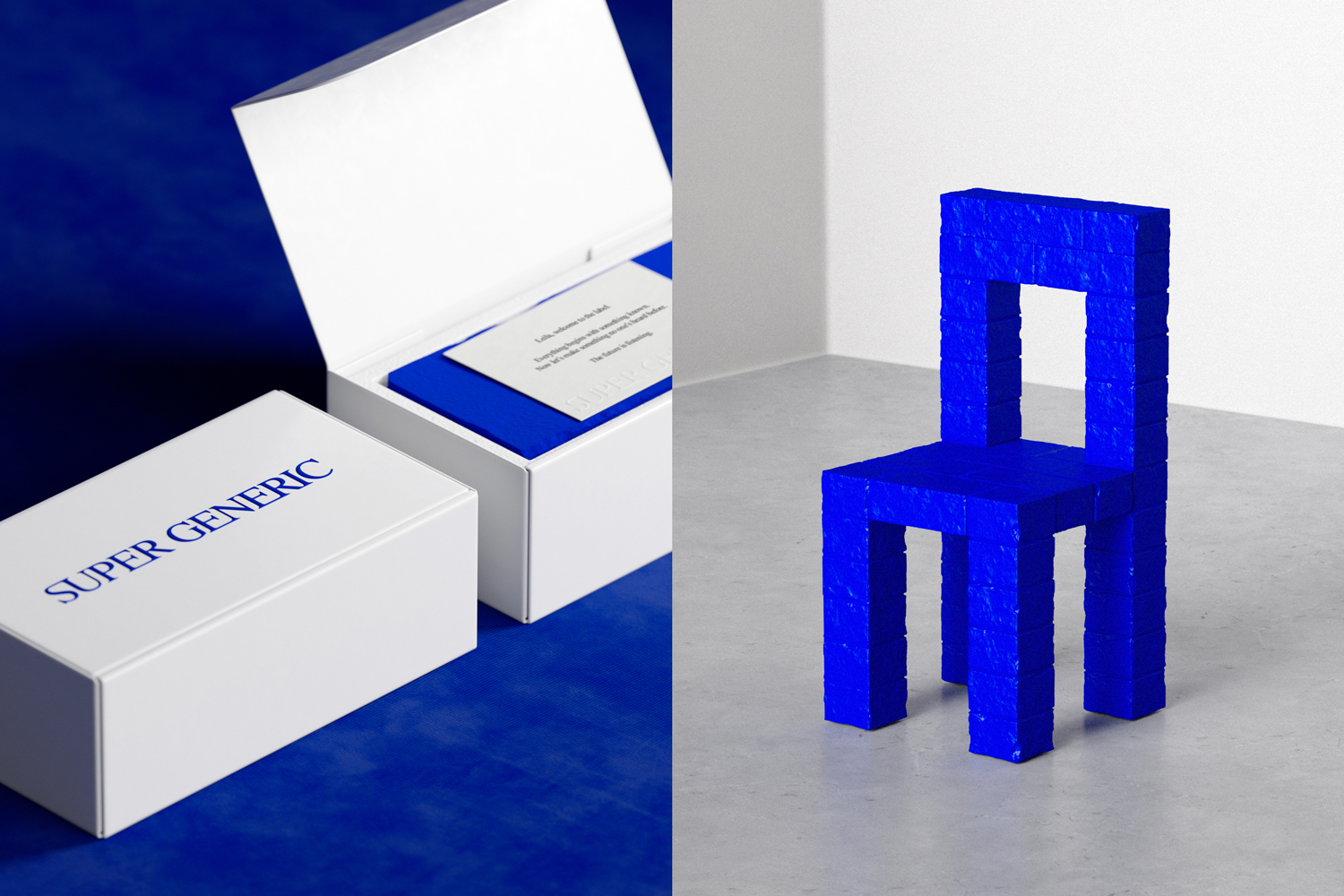
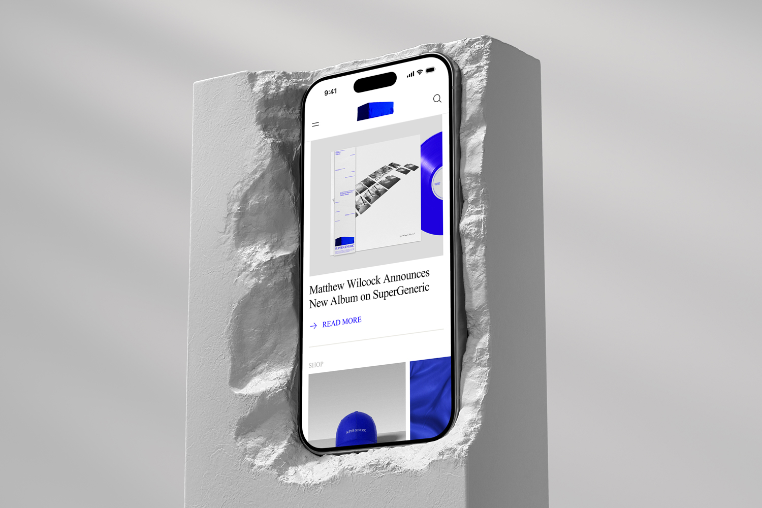
SuperGeneric is a neoclassical record label built to put art and artists first. It sits at the intersection of the classical and the contemporary – championing musicians who blend timeless instrumentation with experimental, electronic, and ambient forms. The label’s sound lives in contrast: natural and artificial, orchestral and synthetic, restrained and expressive. The name became the concept for the identity itself, rooted in a single design principle: make the generic, super. Rather than inventing an elaborate mythology, the work leans into familiarity – default materials, default typographic codes, default cultural objects – then pushes them until they feel charged with meaning. The result is a visual system that bridges past and future, framing the genre as both rooted and radical, serious but not precious.
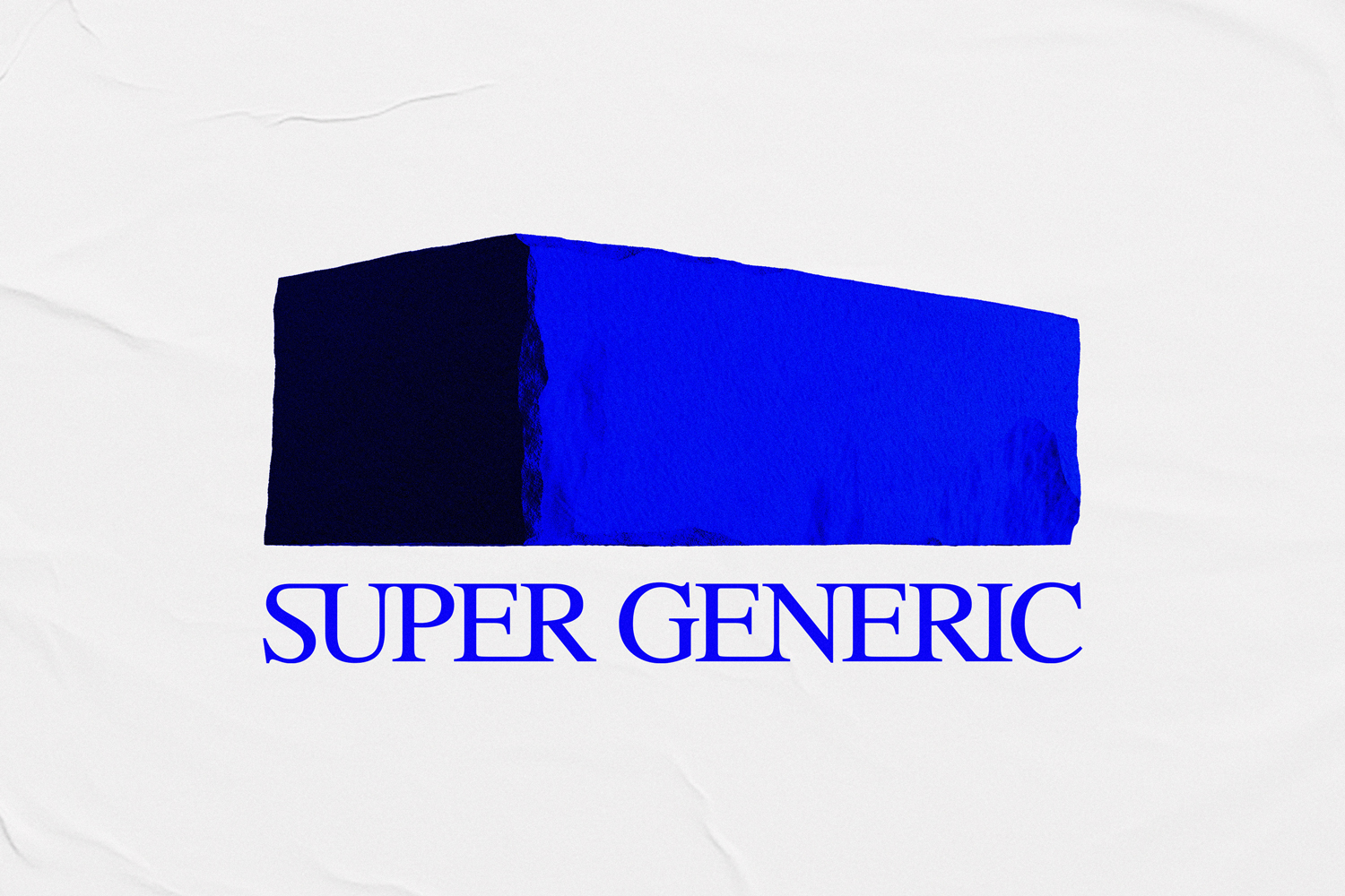
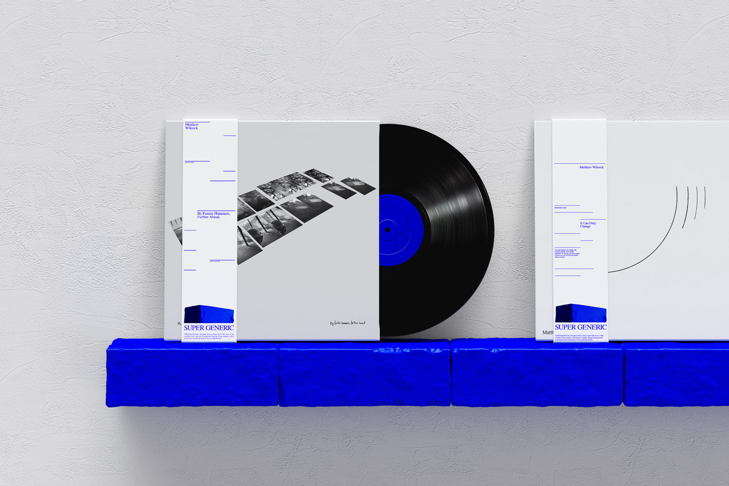
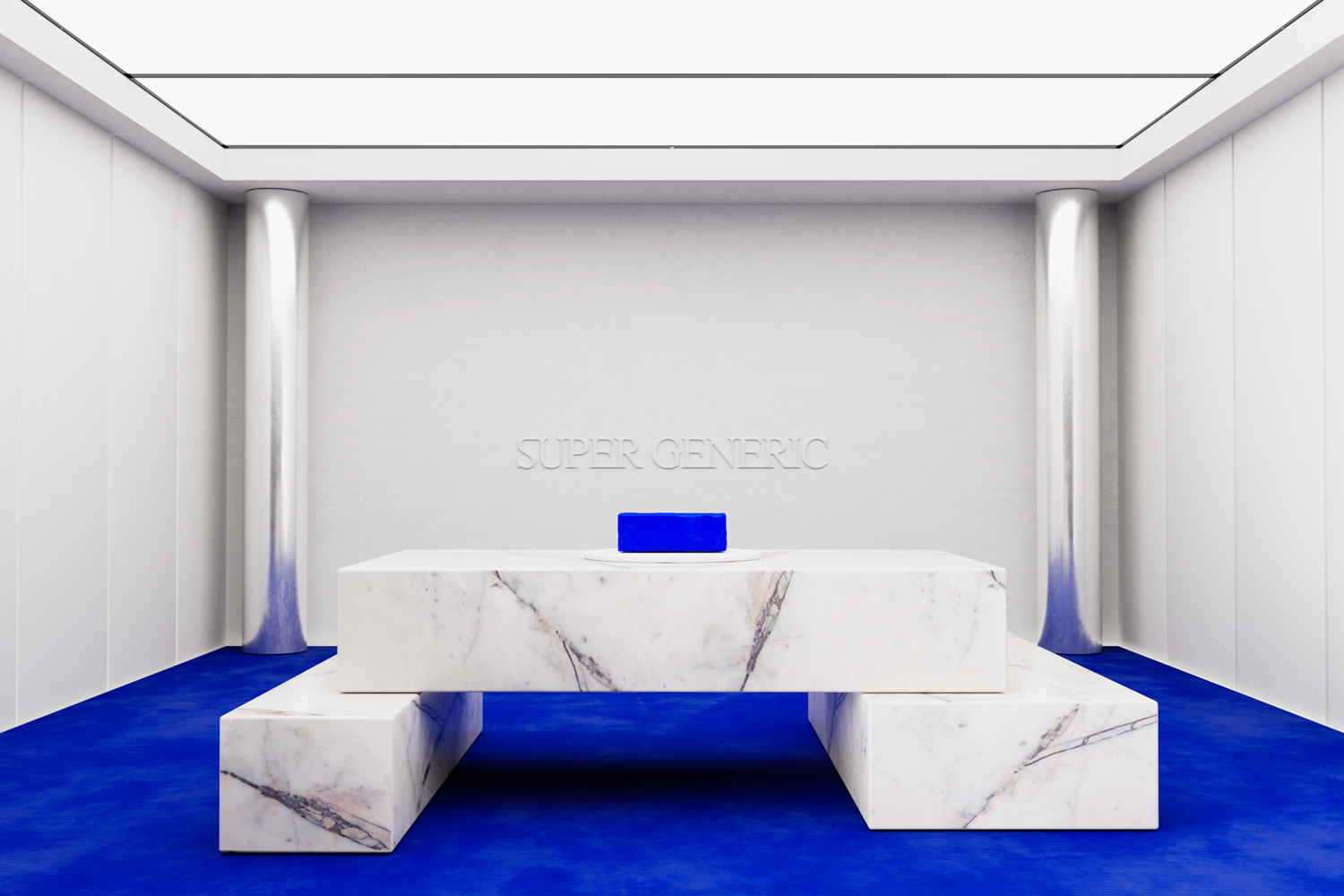
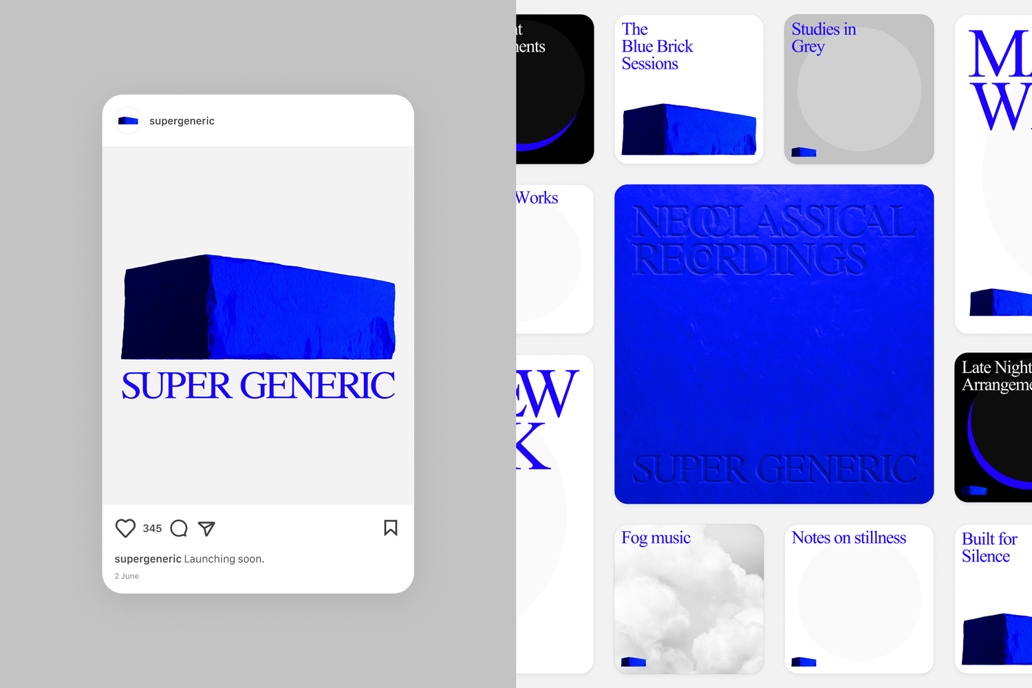
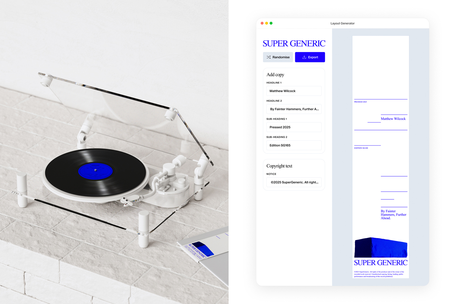
At the heart of the identity is the Blue Brick – a metaphor for elevating the overlooked. A brick is everyday, modular, foundational. By rendering it in a single electric blue, it becomes an object with presence: part artefact, part symbol, part product. It also behaves like the music itself – repeating units that build atmosphere, structure, and emotion over time. The Blue Brick functions as a centrepiece rather than a conventional logo: it can’t be flattened, reduced, diluted, or “made scalable” without losing the point. It exists as a colour image or an object, and that ruthless consistency protects the idea across every touchpoint.
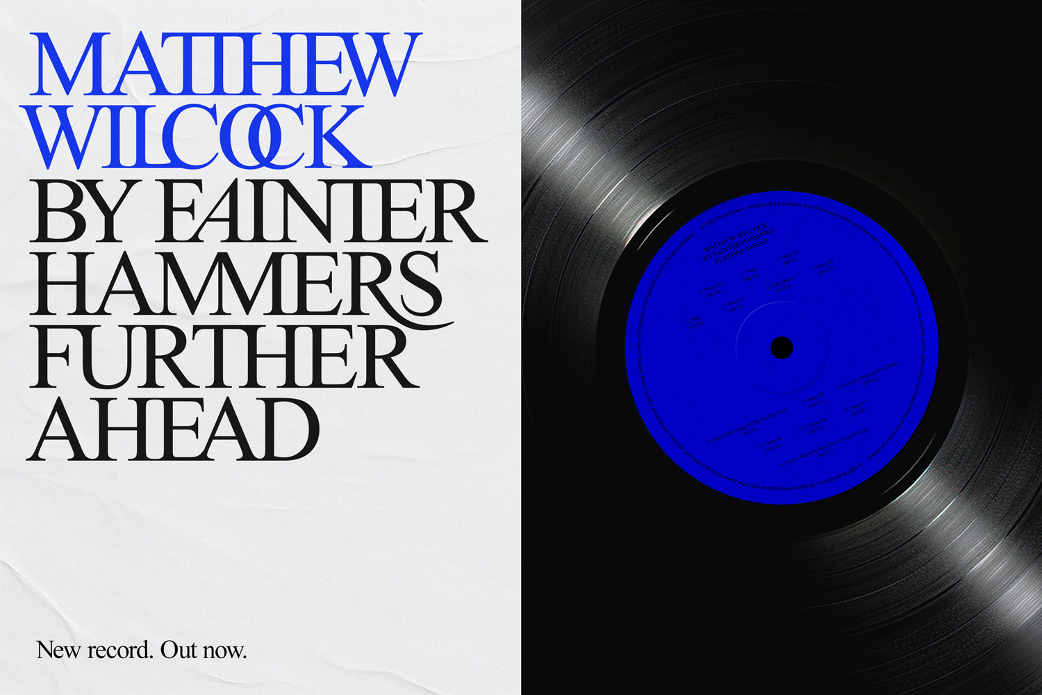
The colour palette follows the same tension. We were drawn to electric blue not only for its intensity, but for its history: for centuries, blue was notoriously difficult to produce. With no easy natural pigments, it became rare, expensive, and symbolic of value and power – hence Royal Blue. Klein’s work in the 1950s shifted that, driven by a mission to find the perfect blue. Today, blue is taken for granted – cheap, digital, available in a tin from B&Q. That contradiction is exactly what interested us: something once precious, now overlooked. In SuperGeneric, electric blue is used as a deliberate disruption – a mark of superness. Applied with restraint, each time it appears is intentional, charged, and expressive. Set against a bright, neutral monochrome palette, it punches through, much like how Klein’s blue behaves in an art gallery.
Typography follows the same logic. Using Times New Roman – one of the world’s most ubiquitous typefaces – the brand elevates the familiar through crafted detail: precisely balanced spacing, exaggerated ligatures, and subtle flourishes. Times carries the weight of classical publishing and institutional culture, but here it’s treated as a living material, tuned and pushed until it feels expressive. From cover art to digital interfaces and social assets, every choice reinforces the same principle: take the default, give it intention, and turn the generic into something worthy of attention.
CREDIT
- Agency/Creative: Lost Property Studio
- Article Title: Lost Property Studio Defines SuperGeneric With a Neoclassical Record Label Identity
- Organisation/Entity: Agency
- Project Type: Identity
- Project Status: Published
- Agency/Creative Country: United Kingdom
- Agency/Creative City: London
- Market Region: Europe
- Project Deliverables: 3D Design, Brand Creation, Brand Design, Brand Mark, Brand World, Branding, Creative Direction, Typography
- Industry: Entertainment
- Keywords: Record Label, Blue, Yves Klein Blue, Avant garde, Identity, Music, Classical, Electronic
-
Credits:
Creative Director / Designer: Steffan Cummins
Client / Composer: Matthew Wilcock


