France makes superb whisky, yet on French shelves international names still dominate. Les Bienheureux asked Lonsdale to reset that dynamic for Lefort: amplify impact in mass retail (GMS) and extend the range with two new SKUs. Our mission was clear: make the brand more powerful on shelf and turn origin into a competitive advantage.
Shopper insight.
In GMS, decisions are fast and visibility is scarce. Shoppers scan vertically and pick up on simple cues: brand first, provenance second, easy navigation third. Our design strategy flows directly from that behavior.
Brand-first architecture.
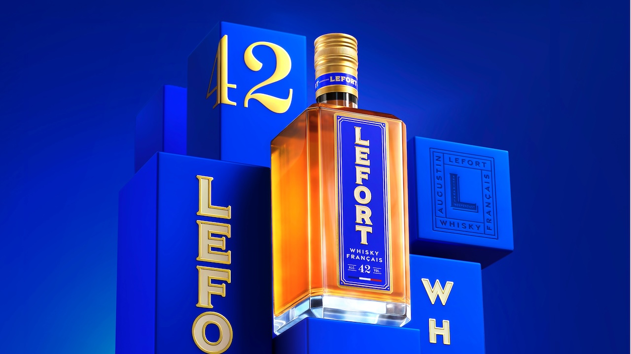
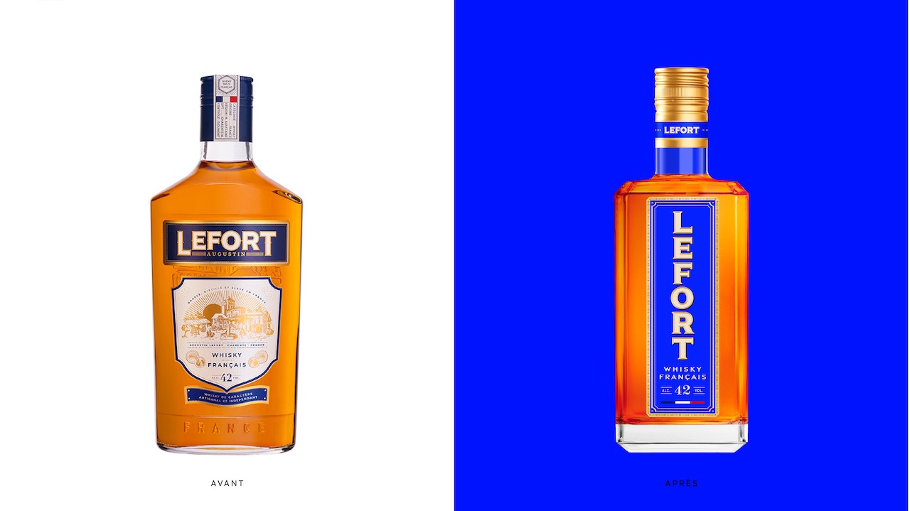
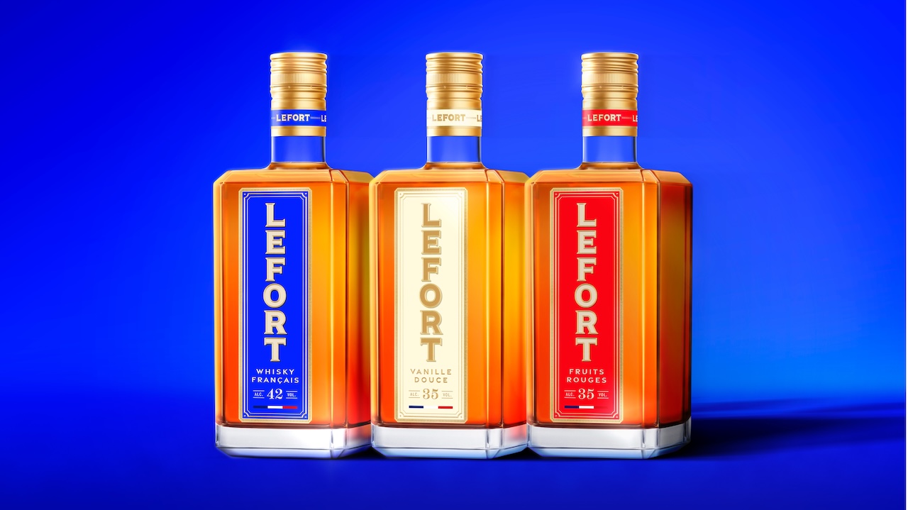
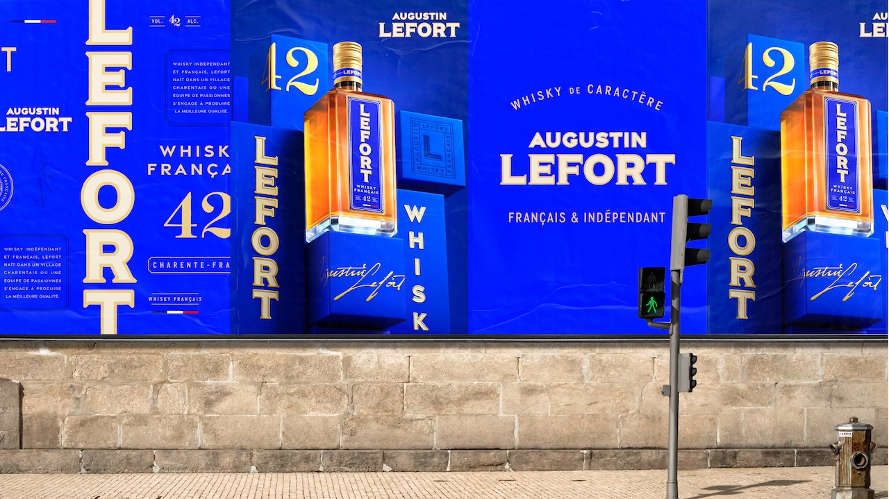
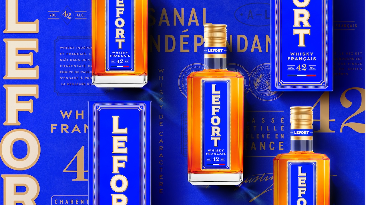
We let the brand speak first, literally. Lefort now claims the label vertically, a confident signature that reads from distance and aligns with quick-scan realities. This isn’t a graphic flourish; it’s a wayfinding device that turns the name into a beacon and solves the core challenge of standing out where attention is hard-won.
Rooted in French heritage.
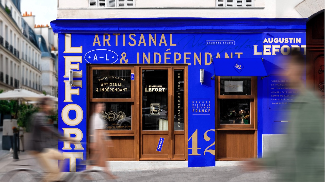
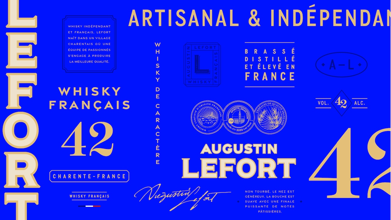
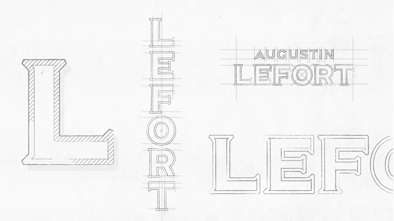
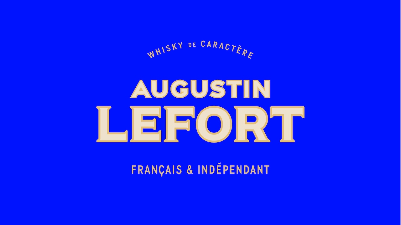
We anchored the brand in its provenance, drawing from historical French shopfront signage and display lettering to craft a typographic voice that feels authentic yet modern. The label stretches the brand across the full surface, disciplined in hierarchy and immediately legible at speed.
3D form that signals quality.
Form follows strategy in three dimensions. We evolved the glass to a classic carafe silhouette, a clear whisky cue that reinforces stature without slipping into pastiche. On pack, finishes and architecture are upgraded to be “premium where it counts”: brand leads, origin signals are unmistakable, and navigation stays clean for shoppers on the move.
A portfolio built to claim the aisle.
With two additional references, Lefort forms a tricolor block (blue, white, red) that broadcasts French provenance at a glance and consolidates shelf real estate through confident repetition. In a category crowded with loud codes, the system wins by being unmistakably Lefort and unmistakably French.
It was an end-to-end project spanning glass volume creation, logotype and packaging evolution, primary and secondary packaging, 3D visuals, range roll-outs, aligning brand story, industrial design, and retail performance. Lefort’s provenance becomes presence, and a presence that converts to power on shelf, meeting both brand ambition and consumer need in the moments that matter.
CREDIT
- Agency/Creative: Lonsdale
- Article Title: Lonsdale Refreshes Lefort Whisky for Mass Retail with a Brand-First Look
- Organisation/Entity: Agency
- Project Type: Packaging
- Project Status: Published
- Agency/Creative Country: France
- Agency/Creative City: Paris
- Market Region: Europe
- Project Deliverables: Brand Design, Branding, Design, Logo Design, Packaging Design
- Format: Bottle
- Industry: Food/Beverage
- Keywords: Lonsdale, Design, Branding, Packaging, Lefort, Les Bienheureuse, Brand design, Design, Brand Territory
-
Credits:
Client Director: Maxime Querbes
Project Manager: Antonin Chauvin
Creative Director: David So
Senior Art Director: Paul Tsizaza
Senior Art Director: Camille Brelet
Art Director: Elisabeth de La Bouvrie
Production Director: Maxence de Torcy
3D Illustrator: Cedric Garofalo


