


Canteen9 is a premium children’s nutritional brand. The project began with a client’s concern that his wife can easily and easily
take care of the child’s health without worrying and that the children can enjoy themselves. Founders said that they had the belief that the child was happy only when the mother was happy, and that sincerity toward their wife, a working mother who had to work and take care of the child every day, was the beginning of the brand. Even in a busy daily life, the brand’s concern about the ingredients of what children eat and how much they should feed played a part in the world. So, we wanted to contain that sincerity, and we found modules and identities that are convenient to eat and children can eat on their own. It is also closely related to Canteen9’s naming.
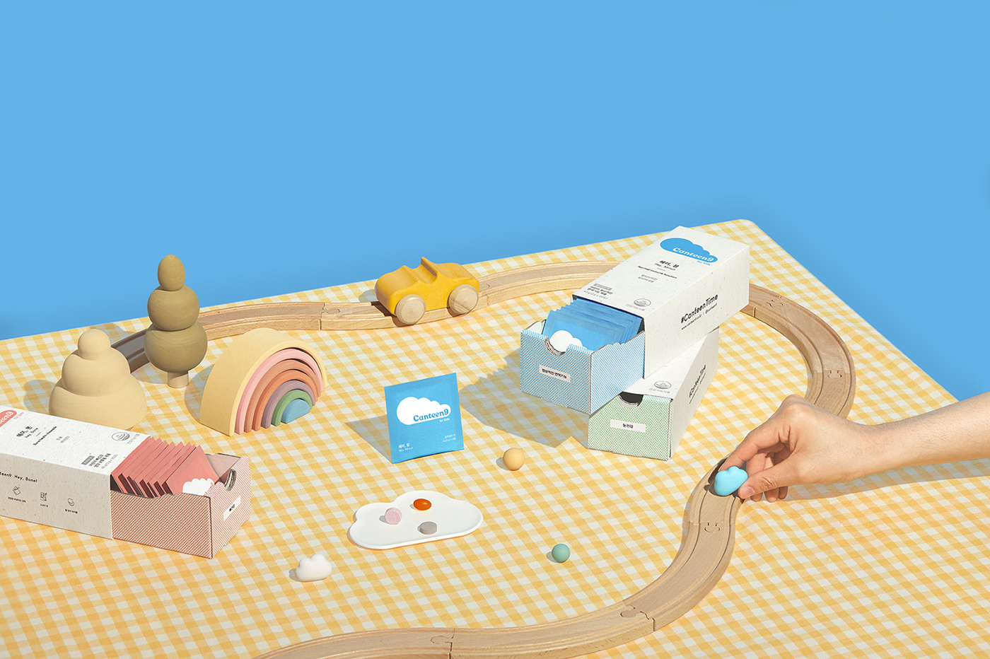
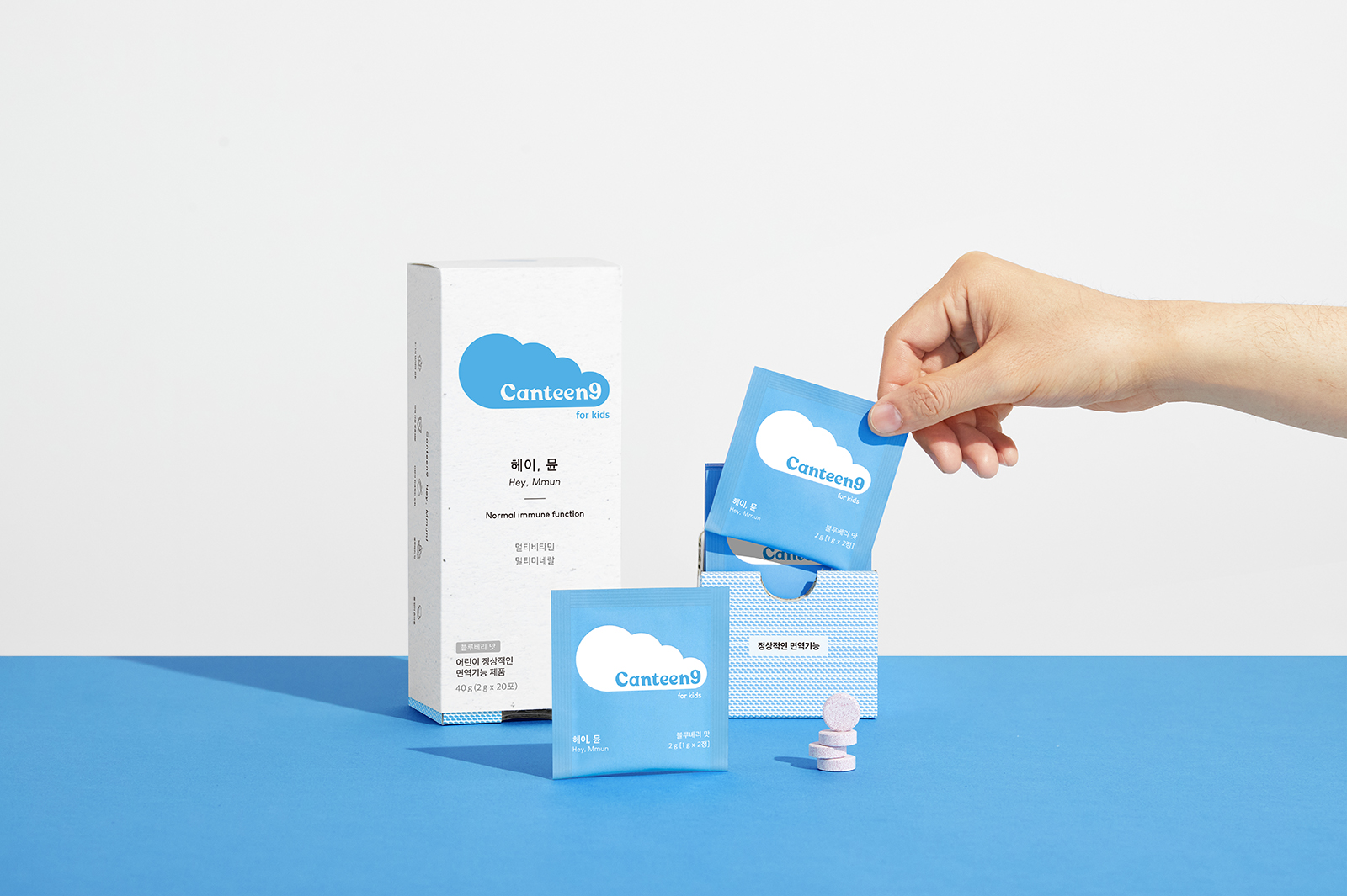
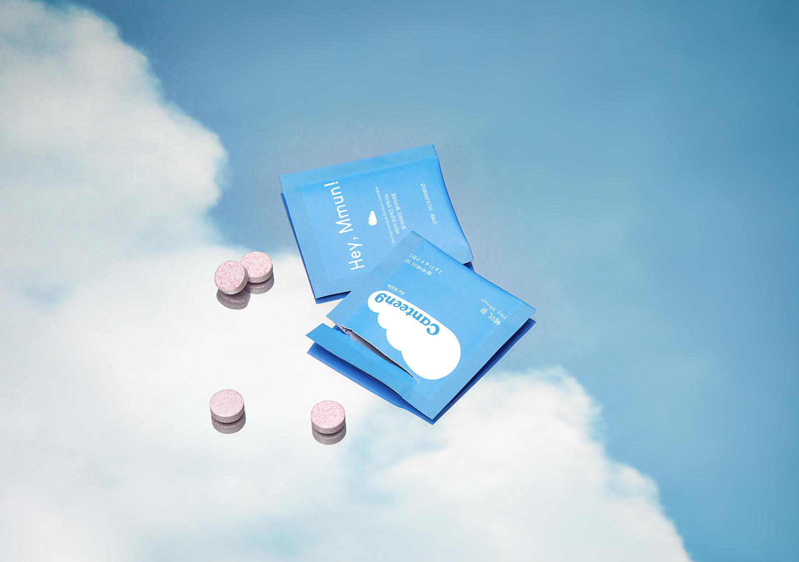
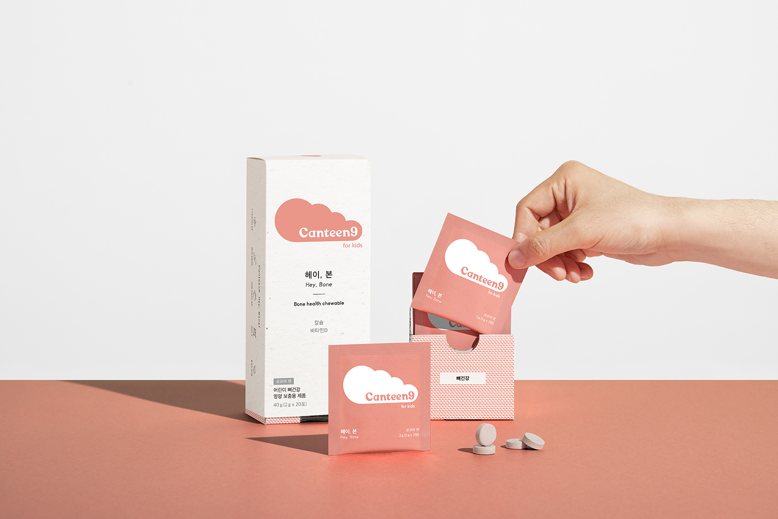
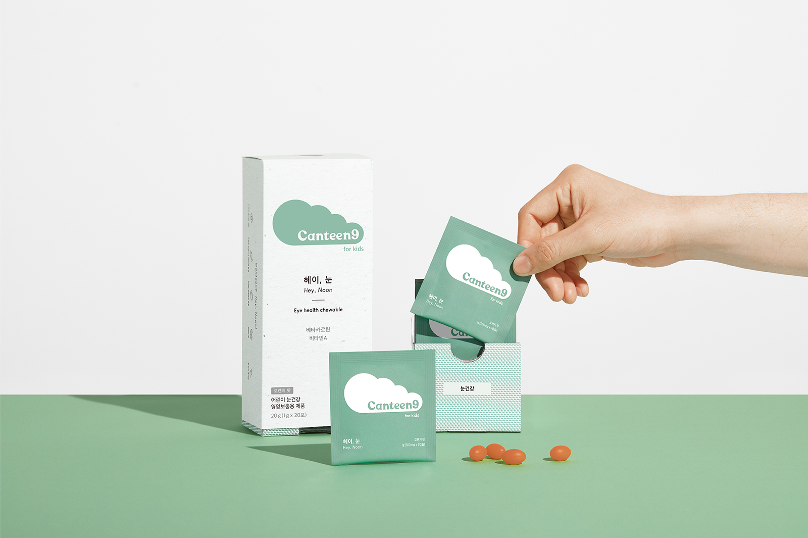
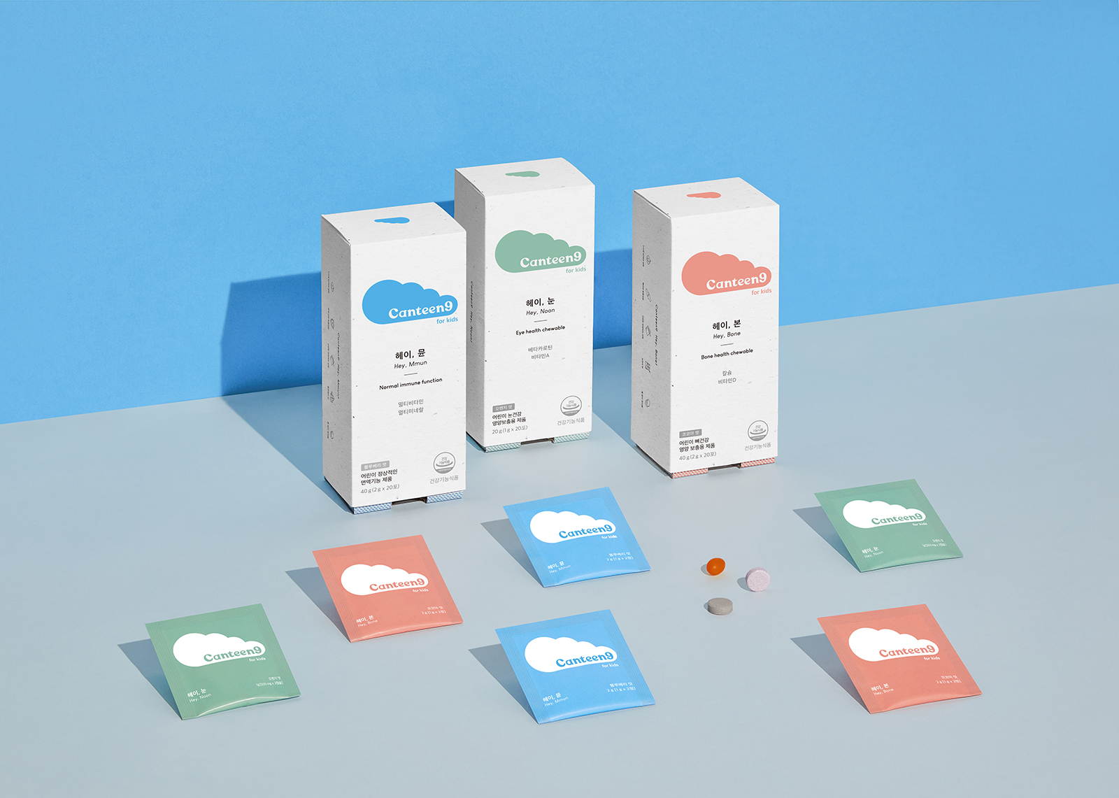
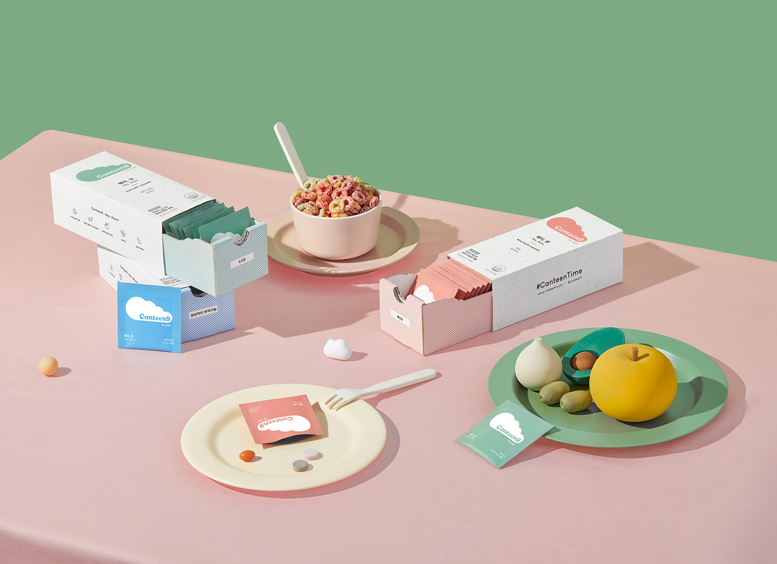
We tried to capture the brand’s value through the symbolic BI of the cloud. When Canteen9 went to the market, the children said they wanted to eat clouds, not medicine. This was a result that we couldn’t predict when designing, but because it was a cloud, the meaning could be conveyed more effectively.
When designing a package, I thought the structure should be different from the existing boxes, like a drawer. The slide structure has become a structure that reflects the current identity of Canteen Nine. In the overall graphic, the brand logo is the first to be seen, and the texture that supports it is the biggest factor. This is because the texture that creates a warm mood is a product that children eat,
so it gives trust to good ingredients and creates a good brand image.
CREDIT
- Agency/Creative: Long&Short
- Article Title: Long&Short Create Canteen9 Premium Children’s Nutritional Branding and Packaging
- Organisation/Entity: Agency
- Project Type: Packaging
- Project Status: Published
- Agency/Creative Country: South Korea
- Agency/Creative City: Seoul
- Market Region: Asia
- Project Deliverables: Brand Design, Packaging Design
- Format: Box, Sachet
- Substrate: Pulp Paper
- Industry: Health Care
- Keywords: Kids, Health, Care
-
Credits:
Creative Director: Moohyung Cho
Designer: Joohyung Yun


