Goal: Development of an identity for Long Fest — a festival dedicated to longboarding. About the festival: The festival will be held in Moscow in the Northern River Station Park. The event will bring together longboarding enthusiasts and professionals from all over the country. The program includes: dance, freestyle and hippie jump competitions, master classes from leading riders and areas for beginners where you can try your hand.
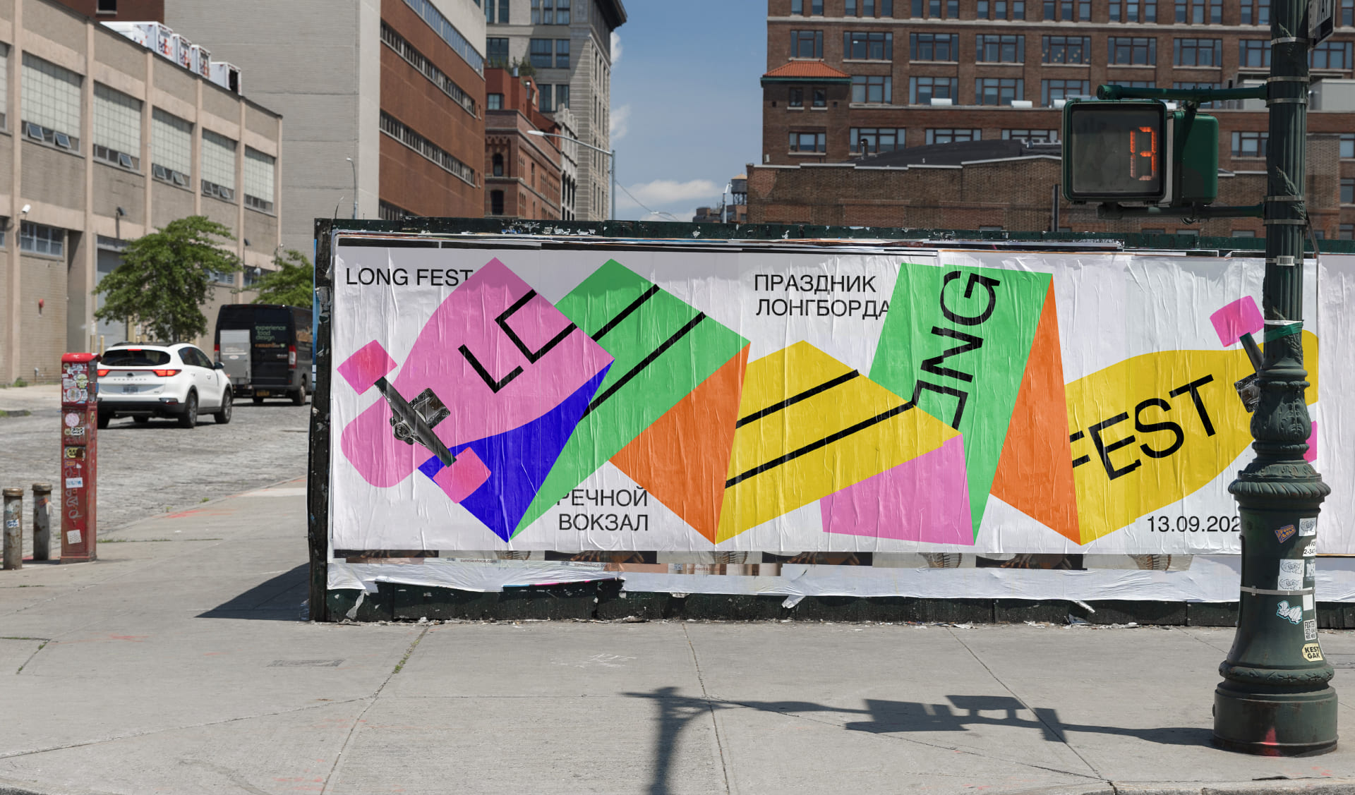
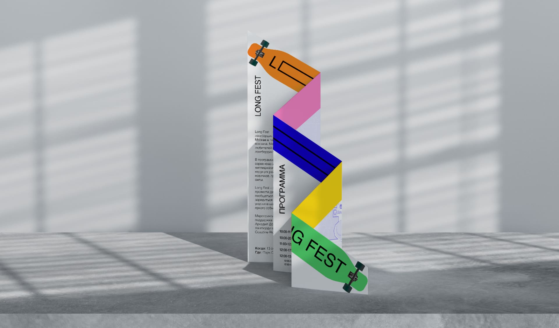
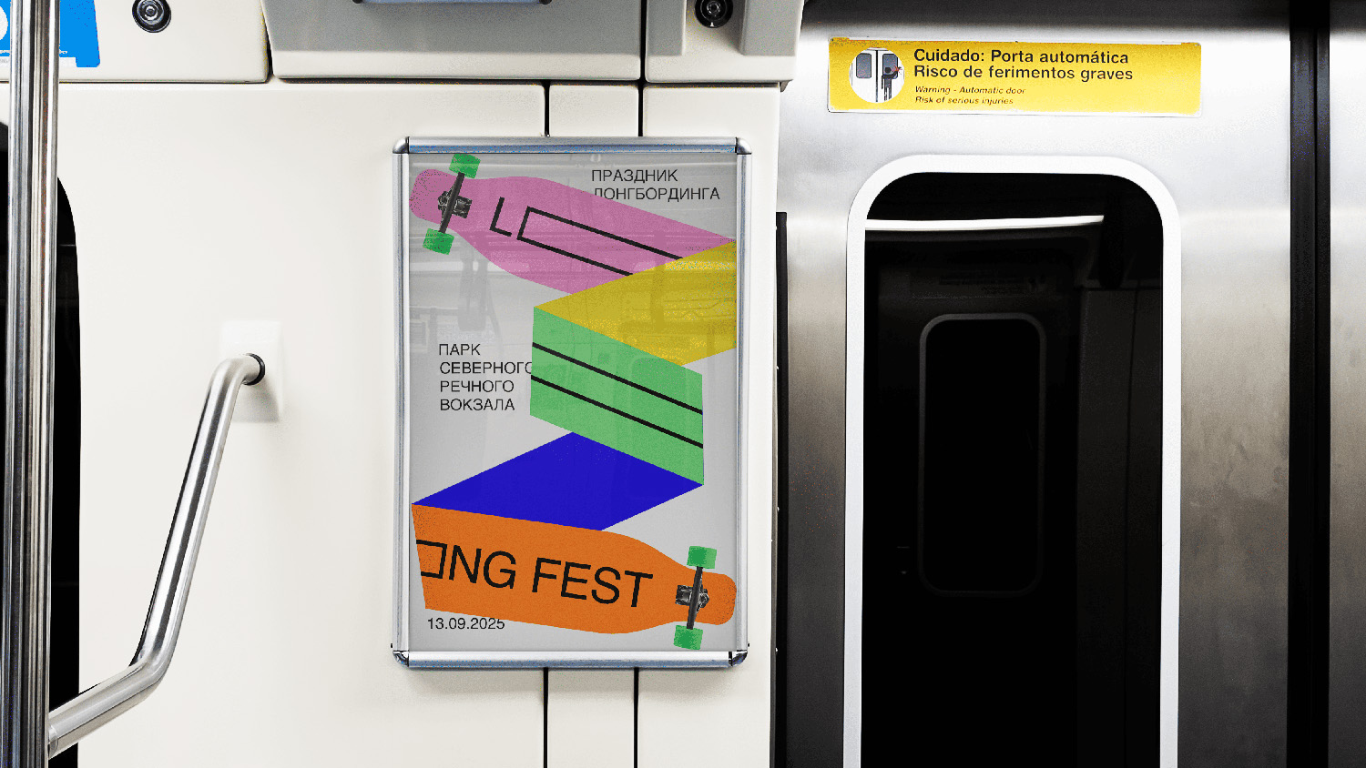
Concept. The main concept is embodied in the logo. The logo is so long that it does not fit into standard formats and begins to fold. This technique visually emphasizes the endless movement, freedom and emancipation associated with longboarding.
Font: The classic grotesque Helvetica was taken as a basis. This balanced font is easy to read and blends well with the geometric shape of the longboard. Colorus. The design uses bright saturated colours. The combination of green, pink, yellow, blue and orange colors gives the design a youthful, modern and festive look.
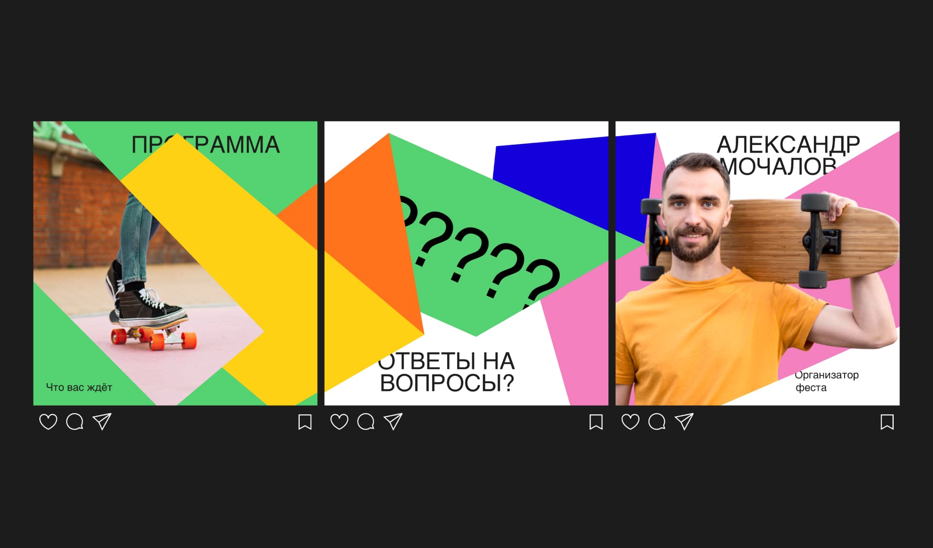
Medium. Due to the fact that the longboard can be folded in any way, the design becomes very flexible and adaptive. The design can be easily adapted to various medium – from banners of different formats to posts on social networks.
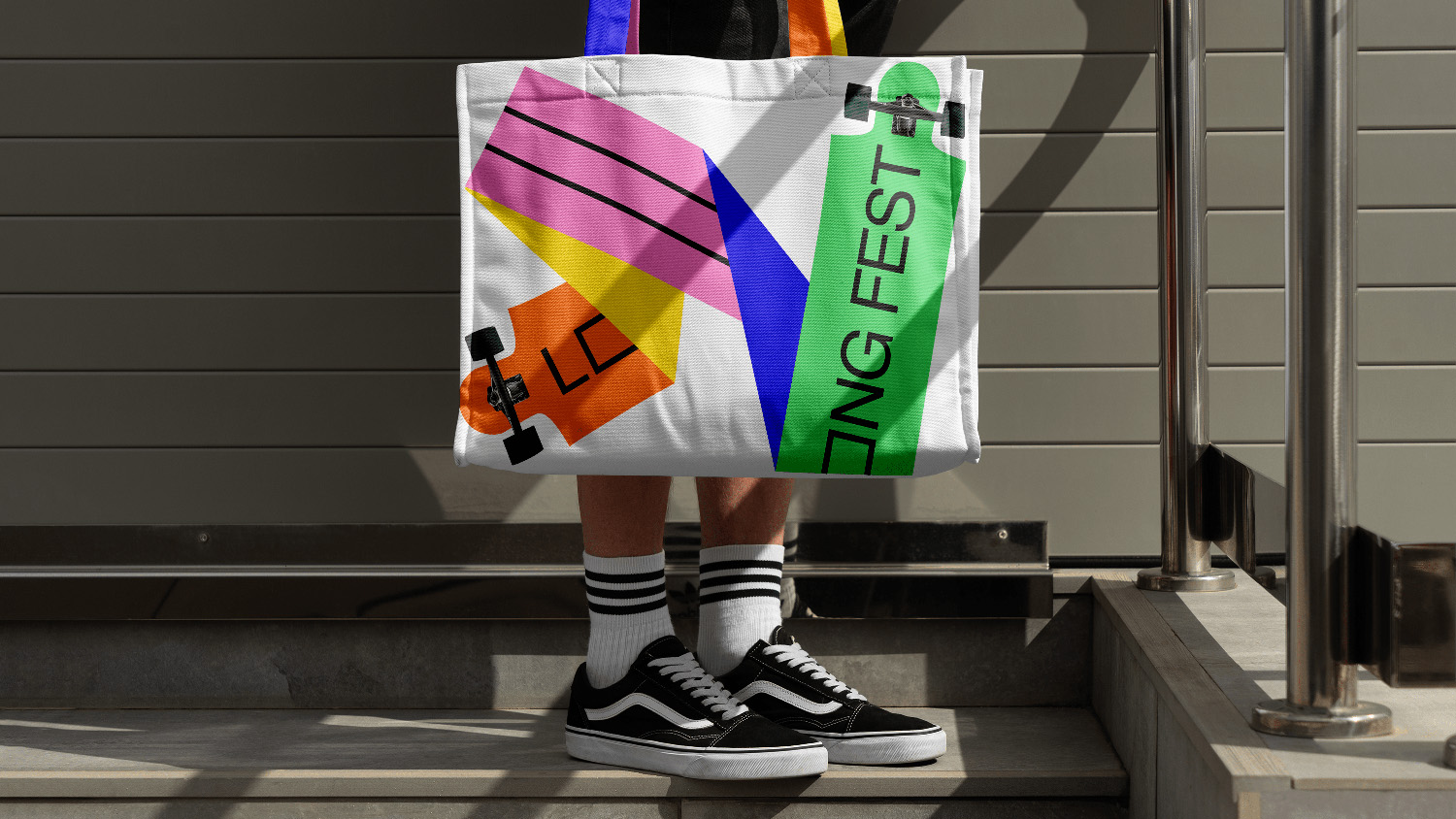
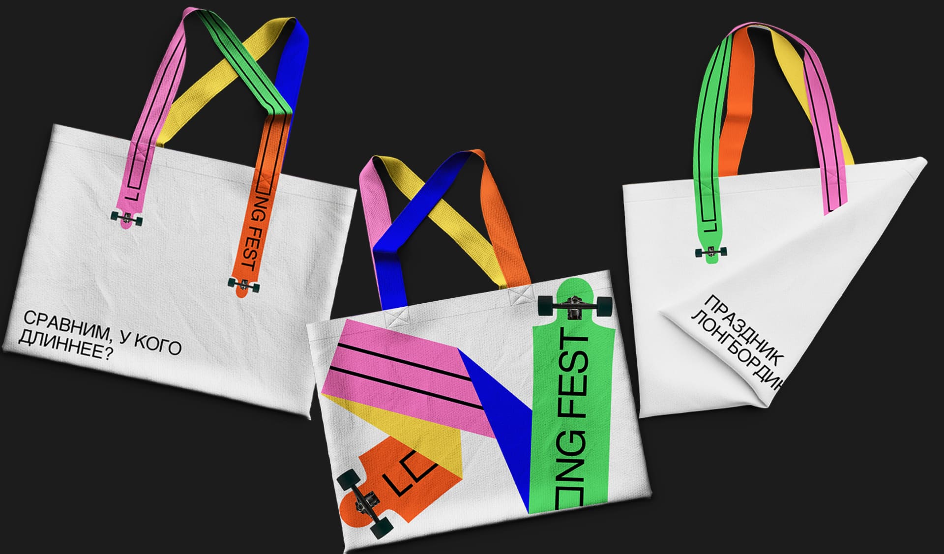
Products. The flexible shape of the longboard fits well on various products: shoppers, T-shirts, etc.
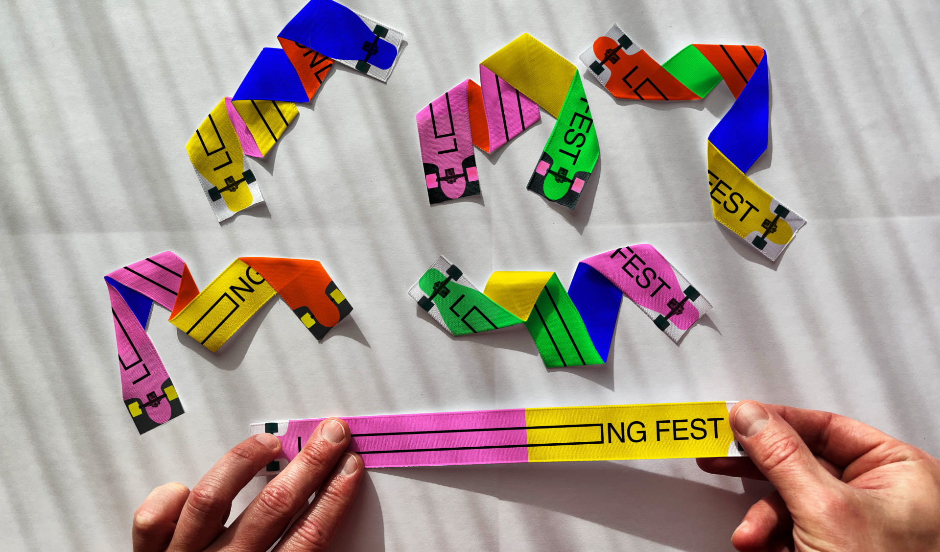
Each participant of the festival will be given ribbons with branded longboards. The ribbons can be easily bent as you like and attached to a T-shirt or bag.
The bright and geometric identity of the festival attracts attention, decorates the city and creates a festive atmosphere.

CREDIT
- Agency/Creative: Nastya Kleyman
- Article Title: Long Fest Playful Brand Identity That Embodies the Spirit of Longboarding
- Organisation/Entity: Student
- Project Type: Identity
- Project Status: Non Published
- Agency/Creative Country: Russia
- Agency/Creative City: Kleyman Anastasia
- Market Region: Europe
- Project Deliverables: 2D Design, Art Direction, Brand Identity, Graphic Design, Typography
- Industry: Entertainment
- Keywords: Art Direction, Brand Identity, Graphic Design, Typography, Longboard, Fest
-
Credits:
Educational Institution: HSE School of Design
Supervisor: Pavel Borisovsky


