
ShopTalk – Chase Vodka
London design studio ShopTalk gives single-estate distiller, Chase, an iconic brand refresh for its potato vodka range, to coincide with its tenth birthday.
Premium British vodka is making a bigger splash than ever in the spirits world, giving Russian and Polish varieties a run for their money.
Chase, a family-run distillery that operates out of its Herefordshire farm, asked ShopTalk to create a brand identity that would bring cohesion to its range of vodkas and make a virtue of its field-to-bottle production values. The new brand and packaging design also needed to celebrate the Britishness of the farm, distillery and vodka and marry nostalgia with modernity.
Rooted in integrity
The Chase family has farmed the Herefordshire landscape for generations. William and James Chase, father and son, are proud of the fact that they grow, distil and bottle their vodka and wanted to communicate that on pack. It was also important that the refresh set Chase vodka apart from mass-produced brands and expressed that it is a high-quality artisanal spirit worthy of its higher price point.
The ten-year anniversary, and the introduction of one bottle for all variants, provided the perfect opportunity for a complete reappraisal of the brand.
James Wood, ShopTalk’s Co-founder and Creative Director, says: “We began our Chase vodka challenge with a research trip to the farm. What became quickly apparent was William and James’s love of quirky British iconography. The premises were laden with vintage enamel signage, as well as rustic wooden potato crates and jute sacks. We knew from that moment we wanted to capture the fact that Chase is a cutting-edge, premium distillery with real provenance and pedigree.”
Message in a bottle
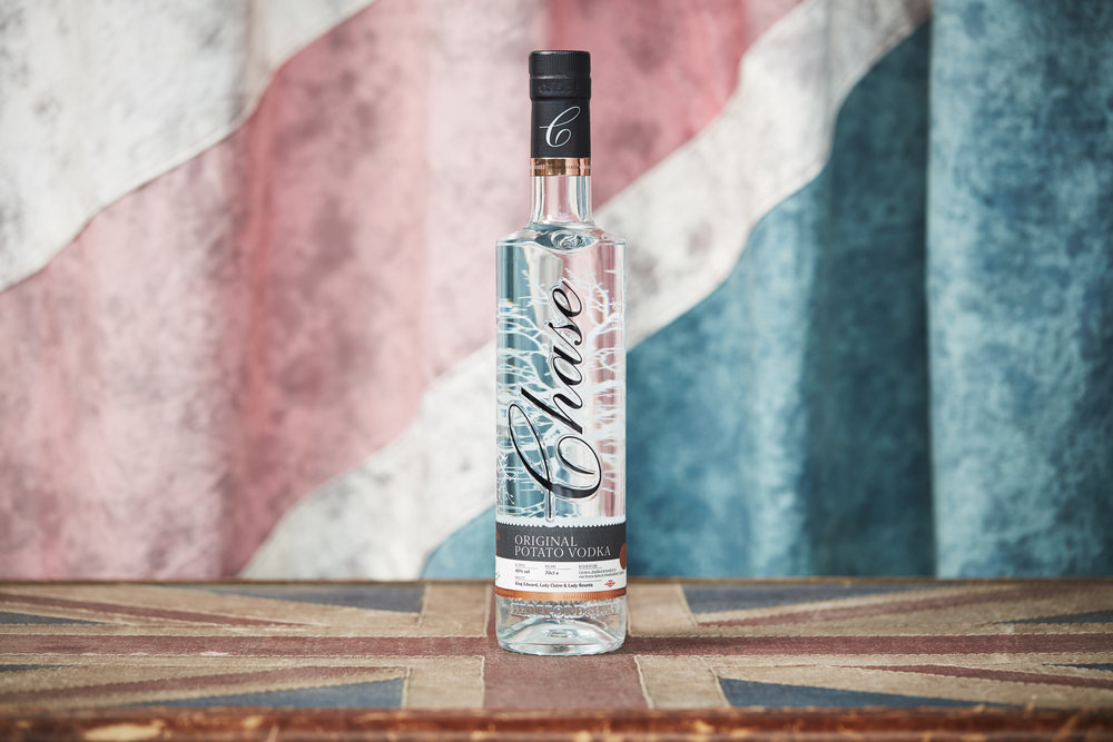
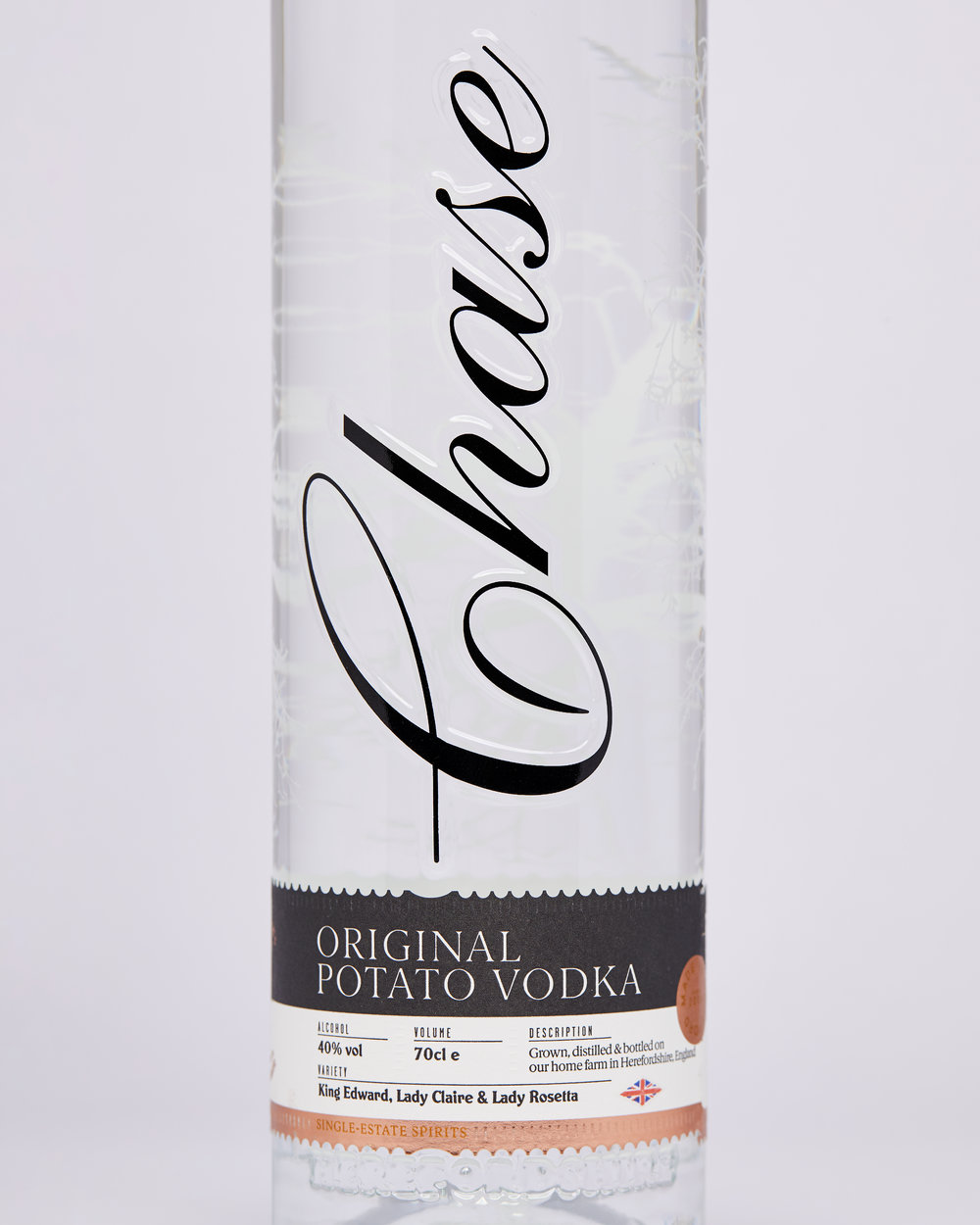
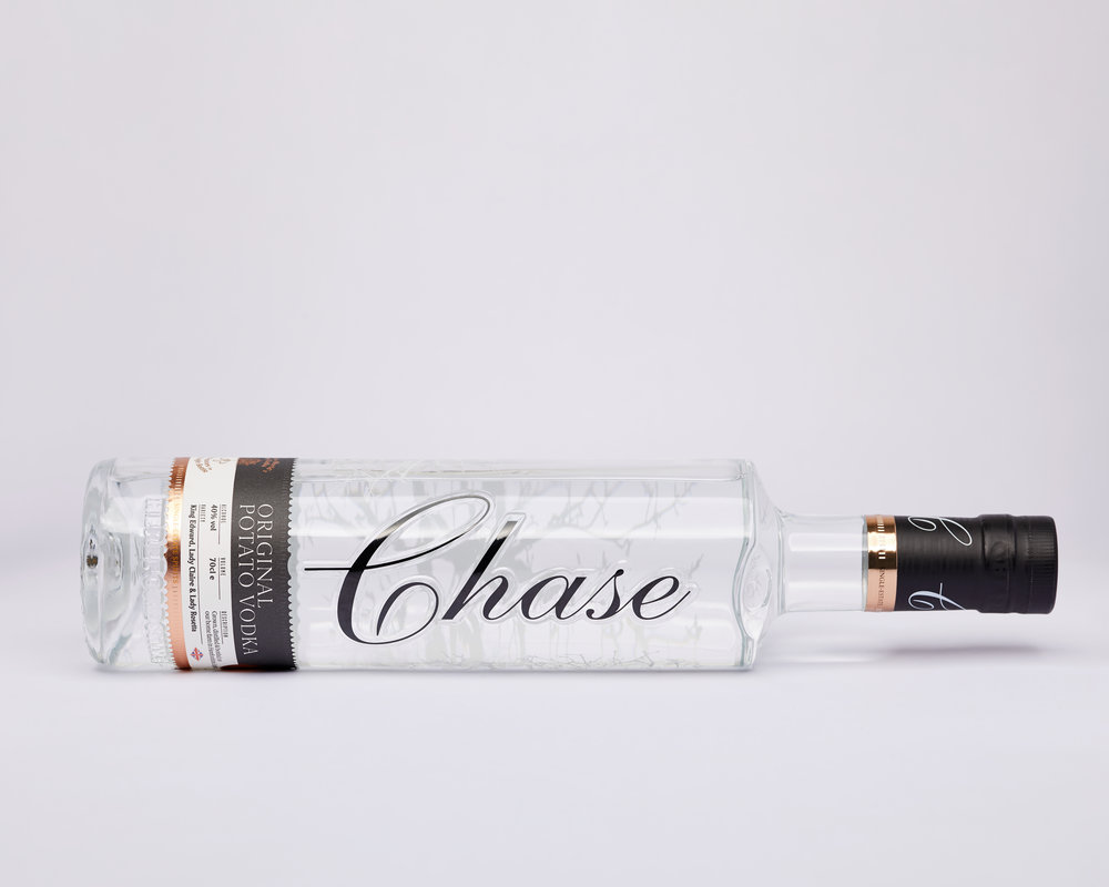
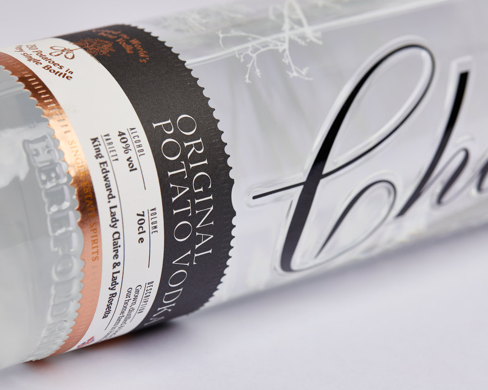
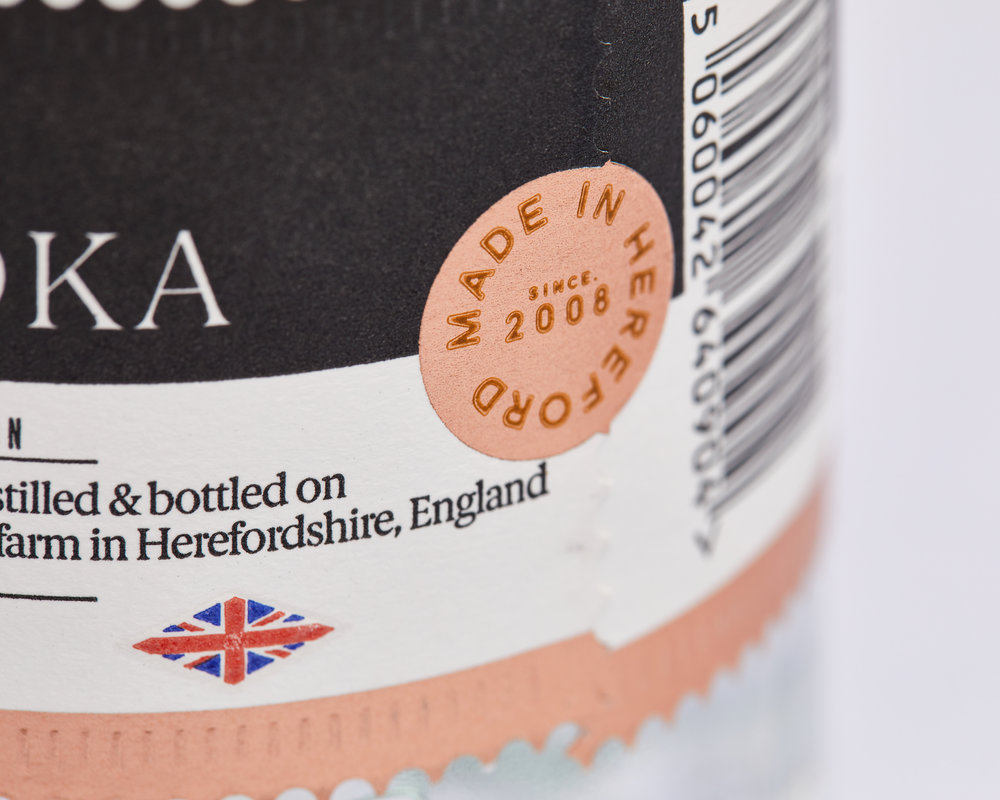
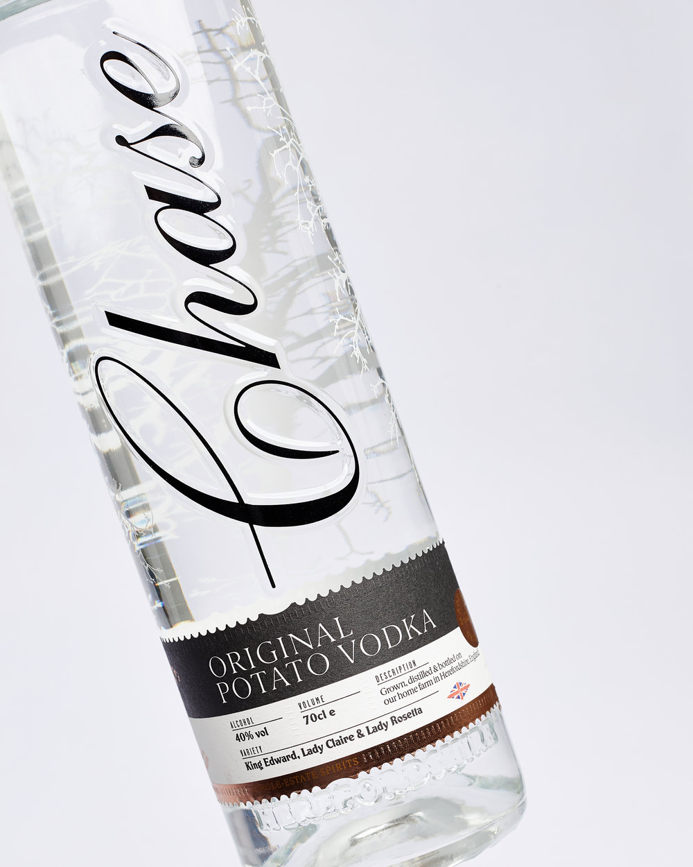
To achieve this, playful references to Britishness have been introduced. The label on the front of the bottle, for example, has been fashioned to look like a postage stamp as an homage to the Penny Black, first introduced nearly 180 years ago. Subtle tyre tracks run across the label hinting at the nation’s impressive motoring legacy and the Chases’ love of classic farm vehicles. And a Union Flag beneath the label leaves the consumer in no doubt as to the provenance of the product.
Luxury paper stock has been used for the label to communicate the vodka’s high-end credentials. And a core monotone colourway nods to Chase Farm’s history, with hints of colour introduced to differentiate the Original, Oak Smoked and flavoured varieties.
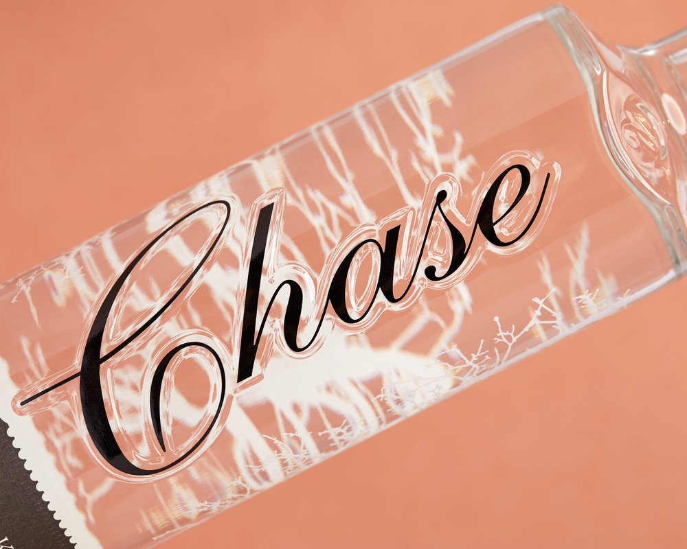
Further quality cues include copper detailing, which also echoes the vast distilling units. Embossing on the label and glass amplify the bottle’s premium look and feel, and potato roots etched across its body celebrate the farm’s pride in produce. Finally, a ‘Made in Herefordshire’ quality stamp brings home the pedigree of the range.
A chip off the old block
James Wood says: “We’ve been Chase’s brand guardians for two years, and in that time we’ve made it our mission to really understand who they are, how they see themselves and their consumer. That collaboration and trust has meant that we’ve been able to create a brand that communicates what Chase represents as a family, farm and spirit brand.”
James Chase, the distillery’s Head Ambassador, says: “ShopTalk has taken the time to fully understand us. Our new identity offers real clarity across all points of sale, and celebrates the fact that we are a modern distillery with a proud British history. We’re sure our customers will love the new look and feel, too.”





CREDIT
- Agency/Creative: ShopTalk
- Article Title: London Design Studio ShopTalk Refresh “Chase” Potato Vodka Range For Its Tenth Birthday
- Organisation/Entity: Agency Commercial, Published
- Project Type: Packaging
- Agency/Creative Country: United Kingdom
- Market Region: Africa
- Format: Bottle, Box
- Substrate: Glass


